---
title: "Data Visualization With ggplot2"
author: "Dr. Hua Zhou @ UCLA"
date: "Jan 29, 2018"
subtitle: Biostat M280
output:
# ioslides_presentation: default
html_document:
toc: true
toc_depth: 4
---
```{r setup, include=FALSE}
knitr::opts_chunk$set(fig.align = 'center', cache = TRUE)
```
## Outline
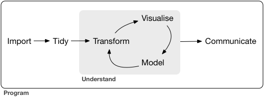
We will spend next couple lectures studying some R packages for typical data science projects.
* Data wrangling (import, visualization, transformation, tidy).
[R for Data Science](http://r4ds.had.co.nz) by Garrett Grolemund and Hadley Wickham.
* Web applications by Shiny.
* Interface with databases, eg., SQL and Apache Spark.
A typical data science project:
## Tidyverse
- `tidyverse` is a collection of R packages that make data wrangling easy.
- Install `tidyverse` from RStudio menu `Tools -> Install Packages...` or
```{r, eval = FALSE}
install.packages("tidyverse")
```
- After installation, load `tidyverse` by
```{r}
library("tidyverse")
```
## Data visualization
> “The simple graph has brought more information to the data analyst’s mind than any other device.”
>
> John Tukey
## `mpg` data
- `mpg` data is available from the `ggplot2` package:
```{r}
mpg
```
- Tibbles are a generalized form of data frames, which are extensively used in tidyverse.
- `displ`: engine size, in litres.
`hwy`: highway fuel efficiency, in mile per gallen (mpg).
# Aesthetic mappings | r4ds chapter 3.3
## Scatter plot
- `hwy` vs `displ`
```{r}
ggplot(data = mpg) +
geom_point(mapping = aes(x = displ, y = hwy))
```
- An aesthetic maps data to a specifc feature of plot.
- Check available aesthetics for a geometric object by `?geom_point`.
## Color of points
- Color points according to `class`:
```{r}
ggplot(data = mpg) +
geom_point(mapping = aes(x = displ, y = hwy, color = class))
```
## Size of points
- Assign different sizes to points according to `class`:
```{r, warning = FALSE}
ggplot(data = mpg) +
geom_point(mapping = aes(x = displ, y = hwy, size = class))
```
## Transparency of points
- Assign different transparency levels to points according to `class`:
```{r}
ggplot(data = mpg) +
geom_point(mapping = aes(x = displ, y = hwy, alpha = class))
```
## Shape of points
- Assign different shapes to points according to `class`:
```{r, warning = FALSE}
ggplot(data = mpg) +
geom_point(mapping = aes(x = displ, y = hwy, shape = class))
```
- Maximum of 6 shapes at a time. By default, additional groups will go unplotted.
## Manual setting of an aesthetic
- Set the color of all points to be blue:
```{r}
ggplot(data = mpg) +
geom_point(mapping = aes(x = displ, y = hwy), color = "blue")
```
# Facets | r4ds chapter 3.5
## Facets
- Facets divide a plot into subplots based on the values of one or more discrete variables.
- A subplot for each car type:
```{r}
ggplot(data = mpg) +
geom_point(mapping = aes(x = displ, y = hwy)) +
facet_wrap(~ class, nrow = 2)
```
----
- A subplot for each car type and drive:
```{r}
ggplot(data = mpg) +
geom_point(mapping = aes(x = displ, y = hwy)) +
facet_grid(drv ~ class)
```
# Geometric objects | r4ds chapter 3.6
## `geom_smooth()`: smooth line
- `hwy` vs `displ` line:
```{r, fig.width = 4.5, fig.height = 3, message = FALSE}
ggplot(data = mpg) +
geom_smooth(mapping = aes(x = displ, y = hwy))
```
## Different line types
- Different line types according to `drv`:
```{r, fig.width = 4.5, fig.height = 3, , message = FALSE}
ggplot(data = mpg) +
geom_smooth(mapping = aes(x = displ, y = hwy, linetype = drv))
```
## Different line colors
- Different line colors according to `drv`:
```{r, fig.width = 4.5, fig.height = 3, message = FALSE}
ggplot(data = mpg) +
geom_smooth(mapping = aes(x = displ, y = hwy, color = drv))
```
## Points and lines
- Lines overlaid over scatter plot:
```{r, fig.width = 4.5, fig.height = 3, message = FALSE}
ggplot(data = mpg) +
geom_point(mapping = aes(x = displ, y = hwy)) +
geom_smooth(mapping = aes(x = displ, y = hwy))
```
----
- Same as
```{r, fig.width = 4.5, fig.height = 3, message = FALSE}
ggplot(data = mpg, mapping = aes(x = displ, y = hwy)) +
geom_point() + geom_smooth()
```
## Aesthetics for each geometric object
- Different aesthetics in different layers:
```{r, fig.width = 4.5, fig.height = 3, message = FALSE}
ggplot(data = mpg, mapping = aes(x = displ, y = hwy)) +
geom_point(mapping = aes(color = class)) +
geom_smooth(data = filter(mpg, class == "subcompact"), se = FALSE)
```
# Bar charts | r4ds chapter 3.7
## `diamonds` data
- `diamonds` data:
```{r}
diamonds
```
## Bar chart
- `geom_bar()` creates bar chart:
```{r}
ggplot(data = diamonds) +
geom_bar(mapping = aes(x = cut))
```
----
- Bar charts, like histograms, frequency polygons, smoothers, and boxplots, plot some computed variables instead of raw data.
- Check available computed variables for a geometric object via help:
```{r, eval = FALSE}
?geom_bar
```
----
- Use `stat_count()` directly:
```{r}
ggplot(data = diamonds) +
stat_count(mapping = aes(x = cut))
```
- `stat_count()` has a default geom `geom_bar()`.
----
- Display frequency instead of counts:
```{r}
ggplot(data = diamonds) +
geom_bar(mapping = aes(x = cut, y = ..prop.., group = 1))
```
Note the aesthetics mapping `group=1` overwrites the default grouping (by `cut`) by considering all observations as a group. Without this we get
```{r}
ggplot(data = diamonds) +
geom_bar(mapping = aes(x = cut, y = ..prop..))
```
----
- Color bar:
```{r, results = 'hold'}
ggplot(data = diamonds) +
geom_bar(mapping = aes(x = cut, colour = cut))
```
----
- Fill color:
```{r, results = 'hold'}
ggplot(data = diamonds) +
geom_bar(mapping = aes(x = cut, fill = cut))
```
----
- Fill color according to another variable:
```{r}
ggplot(data = diamonds) +
geom_bar(mapping = aes(x = cut, fill = clarity))
```
# Positional arguments | r4ds chapter 3.8
----
- `position_gitter()` add random noise to X and Y position of each
element to avoid overplotting:
```{r}
ggplot(data = mpg) +
geom_point(mapping = aes(x = displ, y = hwy), position = "jitter")
```
----
- `geom_jitter()` is similar:
```{r}
ggplot(data = mpg) +
geom_jitter(mapping = aes(x = displ, y = hwy))
```
----
- `position_fill()` stack elements on top of one another,
normalize height:
```{r}
ggplot(data = diamonds) +
geom_bar(mapping = aes(x = cut, fill = clarity), position = "fill")
```
----
- `position_dodge()` arrange elements side by side:
```{r}
ggplot(data = diamonds) +
geom_bar(mapping = aes(x = cut, fill = clarity), position = "dodge")
```
----
- `position_stack()` stack elements on top of each other:
```{r}
ggplot(data = diamonds) +
geom_bar(mapping = aes(x = cut, fill = clarity), position = "stack")
```
# Coordinate systems | r4ds chapter 3.9
----
- A boxplot:
```{r}
ggplot(data = mpg, mapping = aes(x = class, y = hwy)) +
geom_boxplot()
```
----
- `coord_cartesian()` is the default cartesian coordinate system:
```{r}
ggplot(data = mpg, mapping = aes(x = class, y = hwy)) +
geom_boxplot() +
coord_cartesian(xlim = c(0, 5))
```
----
- `coord_fixed()` specifies aspect ratio (x / y):
```{r}
ggplot(data = mpg, mapping = aes(x = class, y = hwy)) +
geom_boxplot() +
coord_fixed(ratio = 1/2)
```
----
- `coord_flip()` flips x- and y- axis:
```{r}
ggplot(data = mpg, mapping = aes(x = class, y = hwy)) +
geom_boxplot() +
coord_flip()
```
----
- A map:
```{r}
library("maps")
nz <- map_data("nz")
head(nz, 20)
```
----
```{r}
ggplot(nz, aes(x = long, y = lat, group = group)) +
geom_polygon(fill = "white", colour = "black")
```
----
- `coord_quickmap()` puts maps in scale:
```{r}
ggplot(nz, aes(long, lat, group = group)) +
geom_polygon(fill = "white", colour = "black") +
coord_quickmap()
```
# Graphics for communications | r4ds chapter 28
## Title
- Figure title should be descriptive:
```{r, message = FALSE}
ggplot(mpg, aes(x = displ, y = hwy)) +
geom_point(aes(color = class)) +
geom_smooth(se = FALSE) +
labs(title = "Fuel efficiency generally decreases with engine size")
```
## Subtitle and caption
-
```{r, message = FALSE}
ggplot(mpg, aes(displ, hwy)) +
geom_point(aes(color = class)) +
geom_smooth(se = FALSE) +
labs(
title = "Fuel efficiency generally decreases with engine size",
subtitle = "Two seaters (sports cars) are an exception because of their light weight",
caption = "Data from fueleconomy.gov"
)
```
## Axis labels
-
```{r, message = FALSE}
ggplot(mpg, aes(displ, hwy)) +
geom_point(aes(colour = class)) +
geom_smooth(se = FALSE) +
labs(
x = "Engine displacement (L)",
y = "Highway fuel economy (mpg)"
)
```
## Math equations
-
```{r}
df <- tibble(x = runif(10), y = runif(10))
ggplot(df, aes(x, y)) + geom_point() +
labs(
x = quote(sum(x[i] ^ 2, i == 1, n)),
y = quote(alpha + beta + frac(delta, theta))
)
```
- `?plotmath`
## Annotations
- Create labels
```{r}
best_in_class <- mpg %>%
group_by(class) %>%
filter(row_number(desc(hwy)) == 1)
best_in_class
```
---
- Annotate points
```{r}
ggplot(mpg, aes(x = displ, y = hwy)) +
geom_point(aes(colour = class)) +
geom_text(aes(label = model), data = best_in_class)
```
----
- `ggrepel` package automatically adjust labels so that they don’t overlap:
```{r}
library("ggrepel")
ggplot(mpg, aes(displ, hwy)) +
geom_point(aes(colour = class)) +
geom_point(size = 3, shape = 1, data = best_in_class) +
ggrepel::geom_label_repel(aes(label = model), data = best_in_class)
```
## Scales
-
```{r, eval=FALSE}
ggplot(mpg, aes(displ, hwy)) +
geom_point(aes(colour = class))
```
automatically adds scales
```{r}
ggplot(mpg, aes(displ, hwy)) +
geom_point(aes(colour = class)) +
scale_x_continuous() +
scale_y_continuous() +
scale_colour_discrete()
```
----
- `breaks`
```{r}
ggplot(mpg, aes(displ, hwy)) +
geom_point() +
scale_y_continuous(breaks = seq(15, 40, by = 5))
```
----
- `labels`
```{r}
ggplot(mpg, aes(displ, hwy)) +
geom_point() +
scale_x_continuous(labels = NULL) +
scale_y_continuous(labels = NULL)
```
----
- Plot y-axis at log scale:
```{r}
ggplot(mpg, aes(x = displ, y = hwy)) +
geom_point() +
scale_y_log10()
```
----
- Plot x-axis in reverse order:
```{r}
ggplot(mpg, aes(x = displ, y = hwy)) +
geom_point() +
scale_x_reverse()
```
## Legends
- Set legend position: `"left"`, `"right"`, `"top"`, `"bottom"`, `none`:
```{r, collapse = TRUE}
ggplot(mpg, aes(displ, hwy)) +
geom_point(aes(colour = class)) +
theme(legend.position = "left")
```
----
- See following link for more details on how to change title, labels, ... of a legend.
## Zooming
- Without clipping (removes unseen data points)
```{r, message = FALSE}
ggplot(mpg, mapping = aes(displ, hwy)) +
geom_point(aes(color = class)) +
geom_smooth() +
coord_cartesian(xlim = c(5, 7), ylim = c(10, 30))
```
----
- With clipping (removes unseen data points)
```{r, message = FALSE, warning = FALSE}
ggplot(mpg, mapping = aes(displ, hwy)) +
geom_point(aes(color = class)) +
geom_smooth() +
xlim(5, 7) + ylim(10, 30)
```
----
-
```{r, message = FALSE, warning = FALSE}
ggplot(mpg, mapping = aes(displ, hwy)) +
geom_point(aes(color = class)) +
geom_smooth() +
scale_x_continuous(limits = c(5, 7)) +
scale_y_continuous(limits = c(10, 30))
```
----
-
```{r, message = FALSE}
mpg %>%
filter(displ >= 5, displ <= 7, hwy >= 10, hwy <= 30) %>%
ggplot(aes(displ, hwy)) +
geom_point(aes(color = class)) +
geom_smooth()
```
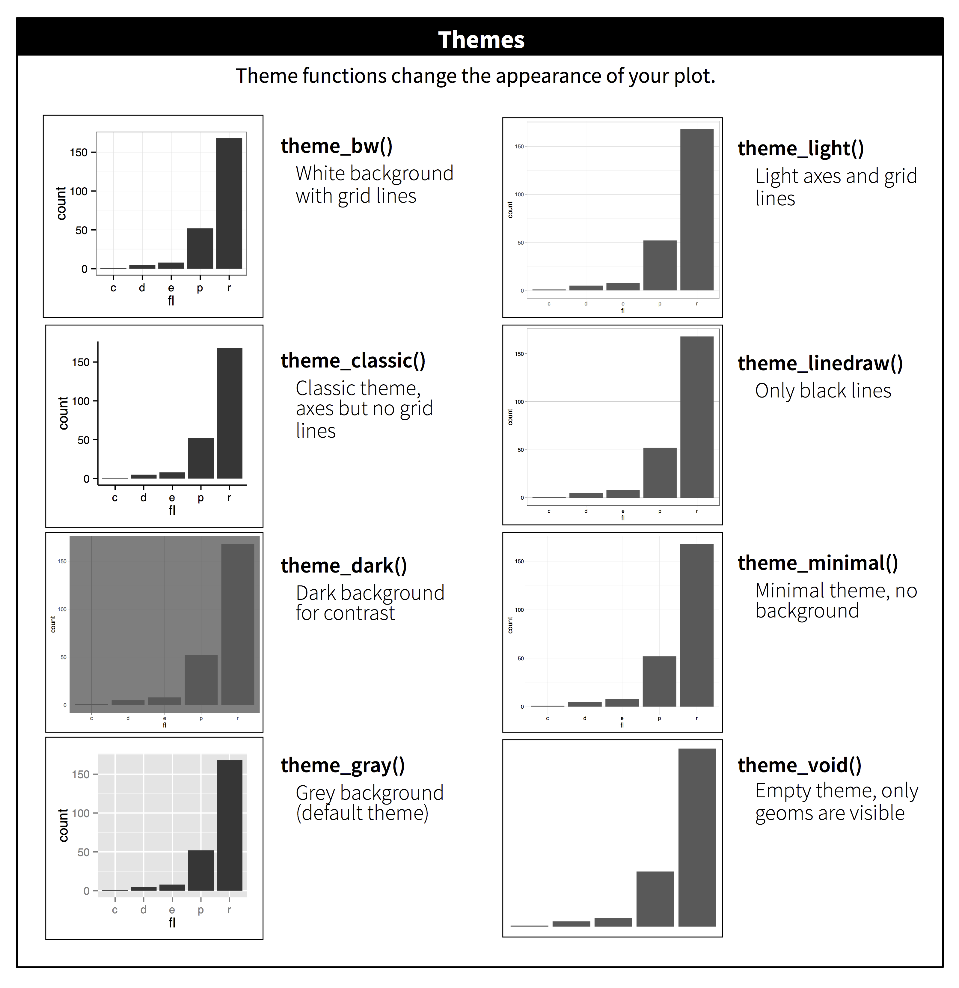
## Themes
-
```{r, message = FALSE}
ggplot(mpg, aes(displ, hwy)) +
geom_point(aes(color = class)) +
geom_smooth(se = FALSE) +
theme_bw()
```
----
## Saving plots
```{r, collapse = TRUE}
ggplot(mpg, aes(displ, hwy)) + geom_point()
ggsave("my-plot.pdf")
```
## Cheat sheet
[RStudio cheat sheet](https://github.com/rstudio/cheatsheets/raw/master/data-visualization-2.1.pdf) is extremely helpful.