Preliminaries
%matplotlib inline
import pandas as pd
import matplotlib.pyplot as plt
Create dataframe
raw_data = {'officer_name': ['Jason', 'Molly', 'Tina', 'Jake', 'Amy'],
        'jan_arrests': [4, 24, 31, 2, 3],
        'feb_arrests': [25, 94, 57, 62, 70],
        'march_arrests': [5, 43, 23, 23, 51]}
df = pd.DataFrame(raw_data, columns = ['officer_name', 'jan_arrests', 'feb_arrests', 'march_arrests'])
df
|
officer_name |
jan_arrests |
feb_arrests |
march_arrests |
| 0 |
Jason |
4 |
25 |
5 |
| 1 |
Molly |
24 |
94 |
43 |
| 2 |
Tina |
31 |
57 |
23 |
| 3 |
Jake |
2 |
62 |
23 |
| 4 |
Amy |
3 |
70 |
51 |
# Create a column with the total arrests for each officer
df['total_arrests'] = df['jan_arrests'] + df['feb_arrests'] + df['march_arrests']
df
|
officer_name |
jan_arrests |
feb_arrests |
march_arrests |
total_arrests |
| 0 |
Jason |
4 |
25 |
5 |
34 |
| 1 |
Molly |
24 |
94 |
43 |
161 |
| 2 |
Tina |
31 |
57 |
23 |
111 |
| 3 |
Jake |
2 |
62 |
23 |
87 |
| 4 |
Amy |
3 |
70 |
51 |
124 |
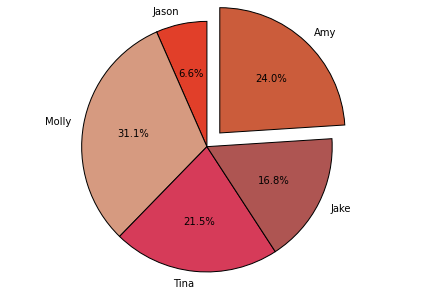
Make plot
# Create a list of colors (from iWantHue)
colors = ["#E13F29", "#D69A80", "#D63B59", "#AE5552", "#CB5C3B", "#EB8076", "#96624E"]

# Create a pie chart
plt.pie(
    # using data total)arrests
    df['total_arrests'],
    # with the labels being officer names
    labels=df['officer_name'],
    # with no shadows
    shadow=False,
    # with colors
    colors=colors,
    # with one slide exploded out
    explode=(0, 0, 0, 0, 0.15),
    # with the start angle at 90%
    startangle=90,
    # with the percent listed as a fraction
    autopct='%1.1f%%',
    )

# View the plot drop above
plt.axis('equal')

# View the plot
plt.tight_layout()
plt.show()

