---
openapi: 3.0.0
info:
description: >-
This is the interface for handling requests for
[app components](https://developers.asana.com/docs/overview-of-app-components). This reference
is generated from an [OpenAPI spec]
(https://raw.githubusercontent.com/Asana/developer-docs/master/defs/app_components_oas.yaml).
title: App Components
termsOfService: https://asana.com/terms
contact:
name: Asana Support
url: https://asana.com/support
license:
name: Apache 2.0
url: https://www.apache.org/licenses/LICENSE-2.0
version: '0.1'
x-docs-schema-whitelist:
- AttachedResourceResponse
- FormField-Checkbox
- FormField-Date
- FormField-Datetime
- FormField-Dropdown
- FormField-MultiLineText
- FormField-RadioButton
- FormField-RichText
- FormField-SingleLineText
- FormField-StaticText
- FormField-Typeahead
- FormMetadataResponse
- RanActionResponse
- WidgetFooter-CustomText
- WidgetFooter-Created
- WidgetFooter-Updated
- WidgetMetadataResponse
- WidgetField-DatetimeWithIcon
- WidgetField-Pill
- WidgetField-TextWithIcon
- TypeaheadListResponse
- TypeaheadItem
- FormValues
- BadRequestResponse
- UnauthorizedResponse
- ForbiddenResponse
- NotFoundResponse
- InternalServerErrorResponse
x-readme:
explorer-enabled: false
servers:
- url: "{siteUrl}"
description: Main endpoint.
tags:
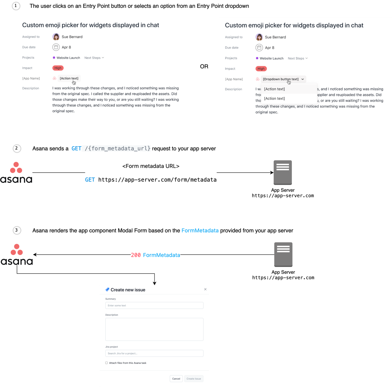
- name: Modal forms
description: >-
The modal form is displayed when the user starts the flow to create a resource. Asana will make a signed
request to the specified `form_metadata_url` in the configuration, and expect a response with the metadata needed to
create the form. This process is also used for forms within rule actions.
- name: Rule actions
description: >-
When a rule containing a rule action is triggered, the [rules](https://asana.com/guide/help/premium/rules) engine will make a request to the app to
inform the app to run the configured rule action. The resulting status code will indicate to the rules engine
whether the action was successfully completed and, if not, specify a cause for the error.
_Note: An app server must be hosted in order for rule actions to function. For a brief list of popular hosting options, see [hosting](/docs/hosting)._
- name: Lookups
description: >-
If the app defined a resource attach URL, tasks without a widget offer the lookup functionality. This appears as a text
input to the user. When the user submits the text, the app responds with either a resource attachment or with an error.
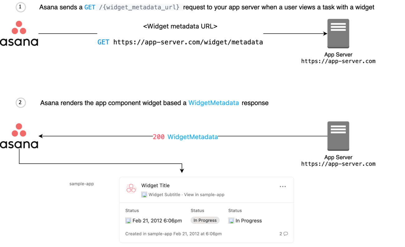
- name: Widgets
description: >-
The widget is displayed when the user views a task with an attachment with a resource URL matching your
capability’s `match_resource_url_pattern`. When this happens, Asana will make a signed request to your `widget_metadata_url`,
and expect a response with information to render in the widget.
components:
parameters:
action:
name: action
in: query
schema:
type: string
description: >-
The ID of an existing rule action that is being edited. Should be omitted when configuring a new rule action.
action_type:
name: action_type
required: true
in: query
schema:
type: string
description: >-
The ID of the configuration used to create the rule action.
attachment:
name: attachment
required: true
in: query
schema:
type: string
description: >-
The attachment ID of the URL attachment.
expires_at:
name: expires_at
required: true
in: query
schema:
type: string
description: >-
The time (in ISO 8601 date format) when the request should expire.
fragment:
name: fragment
required: true
in: query
schema:
type: string
description: >-
The text entered into the typeahead input.
project:
name: project
required: true
in: query
schema:
type: string
description: >-
The project GID this hook is coming from.
user:
name: user
required: true
in: query
schema:
type: string
description: >-
The user GID` this hook is coming from.
resource_url:
name: resource_url
required: true
in: query
schema:
type: string
description: >-
The URL of the URL attachment on the task (i.e., Jira issue, GitHub pull request)
task:
name: task
required: true
in: query
schema:
type: string
description: >-
The task GID this hook is coming from.
workspace:
name: workspace
required: true
in: query
schema:
type: string
description: >-
The workspace GID this hook is coming from.
responses:
BadRequest:
description: >-
Bad request
content:
application/json:
schema:
$ref: '#/components/schemas/BadRequestResponse'
Unauthorized:
description: >-
Unauthorized
content:
application/json:
schema:
$ref: '#/components/schemas/UnauthorizedResponse'
Forbidden:
description: >-
Forbidden
content:
application/json:
schema:
$ref: '#/components/schemas/ForbiddenResponse'
NotFound:
description: >-
Not found
content:
application/json:
schema:
$ref: '#/components/schemas/NotFoundResponse'
TooManyRequests:
description: >-
Too Many Requests
Gone:
description: >-
Gone
InternalServerError:
description: >-
Server error
content:
application/json:
schema:
$ref: '#/components/schemas/InternalServerErrorResponse'
ImATeapot:
description: >-
I'm A Teapot
schemas:
RootUIComponentRequest:
description: >-
The building block of all app component requests.
type: object
properties:
expires_at:
type: string
description: >-
The time (in ISO 8601 date format) when the request should expire.
example: '2019-04-15T01:01:46.055Z'
user:
type: string
description: >-
The user GID this hook is coming from.
example: '54321'
workspace:
type: string
description: >-
The workspace GID this hook is coming from.
example: '12345'
AttachResourceRequest:
allOf:
- $ref: '#/components/schemas/RootUIComponentRequest'
- type: object
description: >-
The body of an attach request.
properties:
task:
type: string
description: >-
The task GID this hook is coming from.
attachment:
type: string
description: >-
The attachment ID of the URL attachment
query:
type: string
description: >-
The user’s input in the lookup text input. This is often a resource URL or resource key, such as
`"CP-1"` or `"https://abcde.atlassian.net/browse/CP-1"`
AttachedResourceResponse:
description: >-
The response to a successful lookup request.
type: object
required:
- resource_name
- resource_url
properties:
resource_name:
description: >-
The name of the attached resource
type: string
example: 'Build the Thing'
resource_url:
description: >-
The URL of the attached resource
type: string
example: 'https://example.atlassian.net/browse/CP-1'
error:
description: >-
The error that should be displayed to the user
type: string
example: 'No resource matched that input'
BadRequestResponse:
description: >-
An error response object indicating a bad request (i.e., a status code of `400`).
type: object
properties:
data:
description: >-
An object containing an `error` string to display to the user.
type: object
properties:
error:
description: >-
The error to display.
type: string
example: "Illegal or malformed request."
CheckboxOption:
description: >-
An option for a checkbox field (i.e., an object in the field's `options` array).
type: object
required:
- id
- label
properties:
id:
description: >-
The ID of the option.
type: string
example: 'opt-in'
label:
description: >-
The label of the option. Limit 80 characters.
type: string
example: 'Opt in'
DropdownOption:
description: >-
An option for a dropdown field (i.e., an object in the field's `options` array).
type: object
required:
- id
- label
properties:
id:
description: >-
The ID of the option.
type: string
example: 'red'
label:
description: >-
The label of the option. Limit 80 characters.
type: string
example: 'Red'
icon_url:
description: >-
*Optional*. The URL for the icon beside the label. If not present, no icon will be displayed.
type: string
example: 'https://example.com/red.png'
ForbiddenResponse:
description: >-
An error response object indicating a forbidden request (i.e., a status code of `403`).
type: object
properties:
data:
description: >-
An object containing an `error` string to display to the user.
type: object
properties:
error:
description: >-
The error to display.
type: string
example: "Access forbidden."
InternalServerErrorResponse:
description: >-
An error response object indicating a request that could not be found (i.e., a status code of `500`).
type: object
properties:
data:
description: >-
An object containing an `error` string to display to the user.
type: object
properties:
error:
description: >-
The error to display.
type: string
example: "Internal server error."
FormField-StaticText:
description: >-
A modal form "field" that displays static text. Fields of this type do not collect user input.
type: object
required:
- id
- type
- name
properties:
type:
description: >-
The type of modal form field.
type: string
enum:
- static_text
example: 'static_text'
id:
description: >-
The ID of the field, which is used to reference the field. These should be unique across the entire form.
type: string
example: 'static_text_field_1'
name:
description: >-
The text (i.e., label) for the field. Limit 50 characters.
type: string
example: 'Please enter the following details:'
FormField-SingleLineText:
description: >-
A modal form field that accepts single-line text input.
type: object
required:
- id
- type
properties:
type:
description: >-
The type of modal form field.
type: string
enum:
- single_line_text
example: 'single_line_text'
id:
description: >-
The ID of the field, which is used to reference the field. These should be unique across the entire form.
type: string
example: 'single_line_text_field_1'
name:
description: >-
The text (i.e., label) to show in the title of the field. Limit 50 characters.
type: string
example: 'Resource name'
is_required:
description: >-
*Optional*. Indicates whether the field is required to submit the form. If this property is not specified, the value is assumed `false`.
type: boolean
example: true
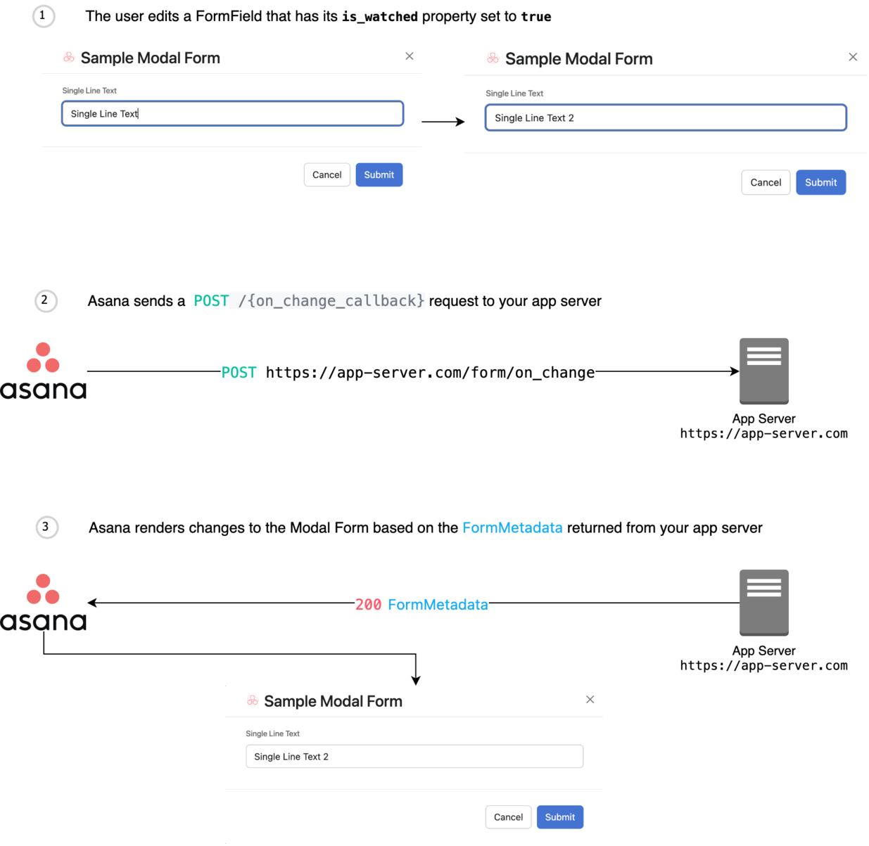
is_watched:
description: >-
*Optional*. Indicates whether the field should be watched. Fields that are watched send requests to the `on_change` URL specified
in the form metadata to get updated form information. If this property is not specified, the value is assumed `false`.
type: boolean
example: true
error:
description: >-
*Optional*. The developer-specified error message displayed to the user if there is an error with the chosen value.
type: string
example: 'Please review and change your input'
placeholder:
description: >-
The placeholder for the input, which is shown if the field has no value. If not provided, there will be no placeholder.
type: string
example: 'Enter the full title of the resource here'
width:
description: >-
*Optional*. The width of the form field. If not provided, the default value will be `"full"`.
type: string
enum:
- full
- half
example: 'full'
value:
description: >-
The value of the field. If not provided, the field will be empty and the form cannot be submitted if it is required. Limit 200 characters.
type: string
example: "Annual Kick-Off Meeting"
FormField-MultiLineText:
description: >-
A modal form field that accepts multi-line text input.
type: object
required:
- id
- type
properties:
type:
description: >-
The type of modal form field.
type: string
enum:
- multi_line_text
example: 'multi_line_text'
id:
description: >-
The ID of the field, which is used to reference the field. These should be unique across the entire form.
type: string
example: 'multi_line_text_field_1'
name:
description: >-
The text (i.e., label) to show in the title of the field. Limit 50 characters.
type: string
example: 'Resource name'
is_required:
description: >-
*Optional*. Indicates whether the field is required to submit the form. If this property is not specified, the value is assumed `false`.
type: boolean
example: true
is_watched:
description: >-
*Optional*. Indicates whether the field should be watched. Fields that are watched send requests to the `on_change` URL specified
in the form metadata to get updated form information. If this property is not specified, the value is assumed `false`.
type: boolean
example: true
error:
description: >-
*Optional*. The developer-specified error message displayed to the user if there is an error with the chosen value.
type: string
example: 'Please review and change your input'
placeholder:
description: >-
The placeholder for the input, which is shown if the field has no value. If not provided, there will be no placeholder.
type: string
example: 'Enter the full title of the resource here'
value:
description: >-
The value of the field. If not provided, the field will be empty and the form cannot be submitted if it is required. Limit 3000 characters.
type: string
example: "Annual Kick-Off Meeting"
FormField-RichText:
description: >-
A modal form field that accepts rich text input.
type: object
required:
- id
- type
properties:
type:
description: >-
The type of modal form field.
type: string
enum:
- rich_text
example: 'rich_text'
id:
description: >-
The ID of the field, which is used to reference the field. These should be unique across the entire form.
type: string
example: 'rich_text_field_1'
name:
description: >-
The text (i.e., label) to show in the title of the field. Limit 50 characters.
type: string
example: 'Resource name'
is_required:
description: >-
*Optional*. Indicates whether the field is required to submit the form. If this property is not specified, the value is assumed `false`.
type: boolean
example: true
is_watched:
description: >-
*Optional*. Indicates whether the field should be watched. Fields that are watched send requests to the `on_change` URL specified
in the form metadata to get updated form information. If this property is not specified, the value is assumed `false`.
type: boolean
example: true
error:
description: >-
*Optional*. The developer-specified error message displayed to the user if there is an error with the chosen value.
type: string
example: 'Please review and change your input'
placeholder:
description: >-
The placeholder for the input, which is shown if the field has no value. If not provided, there will be no placeholder.
type: string
example: 'Enter the full title of the resource here'
value:
description: >-
The value of the field. If not provided, the field will be empty and the form cannot be submitted if it is required. Limit 3000 characters.
type: string
example: "Annual Kick-Off Meeting"
FormField-Dropdown:
description: >-
A modal form field that accepts input via a dropdown list. Limit 50 options.
type: object
required:
- id
- type
- options
properties:
type:
description: >-
The type of modal form field.
type: string
enum:
- dropdown
example: 'dropdown'
id:
description: >-
The ID of the field, which is used to reference the field. These should be unique across the entire form.
type: string
example: 'dropdown_field_1'
name:
description: >-
The text (i.e., label) to show in the title of the field. Limit 50 characters.
type: string
example: 'Resource name'
is_required:
description: >-
*Optional*. Indicates whether the field is required to submit the form. If this property is not specified, the value is assumed `false`.
type: boolean
example: true
is_watched:
description: >-
*Optional*. Indicates whether the field should be watched. Fields that are watched send requests to the `on_change` URL specified
in the form metadata to get updated form information. If this property is not specified, the value is assumed `false`.
type: boolean
example: true
error:
description: >-
*Optional*. The developer-specified error message displayed to the user if there is an error with the chosen value.
type: string
example: 'Please review and change your input'
width:
description: >-
*Optional*. The width of the form field. If not provided, the default value will be `"full"`.
type: string
enum:
- full
- half
example: 'full'
value:
description: >-
*Optional*. The value for the form field, which is the ID of the chosen DropdownOption object.
type: string
example: 'dropdown_option_1'
options:
description: >-
An array (minimum length: 1) of DropdownOption objects.
type: array
items:
$ref: '#/components/schemas/DropdownOption'
FormField-RadioButton:
description: >-
A modal form field that accepts radio button input. Limit 5 options.
type: object
required:
- id
- type
- options
properties:
type:
description: >-
The type of modal form field.
type: string
enum:
- radio_button
example: 'radio_button'
id:
description: >-
The ID of the field, which is used to reference the field. These should be unique across the entire form.
type: string
example: 'radio_button_field_1'
name:
description: >-
The text (i.e., label) to show in the title of the field. Limit 50 characters.
type: string
example: 'Resource name'
is_required:
description: >-
*Optional*. Indicates whether the field is required to submit the form. If this property is not specified, the value is assumed `false`.
type: boolean
example: true
is_watched:
description: >-
*Optional*. Indicates whether the field should be watched. Fields that are watched send requests to the `on_change` URL specified
in the form metadata to get updated form information. If this property is not specified, the value is assumed `false`.
type: boolean
example: true
error:
description: >-
*Optional*. The developer-specified error message displayed to the user if there is an error with the chosen value.
type: string
example: 'Please review and change your input'
value:
description: >-
*Optional*. The value for the form field, which is the ID of the chosen RadioOption object.
type: string
example: 'radio_option_1'
options:
description: >-
An array (minimum length: 1) of RadioOption objects.
type: array
items:
$ref: '#/components/schemas/RadioOption'
FormField-Checkbox:
description: >-
A modal form field that accepts checkbox input. Limit 10 options.
type: object
required:
- id
- type
- options
properties:
type:
description: >-
The type of modal form field.
type: string
enum:
- checkbox
example: 'checkbox'
id:
description: >-
The ID of the field, which is used to reference the field. These should be unique across the entire form.
type: string
example: 'checkbox_field_1'
name:
description: >-
The text (i.e., label) to show in the title of the field. Limit 50 characters.
type: string
example: 'Resource name'
is_required:
description: >-
*Optional*. Indicates whether the field is required to submit the form. If this property is not specified, the value is assumed `false`.
type: boolean
example: true
is_watched:
description: >-
*Optional*. Indicates whether the field should be watched. Fields that are watched send requests to the `on_change` URL specified
in the form metadata to get updated form information. If this property is not specified, the value is assumed `false`.
type: boolean
example: true
error:
description: >-
*Optional*. The developer-specified error message displayed to the user if there is an error with the chosen value.
type: string
example: 'Please review and change your input'
value:
description: >-
*Optional*. The values for the form field, which are the IDs of the chosen CheckboxOption objects.
type: array
items:
type: string
example:
- 'opt-in'
options:
description: >-
An array (minimum length: 1) of CheckboxOption objects.
type: array
items:
$ref: '#/components/schemas/CheckboxOption'
FormField-Date:
description: >-
A modal form field that accepts date input.
type: object
required:
- id
- type
properties:
type:
description: >-
The type of modal form field.
type: string
enum:
- date
example: 'date'
id:
description: >-
The ID of the field, which is used to reference the field. These should be unique across the entire form.
type: string
example: 'date_field_1'
name:
description: >-
The text (i.e., label) to show in the title of the field. Limit 50 characters.
type: string
example: 'Date'
is_required:
description: >-
*Optional*. Indicates whether the field is required to submit the form. If this property is not specified, the value is assumed `false`.
type: boolean
example: true
is_watched:
description: >-
*Optional*. Indicates whether the field should be watched. Fields that are watched send requests to the `on_change` URL specified
in the form metadata to get updated form information. If this property is not specified, the value is assumed `false`.
type: boolean
example: true
error:
description: >-
*Optional*. The developer-specified error message displayed to the user if there is an error with the chosen value.
type: string
example: 'Please review and change your input'
placeholder:
description: >-
The placeholder for the input, which is shown if the field has no value. If not provided, there will be no placeholder.
type: string
example: '2022-02-01'
value:
description: >-
The value of the field. This takes a date with format YYYY-MM-DD or ISO 8601 date string in UTC.
type: string
format: date
example: '2022-02-01'
nullable: true
FormField-Datetime:
description: >-
A modal form field that accepts datetime input.
type: object
required:
- id
- type
properties:
type:
description: >-
The type of modal form field.
type: string
enum:
- datetime
example: 'datetime'
id:
description: >-
The ID of the field, which is used to reference the field. These should be unique across the entire form.
type: string
example: 'datetime_field_1'
name:
description: >-
The text (i.e., label) to show in the title of the field. Limit 50 characters.
type: string
example: 'Datetime'
is_required:
description: >-
*Optional*. Indicates whether the field is required to submit the form. If this property is not specified, the value is assumed `false`.
type: boolean
example: true
is_watched:
description: >-
*Optional*. Indicates whether the field should be watched. Fields that are watched send requests to the `on_change` URL specified
in the form metadata to get updated form information. If this property is not specified, the value is assumed `false`.
type: boolean
example: true
error:
description: >-
*Optional*. The developer-specified error message displayed to the user if there is an error with the chosen value.
type: string
example: 'Please review and change your input'
placeholder:
description: >-
The placeholder for the input, which is shown if the field has no value. If not provided, there will be no placeholder.
type: string
example: '2022-02-01T14:48:00.000Z'
value:
description: >-
The value of the field. This value takes the form of an ISO 8601 date string in UTC.
type: string
format: date-time
example: '2022-02-01T14:48:00.000Z'
nullable: true
FormField-Typeahead:
description: >-
A modal form field that accepts typeahead input.
type: object
required:
- id
- type
- typeahead_url
properties:
type:
description: >-
The type of modal form field.
type: string
enum:
- typeahead
example: 'typeahead'
id:
description: >-
The ID of the field, which is used to reference the field. These should be unique across the entire form.
type: string
example: 'typeahead_field_1'
name:
description: >-
The text (i.e., label) to show in the title of the field. Limit 50 characters.
type: string
example: 'Statuses'
is_required:
description: >-
*Optional*. Indicates whether the field is required to submit the form. If this property is not specified, the value is assumed `false`.
type: boolean
example: true
is_watched:
description: >-
*Optional*. Indicates whether the field should be watched. Fields that are watched send requests to the `on_change` URL specified
in the form metadata to get updated form information. If this property is not specified, the value is assumed `false`.
type: boolean
example: true
error:
description: >-
*Optional*. The developer-specified error message displayed to the user if there is an error with the chosen value.
type: string
example: 'Please review and change your input'
width:
description: >-
*Optional*. The width of the form field. If not provided, the default value will be `"full"`.
type: string
enum:
- full
- half
example: 'full'
typeahead_url:
description: >-
The URL that Asana uses to request typehead results from the application server.
type: string
example: 'https://www.app-server.com/app/typeahead'
value:
allOf:
- $ref: '#/components/schemas/TypeaheadItem'
- type: object
description: >-
*Optional*. The value for the form field, which is the chosen [TypeaheadItem](/docs/typeahead-item) object.
FormMetadataResponse:
description: >-
Contains the metadata that describes how to display and manage a form.
type: object
required:
- metadata
- template
properties:
template:
description: >-
The interface name and version of a distinct form UI layout. A `template` is directly associated with a particular `metadata` schema.
type: string
enum:
- form_metadata_v0
example: 'form_metadata_v0'
metadata:
description: >-
The metadata (i.e., underlying definition) of a form. `metadata` must exist alongside a `template`, and its schema must be specific to the value of that `template`.
type: object
required:
- fields
- title
properties:
title:
description: >-
The title of the form, which is displayed at the top of the creation form
type: string
example: 'Create New Issue'
fields:
description: >-
An array of form field objects that are rendered in the order they are in the array. Limit of 30 fields.
Valid object schemas: [FormField-Checkbox](/docs/form-field-checkbox), [FormField-Date](/docs/form-field-date),
[FormField-Datetime](/docs/form-field-datetime), [FormField-Dropdown](/docs/form-field-dropdown),
[FormField-MultiLineText](/docs/form-field-multi-line-text), [FormField-RadioButton](/docs/form-field-radio-button),
[FormField-RichText](/docs/form-field-rich-text), [FormField-SingleLineText](/docs/form-field-single-line-text),
[FormField-StaticText](/docs/form-field-static-text), [FormField-Typeahead](/docs/form-field-typeahead)
type: array
submit_button_text:
description: >-
The text to display on the form’s submit button. If not provided, the default text “Submit” will be
displayed on the button.
type: string
example: 'Create New Issue'
on_submit_callback:
description: >-
The URL to `POST` the form to when the user clicks the submit button.
If this is field is omitted then the submission button will be disabled. This is useful if the user must
enter information in a watched field first, such as to show additional fields.
type: string
example: 'https://www.example.com/on_submit'
on_change_callback:
description: >-
The URL to `POST` the form to whenever watched field values are changed.
type: string
example: 'https://www.example.com/on_change'
FormOnChangeFormSubmissionRequest:
description: >-
Common properties between app component on change and on submit requests.
properties:
values:
type: object
description: >-
An object that maps each FormField’s GID to its value.
Refer to the `value` property on the FormField schema: [FormField-Checkbox](/docs/form-field-checkbox), [FormField-Date](/docs/form-field-date),
[FormField-Datetime](/docs/form-field-datetime), [FormField-Dropdown](/docs/form-field-dropdown),
[FormField-MultiLineText](/docs/form-field-multi-line-text), [FormField-RadioButton](/docs/form-field-radio-button),
[FormField-RichText](/docs/form-field-rich-text), [FormField-SingleLineText](/docs/form-field-single-line-text),
[FormField-StaticText](/docs/form-field-static-text), [FormField-Typeahead](/docs/form-field-typeahead)
example:
checkbox_field_1: ["opt-in"]
date_field_1: "2021-12-31T08:00:00.000Z"
datetime_field_1: "2023-01-01T00:00:00.000Z"
dropdown_field_1: "red"
multi_line_text_field_1: "Multiline Text"
radio_button_field_1: "blue"
rich_text_field_1: "Rich Text"
single_line_text_field_1: "Single Line Text"
static_text_field_1: "Static Text"
typeahead_field_1:
icon_url: "https://example.com/icon.png"
subtitle: "Subtitle"
title: "Title"
value: "Typeahead"
FormSubmissionRequest:
allOf:
- $ref: '#/components/schemas/RootUIComponentRequest'
- $ref: '#/components/schemas/FormOnChangeFormSubmissionRequest'
- type: object
description: >-
The body of a form submission.
properties:
task:
type: string
description: >-
The task GID this hook is coming from.
example: '67890'
ActionFormSubmissionRequest:
allOf:
- $ref: '#/components/schemas/FormSubmissionRequest'
- type: object
description: >-
The body of a form submission.
properties:
rule_name:
type: string
description: >-
The name of the rule being created
example: 'rule name'
action:
type: string
description: >-
The ID of an existing rule action that is being edited
example: '12345'
action_type:
type: string
description: >-
The ID of the configuration used to create the rule action.
example: '45678'
project:
type: string
description: >-
The project GID this hook is coming from.
example: '12345'
WidgetFooter-Created:
description: >-
A widget footer that displays the timestamp of the resource's creation time.
type: object
required:
- created_at
- footer_type
properties:
footer_type:
description: >-
The type of widget footer.
type: string
enum:
- created
example: 'created'
created_at:
description: >-
The time (in ISO 8601 date format) to show in the footer.
type: string
example: '2012-02-22T02:06:58.147Z'
WidgetFooter-CustomText:
type: object
required:
- footer_type
- text
description: >-
A widget footer that displays custom text and an optional icon.
properties:
footer_type:
description: >-
The text to show in the footer.
type: string
enum:
- custom_text
example: 'custom_text'
text:
description: >-
The text to show in the footer.
type: string
example: 'This is a custom footer message'
icon_url:
description: >-
*Optional*. The icon to show in the footer next to the text. If not provided, no
icon will be shown.
type: string
example: 'https://example-icon.png'
FormOnChangeBaseRequest:
allOf:
- $ref: '#/components/schemas/RootUIComponentRequest'
- $ref: '#/components/schemas/FormOnChangeFormSubmissionRequest'
- type: object
description: >-
The body of an onchange event.
properties:
changed_field:
type: string
description: >-
The name of the changed FormField.
example: 'checkbox_field_1'
FormOnChangeRequest:
allOf:
- $ref: '#/components/schemas/FormOnChangeBaseRequest'
- type: object
description: >-
The body of an onchange event.
properties:
task:
type: string
description: >-
The task GID this hook is coming from.
example: '67890'
ActionFormOnChangeRequest:
allOf:
- $ref: '#/components/schemas/FormOnChangeBaseRequest'
- type: object
description: >-
The body of an action onchange event.
properties:
action:
type: string
description: >-
The ID of an existing rule action that is being edited.
example: '12345'
action_type:
type: string
description: >-
The ID of the configuration used to create the rule action.
example: '45678'
project:
type: string
description: >-
The project GID this hook is coming from.
example: '12345'
NotFoundResponse:
description: >-
An error response object indicating a request that could not be found (i.e., a status code of `404`).
type: object
properties:
data:
description: >-
An object containing an `error` string to display to the user.
type: object
properties:
error:
description: >-
The error to display.
type: string
example: "Not found."
RunActionRequest:
allOf:
- $ref: '#/components/schemas/RootUIComponentRequest'
- type: object
description: >-
The body of an action request.
required:
- idempotency_key
properties:
target_object:
type: string
description: >-
The ID of the target object that the rule action is acting on. Currently, this value is always a task GID.
action:
type: string
description: >-
The action ID generated from rule creation.
action_type:
type: string
description: >-
The ID from the configuration used to create the rule action.
idempotency_key:
type: string
description: >-
A unique key associated with the "run action" request. App servers should use
this key to implement idempotency.
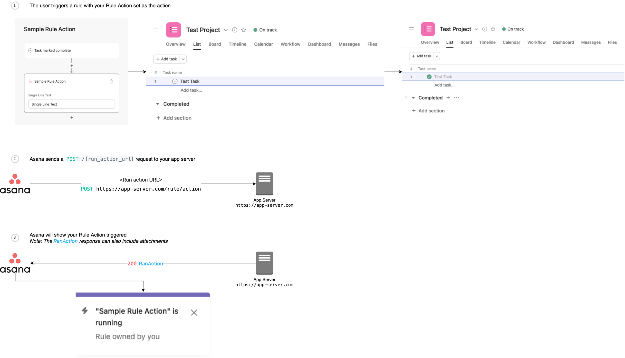
RanActionResponse:
type: object
description: >-
The response to an action request.
required:
- action_result
properties:
error:
description: >-
The error that should be displayed to the user.
type: string
example: 'That resource no longer exists'
action_result:
type: string
enum:
- resources_created
- ok
description: >-
Specifies any additional information that the app wants to send to Asana on completion of the action.
Can only be `resources_created` or `ok`.
example: 'ok'
resources_created:
type: array
description: >-
A field with the data corresponding to the action_result value. Each `action_result` has its own data field
shape that Asana expects. `resources_created` expects the name and URL of the resources that the action
created.
items:
$ref: '#/components/schemas/AttachedResourceResponse'
RadioOption:
description: >-
An option for a radio button field (i.e., an object in the field's `options` array).
type: object
required:
- id
- label
properties:
id:
description: >-
The ID of the option.
type: string
example: 'radio_option_1'
label:
description: >-
The label of the option. Limit 80 characters.
type: string
example: 'Radio Option 1'
sub_label:
description: >-
*Optional*. The label to display as subtext for the `label`.
type: string
example: '#0000FF'
TypeaheadItem:
description: >-
An object describing a typeahead result.
type: object
required:
- title
- value
properties:
title:
description: >-
The title of the typeahead item.
type: string
example: 'OTP Team PF'
subtitle:
description: >-
The subtitle of the typeahead item.
type: string
example: 'OTP'
value:
description: >-
The value of the typeahead item.
type: string
example: 'OTP'
icon_url:
description: >-
The URL of the icon to display next to the title.
type: string
example: 'https://example-icon.png'
TypeaheadListRequest:
allOf:
- $ref: '#/components/schemas/RootUIComponentRequest'
- type: object
description: >-
The body of a typeahead request.
properties:
workspace:
type: string
description: >-
The workspace GID this hook is coming from.
example: '12345'
query:
type: string
description: >-
The user's input in the typeahead text input.
example: 'Messages'
task:
type: string
description: >-
*Conditional*. The task GID this hook is coming from. `task` is only present in the [modal form](/docs/modal-form) (as there is a "context task"), but not in the [rule action](/docs/rule-action) (as rules are associated with a _project_).
example: '67890'
user:
type: string
description: >-
The user GID this hook is coming from.
example: '54321'
expires_at:
type: string
description: >-
The time (in ISO 8601 format) when the request should expire.
example: '2019-04-15T01:01:46.055Z'
TypeaheadListResponse:
description: >-
The response to a successful typeahead request.
type: object
required:
- items
properties:
header:
description: >-
*Optional*. Header text to display above the list of typeahead results. If no `header` is passed in or the value is an empty string, only the typeahead results with be rendered.
type: string
example: 'List of messages'
items:
description: >-
Array of [TypeaheadItem](/docs/typeahead-item) objects that indicate typeahead results.
type: array
items:
$ref: '#/components/schemas/TypeaheadItem'
UnauthorizedResponse:
description: >-
An error response object indicating a unauthorized request (i.e., a status code of `401`).
type: object
properties:
data:
description: >-
An object containing an `error` string to display to the user.
type: object
properties:
error:
description: >-
The error to display.
type: string
example: "Authorization required."
WidgetFooter-Updated:
description: >-
A widget footer that displays the timestamp of the resource's last updated time.
type: object
required:
- footer_type
- last_updated_at
properties:
footer_type:
description: >-
The type of widget footer.
type: string
enum:
- updated
example: 'updated'
last_updated_at:
description: >-
The time (in ISO 8601 date format) to show in the footer.
type: string
example: '2012-02-22T02:06:58.147Z'
WidgetField-DatetimeWithIcon:
description: >-
A widget field that displays a timestamp and an optional icon.
type: object
required:
- name
- type
properties:
type:
description: >-
The type of widget field.
type: string
enum:
- datetime_with_icon
example: 'datetime_with_icon'
name:
description: >-
The text (i.e., label) to show in the title of the field. Limit 40 characters.
type: string
example: 'Status'
datetime:
description: >-
The time (in ISO 8601 date format) to display next to the icon.
type: string
example: '2012-02-22T02:06:58.147Z'
icon_url:
description: >-
*Optional*. The URL of the icon to display next to the time.
type: string
example: 'https://example-icon.png'
WidgetField-Pill:
description: >-
A widget field that displays custom text in a colored "pill" format.
type: object
required:
- color
- name
- text
- type
properties:
type:
description: >-
The type of widget field.
type: string
enum:
- pill
example: 'pill'
name:
description: >-
The text (i.e., label) to show in the title of the field. Limit 40 characters.
type: string
example: 'Status'
text:
description: >-
The text to show in the field. Limit 40 characters.
type: string
example: 'In Progress'
color:
description: >-
The color of the pill.
type: string
enum:
- none
- red
- orange
- yellow-orange
- yellow
- yellow-green
- green
- blue-green
- aqua
- blue
- indigo
- purple
- magenta
- hot-pink
- pink
- cool-gray
example: 'cool-gray'
WidgetField-TextWithIcon:
description: >-
A widget field that displays custom text with an optional icon.
type: object
required:
- name
- text
- type
properties:
type:
description: >-
The type of widget field.
type: string
enum:
- text_with_icon
example: 'text_with_icon'
name:
description: >-
The text (i.e., label) to show in the title of the field. Limit 40 characters.
type: string
example: 'Status'
text:
description: >-
The text to show in the field. Limit 40 characters.
type: string
example: 'In Progress'
icon_url:
description: >-
*Optional*. The URL of the icon to display next to the text.
type: string
example: 'https://example-icon.png'
WidgetMetadataResponse:
description: >-
An object containing information about the widget.
type: object
required:
- metadata
- template
properties:
template:
description: >-
The interface name and version of a distinct widget UI layout. A `template` is directly associated with a particular `metadata` schema.
type: string
enum:
- summary_with_details_v0
example: 'summary_with_details_v0'
metadata:
description: >-
The metadata (i.e., underlying definition) of a widget. `metadata` must exist alongside a `template`, and its schema must be specific to the value of that `template`.
type: object
required:
- fields
- footer
- title
properties:
error:
description: >-
The error that should be displayed to the user.
type: string
example: 'The resource cannot be accessed'
title:
description: >-
The text to show in the title of the widget. Max length of 200 characters.
type: string
example: 'Status'
fields:
description: >-
A list of fields showing data from external resources (i.e., an array of WidgetField objects). A widget must contain at least 1 field and no more than 5 fields.
Valid object schemas: [WidgetField-DatetimeWithIcon](/docs/widget-field-datetime-with-icon), [WidgetField-Pill](/docs/widget-field-pill), [WidgetField-TextWithIcon](/docs/widget-field-text-with-icon).
type: array
subtitle:
description: >-
The text to show under the title of the widget, next to "Open in {App Name}". If not provided, the
`resource_name` from the app definition will be used as default.
type: string
example: 'Custom App Story · Open in Custom App'
subicon_url:
description: >-
The URL of the subicon next to the subtitle . If not provided, no icon will be shown.
type: string
example: 'https://example-icon.png'
footer:
type: object
description: >-
Contains the information to display a footer on the widget.
Valid schemas: [WidgetFooter-Created](/docs/widget-footer-created), [WidgetFooter-CustomText](/docs/widget-footer-custom-text), [WidgetFooter-Updated](/docs/widget-footer-updated).
num_comments:
description: >-
The number of comments to display on the lower right corner of the widget. If not provided, no comment
count will be shown
type: integer
example: 2
paths:
/widget_metadata_url_path_placeholder:
parameters:
- $ref: '#/components/parameters/resource_url'
- $ref: '#/components/parameters/workspace'
- $ref: '#/components/parameters/task'
- $ref: '#/components/parameters/user'
- $ref: '#/components/parameters/attachment'
- $ref: '#/components/parameters/expires_at'
get:
summary: Get widget metadata
description: >-
_Note: The path is a placeholder. The actual path is determined by the
configuration of the app component._
Get the metadata from the app server to render a widget.
 tags:
- Widgets
operationId: getWidgetMetadata
responses:
200:
description: Successfully retrieved the metadata for a single widget.
content:
application/json:
schema:
$ref: '#/components/schemas/WidgetMetadataResponse'
400:
$ref: '#/components/responses/BadRequest'
401:
$ref: '#/components/responses/Unauthorized'
403:
$ref: '#/components/responses/Forbidden'
404:
$ref: '#/components/responses/NotFound'
418:
$ref: '#/components/responses/Unauthorized'
500:
$ref: '#/components/responses/InternalServerError'
/resource_attach_url_path_placeholder:
post:
summary: Attach resource
description: >-
_Note: The path is a placeholder. The actual path is determined by the
configuration of the app component._
When the user attaches a resource URL to a task, Asana will make a signed request to the specified
`resource_attach_url` in the app configuration. Information about the attached resource should be included in the
response.
tags:
- Lookups
operationId: attachResource
requestBody:
description: >-
Request to attach a resource.
required: true
content:
application/json:
schema:
$ref: '#/components/schemas/AttachResourceRequest'
responses:
200:
description: Successfully attached the resource to the given object.
content:
application/json:
schema:
$ref: '#/components/schemas/AttachedResourceResponse'
400:
$ref: '#/components/responses/BadRequest'
401:
$ref: '#/components/responses/Unauthorized'
403:
$ref: '#/components/responses/Forbidden'
404:
$ref: '#/components/responses/NotFound'
500:
$ref: '#/components/responses/InternalServerError'
/resource_typeahead_url_path_placeholder:
get:
summary: Get lookup typeahead results
description: >-
_Note: The path is a placeholder. The actual path is determined by the
configuration of the app component._
Gets typeahead results to render as a dropdown list in the resource lookup input field.
When the user types into the lookup input field, Asana will send a request containing the entered string to the application's `typeahead_url`. The list of [TypeaheadItem](/docs/typeahead-item)s in the response will then be rendered in a dropdown list. When the user selects an item from the list, Asana will send a [resource attach](/docs/resource-attach) request to the app server, then process the response and render the attached resource in the widget.
tags:
- Lookups
operationId: getTypeaheadResults
requestBody:
description: >-
Request to retrieve typeahead results for a resource lookup query.
required: true
content:
application/json:
schema:
$ref: '#/components/schemas/TypeaheadListRequest'
responses:
200:
description: Successfully retrieved typeahead results.
content:
application/json:
schema:
$ref: '#/components/schemas/TypeaheadListResponse'
400:
$ref: '#/components/responses/BadRequest'
401:
$ref: '#/components/responses/Unauthorized'
403:
$ref: '#/components/responses/Forbidden'
404:
$ref: '#/components/responses/NotFound'
500:
$ref: '#/components/responses/InternalServerError'
/form_metadata_url_path_placeholder:
parameters:
- $ref: '#/components/parameters/workspace'
- $ref: '#/components/parameters/task'
- $ref: '#/components/parameters/user'
- $ref: '#/components/parameters/expires_at'
get:
summary: Get form metadata
description: >-
_Note: The path is a placeholder. The actual path is determined by the
configuration of the app component._
Get the metadata from the app server to render a form.
tags:
- Widgets
operationId: getWidgetMetadata
responses:
200:
description: Successfully retrieved the metadata for a single widget.
content:
application/json:
schema:
$ref: '#/components/schemas/WidgetMetadataResponse'
400:
$ref: '#/components/responses/BadRequest'
401:
$ref: '#/components/responses/Unauthorized'
403:
$ref: '#/components/responses/Forbidden'
404:
$ref: '#/components/responses/NotFound'
418:
$ref: '#/components/responses/Unauthorized'
500:
$ref: '#/components/responses/InternalServerError'
/resource_attach_url_path_placeholder:
post:
summary: Attach resource
description: >-
_Note: The path is a placeholder. The actual path is determined by the
configuration of the app component._
When the user attaches a resource URL to a task, Asana will make a signed request to the specified
`resource_attach_url` in the app configuration. Information about the attached resource should be included in the
response.
tags:
- Lookups
operationId: attachResource
requestBody:
description: >-
Request to attach a resource.
required: true
content:
application/json:
schema:
$ref: '#/components/schemas/AttachResourceRequest'
responses:
200:
description: Successfully attached the resource to the given object.
content:
application/json:
schema:
$ref: '#/components/schemas/AttachedResourceResponse'
400:
$ref: '#/components/responses/BadRequest'
401:
$ref: '#/components/responses/Unauthorized'
403:
$ref: '#/components/responses/Forbidden'
404:
$ref: '#/components/responses/NotFound'
500:
$ref: '#/components/responses/InternalServerError'
/resource_typeahead_url_path_placeholder:
get:
summary: Get lookup typeahead results
description: >-
_Note: The path is a placeholder. The actual path is determined by the
configuration of the app component._
Gets typeahead results to render as a dropdown list in the resource lookup input field.
When the user types into the lookup input field, Asana will send a request containing the entered string to the application's `typeahead_url`. The list of [TypeaheadItem](/docs/typeahead-item)s in the response will then be rendered in a dropdown list. When the user selects an item from the list, Asana will send a [resource attach](/docs/resource-attach) request to the app server, then process the response and render the attached resource in the widget.
tags:
- Lookups
operationId: getTypeaheadResults
requestBody:
description: >-
Request to retrieve typeahead results for a resource lookup query.
required: true
content:
application/json:
schema:
$ref: '#/components/schemas/TypeaheadListRequest'
responses:
200:
description: Successfully retrieved typeahead results.
content:
application/json:
schema:
$ref: '#/components/schemas/TypeaheadListResponse'
400:
$ref: '#/components/responses/BadRequest'
401:
$ref: '#/components/responses/Unauthorized'
403:
$ref: '#/components/responses/Forbidden'
404:
$ref: '#/components/responses/NotFound'
500:
$ref: '#/components/responses/InternalServerError'
/form_metadata_url_path_placeholder:
parameters:
- $ref: '#/components/parameters/workspace'
- $ref: '#/components/parameters/task'
- $ref: '#/components/parameters/user'
- $ref: '#/components/parameters/expires_at'
get:
summary: Get form metadata
description: >-
_Note: The path is a placeholder. The actual path is determined by the
configuration of the app component._
Get the metadata from the app server to render a form.
 tags:
- Modal forms
operationId: getFormMetadata
responses:
200:
description: Successfully retrieved the metadata for a single form.
content:
application/json:
schema:
$ref: '#/components/schemas/FormMetadataResponse'
400:
$ref: '#/components/responses/BadRequest'
401:
$ref: '#/components/responses/Unauthorized'
403:
$ref: '#/components/responses/Forbidden'
404:
$ref: '#/components/responses/NotFound'
500:
$ref: '#/components/responses/InternalServerError'
/modal_form_typeahead_url_path_placeholder:
get:
summary: Get modal form typeahead results
description: >-
_Note: The path is a placeholder. The actual path is determined by the
configuration of the app component._
If a modal form field is of type `typehead`, this operation gets typeahead results to render as a dropdown list.
When the user types into a modal form form field, Asana will send a request containing the entered string to the application's `typeahead_url`. The list of [TypeaheadItem](/docs/typeahead-item)s in the response will then be rendered in a dropdown list.
tags:
- Modal forms
operationId: getFormMetadata
responses:
200:
description: Successfully retrieved the metadata for a single form.
content:
application/json:
schema:
$ref: '#/components/schemas/FormMetadataResponse'
400:
$ref: '#/components/responses/BadRequest'
401:
$ref: '#/components/responses/Unauthorized'
403:
$ref: '#/components/responses/Forbidden'
404:
$ref: '#/components/responses/NotFound'
500:
$ref: '#/components/responses/InternalServerError'
/modal_form_typeahead_url_path_placeholder:
get:
summary: Get modal form typeahead results
description: >-
_Note: The path is a placeholder. The actual path is determined by the
configuration of the app component._
If a modal form field is of type `typehead`, this operation gets typeahead results to render as a dropdown list.
When the user types into a modal form form field, Asana will send a request containing the entered string to the application's `typeahead_url`. The list of [TypeaheadItem](/docs/typeahead-item)s in the response will then be rendered in a dropdown list.
 tags:
- Modal forms
operationId: getModalFormTypeaheadResults
requestBody:
description: >-
Request to retrieve typeahead results in a modal form typeahead form field.
required: true
content:
application/json:
schema:
$ref: '#/components/schemas/TypeaheadListRequest'
responses:
200:
description: Successfully retrieved typeahead results.
content:
application/json:
schema:
$ref: '#/components/schemas/TypeaheadListResponse'
400:
$ref: '#/components/responses/BadRequest'
401:
$ref: '#/components/responses/Unauthorized'
403:
$ref: '#/components/responses/Forbidden'
404:
$ref: '#/components/responses/NotFound'
500:
$ref: '#/components/responses/InternalServerError'
/rule_action_typeahead_url_path_placeholder:
get:
summary: Get rule action typeahead results
description: >-
_Note: The path is a placeholder. The actual path is determined by the
configuration of the app component._
In a rule action typeahead form field, this operation gets typeahead results to render as a dropdown list. Typeahead results are limited to 50 items.
When the user types into a rule action form field, Asana will send a request containing the entered string to the application's `typeahead_url`. The list of [TypeaheadItem](/docs/typeahead-item)s in the response will then be rendered in a dropdown list.
tags:
- Modal forms
operationId: getModalFormTypeaheadResults
requestBody:
description: >-
Request to retrieve typeahead results in a modal form typeahead form field.
required: true
content:
application/json:
schema:
$ref: '#/components/schemas/TypeaheadListRequest'
responses:
200:
description: Successfully retrieved typeahead results.
content:
application/json:
schema:
$ref: '#/components/schemas/TypeaheadListResponse'
400:
$ref: '#/components/responses/BadRequest'
401:
$ref: '#/components/responses/Unauthorized'
403:
$ref: '#/components/responses/Forbidden'
404:
$ref: '#/components/responses/NotFound'
500:
$ref: '#/components/responses/InternalServerError'
/rule_action_typeahead_url_path_placeholder:
get:
summary: Get rule action typeahead results
description: >-
_Note: The path is a placeholder. The actual path is determined by the
configuration of the app component._
In a rule action typeahead form field, this operation gets typeahead results to render as a dropdown list. Typeahead results are limited to 50 items.
When the user types into a rule action form field, Asana will send a request containing the entered string to the application's `typeahead_url`. The list of [TypeaheadItem](/docs/typeahead-item)s in the response will then be rendered in a dropdown list.
 tags:
- Rule actions
operationId: getRuleActionTypeaheadResults
requestBody:
description: >-
Request to retrieve typeahead results in a rule action typeahead form field.
required: true
content:
application/json:
schema:
$ref: '#/components/schemas/TypeaheadListRequest'
responses:
200:
description: Successfully retrieved typeahead results.
content:
application/json:
schema:
$ref: '#/components/schemas/TypeaheadListResponse'
400:
$ref: '#/components/responses/BadRequest'
401:
$ref: '#/components/responses/Unauthorized'
403:
$ref: '#/components/responses/Forbidden'
404:
$ref: '#/components/responses/NotFound'
500:
$ref: '#/components/responses/InternalServerError'
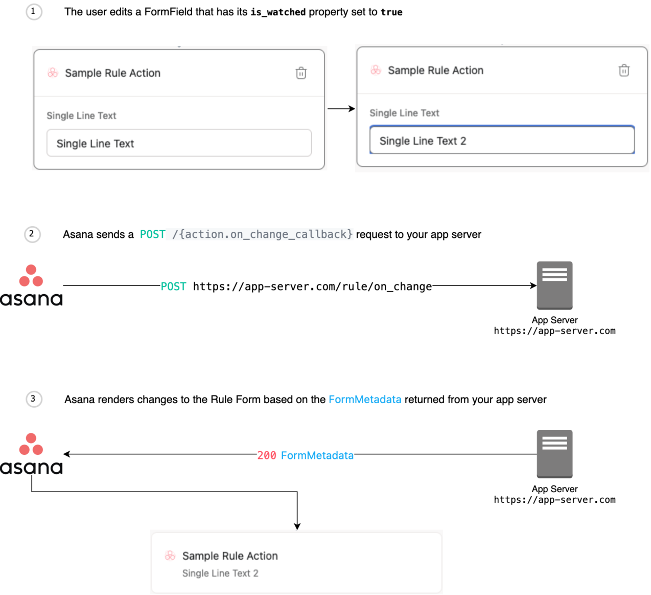
/on_change_callback_path_placeholder:
post:
summary: On change callback
description: >-
_Note: The path is a placeholder. The actual path is determined by the
configuration of the app component._
The callback request made to an app server when a watched field's value changes within a form.
The request is subject to a 10-second timeout if no response is received from the app server.
tags:
- Rule actions
operationId: getRuleActionTypeaheadResults
requestBody:
description: >-
Request to retrieve typeahead results in a rule action typeahead form field.
required: true
content:
application/json:
schema:
$ref: '#/components/schemas/TypeaheadListRequest'
responses:
200:
description: Successfully retrieved typeahead results.
content:
application/json:
schema:
$ref: '#/components/schemas/TypeaheadListResponse'
400:
$ref: '#/components/responses/BadRequest'
401:
$ref: '#/components/responses/Unauthorized'
403:
$ref: '#/components/responses/Forbidden'
404:
$ref: '#/components/responses/NotFound'
500:
$ref: '#/components/responses/InternalServerError'
/on_change_callback_path_placeholder:
post:
summary: On change callback
description: >-
_Note: The path is a placeholder. The actual path is determined by the
configuration of the app component._
The callback request made to an app server when a watched field's value changes within a form.
The request is subject to a 10-second timeout if no response is received from the app server.
 tags:
- Modal forms
operationId: onFormChange
requestBody:
description: >-
Request to notify of an on change event.
required: true
content:
application/json:
schema:
$ref: '#/components/schemas/FormOnChangeRequest'
responses:
200:
description: Successfully returned the new state of the form.
content:
application/json:
schema:
$ref: '#/components/schemas/FormMetadataResponse'
400:
description: Something was wrong with the form data.
content:
application/json:
schema:
$ref: '#/components/schemas/FormMetadataResponse'
401:
$ref: '#/components/responses/Unauthorized'
403:
$ref: '#/components/responses/Forbidden'
404:
$ref: '#/components/responses/NotFound'
500:
$ref: '#/components/responses/InternalServerError'
/on_submit_callback_path_placeholder:
post:
summary: On submit callback
description: >-
_Note: The path is a placeholder. The actual path is determined by the
configuration of the app component._
The callback request made to an app server when a form is submitted.
The request is subject to a 10-second timeout if no response is received from the app server.
tags:
- Modal forms
operationId: onFormChange
requestBody:
description: >-
Request to notify of an on change event.
required: true
content:
application/json:
schema:
$ref: '#/components/schemas/FormOnChangeRequest'
responses:
200:
description: Successfully returned the new state of the form.
content:
application/json:
schema:
$ref: '#/components/schemas/FormMetadataResponse'
400:
description: Something was wrong with the form data.
content:
application/json:
schema:
$ref: '#/components/schemas/FormMetadataResponse'
401:
$ref: '#/components/responses/Unauthorized'
403:
$ref: '#/components/responses/Forbidden'
404:
$ref: '#/components/responses/NotFound'
500:
$ref: '#/components/responses/InternalServerError'
/on_submit_callback_path_placeholder:
post:
summary: On submit callback
description: >-
_Note: The path is a placeholder. The actual path is determined by the
configuration of the app component._
The callback request made to an app server when a form is submitted.
The request is subject to a 10-second timeout if no response is received from the app server.
 tags:
- Modal forms
operationId: onFormSubmit
requestBody:
description: >-
Request to notify of a form submission.
required: true
content:
application/json:
schema:
$ref: '#/components/schemas/FormSubmissionRequest'
responses:
200:
description: Successfully attached the resource created by the form.
content:
application/json:
schema:
$ref: '#/components/schemas/AttachedResourceResponse'
400:
description: Something was wrong with the form data.
content:
application/json:
schema:
$ref: '#/components/schemas/FormMetadataResponse'
401:
$ref: '#/components/responses/Unauthorized'
403:
$ref: '#/components/responses/Forbidden'
404:
$ref: '#/components/responses/NotFound'
500:
$ref: '#/components/responses/InternalServerError'
/run_action_url_path_placeholder:
post:
summary: Run action
description: >-
_Note: The path is a placeholder. The actual path is determined by the
configuration of the app component._
The request made when an action is triggered. Rule actions in rules containing a "Task added to this project" trigger have a 2 minute
delay for newly created tasks in that project. This is to provide time for the creating
user to fill out task details (name, description, etc.) before the rule action is triggered.
An app server must be hosted in order for rule actions to function. For a brief list of popular hosting options, see [hosting](/docs/hosting).
tags:
- Modal forms
operationId: onFormSubmit
requestBody:
description: >-
Request to notify of a form submission.
required: true
content:
application/json:
schema:
$ref: '#/components/schemas/FormSubmissionRequest'
responses:
200:
description: Successfully attached the resource created by the form.
content:
application/json:
schema:
$ref: '#/components/schemas/AttachedResourceResponse'
400:
description: Something was wrong with the form data.
content:
application/json:
schema:
$ref: '#/components/schemas/FormMetadataResponse'
401:
$ref: '#/components/responses/Unauthorized'
403:
$ref: '#/components/responses/Forbidden'
404:
$ref: '#/components/responses/NotFound'
500:
$ref: '#/components/responses/InternalServerError'
/run_action_url_path_placeholder:
post:
summary: Run action
description: >-
_Note: The path is a placeholder. The actual path is determined by the
configuration of the app component._
The request made when an action is triggered. Rule actions in rules containing a "Task added to this project" trigger have a 2 minute
delay for newly created tasks in that project. This is to provide time for the creating
user to fill out task details (name, description, etc.) before the rule action is triggered.
An app server must be hosted in order for rule actions to function. For a brief list of popular hosting options, see [hosting](/docs/hosting).
 tags:
- Rule actions
operationId: runAction
requestBody:
description: >-
Request to notify of an action running.
required: true
content:
application/json:
schema:
$ref: '#/components/schemas/RunActionRequest'
responses:
200:
description: Successfully attached the resource created by the form.
content:
application/json:
schema:
$ref: '#/components/schemas/RanActionResponse'
400:
$ref: '#/components/responses/BadRequest'
401:
$ref: '#/components/responses/Unauthorized'
403:
$ref: '#/components/responses/Forbidden'
404:
$ref: '#/components/responses/NotFound'
410:
$ref: '#/components/responses/Gone'
500:
$ref: '#/components/responses/InternalServerError'
/action.metadata_url_path_placeholder:
parameters:
- $ref: '#/components/parameters/action'
- $ref: '#/components/parameters/action_type'
- $ref: '#/components/parameters/project'
- $ref: '#/components/parameters/workspace'
- $ref: '#/components/parameters/user'
- $ref: '#/components/parameters/expires_at'
get:
summary: Get action metadata
description: >-
_Note: The path is a placeholder. The actual path is determined by the
configuration of the app component._
When a user has navigated to the [custom rule builder](https://asana.com/guide/help/premium/rules#gl-create-rule)
UI and selected a rule action (either through the sidebar or via a rule preset), Asana will make a request to the
app to get the configuration form definition for the chosen rule action. This will initiate the flow to configure
a new rule action or edit the configuration of an existing rule action. This is the endpoint and schema for
updating rule actions; app triggers (V2) will be analogous.
tags:
- Rule actions
operationId: runAction
requestBody:
description: >-
Request to notify of an action running.
required: true
content:
application/json:
schema:
$ref: '#/components/schemas/RunActionRequest'
responses:
200:
description: Successfully attached the resource created by the form.
content:
application/json:
schema:
$ref: '#/components/schemas/RanActionResponse'
400:
$ref: '#/components/responses/BadRequest'
401:
$ref: '#/components/responses/Unauthorized'
403:
$ref: '#/components/responses/Forbidden'
404:
$ref: '#/components/responses/NotFound'
410:
$ref: '#/components/responses/Gone'
500:
$ref: '#/components/responses/InternalServerError'
/action.metadata_url_path_placeholder:
parameters:
- $ref: '#/components/parameters/action'
- $ref: '#/components/parameters/action_type'
- $ref: '#/components/parameters/project'
- $ref: '#/components/parameters/workspace'
- $ref: '#/components/parameters/user'
- $ref: '#/components/parameters/expires_at'
get:
summary: Get action metadata
description: >-
_Note: The path is a placeholder. The actual path is determined by the
configuration of the app component._
When a user has navigated to the [custom rule builder](https://asana.com/guide/help/premium/rules#gl-create-rule)
UI and selected a rule action (either through the sidebar or via a rule preset), Asana will make a request to the
app to get the configuration form definition for the chosen rule action. This will initiate the flow to configure
a new rule action or edit the configuration of an existing rule action. This is the endpoint and schema for
updating rule actions; app triggers (V2) will be analogous.
 tags:
- Rule actions
operationId: getActionMetadata
responses:
200:
description: Successfully retrieved the metadata for a single action.
content:
application/json:
schema:
$ref: '#/components/schemas/FormMetadataResponse'
400:
$ref: '#/components/responses/BadRequest'
401:
$ref: '#/components/responses/Unauthorized'
403:
$ref: '#/components/responses/Forbidden'
404:
$ref: '#/components/responses/NotFound'
500:
$ref: '#/components/responses/InternalServerError'
/action.on_change_callback_path_placeholder:
post:
summary: On action change callback
description: >-
_Note: The path is a placeholder. The actual path is determined by the
configuration of the app component._
The callback request made to an app server when a watched field's value changes within an action form.
The request is subject to a 10-second timeout if no response is received from the app server.
tags:
- Rule actions
operationId: getActionMetadata
responses:
200:
description: Successfully retrieved the metadata for a single action.
content:
application/json:
schema:
$ref: '#/components/schemas/FormMetadataResponse'
400:
$ref: '#/components/responses/BadRequest'
401:
$ref: '#/components/responses/Unauthorized'
403:
$ref: '#/components/responses/Forbidden'
404:
$ref: '#/components/responses/NotFound'
500:
$ref: '#/components/responses/InternalServerError'
/action.on_change_callback_path_placeholder:
post:
summary: On action change callback
description: >-
_Note: The path is a placeholder. The actual path is determined by the
configuration of the app component._
The callback request made to an app server when a watched field's value changes within an action form.
The request is subject to a 10-second timeout if no response is received from the app server.
 tags:
- Rule actions
operationId: onActionFormChange
requestBody:
description: >-
Request to notify of an on change event.
required: true
content:
application/json:
schema:
$ref: '#/components/schemas/ActionFormOnChangeRequest'
responses:
200:
description: Successfully returned the new state of the form.
content:
application/json:
schema:
$ref: '#/components/schemas/FormMetadataResponse'
400:
description: Something was wrong with the form data.
content:
application/json:
schema:
$ref: '#/components/schemas/FormMetadataResponse'
401:
$ref: '#/components/responses/Unauthorized'
403:
$ref: '#/components/responses/Forbidden'
404:
$ref: '#/components/responses/NotFound'
500:
$ref: '#/components/responses/InternalServerError'
/action.on_submit_callback_path_placeholder:
post:
summary: On action submit callback
description: >-
_Note: The path is a placeholder. The actual path is determined by the
configuration of the app component._
The form is submitted when the user chooses to create their rule. Asana will create the rule action data model
object and make a signed request to the `on_submit_callback` specified in the form metadata returned from the
fetch/update rule action form endpoints. Information about the created rule action should be included in the
response if it was successfully created. This is the endpoint and schema for updating rule actions; app triggers
(V2) will be analogous.
The request is subject to a 10-second timeout if no response is received from the app server.
tags:
- Rule actions
operationId: onActionFormChange
requestBody:
description: >-
Request to notify of an on change event.
required: true
content:
application/json:
schema:
$ref: '#/components/schemas/ActionFormOnChangeRequest'
responses:
200:
description: Successfully returned the new state of the form.
content:
application/json:
schema:
$ref: '#/components/schemas/FormMetadataResponse'
400:
description: Something was wrong with the form data.
content:
application/json:
schema:
$ref: '#/components/schemas/FormMetadataResponse'
401:
$ref: '#/components/responses/Unauthorized'
403:
$ref: '#/components/responses/Forbidden'
404:
$ref: '#/components/responses/NotFound'
500:
$ref: '#/components/responses/InternalServerError'
/action.on_submit_callback_path_placeholder:
post:
summary: On action submit callback
description: >-
_Note: The path is a placeholder. The actual path is determined by the
configuration of the app component._
The form is submitted when the user chooses to create their rule. Asana will create the rule action data model
object and make a signed request to the `on_submit_callback` specified in the form metadata returned from the
fetch/update rule action form endpoints. Information about the created rule action should be included in the
response if it was successfully created. This is the endpoint and schema for updating rule actions; app triggers
(V2) will be analogous.
The request is subject to a 10-second timeout if no response is received from the app server.
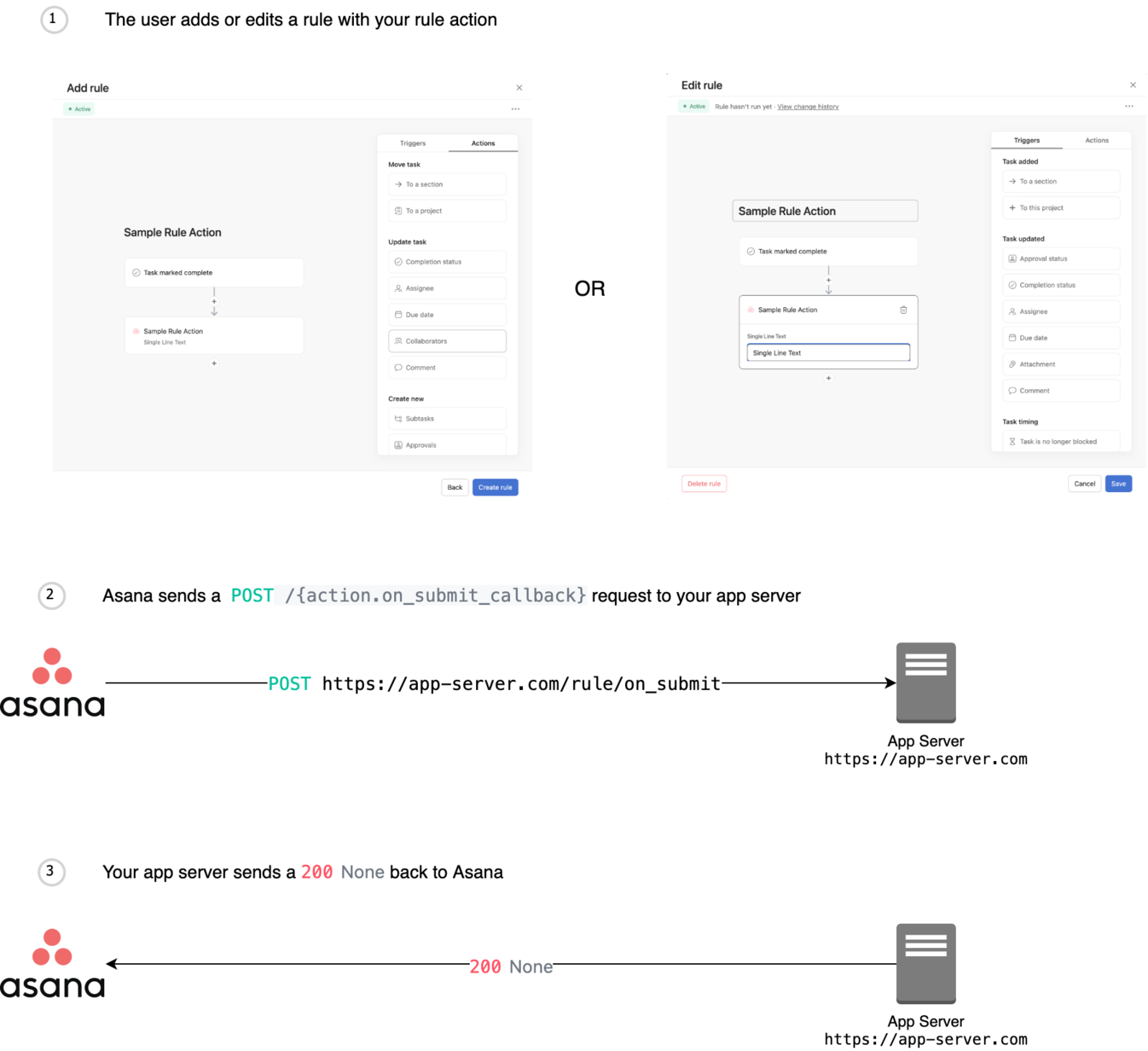 tags:
- Rule actions
operationId: onActionFormSubmit
requestBody:
description: >-
Request to submit an action form.
required: true
content:
application/json:
schema:
$ref: '#/components/schemas/ActionFormSubmissionRequest'
responses:
200:
description: Successfully handled form submission.
400:
description: Something was wrong with the form data.
content:
application/json:
schema:
$ref: '#/components/schemas/FormMetadataResponse'
401:
$ref: '#/components/responses/Unauthorized'
403:
$ref: '#/components/responses/Forbidden'
404:
$ref: '#/components/responses/NotFound'
500:
$ref: '#/components/responses/InternalServerError'
tags:
- Rule actions
operationId: onActionFormSubmit
requestBody:
description: >-
Request to submit an action form.
required: true
content:
application/json:
schema:
$ref: '#/components/schemas/ActionFormSubmissionRequest'
responses:
200:
description: Successfully handled form submission.
400:
description: Something was wrong with the form data.
content:
application/json:
schema:
$ref: '#/components/schemas/FormMetadataResponse'
401:
$ref: '#/components/responses/Unauthorized'
403:
$ref: '#/components/responses/Forbidden'
404:
$ref: '#/components/responses/NotFound'
500:
$ref: '#/components/responses/InternalServerError'