---
title: "Correlation Plots"
output:
rmarkdown::html_vignette:
toc: true
description:
Visualize correlations between data prior to clustering.
vignette: >
%\VignetteIndexEntry{Correlation Plots}
%\VignetteEngine{knitr::rmarkdown}
%\VignetteEncoding{UTF-8}
---
```{r setup, include=FALSE}
knitr::opts_chunk$set(echo = TRUE)
```
```{r echo = FALSE}
options(crayon.enabled = FALSE, cli.num_colors = 0)
```
Download a copy of the vignette to follow along here: [correlation_plots.Rmd](https://raw.githubusercontent.com/BRANCHlab/metasnf/main/vignettes/correlation_plots.Rmd)
In this vignette, we go through how you can visualize associations between the features included in your analyses.
## Data set-up
```{r}
library(metasnf)
# We'll just use the first few columns for this demo
cort_sa_minimal <- cort_sa[, 1:5]
# And one more mock categorical feature for demonstration purposes
city <- fav_colour
city$"city" <- sample(
c("toronto", "montreal", "vancouver"),
size = nrow(city),
replace = TRUE
)
city <- city |> dplyr::select(-"colour")
# Make sure to throw in all the data you're interested in visualizing for this
# data_list, including out-of-model measures and confounding features.
dl <- data_list(
list(cort_sa_minimal, "cortical_sa", "neuroimaging", "continuous"),
list(income, "household_income", "demographics", "ordinal"),
list(pubertal, "pubertal_status", "demographics", "continuous"),
list(fav_colour, "favourite_colour", "demographics", "categorical"),
list(city, "city", "demographics", "categorical"),
list(anxiety, "anxiety", "behaviour", "ordinal"),
list(depress, "depressed", "behaviour", "ordinal"),
uid = "unique_id"
)
summary(dl)
# This matrix contains all the pairwise association p-values
assoc_pval_matrix <- calc_assoc_pval_matrix(dl)
assoc_pval_matrix[1:3, 1:3]
```
## Heatmaps
Here's what a basic heatmap looks like:
```{r eval = FALSE}
ap_heatmap <- assoc_pval_heatmap(assoc_pval_matrix)
```
```{r eval = FALSE, echo = FALSE}
save_heatmap(
ap_heatmap,
"assoc_pval_heatmap.png",
width = 650,
height = 500,
res = 100
)
```
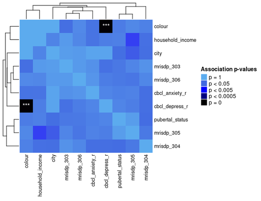
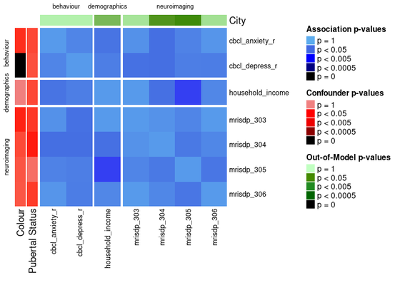
Most of this data was generated randomly, but the "colour" feature is really just a categorical mapping of "cbcl_depress_r".
You can draw attention to confounding features and/or any out of model measures by specifying their names as shown below.
```{r eval = FALSE}
ap_heatmap2 <- assoc_pval_heatmap(
assoc_pval_matrix,
confounders = list(
"Colour" = "colour",
"Pubertal Status" = "pubertal_status"
),
out_of_models = list(
"City" = "city"
)
)
```
```{r eval = FALSE, echo = FALSE}
save_heatmap(
ap_heatmap2,
"assoc_pval_heatmap2.png",
width = 680,
height = 500,
res = 100
)
```
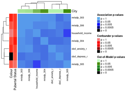
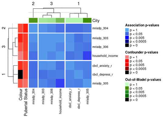
The ComplexHeatmap package offers functionality for splitting heatmaps into slices.
One way to do the slices is by clustering the heatmap with k-means:
```{r eval = FALSE}
ap_heatmap3 <- assoc_pval_heatmap(
assoc_pval_matrix,
confounders = list(
"Colour" = "colour",
"Pubertal Status" = "pubertal_status"
),
out_of_models = list(
"City" = "city"
),
row_km = 3,
column_km = 3
)
```
```{r eval = FALSE, echo = FALSE}
save_heatmap(
ap_heatmap3,
"assoc_pval_heatmap3.png",
width = 680,
height = 500,
res = 100
)
```
Another way to divide the heatmap is by feature domain.
This can be done by providing a data_list with all the features in the `assoc_pval_matrix` and setting `split_by_domain` to `TRUE`.
```{r eval = FALSE}
ap_heatmap4 <- assoc_pval_heatmap(
assoc_pval_matrix,
confounders = list(
"Colour" = "colour",
"Pubertal Status" = "pubertal_status"
),
out_of_models = list(
"City" = "city"
),
dl = data_list,
split_by_domain = TRUE
)
```
```{r eval = FALSE, echo = FALSE}
save_heatmap(
ap_heatmap4,
"assoc_pval_heatmap4.png",
width = 700,
height = 500,
res = 100
)
```