# 🎨 Themes
← Configuration
Themes control the full visual appearance of InputBar. They are stored as `.json` files in `Data/Themes/`.
## Switching themes
Open `Data/Settings.json` and set the `"Theme"` key to the filename of the theme you want, **without** the `.json` extension:
```json
{
"Theme": "theme_default"
}
```
Then reload InputBar (`Settings Reload` in the search bar, or restart the app).
---
## Available themes
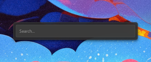
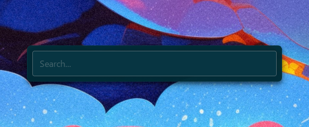
### `theme_default`
### `theme_catppuccin_latte`

### `theme_catppuccin_mocha`
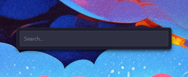
### `theme_dracula`

### `theme_gruvbox`

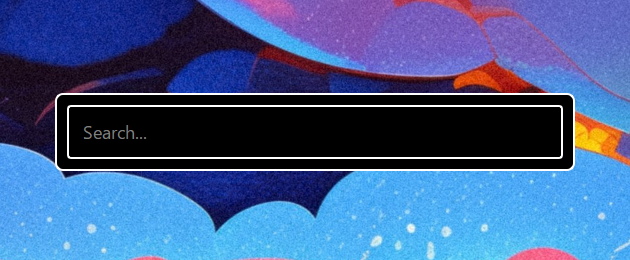
### `theme_high_contrast`
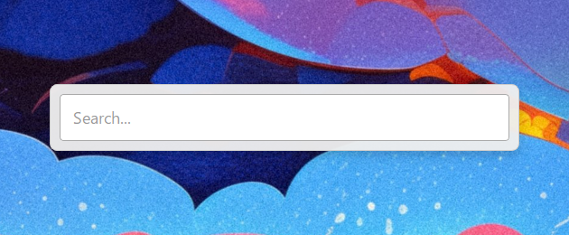
### `theme_light`
### `theme_material_palenight`

### `theme_monokai`

### `theme_nord`

### `theme_solarized_dark`
### `theme_solarized_light`

### `theme_synthwave`

---
## Creating your own theme
1. Copy any existing theme from `Data/Themes/` and rename it (e.g. `mytheme.json`).
2. Edit the values to your liking — see the key reference below.
3. Set `"Theme": "mytheme"` in `Data/Settings.json` and reload.
Any key you omit will automatically fall back to its default value on next startup.
Custom themes are never overwritten by updates.
### Key reference
#### `window`
| Key | Type | Description |
|---|---|---|
| `width` | int | Total window width in pixels |
| `height` | int | **Search bar height** in pixels (window grows dynamically) |
| `margin` | int | Outer margin around the container |
#### `container`
| Key | Type | Description |
|---|---|---|
| `background` | CSS color | Container background |
| `border` | CSS border | Container border |
| `border_radius` | CSS value | Container corner rounding |
| `shadow_color` | `[R, G, B, A]` | Drop shadow color (0–255 each) |
| `shadow_blur` | int | Drop shadow blur radius |
| `shadow_x_offset` | int | Drop shadow horizontal offset |
| `shadow_y_offset` | int | Drop shadow vertical offset |
| `padding` | int | Inner padding of the container |
| `spacing` | int | Spacing between search bar and results list |
#### `search_bar`
| Key | Type | Description |
|---|---|---|
| `background` | CSS color | Search bar background |
| `text_color` | CSS color | Input text color |
| `border` | CSS border | Search bar border |
| `border_radius`| CSS value | Search bar corner rounding |
| `padding` | CSS value | Internal padding of the input |
| `font_size` | CSS value | Font size of the input text |
| `font_family` | string | Font family of the input text |
| `font_weight` | int | Font weight (e.g., 400 for Normal, 700 for Bold) |
| `placeholder` | string | Placeholder text when empty |
#### `results_list`
| Key | Type | Description |
|---|---|---|
| `background` | CSS color | List background |
| `text_color` | CSS color | Default item text color |
| `selected_background` | CSS color | Selected item background |
| `selected_text_color` | CSS color | Selected item text color |
| `font_size` | CSS value | Font size of list items |
| `font_family` | string | Font family of list items |
| `font_weight` | int | Font weight of items |
| `item_padding` | CSS value | Padding inside each item |
| `item_border_radius` | CSS value | Corner rounding of each item |
| `height` | int | **Height of a single item** in pixels |
| `MaxItemToShow` | int | Max visible items before scrolling |
| `icon_size` | int | Size of result icons in pixels |
| `line_spacing` | int | Vertical gap between title and subtitle |
| `subtitle_opacity` | int | Opacity of the second line (0-255) |
| `subtitle_font_ratio` | float | Font size scale for the second line (e.g., 0.8) |
| `subtitle_font_weight`| int | Font weight for the second line |
#### `scrollbar`
| Key | Type | Description |
|---|---|---|
| `width` | CSS value | Scrollbar width — `"0px"` hides it (default) |
| `background` | CSS color | Scrollbar track background |
| `handle_color` | CSS color | Scrollbar handle color |
| `handle_hover_color`| CSS color | Scrollbar handle color on hover |
| `border_radius` | CSS value | Scrollbar handle corner rounding |
#### `icons`
Allows tinting specific system icons to match the theme.
| Key | Type | Description |
|---|---|---|
| `arrow_down` | CSS color | Down arrow icon color |
| `arrow_left` | CSS color | Left arrow icon color |
| `arrow_right`| CSS color | Right arrow icon color |
| `arrow_up` | CSS color | Up arrow icon color |
| `admin` | CSS color | Admin shield icon color |
| `folder` | CSS color | Folder icon color |
| `plugin` | CSS color | General plugin icon color |
| `settings` | CSS color | Settings/Config icon color |
| `shell` | CSS color | Terminal icon color |
| `system` | CSS color | System command icon color |
---
Colors accept any valid CSS format: `rgba(R, G, B, A)`, `#RRGGBB`, `#RGB`, or named colors (`white`, `transparent`, etc.).
Poids de police (weights) values follow standard CSS naming: `100` (Thin), `400` (Normal), `700` (Bold), `900` (Black).