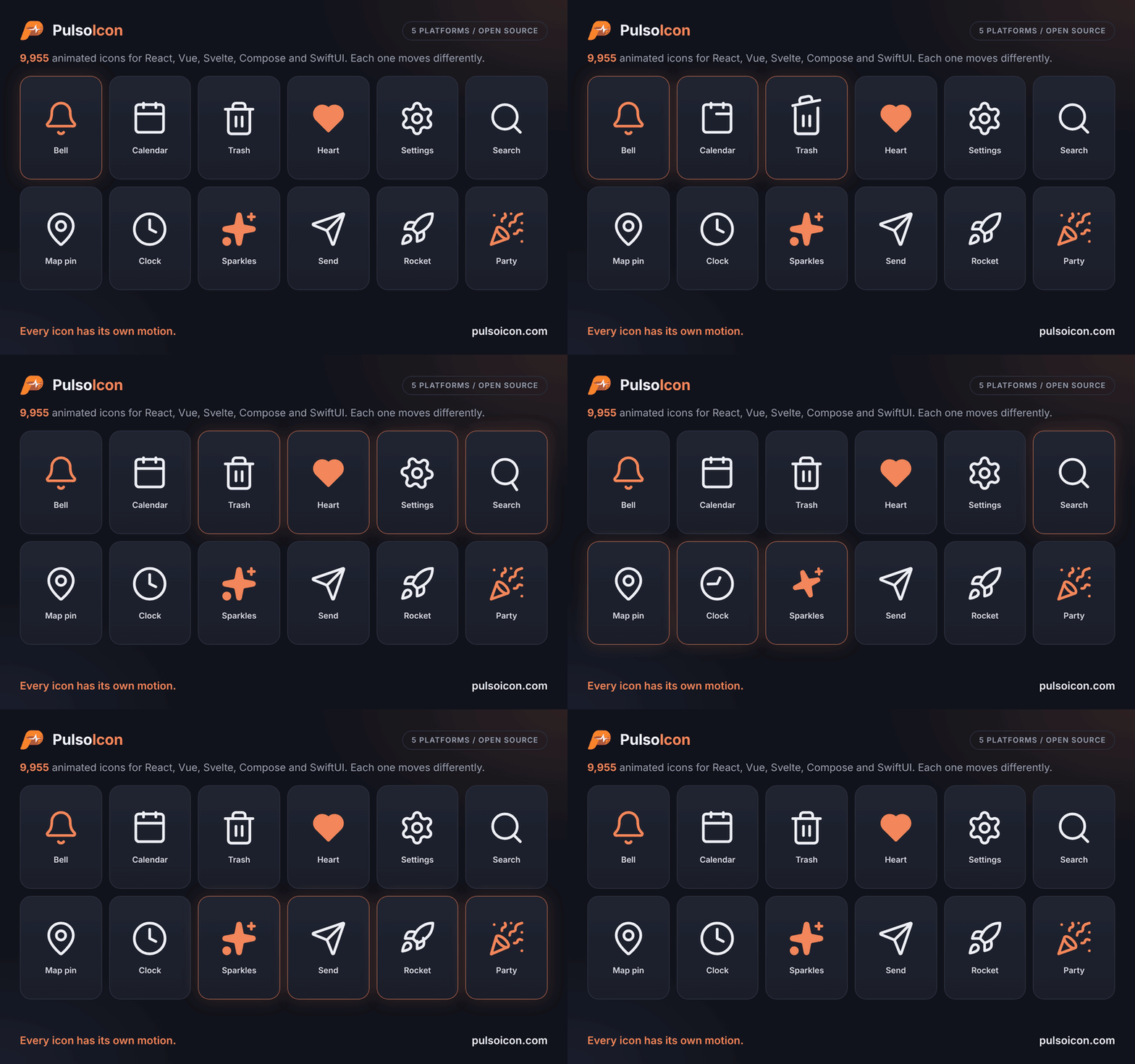
pulsoicon.com: browse all icons, try them live and copy the code
9955 animated icons. Every one has its own motion.
React icons that come alive on hover. A drop-in replacement for lucide-react.
---
A bell rings. A calendar lifts its rings. A trash can opens its lid. A clock's hand goes round.
PulsoIcon gives every icon a motion written for that icon, not one effect stamped on all of them. At rest each icon is a clean 24×24 icon; it plays when someone hovers or focuses the button, link or tab it sits in.
Every one of the 9955 motions is written for this set. About 3,700 icons are drawn here, including the line-art brand logos; the rest build on the shapes of [Lucide](https://lucide.dev), [Tabler Icons](https://tabler.io/icons) and [Iconoir](https://iconoir.com), which are credited in [LICENSE](https://github.com/CityPulso/PulsoIcon/blob/main/LICENSE).
## Why PulsoIcon
- **9955 icons, each with its own motion**:
- **About 3,700 drawn for this set**: about 2,770 line-art brand logos (CityPulso, GitHub, Slack, Spotify, OpenAI, Claude, TikTok, VS Code, Google Drive, …, most drawn after the logos collected by [Simple Icons](https://simpleicons.org)) and around 900 other icons, including lowercase a–z, animals, sports, 3D tools and icons drawn after [Phosphor](https://phosphoricons.com).
- **Built on open icon sets**: all 2020 [Lucide](https://lucide.dev) icons (as of 1.68), plus the shapes of [Tabler Icons](https://tabler.io/icons) (3.50, including 264 brand logos) and [Iconoir](https://iconoir.com) (7.12).
- **3042 brand logos** in all.
- **Switch in one line**: same component names as lucide-react (`Calendar`, `CalendarIcon`, aliases such as `AlertCircle`) and the same props. Usually you only change the import.
- **Ships only what you use**: every icon is its own module and the package is side-effect free, so bundlers keep the icons you import and drop the rest. Three icons add about 12 kB before minification.
- **Plays where people point**: hover or focus anywhere on a button, link, label, tab or menu item and its icon plays.
- **Respects reduced motion**: nothing moves when the system asks for less motion.
- **Two dependencies**: React and [Motion](https://motion.dev), plus `pulsoicon-core`, the icon data every PulsoIcon package shares.
## Install
```bash
npm install pulsoicon-react
```
Works with React 18 or newer. [Motion](https://motion.dev) (12 or newer) is installed for you; if your app already uses Motion, PulsoIcon shares that copy.
The same icons, props and motion are also available for [Vue, Svelte, Android and iOS](https://github.com/CityPulso/PulsoIcon#packages).
## Quick start
```tsx
import { Bell, Calendar, Trash2 } from "pulsoicon-react";
export function Toolbar() {
return (
<>
);
}
```
Hover a button and its icon plays.
### Coming from lucide-react
```diff
- import { Bell, Calendar, Trash2 } from "lucide-react";
+ import { Bell, Calendar, Trash2 } from "pulsoicon-react";
```
Icon components and their props work the same. Lucide's helpers (`createLucideIcon`, `LucideProvider`, the `icons` object) are not included.
### Coming from `pulsoicon` 5.x
The React package was called `pulsoicon` until 5.2.1. From 6.0.1 it is `pulsoicon-react`, next to `pulsoicon-vue` and `pulsoicon-svelte`; nothing else changed:
```diff
- import { Bell } from "pulsoicon";
+ import { Bell } from "pulsoicon-react";
```
### Coming from Tabler
Tabler icon names work too, without the `Icon` prefix: `IconMoodSad` is `MoodSad`, `IconHome` is `Home`, `IconBrandGithub` is `BrandGithub`. Where Lucide already has the icon, the Tabler name points to it (`Home` is `House`), and Tabler families follow Lucide's naming (`HomeDollar` is `HouseDollar`, `PhotoEdit` is `ImageEdit`).
## Props
| Prop | Type | Default | Description |
| --------------------- | ------------------ | -------------- | ---------------------------------------------------------------------------------------------- |
| `size` | `number \| string` | `24` | Width and height |
| `color` | `string` | `currentColor` | Stroke colour, and fill colour when `solid` |
| `strokeWidth` | `number \| string` | `2` | Stroke width on the 24-unit grid |
| `absoluteStrokeWidth` | `boolean` | `false` | Keep the stroke the same number of pixels at any size |
| `solid` | `boolean` | `false` | Filled icon instead of outline (see [Solid icons](#solid-icons)) |
| `animated` | `boolean` | `true` | `false` makes the icon fully static: nothing plays it, not even the ref or `play` |
| `autoAnimated` | `boolean` | `true` | Play the built-in hover / focus trigger. `false` turns that off; the ref and `play` still work |
| `play` | `boolean` | | `true` plays the motion, `false` returns to rest. Works with or without `autoAnimated` |
`autoAnimated` and `play` only exist while the icon can animate, so TypeScript rejects ``. Wrapper components that drop a prop should use the exported `DistributiveOmit` instead of `Omit`, which would lose that check.
Any other SVG attribute (`className`, `style`, `aria-label`, …) is passed to the `