PulsoIcon

PulsoIcon for Vue

pulsoicon.com: browse all icons, try them live and copy the code

9955 animated icons. Every one has its own motion.

npm version license

---

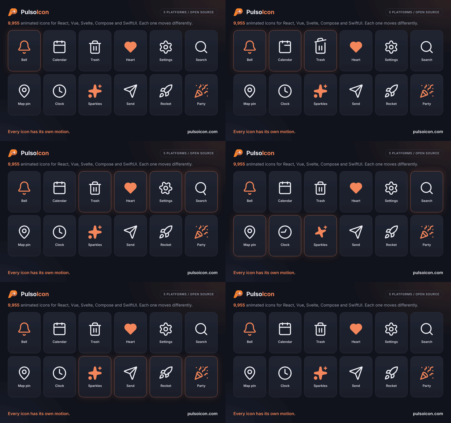
PulsoIcon icons animating on hover

Vue 3.5+ icons that play their own motion when someone hovers or focuses the button, link or tab they sit in. They render exactly the same `` as `pulsoicon-react` and move the same way. ## Install ```bash npm install pulsoicon-vue ``` Works with Vue 3.5 or newer. [Motion](https://motion.dev) (12 or newer) plays the icons; npm installs it for you. ## Quick start ```vue ``` Hover a button and its icon plays. Props work in camelCase or kebab-case (`:stroke-width`, `:auto-animated`). ## Props The same names, defaults and meaning as in every PulsoIcon package. | Prop | Type | Default | Description | | --------------------- | ------------------ | -------------- | ---------------------------------------------------------------------------------------------- | | `size` | `number \| string` | `24` | Width and height | | `color` | `string` | `currentColor` | Stroke colour, and fill colour when `solid` | | `strokeWidth` | `number \| string` | `2` | Stroke width on the 24-unit grid | | `absoluteStrokeWidth` | `boolean` | `false` | Keep the stroke the same number of pixels at any size | | `solid` | `boolean` | `false` | Filled icon instead of outline | | `animated` | `boolean` | `true` | `false` makes the icon fully static: nothing plays it, not even the ref or `play` | | `autoAnimated` | `boolean` | `true` | Play the built-in hover / focus trigger. `false` turns that off; the ref and `play` still work | | `play` | `boolean` | | `true` plays the motion, `false` returns to rest. Works with or without `autoAnimated` | Any other attribute (`class`, `style`, `aria-label`, …) goes on the ``. Icons render with `aria-hidden="true"`; give the surrounding button or link a label. ## When the animation plays An icon plays when the pointer enters, or focus moves into, its closest `button`, `a`, `label`, `summary`, `[role="button"]`, `[role="link"]`, `[role="tab"]` or `[role="menuitem"]`. If there is none, the icon plays on its own hover. Any other element becomes the trigger with `data-icon-trigger`. Nothing moves when the system asks for reduced motion. ### Play from code A template ref gives `startAnimation()` and `stopAnimation()`; both return a promise that resolves when the motion has finished. Set `:auto-animated="false"` when only your code should decide when it plays: ```vue ``` Or drive it from state: ``. ## Solid icons `solid` draws the filled version of an icon, in `color`. About 1,700 icons have a filled drawing; the others fill their closed shapes and cut their inner lines out of the fill. ## Finding icons Names follow lucide-react (`Calendar`, `Trash2`), every icon is also exported with an `Icon` suffix (`BellIcon`), and other icon sets' names work too (`Gear` is `Settings`, Tabler's `IconHome` is `Home`). Brand logos start with `Brand` (`BrandGithub`). Browse them all in the [repository README](https://github.com/CityPulso/PulsoIcon#finding-icons). For icon pickers, `pulsoicon-vue/all` exports every icon by its kebab-case name (all 9955 of them, so only where you need the full set). `pulsoicon-vue/names` lists the names without loading any icon, and `pulsoicon-vue/icons/` loads one: ```ts import type { IconName } from "pulsoicon-vue/names"; import { ICON_NAMES } from "pulsoicon-vue/names"; const load = (name: IconName) => import(`pulsoicon-vue/icons/${name}`); ``` ## Styling Each icon renders ``, so CSS can target every icon (`.pulsoicon`) or one (`.pulsoicon-bell`). ## Other platforms The same icons, props and motion: [React, Vue, Svelte, Android (Jetpack Compose) and iOS (SwiftUI)](https://github.com/CityPulso/PulsoIcon#packages). ## License ISC © CityPulso. Some icon shapes come from Lucide, Tabler Icons, Iconoir, Hugeicons and Phosphor; ship the [LICENSE](https://github.com/CityPulso/PulsoIcon/blob/main/LICENSE) file with your app. What comes from where is listed in the [repository README](https://github.com/CityPulso/PulsoIcon#license).