Groupeton is a biking app that lets users book group rides ahead of time
This project was created in order to solve my own personal issues with most biking applications
This project was created by myself
Adobe XD ,Photoshop and InVision
October 2020
Introduction
Pain Points
Persona
Journey Map
Task Analysis
LoFi Mockups
HiFi Mockups
Reflection
Bike riding has been a passion of mine that has grown rather large since the beginning of the COVID-19 pandemic. I started biking because I wanted to get away from my house and experience the outdoors. I quickly fell in love with biking and I see this being a part of my life now for a very long time.However, there are many times where I would be biking and see groups of riders pass by and I couldn't help but wonder what it would be like to experience my new found passion with others who are just as passionate. I felt that I couldn't be alone and went online to see if I could find local bike riding groups.
After having a clear understanding of what I wanted to accomplish , I then decided to create some mockups on how I wanted the application to look like . My main priority was optimizing the layout for mobile screens. This lead me to having big buttons and big text.
I took to reddit to ask an open ended question to see if others felt the same. This was the general response of the users :
Question : What feature do you think is missing from most cycling/biking apps? - View Reddit Post
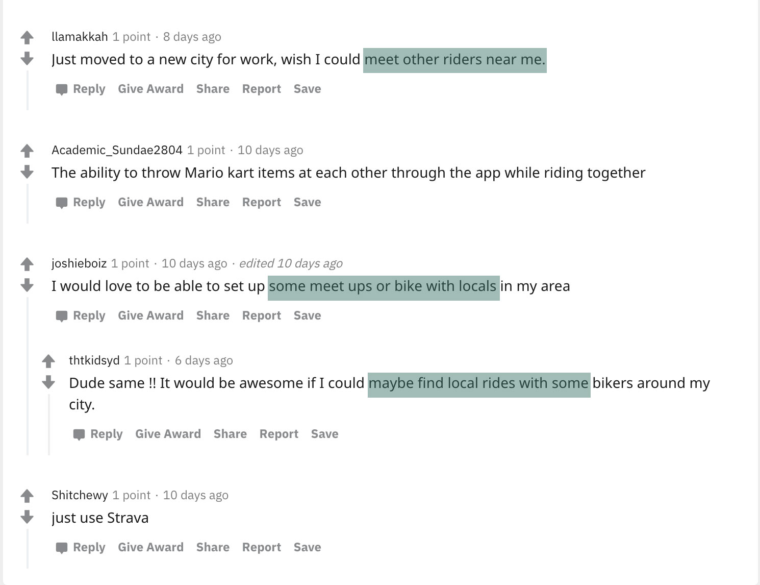
After gaining a better understanding of some of the problems users had with popular biking applications. I then finalized my problem statement. The most prominent pain point is the fact that users are not able to expand their network and meet riders near their area. With that being said, I decided that I would focus my application on two things :
- Create a group ride which will let users get information on the location and time.
- Let users search for group rides that are taking place in a desired city.
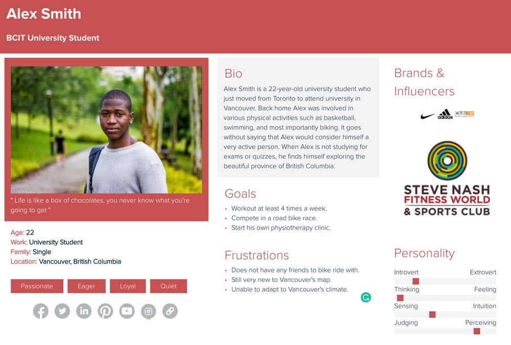
After having a better sense of the application, I then spent some time generating personas. The ideal user of this application is someone who is new to a given city and wants to ride bike with others.
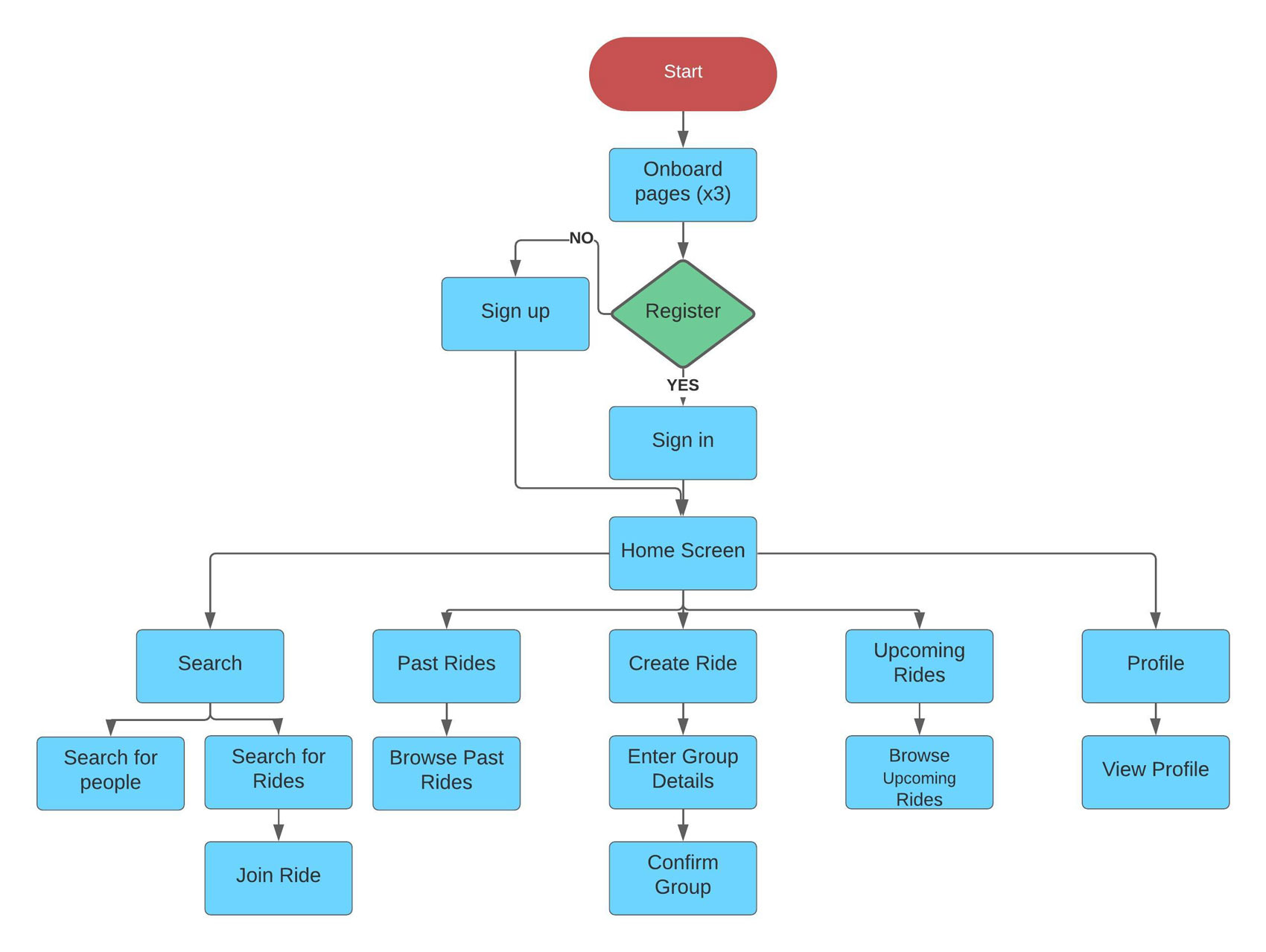
Then the flowchart was created in order to properly outline the flow of the application. I made sure to touch on every single pain point when creating the path. The main components of the app would be to create, view and search for local rides.
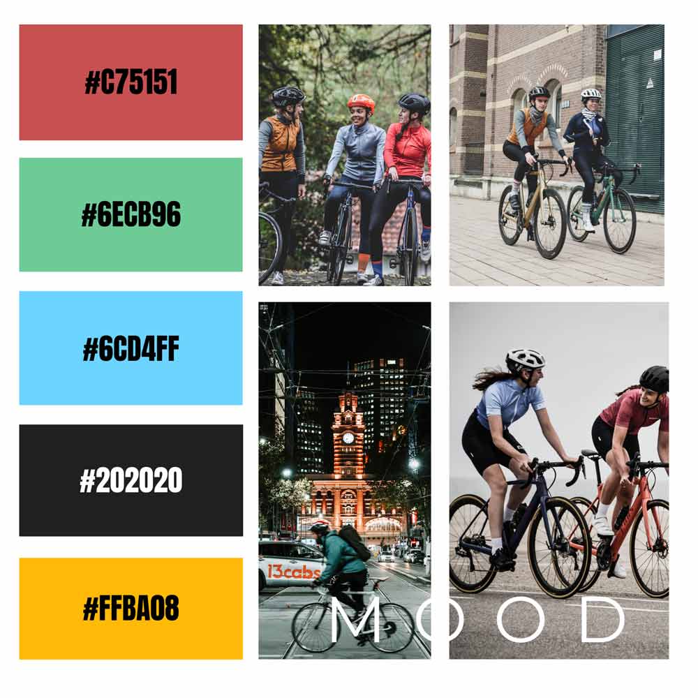
The moodboard emphasizes the styling of the application. I decided to go with these colors due to the fact that they each complimented one another.
The low-fidelity wireframes helped me visualize the flowchart. The main focus of these wireframes were to give myself and my classmates the look and feel of this application.
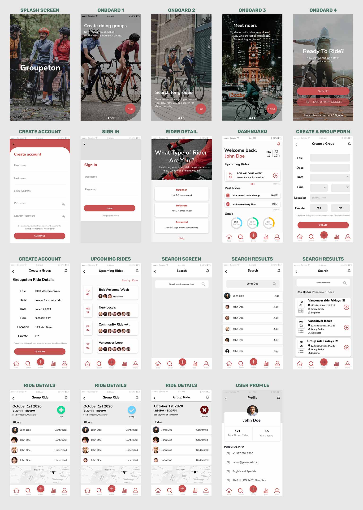
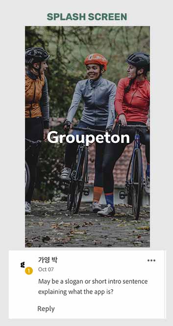
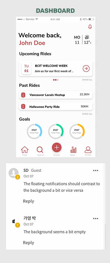
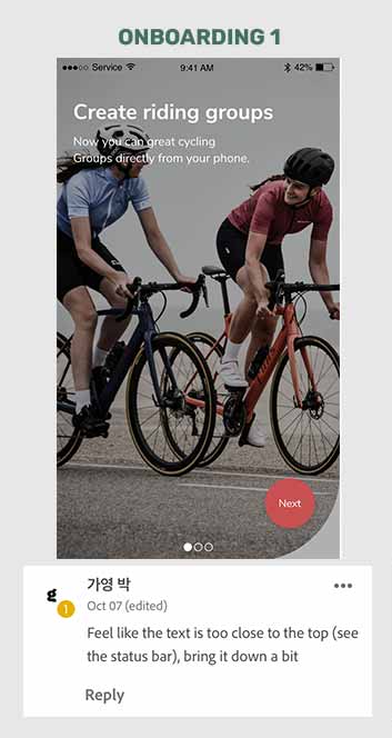
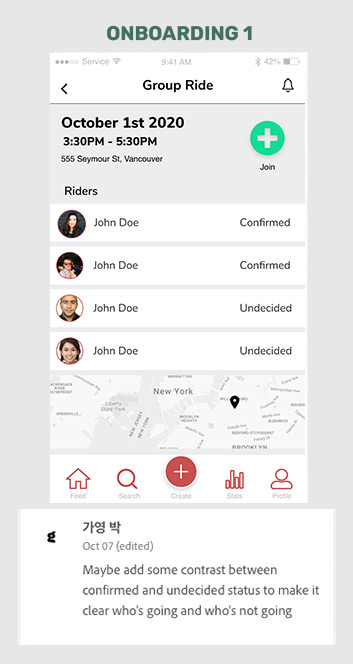
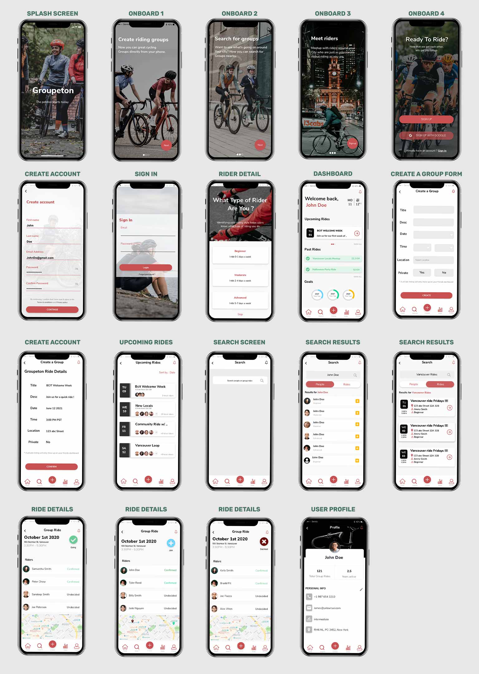
Based on the low-fidelity wireframes , I then created the set of high-fidelity wireframes. My main goal when creating these was to make each possible path intuitive and user friendly.
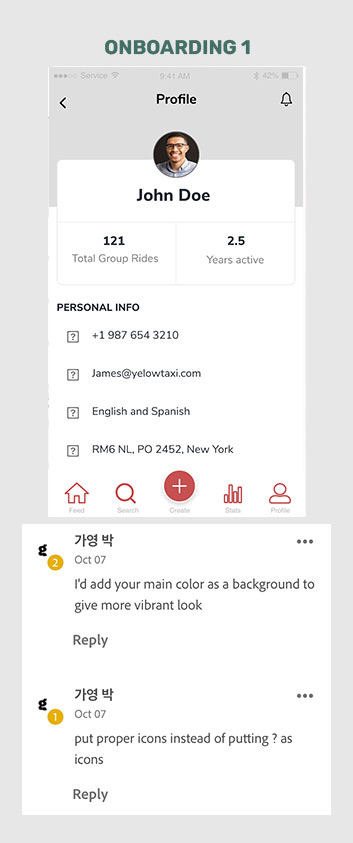
After completing the high fidelity wireframes, I then asked some of my classmates if they could go over my work and add any additional comments. This phase was extremely beneficial for me as having other eyes on a project can really help in its success.
After taking my classmates' feedback, I then went inside adobe Xd and made the necessary adjustments. I then took my mockups and imported them into InVison. That way, I could add interactive elements and give viewers the look and feel that I envisioned. Linked bellow is the fully functioning prototype.