PHASE ONE
Planning
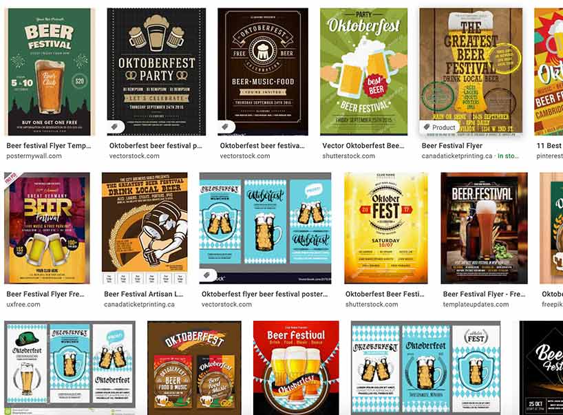
I started off this project by observing many different beer festival posters online. I wanted to get a sense of how the majority of the posters looked.
We were tasked with creating a 3 poster series for a fictional event located anywhere in the world. As someone who enjoys Oktoberfest and rock and roll, I decided to combine the two and create an event called Rocktober fest.
This projects purpose was to get us familiar with adobe indesign while developing our graphic design abilities.
The project was designed and coded by myself.
Adobe Photoshop, Indesign and Illustrator
March 2020
I started off this project by observing many different beer festival posters online. I wanted to get a sense of how the majority of the posters looked.

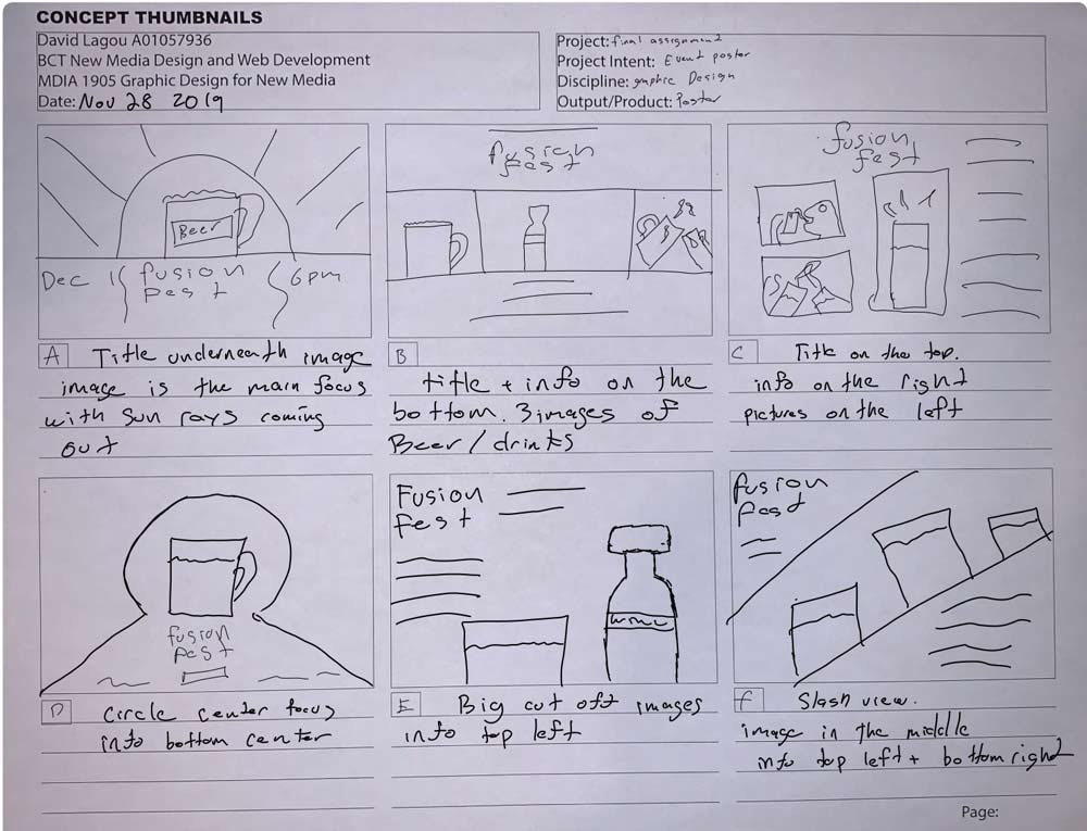
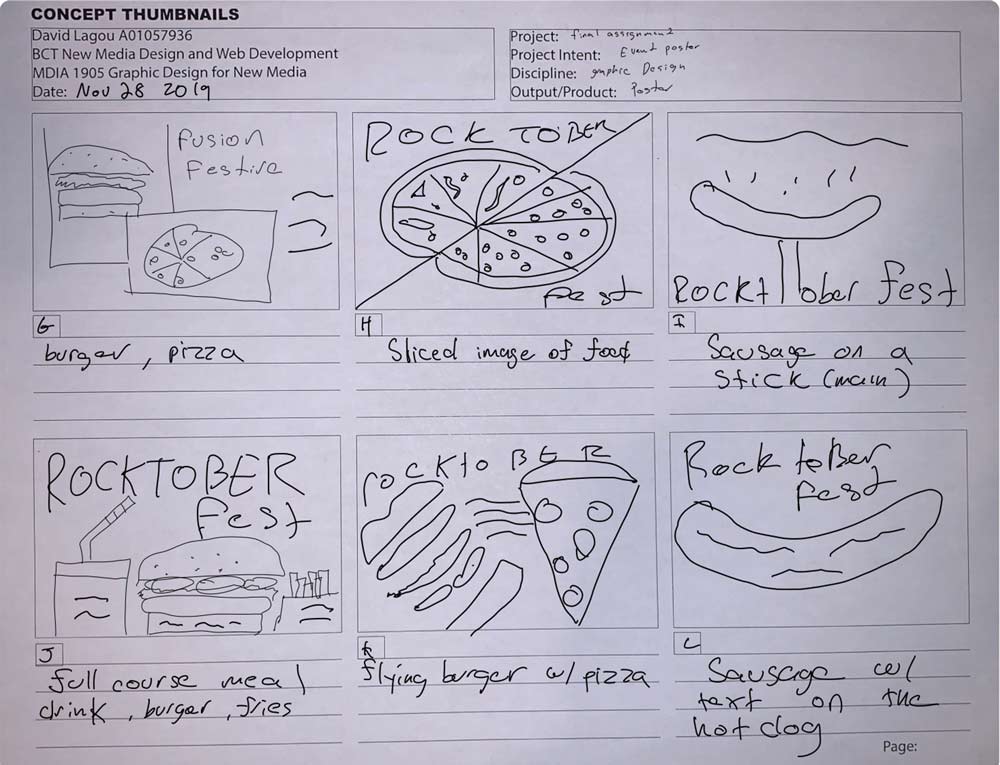
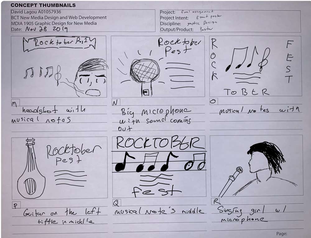
After gathering enough data, I then went on to start creating rough and concepts of the 3 different layouts. The biggest challenge at this point was to create 3 unique but also similar designs that could be tied into one event. When creating the mockups, I decided to focus the design on the three key aspects of the event. This happened to be beer, food and signing. I then created a base template that each aspect could utilize.
ROUGH DRAFTS
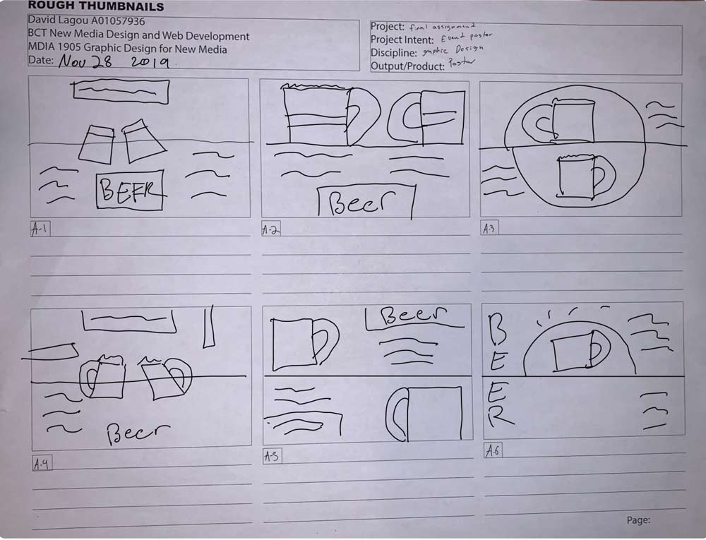
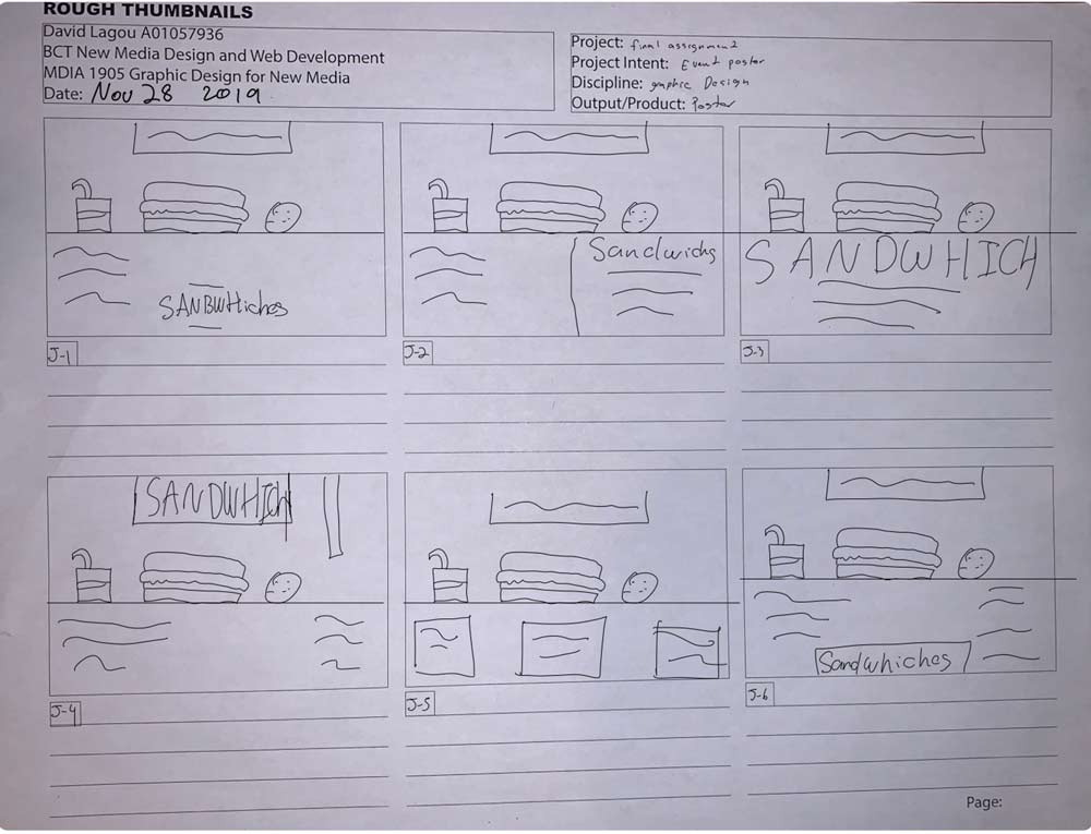
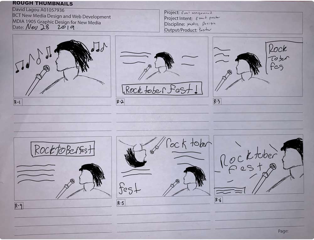
CONCEPT THUMBNAILS
After finalizing the design and moving forward, I then went and chose the appropriate fonts for the poster. I chose fonts that would reflect the mood of the event and colors that supported the general theme of oktoberfest. Yellow was used as the primary color in order to symbolize the color of beer.
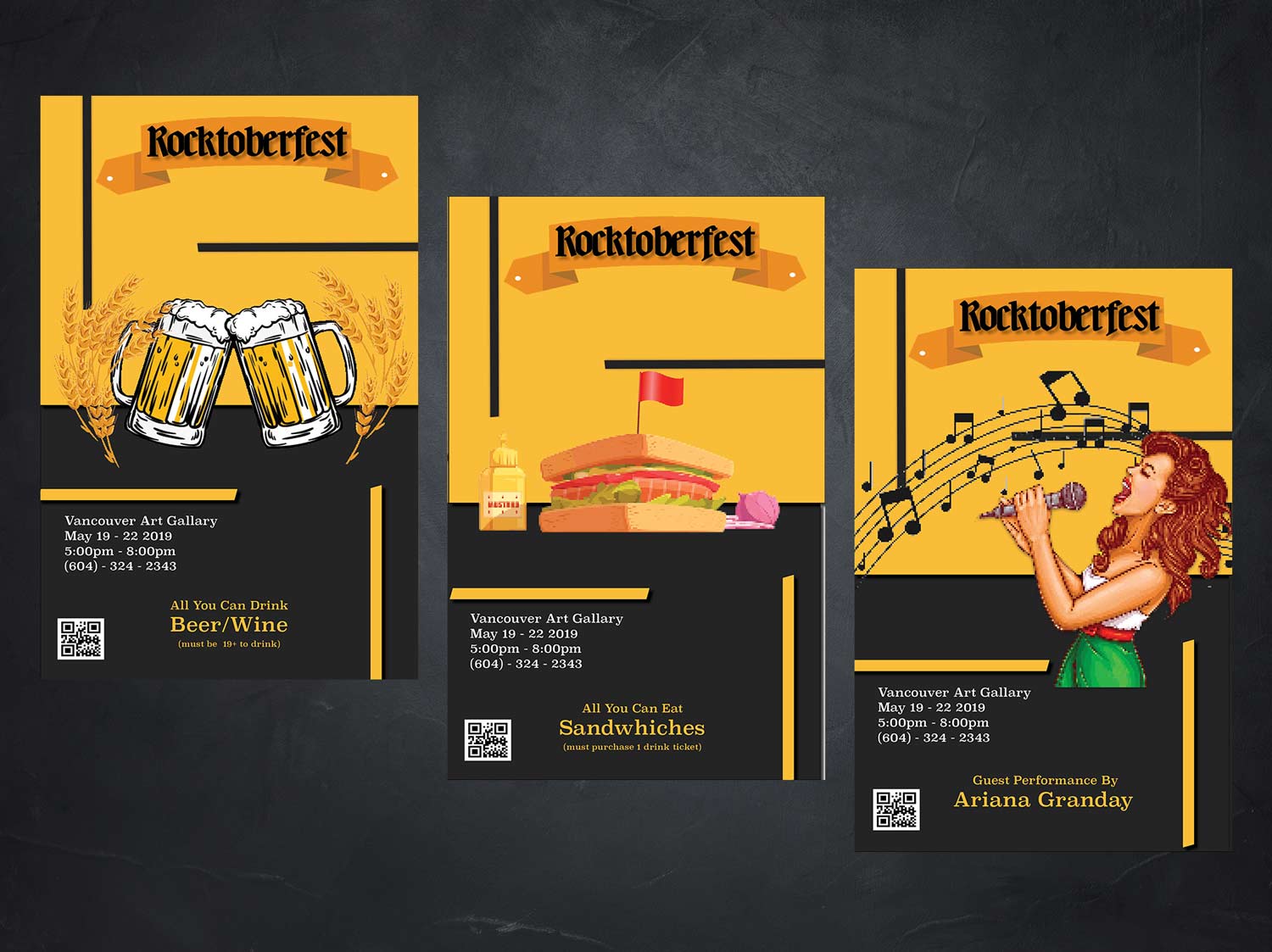
One of the biggest takeaways from this assignment was learning how to keep a consistent brand image while changing some aspects to it.