Yale School of Art Website Case Study
This project was created in order to anaylyze and make suggestions on how to better improve the website.
This project was created by myself
Adobe XD ,Photoshop and InVision
Febuary 2020
Introduction
Pain Points
Persona
Journey Map
Task Analysis
LoFi Mockups
HiFi Mockups
Reflection
For a class assignment we needed to take an existing website and create a case study for it. I chose the Yale School Of Arts website for its interesting choice of design. Although it states that the website lets students, faculty and staff submit articles, I do believe that these freedoms should have come with more parameters.
The yale school of arts is a graduate school that offers MFA’s in graphic design, painting/printmaking photography and sculpture. They Are located in New Haven Connecticut and have approximately 126 students.
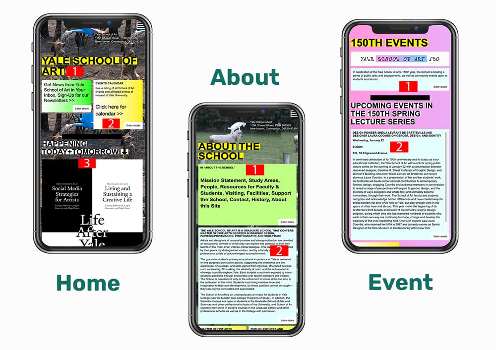
I started with going through the website and writing down some of the most prominent pain points that could affect the end users journey .

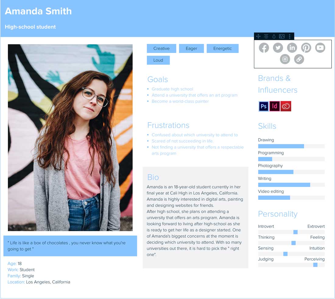
In order to get a grasp on who the target audience will be for the website, I have decided to create a persona. Amanda Smith, like my brother, was a high school student ready to apply for universities. She has a high interest in Arts, and would like to graduate with a degree in an arts program.
Some other users to consider were parents, faculty, and the general public.
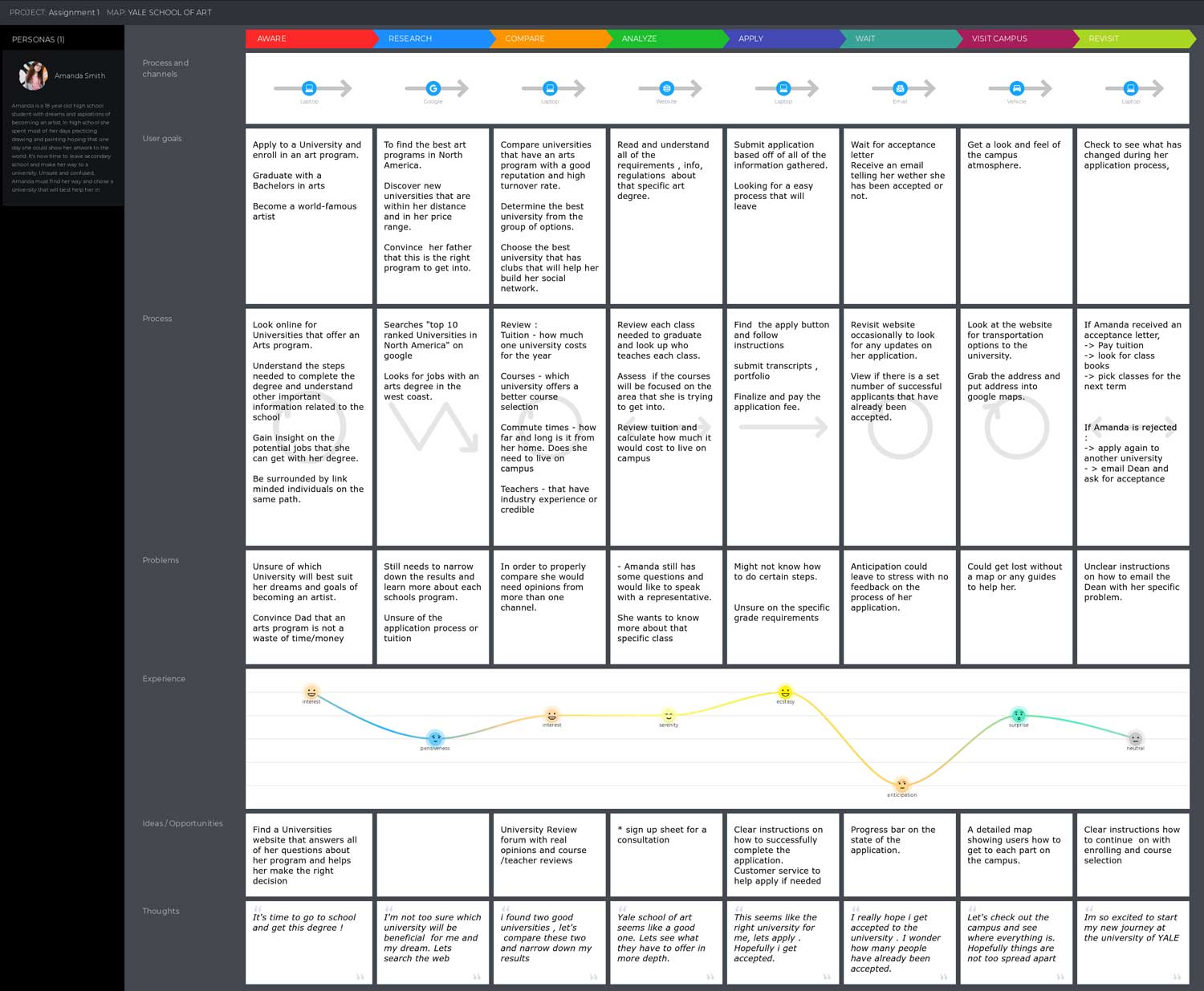
I then decided to illustrate the possible journey that Amanda would take from the beginning of her university hunt, all the way through to acceptance. Also included are some of the problems she might face along the way. This is to better understand the process of the user and discover any challenges that the user may encounter along the way.
Task analysis represents all of the ways different users might use the website. Listed below are some examples of tasks each user type is likely to perform
|
Students |
Parents |
Faculty |
Adults |
|
|---|---|---|---|---|
| Program Ino |  |
|||
| Job Opportunities |  |
|||
| Contact Faculty |  |
 |
||
| Apply |  |
|||
| Keep update |  |
 |
After analyzing the website, there are many areas which could be improved. The 3 key areas that require focus are the home page, about page and the events page.
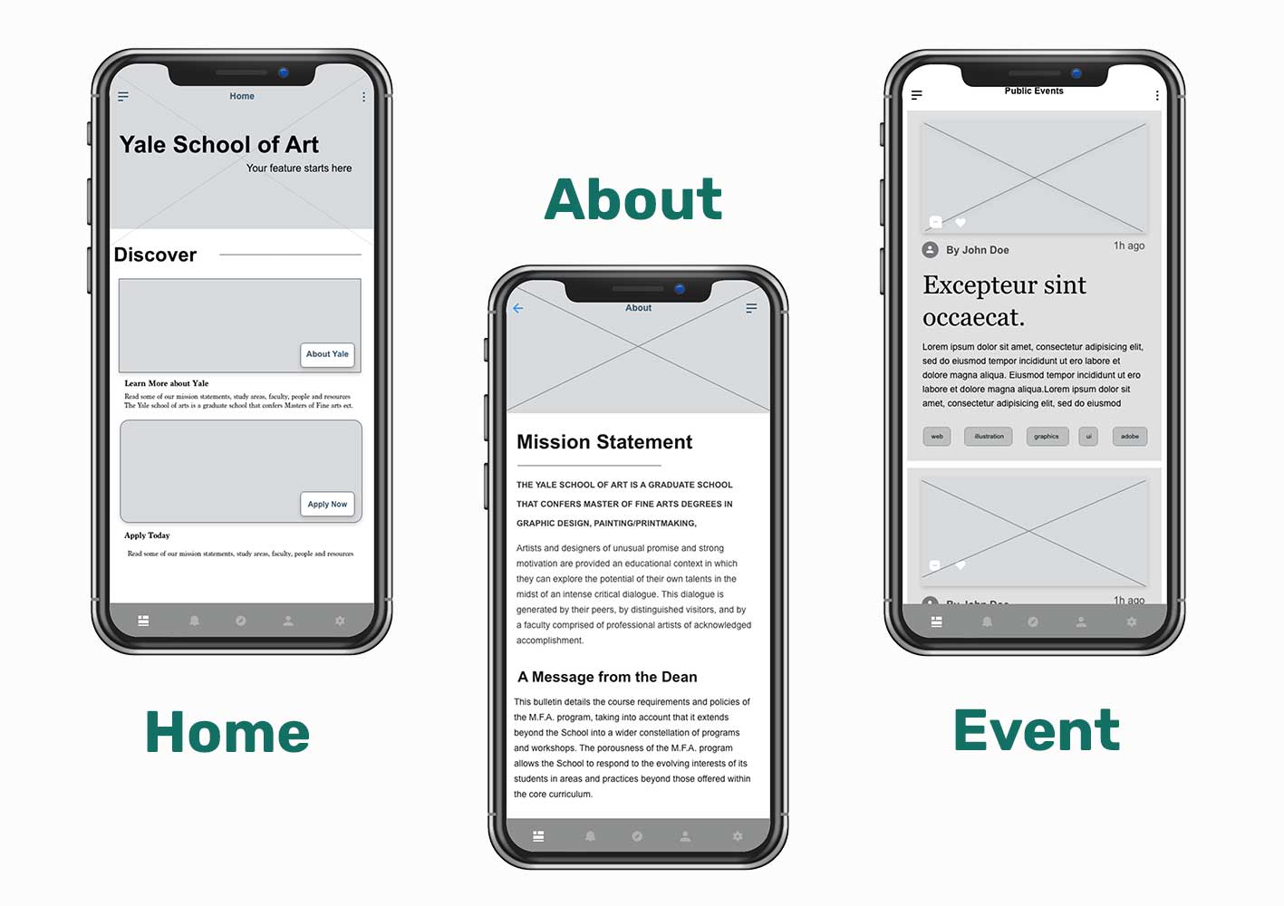
After analyzing the website, there are many areas which could be improved. The 3 key areas that require focus are the home page, about page and the events page.
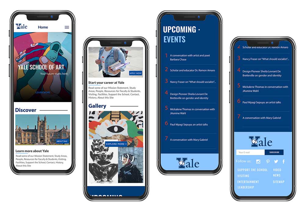
The about page will have a local navigation which when pressed, will reposition users to that specific area. Again, visual hierarchy and chunking were my main inspirations.
While focusing on the about page , I made sure to incorporate Distinct headers to properly show the separation between titles and headers. Along side photos that have relevance to the content
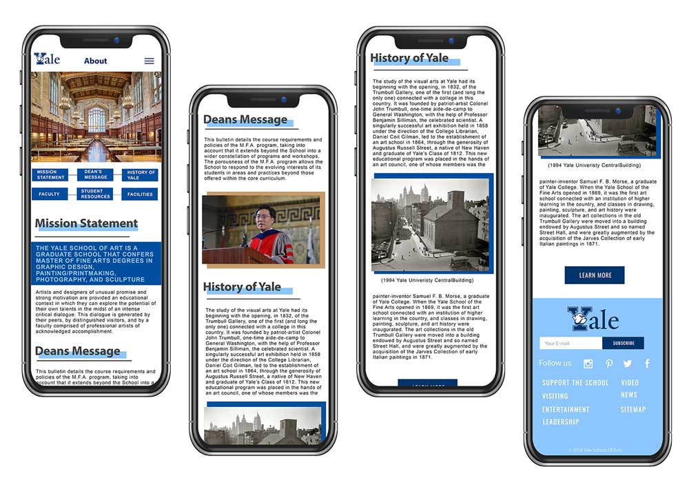
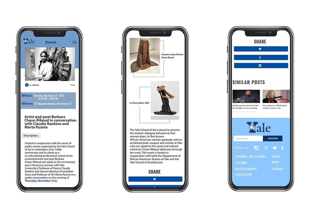
The events page needed to be unique to the event. Displaying the date and location of an event needed to catch the users attention and not get lost in a sea of text. A share button to increase user engagement was missing from the events page. This was a necessary implementation.
After completing this project, I learned a lot more about the importance of good user-centered design. Being able to identify the ideal user of a website and create a journey map for them is a great way of covering all the potential ways a user might use the website. This leads to making smarter decisions and putting yourself in the users shoes. Going forward I will be sure to incorporate this methodology in order to better satisfy my end users needs.