Generalized Additive Models
============================
css: custom.css
transition: none
```{r setup, include=FALSE}
library(knitr)
library(magrittr)
library(viridis)
library(ggplot2)
library(reshape2)
library(animation)
opts_chunk$set(cache=TRUE, echo=FALSE, fig.height=10, fig.width=10)
```
```{r initialmodeletc, echo=FALSE, message=FALSE, warning=FALSE}
load("../spermwhaledata/R_import/spermwhale.RData")
library(Distance)
library(dsm)
df <- ds(dist, truncation=6000)
dsm_tw_xy_depth <- dsm(count ~ s(x, y) + s(Depth), ddf.obj=df, observation.data=obs, segment.data=segs, family=tw())
```
Overview
=========
- What is a GAM?
- What is smoothing?
- How do GAMs work?
- Fitting GAMs using `dsm`
What is a GAM?
===============
type:section
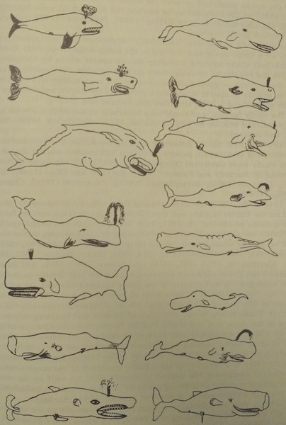
"gam"
====================
1. *Collective noun used to refer to a group of whales, or rarely also of porpoises; a pod.*
2. *(by extension) A social gathering of whalers (whaling ships).*
(via Natalie Kelly, AAD. Seen in Moby Dick.)
Generalized Additive Models
============================
- Generalized: many response distributions
- Additive: terms **add** together
- Models: well, it's a model...
What does a model look like?
=============================
- Count $n_j$ distributed according to some count distribution
- Model as sum of terms
```{r sumterms, fig.width=15}
plot(dsm_tw_xy_depth, pages=1, scheme=1)
```
Mathematically...
==================
Taking the previous example...
$$
n_j = \color{red}{A_j}\color{blue}{\hat{p}_j} \color{green}{\exp}\left[\color{grey}{ \beta_0 + s(\text{y}_j) + s(\text{Depth}_j)} \right] + \epsilon_j
$$
where $\epsilon_j \sim N(0, \sigma^2)$, $\quad n_j\sim$ count distribution
- $\color{red}{\text{area of segment - offset}}$
- $\color{blue}{\text{probability of detection in segment}}$
- $\color{green}{\text{link function}}$
- $\color{grey}{\text{model terms}}$
Response
==================
$$
\color{red}{n_j} = A_j\hat{p}_j \exp\left[ \beta_0 + s(\text{y}_j) + s(\text{Depth}_j) \right] + \epsilon_j
$$
where $\epsilon_j \sim N(0, \sigma^2)$, $\quad \color{red}{n_j\sim \text{count distribution}}$
Count distributions
=====================
```{r countshist}
hist(dsm_tw_xy_depth$data$count, xlab="Count", main="")
```
***
- Response is a count (not not always integer)
- Often, it's mostly zero (that's complicated)
- Want response distribution that deals with that
- Flexible mean-variance relationship
Tweedie distribution
=====================
```{r tweedie}
library(tweedie)
library(RColorBrewer)
# tweedie
y<-seq(0.01,5,by=0.01)
pows <- seq(1.2, 1.9, by=0.1)
fymat <- matrix(NA, length(y), length(pows))
i <- 1
for(pow in pows){
fymat[,i] <- dtweedie( y=y, power=pow, mu=2, phi=1)
i <- i+1
}
plot(range(y), range(fymat), type="n", ylab="Density", xlab="x", cex.lab=1.5,
main="")
rr <- brewer.pal(8,"Dark2")
for(i in 1:ncol(fymat)){
lines(y, fymat[,i], type="l", col=rr[i], lwd=2)
}
```
***
- $\text{Var}\left(\text{count}\right) = \phi\mathbb{E}(\text{count})^q$
- Common distributions are sub-cases:
- $q=1 \Rightarrow$ Poisson
- $q=2 \Rightarrow$ Gamma
- $q=3 \Rightarrow$ Normal
- We are interested in $1 < q < 2$
- (here $q = 1.2, 1.3, \ldots, 1.9$)
Negative binomial distribution
==================
```{r negbin}
y<-seq(1,12,by=1)
disps <- seq(0.001, 1, len=10)
fymat <- matrix(NA, length(y), length(disps))
i <- 1
for(disp in disps){
fymat[,i] <- dnbinom(y, size=disp, mu=5)
i <- i+1
}
plot(range(y), range(fymat), type="n", ylab="Density", xlab="x", cex.lab=1.5,
main="")
rr <- brewer.pal(8,"Dark2")
for(i in 1:ncol(fymat)){
lines(y, fymat[,i], type="l", col=rr[i], lwd=2)
}
```
***
- $\text{Var}\left(\text{count}\right) =$ $\mathbb{E}(\text{count}) + \kappa \mathbb{E}(\text{count})^2$
- Estimate $\kappa$
- Is quadratic relationship a "strong" assumption?
- Similar to Poisson: $\text{Var}\left(\text{count}\right) =\mathbb{E}(\text{count})$
Smooth terms
==================
$$
n_j = A_j\hat{p}_j \exp\left[ \beta_0 + \color{red}{s(\text{y}_j) + s(\text{Depth}_j}) \right] + \epsilon_j
$$
where $\epsilon_j \sim N(0, \sigma^2)$, $\quad n_j\sim$ count distribution
Okay, but what about these "s" things?
====================================
```{r n-covar, fig.height=12, fig.width=9}
spdat <- dsm_tw_xy_depth$data
spdat <- melt(spdat, id.vars = c("Sample.Label","count"), measure.vars = c("x","y"))
p <- ggplot(spdat) +
geom_point(aes(y=count,x=value)) +
theme_minimal() +
theme(strip.text=element_text(size=25),
axis.text.y=element_text(size=15)) +
xlab("") + ylab("Count") +
facet_wrap(~variable, ncol=1)
print(p)
```
***
- Think $s$=**smooth**
- Want to model the covariates flexibly
- Covariates and response not necessarily linearly related!
- Want some wiggles
What is smoothing?
===============
type:section
Straight lines vs. interpolation
=================================
```{r wiggles}
par(cex=1.5, lwd=1.75)
library(mgcv)
# hacked from the example in ?gam
set.seed(2) ## simulate some data...
dat <- gamSim(1,n=50,dist="normal",scale=0.5, verbose=FALSE)
dat$y <- dat$f2 + rnorm(length(dat$f2), sd = sqrt(0.5))
f2 <- function(x) 0.2*x^11*(10*(1-x))^6+10*(10*x)^3*(1-x)^10-mean(dat$y)
ylim <- c(-4,6)
# fit some models
b.justright <- gam(y~s(x2),data=dat)
b.sp0 <- gam(y~s(x2, sp=0, k=50),data=dat)
b.spinf <- gam(y~s(x2),data=dat, sp=1e10)
curve(f2, 0, 1, col="blue", ylim=ylim)
points(dat$x2, dat$y-mean(dat$y), pch=19, cex=0.8)
```
***
- Want a line that is "close" to all the data
- Don't want interpolation -- we know there is "error"
- Balance between interpolation and "fit"
Splines
========
left: 55%
```{r results='hide'}
par(cex=1.5)
set.seed(2)
datb <- gamSim(1,n=400,dist="normal",scale=2)
bb <- gam(y~s(x0, k=5, bs="cr"),data=datb)
# main plot
plot(bb, se=FALSE, ylim=c(-1, 1), lwd=3, asp=1/2)
# plot each basis
cf <- coef(bb)
xp <- data.frame(x0=seq(0, 1, length.out=100))
Xp <- predict(bb, newdata=xp, type="lpmatrix")
for(i in 1:length(cf)){
cf_c <- cf
cf_c[-i] <- 0
cf_c[i] <- 1
lines(xp$x0, as.vector(Xp%*%cf_c), lty=i+1, lwd=2)
}
```
***
- Functions made of other, simpler functions
- **Basis functions** $b_k$, estimate $\beta_k$
- $s(x) = \sum_{k=1}^K \beta_k b_k(x)$
- Makes the maths much easier
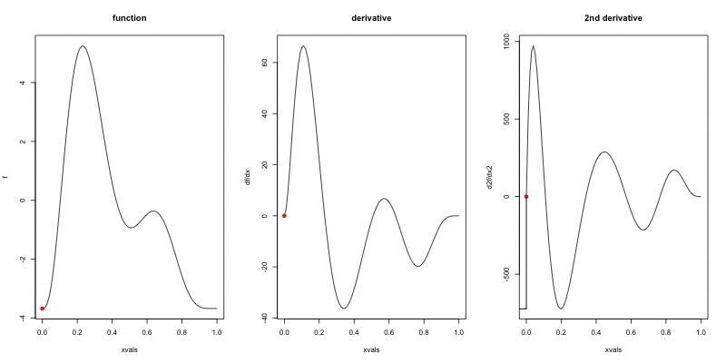
Measuring wigglyness
======================
- Visually:
- Lots of wiggles == NOT SMOOTH
- Straight line == VERY SMOOTH
- How do we do this mathematically?
- Derivatives!
- (Calculus *was* a useful class afterall)
Wigglyness by derivatives
==========================
```{r wigglyanim, results="hide", fig.width=12}
par(cex=1.5, lwd=1.75)
library(numDeriv)
f2 <- function(x) 0.2*x^11*(10*(1-x))^6+10*(10*x)^3*(1-x)^10 - mean(dat$y)
xvals <- seq(0,1,len=100)
plot_wiggly <- function(f2, xvals){
# pre-calculate
f2v <- f2(xvals)
f2vg <- grad(f2,xvals)
f2vg2 <- unlist(lapply(xvals, hessian, func=f2))
f2vg2min <- min(f2vg2) -2
# now plot
for(i in 1:length(xvals)){
par(mfrow=c(1,3))
plot(xvals, f2v, type="l", main="function", ylab="f")
points(xvals[i], f2v[i], pch=19, col="red")
plot(xvals, f2vg, type="l", main="derivative", ylab="df/dx")
points(xvals[i], f2vg[i], pch=19, col="red")
plot(xvals, f2vg2, type="l", main="2nd derivative", ylab="d2f/dx2")
points(xvals[i], f2vg2[i], pch=19, col="red")
polygon(x=c(0,xvals[1:i], xvals[i],f2vg2min),
y=c(f2vg2min,f2vg2[1:i],f2vg2min,f2vg2min), col = "grey")
ani.pause()
}
}
saveGIF(plot_wiggly(f2, xvals), "wiggly.gif", interval = 0.2, ani.width = 800, ani.height = 400)
```
Making wigglyness matter
=========================
- Integration of derivative (squared) gives wigglyness
- Fit needs to be **penalised**
- **Penalty matrix** gives the wigglyness
- Estimate the $\beta_k$ terms but penalise objective
- "closeness to data" + penalty
Penalty matrix
===============
- For each $b_k$ calculate the penalty
- Penalty is a function of $\beta$
- $\lambda \beta^\text{T}S\beta$
- $S$ calculated once
- smoothing parameter ($\lambda$) dictates influence
Smoothing parameter
=======================
```{r wiggles-plot, fig.width=18, fig.height=10}
# make three plots, w. estimated smooth, truth and data on each
par(mfrow=c(1,3), lwd=2.6, cex=1.6, pch=19, cex.main=1.8)
plot(b.justright, se=FALSE, ylim=ylim, main=expression(lambda*plain("= estimated")))
points(dat$x2, dat$y-mean(dat$y))
curve(f2,0,1, col="blue", add=TRUE)
plot(b.sp0, se=FALSE, ylim=ylim, main=expression(lambda*plain("=")*0))
points(dat$x2, dat$y-mean(dat$y))
curve(f2,0,1, col="blue", add=TRUE)
plot(b.spinf, se=FALSE, ylim=ylim, main=expression(lambda*plain("=")*infinity))
points(dat$x2, dat$y-mean(dat$y))
curve(f2,0,1, col="blue", add=TRUE)
```
How wiggly are things?
========================
- We can set **basis complexity** or "size" ($k$)
- Maximum wigglyness
- Smooths have **effective degrees of freedom** (EDF)
- EDF < $k$
- Set $k$ "large enough"
Why GAMs are cool...
================================================
***
- Fancy smooths (cyclic, boundaries, ...)
- Fancy responses (exp family and beyond!)
- Random effects (by equivalence)
- Markov random fields
- Correlation structures
- See Wood (2006/2017) for a handy intro
Okay, that was a lot of theory...
==================================
type:section
Example data
=========================
type:section
Example data
============
 Example data
============
Example data
============
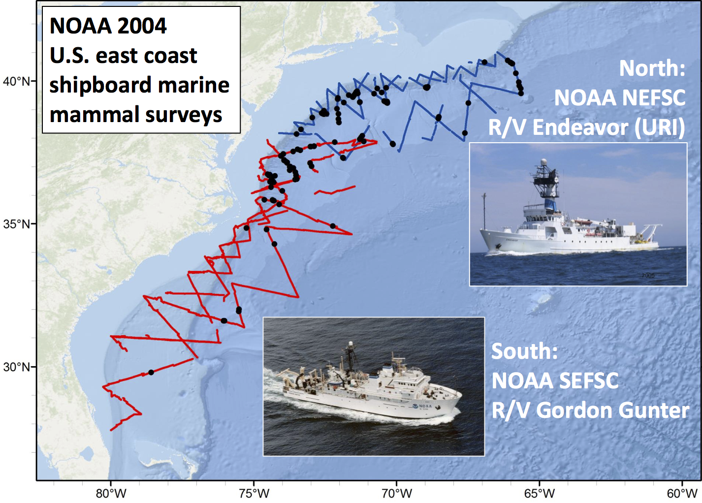
 Sperm whales off the US east coast
====================================
Sperm whales off the US east coast
====================================
 ***
- Hang out near canyons, eat squid
- Surveys in 2004, US east coast
- Combination of data from 2 NOAA cruises
- Thanks to Debi Palka (NOAA NEFSC), Lance Garrison (NOAA SEFSC) for data. Jason Roberts (Duke University) for data prep.
Model formulation
=================
- Pure spatial, pure environmental, mixed?
- May have some prior knowledge
- Biology/ecology
- What are drivers of distribution?
- Inferential aim
- Abundance
- Ecology
Fitting GAMs using dsm
=========================
type:section
Translating maths into R
==========================
$$
n_j = A_j\hat{p}_j \exp\left[ \beta_0 + s(\text{y}_j) \right] + \epsilon_j
$$
***
- Hang out near canyons, eat squid
- Surveys in 2004, US east coast
- Combination of data from 2 NOAA cruises
- Thanks to Debi Palka (NOAA NEFSC), Lance Garrison (NOAA SEFSC) for data. Jason Roberts (Duke University) for data prep.
Model formulation
=================
- Pure spatial, pure environmental, mixed?
- May have some prior knowledge
- Biology/ecology
- What are drivers of distribution?
- Inferential aim
- Abundance
- Ecology
Fitting GAMs using dsm
=========================
type:section
Translating maths into R
==========================
$$
n_j = A_j\hat{p}_j \exp\left[ \beta_0 + s(\text{y}_j) \right] + \epsilon_j
$$
where $\epsilon_j \sim N(0, \sigma^2)$, $\quad n_j\sim$ count distribution
- inside the link: `formula=count ~ s(y)`
- response distribution: `family=nb()` or `family=tw()`
- detectability: `ddf.obj=df_hr`
- offset, data: `segment.data=segs, observation.data=obs`
Your first DSM
===============
```{r firstdsm, echo=TRUE}
library(dsm)
dsm_x_tw <- dsm(count~s(x), ddf.obj=df,
segment.data=segs, observation.data=obs,
family=tw())
```
`dsm` is based on `mgcv` by Simon Wood
What did that do?
===================
```{r echo=TRUE}
summary(dsm_x_tw)
```
Plotting
================
```{r plotsmooth}
plot(dsm_x_tw)
```
***
- `plot(dsm_x_tw)`
- Dashed lines indicate +/- 2 standard errors
- Rug plot
- On the link scale
- EDF on $y$ axis
Adding a term
===============
- Just use `+`
```{r xydsm, echo=TRUE}
dsm_xy_tw <- dsm(count ~ s(x) + s(y),
ddf.obj=df,
segment.data=segs,
observation.data=obs,
family=tw())
```
Summary
===================
```{r echo=TRUE}
summary(dsm_xy_tw)
```
Plotting
================
```{r plotsmooth-xy1, eval=FALSE, echo=TRUE}
plot(dsm_xy_tw, pages=1)
```
```{r plotsmooth-xy2, fig.width=25, echo=FALSE}
par(cex.axis=2, lwd=2, cex.lab=2)
plot(dsm_xy_tw, pages=1)
```
- `scale=0`: each plot on different scale
- `pages=1`: plot together
Bivariate terms
================
- Assumed an additive structure
- No interaction
- We can specify `s(x,y)` (and `s(x,y,z,...)`)
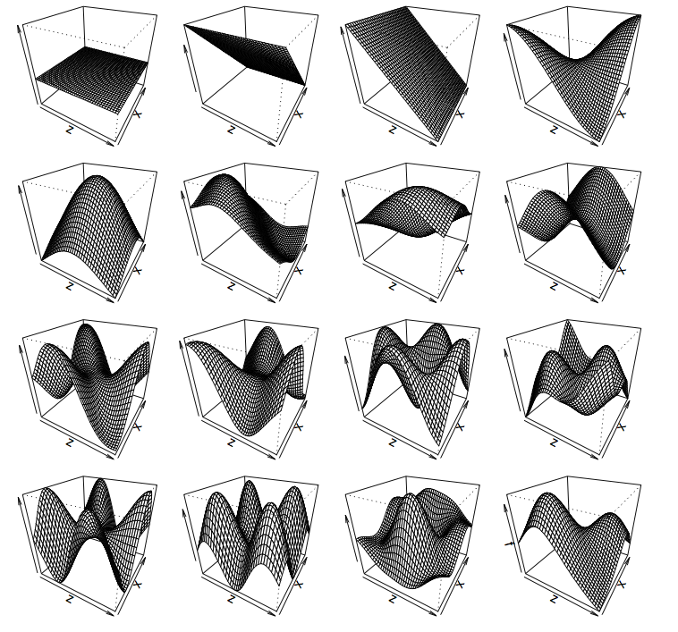
Thin plate regression splines
================================
- Default basis
- One basis function per data point
- Reduce # basis functions (eigendecomposition)
- Fitting on reduced problem
- Multidimensional
Thin plate splines (2-D)
====================
 Bivariate spatial term
=======================
```{r xy-biv-dsm, echo=TRUE}
dsm_xyb_tw <- dsm(count ~ s(x, y),
ddf.obj=df,
segment.data=segs,
observation.data=obs,
family=tw())
```
Summary
===================
```{r echo=TRUE}
summary(dsm_xyb_tw)
```
Plotting... erm...
================
```{r plotsmooth-xy-biv1, eval=TRUE, fig.width=15, fig.height=17}
par(cex.axis=2, lwd=2, cex.lab=2, cex=2)
plot(dsm_xyb_tw, asp=1)
```
***
```{r plotsmooth-xy-biv2, eval=FALSE, echo=TRUE}
plot(dsm_xyb_tw)
```
Let's try something different
===============================
```{r twodee-p, echo=TRUE, eval=FALSE}
plot(dsm_xyb_tw, select=1,
scheme=2, asp=1)
```
- Still on link scale
- `too.far` excludes points far from data
***
```{r twodee, echo=FALSE, fig.height=12}
par(cex.axis=1.2, lwd=2, cex.lab=1.5, cex=2)
plot(dsm_xyb_tw, select=1, scheme=2, asp=1)
```
Comparing bivariate and additive models
========================================
```{r xy-x-y, fig.width=28, fig.height=15}
dsm_xy_nb <- dsm(count~s(x,y),
ddf.obj=df,
segment.data=segs, observation.data=obs,
family=nb())
dsm_x_y_nb <- dsm(count~s(x) +s(y),
ddf.obj=df,
segment.data=segs, observation.data=obs,
family=nb())
par(cex.axis=1.2, cex.main=4, lwd=2, cex.lab=1.8, cex=2, mfrow=c(1,2))
vis.gam(dsm_xy_nb, plot.type = "contour", view=c("x","y"), zlim = c(-11,1), too.far=0.1, asp=1, main="Bivariate")
vis.gam(dsm_x_y_nb, plot.type = "contour", view=c("x","y"), zlim = c(-11,1), too.far=0.1, asp=1, main="Additive")
```
Let's have a go...
==============================
type:section
Bivariate spatial term
=======================
```{r xy-biv-dsm, echo=TRUE}
dsm_xyb_tw <- dsm(count ~ s(x, y),
ddf.obj=df,
segment.data=segs,
observation.data=obs,
family=tw())
```
Summary
===================
```{r echo=TRUE}
summary(dsm_xyb_tw)
```
Plotting... erm...
================
```{r plotsmooth-xy-biv1, eval=TRUE, fig.width=15, fig.height=17}
par(cex.axis=2, lwd=2, cex.lab=2, cex=2)
plot(dsm_xyb_tw, asp=1)
```
***
```{r plotsmooth-xy-biv2, eval=FALSE, echo=TRUE}
plot(dsm_xyb_tw)
```
Let's try something different
===============================
```{r twodee-p, echo=TRUE, eval=FALSE}
plot(dsm_xyb_tw, select=1,
scheme=2, asp=1)
```
- Still on link scale
- `too.far` excludes points far from data
***
```{r twodee, echo=FALSE, fig.height=12}
par(cex.axis=1.2, lwd=2, cex.lab=1.5, cex=2)
plot(dsm_xyb_tw, select=1, scheme=2, asp=1)
```
Comparing bivariate and additive models
========================================
```{r xy-x-y, fig.width=28, fig.height=15}
dsm_xy_nb <- dsm(count~s(x,y),
ddf.obj=df,
segment.data=segs, observation.data=obs,
family=nb())
dsm_x_y_nb <- dsm(count~s(x) +s(y),
ddf.obj=df,
segment.data=segs, observation.data=obs,
family=nb())
par(cex.axis=1.2, cex.main=4, lwd=2, cex.lab=1.8, cex=2, mfrow=c(1,2))
vis.gam(dsm_xy_nb, plot.type = "contour", view=c("x","y"), zlim = c(-11,1), too.far=0.1, asp=1, main="Bivariate")
vis.gam(dsm_x_y_nb, plot.type = "contour", view=c("x","y"), zlim = c(-11,1), too.far=0.1, asp=1, main="Additive")
```
Let's have a go...
==============================
type:section