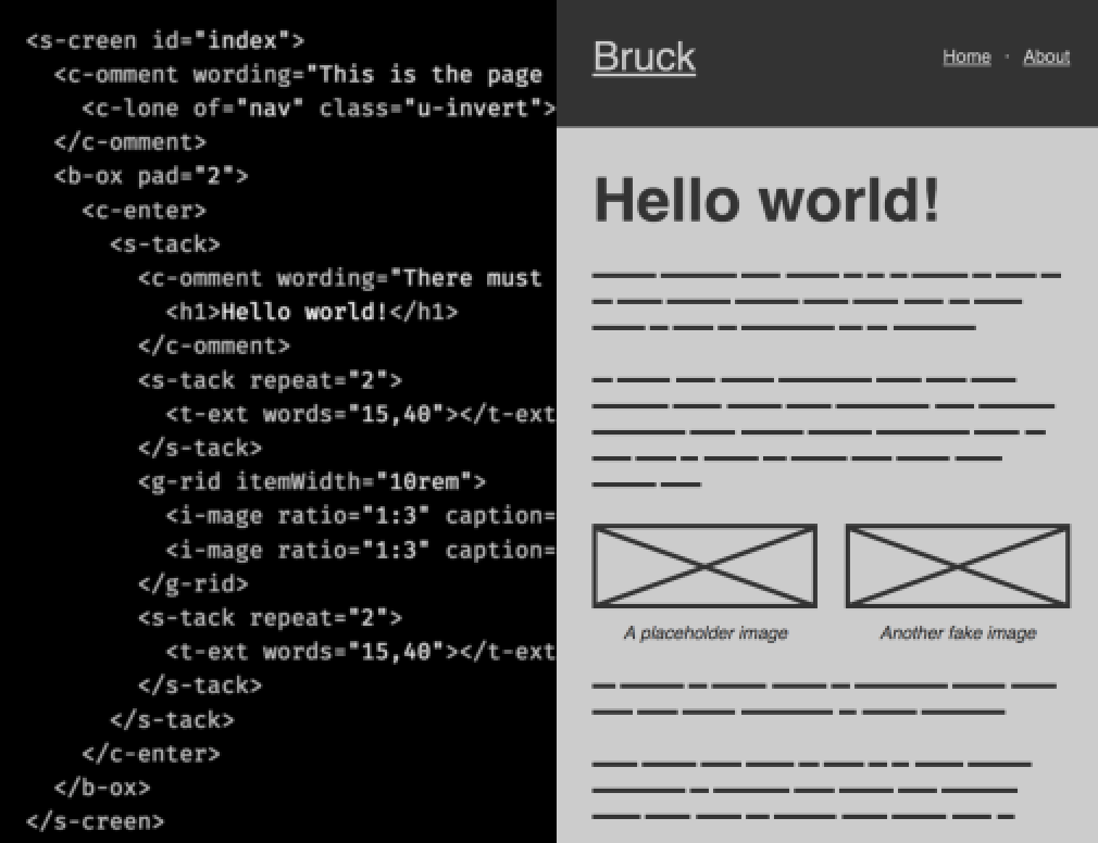
| words |
A comma separated range e.g. Default: |
|---|
` or `
| count |
The number of words. Can be a set integer e.g. Default: |
|---|---|
| capitalize |
Capitalizes the first letter of each word (Boolean) |
| sentence |
Capitalizes the first letter of the first word, and appends a period followed by a space (Boolean) |
| repeat |
How many times to repeat the pattern (i.e. how many sentences to produce). Can be a set integer e.g. |
| ratio |
The expression of an aspect ratio e.g. Default: |
|---|---|
| caption |
The text for a caption, which is placed in a Default: nothing ( |
| minWidth |
Any CSS Default: |
| maxWidth |
Any CSS Default: |
| pad |
Padding for all sides. A point on the modular scale ( Default: |
|---|---|
| border |
Whether to apply a border (Boolean) Default: |
| gap |
A point on the modular scale ( Default: |
|---|---|
| repeat |
The number of times the content (light DOM children) will be repeated. Can be an integer e.g. Default: |
| lines |
Boolean: Whether or not to divide items with horizontal lines/borders Default: omitted (no lines) |
| gap |
A point on the modular scale ( Default: |
|---|---|
| repeat |
The number of times the content (light DOM children) will be repeated. Can be an integer e.g. Default: |
| itemWidth |
The 'ideal' width of the grid item as a CSS length value e.g. Default: |
| gap |
The gap between clustered items. A point on the modular scale ( Default: |
|---|---|
| align |
Maps to the Flexbox Default: |
| gap |
The minimum gap between spread-out items. A point on the modular scale ( Default: |
|---|---|
| spaces |
Where the spaces occur. One of Default: |
| align |
Maps to the Flexbox Default: |
| gap |
The gap between the sidebar and adjacent element. A point on the modular scale ( Default: |
|---|---|
| width |
The width of the sidebar in contexts wide enough that it can be a sidebar. Any CSS length, e.g. Default: |
| to |
Which child element (left or right) to be the sidebar. Values can only be 'left' or 'right'; If anything different is supplied, 'left' is used by default. Default: |
| between |
Some HTML to separate each item e.g. |
|---|---|
| gap |
A point on the modular scale ( Default: |
| justify |
Maps to the Flexbox Default: |
| name (required) |
The name of the icon, matching the filename (without extension) from the icons folder. |
|---|---|
| label |
A string to describe the SVG as an image. Not necessary if the icon has accompanying, descriptive text (for example, alongside a Default: omitted (no label or image role) |
| steps (required) |
A comma-separated set of labels for he consecutive steps, e.g. `steps="one,two,three"`. |
|---|---|
| current |
The label of the current step, which takes Default: the first step (whatever it is named) |
| maxWidth |
A CSS Default: the root |
|---|
| level |
An integer between 1 Default: |
|---|---|
| open |
An integer between 1 |
This content appears when the handle is clicked...
...and so does this content.
| id (required) |
A valid |
|---|---|
| label |
A string describing the screen (think Default: the screen's |
label prop (or the id value as a fallback).
### `| to (required) |
A valid |
|---|
| hideControls |
Boolean. Whether to show the previous and next buttons. Default: |
|---|
| prev() |
Show the previous element |
|---|---|
| next() |
Show the next element |
| goTo(index) |
Show the element with the supplied index |
| wording |
A basic string e.g. Default: 'TBD' |
|---|
| of (required) |
The |
|---|
| label |
A string for the ` Default: |
|---|---|
| name (required) |
A valid |
| value |
Optionally prepopulate a value, e.g. |