# Palettes
30 built-in palettes · 18 dark · 12 light, plus the **Default** dark
and light themes the viewer falls back to when no palette is pinned.
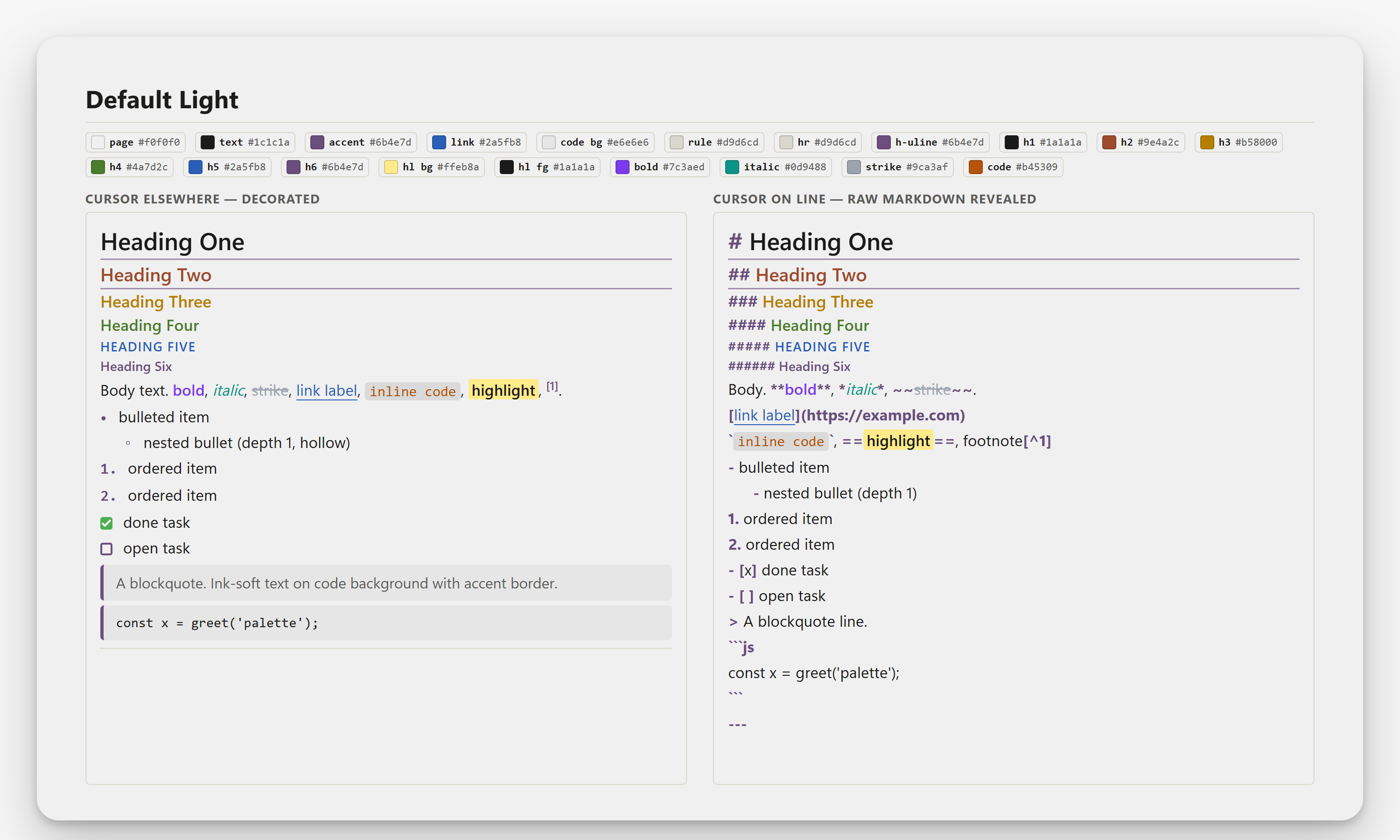
Out of the box no palette is fixed: the page follows the Opus pane background
(light or dark), which is what the **Default Dark** and **Default Light** cards
below show. Pick any of the named palettes to pin it instead.
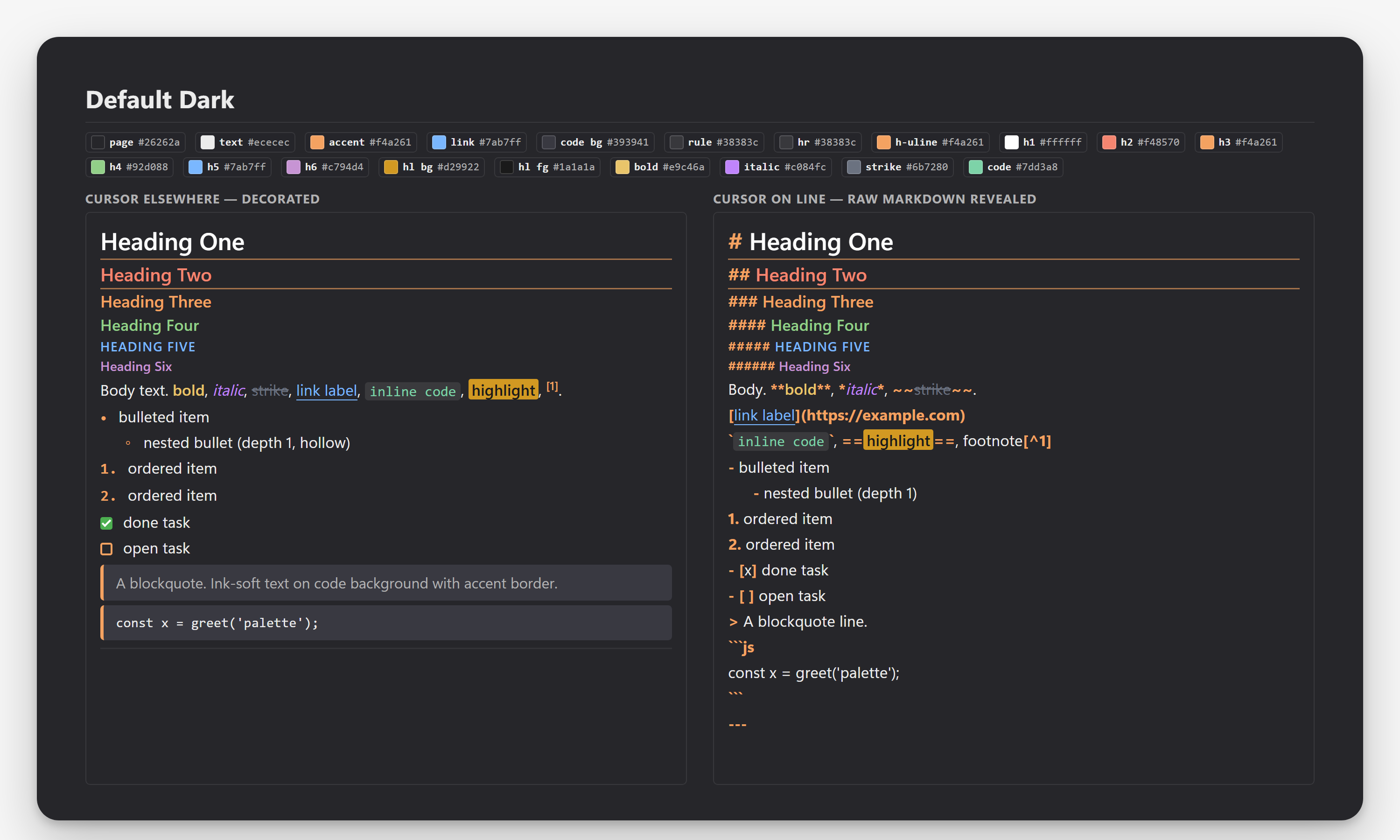
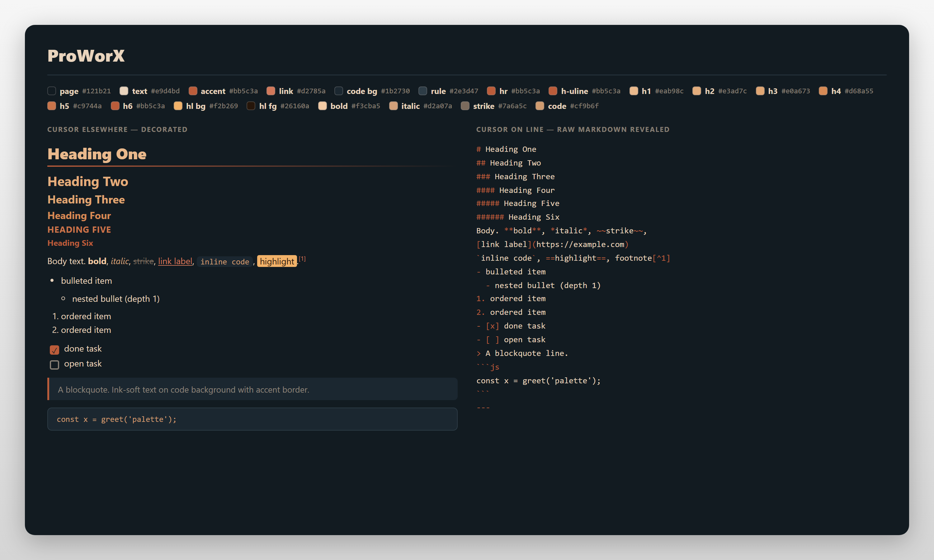
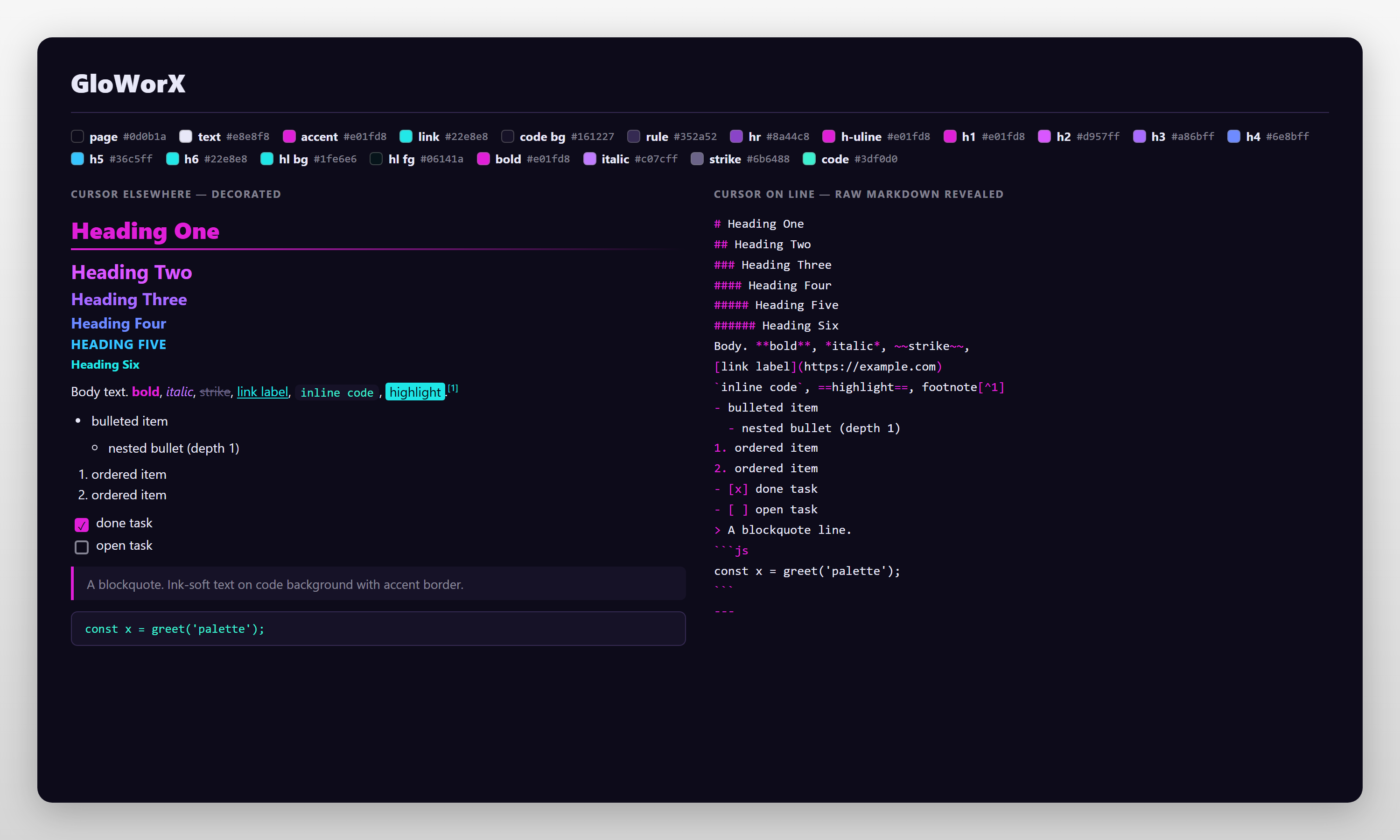
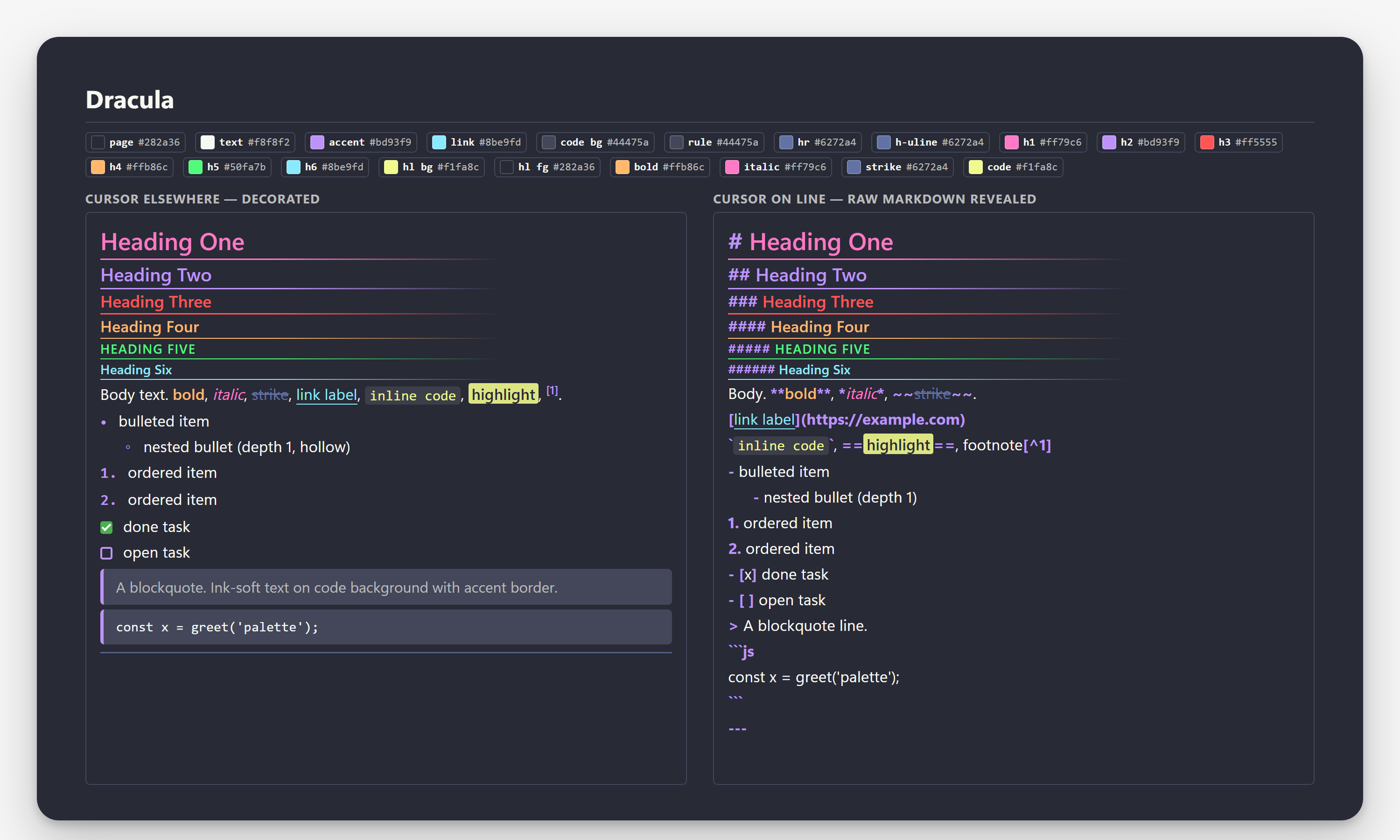
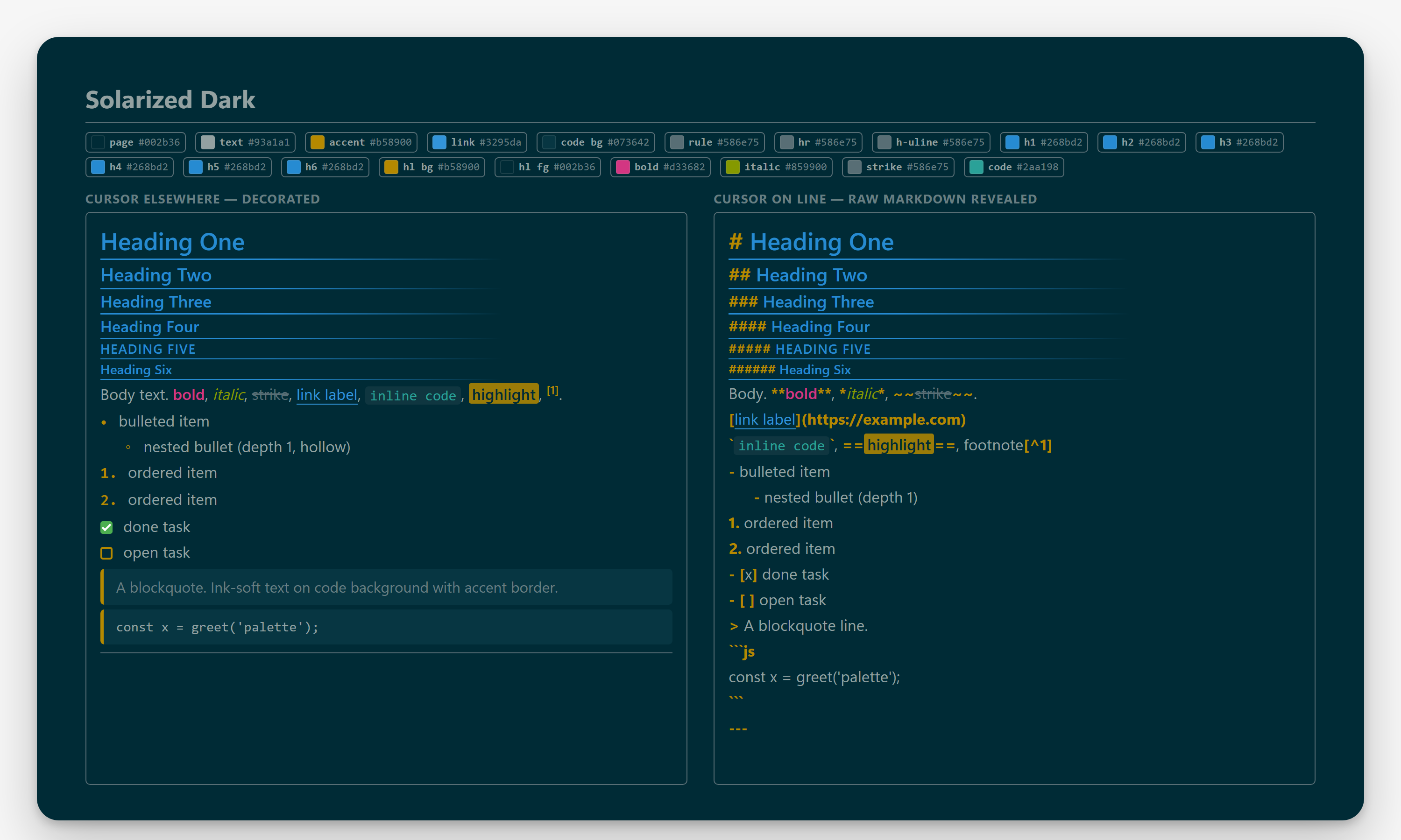
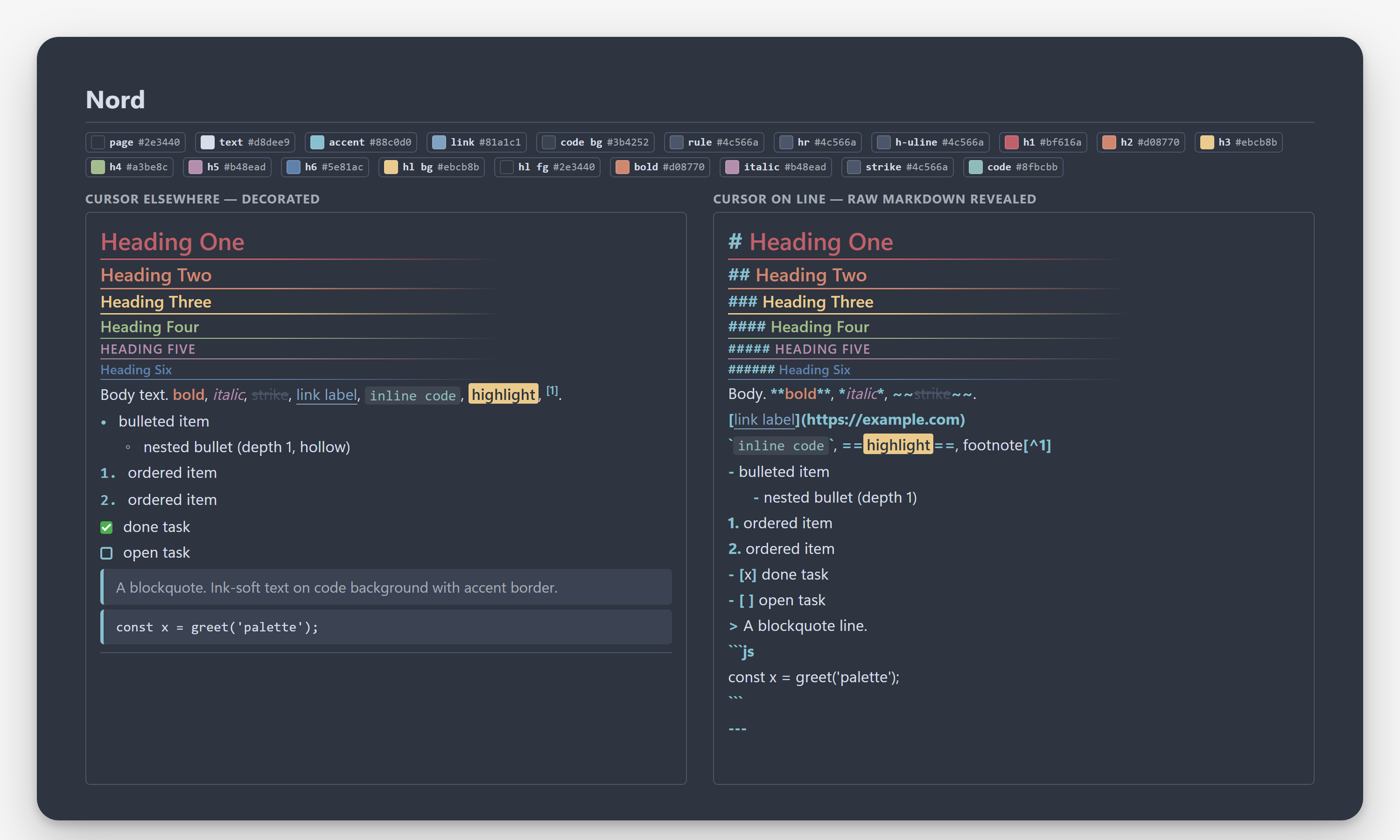
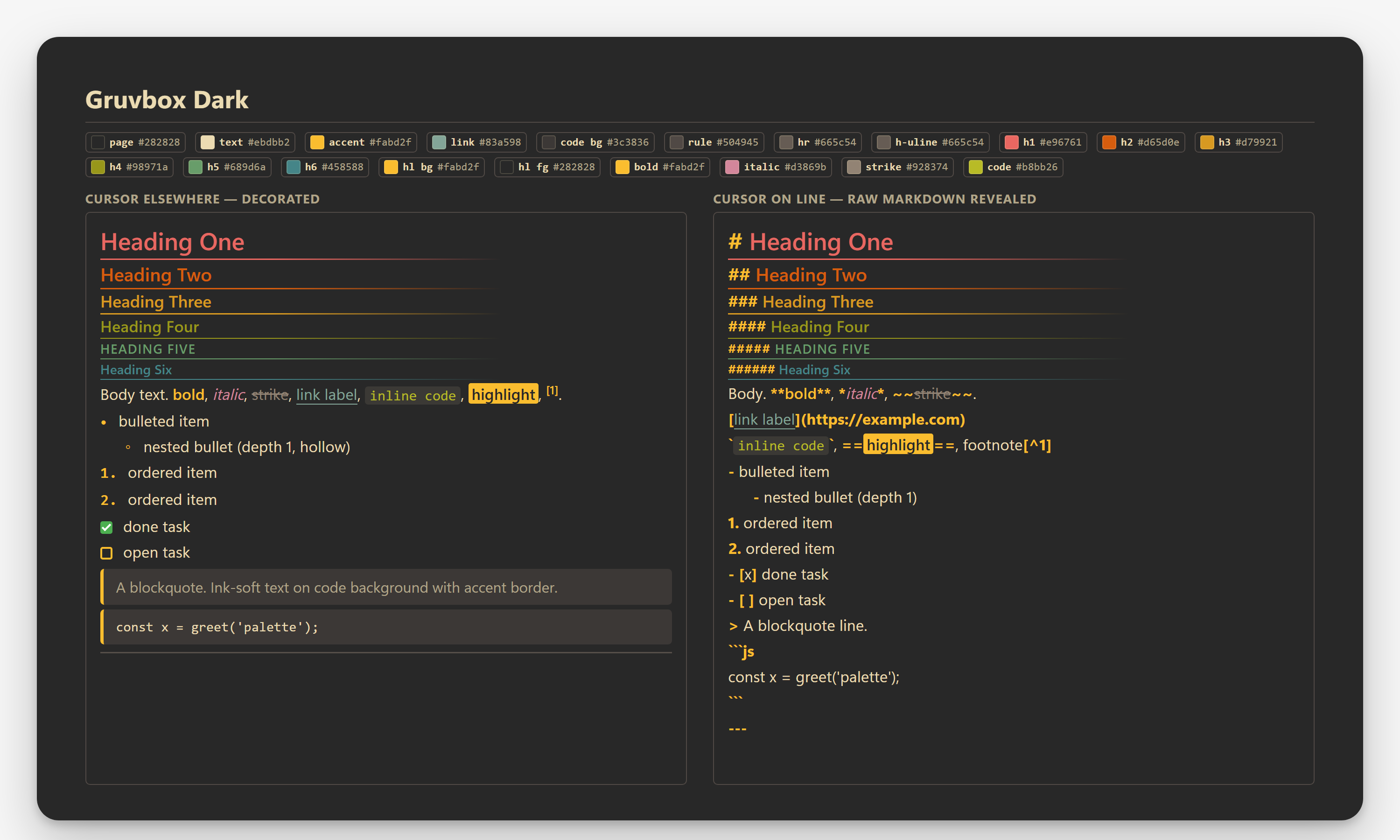
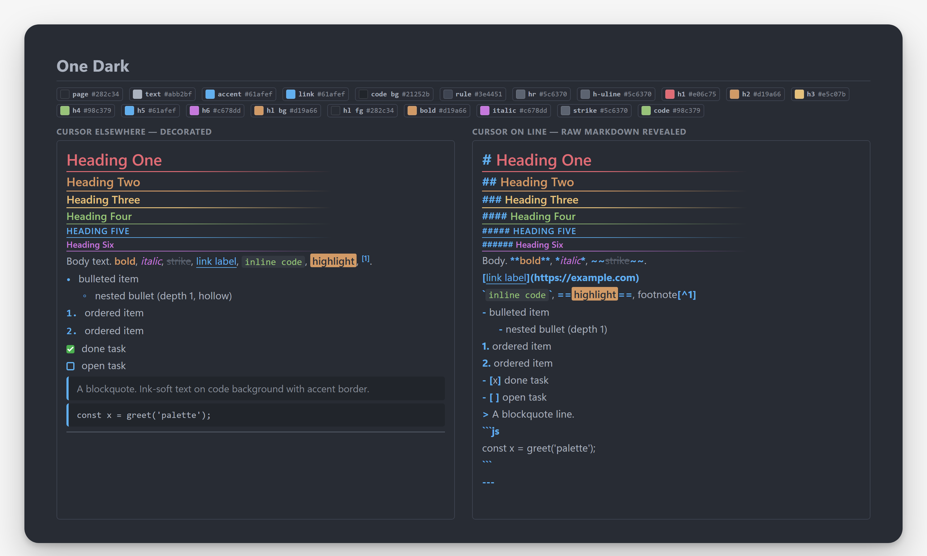
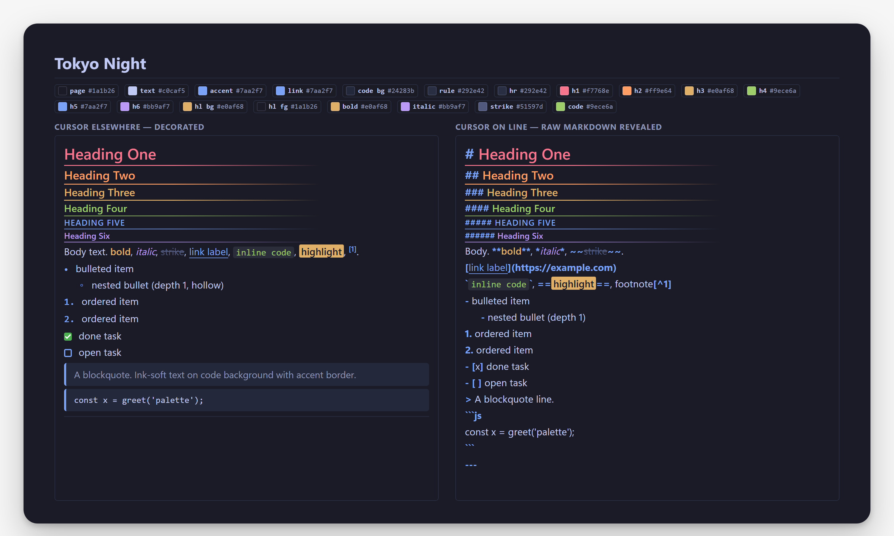
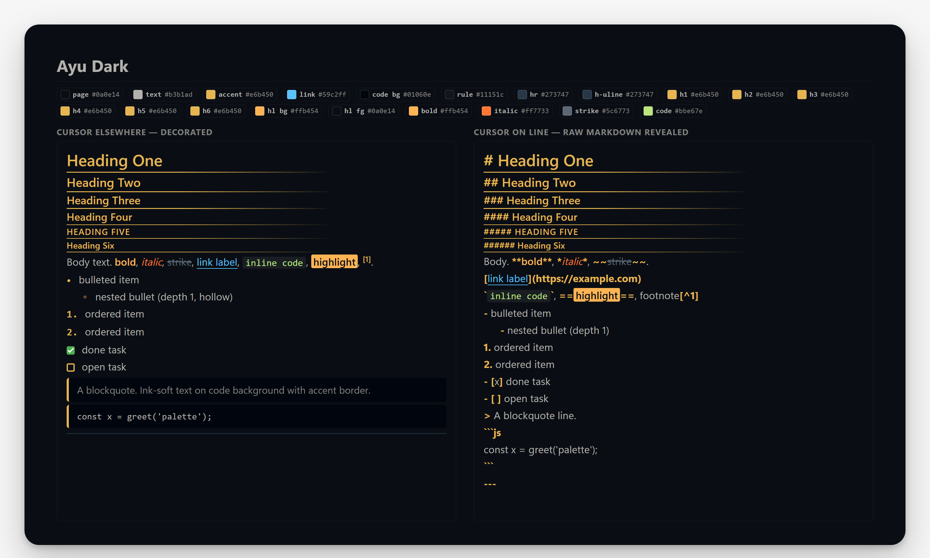
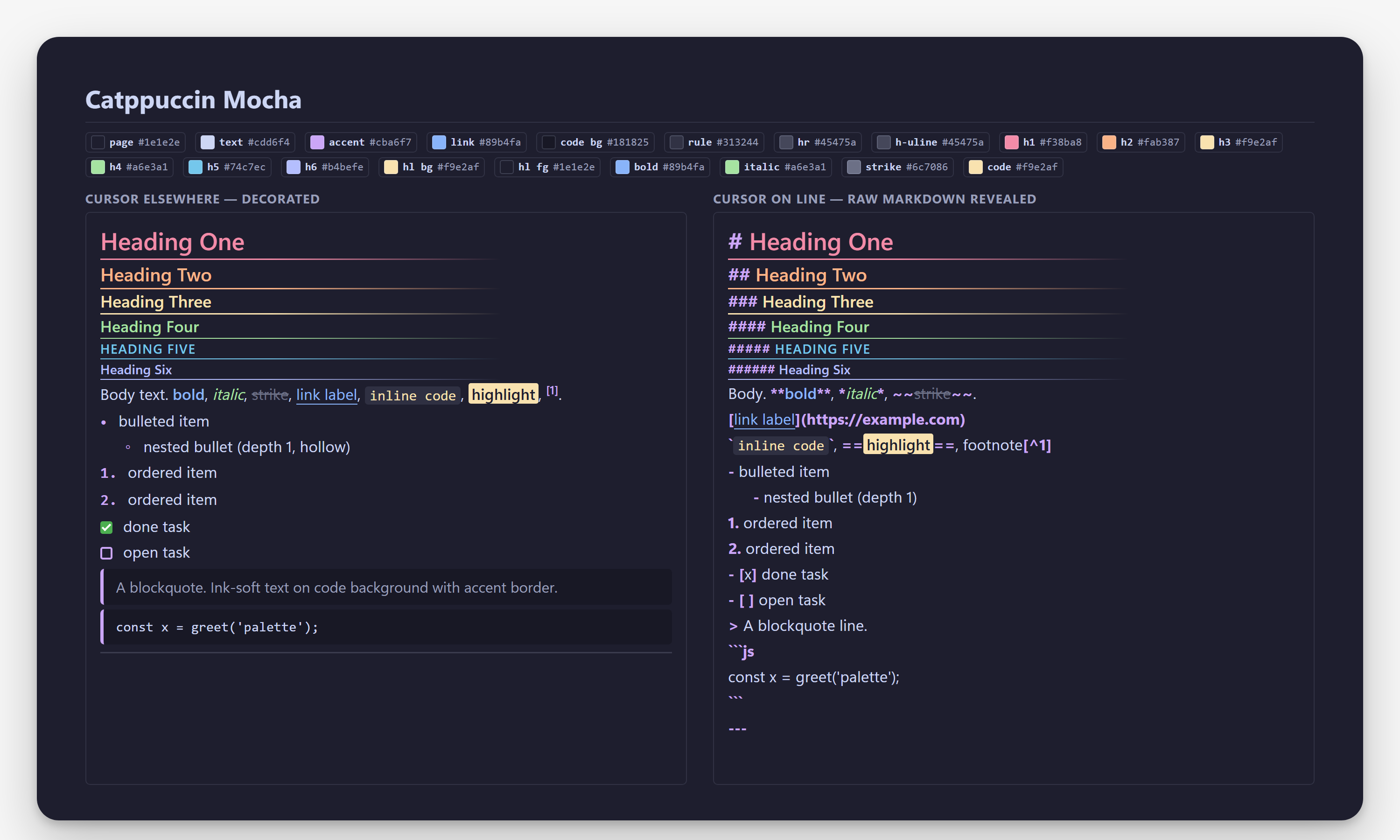
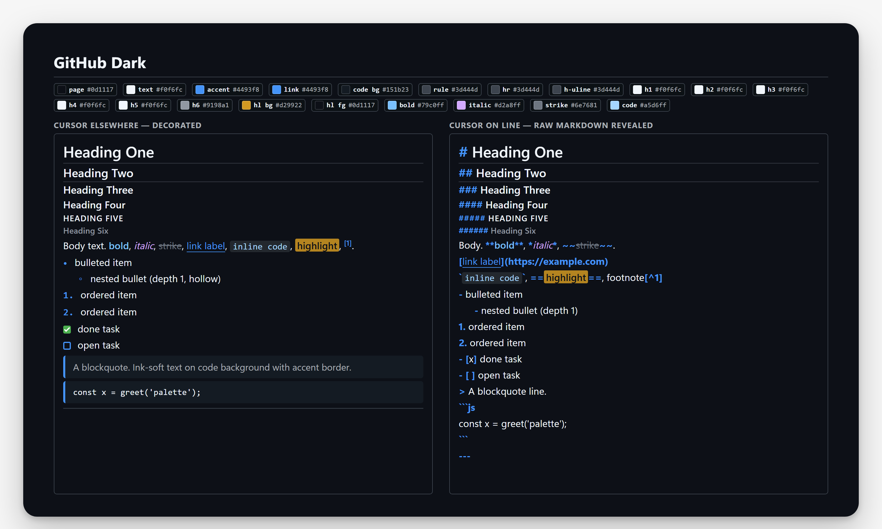
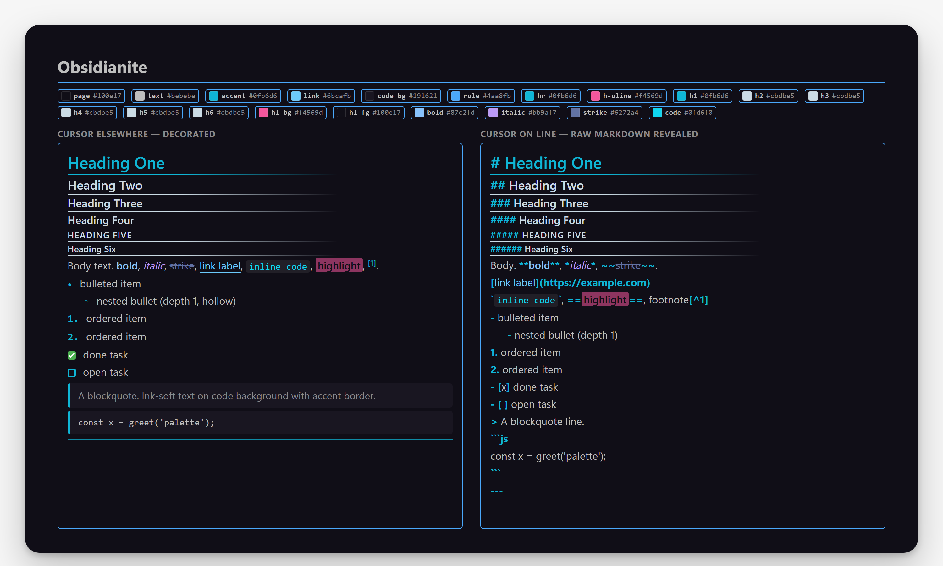
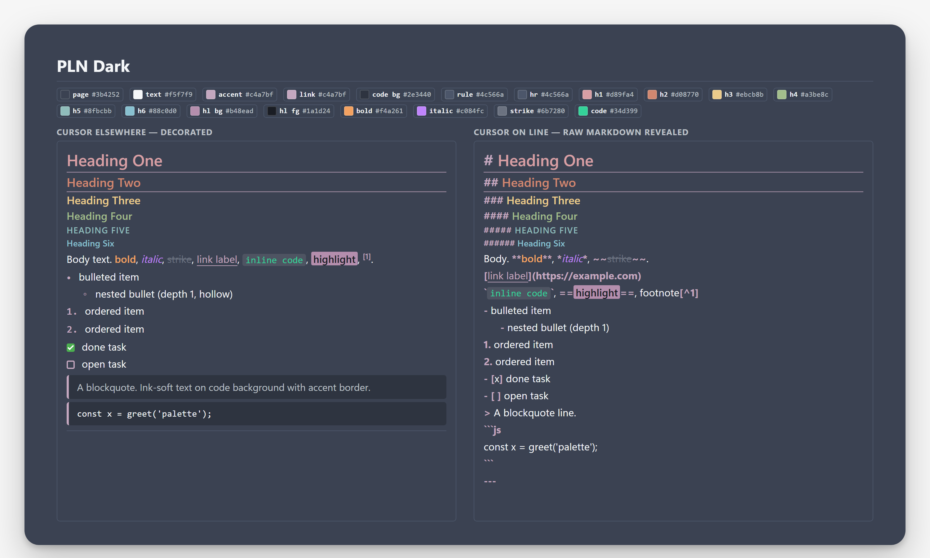
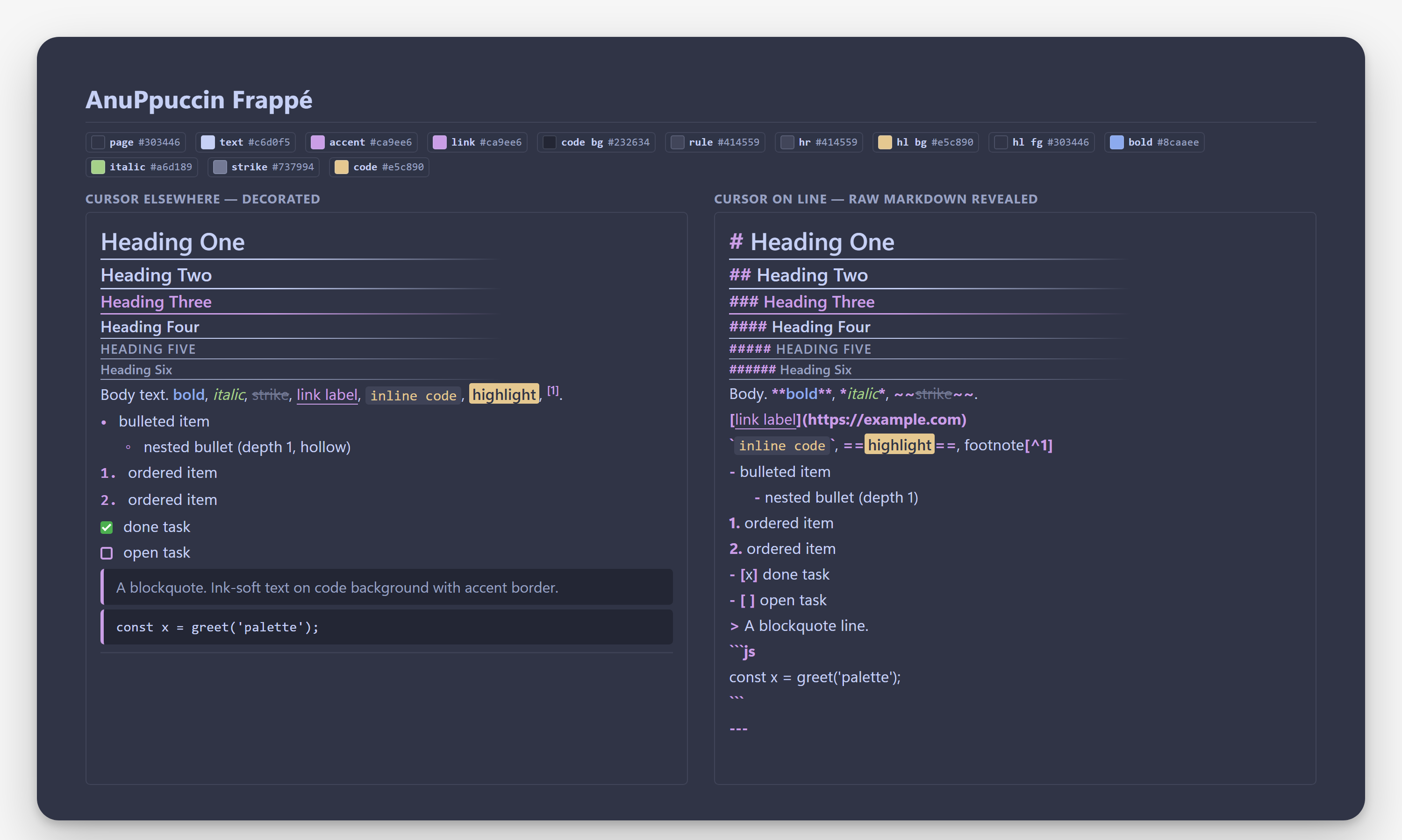
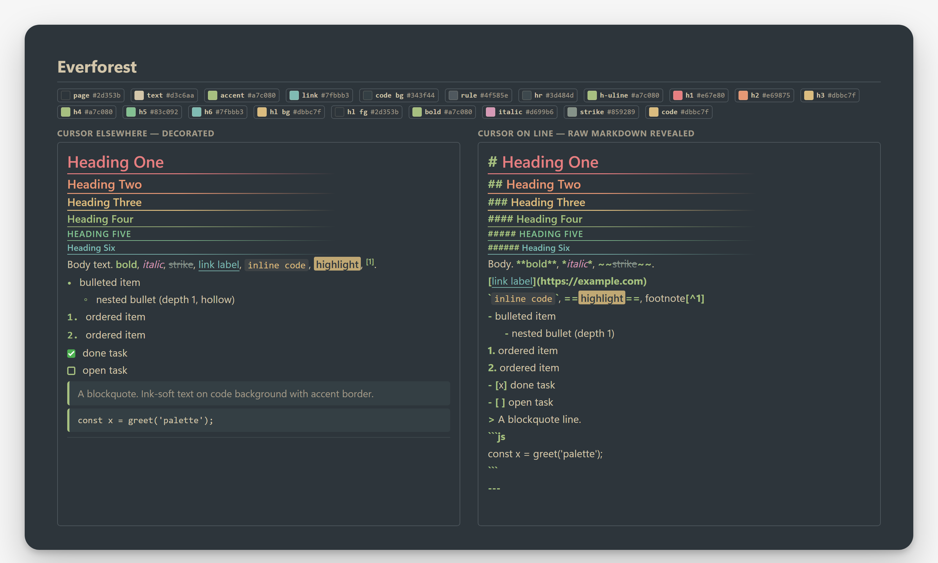
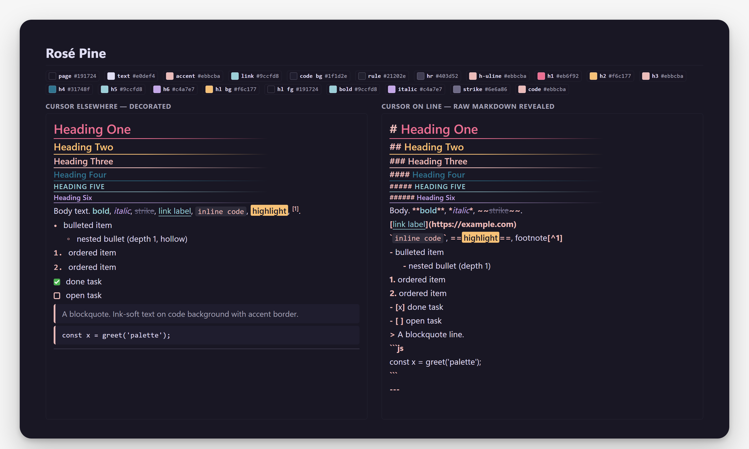
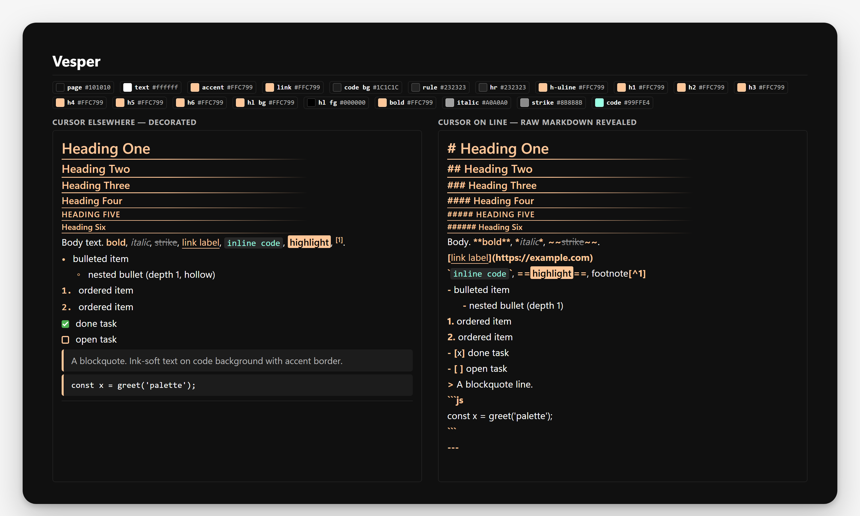
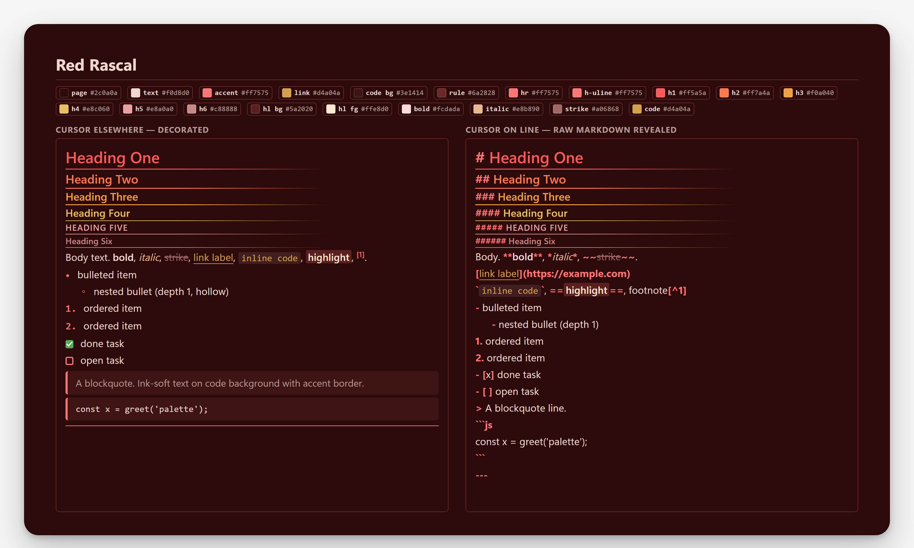
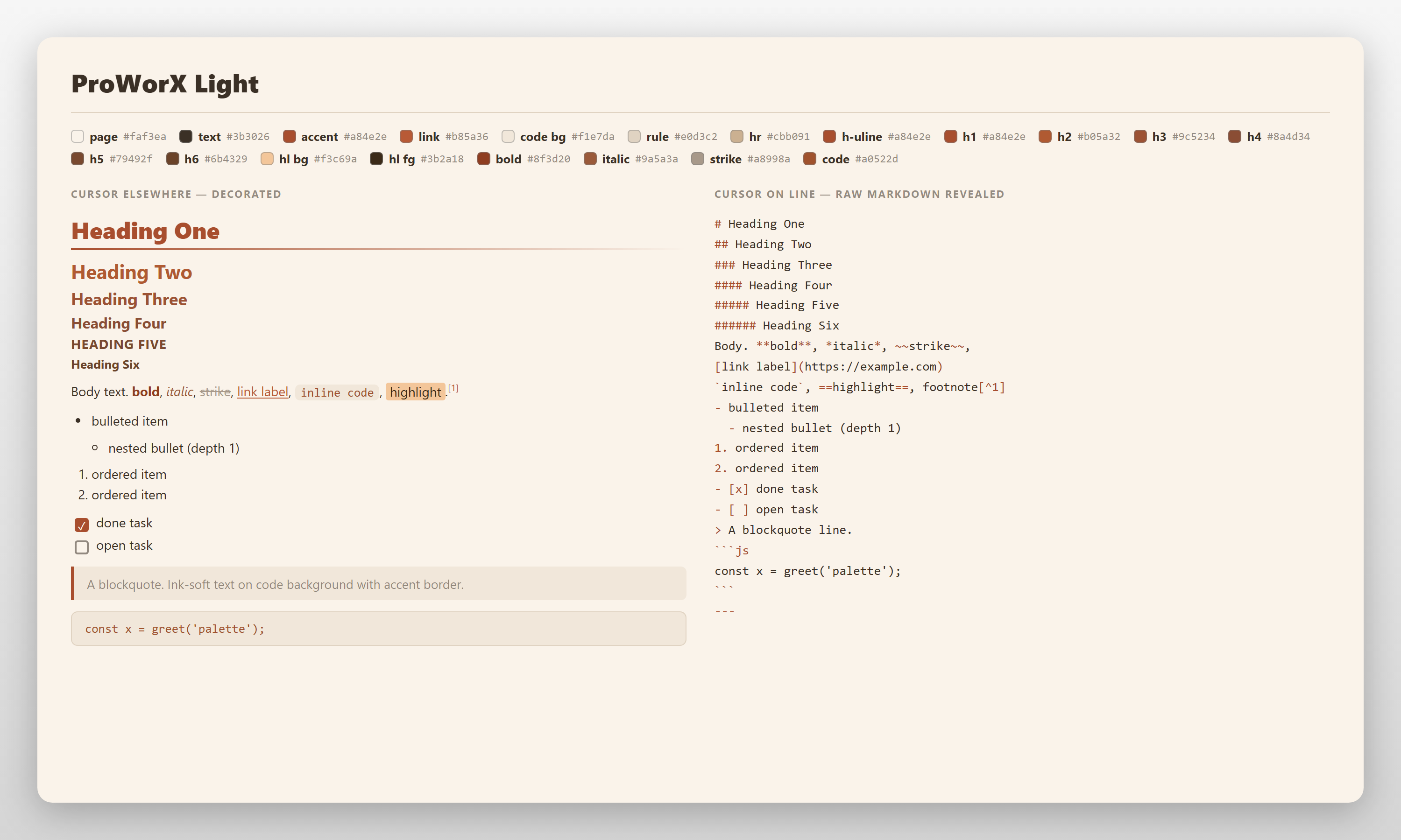
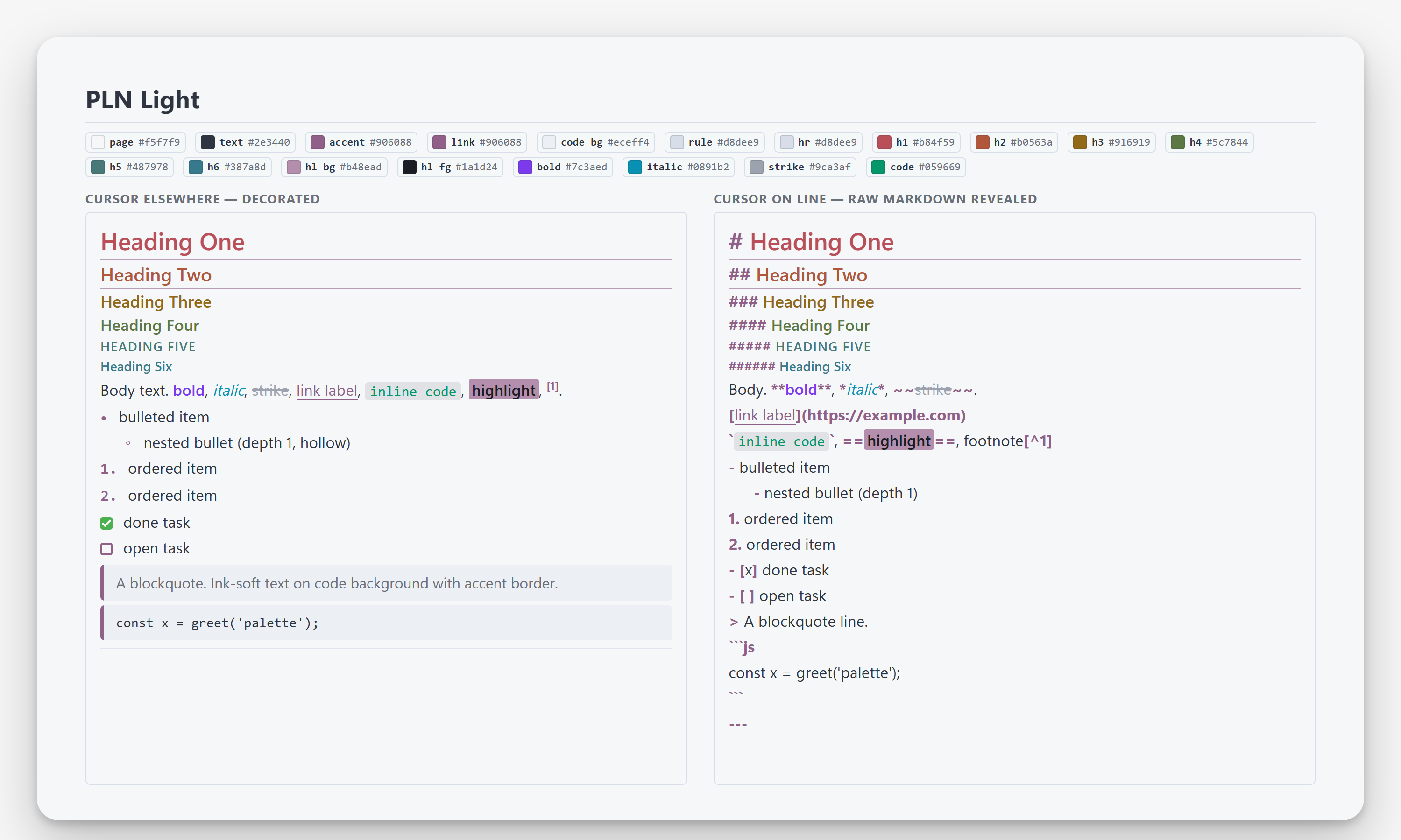
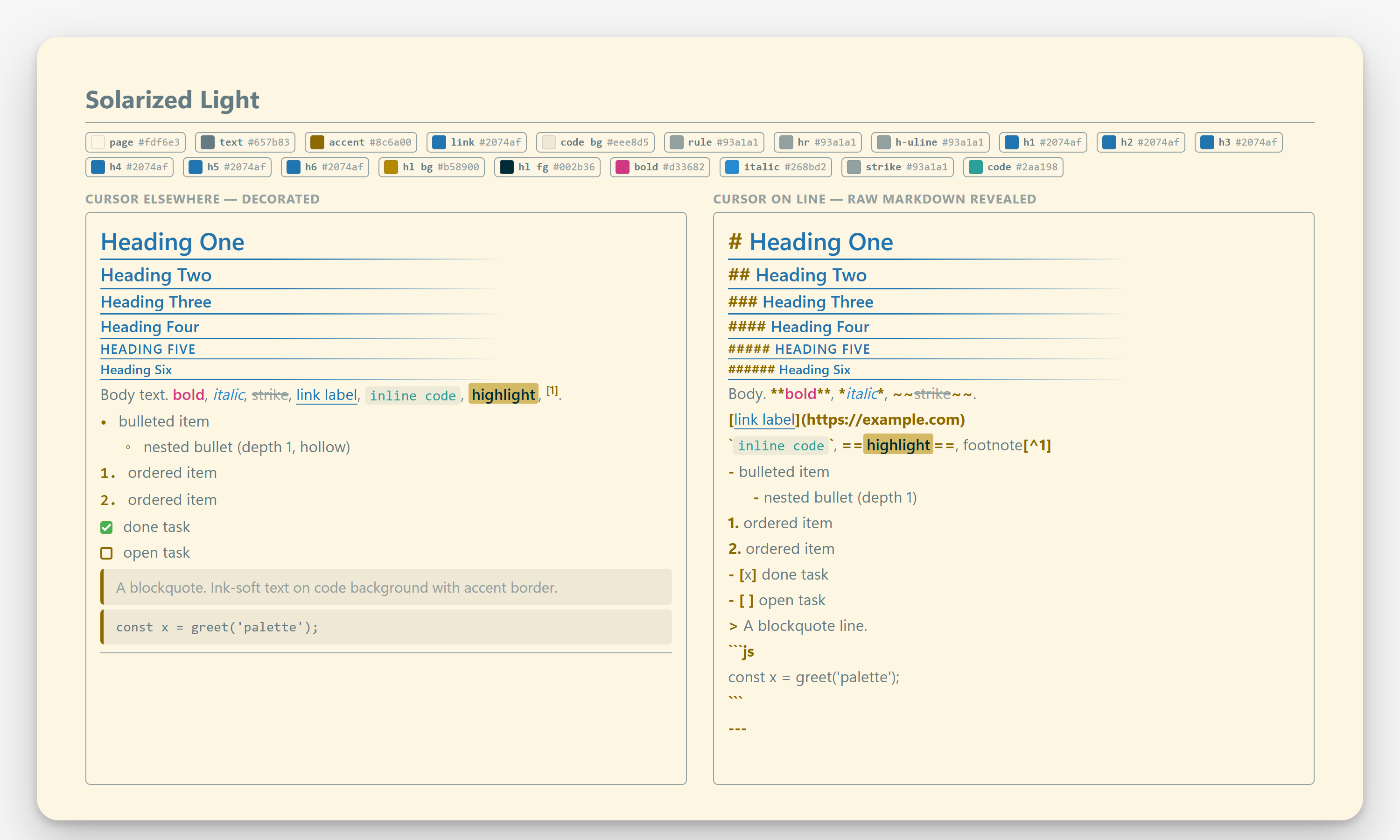
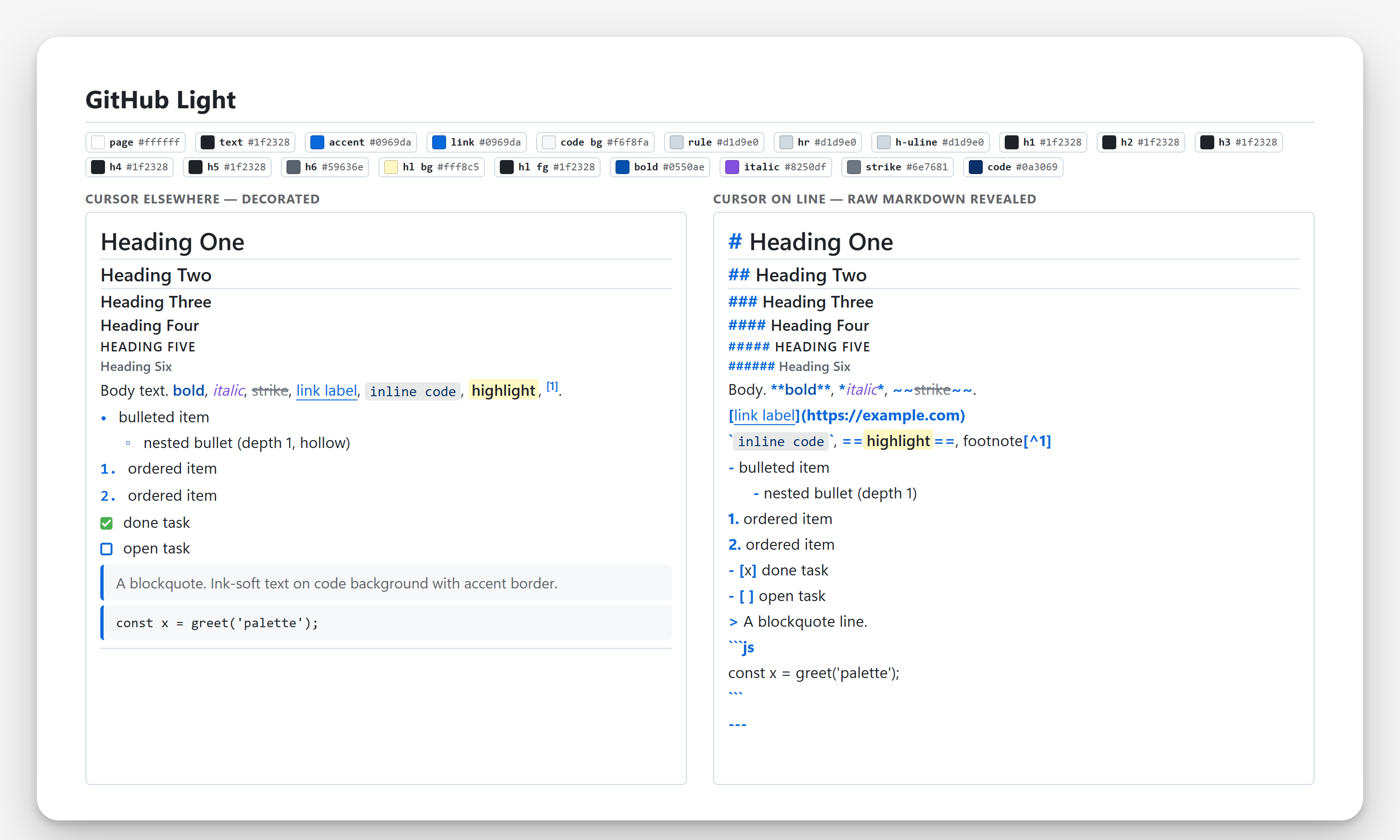
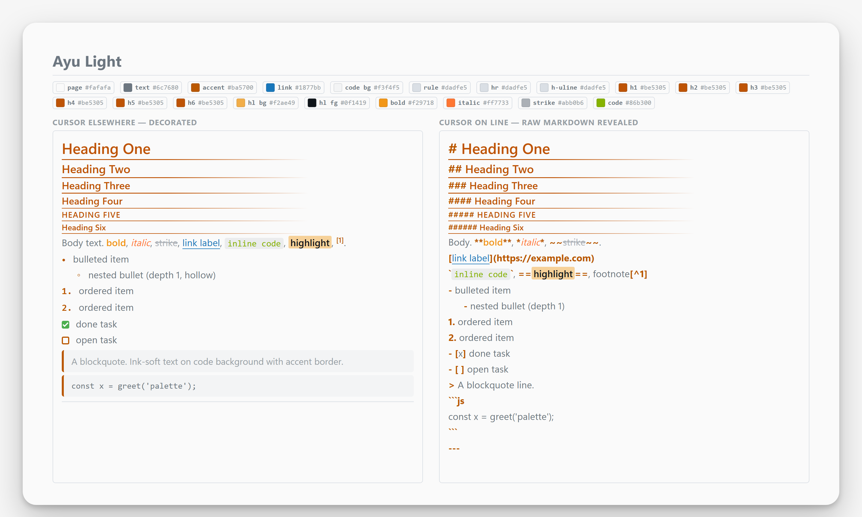
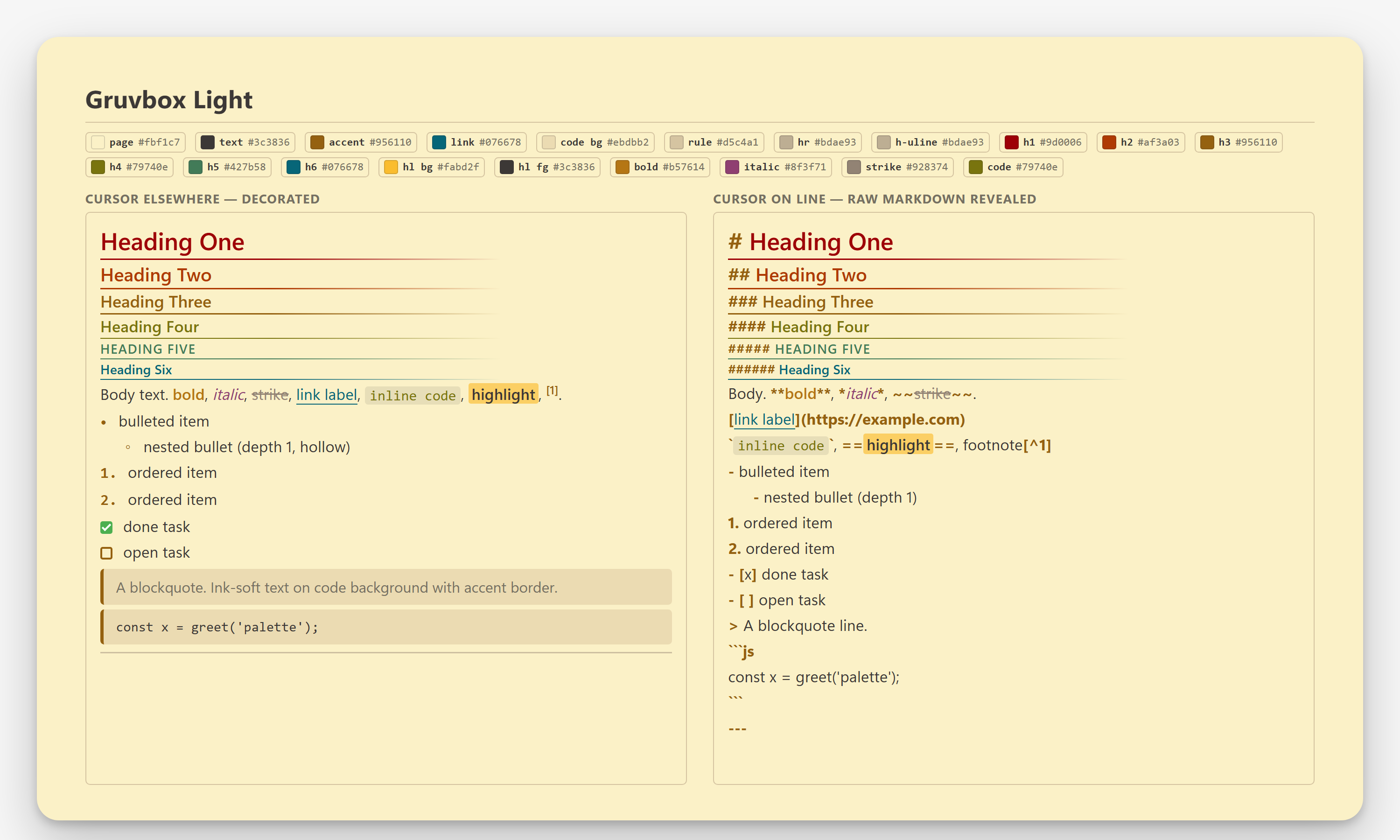
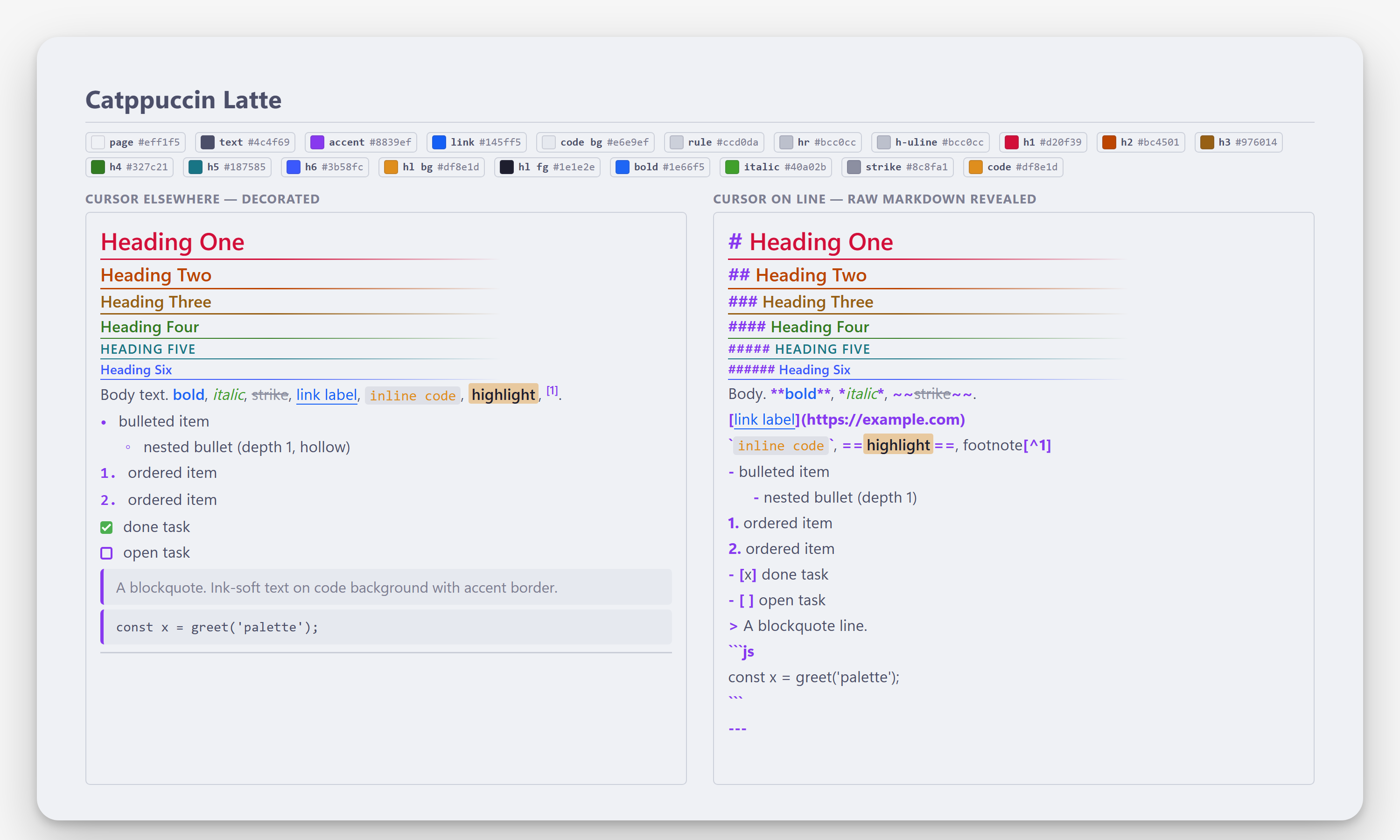
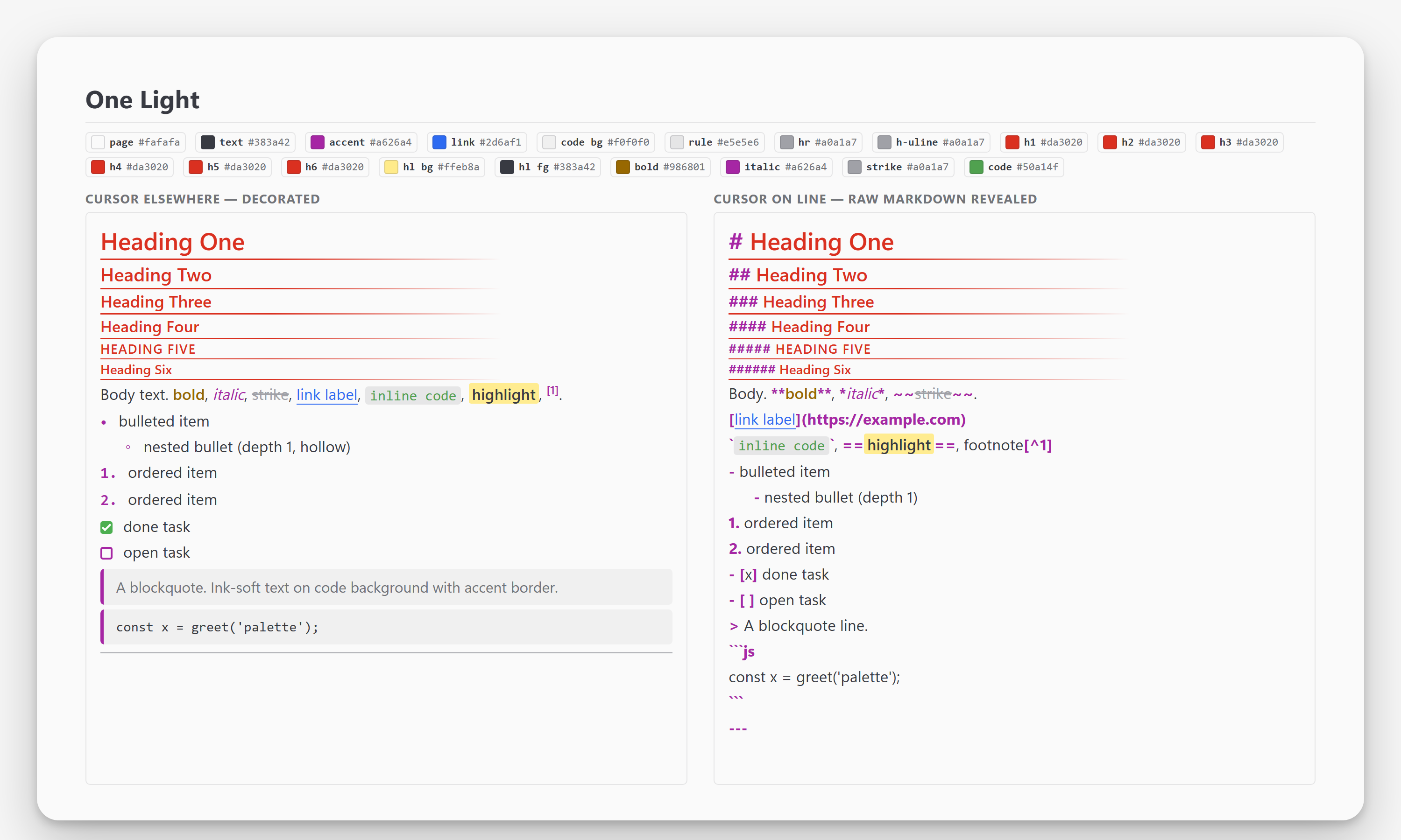
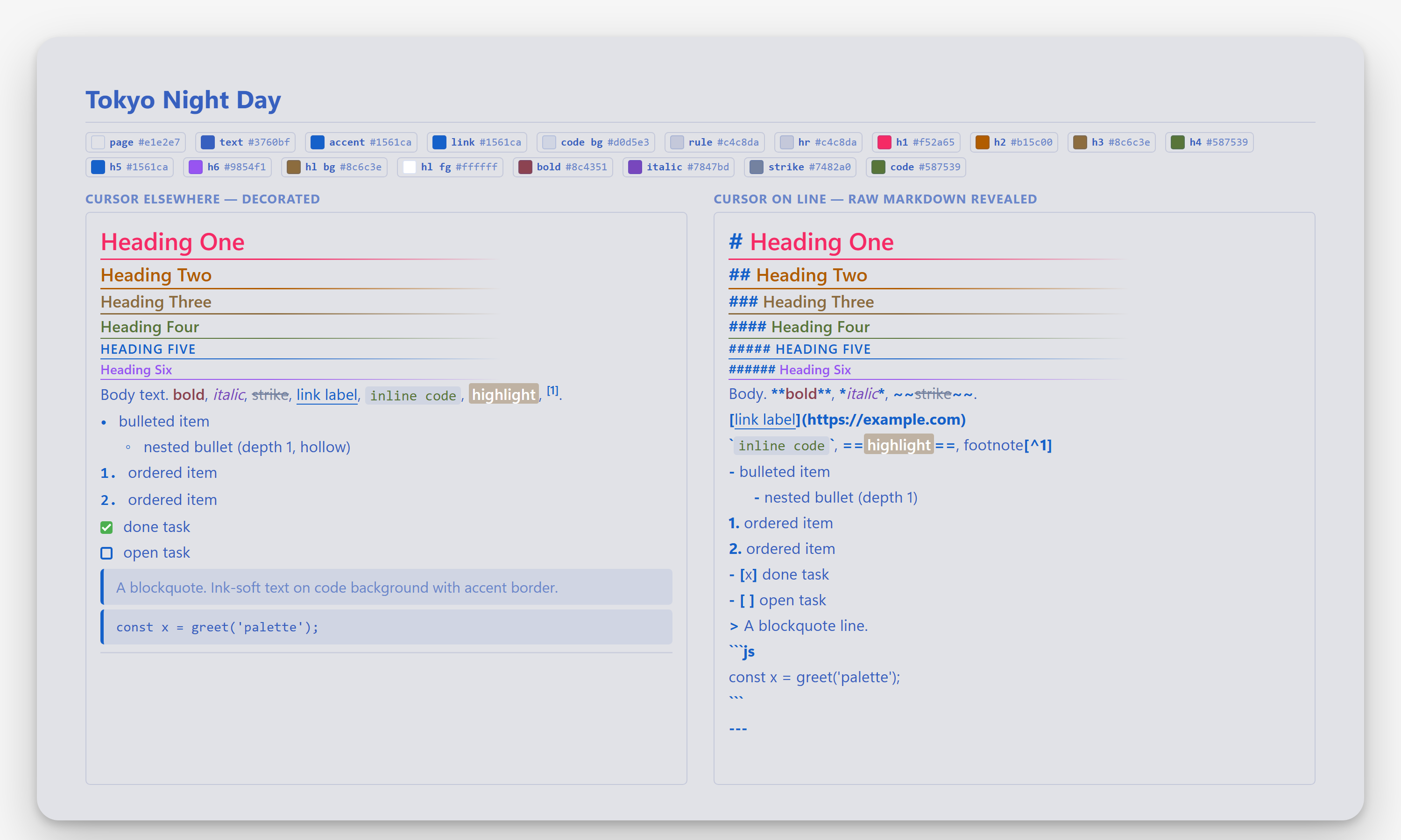
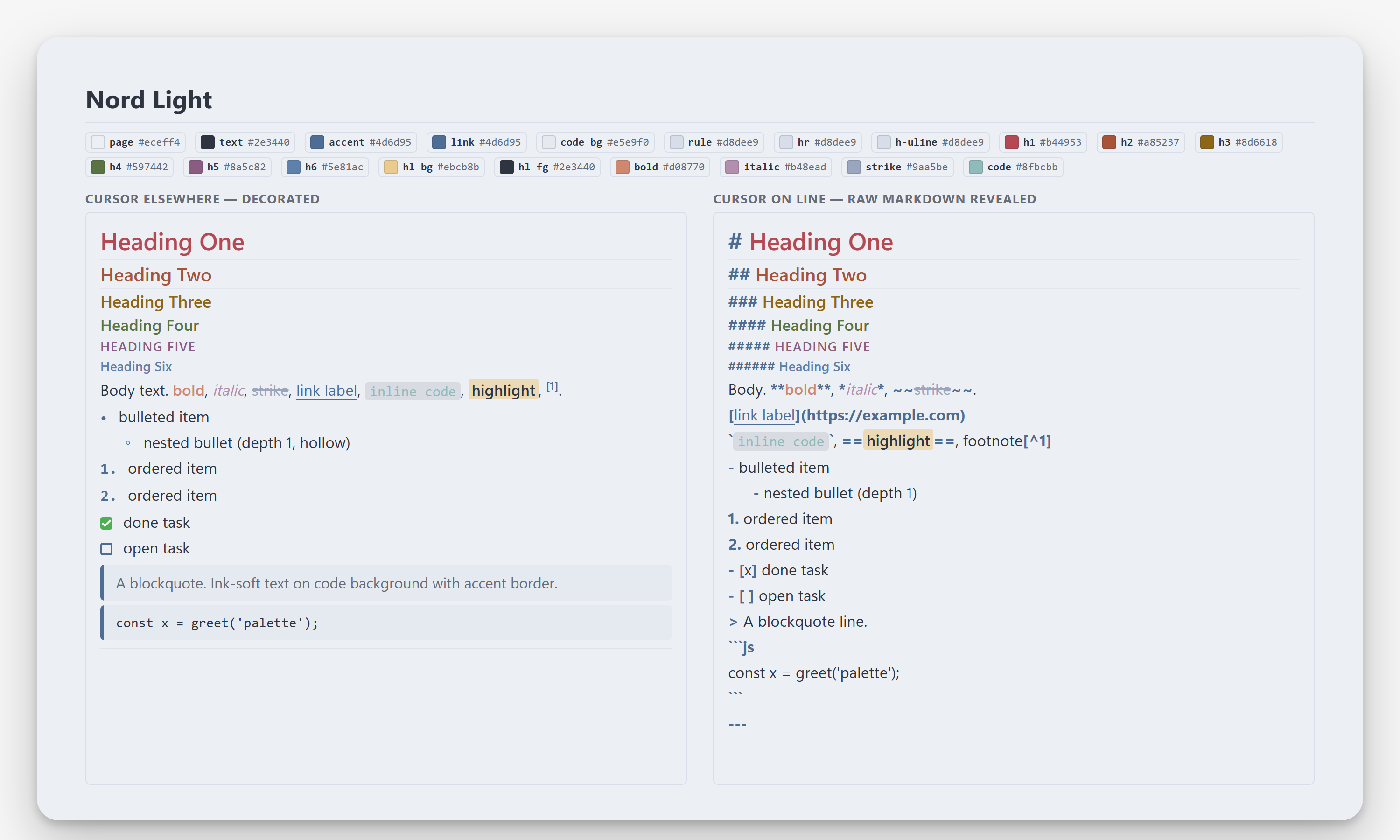
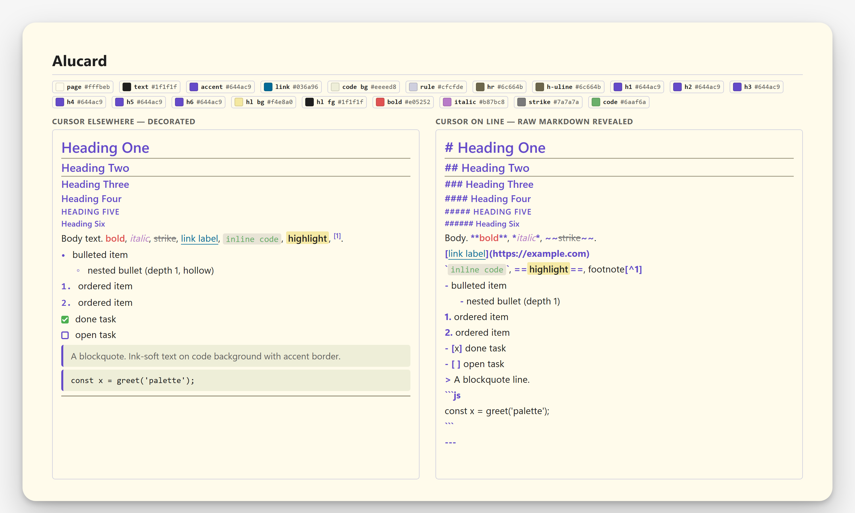
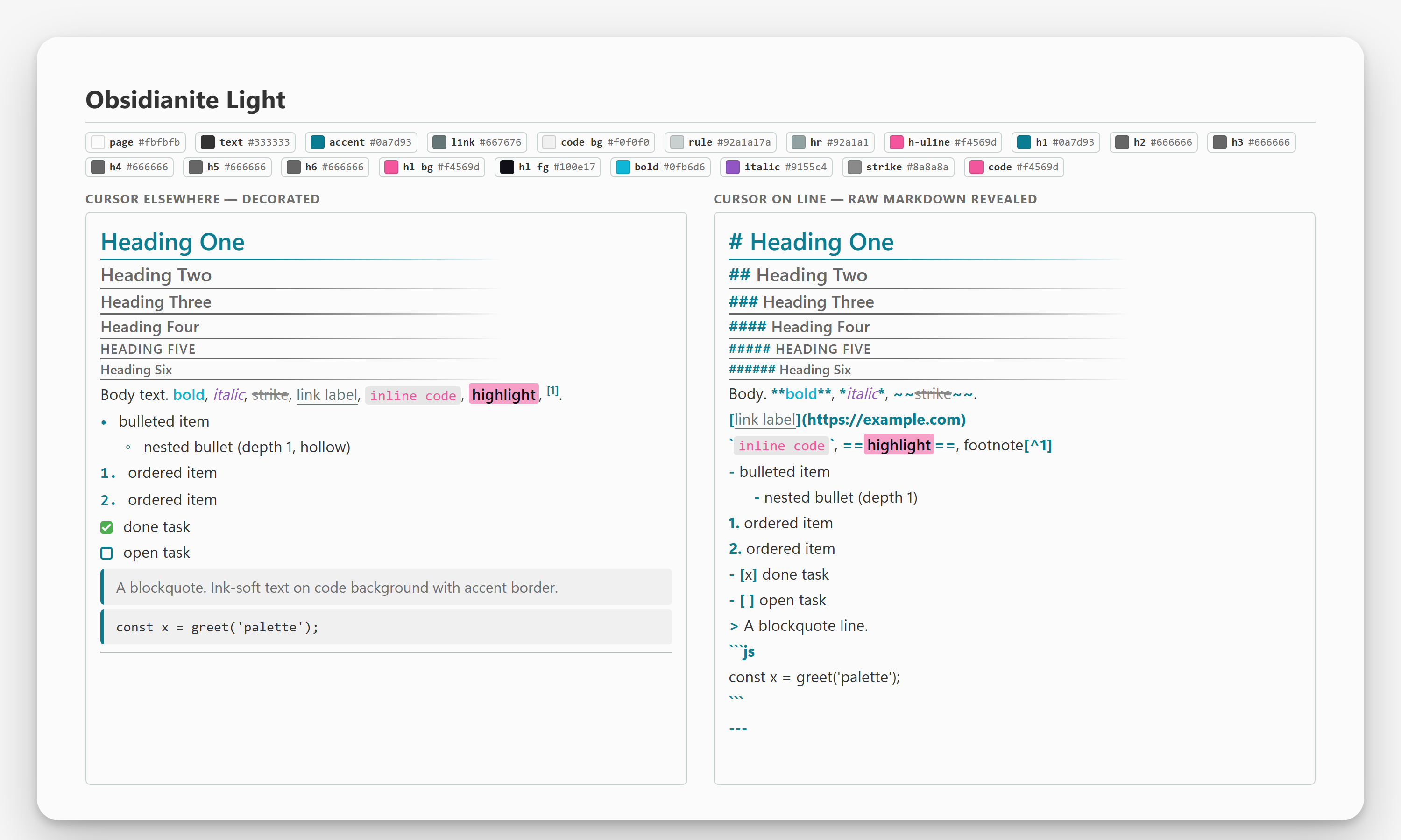
Each card shows two states of the live editor:
- **Cursor elsewhere** - markers hidden / replaced (the rendered look).
- **Cursor on line** - raw markdown source revealed.
Every marker token is coloured via the palette accent; bold / italic / strike / inline-code each get their own palette-derived colour.
## Dark palettes
Default Dark
 |
ProWorX
 |
GloWorX
 |
Dracula
 |
Solarized Dark
 |
Nord
 |
Gruvbox Dark
 |
One Dark
 |
Tokyo Night
 |
Ayu Dark
 |
Catppuccin Mocha
 |
GitHub Dark
 |
Obsidianite
 |
PLN Dark
 |
AnuPpuccin Frappé
 |
Everforest
 |
Rosé Pine
 |
Vesper
 |
Red Rascal
 |
|
## Light palettes
Default Light
 |
ProWorX Light
 |
PLN Light
 |
Solarized Light
 |
GitHub Light
 |
Ayu Light
 |
Gruvbox Light
 |
Catppuccin Latte
 |
One Light
 |
Tokyo Night Day
 |
Nord Light
 |
Alucard
 |
Obsidianite Light
 |
|
## Appearance settings
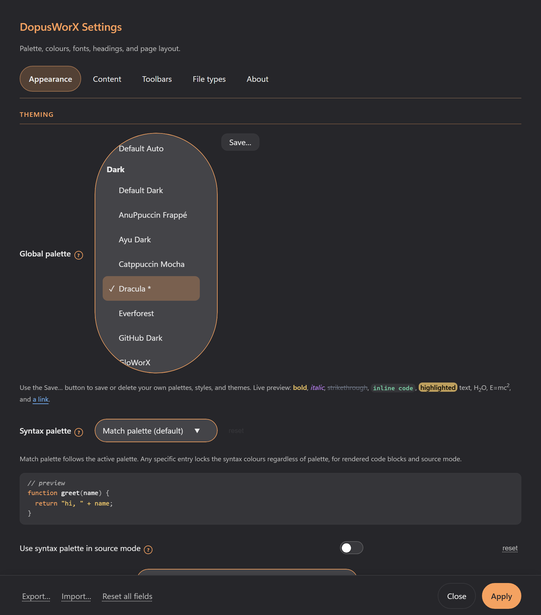
The palettes above set a whole look at once. You pick them from the **Global
palette** dropdown in Settings › Appearance, with dark and light palettes
grouped and Default Auto following the Opus pane. For finer control, the rest of
the Appearance tab overrides individual colours, fonts, headings, list spacing, rules
and page layout on top of the active palette; an empty field falls back to the palette
default. GloWorX is the exception: its neon look is pinned in the stylesheet, so its
colour fields appear greyed out when it is the active palette.
Every colour field carries an alpha slider between the text input and the reset link.
Drag it to set transparency on any colour: it reads the alpha from whatever notation
is already in the field (hex, rgba(), hsla(), or eight-digit #RRGGBBAA) and writes
it back in the same notation, so a live-preview fires on every drag exactly as if you
had typed. The slider hides when the field holds a CSS gradient, which has no single
alpha.
The background fields — Page background, Code block, Blockquote, Table header,
Table cell, and Highlight — also accept a CSS gradient typed directly into the field.
Any valid gradient value (linear-gradient(), radial-gradient(),
repeating-linear-gradient(), and so on) is applied as a background-image layer in
both Reading and Live view; the solid colour override is cleared so the palette's
colour-mix consumers (highlight opacity, table-header hover tints) keep a real colour
to work from.
A few related controls sit alongside the palette picker:
- **Syntax palette** colours fenced code blocks independently of the page.
Match palette (the default) derives code colours from the active palette;
picking a named entry locks the code colouring regardless of the page, and
inline `code` takes the same theme's background and text colour so it
matches the blocks. A separate toggle, **Use syntax palette in source
mode**, extends it to the Source editor. Choosing a named syntax palette
clears any **Code background** colour you have set, because the syntax
theme now owns the code-block background; equally, setting a Code background
colour resets the Syntax palette back to Match palette.
- **DOpus theme counts as** tells the viewer whether to treat your Directory
Opus theme as light or dark when the automatic guess gets it wrong.
- **Viewer background** colours the area behind the page card; leave it empty
to match your Opus pane automatically (identical in the pane and the standalone
window). It travels with your custom palettes and themes and is left alone by
the built-in presets.
- **Page layout** controls how the page card fills the viewer: **Fixed** keeps a
centred column (Page max width applies), **Expand** stretches the card to the
pane width, and **Fill** goes edge to edge with the background carried up behind
the toolbar. Separate left and right padding fields tune the margins.
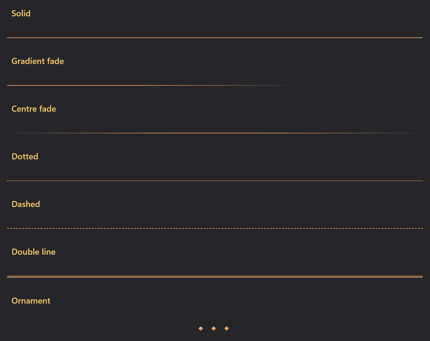
- **Rules and dividers**, further down the Appearance tab, sets the horizontal-rule
colour and thickness plus its **style** - solid, a gradient fade, a centre fade,
dotted, dashed, a double line, or three centred diamonds. (The banner height
moved to Settings › Images.)
- The **Themes** menu at the bottom of Settings saves your current tweaks as a
reusable palette, style or theme of your own, and **Import...** / **Export...**
move your whole settings file between machines.