# `rtsVis`
[](https://CRAN.R-project.org/package=rtsVis)
[](https://CRAN.R-project.org/package=rtsVis)
A lightweight `R` package to visualize large raster time series, building on a fast temporal interpolation core.
rtsVis is linked to the `moveVis` package and their joint use is recommended.
 ## Installation
The released version of rtsVis can be installed from CRAN:
```r
install.packages("rtsVis")
```
The latest version of the package can be installed from github.
```r
devtools::install_github("JohMast/rtsVis")
```
## Concepts
rtsVis operates on lists of objects:
- Lists of `raster` stacks
- Lists of frames (`ggplot` objects of rasters or charts)
To process those lists in a pipeline, we recommend pipes such as provided by `magrittr`.
- Positions of points or polygons, which can be added to the frames or be used to extract values from the time series and create animated charts.
## Functions
### Preparing rasters
* `ts_raster` Assemble/interpolate a raster time series.
* `ts_fill_na` Fill NA values in a raster time series
### Creating Frames
* `ts_flow_frames` Create a series of charts of a raster time series.
* `ts_makeframes` Create spatial ggplots of a raster time series.
* `ts_add_positions_to_frames` Add points, coordinates, or polygons to a list of spatial plots.
## Example
In this example, we use a MODIS time series ` (download here) `to create typical visualisations which highlight vegetation dynamics on the African continent.
### Part 1: Preparing the Data
We read our inputs:
* A list of **MODIS raster files** in tif format, which contain 4 bands (Red, NIR, Blue, Green). These are monthly composites of the MCD43A4.006 product.
* **points** in gpkg format, which can be visualized and for which statistics can be extracted. These correspond to various places in and around Africa.
Optional, but useful to enhance the visualizations:
* an **outline** of the continent Africa.
* a global **hillshade** raster which can be applied to the spatial plots.
Some functions in `rtsVis` require that timestamps for the rasters are set. Often, these come with the metadata or can be derived from the filename. They can also be manually set. In this example, we have monthly medians, and no true acquisition time. Therefore, we manually create a series of dates.
In addition to the input times, we also set output times - for these, output dates will be created. We simply create a second, denser series of dates. Having a denser series will smooth the animation.
If images from the input series are missing, it is not an issue, at least not from the technical side of things. Images for `out_times` will be interpolated regardless of the regularity of the input data. To illustrate this, we remove one of the input images.
``` r
library(raster)
library(sf)
library(rtsVis)
library(RStoolbox)
library(tidyverse)
# Load the inputs
modis_tifs <- list.files("Beispieldaten/MODIS/Africa_MODIS_2017-2020/",full.names = T,pattern=".tif$")
points <- st_read("Beispieldaten/Ancillary/Africa/Africa_places.gpkg")
outline <- st_read("Beispieldaten/Ancillary/Outline_continents_africa.gpkg")
hillshade <- raster("Beispieldaten/Ancillary/SR_LR/SR_LR.tif") %>% readAll()
#Create in-times and out-times
in_dates <- as.POSIXct(seq.Date(as.Date("2017-01-15"),
as.Date("2020-12-15"),
length.out = length(modis_filled)))
out_dates <-seq.POSIXt(from = in_dates[1],
to = in_dates[length(in_dates)],
length.out = length(in_dates)*4 )
# simulate a missing image
in_dates <- in_dates[-13]
modis_tifs <- modis_tifs[-13]
```
### Part 2: Preparing the Rasters
For the preparation of the rasters, we use three functions:
* `stack` A `raster` function which we use with `lapply` to load the tifs into a list.
* `ts_fill_na` We fill, wherever possible, missing values using simple temporal interpolation. This is not strictly necessary, but improves the visualization.
* `ts_raster` We assemble a full time series. This will interpolate additional missing frames for every desired output date and can take a long time for large time-series.
Often, data requires additional preprocessing steps, such as reprojection, cropping, or masking.
These can be applied with `lapply` to retain the list format.
`ts_raster` returns a list of interpolated rasters, one for each desired output date, with timestamps attached.
``` r
#Read the images as stacks
modis_tifs_stacks <- modis_tifs %>% lapply(stack)
#fill NAs
modis_filled <- ts_fill_na(modis_tifs_stacks)
modis_ts <- ts_raster(
r_list = modis_filled,
r_times = in_dates,
out_times = out_dates,
fade_raster = T)
```
### Part 3: Creating Basic RGB animations
In this step, `ts_makeframes` is used to create a list of frames (`ggplot` objects) from the time series (`raster` objects).
We also add a outline to the plot area. This is one example of adding a *position* to a time series.
Using pipes is not necessary, but improves readability greatly.
``` r
#create the frames from the raster
modis_frames_RGB <-
ts_makeframes(x_list = modis_ts,
l_indices = c(1,4,3), # MODIS bands are Red, NIR, Blue, Green
minq = 0.0) # adjust the stretch slightly
# Add the outline of the continent for visual clarity
modis_frames_RGB_ol <-
modis_frames_RGB %>%
ts_add_positions_to_frames(
positions = outline,
psize = 1)
# Use moveVis utility to animate the frames into a gif
moveVis::animate_frames(modis_frames_RGB_ol,
overwrite = TRUE,
out_file = "modis_frames_RGB_ol.gif",
height=300,
width=300,
fps = 10,
res=75)
```
## Installation
The released version of rtsVis can be installed from CRAN:
```r
install.packages("rtsVis")
```
The latest version of the package can be installed from github.
```r
devtools::install_github("JohMast/rtsVis")
```
## Concepts
rtsVis operates on lists of objects:
- Lists of `raster` stacks
- Lists of frames (`ggplot` objects of rasters or charts)
To process those lists in a pipeline, we recommend pipes such as provided by `magrittr`.
- Positions of points or polygons, which can be added to the frames or be used to extract values from the time series and create animated charts.
## Functions
### Preparing rasters
* `ts_raster` Assemble/interpolate a raster time series.
* `ts_fill_na` Fill NA values in a raster time series
### Creating Frames
* `ts_flow_frames` Create a series of charts of a raster time series.
* `ts_makeframes` Create spatial ggplots of a raster time series.
* `ts_add_positions_to_frames` Add points, coordinates, or polygons to a list of spatial plots.
## Example
In this example, we use a MODIS time series ` (download here) `to create typical visualisations which highlight vegetation dynamics on the African continent.
### Part 1: Preparing the Data
We read our inputs:
* A list of **MODIS raster files** in tif format, which contain 4 bands (Red, NIR, Blue, Green). These are monthly composites of the MCD43A4.006 product.
* **points** in gpkg format, which can be visualized and for which statistics can be extracted. These correspond to various places in and around Africa.
Optional, but useful to enhance the visualizations:
* an **outline** of the continent Africa.
* a global **hillshade** raster which can be applied to the spatial plots.
Some functions in `rtsVis` require that timestamps for the rasters are set. Often, these come with the metadata or can be derived from the filename. They can also be manually set. In this example, we have monthly medians, and no true acquisition time. Therefore, we manually create a series of dates.
In addition to the input times, we also set output times - for these, output dates will be created. We simply create a second, denser series of dates. Having a denser series will smooth the animation.
If images from the input series are missing, it is not an issue, at least not from the technical side of things. Images for `out_times` will be interpolated regardless of the regularity of the input data. To illustrate this, we remove one of the input images.
``` r
library(raster)
library(sf)
library(rtsVis)
library(RStoolbox)
library(tidyverse)
# Load the inputs
modis_tifs <- list.files("Beispieldaten/MODIS/Africa_MODIS_2017-2020/",full.names = T,pattern=".tif$")
points <- st_read("Beispieldaten/Ancillary/Africa/Africa_places.gpkg")
outline <- st_read("Beispieldaten/Ancillary/Outline_continents_africa.gpkg")
hillshade <- raster("Beispieldaten/Ancillary/SR_LR/SR_LR.tif") %>% readAll()
#Create in-times and out-times
in_dates <- as.POSIXct(seq.Date(as.Date("2017-01-15"),
as.Date("2020-12-15"),
length.out = length(modis_filled)))
out_dates <-seq.POSIXt(from = in_dates[1],
to = in_dates[length(in_dates)],
length.out = length(in_dates)*4 )
# simulate a missing image
in_dates <- in_dates[-13]
modis_tifs <- modis_tifs[-13]
```
### Part 2: Preparing the Rasters
For the preparation of the rasters, we use three functions:
* `stack` A `raster` function which we use with `lapply` to load the tifs into a list.
* `ts_fill_na` We fill, wherever possible, missing values using simple temporal interpolation. This is not strictly necessary, but improves the visualization.
* `ts_raster` We assemble a full time series. This will interpolate additional missing frames for every desired output date and can take a long time for large time-series.
Often, data requires additional preprocessing steps, such as reprojection, cropping, or masking.
These can be applied with `lapply` to retain the list format.
`ts_raster` returns a list of interpolated rasters, one for each desired output date, with timestamps attached.
``` r
#Read the images as stacks
modis_tifs_stacks <- modis_tifs %>% lapply(stack)
#fill NAs
modis_filled <- ts_fill_na(modis_tifs_stacks)
modis_ts <- ts_raster(
r_list = modis_filled,
r_times = in_dates,
out_times = out_dates,
fade_raster = T)
```
### Part 3: Creating Basic RGB animations
In this step, `ts_makeframes` is used to create a list of frames (`ggplot` objects) from the time series (`raster` objects).
We also add a outline to the plot area. This is one example of adding a *position* to a time series.
Using pipes is not necessary, but improves readability greatly.
``` r
#create the frames from the raster
modis_frames_RGB <-
ts_makeframes(x_list = modis_ts,
l_indices = c(1,4,3), # MODIS bands are Red, NIR, Blue, Green
minq = 0.0) # adjust the stretch slightly
# Add the outline of the continent for visual clarity
modis_frames_RGB_ol <-
modis_frames_RGB %>%
ts_add_positions_to_frames(
positions = outline,
psize = 1)
# Use moveVis utility to animate the frames into a gif
moveVis::animate_frames(modis_frames_RGB_ol,
overwrite = TRUE,
out_file = "modis_frames_RGB_ol.gif",
height=300,
width=300,
fps = 10,
res=75)
```

### Part 4: Customizing frames
The animation created suggests notable vegetation dynamics. An easy way to highlight this is the NDVI.
We calculate the NDVI using the `overlay` function provided by the `raster` package, and reattach the timestamps using `ts_copy_frametimes`. Thereby we receive a second time series with a single layer per timestep. Thus, we do not create RGB frames, but gradient frames.
Note that the individual frames are simply `ggplot` objects. Hence, `moveVis` functions and `ggplot` functions can be easily applied to the created frames using `lapply`.
``` r
#calculate the NDVI per image
modis_ndvi <- modis_ts %>% lapply(function(x){
ndvi <- overlay(x[[2]], x[[1]], fun=function(nir,red){(nir-red)/(nir+red)})
}) %>% rtsVis::ts_copy_frametimes(modis_ts)
# Create the frames from the NDVI raster
modis_ndvi_fr <-
ts_makeframes(x_list = modis_ndvi,
hillshade = hillshade,
r_type = "gradient")
# The frames can be adjusted like any ggplot
modis_ndvi_fr_styled <- modis_ndvi_fr %>% lapply(FUN=function(x){
x+scale_fill_gradient2("NDVI",
low = "red",
mid="yellow",
high = "green4",
midpoint=0.3,
limits=c(-0,1),
na.value = NA)+
theme_bw() +
xlab("Longitude")+
ylab("Latitude")+
ggtitle("Seasonality of NDVI in Africa",
"Derived from MCD43A4 -- Monthly Composite 2015-2020 -- Projection: WGS 84 (EPSG 4326)")
}) %>%
# packages like moveVis provide additional mapping functions
moveVis::add_northarrow(colour = "black", position = "bottomleft") %>%
moveVis::add_progress()
```
### Part 5: Utilizing positions
`rtsVis` uses vector objects (positions) in two different ways:
* To **enhance** spatial frames, by adding noteworthy positions, such as test sites.
* To **create** flow frames, which are animated plots which visualize the data that is extracted under the positions.
Sometimes, adding a position is for visual appeal only, as we do here by adding an outline to the continents.
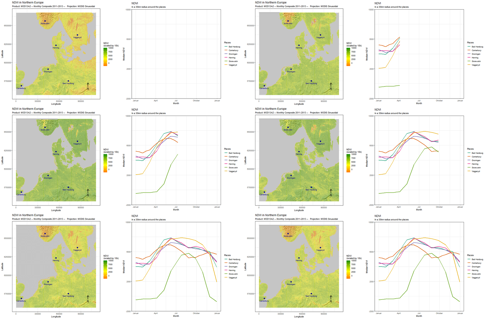
But often, it makes sense to use the two together. In this example, we use (`ts_add_positions_to_frames`) to add several locations as points to our spatial frames. Subsequently, we extract values in a buffer around these locations and create a line chart that visualizes the development of these values over time.
``` r
#reduce the number of points slightly
modis_ndvi_fr_styled_pos <-
modis_ndvi_fr_styled %>%
ts_add_positions_to_frames(outline,pcol = "white",psize = 1) %>%
ts_add_positions_to_frames(positions = points,
position_names = points$Name,
tcol = "blue4",
t_hjust = -1.5,
tsize = 4,
psize=3,
pcol="blue4",
add_text = T,col_by_pos = T)
# rtsVis comes with a variety of plotting functions. We select line2
# which maps color to position
modis_ndvi_lineframes <-
modis_ndvi %>%
ts_flow_frames(positions = points,
position_names = points$Name,
pbuffer = 0.1,
val_min = -0,
val_max = 1,
legend_position = "right",
plot_function = "line2",
aes_by_pos = TRUE,
position_legend = TRUE) %>%
# Flow frames too can be adjusted like any ggplot,
# for instance, to set a specific color scale
lapply(FUN = function(x){
x+
ggtitle("NDVI", "In a 1° radius around the places")+
ylab("Median NDVI")+
xlab("Year")+
theme(aspect.ratio = 0.3)+
scale_color_brewer("Places",palette = "Set1")
})
```
Since the positions and the flow frames are thematically connected, it makes sense to combine the two in a single animation.
For this, we again use `moveVis` functionalities.
Before we do that, we make sure that the colors of the points match those in the graph. Again, existing frames can be easily modified using `lapply` and ggplot2 syntax.
``` r
# apply the same color palette to the spatial frames
modis_ndvi_fr_styled_pos <- modis_ndvi_fr_styled_pos %>% lapply(function(x){
x+
scale_color_brewer("Places",palette = "Set1")
})
#Join and animate the frames using moveVis functionalities
modis_ndvi_joined <- moveVis::join_frames(
list(modis_ndvi_fr_styled,
modis_ndvi_lineframes)
)
moveVis::animate_frames(modis_ndvi_joined,
overwrite = TRUE,
out_file = "modis_frames_NDVI.gif",
height=525,
width=1200,
fps = 10,
res=75)
```
#### Further plot types
`rtsVis`provides a number of preset plot types for visualising multispectral, gradient, or discrete rasters:
* Line plots(`line` and `line2`)
* Violin charts (`vio`)
* Density charts (`dens` and `dens2`)
* Pie charts (`pie`)
* Bar charts (`bar_stack` and `bar_fill`)
They are all used in the same way, by passing the respective argument to `ts_flow_frames`:
``` r
# Violin frames visualising the distributions of the different bands at different positions
modis_ts_vioframes <-
modis_ts %>%
ts_flow_frames(positions = points[1:3,],
position_names = points[1:3,]$Name,
pbuffer = 3,
legend_position = "right",
plot_function = "vio",aes_by_pos = F,
position_legend = TRUE,band_colors = c("Red","Purple","Blue","Darkgreen"))
# Density frames visualizing the distributions of the NDVI across positions
modis_ts_densframes <-
modis_ndvi %>%
ts_flow_frames(positions = points[5:7,],
position_names = points[5:7,]$Name,
pbuffer = 3,
plot_function = "dens2",
band_legend_title = "NDVI",
band_names = "NDVI",band_colors = c("olivegreen"))
# plenty other types and custom plot functions...
```
It is also possible to create custom plot functions and pass them to `ts_flow_frames`, like this:
``` r
custom_plot_function <- function(edf,pl,lp, bl, blt,plt, ps, vs,abp){
# ... Code for the creation of the ggplot
# return (plot)
}
modis_ts_vioframes <-
modis_ts %>%
ts_flow_frames(positions = points,
position_names = points$Name,
pbuffer = 3,
plot_function = custom_plot_function)
```

## Demo
For more examples, and a guide on how to create custom plot functions, check out the [Demo](https://github.com/JohMast/rtsVis_demo) repository.
In development, published on CRAN. Last updated: `2021-05-18 17:30:00 CEST`
## Links
To learn more about creating **custom plot types**, access the guide and test material at the associated github [repo](https://github.com/JohMast/rtsVis_demo/).
For creating visualization with movement data, visit [moveVis](http://movevis.org/).
For inspiration, visit the [r-graph-gallery](https://www.r-graph-gallery.com/)!
To learn about data visualization see Claus Wilke's excellent [book](https://clauswilke.com/dataviz/).