---
title: "Lab 7. Simple linear regression. Multivariate linear regression. Dummy variables"
output:
html_document: default
pdf_document: default
---
```{r setup, include=FALSE}
knitr::opts_chunk$set(echo = TRUE, message = FALSE)
```
```{r}
#install.packages("GGally")
library(tidyverse)
library(GGally) # a useful extension for ggplot2
library(readr)
```
## Problem set A
#### Data description
Two hundred observations were randomly sampled from the High School and Beyond survey, a survey conducted on high school seniors by the National Center of Education Statistics. Source: UCLA Academic Technology Services.
Variables
`id`: Student ID.
`gender`: Student’s gender, with levels female and male.
`race`: Student’s race, with levels african american, asian, hispanic, and white.
`ses`: Socio economic status of student’s family, with levels low, middle, and high.
`schtyp`: Type of school, with levels public and private.
`prog`: Type of program, with levels general, academic, and vocational.
`read`: Standardized reading score.
`write`: Standardized writing score.
`math`: Standardized math score.
`science`: Standardized science score.
`socst`: Standardized social studies score.
Let’s load data first:
```{r}
educ <- read.csv("https://raw.githubusercontent.com/LingData2019/LingData2020/master/data/education.csv")
```
Now let us choose variables that correspond to abilities (`read` and `write`) and scores for subjects (`math`, `science`, `socst`).
```{r}
scores <- educ %>% select(read, write, math, science, socst)
```
Let’s create a basic scatterplot matrix, a graph that includes several scatterplots, one for each pair of variables.
```{r}
pairs(scores)
# you can add asp=1 as an argument to make the ratio of y to x equal 1:1
```
**Question**: Judging by this graph, can you say which scores have the strongest association? Try to guess the values of correlation coefficient for each pair of variables.
Now let’s create a more beautiful plot using `GGally` package and check whether your guesses were true:
```{r}
ggpairs(scores) # dataset inside
# try also with the argument upper=list(continuous = "density")
```
Let’s choose a pair of variables and proceed to formal testing. We will check whether students’ score for Math and Science are associated.
First, create a simple scatterplot for these variables:
```{r}
ggplot(data = scores, aes(x = math, y = science)) +
geom_point() +
labs(x = "Math score",
y = "Science score",
title = "Students' scores")
```
Again, as we saw, these variables seem to be positively associated.
*Substantial hypothesis*:
Math score and Science score should be associated. Explanation: most fields of Science require some mathematical knowledge, so it is logical to expect that people with higher Math score succeed in Sciences and vice versa.
*Statistical hypotheses*:
*H0*: there is no linear association between Math score and Science score, the true correlation coefficient R is 0.
*H1*: there is linear association between Math score and Science score, the true correlation coefficient R is not 0.
```{r}
cor.test(scores$math, scores$science)
```
P-value here is approximately 0, so at the 5% significance level we reject *H0* about the absence of linear association. Thus, we can conclude that Math score and Sciences score are associated. The Pearson’s correlation coefficient here is 0.63, so we can say that the direction of this association is positive (the more is the Math score, the more the Science score is) and its strength is moderate.
### Simple linear regression
Now suppose we are interested in the following thing: how does Science score change (on average) if Math score increases by one point? To answer this question we have to build a linear regression model. In our case it will look like this:
$Science = \beta_0 + \beta_1 × Math + \epsilon$
```{r}
fit1 <- lm(data = scores, science ~ math)
summary(fit1)
```
How to interpret such an output?
Intercept is our $\beta_0$ and math is our $\beta_1$, the coefficient before the independent variable Math score. So, we can write a regression equation (try it).
```{r}
p <- ggplot(data = scores, aes(x = math, y = science)) +
geom_point() +
labs(x = "Math score",
y = "Science score",
title = "Students' scores") +
geom_smooth(method=lm)
p
```
2. The coefficient $\beta_1$ shows how Science scores changes on average when Math scores increases by one unit. Now test its significance.
*H0*: the true correlation coefficient equals to 0 (Math score does not affect Science score).
*H1*: the true correlation coefficient is not 0.
Should we reject our null hypothesis at the 5% significance level? Make conclusions.
3. Multiple R-squared is $R^2$, a coefficient of determination that shows what share of the reality our model explains. A more formal way to interpret it: it shows a share of variance of a dependent variable that is explained by an independent one.
Let's look at **predicted variables** and **residual**.
First, we will obtain them from the model and add to our data set `score`.
```{r}
scores$fit1.predict <- fit1$fitted.values # Save the predicted values
scores$fit1.residuals <- fit1$residuals # Save the residual values
scores %>% select (science, fit1.predict, fit1.residuals) %>%
head()
```
```{r}
ggplot(data = scores, aes(x = math, y = science)) +
geom_point() +
labs(x = "Math score",
y = "Science score",
title = "Students' scores") +
geom_point(aes(y = fit1.predict), shape = 1, color ="red") + # Add the predicted values
geom_segment(aes(xend = math, yend = fit1.predict)) +
theme_bw()
```
Or, use data directly from the model:
```{r}
ggplot(data = fit1, aes(x = fit1$fitted.values,
y = fit1$residuals)) +
geom_point() +
geom_line(aes(y = 0)) +
labs(title = "Science ~ Math",
x = "fitted values",
y = "residuals") +
theme_bw()
```
* Predict
Now we can predict `science` for a new dataset.
```{r}
predict(fit1, newdata = data.frame(math = c(44,55,66)))
```
A **prediction interval** reflects the uncertainty around a single value, while a **confidence interval** reflects the uncertainty around the mean prediction values.
* Confidence interval
```{r}
new.math <- data.frame(
math = c(44,55,66)
)
predict(fit1, newdata = new.math, interval = "confidence")
```
By default, the 95% confidence intervals around the mean the predictions are provided.
* Prediction interval plot
```{r}
predict(fit1, newdata = new.math, interval = "prediction")
```
According to the model fit1, 95% students with the math score of 44 have the science scores between 30.8 and 61.3. A prediction interval is generally much wider than a confidence interval for the same value.
### Multivariate linear regression
You can include more variables as predictors for `science`, such as
$Science = \beta_0 + \beta_1 × Math + \beta_2 × Read + \epsilon$
```{r}
fit2 <- lm(data = scores, science ~ math + read)
summary(fit2)
#fit3 <- lm(data = scores, science ~ math + socst + read + write)
# or just fit3 <- lm(data = scores, science ~ .)
```
Write down the coefficients of your model ($\beta_0, \beta_1, ...$:
```{r}
fit2$coefficients
```
* Which of the predictor variables are significant?
From the summary() we can see that both Math and Read are significant predictors for Science at 5% significance level (p-value of Math is 9.90e-08, p-value of Read is 1.12e-07).
* Is this model fit?
Multiple R2 closer to 1 indicates that the model explains the large part of the variance of `Science` and hence is a good fit. In this case, the value is 0.4782 and hence the model is a moderate fit.
Plot fit2:
* Residuals VS Fitted plot
```{r}
plot(fit2, which=1)
```
Residuals are expected to be random in nature and there should not be any pattern in the graph. The average of the residual plot should be close to zero. From the above plot, we can see that the red trend line is almost at zero.
* Q-Q Plot
```{r}
qqnorm(resid(fit2)) # or fit2$residuals
qqline(resid(fit2))
# or plot(fit2, which=2)
```
Q-Q plot shows whether the residuals are normally distributed. Ideally, the points should be on the qqline. In the above plot, we see that most of the points are on the line except some points at towards the end.
## Problem set B
Today we will use data from the linguistic database. The most popular linguistic databases are the linguistic typology database WALS (Word Atlas of Language Structures) and LAPSyD (Lyon-Albuquerque Phonological Systems Database).
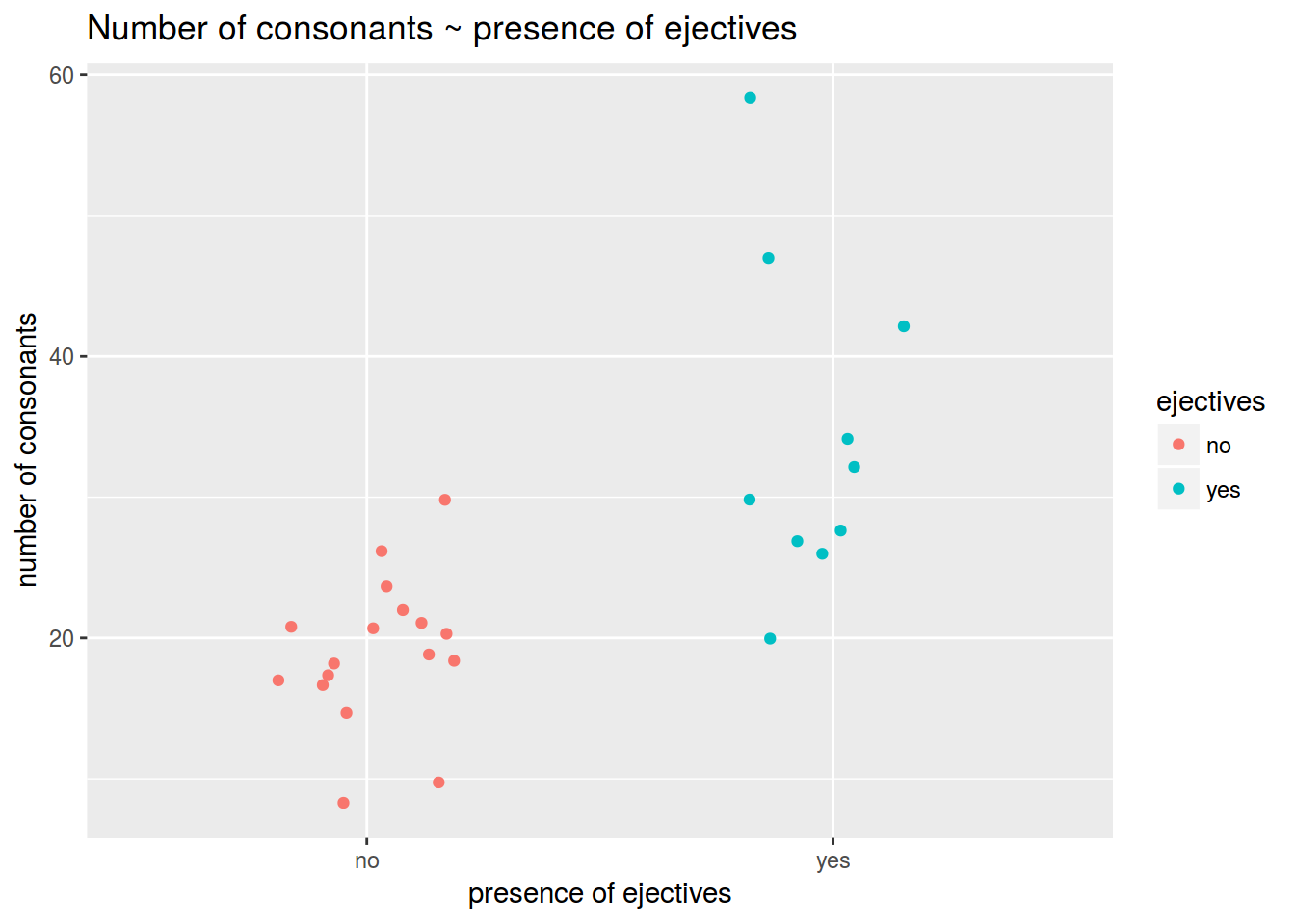
Let us know whether the languages with [ejective](https://en.wikipedia.org/wiki/Ejective_consonant) sounds (ru: `abruptiv`) have in average more consonants than others. These are data from the LAPSyD databasem: [http://goo.gl/0btfKa](http://goo.gl/0btfKa).
### 1.1
Visualise data like this:
 ### 1.2
Calculate the mean number of consonants in languages without ejectives.
```{r}
```
### 1.3
Calculate the mean number of consonants in languages with ejectives.
```{r}
```
### 1.4
Is the mean difference between groups is statistically significant?
```{r}
# Your answer:
# Provide the code for statistical testing below:
```
## Regression with dummy variables (categorial predictors)
A **dummy variable** is a numerical variable used in regression analysis to represent subgroups in the dataset. In the simplest case (two groups), we would use a `0, 1` dummy variable: an obsevation is given a value of `0` if it is in the reference group and `1` if it is in another group.
$y_i = \beta_0 + \beta × Z_i + \epsilon_i$
where:
$y_i$ is outcome score of $i^{th}$ unit,
$\beta_0$ is coefficient for the intercept,
$\beta_1$ is coefficient for the slope,
$Z_i$ is:
`0` if the $i^{th}$ unit is in the reference group;
`1` if the $i^{th}$ unit is in another group;
$\epsilon_i$ is residual for the $i^{th}$ unit.
Dummy variables are useful because they allow one to use a single regression equation to represent multiple groups. The dummy variables act like `switches' that turn various parameters on and off in an equation.
### 1.5
Make a linear regression that predicts the number of consonants by the presence/absense of ejectives. Write down the formula for the regression line.
```{r}
```
Did you get the point? What is the difference between means values and coefficients of the regression in simple model with only one dummy-predictor?
## Problem set C
This set is based on (Coretta 2017, https://goo.gl/NrfgJm). This dissertation deals with the relation between vowel duration and aspiration in consonants. Author carried out a data collection with 5 natives speakers of Icelandic. Then he extracted the duration of vowels followed by aspirated versus non-aspirated consonants. Check out whether the vowels before consonants of different places of articulation are significantly different.
Use the [link](https://raw.githubusercontent.com/LingData2019/LingData2020/master/data/icelandic.csv) to download the data.
### 2.1
Create the plot like this.
### 1.2
Calculate the mean number of consonants in languages without ejectives.
```{r}
```
### 1.3
Calculate the mean number of consonants in languages with ejectives.
```{r}
```
### 1.4
Is the mean difference between groups is statistically significant?
```{r}
# Your answer:
# Provide the code for statistical testing below:
```
## Regression with dummy variables (categorial predictors)
A **dummy variable** is a numerical variable used in regression analysis to represent subgroups in the dataset. In the simplest case (two groups), we would use a `0, 1` dummy variable: an obsevation is given a value of `0` if it is in the reference group and `1` if it is in another group.
$y_i = \beta_0 + \beta × Z_i + \epsilon_i$
where:
$y_i$ is outcome score of $i^{th}$ unit,
$\beta_0$ is coefficient for the intercept,
$\beta_1$ is coefficient for the slope,
$Z_i$ is:
`0` if the $i^{th}$ unit is in the reference group;
`1` if the $i^{th}$ unit is in another group;
$\epsilon_i$ is residual for the $i^{th}$ unit.
Dummy variables are useful because they allow one to use a single regression equation to represent multiple groups. The dummy variables act like `switches' that turn various parameters on and off in an equation.
### 1.5
Make a linear regression that predicts the number of consonants by the presence/absense of ejectives. Write down the formula for the regression line.
```{r}
```
Did you get the point? What is the difference between means values and coefficients of the regression in simple model with only one dummy-predictor?
## Problem set C
This set is based on (Coretta 2017, https://goo.gl/NrfgJm). This dissertation deals with the relation between vowel duration and aspiration in consonants. Author carried out a data collection with 5 natives speakers of Icelandic. Then he extracted the duration of vowels followed by aspirated versus non-aspirated consonants. Check out whether the vowels before consonants of different places of articulation are significantly different.
Use the [link](https://raw.githubusercontent.com/LingData2019/LingData2020/master/data/icelandic.csv) to download the data.
### 2.1
Create the plot like this.
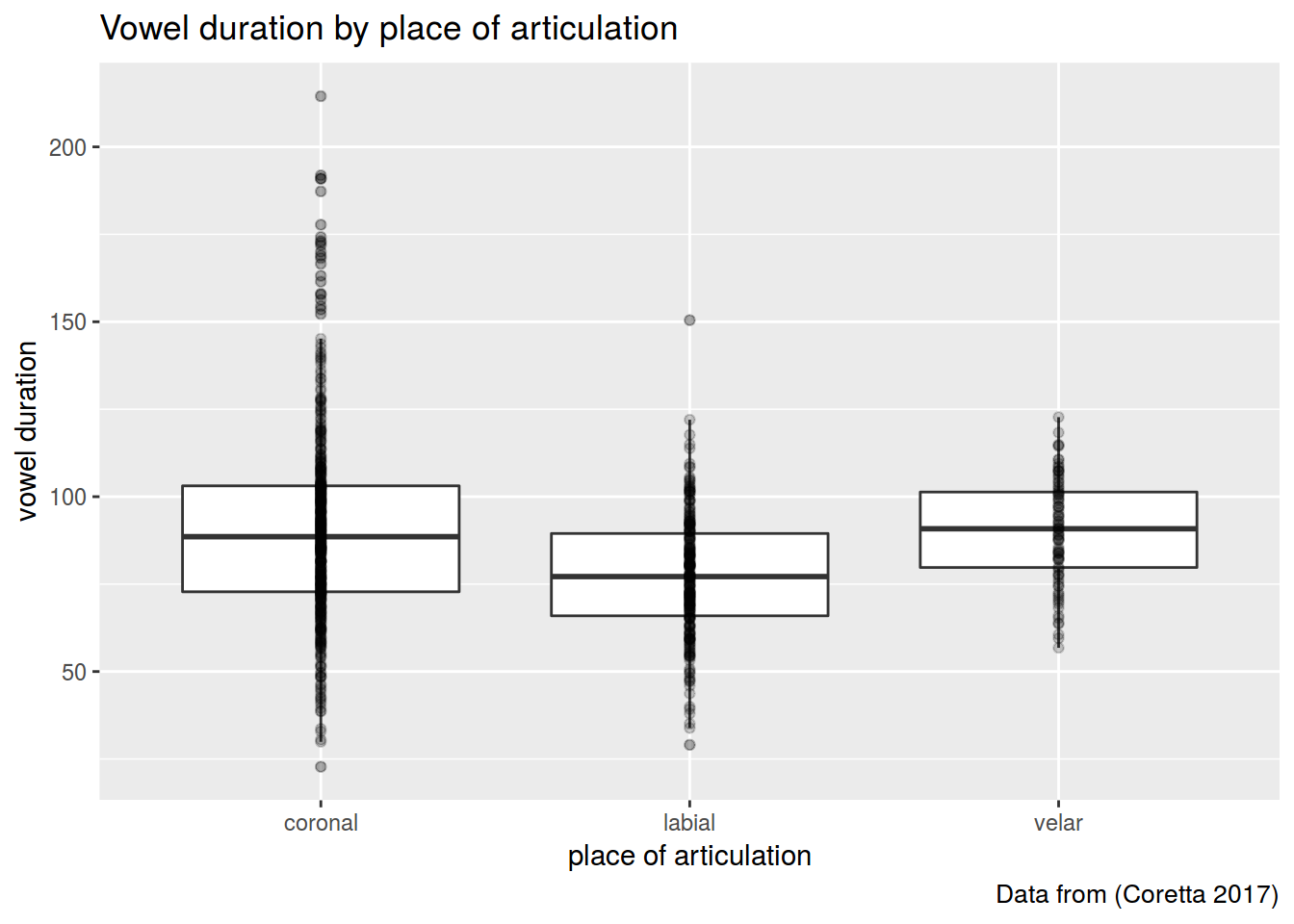 I used alpha and outlier.alpha arguments equal to 0.2.
```{r}
```
### 2.2
Fit a regression model and provide F statistics and p-value for place argument.
```{r}
# Write down the formula:
# F statistics:
# p-value for place:
```
### 2.3
List the model coefficients.
```{r}
#
```
### 2.4
Calculate mean values for vowel duration in each place of articulation group.
```{r}
#
```
Did you get the point? What are the model coefficients?
# Problem set D
The data which we use in this part is a hypothetical study on child language acquisition. We want to investigate the effects of amount of time spend in front of TV to two-year-old children's language development. The response variable in this data set, cdi, is a standard measure of children's language abilities based on parental reports. The predictor we are mainly interested in is tv.hours, which is the weekly hours of TV time for each child. The data is randomly generated.
The data can be found as an R data file at http://coltekin.net/cagri/R/data/tv.rda.
```{r, eval=FALSE}
load("tv.rda") # you have probably to add a path to your file
head(tv)
summary(tv)
```
### 3.1
Fit a simple regression model where tv.hours is the only predictor of the cdi score. What is the adjusted R?
```{r}
# Provide your code below:
# R^2
```
### 3.2
Fit a simple regression model where mot.education is the only predictor of the cdi score. What is the adjusted R??
```{r}
# Provide your code below:
# R^2
```
### 3.3
Fit a multiple regression model predicting `cdi` from `tv.hours` and `mot.education`. What is the adjusted R?
```{r}
# Provide your code below:
# R^2
```
### 3.4
Fit a multiple regression model predicting cdi from all predictors in a dataset. What is the adjusted R?
```{r}
# Provide your code below:
# R^2
```
### 3.5
Create a facet scatterplot in order to visualize the association of `cdi` and `tv.hours` by `book.reading` groups.
```{r, eval=FALSE}
tv1 <- tv %>% mutate(book.reading=factor(book.reading))
model3 <- lm(data=tv1, cdi ~ tv.hours + book.reading)
summary(model3)
tv %>%
ggplot(aes(tv.hours, cdi))+
geom_smooth(method="lm")+
geom_point()+
facet_wrap(~tv$book.reading)
```
#### Tips
* ggpairs and ggcorr (correlograms) https://www.r-graph-gallery.com/199-correlation-matrix-with-ggally.html
* You can use `augment()` from the library(broom) to represent data from your model, standardised residuals, etc. as data frame.
```{r}
library(broom)
fit4 <- lm(data = scores, science ~ math) %>%
augment()
summary(fit4)
```
* Tips on the model plots
```{r}
#plot(fit2)
```
which=2. [Q-Q plot](https://data.library.virginia.edu/understanding-q-q-plots/) [documentaion](https://www.rdocumentation.org/packages/stats/versions/3.6.2/topics/plot.lm)
-- allows one to assess if a set of data plausibly came from some theoretical distribution, such as a normal one.
which=3. Scale-Location (Spread-Location)
-- allows one to check the assumption of equal variance (homoscedasticity). The ideal plot is a horizontal line with equally (randomly) spread points.
which=4. Residuals vs Leverage
-- allows one to reveal influential observations, if any. When cases are outside of the Cook’s distance (dashed line), the cases are influential to the regression results. The regression results will be altered if we exclude those cases.
* Predition intervals on the scatter plot
```{r}
band.lower <- suppressWarnings(predict(fit1, type = "response", interval = "prediction"))[,2]
band.upper <- suppressWarnings(predict(fit1, type = "response", interval = "prediction"))[,3]
p +
geom_line(aes(y = band.lower), color = "red", linetype = "dashed") +
geom_line(aes(y = band.upper), color = "red", linetype = "dashed")
```
I used alpha and outlier.alpha arguments equal to 0.2.
```{r}
```
### 2.2
Fit a regression model and provide F statistics and p-value for place argument.
```{r}
# Write down the formula:
# F statistics:
# p-value for place:
```
### 2.3
List the model coefficients.
```{r}
#
```
### 2.4
Calculate mean values for vowel duration in each place of articulation group.
```{r}
#
```
Did you get the point? What are the model coefficients?
# Problem set D
The data which we use in this part is a hypothetical study on child language acquisition. We want to investigate the effects of amount of time spend in front of TV to two-year-old children's language development. The response variable in this data set, cdi, is a standard measure of children's language abilities based on parental reports. The predictor we are mainly interested in is tv.hours, which is the weekly hours of TV time for each child. The data is randomly generated.
The data can be found as an R data file at http://coltekin.net/cagri/R/data/tv.rda.
```{r, eval=FALSE}
load("tv.rda") # you have probably to add a path to your file
head(tv)
summary(tv)
```
### 3.1
Fit a simple regression model where tv.hours is the only predictor of the cdi score. What is the adjusted R?
```{r}
# Provide your code below:
# R^2
```
### 3.2
Fit a simple regression model where mot.education is the only predictor of the cdi score. What is the adjusted R??
```{r}
# Provide your code below:
# R^2
```
### 3.3
Fit a multiple regression model predicting `cdi` from `tv.hours` and `mot.education`. What is the adjusted R?
```{r}
# Provide your code below:
# R^2
```
### 3.4
Fit a multiple regression model predicting cdi from all predictors in a dataset. What is the adjusted R?
```{r}
# Provide your code below:
# R^2
```
### 3.5
Create a facet scatterplot in order to visualize the association of `cdi` and `tv.hours` by `book.reading` groups.
```{r, eval=FALSE}
tv1 <- tv %>% mutate(book.reading=factor(book.reading))
model3 <- lm(data=tv1, cdi ~ tv.hours + book.reading)
summary(model3)
tv %>%
ggplot(aes(tv.hours, cdi))+
geom_smooth(method="lm")+
geom_point()+
facet_wrap(~tv$book.reading)
```
#### Tips
* ggpairs and ggcorr (correlograms) https://www.r-graph-gallery.com/199-correlation-matrix-with-ggally.html
* You can use `augment()` from the library(broom) to represent data from your model, standardised residuals, etc. as data frame.
```{r}
library(broom)
fit4 <- lm(data = scores, science ~ math) %>%
augment()
summary(fit4)
```
* Tips on the model plots
```{r}
#plot(fit2)
```
which=2. [Q-Q plot](https://data.library.virginia.edu/understanding-q-q-plots/) [documentaion](https://www.rdocumentation.org/packages/stats/versions/3.6.2/topics/plot.lm)
-- allows one to assess if a set of data plausibly came from some theoretical distribution, such as a normal one.
which=3. Scale-Location (Spread-Location)
-- allows one to check the assumption of equal variance (homoscedasticity). The ideal plot is a horizontal line with equally (randomly) spread points.
which=4. Residuals vs Leverage
-- allows one to reveal influential observations, if any. When cases are outside of the Cook’s distance (dashed line), the cases are influential to the regression results. The regression results will be altered if we exclude those cases.
* Predition intervals on the scatter plot
```{r}
band.lower <- suppressWarnings(predict(fit1, type = "response", interval = "prediction"))[,2]
band.upper <- suppressWarnings(predict(fit1, type = "response", interval = "prediction"))[,3]
p +
geom_line(aes(y = band.lower), color = "red", linetype = "dashed") +
geom_line(aes(y = band.upper), color = "red", linetype = "dashed")
```