---
description: Quality control of single cell RNA-Seq data. Inspection of
QC metrics including number of UMIs, number of genes expressed,
mitochondrial and ribosomal expression, sex and cell cycle state.
subtitle: Bioconductor Toolkit
title: Quality Control
---
> **Note**
>
> Code chunks run R commands unless otherwise specified.
## Get data
In this tutorial, we will run all tutorials with a set of 8 PBMC 10x
datasets from 4 covid-19 patients and 4 healthy controls, the samples
have been subsampled to 1500 cells per sample. We can start by defining
our paths.
``` {r}
#| label: paths
# download pre-computed annotation
fetch_annotation <- TRUE
# url for source and intermediate data
path_data <- "https://nextcloud.dc.scilifelab.se/public.php/webdav"
curl_upass <- "-u zbC5fr2LbEZ9rSE:scRNAseq2025"
path_covid <- "./data/covid/raw"
if (!dir.exists(path_covid)) dir.create(path_covid, recursive = T)
path_results <- "./data/covid/results"
if (!dir.exists(path_results)) dir.create(path_results, recursive = T)
```
``` {r}
#| label: fetch-data
file_list <- c(
"normal_pbmc_13.h5", "normal_pbmc_14.h5", "normal_pbmc_19.h5", "normal_pbmc_5.h5",
"ncov_pbmc_15.h5", "ncov_pbmc_16.h5", "ncov_pbmc_17.h5", "ncov_pbmc_1.h5"
)
for (i in file_list) {
path_file <- file.path(path_covid, i)
if (!file.exists(path_file)) {
download.file(url = file.path(file.path(path_data, "covid/raw"), i),
destfile = path_file, method = "curl", extra = curl_upass)
}
}
```
With data in place, now we can start loading libraries we will use in
this tutorial.
``` {r}
#| label: libraries
suppressPackageStartupMessages({
library(scater)
library(scran)
library(patchwork) # combining figures
library(org.Hs.eg.db)
library(scDblFinder)
})
```
We can first load the data individually by reading directly from HDF5
file format (.h5).
``` {r}
#| label: read-data
cov.15 <- Seurat::Read10X_h5(
filename = file.path(path_covid, "ncov_pbmc_15.h5"),
use.names = T
)
cov.1 <- Seurat::Read10X_h5(
filename = file.path(path_covid, "ncov_pbmc_1.h5"),
use.names = T
)
cov.16 <- Seurat::Read10X_h5(
filename = file.path(path_covid, "ncov_pbmc_16.h5"),
use.names = T
)
cov.17 <- Seurat::Read10X_h5(
filename = file.path(path_covid, "ncov_pbmc_17.h5"),
use.names = T
)
ctrl.5 <- Seurat::Read10X_h5(
filename = file.path(path_covid, "normal_pbmc_5.h5"),
use.names = T
)
ctrl.13 <- Seurat::Read10X_h5(
filename = file.path(path_covid, "normal_pbmc_13.h5"),
use.names = T
)
ctrl.14 <- Seurat::Read10X_h5(
filename = file.path(path_covid, "normal_pbmc_14.h5"),
use.names = T
)
ctrl.19 <- Seurat::Read10X_h5(
filename = file.path(path_covid, "normal_pbmc_19.h5"),
use.names = T
)
```
## Collate
We can now merge them objects into a single object. Each analysis
workflow (Seurat, Scater, Scanpy, etc) has its own way of storing data.
We will add dataset labels as **cell.ids** just in case you have
overlapping barcodes between the datasets. After that we add a column
**type** in the metadata to define covid and ctrl samples.
``` {r}
#| label: create-sce
sce <- SingleCellExperiment(assays = list(counts = cbind(cov.1, cov.15, cov.16, cov.17, ctrl.5, ctrl.13, ctrl.14,ctrl.19)))
dim(sce)
# Adding metadata
sce@colData$sample <- unlist(sapply(c("cov.1", "cov.15", "cov.16", "cov.17", "ctrl.5", "ctrl.13", "ctrl.14","ctrl.19"), function(x) rep(x, ncol(get(x)))))
sce@colData$type <- ifelse(grepl("cov", sce@colData$sample), "Covid", "Control")
```
Once you have created the merged Seurat object, the count matrices and
individual count matrices and objects are not needed anymore. It is a
good idea to remove them and run garbage collect to free up some memory.
``` {r}
#| label: gc
# remove all objects that will not be used.
rm(cov.15, cov.1, cov.17, cov.16, ctrl.5, ctrl.13, ctrl.14, ctrl.19)
# run garbage collect to free up memory
gc()
```
Here is how the count matrix and the metadata look like for every cell.
``` {r }
#| label: show-object
head(counts(sce)[, 1:10])
head(sce@colData, 10)
```
## Calculate QC
Having the data in a suitable format, we can start calculating some
quality metrics. We can for example calculate the percentage of
mitochondrial and ribosomal genes per cell and add to the metadata. The
proportion of hemoglobin genes can give an indication of red blood cell
contamination, but in some tissues it can also be the case that some
celltypes have higher content of hemoglobin. This will be helpful to
visualize them across different metadata parameters (i.e. datasetID and
chemistry version). There are several ways of doing this. The QC metrics
are finally added to the metadata table.
Citing from Simple Single Cell workflows (Lun, McCarthy & Marioni,
2017): High proportions are indicative of poor-quality cells (Islam et
al. 2014; Ilicic et al. 2016), possibly because of loss of cytoplasmic
RNA from perforated cells. The reasoning is that mitochondria are larger
than individual transcript molecules and less likely to escape through
tears in the cell membrane.
``` {r}
#| label: qc-genes
# Mitochondrial genes
mito_genes <- rownames(sce)[grep("^MT-", rownames(sce))]
# Ribosomal genes
ribo_genes <- rownames(sce)[grep("^RP[SL]", rownames(sce))]
# Hemoglobin genes - includes all genes starting with HB except HBP.
hb_genes <- rownames(sce)[grep("^HB[^(P|E|S)]", rownames(sce))]
```
First, let Scran calculate some general qc-stats for genes and cells
with the function `perCellQCMetrics`. It can also calculate proportion
of counts for specific gene subsets, so first we need to define which
genes are mitochondrial, ribosomal and hemoglobin.
``` {r}
#| label: qc-calc
sce <- addPerCellQC(sce, flatten = T, subsets = list(mt = mito_genes, hb = hb_genes, ribo = ribo_genes))
# Way2: Doing it manually
sce@colData$percent_mito <- Matrix::colSums(counts(sce)[mito_genes, ]) / sce@colData$total * 100
```
Now you can see that we have additional data in the metadata slot.
``` {r}
#| label: coldata
head(colData(sce))
```
## Plot QC
Now we can plot some of the QC variables as violin plots.
``` {r}
#| label: qc-vln
#| fig-height: 6
#| fig-width: 10
# total is total UMIs per cell
# detected is number of detected genes.
# the different gene subset percentages are listed as subsets_mt_percent etc.
wrap_plots(
plotColData(sce, y = "detected", x = "sample", colour_by = "sample"),
plotColData(sce, y = "total", x = "sample", colour_by = "sample"),
plotColData(sce, y = "subsets_mt_percent", x = "sample", colour_by = "sample"),
plotColData(sce, y = "subsets_ribo_percent", x = "sample", colour_by = "sample"),
plotColData(sce, y = "subsets_hb_percent", x = "sample", colour_by = "sample"),
ncol = 3
) + plot_layout(guides = "collect")
```
> **Discuss**
>
> Looking at the violin plots, what do you think are appropriate cutoffs
> for filtering these samples
As you can see, there is quite some difference in quality for these
samples, with for instance the covid_15 and covid_16 samples having
cells with fewer detected genes and more mitochondrial content. As the
ribosomal proteins are highly expressed they will make up a larger
proportion of the transcriptional landscape when fewer of the lowly
expressed genes are detected. We can also plot the different QC-measures
as scatter plots.
``` {r}
#| label: qc-scatter
#| fig-height: 5
#| fig-width: 6
plotColData(sce, x = "total", y = "detected", colour_by = "sample")
```
> **Discuss**
>
> Plot additional QC stats that we have calculated as scatter plots. How
> are the different measures correlated? Can you explain why?
## Filtering
### Detection-based filtering
A standard approach is to filter cells with low number of reads as well
as genes that are present in at least a given number of cells. Here we
will only consider cells with at least 200 detected genes and genes need
to be expressed in at least 3 cells. Please note that those values are
highly dependent on the library preparation method used.
In Scran, we can use the function `quickPerCellQC` to filter out
outliers from distributions of qc stats, such as detected genes, gene
subsets etc. But in this case, we will take one setting at a time and
run through the steps of filtering cells.
``` {r}
#| label: filter
dim(sce)
selected_c <- colnames(sce)[sce$detected > 200]
selected_f <- rownames(sce)[Matrix::rowSums(counts(sce)) > 3]
sce.filt <- sce[selected_f, selected_c]
dim(sce.filt)
```
Extremely high number of detected genes could indicate doublets.
However, depending on the cell type composition in your sample, you may
have cells with higher number of genes (and also higher counts) from one
cell type. In this case, we will run doublet prediction further down, so
we will skip this step now, but the code below is an example of how it
can be run:
``` {r}
# skip for now and run doublet detection instead...
# high.det.v3 <- sce.filt$nFeatures > 4100
# high.det.v2 <- (sce.filt$nFeatures > 2000) & (sce.filt$sample_id == "v2.1k")
# remove these cells
# sce.filt <- sce.filt[ , (!high.det.v3) & (!high.det.v2)]
# check number of cells
# ncol(sce.filt)
```
Additionally, we can also see which genes contribute the most to such
reads. We can for instance plot the percentage of counts per gene.
In Scater, you can also use the function `plotHighestExprs()` to plot
the gene contribution, but the function is quite slow, so we will do it
on our own instead..
``` {r}
#| label: top-genes
#| fig-height: 7
#| fig-width: 7
# Compute the relative expression of each gene per cell
# Use sparse matrix operations, if your dataset is large, doing matrix devisions the regular way will take a very long time.
C <- counts(sce.filt)
C@x <- C@x / rep.int(colSums(C), diff(C@p)) * 100
most_expressed <- order(Matrix::rowSums(C), decreasing = T)[20:1]
boxplot(as.matrix(t(C[most_expressed, ])), cex = .1, las = 1, xlab = "% total count per cell", col = scales::hue_pal()(20)[20:1], horizontal = TRUE)
rm(C)
# also, there is the option of running the function "plotHighestExprs" in the scater package, however, this function takes very long to execute.
```
As you can see, MALAT1 constitutes up to 30% of the UMIs from a single
cell and the other top genes are mitochondrial and ribosomal genes. It
is quite common that nuclear lincRNAs have correlation with quality and
mitochondrial reads, so high detection of MALAT1 may be a technical
issue. Let us assemble some information about such genes, which are
important for quality control and downstream filtering.
### Mito/Ribo filtering
We also have quite a lot of cells with high proportion of mitochondrial
and low proportion of ribosomal reads. It would be wise to remove those
cells, if we have enough cells left after filtering. Another option
would be to either remove all mitochondrial reads from the dataset and
hope that the remaining genes still have enough biological signal. A
third option would be to just regress out the `percent_mito` variable
during scaling. In this case we had as much as 99.7% mitochondrial reads
in some of the cells, so it is quite unlikely that there is much cell
type signature left in those. Looking at the plots, make reasonable
decisions on where to draw the cutoff. In this case, the bulk of the
cells are below 20% mitochondrial reads and that will be used as a
cutoff. We will also remove cells with less than 5% ribosomal reads.
``` {r}
#| label: filter2
selected_mito <- sce.filt$subsets_mt_percent < 20
selected_ribo <- sce.filt$subsets_ribo_percent > 5
# and subset the object to only keep those cells
sce.filt <- sce.filt[, selected_mito & selected_ribo]
dim(sce.filt)
```
As you can see, a large proportion of sample covid_15 is filtered out.
Also, there is still quite a lot of variation in `percent_mito`, so it
will have to be dealt with in the data analysis step. We can also notice
that the `percent_ribo` are also highly variable, but that is expected
since different cell types have different proportions of ribosomal
content, according to their function.
### Plot filtered QC
Lets plot the same QC-stats once more.
``` {r}
#| label: qc-vln-filt
#| fig-height: 6
#| fig-width: 10
wrap_plots(
plotColData(sce, y = "detected", x = "sample", colour_by = "sample"),
plotColData(sce, y = "total", x = "sample", colour_by = "sample"),
plotColData(sce, y = "subsets_mt_percent", x = "sample", colour_by = "sample"),
plotColData(sce, y = "subsets_ribo_percent", x = "sample", colour_by = "sample"),
plotColData(sce, y = "subsets_hb_percent", x = "sample", colour_by = "sample"),
ncol = 3
) + plot_layout(guides = "collect")
```
### Filter genes
As the level of expression of mitochondrial and MALAT1 genes are judged
as mainly technical, it can be wise to remove them from the dataset
before any further analysis. In this case we will also remove the HB
genes.
``` {r}
#| label: filt-genes
dim(sce.filt)
# Filter MALAT1
sce.filt <- sce.filt[!grepl("MALAT1", rownames(sce.filt)), ]
# Filter Mitocondrial
sce.filt <- sce.filt[!grepl("^MT-", rownames(sce.filt)), ]
# Filter Ribossomal gene (optional if that is a problem on your data)
# sce.filt <- sce.filt[ ! grepl("^RP[SL]", rownames(sce.filt)), ]
# Filter Hemoglobin gene (optional if that is a problem on your data)
sce.filt <- sce.filt[!grepl("^HB[^(P|E|S)]", rownames(sce.filt)), ]
dim(sce.filt)
```
## Sample sex
When working with human or animal samples, you should ideally constrain
your experiments to a single sex to avoid including sex bias in the
conclusions. However this may not always be possible. By looking at
reads from chromosomeY (males) and XIST (X-inactive specific transcript)
expression (mainly female) it is quite easy to determine per sample
which sex it is. It can also be a good way to detect if there has been
any mislabelling in which case, the sample metadata sex does not agree
with the computational predictions.
To get chromosome information for all genes, you should ideally parse
the information from the gtf file that you used in the mapping pipeline
as it has the exact same annotation version/gene naming. However, it may
not always be available, as in this case where we have downloaded public
data. R package biomaRt can be used to fetch annotation information. The
code to run biomaRt is provided. As the biomart instances are quite
often unresponsive, we will download and use a file that was created in
advance.
> **Tip**
>
> Here is the code to download annotation data from Ensembl using
> biomaRt. We will not run this now and instead use a pre-computed file
> in the step below.
>
> ``` {r}
> #| label: annot
> # fetch_annotation is defined at the top of this document
> if (!fetch_annotation) {
> suppressMessages(library(biomaRt))
>
> # initialize connection to mart, may take some time if the sites are unresponsive.
> mart <- useMart("ENSEMBL_MART_ENSEMBL", dataset = "hsapiens_gene_ensembl")
>
> # fetch chromosome info plus some other annotations
> genes_table <- try(biomaRt::getBM(attributes = c(
> "ensembl_gene_id", "external_gene_name",
> "description", "gene_biotype", "chromosome_name", "start_position"
> ), mart = mart, useCache = F))
>
> write.csv(genes_table, file = "data/covid/results/genes_table.csv")
> }
> ```
Download precomputed data.
``` {r}
#| label: fetch-annot
# fetch_annotation is defined at the top of this document
if (fetch_annotation) {
genes_file <- file.path(path_results, "genes_table.csv")
if (!file.exists(genes_file)) download.file(file.path(path_data, "covid/results_bioc/genes_table.csv"), destfile = genes_file,
method = "curl", extra = curl_upass)
}
```
``` {r}
#| label: read-annot
genes.table <- read.csv(genes_file)
genes.table <- genes.table[genes.table$external_gene_name %in% rownames(sce.filt), ]
```
Now that we have the chromosome information, we can calculate the
proportion of reads that comes from chromosome Y per cell.But first we
have to remove all genes in the pseudoautosmal regions of chrY that are:
\* chromosome:GRCh38:Y:10001 - 2781479 is shared with X: 10001 - 2781479
(PAR1) \* chromosome:GRCh38:Y:56887903 - 57217415 is shared with X:
155701383 - 156030895 (PAR2)
``` {r}
#| label: par
par1 = c(10001, 2781479)
par2 = c(56887903, 57217415)
p1.gene = genes.table$external_gene_name[genes.table$start_position > par1[1] & genes.table$start_position < par1[2] & genes.table$chromosome_name == "Y"]
p2.gene = genes.table$external_gene_name[genes.table$start_position > par2[1] & genes.table$start_position < par2[2] & genes.table$chromosome_name == "Y"]
chrY.gene <- genes.table$external_gene_name[genes.table$chromosome_name == "Y"]
chrY.gene = setdiff(chrY.gene, c(p1.gene, p2.gene))
sce.filt@colData$pct_chrY <- Matrix::colSums(counts(sce.filt)[chrY.gene, ]) / colSums(counts(sce.filt))
```
Then plot XIST expression vs chrY proportion. As you can see, the
samples are clearly on either side, even if some cells do not have
detection of either.
``` {r}
#| label: sex-scatter
#| fig-height: 5
#| fig-width: 5
# as plotColData cannot take an expression vs metadata, we need to add in XIST expression to colData
sce.filt@colData$XIST <- counts(sce.filt)["XIST", ] / colSums(counts(sce.filt)) * 10000
plotColData(sce.filt, "XIST", "pct_chrY")
```
Plot as violins.
``` {r}
#| label: sex-vln
#| fig-height: 4
#| fig-width: 8
wrap_plots(
plotColData(sce.filt, y = "XIST", x = "sample", colour_by = "sample"),
plotColData(sce.filt, y = "pct_chrY", x = "sample", colour_by = "sample"),
ncol = 2
) + plot_layout(guides = "collect")
```
> **Discuss**
>
> Here, we can see clearly that we have three males and five females,
> can you see which samples they are? Do you think this will cause any
> problems for downstream analysis? Discuss with your group: what would
> be the best way to deal with this type of sex bias?
## Cell cycle state
We here perform cell cycle scoring. To score a gene list, the algorithm
calculates the difference of mean expression of the given list and the
mean expression of reference genes. To build the reference, the function
randomly chooses a bunch of genes matching the distribution of the
expression of the given list. Cell cycle scoring adds three slots in the
metadata, a score for S phase, a score for G2M phase and the predicted
cell cycle phase.
``` {r}
#| label: cc
hs.pairs <- readRDS(system.file("exdata", "human_cycle_markers.rds", package = "scran"))
anno <- select(org.Hs.eg.db, keys = rownames(sce.filt), keytype = "SYMBOL", column = "ENSEMBL")
ensembl <- anno$ENSEMBL[match(rownames(sce.filt), anno$SYMBOL)]
# Use only genes related to biological process cell cycle to speed up
# https://www.ebi.ac.uk/QuickGO/term/GO:0007049 = cell cycle (BP,Biological Process)
GOs <- na.omit(select(org.Hs.eg.db, keys = na.omit(ensembl), keytype = "ENSEMBL", column = "GO"))
GOs <- GOs[GOs$GO == "GO:0007049", "ENSEMBL"]
hs.pairs <- lapply(hs.pairs, function(x) {
x[rowSums(apply(x, 2, function(i) i %in% GOs)) >= 1, ]
})
str(hs.pairs)
cc.ensembl <- ensembl[ensembl %in% GOs] # This is the fastest (less genes), but less accurate too
# cc.ensembl <- ensembl[ ensembl %in% unique(unlist(hs.pairs))]
assignments <- cyclone(sce.filt[ensembl %in% cc.ensembl, ], hs.pairs, gene.names = ensembl[ensembl %in% cc.ensembl])
sce.filt$G1.score <- assignments$scores$G1
sce.filt$G2M.score <- assignments$scores$G2M
sce.filt$S.score <- assignments$scores$S
sce.filt$phase <- assignments$phases
table(sce.filt$phase)
```
We can now create a violin plot for the cell cycle scores as well.
``` {r}
#| label: cc-plot
#| fig-height: 4
#| fig-width: 14
wrap_plots(
plotColData(sce.filt, y = "G2M.score", x = "G1.score", colour_by = "phase"),
plotColData(sce.filt, y = "G2M.score", x = "sample", colour_by = "sample"),
plotColData(sce.filt, y = "G1.score", x = "sample", colour_by = "sample"),
plotColData(sce.filt, y = "S.score", x = "sample", colour_by = "sample"),
ncol = 4
) + plot_layout(guides = "collect")
```
Cyclone predicts most cells as G1, but also quite a lot of cells with
high S-Phase scores. Compare to results with Seurat and Scanpy and see
how different predictors will give clearly different results.
Cyclone does an automatic prediction of cell cycle phase with a default
cutoff of the scores at 0.5 As you can see this does not fit this data
very well, so be cautious with using these predictions. Instead we
suggest that you look at the scores.
## Predict doublets
Doublets/Multiples of cells in the same well/droplet is a common issue
in scRNAseq protocols. Especially in droplet-based methods with
overloading of cells. In a typical 10x experiment the proportion of
doublets is linearly dependent on the amount of loaded cells. As
indicated from the Chromium user guide, doublet rates are about as
follows:\
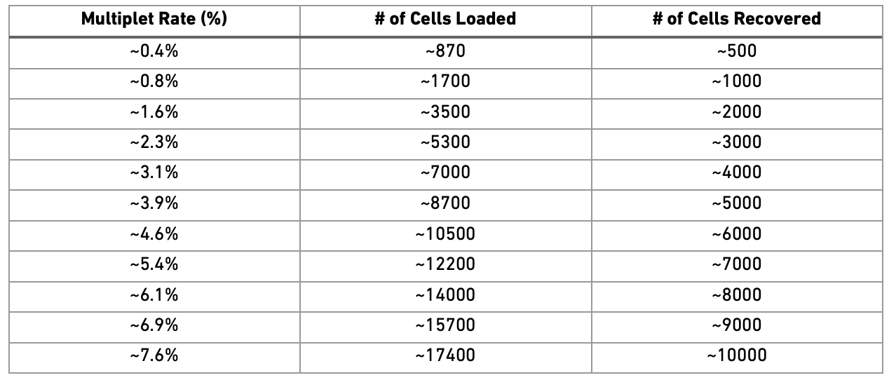\
Most doublet detectors simulates doublets by merging cell counts and
predicts doublets as cells that have similar embeddings as the simulated
doublets. Most such packages need an assumption about the
number/proportion of expected doublets in the dataset. The data you are
using is subsampled, but the original datasets contained about 5 000
cells per sample, hence we can assume that they loaded about 9 000 cells
and should have a doublet rate at about 4%.
> **Caution**
>
> Ideally doublet prediction should be run on each sample separately,
> especially if your samples have different proportions of cell types.
> In this case, the data is subsampled so we have very few cells per
> sample and all samples are sorted PBMCs, so it is okay to run them
> together.
There is a method to predict if a cluster consists of mainly doublets
`findDoubletClusters()`, but we can also predict individual cells based
on simulations using the function `computeDoubletDensity()` which we
will do here. Doublet detection will be performed using PCA, so we need
to first normalize the data and run variable gene detection, as well as
UMAP for visualization. These steps will be explored in more detail in
coming exercises.
``` {r}
#| label: doublet-norm
sce.filt <- logNormCounts(sce.filt)
dec <- modelGeneVar(sce.filt, block = sce.filt$sample)
hvgs <- getTopHVGs(dec, n = 2000)
sce.filt <- runPCA(sce.filt, subset_row = hvgs)
sce.filt <- runUMAP(sce.filt, pca = 10)
```
``` {r}
#| label: doublet
# run computeDoubletDensity with 10 principal components.
sce.filt <- scDblFinder(sce.filt, dims = 10)
```
``` {r}
#| label: doublet-plot
#| fig-height: 5
#| fig-width: 14
wrap_plots(
plotUMAP(sce.filt, colour_by = "scDblFinder.score"),
plotUMAP(sce.filt, colour_by = "scDblFinder.class"),
plotUMAP(sce.filt, colour_by = "sample"),
ncol = 3
)
```
We should expect that two cells have more detected genes than a single
cell, lets check if our predicted doublets also have more detected genes
in general.
``` {r}
#| label: doublet-vln
plotColData(sce.filt, y = "detected", x = "scDblFinder.class")
```
Now, lets remove all predicted doublets from our data.
``` {r}
#| label: doublet-filt
sce.filt <- sce.filt[, sce.filt$scDblFinder.class == "singlet"]
dim(sce.filt)
```
To summarize, lets check how many cells we have removed per sample, we
started with 1500 cells per sample. Looking back at the intitial QC
plots does it make sense that some samples have much fewer cells now?
``` {r}
#| label: view-data
table(sce$sample)
table(sce.filt$sample)
```
> **Discuss**
>
> "In this case we ran doublet detection with all samples together since
> we have very small subsampled datasets. But in a real scenario it
> should be run one sample at a time. Why is this important do you
> think?"
## Save data
Finally, lets save the QC-filtered data for further analysis. Create
output directory `data/covid/results` and save data to that folder. This
will be used in downstream labs.
``` {r}
#| label: save
saveRDS(sce.filt, file.path(path_results, "bioc_covid_qc.rds"))
```
## Session info
```{=html}
```
```{=html}
```
Click here
```{=html}
```
``` {r}
#| label: session
sessionInfo()
```
```{=html}
```