---
description: Reconstructing developmental or differentiation pathways
from individual cell gene expression profiles to understand cellular
transitions and relationships.
subtitle: Seurat Toolkit
title: Trajectory inference using Slingshot
---
> **Note**
>
> Code chunks run R commands unless otherwise specified.
## Loading libraries
``` {r}
#| label: libraries
suppressPackageStartupMessages({
library(Seurat)
library(plotly)
options(rgl.printRglwidget = TRUE)
library(Matrix)
library(sparseMatrixStats)
library(slingshot)
library(tradeSeq)
library(patchwork)
})
# Define some color palette
pal <- c(scales::hue_pal()(8), RColorBrewer::brewer.pal(9, "Set1"), RColorBrewer::brewer.pal(8, "Set2"))
set.seed(1)
pal <- rep(sample(pal, length(pal)), 200)
```
Nice function to easily draw a graph:
``` {r}
#| label: graph-func
# Add graph to the base R graphics plot
draw_graph <- function(layout, graph, lwd = 0.2, col = "grey") {
res <- rep(x = 1:(length(graph@p) - 1), times = (graph@p[-1] - graph@p[-length(graph@p)]))
segments(
x0 = layout[graph@i + 1, 1], x1 = layout[res, 1],
y0 = layout[graph@i + 1, 2], y1 = layout[res, 2], lwd = lwd, col = col
)
}
```
## Preparing data
If you have been using the **Seurat**, **Bioconductor** or **Scanpy**
toolkits with your own data, you need to reach to the point where you
have:
- A dimensionality reduction on which to run the trajectory (for
example: PCA, ICA, MNN, harmony, Diffusion Maps, UMAP)
- The cell clustering information (for example: from Louvain, K-means)
- A KNN/SNN graph (this is useful to inspect and sanity-check your
trajectories)
We will be using a subset of a bone marrow dataset (originally
containing about 100K cells) for this exercise on trajectory inference.
The bone marrow is the source of adult immune cells, and contains
virtually all differentiation stages of cell from the **immune** system
which later circulate in the blood to all other organs.
You can download the data:
``` {r}
#| label: fetch-data
# download pre-computed data if missing or long compute
fetch_data <- TRUE
path_trajectory <- "./data/trajectory"
if (!dir.exists(path_trajectory)) dir.create(path_trajectory, recursive = T)
# url for source and intermediate data
path_data <- "https://nextcloud.dc.scilifelab.se/public.php/webdav"
curl_upass <- "-u zbC5fr2LbEZ9rSE:scRNAseq2025"
path_file <- "data/trajectory/trajectory_seurat_filtered.rds"
if (!dir.exists(dirname(path_file))) dir.create(dirname(path_file), recursive = TRUE)
if (!file.exists(path_file)) download.file(url = file.path(path_data, "trajectory/trajectory_seurat_filtered.rds"), destfile = path_file, method = "curl", extra = curl_upass)
```
We already have pre-computed and subsetted the dataset (with 6688 cells
and 3585 genes) following the analysis steps in this course. We then
saved the objects, so you can use common tools to open and start to work
with them (either in R or Python).
In addition there was some manual filtering done to remove clusters that
are disconnected and cells that are hard to cluster, which can be seen
in this
[script](https://github.com/NBISweden/workshop-scRNAseq/blob/master/scripts/data_processing/slingshot_preprocessing.Rmd)
## Reading data
``` {r}
#| label: read-data
obj <- readRDS("data/trajectory/trajectory_seurat_filtered.rds")
# Calculate cluster centroids (for plotting the labels later)
mm <- sparse.model.matrix(~ 0 + factor(obj$clusters_use))
colnames(mm) <- levels(factor(obj$clusters_use))
centroids2d <- as.matrix(t(t(obj@reductions$umap@cell.embeddings) %*% mm) / Matrix::colSums(mm))
```
Let's visualize which clusters we have in our dataset:
``` {r}
#| label: plot-data
#| fig-height: 8
#| fig-width: 8
vars <- c("batches", "dataset", "clusters_use", "Phase")
pl <- list()
for (i in vars) {
pl[[i]] <- DimPlot(obj, group.by = i, label = T) + theme_void() + NoLegend()
}
wrap_plots(pl)
```
You can check, for example, the number of cells in each cluster:
``` {r}
#| label: table-clust
table(obj$clusters_use)
```
## Exploring the data
It is crucial that you have some understanding of the dataset being
analyzed. What are the clusters you see in your data and most
importantly **How are the clusters related to each other?**. Well, let's
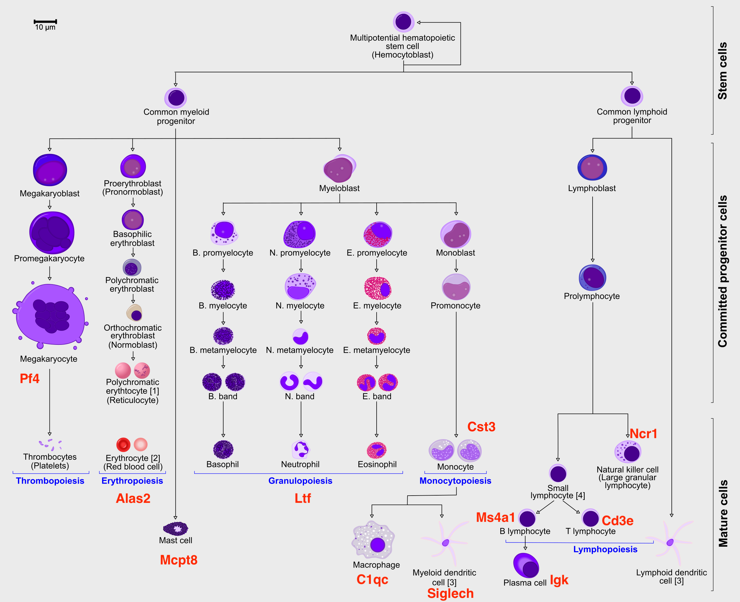
explore the data a bit. With the help of this table, write down which
cluster numbers in your dataset express these key markers.
Marker Cell Type
--------- ----------------------------
Cd34 HSC progenitor
Ms4a1 B cell lineage
Cd3e T cell lineage
Ltf Granulocyte lineage
Cst3 Monocyte lineage
Mcpt8 Mast Cell lineage
Alas2 RBC lineage
Siglech Dendritic cell lineage
C1qc Macrophage cell lineage
Pf4 Megakaryocyte cell lineage
``` {r}
#| label: plot-markers
#| fig-height: 9
#| fig-width: 12
vars <- c("Cd34", "Ms4a1", "Cd3e", "Ltf", "Cst3", "Mcpt8", "Alas2", "Siglech", "C1qc", "Pf4")
pl <- list()
pl <- list(DimPlot(obj, group.by = "clusters_use", label = T) + theme_void() + NoLegend())
for (i in vars) {
pl[[i]] <- FeaturePlot(obj, features = i, order = T) + theme_void() + NoLegend()
}
wrap_plots(pl)
```
To make it easier to interpret the data, we will add in some labels to
the most important clusters.
``` {r}
#| label: annot
new_clust = as.character(obj$clusters_use)
new_clust[new_clust == "34"] = "34-Prog" # progenitors
new_clust[new_clust == "17"] = "17-Gran" # granulocytes
new_clust[new_clust == "27"] = "27-DC" # dendritic cells
new_clust[new_clust == "25"] = "25-Mac" # macrophage
new_clust[new_clust == "16"] = "16-TC" # T-cells
new_clust[new_clust == "20"] = "20-BC" # B-cells
new_clust[new_clust == "26"] = "26-Mast" # Mast cells
new_clust[new_clust == "53"] = "53-Mega" # Megakaryocytes
new_clust[new_clust == "49"] = "49-RBC" # Red blood cells
obj$clust_annot = factor(new_clust)
DimPlot(obj, group.by = "clust_annot", label = T) + theme_void() + NoLegend()
```
Another way to better explore your data is to look in higher dimensions,
to really get a sense for what is right or wrong. As mentioned in the
dimensionality reduction exercises, here we ran UMAP with **3**
dimensions.
> **Important**
>
> The UMAP needs to be computed to results in exactly 3 dimensions
Since the steps below are identical to both `Seurat` and `Bioconductor`
toolkits, we will extract the matrices from both, so it is clear what is
being used where and to remove long lines of code used to get those
matrices. We will use them all. Plot in 3D with `Plotly`:
``` {r}
#| label: plot-3d
df <- data.frame(obj@reductions$umap3d@cell.embeddings, variable = factor(obj$clust_annot))
colnames(df)[1:3] <- c("UMAP_1", "UMAP_2", "UMAP_3")
p_State <- plot_ly(df, x = ~UMAP_1, y = ~UMAP_2, z = ~UMAP_3, color = ~variable, colors = pal, size = .5) %>% add_markers()
p_State
```
``` {r}
#| label: save-3d
#| eval: false
# to save interactive plot and open in a new tab
try(htmlwidgets::saveWidget(p_State, selfcontained = T, "data/trajectory/umap_3d_clustering_plotly.html"), silent = T)
utils::browseURL("data/trajectory/umap_3d_clustering_plotly.html")
```
We can now compute the lineages on these dataset.
``` {r}
#| label: plot-lineages
#| fig-height: 6
#| fig-width: 6
# Define lineage ends
ENDS <- c("17-Gran", "27-DC", "25-Mac", "16-TC", "26-Mast", "53-Mega", "49-RBC")
set.seed(1)
lineages <- as.SlingshotDataSet(getLineages(
data = obj@reductions$umap3d@cell.embeddings,
clusterLabels = obj$clust_annot,
dist.method = "mnn", # It can be: "simple", "scaled.full", "scaled.diag", "slingshot" or "mnn"
end.clus = ENDS, # You can also define the ENDS!
start.clus = "34-Prog"
)) # define where to START the trajectories
# IF NEEDED, ONE CAN ALSO MANULALLY EDIT THE LINEAGES, FOR EXAMPLE:
# sel <- sapply( lineages@lineages, function(x){rev(x)[1]} ) %in% ENDS
# lineages@lineages <- lineages@lineages[ sel ]
# names(lineages@lineages) <- paste0("Lineage",1:length(lineages@lineages))
# lineages
# Change the reduction to our "fixed" UMAP2d (FOR VISUALISATION ONLY)
lineages@reducedDim <- obj@reductions$umap@cell.embeddings
{
plot(obj@reductions$umap@cell.embeddings, col = pal[obj$clust_annot], cex = .5, pch = 16)
lines(lineages, lwd = 1, col = "black", cex = 2)
text(centroids2d, labels = rownames(centroids2d), cex = 0.8, font = 2, col = "white")
}
```
## Defining Principal Curves
Once the clusters are connected, Slingshot allows you to transform them
to a smooth trajectory using principal curves. This is an algorithm that
iteratively changes an initial curve to better match the data points. It
was developed for linear data. To apply it to single-cell data,
slingshot adds two enhancements:
- It will run principal curves for each 'lineage', which is a set of
clusters that go from a defined start cluster to some end cluster
- Lineages with a same set of clusters will be constrained so that
their principal curves remain bundled around the overlapping
clusters
Since the function `getCurves()` takes some time to run, we can speed up
the convergence of the curve fitting process by reducing the amount of
cells to use in each lineage. Ideally you could all cells, but here we
had set `approx_points` to 300 to speed up. Feel free to adjust that for
your dataset.
``` {r}
#| label: principal-curves
#| fig-height: 6
#| fig-width: 6
# Define curves
curves <- as.SlingshotDataSet(getCurves(
data = lineages,
thresh = 1e-1,
stretch = 1e-1,
allow.breaks = F,
approx_points = 100
))
curves
# Plots
{
plot(obj@reductions$umap@cell.embeddings, col = pal[obj$clust_annot], pch = 16)
lines(curves, lwd = 2, col = "black")
text(centroids2d, labels = levels(obj$clust_annot), cex = 1, font = 2)
}
```
> **Discuss**
>
> Does these lineages fit the biological expectations given what you
> know of hematopoesis. Please have a look at the figure in Section 2
> and compare to the paths you now have.
With those results in hands, we can now compute the differentiation
**pseudotime**.
``` {r}
#| label: pseudotime
#| fig-height: 6
#| fig-width: 6
pseudotime <- slingPseudotime(curves, na = FALSE)
cellWeights <- slingCurveWeights(curves)
x <- rowMeans(pseudotime)
x <- x / max(x)
o <- order(x)
{
plot(obj@reductions$umap@cell.embeddings[o, ],
main = paste0("pseudotime"), pch = 16, cex = 0.4, axes = F, xlab = "", ylab = "",
col = colorRampPalette(c("grey70", "orange3", "firebrick", "purple4"))(99)[x[o] * 98 + 1]
)
points(centroids2d, cex = 2.5, pch = 16, col = "#FFFFFF99")
text(centroids2d, labels = levels(obj$clust_annot), cex = 1, font = 2)
}
```
> **Discuss**
>
> The pseudotime represents the distance of every cell to the starting
> cluster. Have a look at the pseudotime plot, how well do you think it
> represents actual developmental time? What does it represent?
## Finding differentially expressed genes
The main way to interpret a trajectory is to find genes that change
along the trajectory. There are many ways to define differential
expression along a trajectory:
- Expression changes along a particular path (i.e. change with
pseudotime)
- Expression differences between branches
- Expression changes at branch points
- Expression changes somewhere along the trajectory
- ...
`tradeSeq` is a recently proposed algorithm to find trajectory
differentially expressed genes. It works by smoothing the gene
expression along the trajectory by fitting a smoother using generalized
additive models (GAMs), and testing whether certain coefficients are
statistically different between points in the trajectory.
``` {r}
#| label: multicore
BiocParallel::register(BiocParallel::MulticoreParam())
```
The fitting of GAMs can take quite a while, so **for demonstration
purposes we first do a very stringent filtering** of the genes.
> **Tip**
>
> In an ideal experiment, you would use all the genes, or at least those
> defined as being variable.
``` {r}
#| label: subset-genes
sel_cells <- split(colnames(obj@assays$RNA@data), obj$clust_annot)
sel_cells <- unlist(lapply(sel_cells, function(x) {
set.seed(1)
return(sample(x, 20))
}))
gv <- as.data.frame(na.omit(scran::modelGeneVar(obj@assays$RNA@data[, sel_cells])))
gv <- gv[order(gv$bio, decreasing = T), ]
sel_genes <- sort(rownames(gv)[1:500])
```
Fitting the model:
> **Caution**
>
> This is a slow compute intensive step, we will not run this now and
> instead use a pre-computed file in the step below.
``` {r}
#| label: fit-gam
path_file <- "data/trajectory/seurat_scegam.rds"
# fetch_data is defined at the top of this document
if (!fetch_data) {
sceGAM <- fitGAM(
counts = drop0(obj@assays$RNA@data[sel_genes, sel_cells]),
pseudotime = pseudotime[sel_cells, ],
cellWeights = cellWeights[sel_cells, ],
nknots = 5, verbose = T, parallel = T, sce = TRUE,
BPPARAM = BiocParallel::MulticoreParam()
)
saveRDS(sceGAM, path_file)
}
```
Download the precomputed file.
``` {r}
#| label: fetch-gam
path_file <- "data/trajectory/seurat_scegam.rds"
# fetch_data is defined at the top of this document
if (fetch_data) {
if (!file.exists(path_file)) download.file(url = file.path(path_data, "trajectory/seurat_scegam.rds"), destfile = path_file, method = "curl", extra = curl_upass)
}
```
``` {r}
#| label: load-gam
# read data
sceGAM <- readRDS(path_file)
```
``` {r}
#| label: plot-gam
#| fig-height: 5
#| fig-width: 7
plotGeneCount(curves, clusters = obj$clust_annot, models = sceGAM)
lineages
```
``` {r}
#| label: plot-gam-lineages
#| fig-height: 6
#| fig-width: 6
lc <- sapply(lineages@lineages, function(x) {
rev(x)[1]
})
names(lc) <- gsub("Lineage", "L", names(lc))
lc.idx = match(lc, levels(obj$clust_annot))
{
plot(obj@reductions$umap@cell.embeddings, col = pal[obj$clust_annot], pch = 16)
lines(curves, lwd = 2, col = "black")
points(centroids2d[lc.idx, ], col = "black", pch = 16, cex = 4)
text(centroids2d[lc.idx, ], labels = names(lc), cex = 1, font = 2, col = "white")
}
```
### Genes that change with pseudotime
We can first look at general trends of gene expression across
pseudotime.
``` {r}
#| label: dge
set.seed(8)
res <- na.omit(associationTest(sceGAM, contrastType = "consecutive"))
res <- res[res$pvalue < 1e-3, ]
res <- res[res$waldStat > mean(res$waldStat), ]
res <- res[order(res$waldStat, decreasing = T), ]
res[1:10, ]
```
We can plot their expression:
``` {r}
#| label: plot-dge
#| fig-height: 12
#| fig-width: 12
par(mfrow = c(4, 4), mar = c(.1, .1, 2, 1))
{
plot(obj@reductions$umap@cell.embeddings, col = pal[obj$clusters_use], cex = .5, pch = 16, axes = F, xlab = "", ylab = "")
lines(curves, lwd = 2, col = "black")
points(centroids2d[lc.idx, ], col = "black", pch = 15, cex = 3, xpd = T)
text(centroids2d[lc.idx, ], labels = names(lc), cex = 1, font = 2, col = "white", xpd = T)
}
vars <- rownames(res[1:15, ])
vars <- na.omit(vars[vars != "NA"])
for (i in vars) {
x <- drop0(obj@assays$RNA@data)[i, ]
x <- (x - min(x)) / (max(x) - min(x))
o <- order(x)
plot(obj@reductions$umap@cell.embeddings[o, ],
main = paste0(i), pch = 16, cex = 0.5, axes = F, xlab = "", ylab = "",
col = colorRampPalette(c("lightgray", "grey60", "navy"))(99)[x[o] * 98 + 1]
)
}
```
### Genes that change between two pseudotime points
We can define custom pseudotime values of interest if we're interested
in genes that change between particular point in pseudotime. By default,
we can look at differences between start and end:
``` {r}
#| label: dge-pt
res <- na.omit(startVsEndTest(sceGAM, pseudotimeValues = c(0, 1)))
res <- res[res$pvalue < 1e-3, ]
res <- res[res$waldStat > mean(res$waldStat), ]
res <- res[order(res$waldStat, decreasing = T), ]
res[1:10, 1:6]
```
You can see now that there are several more columns, one for each
lineage. This table represents the differential expression within each
lineage, to identify which genes go up or down. Let's check lineage 1:
``` {r}
#| label: plot-dge-pt
#| fig-height: 12
#| fig-width: 12
# Get the top UP and Down regulated in lineage 1
res_lin1 <- sort(setNames(res$logFClineage1, rownames(res)))
vars <- names(c(rev(res_lin1)[1:7], res_lin1[1:8]))
vars <- na.omit(vars[vars != "NA"])
par(mfrow = c(4, 4), mar = c(.1, .1, 2, 1))
{
plot(obj@reductions$umap@cell.embeddings, col = pal[obj$clusters_use], cex = .5, pch = 16, axes = F, xlab = "", ylab = "")
lines(curves, lwd = 2, col = "black")
points(centroids2d[lc.idx, ], col = "black", pch = 15, cex = 3, xpd = T)
text(centroids2d[lc.idx, ], labels = names(lc), cex = 1, font = 2, col = "white", xpd = T)
}
for (i in vars) {
x <- drop0(obj@assays$RNA@data)[i, ]
x <- (x - min(x)) / (max(x) - min(x))
o <- order(x)
plot(obj@reductions$umap@cell.embeddings[o, ],
main = paste0(i), pch = 16, cex = 0.5, axes = F, xlab = "", ylab = "",
col = colorRampPalette(c("lightgray", "grey60", "navy"))(99)[x[o] * 98 + 1]
)
}
```
### Genes that are different between lineages
More interesting are genes that are different between two branches. We
may have seen some of these genes already pop up in previous analyses of
pseudotime. There are several ways to define "different between
branches", and each have their own functions:
- Different at the end points, using `diffEndTest()`
- Different at the branching point, using `earlyDETest()`
- Different somewhere in pseudotime the branching point, using
`patternTest()`
Note that the last function requires that the pseudotimes between two
lineages are aligned.
``` {r}
#| label: dge-lin
res <- na.omit(diffEndTest(sceGAM))
res <- res[res$pvalue < 1e-3, ]
res <- res[res$waldStat > mean(res$waldStat), ]
res <- res[order(res$waldStat, decreasing = T), ]
res[1:10, ]
```
You can see now that there are even more columns, one for the pairwise
comparison between each lineage. Let's check lineage 1 vs lineage 2:
``` {r}
#| label: plot-dge-lin
#| fig-height: 12
#| fig-width: 12
# Get the top UP and Down regulated in lineage 1 vs 2
res_lin1_2 <- sort(setNames(res$logFC1_2, rownames(res)))
vars <- names(c(rev(res_lin1_2)[1:7], res_lin1_2[1:8]))
vars <- na.omit(vars[vars != "NA"])
par(mfrow = c(4, 4), mar = c(.1, .1, 2, 1))
{
plot(obj@reductions$umap@cell.embeddings, col = pal[obj$clusters_use], cex = .5, pch = 16, axes = F, xlab = "", ylab = "")
lines(curves, lwd = 2, col = "black")
points(centroids2d[lc.idx, ], col = "black", pch = 15, cex = 3, xpd = T)
text(centroids2d[lc.idx, ], labels = names(lc), cex = 1, font = 2, col = "white", xpd = T)
}
for (i in vars) {
x <- drop0(obj@assays$RNA@data)[i, ]
x <- (x - min(x)) / (max(x) - min(x))
o <- order(x)
plot(obj@reductions$umap@cell.embeddings[o, ],
main = paste0(i), pch = 16, cex = 0.5, axes = F, xlab = "", ylab = "",
col = colorRampPalette(c("lightgray", "grey60", "navy"))(99)[x[o] * 98 + 1]
)
}
```
Check out this
[vignette](https://statomics.github.io/tradeSeq/articles/tradeSeq.html)
for a more in-depth overview of tradeSeq and many other differential
expression tests.
## Generating batch-corrected data for differential gene expression
Before computing differential gene expression, sometimes it is a good
idea to make sure our dataset is somewhat homogeneous (without very
strong batch effects). In this dataset, we actually used data from 4
different technologies (Drop-seq, SmartSeq2 and 10X) and therefore
massive differences in read counts can be observed:
If you want to know more about how to control for this issue, please
have a look at
[batch_corrected_counts.Rmd](https://github.com/NBISweden/workshop-scRNAseq/blob/master/scripts/data_processing/batch_corrected_counts.Rmd)
## References
Cannoodt, Robrecht, Wouter Saelens, and Yvan Saeys. 2016. "Computational
Methods for Trajectory Inference from Single-Cell Transcriptomics."
*European Journal of Immunology* 46 (11): 2496--2506.
[doi](https://doi.org/10.1002/eji.201646347).
Saelens, Wouter, Robrecht Cannoodt, Helena Todorov, and Yvan Saeys.
2019. "A Comparison of Single-Cell Trajectory Inference Methods."
*Nature Biotechnology* 37 (5): 547--54.
[doi](https://doi.org/10.1038/s41587-019-0071-9).
## Session info
```{=html}
```
```{=html}
```
Click here
```{=html}
```
``` {r}
#| label: session
sessionInfo()
```
```{=html}
```