# @nativescript/picker
A NativeScript plugin that provides a UI element for picking an object/value from a list opened in a modal popup.
## Installation
```cli
npm install @nativescript/picker
```
## Usage
* [Usage](#usage)
* [Core](#core)
* [Angular](#angular)
* [Vue](#vue)
* [Style The PickerField](#style-the-pickerfield)
* [PickerField API](#pickerfield-api)
| |
|:---------|:--------
|`iOS` | `Android`
## Usage
### Core
Register the plugin namespace using the `xmlns` attribute of the `` view.
```xml
...
```
Or with item template
```xml
```
## Data filter
You can filter the data by setting `showFilter="true"`, by default the plugin will look at the `name` key on the items source, but you can control this by setting `filterKeyName="title"` assuming your data Items contains a title key :
> focus the search bar by setting `focusOnShow="true"`
```ts
let dataItems = new ObservableArray<{title: string, age: number}>();
for(let i = 0; i <= 30; i++) {
dataItems.push({
title: "Title" + i,
age: 30 + i
})
}
```
## Get selected item
You need to register the callback from pickerClosed property `pickerClosed="onSelectedItem"` this will return the `selectedIndex` :
```ts
onSelectedItem(args) {
let index = args.object?.selectedIndex;
console.log('Picker > closed', index);
console.log('Picker > closed', dataItems[index].title);
}
```
## Style
You can targed the Picker via thoes css class ex: `.pickerRootModal`:
- `pickerRootModal` targetting the `Modal`
- `pickerPage` targetting the `Page`
- `pickerGridLayout` targetting the `GridLayout` wraper that contains all the views
- `pickerListView` targetting the `ListView`
- `pearchBarContainer` targetting the search bar container `StackLayout`
- `pickerSearchBar` targetting the search bar `TextField`
[See here also](#pickerfield-1)
### Angular
Import the plugin module in the module of your component:
```ts
import { NativeScriptPickerModule } from "@nativescript/picker/angular";
...
@NgModule({
imports: [
NativeScriptPickerModule,
...
],
...
```
Then declare the fields in the HTML of your component:
```html
```
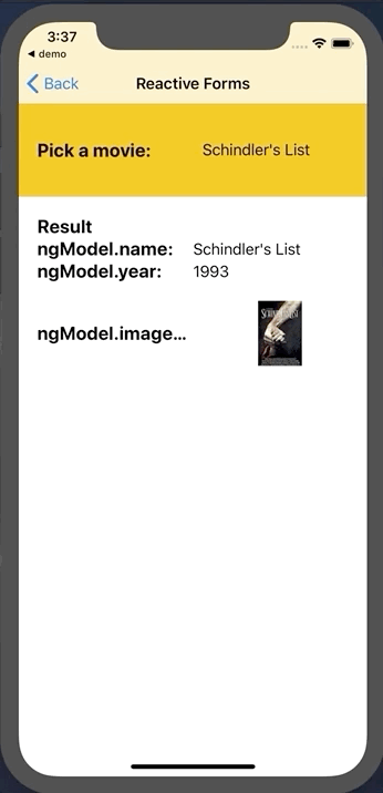
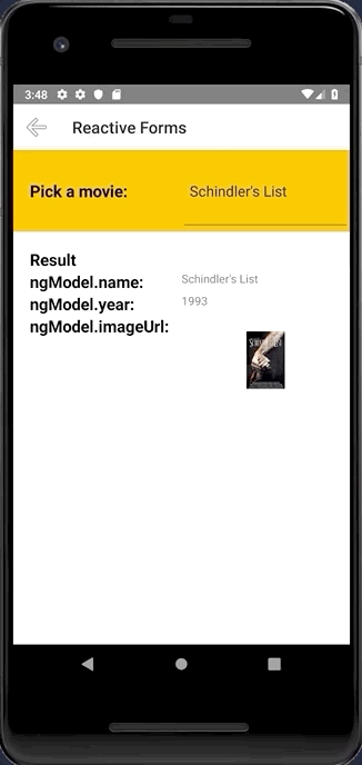
### Define a custom item template
You can also define a custom item template for the picker's list:
```html
```
With the following bindings:
```ts
interface IDataItem {
name: string;
id: number;
description: string;
imageUrl: string;
}
this.items = new ObservableArray();
for (let i = 0; i < 20; i++) {
this.items.push({
name: 'Item ' + i,
id: i,
description: 'Description ' + i,
imageUrl: 'https://picsum.photos/150/70/?random',
});
}
```
### Vue
```js
import PickerField from '@nativescript/picker/vue';
app.use(PickerField);
```
Then, declare the fields in the template of your component:
```html
```
### Style the PickerField
The `PickerField` can be targeted in CSS through its element selector and additionally by setting a class. The `PickerField` also opens a modal window containing a Page element that contains an `ActionBar` and a `ListView.` This Page element can be targeted with the `PickerPage` selector
as follows:
```css
PickerPage {
}
```
, and through the `PickerPage` selector, you can style all the picker modals with selectors like `PickerPage ActionBar` and `PickerPage ListView`.
```css
PickerPage ActionBar{
}
PickerPage ListView {
}
```
In addition to that, if you set a class on the `PickerField`, it will be transferred to the `PickerPage` and with it, you can style individual modals.
## PickerField API
The `PickerField` extends the `TextField` view which means that any functionality the default `TextField` provides is also available in the `PickerField` component. The only difference is that by design it is in "read-only" mode, or simply put you cannot change its text. Changing the text of the `PickerField` occurs when a user taps a value from the list
| Property | Type | Description
|:----------------|:-------------|:----------------
| `itemLoadingEvent` | `string`| String value used when hooking to itemLoading event.
| `pickerTitle` | `string` | The title of the modal view.
| `items` | `items: any[]` \| `ItemsSource` | The source collection used to populate the list of the modal view.
| `itemTemplate`| `string` \| `Template` | Тhe UI template for the ListView items of the list of the modal view.
| `modalAnimated`| `boolean` | Optional parameter specifying whether to show the modal view with animation.
| `textField` | `string` | The 'property' of the object from the 'items' collection that will be used by the 'text' property of the PickerField. |
| `valueField`| `string` | The 'property' of the object from the 'items' collection that will be used when setting the `selectedValue` property of the PickerField. |
| `selectedValue`| `any` | The object selected from the list in the modal view.
| `selectedIndex`| `number` | The index of the object from the `items` collection that has been selected from the list in the modal view.
| `iOSCloseButtonPosition`| `'left'` \| `'right'`| The position of the 'close' button of the ActionBar of the modal view.
| `iOSCloseButtonIcon`| `number` | The icon of the 'close' button of the ActionBar of the modal view.
| `androidCloseButtonPosition` | `'navigationButton'` \| `'actionBar'` \| `'actionBarIfRoom'` \| `'popup'`| The position of the 'close' button of the ActionBar of the modal view.
| `androidCloseButtonIcon`| `string` | The icon of the 'close' button of the ActionBar of the modal view.
| `showFilter` | Show the search bar |
| `filterKeyName` | Set object key to use when filtering (see the doc)|
| `focusOnShow` | Set the focus to the serach bar|
| `hintText` | Set the hint of the search bar|
 |
|  |:---------|:--------
|`iOS` | `Android`
## Usage
### Core
Register the plugin namespace using the `xmlns` attribute of the `
|:---------|:--------
|`iOS` | `Android`
## Usage
### Core
Register the plugin namespace using the `xmlns` attribute of the `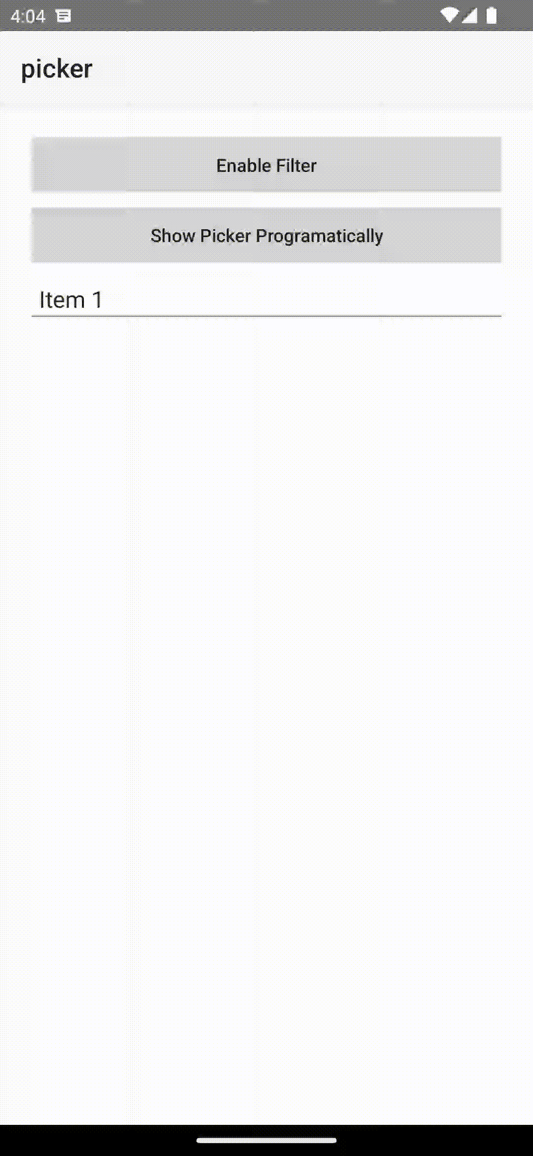 ## Get selected item
You need to register the callback from pickerClosed property `pickerClosed="onSelectedItem"` this will return the `selectedIndex` :
```ts
onSelectedItem(args) {
let index = args.object?.selectedIndex;
console.log('Picker > closed', index);
console.log('Picker > closed', dataItems[index].title);
}
```
## Style
You can targed the Picker via thoes css class ex: `.pickerRootModal`:
- `pickerRootModal` targetting the `Modal`
- `pickerPage` targetting the `Page`
- `pickerGridLayout` targetting the `GridLayout` wraper that contains all the views
- `pickerListView` targetting the `ListView`
- `pearchBarContainer` targetting the search bar container `StackLayout`
- `pickerSearchBar` targetting the search bar `TextField`
[See here also](#pickerfield-1)
### Angular
Import the plugin module in the module of your component:
```ts
import { NativeScriptPickerModule } from "@nativescript/picker/angular";
...
@NgModule({
imports: [
NativeScriptPickerModule,
...
],
...
```
Then declare the fields in the HTML of your component:
```html
## Get selected item
You need to register the callback from pickerClosed property `pickerClosed="onSelectedItem"` this will return the `selectedIndex` :
```ts
onSelectedItem(args) {
let index = args.object?.selectedIndex;
console.log('Picker > closed', index);
console.log('Picker > closed', dataItems[index].title);
}
```
## Style
You can targed the Picker via thoes css class ex: `.pickerRootModal`:
- `pickerRootModal` targetting the `Modal`
- `pickerPage` targetting the `Page`
- `pickerGridLayout` targetting the `GridLayout` wraper that contains all the views
- `pickerListView` targetting the `ListView`
- `pearchBarContainer` targetting the search bar container `StackLayout`
- `pickerSearchBar` targetting the search bar `TextField`
[See here also](#pickerfield-1)
### Angular
Import the plugin module in the module of your component:
```ts
import { NativeScriptPickerModule } from "@nativescript/picker/angular";
...
@NgModule({
imports: [
NativeScriptPickerModule,
...
],
...
```
Then declare the fields in the HTML of your component:
```html