# BoomMenu
[](https://github.com/Nightonke/WoWoViewPager)
[](https://github.com/Nightonke/BoomMenu)
[](https://github.com/Nightonke/CoCoin)
[](https://github.com/Nightonke/BlurLockView)
[](https://github.com/Nightonke/LeeCo)
[](https://github.com/Nightonke/GithubWidget)
[](https://github.com/Nightonke/JellyToggleButton)
[](https://github.com/Nightonke/FaceOffToggleButton)
###此README只适用于V1.0.9或以下,推荐使用新版本,[新版本的使用方法](https://github.com/Nightonke/BoomMenu/wiki)
是否觉得这种菜单按钮有点无聊?

要不,试试这个:

BoomMenu可以让你的菜单按钮 ... 瞬间爆炸!
想看看iOS版本吗?戳[我](https://github.com/Nightonke/VHBoomMenuButton)
# 目录
[English Version](https://github.com/Nightonke/BoomMenu)
[Gradle & Maven](https://github.com/Nightonke/BoomMenu/blob/master/README-ZH.md#gradle-and-maven)
[Note](https://github.com/Nightonke/BoomMenu/blob/master/README-ZH.md#note)
[Demo](https://github.com/Nightonke/BoomMenu/blob/master/README-ZH.md#demo)
###用法
1. [Easy to Use in 3 Steps](https://github.com/Nightonke/BoomMenu/blob/master/README-ZH.md#easy-to-use-in-3-steps)
2. [Use in Action Bar](https://github.com/Nightonke/BoomMenu/blob/master/README-ZH.md#use-in-action-bar)
3. [Use in Floating Action Button](https://github.com/Nightonke/BoomMenu/blob/master/README-ZH.md#use-in-floating-action-button)
4. [Use in List](https://github.com/Nightonke/BoomMenu/blob/master/README-ZH.md#use-in-list)
5. [Use in Share Style](https://github.com/Nightonke/BoomMenu/blob/master/README-ZH.md#use-in-share-style)
6. [Use with Builder](https://github.com/Nightonke/BoomMenu/blob/master/README-ZH.md#use-with-builder)
4. [Hamburger Button and Circle Button](https://github.com/Nightonke/BoomMenu/blob/master/README-ZH.md#hamburger-button-and-circle-button)
5. [Number of Sub Buttons](https://github.com/Nightonke/BoomMenu/blob/master/README-ZH.md#number-of-sub-buttons)
6. [Boom Types](https://github.com/Nightonke/BoomMenu/blob/master/README-ZH.md#boom-types)
7. [Place Types](https://github.com/Nightonke/BoomMenu/blob/master/README-ZH.md#place-types)
8. [Ease Types](https://github.com/Nightonke/BoomMenu/blob/master/README-ZH.md#ease-types)
9. [Boom Animation Duration](https://github.com/Nightonke/BoomMenu/blob/master/README-ZH.md#boom-animation-duration)
10. [Animation Start Delay](https://github.com/Nightonke/BoomMenu/blob/master/README-ZH.md#animation-start-delay)
11. [Rotation Degree](https://github.com/Nightonke/BoomMenu/blob/master/README-ZH.md#rotation-degree)
12. [Auto Dismiss](https://github.com/Nightonke/BoomMenu/blob/master/README-ZH.md#auto-dismiss)
13. [Cancelable](https://github.com/Nightonke/BoomMenu/blob/master/README-ZH.md#cancelable)
14. [Show Order and Hide Order](https://github.com/Nightonke/BoomMenu/blob/master/README-ZH.md#show-order-and-hide-order)
15. [Sub Buttons Click Listener](https://github.com/Nightonke/BoomMenu/blob/master/README-ZH.md#sub-buttons-click-listener)
16. [Animation Listener](https://github.com/Nightonke/BoomMenu/blob/master/README-ZH.md#animation-listener)
17. [Click Effects](https://github.com/Nightonke/BoomMenu/blob/master/README-ZH.md#click-effects)
18. [Sub Button Texts Color](https://github.com/Nightonke/BoomMenu/blob/master/README-ZH.md#sub-button-texts-color)
19. [Dim Types](https://github.com/Nightonke/BoomMenu/blob/master/README-ZH.md#dim-types)
20. [Shadow of Sub Buttons and Boom Button](https://github.com/Nightonke/BoomMenu/blob/master/README-ZH.md#shadow-of-sub-buttons-and-boom-button)
21. [Get States and Dismiss](https://github.com/Nightonke/BoomMenu/blob/master/README-ZH.md#get-states-and-dismiss)
22. [Get Sub Views of Sub Button](https://github.com/Nightonke/BoomMenu/blob/master/README-ZH.md#get-sub-views-of-sub-button)
[Versions](https://github.com/Nightonke/BoomMenu/blob/master/README-ZH.md#versions)
[Todo](https://github.com/Nightonke/BoomMenu/blob/master/README-ZH.md#todo)
[License](https://github.com/Nightonke/BoomMenu/blob/master/README-ZH.md#license)
# Gradle and Maven
添加 "compile 'com.nightonke:boommenu:1.0.9'" 到app模块中的build.gradle即可:
```
dependencies {
...
compile 'com.nightonke:boommenu:1.0.9'
...
}
```
或者通过 maven:
```maven
com.nightonke
boommenu
1.0.9
pom
```
# Note
1. 使用了 [dmytrodanylyk-ShadowLayout](https://github.com/dmytrodanylyk/shadow-layout) 来为按钮产生阴影效果。
2. BoomMenuButton在1.0.4版本开始已经可以在列表中使用。
# Demo
你可以在这个demo中选择绝大部分的BoomMenuButton的选项来查看其不同的效果。当你查看demo的MainActivity的时候,不用担心里面过长的代码,很多代码都是为了处理RadioGroup的逻辑。

通过链接下载:
[Boom V1.0.9 in Github](https://github.com/Nightonke/BoomMenu/blob/master/Apk/BoomMenu%20V1.0.9.apk?raw=true)
[Boom V1.0.9 in Fir](http://fir.im/tv85)
# Usage
### Easy to Use in 3 Steps
查看demo中的一个 [简单示例](https://github.com/Nightonke/BoomMenu/blob/master/README-ZH.md/blob/master/app/src/main/java/com/nightonke/boommenusample/EasyUseActivity.java) ,你就会发现,其实只需要三步即可使用:
**1**.添加BoomMenuButton到xml中:
```xml
```
**2.**在onCreate()方法中findView:
```java
boomMenuButton = (BoomMenuButton)findViewById(R.id.boom);
```
**3.**在onWindowFocusChanged()方法中初始化BoomMenuButton:
```java
@Override
public void onWindowFocusChanged(boolean hasFocus) {
super.onWindowFocusChanged(hasFocus);
boomMenuButton.init(
subButtonDrawables, // 子按钮的图标Drawable数组,不可以为null
subButtonTexts, // 子按钮的文本String数组,可以为null
subButtonColors, // 子按钮的背景颜色color二维数组,包括按下和正常状态的颜色,不可为null
ButtonType.HAM, // 子按钮的类型
BoomType.PARABOLA, // 爆炸类型
PlaceType.HAM_3_1, // 排列类型
null, // 展开时子按钮移动的缓动函数类型
null, // 展开时子按钮放大的缓动函数类型
null, // 展开时子按钮旋转的缓动函数类型
null, // 隐藏时子按钮移动的缓动函数类型
null, // 隐藏时子按钮缩小的缓动函数类型
null, // 隐藏时子按钮旋转的缓动函数类型
null // 旋转角度
);
}
```
### Use in Action Bar
如何在ActionBar中使用BoomMenuButton:
**1**.自定义一个ActionBar的layout,比如custom_actionbar.xml:
```xml
```
**2**.在onCreate()方法中应用你的自定义ActionBar:
```java
@Override
protected void onCreate(Bundle savedInstanceState) {
super.onCreate(savedInstanceState);
setContentView(R.layout.activity_main);
ActionBar mActionBar = getSupportActionBar();
mActionBar.setDisplayShowHomeEnabled(false);
mActionBar.setDisplayShowTitleEnabled(false);
LayoutInflater mInflater = LayoutInflater.from(this);
mCustomView = mInflater.inflate(R.layout.custom_actionbar, null);
TextView mTitleTextView = (TextView) mCustomView.findViewById(R.id.title_text);
mTitleTextView.setText(R.string.app_name);
boomMenuButtonInActionBar = (BoomMenuButton) mCustomView.findViewById(R.id.boom);
boomMenuButtonInActionBar.setOnSubButtonClickListener(this);
boomMenuButtonInActionBar.setAnimatorListener(this);
mActionBar.setCustomView(mCustomView);
mActionBar.setDisplayShowCustomEnabled(true);
((Toolbar) mCustomView.getParent()).setContentInsetsAbsolute(0,0);
}
```
**3**.在onWindowFocusChanged()方法中初始化BoomMenuButton。就像在[简单使用](https://github.com/Nightonke/BoomMenu/blob/master/README-ZH.md#easy-to-use-in-3-steps)中介绍的一样。
###Use in Floating Action Button
如何在FloatingActionButton中使用?与上述类似,稍微修改一下xml文件:
```xml
```
| 参数 | 类型 | 干啥的 |
| ------------- |-------------| -----|
| app:boom_inActionBar | boolean |真,表示应用在ActionBar中 |
| app:boom_inList | boolean | true for boom menu button in list |
| app:boom_button_color | color | BoomMenuButton的背景色,仅仅在FloatingActionButton中有效 |
| app:boom_button_pressed_color | color | BoomMenuButton的按下背景颜色,仅仅在点击效果为Normal时有效 |
### Use in List
如何在列表中使用BoomMenuButton:
**1**.自定义列表子项布局:
```xml
```
**2**.在adapter中用延迟初始化按钮:
```java
@Override
public View getView(int position, View convertView, final ViewGroup parent) {
...
viewHolder.circleBoomMenuButton.postDelayed(new Runnable() {
@Override
public void run() {
viewHolder.circleBoomMenuButton.init(
circleSubButtonDrawables, // The drawables of images of sub buttons. Can not be null.
circleSubButtonTexts, // The texts of sub buttons, ok to be null.
subButtonColors, // The colors of sub buttons, including pressed-state and normal-state.
ButtonType.CIRCLE, // The button type.
BoomType.PARABOLA, // The boom type.
PlaceType.CIRCLE_3_1, // The place type.
null, // Ease type to move the sub buttons when showing.
null, // Ease type to scale the sub buttons when showing.
null, // Ease type to rotate the sub buttons when showing.
null, // Ease type to move the sub buttons when dismissing.
null, // Ease type to scale the sub buttons when dismissing.
null, // Ease type to rotate the sub buttons when dismissing.
null // Rotation degree.
);
viewHolder.hamBoomMenuButton.setSubButtonShadowOffset(
Util.getInstance().dp2px(2), Util.getInstance().dp2px(2));
viewHolder.circleBoomMenuButton.setSubButtonShadowOffset(
Util.getInstance().dp2px(2), Util.getInstance().dp2px(2));
}
}, 1);
...
}
```
更多信息请查看[代码](https://github.com/Nightonke/BoomMenu/blob/master/app/src/main/java/com/nightonke/boommenusample/ListViewActivity.java)
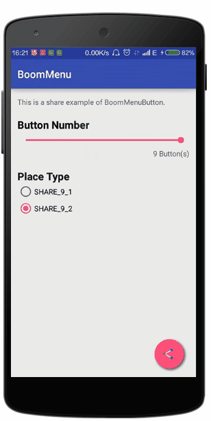
### Use in Share Style
分享风格的按钮在版本1.0.6已经可以使用,效果就像开篇的gif。只需要把place type改成```PlaceType.SHARE_X_X```即可,demo中有分享风格按钮的所有示例。可以用 ```setShareLineWidth(float width)``` 来设置分享按钮中线段的宽度,或者用 ```setShareLine1Color(int color)``` 和 ```setShareLine2Color(int color)``` 来改变线段的颜色。
更多信息请查看[代码](https://github.com/Nightonke/BoomMenu/blob/master/app/src/main/java/com/nightonke/boommenusample/ShareActivity.java)
### Use with Builder
感谢 @demolot 提醒我使用Builder来初始化BMB。现在BMB已经支持Builder初始化。
```
@Override
public void onWindowFocusChanged(boolean hasFocus) {
super.onWindowFocusChanged(hasFocus);
// this is an example to show how to use the builder
new BoomMenuButton.Builder()
// set all sub buttons with subButtons method
//.subButtons(subButtonDrawables, subButtonColors, subButtonTexts)
// or add each sub button with addSubButton method
.addSubButton(this, R.drawable.boom, subButtonColors[0], "BoomMenuButton")
.addSubButton(this, R.drawable.java, subButtonColors[1], "View source code")
.addSubButton(this, R.drawable.github, subButtonColors[2], "Follow me")
.frames(80)
.duration(800)
.delay(100)
.showOrder(OrderType.RANDOM)
.hideOrder(OrderType.RANDOM)
.button(ButtonType.HAM)
.boom(BoomType.PARABOLA_2)
.place(PlaceType.HAM_3_1)
.showMoveEase(EaseType.EaseOutBack)
.hideMoveEase(EaseType.EaseOutCirc)
.showScaleEase(EaseType.EaseOutBack)
.hideScaleType(EaseType.EaseOutCirc)
.rotateDegree(720)
.showRotateEase(EaseType.EaseOutBack)
.hideRotateType(EaseType.Linear)
.autoDismiss(true)
.cancelable(true)
.dim(DimType.DIM_6)
.clickEffect(ClickEffectType.RIPPLE)
.boomButtonShadow(Util.getInstance().dp2px(2), Util.getInstance().dp2px(2))
.subButtonsShadow(Util.getInstance().dp2px(2), Util.getInstance().dp2px(2))
.subButtonTextColor(Color.BLACK)
.onBoomButtonBlick(null)
.animator(null)
.onSubButtonClick(null)
// this only work when the place type is SHARE_X_X
.shareStyle(0, 0, 0)
.init(boomMenuButton);
}
```
更多信息请查看[代码](https://github.com/Nightonke/BoomMenu/blob/master/app/src/main/java/com/nightonke/boommenusample/BuilderActivity.java)
### Hamburger Button and Circle Button
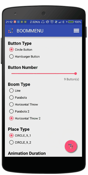
在BMB(BoomMenuButton)中有两种子按钮类型,Hamburger和circle。你可以使用 ```ButtonType.HAM``` 和 ```ButtonType.CIRCLE``` 来初始化BMB。
### Number of Sub Buttons
对于HAM类型,可以有1到4个自按钮。对于CIRCLE类型,可以有1到9个子按钮。
### Boom Types
当前版本中提供了5种展开的类型,它们是 ```BoomType.LINE```, ```BoomType.PARABOLA_2``` , ```BoomType.HORIZONTAL_THROW```, ```BoomType.PARABOLA_2``` 和 ```BoomType.HORIZONTAL_THROW_2```。 Demo中提供了这5中方式的效果,你可以在初始化的时候设置展开类型,或者通过setter:
```java
setBoomType(newBoomType);
```
### Place Types
当前版本有32种对子按钮的排列方式。你可以使用 ```PlaceType.CIRCLE_X_X``` 和```PlaceType.HAM_X_X``` (前一个X代表子按钮数量,后一个代表排列方式)来初始化BMB。


更多信息请查看 [PlaceType.class](https://github.com/Nightonke/BoomMenu/blob/master/boommenu/src/main/java/com/nightonke/boommenu/Types/PlaceType.java)
### Ease Types
对6种展开或隐藏的子动画有30种缓动函数可以使用。你可以设置移动、缩放、旋转动画的缓动效果当初始化BMB的时候,如果设置为null则表明使用默认值。当然,也可以通过setter来设置:
```java
setShowMoveEaseType(showMoveEaseType);
setShowScaleEaseType(showScaleEaseType);
setShowRotateEaseType(showRotateEaseType);
setHideMoveEaseType(hideMoveEaseType);
setHideScaleEaseType(hideScaleEaseType);
setHideRotateEaseType(hideRotateEaseType);
```
更多信息,请查看 [Ease Type Package](https://github.com/Nightonke/BoomMenu/tree/master/boommenu/src/main/java/com/nightonke/boommenu/Eases)。 或者查看之前我写的 [开源库](https://github.com/Nightonke/WoWoViewPager#ease) (缓动效果是一样的)。
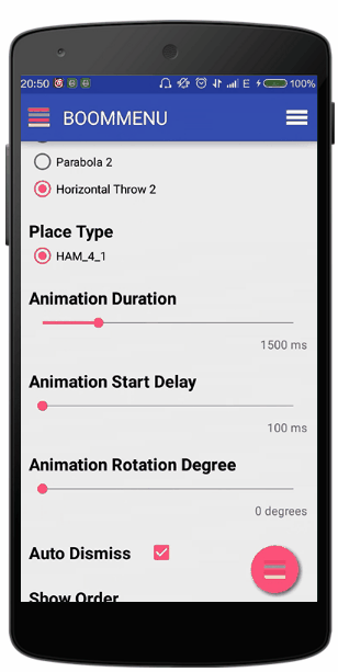
### Boom Animation Duration
通过 ```setDuration(duration)``` (ms为单位)来设置展开或隐藏的延时。 默认值为 800ms。
### Animation Start Delay
通过 ```setDelay(delay)``` 来设置每两个子按钮之间动画的延时(ms为单位)。 比如,如果延时设为0,那么所有子按钮都会同时展开或隐藏,默认值为100ms。
### Rotation Degree
你可以设置子按钮展开或隐藏时的旋转角度。但是注意,只对圆形的子按钮有效,因为对于长方形的子按钮来说,旋转时其阴影效果很难绘制。默认值为720度。你可以在初始化的时候设置或者通过setter ```setRotateDegree(rotateDegree)``` 来设置。
### Auto Dismiss
当点击一个子按钮的时候,默认BMB是会隐藏所有子按钮的。如果你不想这样,你可以用 ```setAutoDismiss(autoDismiss)``` 把自动隐藏值设为false。
### Cancelable
当子按钮全部展开后,点击除了子按钮的区域,BMB会执行隐藏所有子按钮的动画。如果你不想这样,可以用过 ```setCancelable(cancelable)``` 来吧cancelable值设为false。 但是要记得把某个子按钮的点击事件中用BMB的dismiss()函数来隐藏子按钮,否则BMB会无法隐藏。
### Show Order and Hide Order
设置展开或隐藏时的子按钮顺序,可以通过 ```OrderType.DEFAULT```, ```OrderType.REVERSE``` 和```OrderType.RANDOM```。 用setter ```setShowOrderType(showOrderType)``` 和 ```setHideOrderType(hideOrderType)``` 来设置相应的值。
### Sub Buttons Click Listener
```java
boomMenuButton.setOnSubButtonClickListener(new BoomMenuButton.OnSubButtonClickListener() {
@Override
public void onClick(int buttonIndex) {
// 返回被点击的子按钮下标
}
});
```
### Animation Listener
```java
boomInfo.setAnimatorListener(new BoomMenuButton.AnimatorListener() {
@Override
public void toShow() {
// 当BMB即将开始执行展开动画
}
@Override
public void showing(float fraction) {
// 展开动画正在进行,fraction表示进度
}
@Override
public void showed() {
// 展开动画刚刚结束
}
@Override
public void toHide() {
// BMB即将开始执行隐藏动画
}
@Override
public void hiding(float fraction) {
// 隐藏动画正在进行,fraction表示进度
}
@Override
public void hided() {
// 隐藏动画刚刚结束
}
});
```
### Click Effects
使用 ```setClickEffectType(clickEffectType)``` 来为所有按钮(包括BMB自身)设置点击效果。 用 ```ClickEffectType.RIPPLE``` 来设置波纹效果(只在Android 5.0或其后有效) 或 ```ClickEffectType.NORMAL``` 来设置普通点击效果。
### Sub Button Texts Color
用 ```setTextViewColor(int color)``` 来为所有的子按钮设置文本颜色。或者通过 ```setTextViewColor(int[] colors)``` 来为子按钮分别设置文本颜色。
### Dim Types
使用DimType来设置背景的暗淡效果。注意到在demo中,当点击FloatingActionButton时,背景并不会暗淡,但是点击ActionBar中的BMB时,背景会变暗淡。有10个值可以来设置暗淡效果:
```java
public enum DimType {
DIM_0(Color.parseColor("#00000000")),
DIM_1(Color.parseColor("#11000000")),
DIM_2(Color.parseColor("#22000000")),
DIM_3(Color.parseColor("#33000000")),
DIM_4(Color.parseColor("#44000000")),
DIM_5(Color.parseColor("#55000000")),
DIM_6(Color.parseColor("#66000000")),
DIM_7(Color.parseColor("#77000000")),
DIM_8(Color.parseColor("#88000000")),
DIM_9(Color.parseColor("#99000000"));
public int value;
DimType(int value) {
this.value = value;
}
}
```
用 ```setDimType(DimType dimType)``` 来设置BMB的暗淡效果。比如,你可以使用 ```boomMenuButton.setDimType(DimType.DIM_0);``` 来保持背景的明亮。
### Shadow of Sub Buttons and Boom Button
你可以设置子按钮和BMB的阴影偏移效果。用 ```setSubButtonShadowOffset(float xOffset, float yOffset)``` (pixel为单位)来设置子按钮的阴影偏移效果,用 ```setBoomButtonShadowOffset(float xOffset, float yOffset)``` 来设置BMB的阴影偏移效果。
### Get States and Dismiss
通过以下函数来获得BMB当前的状态:
```java
boolean isClosed();
boolean isClosing();
boolean isOpen();
boolean isOpening();
```
用 ```boolean dismiss()``` 来强制执行BMB的隐藏效果。返回真如果BMB可以执行隐藏动画,返回假如果当前BMB不可执行隐藏动画(因为BMB正在执行展开、隐藏动画或正处于未展开的状态)。
### Get Sub Views of Sub Button
如果想对子按钮的子控件稍加修改,可以调用:
```java
ImageView[] getImageViews();
TextView[] getTextViews();
```
# Versions
### 1.0.1
第一个版本。
### 1.0.2
修复在lollipop版本之下运行崩溃的错误。
### 1.0.3
修复在Android4.0版本中出现的圆形子按钮图片背景色为黑色的bug。
### 1.0.4
BMB已经可以在列表中使用。
### 1.0.5
分享风格按钮。
### 1.0.6
分享风格按钮相关设置。
### 1.0.7
感谢 @hisham2007 发现的RTL模式下的bug。现在BMB已经可以正常支持RTL模式。
感谢 @demolot 提醒我用Builder来初始化BMB。更多信息,请查看[Use with BMB](https://github.com/Nightonke/BoomMenu/blob/master/README-ZH.md#use-with-builder)。
### 1.0.8
试图解决一下内存优化的issue,不知是否然并卵。
### 1.0.9
试图解决空指针的issue,不知是否然并卵。
# Todo
1. 粒子效果。
2. ~~让BMB可以在listview中使用~~。
# License
Copyright 2016 Nightonke
Licensed under the Apache License, Version 2.0 (the "License");
you may not use this file except in compliance with the License.
You may obtain a copy of the License at
http://www.apache.org/licenses/LICENSE-2.0
Unless required by applicable law or agreed to in writing, software
distributed under the License is distributed on an "AS IS" BASIS,
WITHOUT WARRANTIES OR CONDITIONS OF ANY KIND, either express or implied.
See the License for the specific language governing permissions and
limitations under the License.