---
_db_id: 414
available_flavours:
- kotlin
content_type: project
prerequisites:
hard:
- projects/kotlin/project-1/liner-layout-using-the-layout-editor
soft: []
ready: true
submission_type: repo
title: User Activity
---
## App overview
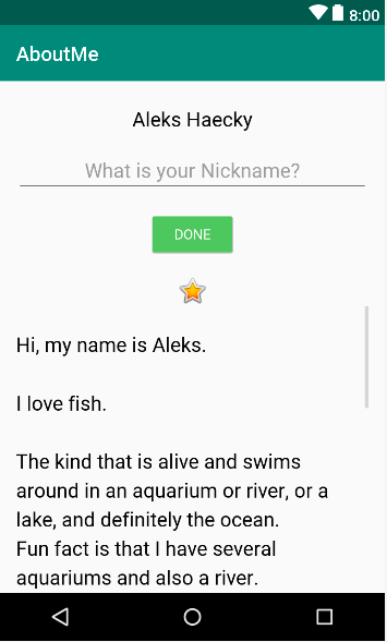
In this project, you extend the AboutMe app to add user interaction.
You add a nickname field, a DONE button, and a text view to display the nickname.
Once the user enters a nickname and taps the DONE button, the text view updates to show the entered nickname. The user can update the nickname again by tapping the text view.
## Task : Add an EditText for text input
In this task, you add an EditText input field to allow the user to enter a nickname.
This you need to do to with a clone of your previous project 'About Me'.
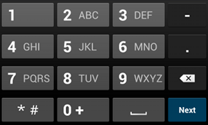
Apps are more interesting if the user can interact with the app, for example if the user can enter text. To accept text input, Android provides a user interface (UI) widget called an edit text. You define an edit text using EditText, a subclass of TextView. An edit text allows the user to enter and modify text input, as shown in the screenshot below.
### Step 1 : Add an EditText
In Android Studio, open the activity_main.xml layout file in the Design tab.
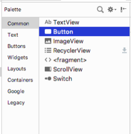
In the Palette pane, click Text.
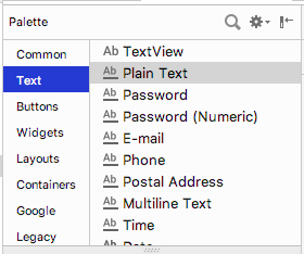
Ab TextView, which is a `TextView`, shows at the top of the list of text elements in the Palette pane. Below Ab TextView are multiple `EditText` views.
In the Palette pane, notice how the icon for `TextView` shows the letters Ab with no underscoring. The `EditText` icons, however, show Ab underscored. The underscoring indicates that the view is editable.
For each of the `EditText` views, Android sets different attributes, and the system displays the appropriate soft input method (such as an on-screen keyboard).
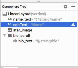
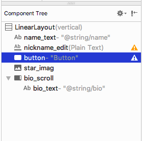
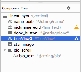
Drag a PlainText edit text into the Component Tree and place it below the `name_text` and above the `star_image`.
Use the Attributes pane to set the following attributes on the EditText view.
| Attribute | Value |
| ------------- | ---------------------- |
| id | nickname_edit |
| layout_width | match_parent (default) |
| layout_height | wrap_content (default) |
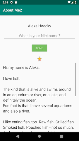
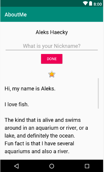
Run your app. Above the star image, you see an edit text with default text "Name".
## Task: Style your EditText
In this task, you style your EditText view by adding a hint, changing the text alignment, changing the style to the NameStyle, and setting the input type.
### Step 1: Add hint text
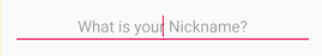
1 - Add a new string resource for the hint in the string.xml file.
```
What is your Nickname?
```
`Tip: It's a good practice to show a hint in each EditText view to help users figure out what input is expected for editable fields.`
2 - Use the Attributes pane to set the following attributes to the EditText view:
| Attribute | Value |
| ------------- | ----------------------------- |
| style | NameStyle |
| textAlignment | (center) |
| hint | @string/what_is_your_nickname |
3 - In the Attributes pane, remove the Name value from the text attribute. The text attribute value needs to be empty so that the hint is displayed.
### Step 2 : Set the inputType attribute
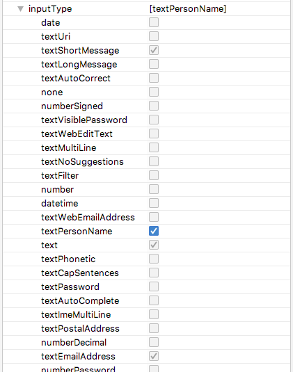
The `inputType` attribute specifies the type of input users can enter in the `EditText` view. The Android system displays the appropriate input field and on-screen keyboard, depending on the input type set.
To see all the possible input types, in the Attributes pane, click the `inputType` field, or click the three dots ... next to the field. A list opens that shows all the types of input you can use, with the currently active input type checked. You can select more than one input type.
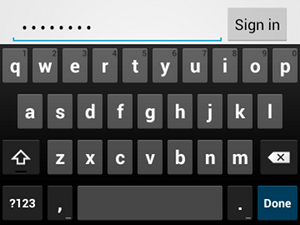
For example, for passwords, use the `textPassword` value. The text field hides the user's input.
For phone numbers, use the `phone` value. A number keypad is displayed, and the user can enter only numbers.
Set the input type for the nickname field:
1 - Set the `inputType` attribute to `textPersonName` for the `nickname_edit` edit text.
2 - In the **Component Tree** pane, notice an `autoFillHints` warning. This warning does not apply to this app and is beyond the scope of this project, so you can ignore it.

3 - In the Attributes pane, verify the values for the following attributes of the EditText view:
| Attribute | Value |
| ------------- | ------------------------------- |
| id | nickname_edit |
| layout_width | match_parent (default) |
| layout_height | wrap_content (default) |
| style | @style/NameStyle |
| inputType | textPersonName |
| hint | "@string/what_is_your_nickname" |
| text | (empty) |
## Task: Add a button and style it.
A `Button` is a UI element that the user can tap to perform an action. A button can consist of text, an icon, or both text and an icon.
  
In this task, you add a DONE button, which the user taps after they enter a nickname. The button swaps the `EditText` view with a `TextView` view that displays the nickname. To update the nickname, the user can tap the `TextView` view.
### Step 1: Add a DONE button
1 - Drag a button from the Palette pane into the Component Tree. Place the button below the `nickname_edit` edit text.
2 - Create a new string resource named `done`. Give the string a value of `Done`,
`Done`
3 - Use the Attributes pane to set the following attributes on the newly added Button view:
| Attribute | Value |
| -------------- | ----------------- |
| id | done_button |
| text | @string/done |
| layout_gravity | center_horizontal |
| layout_width | wrap_content |
The `layout_gravity` attribute centers the view in its parent layout, `LinearLayout`.
4 - Change the style to `Widget.AppCompat.Button.Colored`, which is one of the predefined styles that Android provides. You can select the style from either the drop-down or from the Resources window.
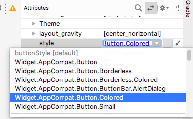
This style changes the button color to the accent color, colorAccent. The accent color is defined in the `res/values/colors.xml` file.
The `colors.xml` file contains the default colors for your app. You can add new color resources or change the existing color resources in your project, based on your app's requirements.
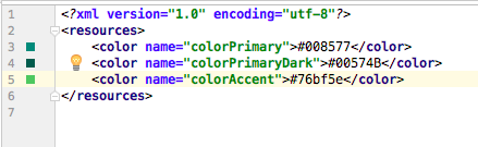
Sample `colors.xml` file:
```
#008577#00574B#D81B60
```
### Step 2: Style the DONE button
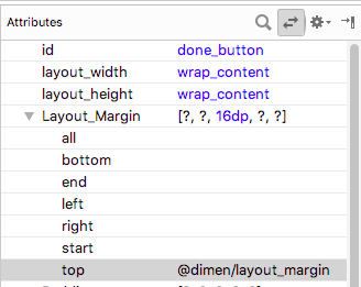
1 - In the Attributes pane, add a top margin by selecting `Layout_Margin` > Top. Set the top margin to layout_margin, which is defined in the `dimens.xml` file.
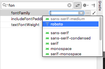
2 - Set the fontFamily attribute to roboto from the drop-down menu.
3 - Switch to the Text tab and verify the generated XML code for the newly added button.
```
```
### Step 3: Change the color resource
In this step, you change the button's accent color to match your activity's app bar.
1 - Open `res/values/colors.xml` and change the value of the `colorAccent` to `#76bf5e`.
`#76bf5e`
You can see the color corresponding to the HEX code, in the left margin of the file editor.
Notice the change in the button color in the design editor.
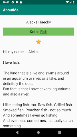
2 - Run your app. You should see a styled DONE button below the edit text.
## Task: Add a TextView to display the nickname
After the user enters a nickname and taps the DONE button, the nickname displays in a `TextView` view. In this task, you add a text view with a colored background. The text view displays the user's nickname above the `star_image`.
### Step 1: Add a TextView for the nickname
Drag a text view from the Palette pane into the Component Tree. Place the text view below the `done_button` and above the `star_image`.
2 - Use the Attributes pane to set the following attributes for the new TextView view:
| Attribute | Value |
| ------------- | ------------- |
| id | nickname_test |
| style | NameStyle |
| textAlignment | (center) |
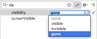
### Step 2: Change the visibility of the TextView
You can show or hide views in your app using the visibility attribute. This attribute takes one of three values:
- visible: The view is visible.
- Invisible: Hides the view, but the view still takes up space in the layout.
- gone: Hides the view, and the view does not take up any space in the layout.
1 - In the Attributes pane, set the visibility of the nickname_text text view to gone, because you don't want your app to show this text view at first.
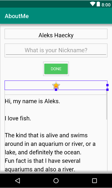
Notice that as you change the attribute in the Attributes pane, the nickname_text view disappears from the design editor. The view is hidden in the layout preview.
2 - Change the text attribute value of the nickname_text view to an empty string.
Your generated XML code for this TextView should look similar to this:
```
```
Your layout preview should look something like the following:
## Task: Add a click listener to the DONE button
A click handler on the `Button` object (or on any view) specifies the action to be performed when the button (view) is tapped. The function that handles the click event should be implemented in the `Activity` that hosts the layout with the button (view).
The click listener has generically this format, where the passed in view is the view that received the click or tap.
```
private fun clickHandlerFunction(viewThatIsClicked: View) {
// Add code to perform the button click event
}
```
ou can attach the click-listener function to button click events two ways:
In the XML layout, you can add the `android:onClick` attribute to the `