---
_db_id: 599
available_flavours:
- kotlin
content_type: project
prerequisites:
hard:
- projects/kotlin/project-9/material-designs-dimensions-and-colours
soft: []
ready: true
submission_type: repo
title: Material Designs and Dimensions and Colours.
---
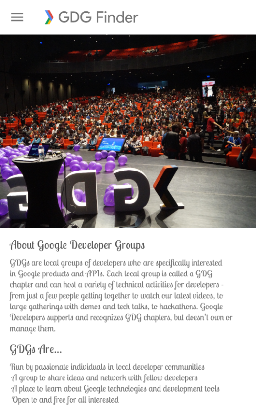
### App overview
The GDG-finder starter app builds on everything you've learned so far in this course.
The app uses ConstraintLayout to lay out three screens. Two of the screens are just layout files that you'll use to explore colors and text on Android.
The third screen is a GDG finder. GDGs, or Google Developer Groups, are communities of developers that focus on Google technologies, including Android. GDGs around the world host meetups, conferences, study jams, and other events.
As you develop this app, you work on the real list of GDGs. The finder screen uses the device's location to sort the GDGs by distance.
If you're lucky and there's a GDG in your region, you can check out the website and sign up for their events! GDG events are a great way to meet other Android developers and learn industry best practices that didn't fit in this course.
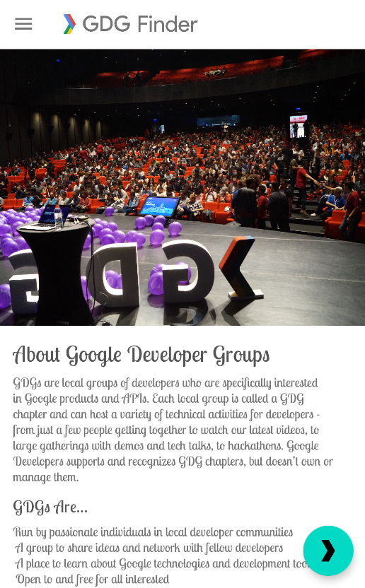
The screenshots below show how your app will change from the beginning to the end of this project.
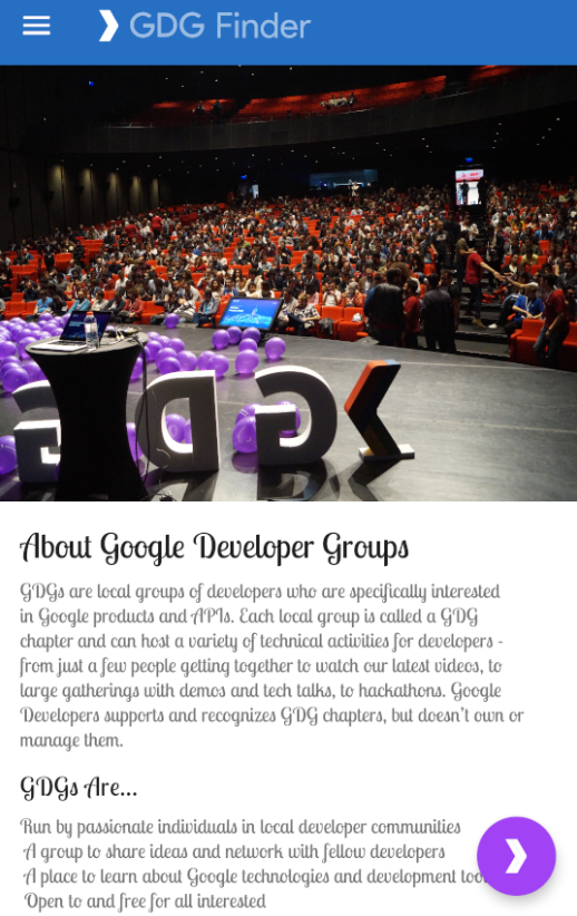
### Task: Add a floating action button (FAB)
In this task, you add a floating action button (FAB) to the home screen of the GDG Finder app.
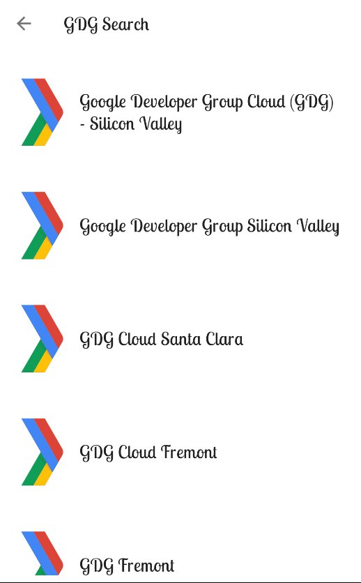
A FAB is a large round button that represents a primary action, which is the main thing a user should do on the screen. The FAB floats above all other content, as shown in the screenshot on the left below. When the user taps the FAB, they are taken to a list of GDGs, as shown on the right.

#### Step 1: Add a FAB to the home fragment layout
- Download and run the GDGFinderStyles app, which is the starter app for this project. If you did the preceding project, you can continue from the final code of that project.
- In build.gradle(Module: app), verify that the material library is included. To use Material Design components, you need to include this library.
`implementation 'com.google.android.material:material:1.1.0-alpha04'`
- Open res/layout/home_fragment.xml and switch to the Text tab.
- Currently, the home screen layout uses a single ScrollView with a ConstraintLayout as a child. If you added a FAB to the ConstraintLayout, the FAB would be inside the ConstraintLayout, not floating over all the content, and it would scroll with the rest of the content of the ConstraintLayout. You need a way to float the FAB above your current layout.
CoordinatorLayout is a view group that lets you stack views on top of each other. While CoordinatorLayout doesn't have any fancy layout abilities, it is sufficient for this app. The ScrollView should take up the full screen, and the FAB should float near the bottom edge of the screen.
- In home_fragment.xml, add a CoordinatorLayout around the ScrollView.
```
...
```
- Replace with . Coordinator layout knows about scrolling, and you need to use NestedScrollView inside another view with scrolling for scrolling to work correctly.
`androidx.core.widget.NestedScrollView`
-Inside and at the bottom of the CoordinatorLayout, below the NestedScrollView, add a FloatingActionButton.
```
```
- Run your app. You see a colored dot in the top-left corner.
- Tap the button. Notice that the button visually responds.
- Scroll the page. Notice that the button stays put.
#### Step 2: Style the FAB
In this step, you move the FAB to the bottom-right corner and add an image that indicates the FAB's action.
- Still in home_fragment.xml, add the layout_gravity attribute to the FAB and move the button to the bottom and end of the screen. The layout_gravity attribute tells a view to lay out on the top, bottom, start, end, or center of the screen. You can combine positions using a vertical bar.
`android:layout_gravity="bottom|end"`
- Check in the Preview pane that the button has moved.
- Add a layout_margin of 16dp to the FAB to offset it from the edge of the screen.
`android:layout_margin="16dp"`
- Use the provided ic_gdg icon as the image for the FAB. After you add the code below, you see a chevron inside the FAB.
`` app:srcCompat="@drawable/ic_gdg"`
- Run the app, and it should look like the screenshot below.

### Step 3: Add a click listener to the FAB
In this step, you add a click handler to the FAB that takes the user to a list of GDGs. You've added click handlers in previous projects, so the instructions are terse.
- In home_fragment.xml, in the tag, define a variable viewModel for the provided HomeViewModel.
```
```
- Add the onClick listener to the FAB and call it onFabClicked().
`android:onClick="@{() -> viewModel.onFabClicked()}"`
- In the home package, open the provided HomeViewModel class and look at the navigation live data and functions, which are also shown below. Notice that when the FAB is clicked, the onFabClicked()click handler is called, and the app triggers navigation.
```
private val _navigateToSearch = MutableLiveData()
val navigateToSearch: LiveData
get() = _navigateToSearch
fun onFabClicked() {
_navigateToSearch.value = true
}
fun onNavigatedToSearch() {
_navigateToSearch.value = false
}
```
- In the home package, open the HomeFragment class. Notice that onCreateView() creates the HomeViewModel and assigns it to viewModel.
- Add the viewModel to the binding in onCreateView().
```
binding.viewModel = viewModel
```
- To eliminate the error, clean and rebuild your project to update the binding object.
- Also in onCreateView(), add an observer that navigates to the list of GDGs. Here is the code:
```
viewModel.navigateToSearch.observe(viewLifecycleOwner,
Observer { navigate ->
if(navigate) {
val navController = findNavController()
navController.navigate(R.id.action_homeFragment_to_gdgListFragment)
viewModel.onNavigatedToSearch()
}
})
```
- Make the necessary imports from androidx. Import this findNavController and Observer:
```
import androidx.navigation.fragment.findNavController
import androidx.lifecycle.Observer
```
- Run your app.
- Tap the FAB and it takes you to the GDG list. If you are running the app on a physical device, you are asked for the location permission. If you are running the app in an emulator, you may see a blank page with the following message:
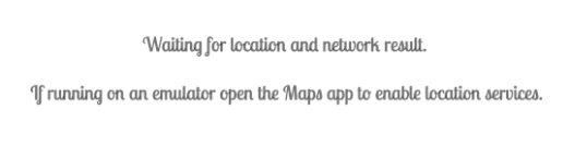
If you get this message running on the emulator, make sure you are connected to the internet and have location settings turned on. Then open the Maps app to enable location services. You may also have to restart your emulator.

### Task: Use styling in a world of Material Design
To get the most out of Material Design components, use theme attributes. Theme attributes are variables that point to different types of styling information, such as the primary color of the app. By specifying theme attributes for the MaterialComponents theme, you can simplify your app styling. Values you set for colors or fonts apply to all widgets, so you can have consistent design and branding.
#### Step 1: Use Material theme attributes
In this step, you change the styling of the title headers on the home screen to use Material Design theme attributes to style your views. This helps you follow the Material style guide while customizing your app's style.
- Open the Material web page for typography theming:
`https://material.io/develop/android/theming/typography/`
- The page shows you all the styles available with Material themes.
- On the page, search or scroll to find textAppearanceHeadline5 (Regular 24sp) and textAppearanceHeadline6 (Regular 20sp). These two attributes are good matches for your app.
- In home_fragment.xml, replace the current style (android:textAppearance="@style/TextAppearance.Title") of the title TextView with style="?attr/textAppearanceHeadline5". The syntax ?attr is a way to look up a theme attribute and apply the value of Headline 5, as defined in the current theme.
```
- 18sp
```
- Inside this style, override the default textAppearanceHeadline6 of the theme, by defining an item that styles textAppearanceHeadline6 with the custom style that you just added.
```
- @style/TextAppearance.CustomHeadline6
```
- In home_fragment.xml, apply textAppearanceHeadline6 to the subtitle view and reformat your code (Code > Reformat code).
` android:textAppearance="?attr/textAppearanceHeadline6"`
- Run the app. Notice the difference in font color, which is subtle, but makes a big difference in how readable the screen is.
| ORIGINAL: | AFTER: |
|---|---|
|  |  |
#### Task: Change the toolbar theme
Sometimes you may want to change portions of your screen to a different theme, but not all of it. For example, you could make the toolbar use the dark Material components theme. You do this using theme overlays.
A Theme is used to set the global theme for the entire app. A ThemeOverlay is used to override (or "overlay") that theme for specific views, especially the toolbar.
Theme overlays are "thin themes" that are designed to overlay an existing theme, like icing on top of a cake. They are useful when you want to change a subsection of your app, for example, change the toolbar to be dark, but continue using a light theme for the rest of the screen. You apply a theme overlay to a view, and the overlay applies to that view and all its children.
You do this by applying the desired theme to the root view of the view hierarchy for which you want to use it. This does not change anything yet! When you want a view in the hierarchy to use a particular attribute that's defined in the overlay theme, you specifically set the attribute on the view and set the value to ?attr/valuename.
#### Step: Use theme overlays
The MaterialComponents theme does not have an option for a dark toolbar on a light screen. In this step, you change the theme for just the toolbar. You make the toolbar dark by applying the Dark theme, which is available from MaterialComponents, to the toolbar as an overlay.
- Open activity_main.xml and find where the Toolbar is defined (androidx.appcompat.widget.Toolbar). The Toolbar is part of Material Design and allows more customization than the app bar that activities use by default.
To change the toolbar and any of its children to the dark theme, start by setting the theme of the Toolbar to the Dark.ActionBar theme. Make sure you do this in the Toolbar, not in the ImageView.
```
```
The layout_constraintGuide_begin="16dp" is correct according to the Material specifications. But app:layout_constraintGuide_end="26dp" should be 16dp also. You could just fix this here manually. However, it is better to create a dimension for these margins and then apply them consistently throughout your app.
#### Step 2: Create a dimension
- In home_fragment xml, using the Text view, put your cursor on the 16dp of app:layout_constraintGuide_begin="16dp".
- Open the intentions menu and select Extract dimension resource.
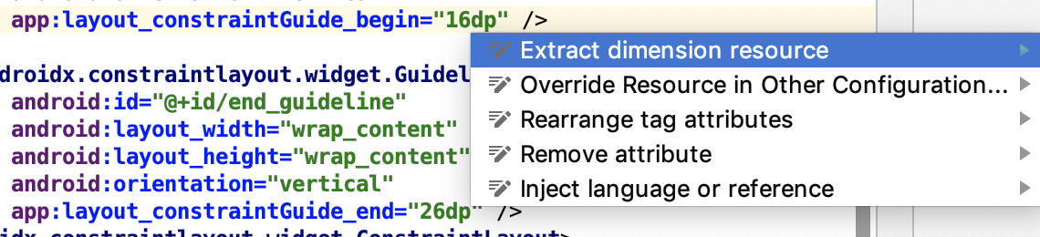
- Set the Resource Name of the dimension to spacing_normal. Leave everything else as given and click OK.
- Fix layout_constraintGuide_end to also use the spacing_normal dimension.
```
@color/primaryColor
- @color/primaryDarkColor
- @color/primaryLightColor
- @color/primaryTextColor
- @color/secondaryColor
- @color/secondaryDarkColor
- @color/secondaryTextColor
```
- Run the app. This looks pretty good...
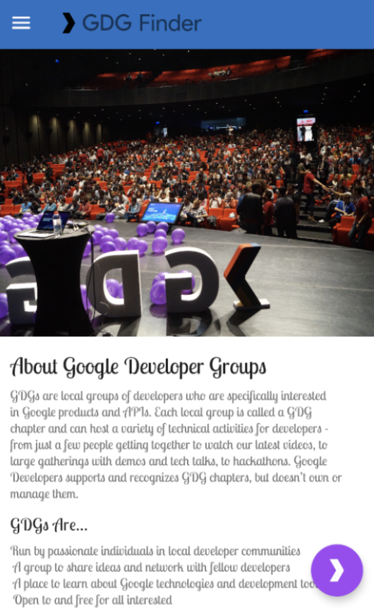
- However, notice that colorOnPrimary isn't light enough for the logo tint (including the "GDG Finder text") to stand out sufficiently when displayed on top of colorPrimaryDark.
- In activity_main.xml, find the Toolbar. In the ImageView, change the logo tint to colorOnSecondary.
- Run the app.
```
colorOnPrimary: A color that passes accessibility guidelines for text and iconography when drawn on top of the primary color.
colorOnSecondary: A color that passes accessibility guidelines for text and iconography when drawn on top of the secondary color.
```
