

Validation Text Area widget overview and structure
A Spry Validation Text Area widget is a text area that displays valid or invalid states when the user enters a few sentences of text. If the text area is a required field and the user fails to enter any text, the widget returns a message stating that a value is required.
The following example shows a Validation Text Area widget in various states.
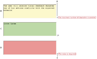
- A.
- Characters remaining counter
- B.
- Text Area widget in focus, maximum number of characters state
- C.
- Text Area widget in focus, valid state
- D.
- Text Area widget, required state
- E.
- Characters typed counter
The Validation Text Area widget includes a number of states (for example, valid, invalid, required value, and so on). You can alter the properties of these states by editing the corresponding CSS file (SpryValidationTextarea.css), depending on the desired validation results. A Validation Text Area widget can validate at various points—for example, when the user clicks outside the widget, as the user types, or when the user tries to submit the form.
- Initial state
- When the page loads in the browser, or when the user resets the form.
- Focus state
- When the user places the insertion point in the widget.
- Valid state
- When the user enters information correctly, and the form can be submitted.
- Required state
- When the user fails to enter any text.
- Minimum Number Of Characters state
- When the user enters fewer than the minimum number of characters required in the text area.
- Maximum Number Of Characters state
- When the user enters greater than the maximum number of characters allowed in the text area.
Whenever a Validation Text Area widget enters one of these states through user interaction, the Spry framework logic applies a specific CSS class to the HTML container for the widget at run time. For example, if a user tries to submit a form, but did not enter text in the text area, Spry applies a class to the widget that causes it to display the error message, “A value is required.” The rules that control the style and display states of error messages exist in the SpryValidationTextarea.css file that accompanies the widget.
The default HTML code for the Validation Text Area widget, usually inside a form, is made up of a container span tag that surrounds the textarea tag of the text area. The HTML code for the Validation Text Area widget also includes script tags in the head of the document and after the widget’s HTML code. The script tag in the head of the document defines all of the JavaScript functions related to the Text Area widget. The script tag after the widget code creates a JavaScript object that makes the text area interactive.
Following is the HTML code for a Validation Text Area widget:
<head>
...
<!-- Link the Spry Validation Text Area JavaScript library -->
<script src="SpryAssets/SpryValidationTextarea.js" type="text/javascript"></script>
<!-- Link the CSS style sheet that styles the widget -->
<link href="SpryAssets/SpryValidationTextarea.css" rel="stylesheet" type="text/css" />
</head>
<body>
	<form id="form1" name="form1" method="post" action="">
		<!-- Create the text area widget and assign a unique id-->
		<span id="sprytextarea1">
			<textarea name="textarea1" id="textarea1" cols="45" rows="5"></textarea>
			<!--Display an error message-->
			<span class="textareaRequiredMsg">A value is required.</span>
		</span>
	</form>
<!-- Initialize the Validation Text Area widget object-->
<script type="text/javascript">
var ta1 = new Spry.Widget.ValidationTextarea("sprytextarea1");
</script>
</body>
In the code, the new JavaScript operator initializes the Text Area widget object, and transforms the span content with the ID of sprytextarea1 from static HTML code into an interactive page element.
The span tag for the error message in the widget has a CSS class applied to it. This class (which is set to display:none; by default), controls the style and visibility of the error message, and exists in the accompanying SpryValidationTextarea.css file. When the widget enters different states as a result of user interaction, Spry places different classes on the container for the widget, which in turn affects the error-message class.
You can add other error messages to a Validation Text Area widget by creating a span tag (or any other type of tag) to hold the text of the error message. Then, by applying a CSS class to it, you can hide or show the message, depending on the widget state.
You can change the default appearance of the Validation Text Area widget's states by editing the corresponding CSS rule in the SpryValidationTextarea.css file. For example, to change the background color for a state, edit the corresponding rule or add a new rule (if it’s not already present) in the style sheet.
Variation on tags used for Text Area widget structure
In the preceding example, span tags create the structure for the widget:
Container SPAN
	TEXTAREA tag
	Error message SPAN
You can, however, use almost any container tag to create the widget:
Container DIV
	TEXTAREA tag
	Error Message P
Spry uses the tag ID (not the tag itself) to create the widget. Spry also displays error messages using CSS code that is indifferent to the actual tag used to contain the error message.
The ID passed into the widget constructor identifies a specific HTML element. The constructor finds this element and looks inside the identified container for a corresponding textarea tag. If the ID passed to the constructor is the ID of the textarea tag (rather than a container tag), the constructor attaches validation triggers directly to the textarea tag. If there is no container tag, however, the widget cannot display error messages, and different validation states will only alter the appearance of the textarea tag element (for example, its background color).