Collapsible Panel widget overview and structure
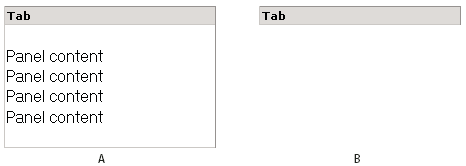
A Collapsible Panel widget is a panel that can store content in a compact space. Users hide or reveal the content stored in the Collapsible Panel by clicking the tab of the widget. The following example shows a Collapsible Panel widget, expanded and collapsed.

- A.
- Expanded
- B.
- Collapsed
The HTML code for the Collapsible Panel widget is made up of an outer div tag that contains the content div tag and the tab container div tag. The HTML code for the Collapsible Panel widget also includes script tags in the head of the document and after the Collapsible Panel’s HTML code.
The script tag in the head of the document defines all of the JavaScript functions related to the Collapsible Panel widget. The script tag after the Collapsible Panel widget code creates a JavaScript object that makes the Collapsible Panel interactive. Following is the HTML code for an Collapsible Panel widget:
<head>
...
	<!--Link the CSS style  sheet that styles the Collapsible Panel-->
	<link href="SpryAssets/SpryCollapsiblePanel.css" rel="stylesheet"
		type="text/css" />
	<!--Link the Spry Collapsible Panel JavaScript library-->
	<script src="SpryAssets/SpryCollapsiblePanel.js" type="text/javascript"></script>
</head>
<body>
	<!--Create the Collapsible Panel widget and assign classes to each element-->
	<div id="CollapsiblePanel1" class="CollapsiblePanel">
		<div class="CollapsiblePanelTab">Tab</div>
		<div class="CollapsiblePanelContent">Content</div>
	</div>
	<!--Initialize the Collapsible Panel widget object-->
	<script type="text/javascript">
		var cp1 = new Spry.Widget.CollapsiblePanel("CollapsiblePanel1");
	</script>
</body>
In the code, the new JavaScript operator initializes the Collapsible Panel widget object, and transforms the div content with the ID of CollapsiblePanel1 from static HTML code into an interactive page element. The Spry.Widget.CollapsiblePanel method is a constructor in the Spry framework that creates Collapsible Panel objects, and the information necessary to initialize the object is contained in the SpryCollapsiblePanel.js JavaScript library that you linked to in the head of the document.
Each of the elements in the Collapsible Panel widget contains a CSS class. These classes control the style of the Collapsible Panel widget, and exist in the accompanying SpryCollapsiblePanel.css file.
You can change the appearance of any given part of the Collapsible Panel widget by editing the CSS code that corresponds to the class names assigned to it in the HTML code. For example, to change the background color of the Collapsible Panel’s tabs, edit the CollapsiblePanelTab rule in the SpryCollapsiblePanel.css file. Keep in mind that changing the CSS code in the SpryCollapsiblePanel.css file will affect all collapsible panels that are linked to that file.
In addition to the classes shown in the HTML code, the Collapsible Panel widget includes certain default behaviors that are attached to the widget. These behaviors are a built‑in part of the Spry framework, and are in the SpryCollapsiblePanel.js JavaScript library file. The Collapsible Panel library includes behaviors related to hovering, clicking (to open and close the panel), panel focus, and keyboard navigation.
You can change the look of the Collapsible Panel as it relates to these behaviors by editing the appropriate classes in the SpryCollapsiblePanel.css file. If for some reason you want to remove a given behavior, you can delete the CSS rules that correspond to that behavior.
Variation on tags used for Collapsible Panel widget structure
In the preceding example, div tags create a nested tag structure for the widget:
Container div
	Tab div
	Content div
This 2-level, 3-container structure is essential for the Collapsible Panel widget to work properly; the structure, however, is more important than the actual tags you decide to use. Spry reads the structure (not div tags necessarily) and builds the widget accordingly. As long as the 2-level, 3-container structure is in place, you can use any block-level element to create the widget:
Container div
	H3 tag
	P tag
The div tags in the example are flexible and can contain other block-level elements. A p tag (or any other inline tag), however, cannot contain other block-level elements, so you cannot use it as a container or panel tag for the collapsible panel.

