

Validation Select widget overview and structure
A Spry Validation Select widget is a drop-down menu that displays valid or invalid states when the user makes a selection. For example, you can insert a Validation Select widget that contains a list of states, grouped into different sections and divided by horizontal lines. If the user accidentally selects one of the divider lines as opposed to one of the states, the Validation Select widget returns a message to the user stating that their selection is invalid.
The following example shows an expanded Validation Select widget, as well as the collapsed form of the widget in various states.
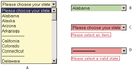
- A.
- Validation Select widget in focus
- B.
- Select widget, valid state
- C.
- Select widget, required state
- D.
- Select widget, invalid state
The Validation Select widget includes a number of states (for example, valid, invalid, required value, and so on). You can alter the properties of these states by editing the corresponding CSS file (SpryValidationSelect.css), depending on the desired validation results. A Validation Select widget can validate at various points (for example, when the user clicks outside the widget, as the user makes selections, or when the user tries to submit the form).
- Initial state
- When the page loads in the browser, or when the user resets the form.
- Focus state
- When the user clicks the widget.
- Valid state
- When the user selects a valid item, and the form can be submitted.
- Invalid state
- When the user selects an invalid item.
- Required state
- When the user fails to select a valid item.
Whenever a Validation Select widget enters one of the preceding states through user interaction, the Spry framework logic applies a specific CSS class to the HTML container for the widget at run time. For example, if a user tries to submit a form, but did not select an item from the menu, Spry applies a class to the widget so that it displays the error message, “Please select an item.” The rules that control the style and display states of error messages reside in the SpryValidationSelect.css file that accompanies the widget.
The default HTML code for the Validation Select widget, usually inside of a form, is made up of a container span tag that surrounds the select tag of the text area. The HTML code for the Validation Select widget also includes script tags in the head of the document and after the widget’s HTML code. The script tag in the head of the document defines all of the JavaScript functions related to the Select widget. The script tag after the widget code creates a JavaScript object that makes the widget interactive.
Following is the HTML code for a Validation Select widget:
<head>
...
<!-- Link the Spry Validation Select JavaScript library -->
<script src="SpryAssets/SpryValidationSelect.js" type="text/javascript"></script>
<!-- Link the CSS style sheet that styles the widget -->
<link href="SpryAssets/SpryValidationSelect.css" rel="stylesheet" type="text/css" />
</head>
<body>
	<form id="form1" name="form1" method="post" action="">
		<!-- Create the select widget and assign a unique id-->
		<span id="spryselect1">
		<select name="select1" id="select1">
			<!-- Add items and values to the widget-->
			<option>--Please select an item--</option>
			<option value="item1">Item 1</option>
			<option value="item2">Item 2</option>
			<option value="-1">Invalid Item</option>
			<option value="item3">Item 3</option>
			<option>Empty Item</option>
		</select>
		<!--Add an error message-->
		<span class="selectRequiredMsg">Please select an item.</span>
		</span>
	</form>
<!-- Initialize the Validation Select widget object-->
<script type="text/javascript">
	var selectwidget1 = new Spry.Widget.ValidationSelect("spryselect1");
</script>
</body>
In the code, the new JavaScript operator initializes the Select widget object, and transforms the span content with the ID of spryselect1 from static HTML code into an interactive page element.
The span tag for the error message in the widget has a CSS class applied to it. This class (which is set to display:none; by default), controls the style and visibility of the error message, and exists in the accompanying SpryValidationSelect.css file. When the widget enters different states as a result of user interaction, Spry places different classes on the container for the widget, which in turn affects the error-message class.
You can add other error messages to a Validation Select widget by creating a span tag (or any other type of tag) to hold the text of the error message. Then, by applying a CSS class to it, you can hide or show the message, depending on the widget state.
You can change the default appearance of the Validation Select widget's state by editing the corresponding CSS rule in the SpryValidationSelect.css file. For example, to change the background color for a state, edit the corresponding rule or add a new rule (if it’s not already present) in the style sheet.
Variation on tags used for Select widget structure
In the preceding example, span tags create the structure for the widget:
Container SPAN
	SELECT tag
	Error message SPAN
You can, however, use almost any container tag to create the widget.
Container DIV
	SELECT tag
	Error Message P
Spry uses the tag ID (not the tag itself) to create the widget. Spry also displays error messages using CSS code that is indifferent to the actual tag used to contain the error message.
The ID passed into the widget constructor identifies a specific HTML element. The constructor finds this element and looks inside the identified container for a corresponding select tag. If the ID passed to the constructor is the ID of the select tag (rather than a container tag), the constructor attaches validation triggers directly to the select tag. If no container tag is present, however, the widget cannot display error messages, and different validation states will only alter the appearance of the select tag element (for example, its background color).