

Sliding Panels widget overview and structure
The Spry Sliding Panels widget is a disclosure widget that works by providing a window-like opening through which you can view content. The content itself is kept in a content panel that moves in different directions behind the opening.
The content panel is a block of content separated into any number of discrete blocks. When a user clicks an element to show a specific block of content, the entire content panel moves behind the opening until the selected content appears. The content panel can use any type of layout, and the widget slides the content panel up, down, or diagonally as needed:
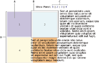
- A.
- Single content panel
- B.
- Content window
- C.
- Navigation links
- D.
- Content container
You can lay out the content panel in any way. Panels can be in a straight line horizontally or vertically, in a grid as shown in the illustration, or in any other type of layout.
Like the code for other Spry widgets, the code for the Sliding Panels widget can use any number of tag types, as long as the tags follow the correct nesting structure. (The div tags are used in most of the examples.)
The structure is as follows:
Main widget element
	Content panel container
		Content panel
		Content panel
The main widget element creates the opening that makes the content visible. The content panel container holds all of the individual panels, and can be any height or width. The content panels hold the actual pieces of content. The content panel size should match the main widget (or opening) size. You can have an unlimited number of content panels in the widget.
Each content panel must have a unique ID. As with all widgets, the Sliding Panels widget is activated by a script tag below the widget code, and the script tag contains this ID.
The following is an example of code for a Sliding Panels widget:
<head>
. . .
<!--Link the Sliding Panels JavaScript library-->
<script type="text/javascript" src="SprySlidingPanels.js"></script>
<!--Link the CSS style sheet that styles the widget-->
<link href="SprySlidingPanels.css" rel="stylesheet" type="text/css" />
<style type="text/css">
#p1 {
	background-color: #FFFF99;
}
#p2 {
	background-color: #FF99FF;
}
#p3 {
	background-color: #99FFFF;
}
#p4 {
	background-color: #0066FF;
}
</style>
</head>
<body>
<!--Add navigation to scroll through content panels-->
<a href="#" onclick="sp1.showFirstPanel(); return false;">First</a> |
<a href="#" onclick="sp1.showPreviousPanel(); return false;">Previous</a> |
<a href="#" onclick="sp1.showNextPanel(); return false;">Next</a> |
<a href="#" onclick="sp1.showLastPanel(); return false;">Last</a>
<!--Create the Sliding Panels widget and assign it the Sliding Panels class-->
<div id="SlidingPanels1" class="SlidingPanels">
	<div class="SlidingPanelsContentGroup">
		<!--Add content panels with unique IDs-->
		<div id="p1" class="SlidingPanelsContent">
			<p>Panel 1</p>
			<p>Lorem ipsum dolor sit amet, consectetur adipisicing elit.</p>
		</div>
		<div id="p2" class="SlidingPanelsContent">
			<p>Panel 2</p>
			<p>Panel 2</p>
		</div>
		<div id="p3" class="SlidingPanelsContent">
			<p>Panel 3</p>
			<p>Lorem ipsum dolor sit amet, consectetur adipisicing elit.</p>
		</div>
		<div id="p4" class="SlidingPanelsContent">
			<p>Panel 4</p>
			<p>Panel 4</p>
		</div>
	</div>
</div>
<!--Initialize the Sliding Panels widget object-->
<script type="text/javascript">
var sp1 = new Spry.Widget.SlidingPanels("SlidingPanels1");
</script>
</body>
The script tag in the head of the document defines all of the JavaScript functions related to the Sliding Panels widget. The script tag after the widget code creates a JavaScript object that makes the widget interactive. The new JavaScript operator initializes the Sliding Panels widget object, and transforms the div content with the ID of SlidingPanels1 from static HTML code into an interactive page element. The Spry.Widget.SlidingPanels method is a constructor in the Spry framework that creates sliding panel JavaScript objects, and the information necessary to initialize the object is contained in the SprySlidingPanels.js JavaScript library that is linked to in the head of the document.
Each of the div tags in the Sliding Panels widget contains a CSS class. These classes control the style of the widget, and exist in the accompanying SprySlidingPanels.css file. You can change the appearance of any given part of the widget by editing the CSS code that corresponds to the class names assigned to it in the HTML code.
In addition to the classes shown in the HTML code, the Sliding Panels widget includes certain default behaviors that are attached to the widget. These behaviors are a built‑in part of the Spry framework, and are in the SprySlidingPanels.js JavaScript library file.
In the example, a tags are used to switch between panels. The showFirstPanel, showPreviousPanel, showNextPanel, and showLastPanel behaviors let you navigate through the panels you want to view.