# `@alikhalilll/a-tel-input` > A headless, shadcn-vue style **international telephone input** for Vue 3 / Nuxt 3+. > Country auto-detect · libphonenumber-js validation · responsive picker (popover ⇆ drawer) · > RTL & i18n ready · first-class VeeValidate + Zod integration · server-side validation hook.

ATelInput — input on the left with the country picker open next to it, showing flags, country names, and dial codes

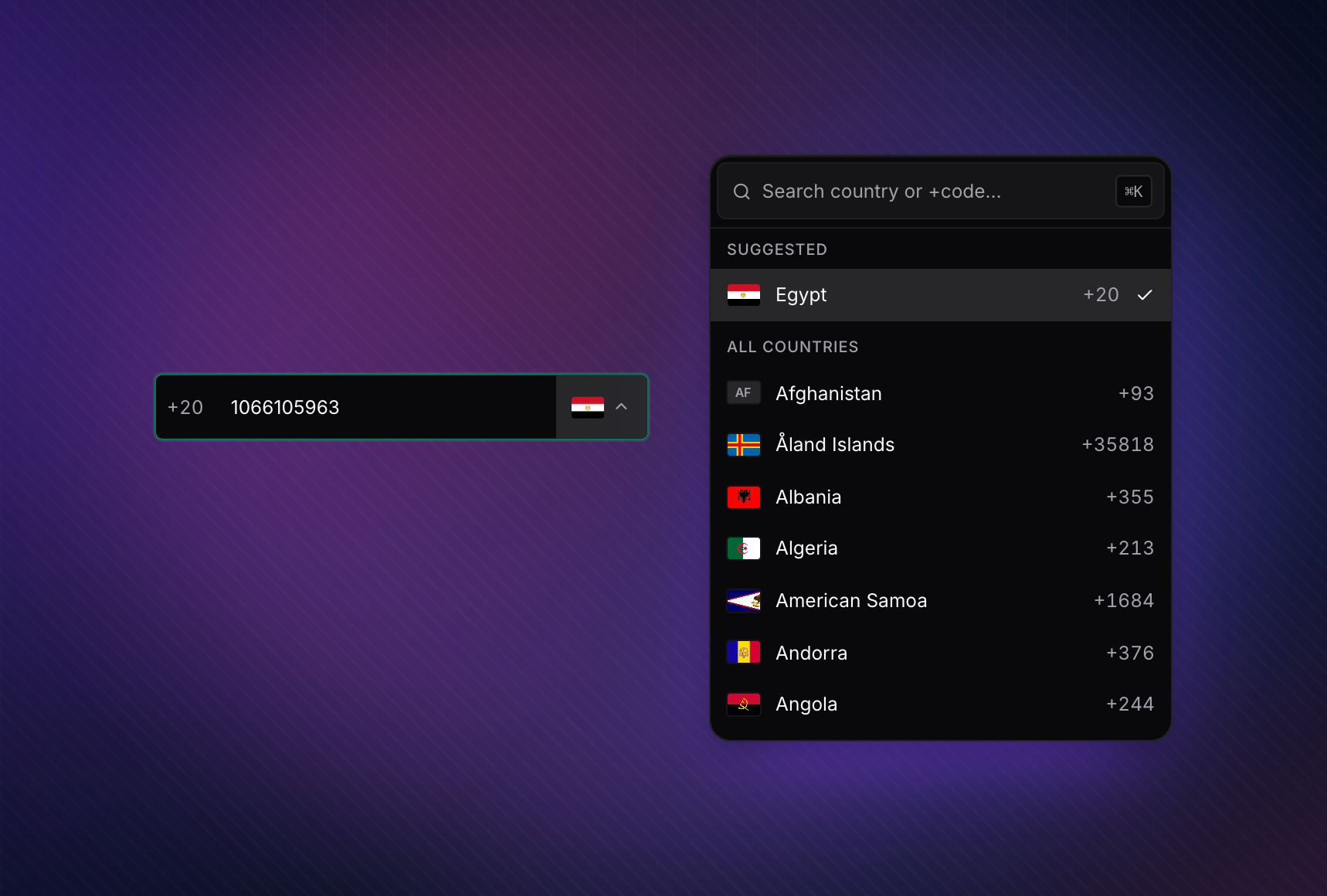
Headless picker — popover on desktop, bottom-sheet on mobile.

[![npm version](https://img.shields.io/npm/v/%40alikhalilll%2Fa-tel-input.svg?style=for-the-badge&label=npm&labelColor=0a0a0a&color=635bff)](https://www.npmjs.com/package/@alikhalilll/a-tel-input) [![license](https://img.shields.io/npm/l/%40alikhalilll%2Fa-tel-input.svg?style=for-the-badge&labelColor=0a0a0a&color=635bff)](./LICENSE) [![types](https://img.shields.io/npm/types/%40alikhalilll%2Fa-tel-input.svg?style=for-the-badge&labelColor=0a0a0a&color=635bff)](https://www.npmjs.com/package/@alikhalilll/a-tel-input) ## Setup ### Nuxt 3 / 4 ```bash pnpm add @alikhalilll/a-tel-input # npm install @alikhalilll/a-tel-input # yarn add @alikhalilll/a-tel-input # bun add @alikhalilll/a-tel-input ``` ```ts // nuxt.config.ts export default defineNuxtConfig({ modules: ['@alikhalilll/a-tel-input/nuxt'], css: ['@alikhalilll/a-tel-input/styles.css'], }); ``` `ATelInput`, `ACountrySelect`, and `ACountryFlag` are auto-imported — no `import` statement needed in your `.vue` files. ### Vue + Vite ```bash pnpm add @alikhalilll/a-tel-input ``` ```ts // main.ts import '@alikhalilll/a-tel-input/styles.css'; ``` Optional auto-resolve via `unplugin-vue-components`: ```ts // vite.config.ts import Components from 'unplugin-vue-components/vite'; import { ATelInputResolver } from '@alikhalilll/a-tel-input/resolver'; export default { plugins: [Components({ resolvers: [ATelInputResolver()] })] }; ``` ### REST Countries v5 (optional) The component renders with a synchronous, offline country list built from `libphonenumber-js` + `Intl.DisplayNames` — no network, no auth. Pass `restCountriesApiKey` to opt into the v5 fetch (one request per browser, cached in `localStorage` for 30 days): ```ts // nuxt.config.ts — applies app-wide export default defineNuxtConfig({ modules: ['@alikhalilll/a-tel-input/nuxt'], aTelInput: { apiKey: 'rc_live_...' }, }); ``` ```vue ``` ```ts // Vue + Vite — install once at bootstrap import { installTelInputDefaults } from '@alikhalilll/a-tel-input'; installTelInputDefaults(app, { apiKey: 'rc_live_...' }); ``` Per-component props win over the injected default. Any failure (CORS, network, non-2xx) silently falls back to the offline baseline — never an empty dropdown. CORS requires you to allowlist your origin's hostnames on the REST Countries dashboard. --- ## Why this component - **Universal country detection** — debounced parse against the **full libphonenumber metadata (~250 countries)**. Works with international format (`+201066105963`) AND local format (`01066105963`), with NANP disambiguation and a hint-priority chain (env → current → recents → popular → all). No "only the popular countries" caveats. - **Validates and formats** — error reasons, format hint, E.164 output, every keystroke. - **Responsive surface** — popover on desktop, bottom-sheet drawer on mobile, sticky-safe scroll lock on **both**. The page underneath never scrolls; the inner picker list does. - **Headless slots for every region** — trigger, chevron, flag, item, search, hint, error. Restyle the field down to the pixel without forking the logic. - **First-class form-library integration** — controlled `error` prop, `@blur` event, `useTelField()` composable for VeeValidate, `zPhone()` factory for Zod schemas, and a `validating` spinner for async server-side checks ("is this number already registered?"). - **Two binding contracts, your pick** — single default `v-model` (E.164 string, drops into VeeValidate's `` via `v-bind="field"`), or split `v-model:phone` + `v-model:country`. Both stay in sync. - **i18n + RTL out of the box** — country names localised via `Intl.DisplayNames`, alternative numerals (Arabic-Indic, Persian, Devanagari, Bengali) folded to ASCII on input, RTL inherited from the page or forced via `dir`. - **Efficient by default** — country list built synchronously from `libphonenumber-js` metadata + `Intl.DisplayNames` — **zero network requests**. Lookup indexes are populated at first call, so country detection (`+20`, `+44`, ambiguous `+1` NANP, etc.) works from first paint. IP geolocation request still deduped to one call per page across every `` / `` / `useTelField()` / `zPhone()` instance. LRU-cached matcher. - **Optional REST Countries v5 upgrade** — pass `restCountriesApiKey` (or configure it via the Nuxt module / `installTelInputDefaults`) to fire one `api.restcountries.com/countries/v5` request per browser; the result is cached in `localStorage` for 30 days. Without a key the picker stays on the offline baseline — no behaviour change required. - **SSR-safe** — country detection runs only after mount, hydration is clean. - **TypeScript-first** — every prop, slot, and event fully typed; web-types ship for JetBrains IDEs. --- ## Table of contents - [Setup](#setup) - [Quick start](#quick-start) - [Form integration](#form-integration) - [VeeValidate + Zod](#veevalidate--zod) - [Server-side validation](#server-side-validation-is-this-phone-already-registered) - [Native HTML forms](#native-html-forms) - [API reference](#api-reference) - [Props](#props) - [Events](#events) - [Slots](#slots) - [Exposed methods](#exposed-methods) - [Composables](#composables) - [Theming](#theming) - [Accessibility](#accessibility) - [SSR](#ssr) - [TypeScript](#typescript) - [Browser support](#browser-support) - [Troubleshooting](#troubleshooting) - [License](#license) --- ## Quick start The component supports **two binding contracts** — pick whichever fits your form code: ### Single v-model (E.164 string) The friendliest with VeeValidate's ``, native HTML `
` submission, and anything else that expects one canonical value: ```vue ``` ### Split `v-model:phone` + `v-model:country` When you want the raw national digits and the dial code as separate values: ```vue ``` | Binding | Type | Carries | | ----------------- | ---------------- | --------------------------------------------------------------------- | | `v-model` | `string` | Full E.164 string (`'+201066105963'`). Empty when invalid / blank. | | `v-model:phone` | `string` | Digits-only national number (no `+`, no spaces). | | `v-model:country` | `number \| null` | Dial-digit number (e.g. `20` for Egypt, `1` for NANP). `null` ≈ none. | > The two contracts stay in sync — you can mix them, but most apps pick one and stick with it. The picker is **hidden by default** until a leading dial code is detected from typing — pass `default-country` to show it pre-selected, or `:detect-from-input="false"` for the legacy always-visible picker. --- ## Form integration `@alikhalilll/a-tel-input` ships two thin subpath entries so the same validation engine that powers the in-field UI is also available to your form layer: - **`@alikhalilll/a-tel-input/vee-validate`** — `useTelField()` composable. - **`@alikhalilll/a-tel-input/zod`** — `zPhone()` / `zPhoneObject()` schema factories. Both `vee-validate` and `zod` are **optional peer dependencies** — install them yourself. ### Drop-in `` pattern If you're already using VeeValidate's slot-style fields, **`v-bind="field"` just works**. ATelInput's default `v-model` is the E.164 string, and Vue auto-spreads `field.modelValue` + `field['onUpdate:modelValue']` + `field.name` + `field.onBlur` from the slot prop directly onto the component: ```vue ``` That's it — no `useTelField()`, no manual wiring, no `handleBlur` to forward. `field` provides everything; `:error="errors[0]"` surfaces the first error message in the existing error region. > Prefer `useTelField()` (below) when you also need async / server-side validation in > flight, or when you want the helper to manage `defaultCountry` for you. ### VeeValidate + Zod (with useTelField) ```bash # pnpm pnpm add vee-validate @vee-validate/zod zod # npm npm install vee-validate @vee-validate/zod zod # yarn yarn add vee-validate @vee-validate/zod zod # bun bun add vee-validate @vee-validate/zod zod ``` ```ts import { useForm } from 'vee-validate'; import { toTypedSchema } from '@vee-validate/zod'; import { z } from 'zod'; import { useTelField } from '@alikhalilll/a-tel-input/vee-validate'; import { zPhone } from '@alikhalilll/a-tel-input/zod'; const { handleSubmit } = useForm({ validationSchema: toTypedSchema(z.object({ phone: zPhone() })), }); const { phone, country, error, handleBlur, fieldProps } = useTelField('phone', { validateOn: 'blur', defaultCountry: 'SA', }); ``` ```vue ``` `useTelField` composes the digits-only `phone` + the dial-code `country` into an E.164 string under the hood, and feeds **that** to VeeValidate's schema — so your Zod schema validates a single canonical value while the component still binds to two v-models. ### Server-side validation ("is this phone already registered?") > **Important** — VeeValidate **ignores field-level `rules`** when `useForm` is given a > `validationSchema`. To run an async server check, chain it onto the schema itself via > `z.refine(async)`. `handleSubmit` awaits the schema, and `meta.pending` (which drives > `useTelField`'s `validating` ref → the in-field spinner) follows the schema's async work. ```ts import { useForm } from 'vee-validate'; import { toTypedSchema } from '@vee-validate/zod'; import { z } from 'zod'; import { useTelField } from '@alikhalilll/a-tel-input/vee-validate'; import { zPhone } from '@alikhalilll/a-tel-input/zod'; // Build the schema: sync zPhone() first (cheap — runs locally via libphonenumber-js), // then an async refine that hits your server. Refines run AFTER the parent passes, so // the server is only contacted when the value is syntactically valid. const phoneSchema = zPhone().refine( async (value) => { if (!value) return true; const { exists } = await $fetch('/api/phone/exists', { query: { phone: value } }); return !exists; }, { message: 'This phone number is already registered.' } ); const { handleSubmit } = useForm({ validationSchema: toTypedSchema(z.object({ phone: phoneSchema })), }); const { phone, country, error, handleBlur, fieldProps, validating } = useTelField('phone', { validateOn: 'blur', }); ``` ```vue ``` - `error` displays the server message in the existing error region. - `validating` is `true` while the request is in flight — renders a small spinner inside the field and sets `aria-busy="true"`. It does **not** disable the input. - `handleSubmit` awaits the async refine before invoking your callback, so a failing server check blocks submission automatically. ### Native HTML forms ```vue
``` `name` is forwarded to the inner `` so `FormData` picks the value up. The submitted value is the digits-only national number — compose the E.164 with `usePhoneValidation()` in your submit handler if you want the international form. --- ## API reference ### Props | Prop | Type | Default | Description | | ---------------------- | -------------------------------------- | ---------- | ---------------------------------------------------------------------------------------------------------------------------------------------------------------------------- | | `modelValue` | `string` | `''` | Default `v-model` — full **E.164** string (`'+201066105963'`). Drops directly into VeeValidate's `` via `v-bind="field"`. | | `phone` | `string` | `''` | `v-model:phone` — digits-only national number. | | `country` | `number \| null` | `null` | `v-model:country` — selected dial-digit number (e.g. `20`). | | `name` | `string` | — | Forwarded to the inner `` for native form submission / form libraries. | | `error` | `string \| null` | — | Externally controlled error message. When non-empty, overrides internal validation. | | `validating` | `boolean` | `false` | `true` while an async validation is in flight. Renders a spinner inside the field. | | `validateOn` | `'change' \| 'blur' \| 'eager'` | `'change'` | When to surface validation in the UI. | | `defaultCountry` | `string` | — | Initial country — ISO2 (`'EG'`) or dial code (`'20'` / `'+20'`). | | `detectCountry` | `DetectionStrategy` | `'auto'` | Silent country hint chain: IP → timezone → `navigator.language`. | | `detectFromInput` | `boolean` | `true` | Reveal the picker on first dial-code match while typing. | | `detectDebounceMs` | `number` | `800` | Debounce window for `detectFromInput`. | | `allowedDialCodes` | `string[]` | — | Whitelist of dial codes; others render disabled. | | `size` | `'xs' \| 'sm' \| 'md' \| 'lg' \| 'xl'` | `'md'` | Control size — mirrors the shared `Size` scale. | | `dir` | `'ltr' \| 'rtl' \| 'auto'` | `'auto'` | Text direction (inherits from the page by default). | | `locale` | `string` | — | BCP-47 locale — localises country names + numerals in hints. | | `messages` | `TelInputMessagesInput` | — | Bag of every UI string; merged onto English defaults. | | `showValidation` | `boolean` | `false` | Colour the field border + error line by validity. | | `showValidationIcon` | `boolean` | `false` | Show the valid / error icon at the field end. | | `disabled` / `loading` | `boolean` | `false` | Field state. | | `placeholder` | `string` | derived | Falls back to the country's `format_hint` when empty. | | `flagUrl` | `(iso2, w) => string` | flagcdn | Override the flag image source. | | `countries` | `CountryOption[]` | derived | Provide your own country list (bypasses the internal libphonenumber-derived list). | | `restCountriesApiKey` | `string` | — | Opt-in REST Countries v5 API key. One fetch per browser, cached for 30 days. Falls back to the sync baseline on any failure. | | `searcher` | `(q, c) => boolean` | substring | Custom search predicate. | | `detector` | `async (opts) => string \| null` | built-in | Fully custom country detection. | | `ipEndpoint` | `string` | `ipapi.co` | Override the IP geolocation endpoint. | | `scrollLock` | `'events' \| 'body' \| 'none'` | `'events'` | How page-scroll is blocked while the picker is open. Applies on both desktop and mobile. | | `forceBottomSheet` | `boolean` | `false` | Force the picker to render as a bottom-sheet drawer regardless of viewport width. Useful for primarily-mobile flows where the picker should feel modal on every form factor. | | Class hooks | `string` | — | `class`, `fieldClass`, `inputClass`, `contentClass`, `popoverClass`, `drawerClass`, `hintClass`, `errorClass`. | | Localised strings | `string` | — | `searchPlaceholder`, `emptyText`, `loadingText`, `errorMessages`. | > The full prop / type reference (with every default and every JSDoc note) lives in > [`src/types.ts`](./src/types.ts) and is published as part of the package types. ### Events | Event | Payload | Fires when | | ------------------- | ---------------- | ---------------------------------------------------------- | | `update:modelValue` | `string` | Composed E.164 string changed (the default `v-model`). | | `update:phone` | `string` | Digits-only national number changed. | | `update:country` | `number \| null` | Dial-code number changed. | | `blur` | `FocusEvent` | Inner input lost focus (also flips internal `hasBlurred`). | | `focus` | `FocusEvent` | Inner input gained focus. | ### Slots Every visual region is a slot — the component is fully recomposable. | Slot | Props | | --------------- | ------------------------------------------------------------- | | `prefix` | — | | `suffix` | `{ validationState, validation }` | | `trigger` | `{ selectedCountry, open, sizeClasses }` | | `chevron` | `{ open }` | | `selected-flag` | `{ country, open }` — trigger only | | `item-flag` | `{ country }` — popover option rows only | | `flag` | `{ country, context: 'trigger' \| 'item' }` — legacy unified¹ | | `item` | `{ country, selected, disabled, select }` | | `group-header` | `{ label, group: 'suggested' \| 'all' }` | | `search` | `{ value, setValue, isSearching }` | | `loading` | — | | `empty` | `{ query }` | | `detecting` | — (during country detection) | | `validating` | — (during async form validation) | | `valid-icon` | — | | `error-icon` | `{ reason }` | | `hint` | `{ country, formatHint, example }` | | `error` | `{ message, reason, validation }` | ¹ Legacy unified slot — still fires for both the trigger and each option row (distinguished by `context`) so existing consumers keep working. Prefer `selected-flag` / `item-flag` in new code so changes to one location don't spill into the other. Example: customising the trigger to render flag + country name without changing how rows in the popover look: ```vue ``` ### Exposed methods Reach these via `` → `tel.value?.()`: | Member | Type | Notes | | ------------------------ | ------------------------------------------- | ----------------------------------------------- | | `validation` | `ComputedRef` | Full validation result. | | `required` | `ComputedRef` | Country format hint + example E.164. | | `selectedDialCode` | `ComputedRef` | `+`-prefixed dial code of the selected country. | | `validationState` | `ComputedRef<'idle' \| 'valid' \| 'error'>` | Raw state (no typing-pause gating). | | `visibleValidationState` | `ComputedRef<'idle' \| 'valid' \| 'error'>` | UI-surfacing state (gated by `validateOn`). | | `isDetecting` | `Readonly>` | `true` during the first debounce window. | | `hasFinishedTyping` | `Readonly>` | Flips after the debounce settles. | | `detectionAttempted` | `Readonly>` | `true` after at least one detection pass. | | `focus(options?)` | `() => void` | Focus the inner ``. | | `blur()` | `() => void` | Blur the inner ``. | | `select()` | `() => void` | Select the inner ``'s text. | ### Composables Re-exported from the main entry — compose your own field from the same primitives the component uses. | Symbol | Source path | Purpose | | ------------------------- | --------------------------------------- | --------------------------------------------------------------------------------------------------------------------------------------------------------------------------- | | `usePhoneValidation` | `@alikhalilll/a-tel-input` | The libphonenumber-js wrapper — `validate`, `getRequiredInfo`, `searchCountries`, `getCountryByValue`, `getCountriesByDial`. | | `useCountryMatching` | `@alikhalilll/a-tel-input` | Longest-prefix dial-code matching with tier-3 NANP tie-break. | | `detectCountry` | `@alikhalilll/a-tel-input` | The IP → timezone → locale → default chain (callable standalone). | | `useTypingPhase` | `@alikhalilll/a-tel-input` | Debounced typing-pause state machine. | | `useTelInputValidation` | `@alikhalilll/a-tel-input` | View-layer facade (visible state, error message, show flags). | | `useCountrySelection` | `@alikhalilll/a-tel-input` | Picker selection state machine (`iso2` + `source` enum + `detectionLocked`). The single state machine the component uses internally — useful when composing your own field. | | `useSyncedModel` | `@alikhalilll/a-tel-input` | Generic bidirectional sync between a `defineModel` ref and internal state, with the echo-loop guard built in. Reusable in any v-model bridge. | | `useTelField` | `@alikhalilll/a-tel-input/vee-validate` | VeeValidate adapter — see [Form integration](#form-integration). | | `zPhone` / `zPhoneObject` | `@alikhalilll/a-tel-input/zod` | Zod schema factories — see [Form integration](#form-integration). | | `normalizeDigits` | `@alikhalilll/a-tel-input` | Fold Arabic-Indic / Persian / Devanagari / Bengali numerals → ASCII. | | `defaultFlagUrl` | `@alikhalilll/a-tel-input` | Default flagcdn URL builder. | | `provideTelInputDefaults` | `@alikhalilll/a-tel-input` | Vue `provide` helper — set `apiKey` / `restCountriesBaseUrl` once for an ancestor subtree. | | `installTelInputDefaults` | `@alikhalilll/a-tel-input` | Same as above but bound to a Vue `App` (called by the Nuxt module's auto-installed plugin). | --- ## Theming The component renders with neutral defaults and reads global design tokens — restyle from your app's stylesheet without touching the component itself. ### CSS custom properties Set these on `:root` (or any ancestor) to retint the component: | Token | Used for | | -------------------------- | ------------------------------------- | | `--ak-ui-background` | Field + popover/drawer background. | | `--ak-ui-foreground` | Field + popover/drawer text. | | `--ak-ui-input` | Field border. | | `--ak-ui-ring` | Focus ring colour. | | `--ak-ui-muted-foreground` | Dial prefix, hint text, placeholder. | | `--ak-ui-destructive` | Error border / ring / icon / message. | | `--ak-ui-radius` | Field corner radius. | Valid / error tints (green / red) read literal values — override via the class hooks below. ### Class hooks Each visual region accepts a class prop you can target with utility classes (Tailwind, your own utility framework, or plain CSS): | Prop | Targets | | -------------- | -------------------------------------------------------------------------- | | `class` | The root wrapper (`.a-tel-input`). | | `fieldClass` | The field row that contains input + dial + picker (`.a-tel-input__field`). | | `inputClass` | The actual `` element. | | `hintClass` | The hint paragraph below the field. | | `errorClass` | The error paragraph below the field. | | `popoverClass` | The desktop popover surface. | | `drawerClass` | The mobile drawer surface. | | `contentClass` | Both branches (applied alongside `popoverClass` / `drawerClass`). | ### Stateful selectors - `[data-state="idle" | "valid" | "error"]` on the root and on `.a-tel-input__field`. - `[data-size="xs" | "sm" | "md" | "lg" | "xl"]` on the root. - `[data-show-validation]` on the root when `showValidation` is on. - `[aria-invalid="true"]` on the input when the surfaced state is error. - `[aria-busy="true"]` on the input when `validating` is true. ### Dark mode Light / dark is driven entirely by the `--ak-ui-*` tokens — set them to dark values under `[data-theme="dark"]` (or however your app gates dark mode) and everything follows. --- ## Accessibility - `aria-label` on the inner `` (overrideable via `messages.phoneInputLabel`). - `aria-invalid="true"` mirrors the surfaced error state. - `aria-describedby` points at the hint / error line whenever it has content; the line is an `aria-live="polite"` region so screen readers announce new errors. - `aria-errormessage` points at the same line when the field is in error. - `aria-busy="true"` on the input while `validating` is on. - Country picker is keyboard-navigable — arrow keys, `/` to focus search, Enter to pick, Esc to close. - Focus management is handled by the underlying popover/drawer — focus returns to the trigger on close. --- ## SSR Country detection runs **only inside `onMounted`** — the field renders immediately with `defaultCountry` (or empty) on the server, and the IP / timezone / locale chain patches in on hydration. There are no SSR network calls, and `useEventScrollLock` short-circuits when `document` is unavailable. If `default-country` is set, the picker is visible at first paint and hydration is a no-op visually. If you rely on `detect-from-input`, the picker stays hidden until the client-side parser sees a leading dial code — also hydration-safe. --- ## TypeScript Import the public types from the main entry: ```ts import type { ATelInputProps, ATelInputEmits, ATelInputSlots, ATelInputSize, ATelInputDir, ATelInputValidateOn, TelInputMessages, TelInputMessagesInput, PhoneValidationResult, PhoneValidationReason, PhoneRequiredInfo, CountryOption, } from '@alikhalilll/a-tel-input'; ``` Slot props are inferable in templates: ```vue ``` Or in script: ```ts type SuffixProps = Parameters>[0]; ``` --- ## Browser support Modern evergreen browsers — last two versions of Chrome, Edge, Firefox, Safari, and the matching mobile WebViews. Uses `Intl.DisplayNames` for localized country names (universal since 2020). No polyfills required. --- ## Troubleshooting **Why is the picker hidden until I type?** `detectFromInput` is on by default — the field starts as a single clean input and the picker reveals once a leading dial code is recognised. Pass `default-country="EG"` (or any ISO2 / dial-code string) to show it pre-selected, or `:detect-from-input="false"` for the legacy always-visible picker. **How do I show validation only after blur?** `validateOn="blur"`. Or use `useTelField()` — its `fieldProps` already includes that. **I want a single E.164 value out of the field.** Two options. From a form: `useTelField()` tracks the E.164 string as VeeValidate's value (see [Form integration](#form-integration)). Without a form: `tellRef.value?.validation.full_phone`. **My Zod schema rejects a valid number.** Check `allowedDialCodes` and `country` — `zPhone({ country: 'EG' })` expects the **national** digits (`'1066105963'`), while `zPhone()` (no `country`) expects the **E.164** form (`'+201066105963'`). Use `zPhoneObject()` if you want to pass `{ phone, country }` directly. **The page underneath the drawer scrolls.** That was a bug in versions < 1.1.0 — the event scroll-lock was desktop-only. Upgrade. **Opening the picker mid-scroll makes my page header / sticky TOC vanish.** Fixed in 1.1.3. The legacy `scroll-lock="body"` mode (and reka-ui's `modal=true` body lock that fired alongside it) used to mutate `body { overflow: hidden }`, which silently broke `position: sticky` on the host page. Both paths now share the event-based lock (sticky-safe). The default `scroll-lock="events"` always behaved correctly; only `'body'` was destructive, and it's now equivalent. **Country auto-detect didn't work.** The default `ipEndpoint` is `https://ipapi.co/json/` — it's free-tier rate-limited. Either provide your own endpoint (`ip-endpoint="/api/geo"` returning `{ country_code }`), swap the entire chain via the `detector` prop, or disable IP and fall through to timezone: `detect-country="locale"`. --- ## License [MIT](./LICENSE) © alikhalilll