# react-device-bezels
[](https://www.npmjs.com/package/react-device-bezels)
[](https://www.npmjs.com/package/react-device-bezels)
[](./LICENSE)
React device mockups and pure CSS device frames for iPhone, iPad, Android, Pixel, Galaxy, tablets, and app screenshots.
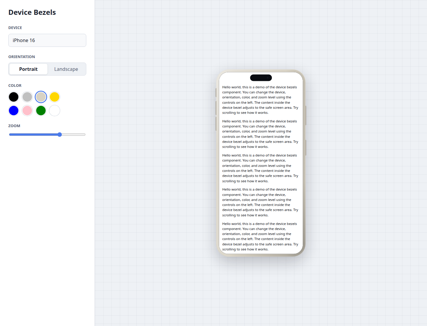
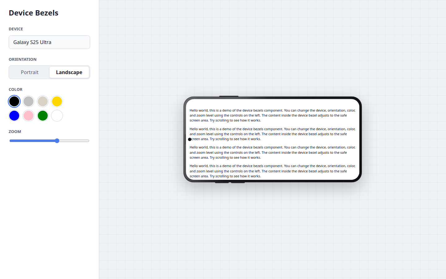
`react-device-bezels` renders realistic device shells around any React content. Use it for app previews, product pages, documentation, screenshots, portfolios, launch pages, or internal design tools. If you need a React device frameset, iPhone mockup, Android device frame, or screenshot wrapper, this package gives you a lightweight CSS-based option.
[Live demo](https://ash-negee.github.io/device-frames/) | [npm package](https://www.npmjs.com/package/react-device-bezels) | [GitHub repository](https://github.com/ash-negee/device-frames)
## Highlights
- Pure SCSS/CSS bezels, no device image assets required
- Works with JSX, screenshots, videos, canvases, and any React children
- Safe-area-aware scroll container for Dynamic Island, notches, punch-hole cameras, and landscape cutouts
- iOS and Android phones, tablets, and foldables
- Device color, orientation, zoom, and custom screen dimensions
- Typed React API with ESM, CJS, and TypeScript declarations
- Compiled CSS and source SCSS exports
## Use Cases
- Wrap app screenshots in iPhone, iPad, Pixel, and Galaxy frames
- Render live React UI inside realistic device mockups
- Build product landing pages, portfolios, app store previews, docs, and launch pages
- Create responsive mobile previews without image-based device assets
- Show portrait and landscape app states in one React component
- Build screenshot galleries, product mockups, and mobile UI documentation
## Install
```sh
npm install react-device-bezels
```
## Quick Start
```tsx
import { DeviceFrame } from "react-device-bezels";
import "react-device-bezels/styles.css";
export function Preview() {
return (
Dashboard
This is real JSX rendered inside the device screen.
);
}
```
## Screenshot Usage
For full-bleed screenshots, pass an image as the child and make it fill the screen.
```tsx
import { DeviceFrame } from "react-device-bezels";
import "react-device-bezels/styles.css";
export function ScreenshotPreview() {
return (
);
}
```
## JSX Content
Children render inside `.df-device__content`, a safe-area-aware scroll container. Content avoids the notch, island, punch-hole camera, and landscape cutouts automatically. Scrollbars are hidden by default while scrolling remains enabled.
```tsx
{({ device, orientation }) => (
{device.label}
{orientation}
)}
```
Use `screenClassName` or `screenStyle` for the full screen surface. Use `contentClassName` or `contentStyle` for the scrollable inner content.
## API
```tsx
type DeviceFrameProps = {
device?: DeviceName;
color?: DeviceColor | string;
orientation?: "portrait" | "landscape";
landscape?: boolean;
width?: number | string;
height?: number | string;
zoom?: number;
className?: string;
frameClassName?: string;
screenClassName?: string;
contentClassName?: string;
style?: React.CSSProperties;
screenStyle?: React.CSSProperties;
contentStyle?: React.CSSProperties;
children?: React.ReactNode | ((props: DeviceFrameRenderProps) => React.ReactNode);
};
```
| Prop | Default | Description |
| --- | --- | --- |
| `device` | `"iphone-15"` | Preset device name. |
| `color` | Device default | Preset color name or any CSS color value. |
| `orientation` | `"portrait"` | `"portrait"` or `"landscape"`. |
| `landscape` | `false` | Convenience boolean for landscape orientation. |
| `width` | Preset width | Custom screen width before bezel chrome. |
| `height` | Preset height | Custom screen height before bezel chrome. |
| `zoom` | `1` | Scales the rendered device. |
| `className` | - | Class for the outer wrapper. |
| `frameClassName` | - | Class for the hardware shell. |
| `screenClassName` | - | Class for the clipped screen surface. |
| `contentClassName` | - | Class for the safe, scrollable content layer. |
| `style` | - | Inline styles and CSS variables for the outer wrapper. |
| `screenStyle` | - | Inline styles for the screen surface. |
| `contentStyle` | - | Inline styles for the scrollable content layer. |
| `children` | - | React content or a render function. |
## Devices
`DeviceName` is inferred from `DEVICE_PRESETS`, so the TypeScript type always matches the exported preset list.
```tsx
import { DEVICE_PRESETS } from "react-device-bezels";
const devices = DEVICE_PRESETS.map((device) => device.name);
```
The package currently includes 76 presets across these families:
- iPhone 16, 15, 14, 13, 12, 11, X/XR, 8 Plus, and SE
- iPad Pro, iPad Air, iPad, and iPad Mini
- Google Pixel 9, 8, 7, 6, Fold, and Pixel Tablet
- Samsung Galaxy S25, S24, S23, S22, Z Flip, Z Fold, and Galaxy Tab
- OnePlus 13, 12, and Open
- Xiaomi 15, 15 Ultra, and 14
## Styling
Import compiled CSS:
```tsx
import "react-device-bezels/styles.css";
```
Or import source SCSS:
```scss
@use "react-device-bezels/styles.scss";
```
The outer element exposes CSS variables for advanced customization:
```tsx
```
## Examples
Portrait iPhone with JSX:
```tsx
```
Landscape Android preview:
```tsx
```
Custom dimensions:
```tsx
```
## Development
```sh
npm install
npm run dev
npm run check
```
`npm run check` typechecks the package, builds ESM/CJS/type declarations, compiles CSS, and runs an npm pack dry-run.
## Package Exports
```tsx
import { DeviceFrame, DEVICE_PRESETS } from "react-device-bezels";
import "react-device-bezels/styles.css";
```
```scss
@use "react-device-bezels/styles.scss";
```
## Notes
- Frames are CSS approximations intended for previews and mockups, not exact CAD/device templates.
- Screen sizes are logical CSS viewport dimensions, not physical hardware pixels.
- Android viewport dimensions can vary by browser, display size, and user scaling settings.
## License
MIT
