[中文(Chinese)](https://github.com/chaychan/BottomBarLayout)
### Support
If you feel that my project is helpful to you, please help me to click on the **star** and let more people see it. Thank you!
### Version 3.0
The new version 3.0 has refactored the project, and the usage is very different. If you used version 2.0 before, please refer to [BottomBarLayout-2.1.0](https://github.com/chaychan/BottomBarLayout/blob/master/README-en-2.0.md) for detailed usage if you want to continue to update and maintain it. The old version will no longer be maintained. If necessary, please download the source code and modify it. The branch name is feature-2.1.0
### Introduction
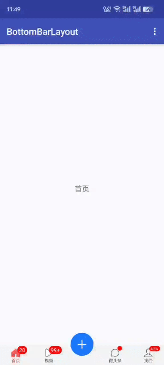
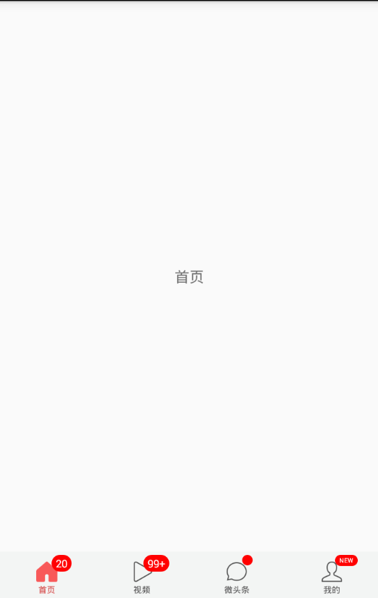
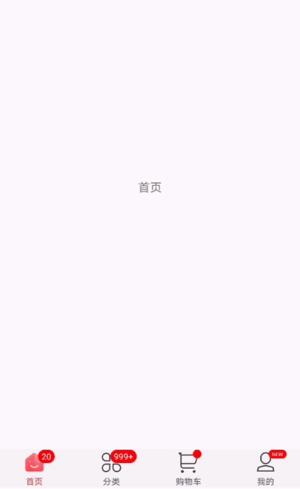
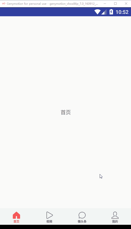
Currently, App on the market almost has a navigation bar at the bottom, so we often need to use this during development. Although there are many tools on the github packaged bottom navigation bar, such as bottombar, alphaIndicator Swipe gradient bottom controls etc., but these controls are not particularly easy to use due to too many functions and no detailed documentation. Sometimes we just want a simple bottom navigation, but we don't want to go One by one in the layout of the LinearLayout or RadioGroup, and then change the tab icon, let ViewPager jump to the corresponding page and a series of tedious operations, this time, you can use BottomBarLayout, simply can achieve the following effect:
#### Apk
[click to download](https://raw.githubusercontent.com/chaychan/BottomBarLayout/master/apk/demo.apk)
or scan the QR code

#### **How to import**
Add the jitpack repository address in allprojects{} in build.gradle in the project root directory, as follows:
```
allprojects {
repositories {
jcenter()
maven { url 'https://jitpack.io' }//Add jitpack
}
}
```
Open the build.gradle in the app's module, add dependencies in dependencies {} as follows:
```
dependencies {
implementation 'com.github.chaychan:BottomBarLayout:3.0.0' //It is recommended to use the latest version
}
```
The latest version can be viewed
[https://github.com/chaychan/BottomBarLayout/releases](https://github.com/chaychan/BottomBarLayout/releases)
### Demo
#### Supports raising the middle icon and intercepting before clicking
#### Display unread, show red dot, display message
#### Support to use lottie
#### Historical version update notes
[Historical version update notes](https://github.com/chaychan/BottomBarLayout/blob/master/update-note-en.md)
### Usage
#### Attribute introduction
```
```
#### Configuration in the layout file
In the xml file, configure BottomBarLayout to wrap the sub-item BottomBarItem
```
```
#### Java file settings
Find the corresponding ViewPager2 and BottomBarLayout, set Adapter for ViewPager2, and then set the ViewPager2 for BottomBarLayout
```
protected List getTabData() {
List tabData = new ArrayList<>();
tabData.add(new TabData("首页", R.mipmap.tab_home_normal, R.mipmap.tab_home_selected));
tabData.add(new TabData("视频", R.mipmap.tab_video_normal, R.mipmap.tab_video_selected));
tabData.add(new TabData("微头条", R.mipmap.tab_micro_normal, R.mipmap.tab_micro_selected));
tabData.add(new TabData("我的", R.mipmap.tab_me_normal, R.mipmap.tab_me_selected));
//If it is lottie. The lottie file storage location: /src/main/assets
//tabData.add(new TabData("首页", "home.json"));
//tabData.add(new TabData("分类", "category.json"));
//tabData.add(new TabData("购物车", "cart.json"));
//tabData.add(new TabData("我的", "mine.json"));
return tabData;
}
...
mBottomBarLayout.setData(tabData); //Setting up the data source
mVpContent.setAdapter(new MyAdapter(getSupportFragmentManager()));
mBottomBarLayout.setViewPager2(mVpContent);
```
This realizes the bottom navigation bar function
#### Set the middle icon to be raised
```
```
#### Add item dynamically
```
for (int i = 0; i < mTitleIds.length; i++) {
//create item
BottomBarItem item = createBottomBarItem(i);
mBottomBarLayout.addItem(item); //addItem
TabFragment homeFragment = createFragment(mTitleIds[i]);
mFragmentList.add(homeFragment);
}
private BottomBarItem createBottomBarItem(int i) {
BottomBarItem item = new BottomBarItem.Builder(this)
.titleTextSize(8)
.titleNormalColor(R.color.tab_normal_color)
.titleSelectedColor(R.color.tab_selected_color)
// .marginTop(5)
// .itemPadding(5)
// .unreadNumThreshold(99)
// .unreadTextColor(R.color.white)
//There are still many properties, please see the methods in the Builder for details.
.create(mNormalIconIds[i], mSelectedIconIds[i], getString(mTitleIds[i]));
return item;
}
```
#### Remove item
```
mBottomBarLayout.removeItem(0);
```
#### Turn on the slide effect
Tab switch between the closure of the default sliding effect, if you need to open the setSmoothScroll () method can be called by calling BottomBarLayout:
```
mBottomBarLayout.setSmoothScroll(true);
```
You can also specify BottomBarLayout's smoothScroll property to be true in the layout file.
The effect after opening is as follows:
#### Intercept before jump
```
mBottomBarLayout.setOnPageChangeInterceptor(position -> {
boolean isLogin = false; //Simulate no login
if (position == TAB_POSITION_ME && !isLogin){
//no login intercept to other tab or to LoginActivity
Toast.makeText(ViewPager2DemoActivity.this, "Test intercept, Login first please", Toast.LENGTH_SHORT).show();
return true;
}
return false;
});
```
#### Set the item selected listener
```
mBottomBarLayout.setOnItemSelectedListener((bottomBarItem, previousPosition, currentPosition) -> {
//do something
});
```
#### Set whether to call back setOnItemSelectedListener when clicking the same tab repeatedly
```
app:sameTabClickCallBack="true" //Defaults to false
```
#### Display unread, show red dot, display message
```
mBottomBarLayout.setUnread(0,20);//Set the first tab's unread 20
mBottomBarLayout.setUnread(1,101);//Set the first tab's unread 101
mBottomBarLayout.showNotify(2);//The third page shows the tips of the little red dot
mBottomBarLayout.setMsg(3,"NEW");//The fourth tab shows the NEW text
```
When the setting of unread less than or equal to 0, the disappearance of small red dot will disappear;
When the unread count is 1-99, the corresponding number is displayed.
When unread more than 99, it shows 99+;
#### Set unaware reading threshold
The unread threshold may specify the BottomBarItem's unreadThreshold property setting, which defaults to 99. For example, if app:unreadThreshold="999" is set, if the reading does not exceed this value, "999+" is displayed。
#### Hidden tips red dot, tips message
```
mBottomBarLayout.hideNotify(2);//Hide the third page shows the tips of the little red dot
mBottomBarLayout.hideMsg(3);//Hide the text displayed on the fourth tab
```
#### Set unread font color
```
app:unreadTextColor="@color/unreadTextColor"
```
#### Set the unread background
```
app:unreadTextBg="@drawable/shape_unread"
```
Drawable is written as follows:
```
```
#### Set prompt text font color, background
```
app:msgTextColor="@color/msgTextColor"
app:msgTextBg="@drawable/shape_msg"
```
#### Set prompt point background
```
app:notifyPointBg="@drawable/shape_notify_point"
```
Well, here's the introduction of BottomBarLayout stop here, the reason for the package this control is mainly for the convenience of development, hope to help more people, if you have any ideas or comments may wish to put forward to me, I will continue to improve BottomBarLayout of.
#### Support and encouragement
If you think my project is helpful to you, star! So I will be more motivated to improve this project.