Logistic Regression (with Regularization) and Evaluation Metrics 
Fall 2017
from IPython.display import Image

# inline plotting instead of popping out
%matplotlib inline
import matplotlib
matplotlib.rcParams.update({'font.size': 22})

# load utility classes/functions that has been taught in previous labs
# e.g., plot_decision_regions()
import os, sys
module_path = os.path.abspath(os.path.join('.'))
sys.path.append(module_path)
from lib import *
In this lab, we will guide you through the practice of Logistic Regression.
Logistic Regression
Logistic Regression is a classification algorithm in combination with a decision rule that makes dichotomous the predicted probabilities of the outcome. Currently, it is one of the most widely used classification models in Machine Learning.
As discussed in the lecture, Logistic Regression predicts the label $\hat{y}$ of a given point $\boldsymbol{x}$ by
$$\hat{y}=\arg\max_{y}\mathrm{P}(y\,|\,\boldsymbol{x};\boldsymbol{w})$$
and the condition probability is defined as
$$\mathrm{P}(y\,|\,\boldsymbol{x};\boldsymbol{w})=\sigma(\boldsymbol{w}^{\top}\boldsymbol{x})^{y'}[1-\sigma(\boldsymbol{w}^{\top}\boldsymbol{x})]^{(1-y')},$$
where $y'=\frac{y+1}{2}$. Let's first plot the logistic function $\sigma$ over $z=\boldsymbol{w}^{\top}\boldsymbol{x}$
$$\sigma\left(z\right)=\frac{\exp(z)}{\exp(z)+1}=\frac{1}{1+\exp(-z)}$$
import matplotlib.pyplot as plt
import numpy as np

def logistic(z):
    return 1.0 / (1.0 + np.exp(-z))

z = np.arange(-7, 7, 0.1)
sigma = logistic(z)

fig, ax = plt.subplots(figsize=(8,5))
plt.plot(z, sigma)
plt.axvline(0.0, color='k')
plt.ylim(-0.1, 1.1)
plt.xlabel('z')
plt.ylabel('$\sigma(z)$')
plt.title('Logistic function')
plt.hlines(y=1.0, xmin=-7, xmax=7, color='red', linewidth = 1, linestyle = '--')
plt.hlines(y=0.5, xmin=-7, xmax=7, color='red', linewidth = 1, linestyle = '--')
plt.hlines(y=0, xmin=-7, xmax=7, color='red', linewidth = 1, linestyle = '--')
plt.tight_layout()
for item in (ax.get_yticklabels()):
    item.set_fontsize(20)
plt.savefig('./output/fig-logistic.png', dpi=300)
plt.show()

We can see that $\sigma(z)$ approaches $1$ when $(z \rightarrow \infty)$, since $e^{-z}$ becomes very small for large values of $z$. Similarly, $\sigma(z)$ goes downward to $0$ for $ z \rightarrow -\infty$ as the result of an increasingly large denominator. The logistic function takes real number values as input and transforms them to values in the range $[0, 1]$ with an intercept at $\sigma(z) = 0.5$.
To learn the weights $\boldsymbol{w}$ from the training set $\mathbb{X}$, we can use ML estimation:
$$\arg\max_{\boldsymbol{w}}\log\mathrm{P}(\mathbb{X}\,|\,\boldsymbol{w}).$$
This problem can be solved by gradient descent algorithm with the following update rule:
$$\boldsymbol{w}^{(t+1)}=\boldsymbol{w}^{(t)}-\eta\nabla_{\boldsymbol{w}}\log\mathrm{P}(\mathbb{X}\,|\,\boldsymbol{w}^{(t)}),$$
where
$$\nabla_{\boldsymbol{w}}\log\mathrm{P}(\mathbb{X}\,|\,\boldsymbol{w}^{(t)})=\sum_{t=1}^{N}[y'^{(i)}-\sigma(\boldsymbol{w}^{(t)\top}\boldsymbol{x}^{(i)})]\boldsymbol{x}^{(i)}.$$
Once $\boldsymbol{w}$ is solved, we can then make predictions by
$$\hat{y}=\arg\max_{y}\mathrm{P}(y\,|\,\boldsymbol{x};\boldsymbol{w})=\arg\max_{y}\{\sigma(\boldsymbol{w}^{\top}\boldsymbol{x}),1-\sigma(\boldsymbol{w}^{\top}\boldsymbol{x})\}=\mathrm{sign}(\boldsymbol{w}^{\top}\boldsymbol{x}).$$
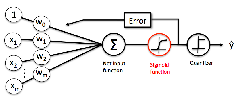
Logistic Regression is very easy to implement but performs well on linearly separable classes (or classes close to linearly separable). Similar to the Perceptron and Adaline, the Logistic Regression model is also a linear model for binary classification. We can relate the Logistic Regression to our previous Adaline implementation. In Adaline, we used the identity function as the activation function. In Logistic Regression, this activation function simply becomes the logistic function (also called as sigmoid function) as illustrated below:
Predicting Class-Membership Probability
One benefit of using Logistic Regression is that it is able to output the class-membership probability (i.e., probability of a class to which a point $\boldsymbol{x}$ belongs) via $\sigma(\boldsymbol{w}^{\top}\boldsymbol{x})$ and $1-\sigma(\boldsymbol{w}^{\top}\boldsymbol{x})$.
In fact, there are many applications where we are not only interested in predicting class labels, but also in estimating the class-membership probability. For example, in weather forecasting, we are interested not only if it will rain tomorrow but also the chance of raining. Similarly, when diagnosing disease we usually care about the chance that a patient has a particular disease given certain symptoms. This is why Logistic Regression enjoys wide popularity in the field of medicine.
Training a Logistic Regression Model with Scikit-learn
Scikit-learn implements a highly optimized version of logistic regression that also supports multiclass classification off-the-shelf. Let's use it to make predictions on the standardized Iris training dataset.
NOTE: Logistic Regression, like many other binary classification models, can be easily extended to multiclass classification via One-vs-All or other similar techniques.
import pandas as pd
from IPython.display import display
from sklearn.model_selection import train_test_split

df = pd.read_csv('https://archive.ics.uci.edu/ml/'
                 'machine-learning-databases/iris/iris.data', header=None)
df.columns = ['Sepal length', 'Sepal width', 'Petal length', 'Petal width', 'Class label']
display(df.head())

# for simplicity, consider only two features and two classes

X = df[['Petal length', 'Petal width']].values[50:150,]
y, y_label = pd.factorize(df['Class label'].values[50:150])

X_train, X_test, y_train, y_test = train_test_split(
  X, y, test_size=0.2, random_state=1)

print('#Training data points: %d' % X_train.shape[0])
print('#Testing data points: %d' % X_test.shape[0])
print('Class labels: %s (mapped from %s)' % (np.unique(y), np.unique(y_label)))

# Standardize X

from sklearn.preprocessing import StandardScaler

sc = StandardScaler()
sc.fit(X_train)
X_train_std = sc.transform(X_train)
X_test_std = sc.transform(X_test)
from sklearn.linear_model import LogisticRegression

lr = LogisticRegression(C=1000.0, random_state=0)
lr.fit(X_train_std, y_train)

# plot decision regions
fig, ax = plt.subplots(figsize=(8,6))
X_combined_std = np.vstack((X_train_std, X_test_std))
y_combined = np.hstack((y_train, y_test))

plot_decision_regions(X_combined_std, y_combined,
                      classifier=lr, test_idx=range(y_train.size,
                                                    y_train.size + y_test.size))
plt.xlabel('Petal length [Standardized]')
plt.ylabel('Petal width [Standardized]')
plt.legend(loc='lower right')
plt.tight_layout()
plt.legend(loc=4, prop={'size': 20})
for item in ([ax.title, ax.xaxis.label, ax.yaxis.label] +
             ax.get_xticklabels() + ax.get_yticklabels()):
    item.set_fontsize(20)
for item in (ax.get_xticklabels() + ax.get_yticklabels()):
    item.set_fontsize(15)
plt.savefig('./output/fig-logistic-regression-boundray-2.png', dpi=300)
plt.show()

The Logistic Regression class can predict the class-membership probability via the predict_proba() method. For example, we can predict the probabilities of the first testing point:
test_idx = 1
print('Correct label: %s\n' % y_label[y_test[test_idx]])

prob = lr.predict_proba(X_test_std[test_idx, :].reshape(1, -1))

print('Prob for class %s: %.2f' % (y_label[0], prob[:, 0]))
print('Prob for class %s: %.2f' % (y_label[1], prob[:, 1]))
The prob array tells us that the model predicts a 99% chance that the sample belongs to the Iris-Virginica class, and a 1% chance that the sample is a Iris-Versicolor flower.
Regularization
One way to regularize a logistic regression classifier is to add a weight decay term in the objective (or cost function), as in Ridge regression:
$$\arg\max_{\boldsymbol{w}}\log\mathrm{P}(\mathbb{X}\,|\,\boldsymbol{w})-\frac{\alpha}{2}\Vert\boldsymbol{w}\Vert^2,$$
where $\alpha > 0$ is a hyperparameter that controls the trade-off between maximizing the log likelihood and minimizing the weight. Note that the Logistic Regression class implemented in Scikit-learn uses the hyperparameter $C=1/\alpha$ due to convention.
weights, params = [], []
for c in np.arange(-5, 5, dtype='float32'):
  lr = LogisticRegression(C=10**c, random_state=0)
  lr.fit(X_train_std, y_train)
  # get the coefficients of w
  weights.append(lr.coef_[0])
  params.append(10**c)

fig, ax = plt.subplots(figsize=(8,6))
weights = np.array(weights)
plt.plot(params, weights[:, 0],
         label='Petal length')
plt.plot(params, weights[:, 1],
         label='Petal width', linestyle='--')
plt.xlim(10**4, 10**-5)
plt.xscale('log')
plt.xlabel('C')
plt.ylabel('Weight coefficient')
plt.legend(loc='upper right')
plt.tight_layout()
plt.legend(loc=1, prop={'size': 20})
for item in ([ax.title, ax.xaxis.label, ax.yaxis.label] +
             ax.get_xticklabels() + ax.get_yticklabels()):
    item.set_fontsize(20)
for item in (ax.get_xticklabels() + ax.get_yticklabels()):
    item.set_fontsize(15)
plt.savefig('./output/fig-logistic-regression-c.png', dpi=300)
plt.show()

Evaluation Metrics for Binary Classifiers
So far, we evaluate the performance of a classifier using the accuracy metric. Although accuracy is a general and common metric, there are several other evaluation metrics that allow us to quantify the performance of a model from different aspects.
Confusion Matrix
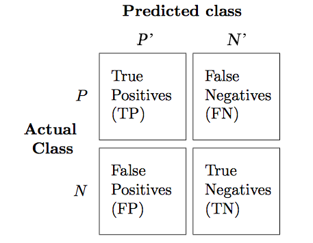
Before we get into the details of different evaluation metrics, let's print the so-called confusion matrix, a square matrix that reports the counts of the true positive, true negative, false positive, and false negative predictions of a classifier, as shown below:
The confusion matrix of our logistic regressor over the Iris dataset is shown as follows:
from sklearn.metrics import confusion_matrix

lr = LogisticRegression(random_state=0)
lr.fit(X_train_std, y_train)
y_pred = lr.predict(X_test_std)
confmat = confusion_matrix(y_true=y_test, y_pred=y_pred)

fig, ax = plt.subplots(figsize=(4,4))
ax.matshow(confmat, cmap=plt.cm.Blues, alpha=0.3)
for i in range(confmat.shape[0]):
  for j in range(confmat.shape[1]):
    ax.text(x=j, y=i, s=confmat[i, j], va='center', ha='center')

plt.xlabel('Predicted label')
plt.ylabel('True label')

plt.tight_layout()
plt.savefig('./output/fig-logistic-regression-confusion-2.png', dpi=300)
for item in ([ax.title, ax.xaxis.label, ax.yaxis.label] +
             ax.get_xticklabels() + ax.get_yticklabels()):
    item.set_fontsize(20)
for item in (ax.get_xticklabels() + ax.get_yticklabels()):
    item.set_fontsize(15)
plt.show()

The meaning of each entry in the above confusion matrix is straightforward. For example, the cell at $(1,0)$ means that $2$ positive testing points are misclassified as negative. Confusion matrix helps us know not only the count of how many errors but how they are wrong. Correct predictions counts into the diagonal entries. A good performing classifier should have a confusion matrix that is a diagonal matrix which means that the entries outside the main diagonal are all zero.
The error rate (ERR) and accuracy (ACC) we have been using can be defined as follows:
$$ERR = \frac{FP+FN}{P+N},\enspace\text{ (the lower, the better)}$$
$$ACC = \frac{TP+TN}{P+N} = 1-ERR.\enspace\text{ (the higher, the better)}$$
True and False Positive Rate
The true positive rate (TPR) and false positive rate (FPR) are defined as:
$$FPR = \frac{FP}{N},\enspace\text{ (the lower, the better)}$$
$$TPR = \frac{TP}{P}.\enspace\text{ (the higher, the better)}$$
TPR and FPR are metrics particularly useful for tasks with imbalanced classes. For example, if we have 10% positive and 90% negative examples in the training set, then a dummy classifier that always give negative predictions will be able to achieve 90% accuracy. The accuracy metric is misleading in this case. On the other hand, by checking the TPR which equals to 0%, we learn that the dummy classifier is not performing well.
Precision, Recall, and $F_1$-Score
The Precision (PRE) and recall (REC) metrics are defines as:
$$PRE = \frac{TP}{P'},\enspace\text{ (the higher, the better)}$$
$$REC = \frac{TP}{P} = TPR.\enspace\text{ (the higher, the better)}$$
Basically, PRE means "how many points predicted as positive are indeed positive;" while REC refers to "how many positive points in the ground truth are successfully identified as positive." PRE and REC are useful metrics if we care specifically about the performance of positive predictions.
In practice, we may combine PRE and REC into a single score called the $F_1$-score:
$$F_1 = 2\frac{(PRE * REC)}{PRE+REC},\enspace\text{ (the higher, the better)}$$
which reaches its best value at $1$ and worst at $0$.
Evaluation Metrics for Soft Classifiers
Many classifiers, such as Adaline and Logistic Regression, can make "soft" predictions (i.e., real values instead of the "hard" 1 or -1). We may "harden" the soft predictions by defining a decision threshold $\theta$. For example, suppose a classifier makes soft predictions in range $[-1,1]$ that are sorted as follows:
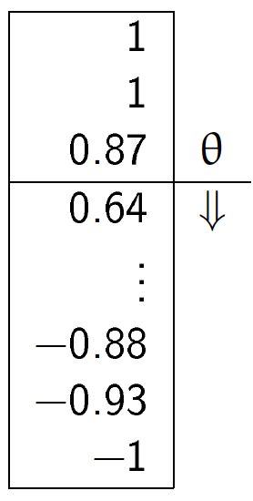
We can define a threshold $\theta=0.8$ such that points with scores larger/smaller than $0.8$ become positive/negative outputs. It is clear that the performance of the classifier will vary as we use different values for threshold.
Receiver Operating Characteristic (ROC) Curve
The receiver operator characteristic (ROC) curve measures the performance of a classifier at all possible thresholds. We can draw an ROC curve by following the steps:
- Rank the soft predictions from highest to lowest;
- For each indexing threshold $\theta$ that makes the first $\theta$ points positive and the rest negative, $\theta=1,\cdots,\vert\mathbb{X}\vert$, calculate the $TPR^{(\theta)}$ and $FPR^{(\theta)}$;
- Draw points $(TPR^{(\theta)},FPR^{(\theta)})$ in a 2-D plot and connect the points to get an ROC curve.
Let's plot the ROC curve of our logistic regressor:
from sklearn.metrics import roc_curve
from scipy import interp
from cycler import cycler

lr = LogisticRegression(random_state=0)
lr.fit(X_train_std, y_train)

fig = plt.figure(figsize=(7,7))

mean_tpr = 0.0
mean_fpr = np.linspace(0, 1, 100)
all_tpr = []

probas = lr.predict_proba(X_test_std)

fpr, tpr, thresholds = roc_curve(y_test,
                                 probas[:, 0],
                                 pos_label=0)
plt.plot(fpr, tpr, lw=2,
         label='Logistic regression')

plt.plot([0, 1],
         [0, 1],
         linestyle='--',
         color='gray',
         label='Random guessing')

plt.plot([0, 0, 1],
         [0, 1, 1],
         linestyle='--',
         color='gray',
         label='Perfect')

plt.xlim([-0.05, 1.05])
plt.ylim([-0.05, 1.05])
plt.xlabel('FPR')
plt.ylabel('TPR')
plt.title('ROC Curve')
plt.legend(loc="lower right")
plt.tight_layout()
plt.legend(loc=4, prop={'size': 18})
for item in ([ax.title, ax.xaxis.label, ax.yaxis.label] +
             ax.get_xticklabels() + ax.get_yticklabels()):
    item.set_fontsize(20)
for item in (ax.get_xticklabels() + ax.get_yticklabels()):
    item.set_fontsize(15)
plt.savefig('./output/fig-roc-lg.png', dpi=300)
plt.show()

How does the ROC curve of a "good" classifier look like?
The ROC curve of a perfect classifier would have a line that goes from bottom left to top left and top left to top right. On the other hand, if the ROC curve is just the diagonal line then the model is just doing random guessing. Any useful classifier should have an ROC curve falling between these two curves.
Model Comparison
ROC curves are useful for comparing the performance of different classifiers over the same dataset. For example, suppose we have three classifiers $A$, $B$, and $C$ and their respective ROC curves, as shown below:
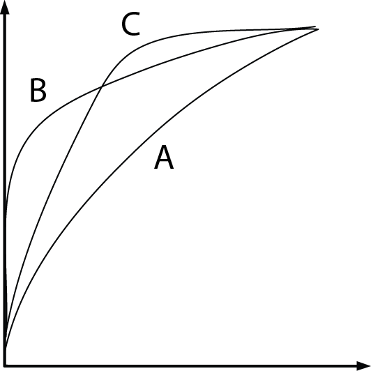
It is clear that the classifiers $B$ and $C$ are better than $A$. But how about $B$ and $C$? This can also be answered by ROC curves:
- If we tolerate no more than 10% FPR, we should pick $B$ at an indexing threshold $\theta=0.15\vert\mathbb{X}\vert$ to get 60% TPR;
- If we tolerate 40% FPR, then pick $C$ at $\theta=0.4\vert\mathbb{X}\vert$, which gives 90% TPR.
Area Under the Curve (AUC)
We can reduce an ROC curve to a single value by calculating the area under the curve (AUC). A perfect classifier has $AUC=1.0$, and random guessing results in $AUC=0.5$. It can be shown that AUC is equal to the probability that a classifier will rank a randomly chosen positive instance higher than a randomly chosen negative one.
Let's compute the AUC of our logistic regressor:
from sklearn.metrics import auc

print('AUC: %.2f' % auc(fpr, tpr))
That's a pretty high score!
Evaluation Metrics for Multiclass Classification
In multiclass classification problem, we can extend the above metrics via one-vs-all technique, where we treat one class as "positive" and the rest as "negative" and compute a score for the class. If there are $K$ classes, then we compute $K$ scores, one for each class. However, if we just want to have a single final score, we need to decide how to combine these scores.
Scikit-learn implements the macro and micro averaging methods. For example, the micro-average of $K$ precision scores is calculated as follows:
$$PRE_{micro} = \frac{TP^{(1)} + \cdots + TP^{(K)}}{P'^{(1)} + \cdots + P'^{(K)}};$$
while the macro-average is simply the average of individual PRE's:
$$PRE_{macro} = \frac{PRE^{(1)} + \cdots + PRE^{(K)}}{K}$$
Micro-averaging is useful if we want to weight each data point or prediction equally, whereas macro-averaging weights all classes equally. Macro-average is the default in Scikit-learn.
Let's train a multiclass logistic regressor and see how it performs:
from sklearn.metrics import precision_score, recall_score, f1_score
from lib import *

# prepare datasets

X = df[['Petal length', 'Petal width']].values[30:150,]
y, y_label = pd.factorize(df['Class label'].values[30:150])

X_train, X_test, y_train, y_test = train_test_split(
    X, y, test_size=0.33, random_state=1)

print('#Training data points: %d + %d + %d = %d' % ((y_train == 0).sum(),
                                                    (y_train == 1).sum(),
                                                    (y_train == 2).sum(),
                                                     y_train.size))
print('#Testing data points: %d + %d + %d = %d' % ((y_test == 0).sum(),
                                                    (y_test == 1).sum(),
                                                    (y_test == 2).sum(),
                                                     y_test.size))
print('Class labels: %s (mapped from %s)' % (np.unique(y), np.unique(y_label)))

# standarize X

sc = StandardScaler()
sc.fit(X_train)
X_train_std = sc.transform(X_train)
X_test_std = sc.transform(X_test)

# training & testing

lr = LogisticRegression(C=1000.0, random_state=0)
lr.fit(X_train_std, y_train)
y_pred = lr.predict(X_test_std)

# plot decision regions
fig, ax = plt.subplots(figsize=(8,6))

X_combined_std = np.vstack((X_train_std, X_test_std))
y_combined = np.hstack((y_train, y_test))

plot_decision_regions(X_combined_std, y_combined,
                      classifier=lr, test_idx=range(y_train.size,
                                     y_train.size + y_test.size))
plt.xlabel('Petal length [Standardized]')
plt.ylabel('Petal width [Standardized]')
plt.legend(loc='lower right')
plt.tight_layout()
plt.legend(loc=4, prop={'size': 15})
for item in ([ax.title, ax.xaxis.label, ax.yaxis.label] +
             ax.get_xticklabels() + ax.get_yticklabels()):
    item.set_fontsize(20)
for item in (ax.get_xticklabels() + ax.get_yticklabels()):
    item.set_fontsize(15)
plt.savefig('./output/fig-logistic-regression-boundray-3.png', dpi=300)
plt.show()

# plot confusion matrix

confmat = confusion_matrix(y_true=y_test, y_pred=y_pred)
fig, ax = plt.subplots(figsize=(5,5))
ax.matshow(confmat, cmap=plt.cm.Blues, alpha=0.3)
for i in range(confmat.shape[0]):
  for j in range(confmat.shape[1]):
    ax.text(x=j, y=i, s=confmat[i, j], va='center', ha='center')
plt.xlabel('Predicted label')
plt.ylabel('True label')
plt.tight_layout()
plt.tight_layout()
plt.legend(loc=4, prop={'size': 20})
for item in ([ax.title, ax.xaxis.label, ax.yaxis.label] +
             ax.get_xticklabels() + ax.get_yticklabels()):
    item.set_fontsize(20)
for item in (ax.get_xticklabels() + ax.get_yticklabels()):
    item.set_fontsize(15)
plt.savefig('./output/fig-logistic-regression-confusion-3.png', dpi=300)
plt.show()

# metrics

print('[Precision]')
p = precision_score(y_true=y_test, y_pred=y_pred, average=None)
print('Individual: %.2f, %.2f, %.2f' % (p[0], p[1], p[2]))
p = precision_score(y_true=y_test, y_pred=y_pred, average='micro')
print('Micro: %.2f' % p)
p = precision_score(y_true=y_test, y_pred=y_pred, average='macro')
print('Macro: %.2f' % p)

print('\n[Recall]')
r = recall_score(y_true=y_test, y_pred=y_pred,average=None)
print('Individual: %.2f, %.2f, %.2f' % (r[0], r[1], r[2]))
r = recall_score(y_true=y_test, y_pred=y_pred, average='micro')
print('Micro: %.2f' % r)
r = recall_score(y_true=y_test, y_pred=y_pred, average='macro')
print('Macro: %.2f' % r)

print('\n[F1-score]')
f = f1_score(y_true=y_test, y_pred=y_pred, average=None)
print('Individual: %.2f, %.2f, %.2f' % (f[0], f[1], f[2]))
f = f1_score(y_true=y_test, y_pred=y_pred, average='micro')
print('Micro: %.2f' % f)
f = f1_score(y_true=y_test, y_pred=y_pred, average='macro')
print('Macro: %.2f' % f)


We can see that the micro average reports more conservative scores. This is because it takes into account the class size. In our testing set, the first class is smaller than the others so its score (1.00) contributes less to the final score.
Assignment
Goal:
Predict the presence or absence of cardiac arrhythmia in a patient.
Requirements:
Submit on iLMS your code file (Lab06-學號.ipynb) and image file (Lab06-學號.png).
Your code file should contain:
- Loading of dataset.
- Splitting of dataset to training and testing data (test_size = 30% of the whole dataset; random_state=20171012)
- Building of a Logistic Regression model using scikit-learn with random_state = 0. (Hint: using all the features, the AUC >= 0.62).
- Building of a regularized Logistic Regression model with random_state = 0. Tune the C parameter until AUC >= 0.79.
- Plotting of the confusion matrix and the ROC curve of the best regularized Logistic Regression model.
- Evaluation and explanation of the performance of the model using the results from the confusion matrix and the ROC curve.
Your image file should contain:
The figures from (5), which are the confusion matrix and the ROC curve of the best regularized Logistic Regression model.
Important:
Please make sure that we can rerun your code.
Dataset:
The Arrhythmia dataset from UCI repository contains 280 variables collected from 452 patients. Its information helps in distinguishing between the presence and absence of cardiac arrhythmia and in classifying arrhytmia in one of the 16 groups. In this homework, we will just focus on building a Logistic Regression model that can classify between the presence and absence of arrhythmia.
Class 01 refers to 'normal' ECG which we will regard as 'absence of arrhythmia' and the rest of the classes will be 'presence of arrhythmia'.
import pandas as pd
import numpy as np

#load the data
data = pd.read_csv('http://archive.ics.uci.edu/ml/machine-learning-databases/arrhythmia/arrhythmia.data', header=None, sep=',', engine='python')

display(data.head(3))
How big is the dataset?
print('%d rows and %d columns' % (data.shape[0],data.shape[1]))
The last column of the dataset is the class label. It contains the 16 ECG classifications:
np.unique(data[len(data.columns)-1])
Let's make that column (class label) dichotomous.
Value is 0 if ECG is normal, 1 otherwise
data['arrhythmia'] = data[len(data.columns)-1].map(lambda x: 0 if x==1 else 1)
Are the groups balanced?
data.groupby(['arrhythmia']).size()
Some columns have missing values denoted as '?'
To make the preprocessing simpler, let's just retain the columns with numeric values.
data = data._get_numeric_data()
print('%d rows and %d columns' % (data.shape[0],data.shape[1]))
data.head(3)
X = data.iloc[:, :-2]  # The first to third-last columns are the features
y = data.iloc[:, -1]   # The last column is the ground-truth label
print(np.unique(y))
# splitting the dataset to training and validation datasets
from sklearn.model_selection import train_test_split
X_train, X_test, y_train, y_test = train_test_split(X, y, test_size=0.3, random_state=20171012)
# Standardizing the training and test datasets
# Note that we are scaling based on the information from the training data
# Then we apply the scaling that is done from training data to the test data

from sklearn.preprocessing import StandardScaler

sc = StandardScaler()
sc.fit(X_train)
X_train_std = sc.transform(X_train)
X_test_std = sc.transform(X_test)