---
authors:
- admin
categories:
- Stata
- Econometrics
- Tutorial
- Cross-sectional Data
- FWL Theorem
draft: false
featured: false
date: "2026-03-27T00:00:00Z"
external_link: ""
image:
caption: ""
focal_point: Smart
placement: 3
links:
- icon: file-code
icon_pack: fas
name: "Stata do-file"
url: analysis.do
- icon: file-alt
icon_pack: fas
name: "Stata log"
url: analysis.log
- icon: markdown
icon_pack: fab
name: "MD version"
url: https://raw.githubusercontent.com/cmg777/starter-academic-v501/master/content/post/stata_fwl/index.md
slides:
summary: A hands-on guide to the scatterfit package in Stata --- from understanding the Frisch-Waugh-Lovell theorem through simulated confounding to visualizing fixed effects in real panel data --- showing what "controlling for" looks like as a scatter plot.
tags:
- stata
- causal
- causal inference
- panel
title: "Visualizing Regression with the FWL Theorem in Stata"
url_code: ""
url_pdf: ""
url_slides: ""
url_video: ""
toc: true
diagram: true
---
## 1. Overview
"What does it actually mean to *control for* a variable?" This question appears in every applied regression course, and the answer is surprisingly hard to visualize. When we say "the effect of coupons on sales, controlling for income," we are describing a relationship in multidimensional space. This relationship cannot be directly plotted on a two-dimensional scatter. The **Frisch-Waugh-Lovell (FWL) theorem** changes this: it shows that the coefficient from a multiple regression equals the slope of a simple bivariate regression --- after first *residualizing* (partialling out) the control variables from both the outcome and the variable of interest.
The [scatterfit](https://github.com/leojahrens/scatterfit) Stata package (Ahrens, 2024) makes this visual in one command. It takes a dependent variable, an independent variable, and optional controls or fixed effects, then produces a scatter plot of the residualized data with a fitted regression line. Built on `reghdfe`, it handles high-dimensional fixed effects efficiently. It also offers features beyond what R's `fwl_plot()` or Python's manual FWL can do: **binned scatter plots** for large datasets, **regression parameters printed directly on the plot**, and **multiple fit types** (linear, quadratic, lowess).
This tutorial is the third in a trilogy --- see the companion [R tutorial](/post/r_fwlplot/) and [Python tutorial](/post/python_fwl/) --- and uses the **same datasets** for cross-language comparability. All data are loaded from GitHub URLs so the analysis is fully reproducible.
**Learning objectives:**
- Use `scatterfit` to visualize bivariate relationships with and without controls
- Demonstrate FWL residualization with `controls()` and `fcontrols()`
- Verify manually that FWL reproduces `reghdfe` coefficients exactly
- Visualize fixed effects using `fcontrols()` on flights data
- Use binned scatter plots to summarize patterns in large datasets
- Show regression parameters directly on plots with `regparameters()`
### Key concepts at a glance
The post leans on a small vocabulary repeatedly. The rest of the tutorial assumes you can move between these terms quickly. Each concept below has three parts. The **definition** is always visible. The **example** and **analogy** sit behind clickable cards: open them when you need them, leave them collapsed for a quick scan. If a later section mentions "FWL theorem" or "omitted variable bias" and the term feels slippery, this is the section to re-read.
**1. Frisch-Waugh-Lovell theorem** $\hat\beta\_1 = \hat\beta\_1^{\mathrm{resid}}$.
The full-regression coefficient on $X\_1$ equals the simple regression of $\tilde Y$ on $\tilde X\_1$. The tildes are residuals from regressing each on the other controls. Two routes give the same number.
Example
Regressing `sales` on `coupons` and `income` jointly gives a coupon coefficient of +0.2123. Regressing the residualized `sales` on the residualized `coupons` gives +0.2122882. Same number, two paths.
Analogy
A recipe with redundant ingredients you can subtract first. Subtract the broth from the stock. Then read the seasoning.
**2. Residualization (partial-out)** $\tilde y = y - \hat y$.
Replace each variable with the part *not* explained by the other regressors. Then look only at what is left. The leftover is the new variable.
Example
Regress `sales` on `income` to get `sales_resid`. Regress `coupons` on `income` to get `coupons_resid`. Plot one against the other to see the controlled relationship.
Analogy
Wiping a foggy window before looking through it. The view becomes the part you actually care about.
**3. Control variable** $X\_2$.
A regressor included so the coefficient on $X\_1$ measures effect *holding $X\_2$ fixed*. Different from the treatment variable of interest. Often a confounder.
Example
In the store data, `income` is the control. We include it so the `coupons` slope reflects the within-income effect, not the across-income confounding.
Analogy
Matching apples to apples instead of apples to oranges.
**4. Omitted variable bias** $\mathrm{OVB} = \gamma \cdot \delta$.
The naive slope of $Y$ on $X\_1$ differs from the true slope by exactly $\gamma \cdot \delta$. Here $\gamma$ is the effect of the omitted $X\_2$ on $Y$. And $\delta$ is the slope of $X\_2$ on $X\_1$.
Example
The `income` effect on `sales` is +0.3004 ($\gamma$). The `coupons`-on-`income` slope is -0.4937 ($\delta$). OVB = +0.3004 × -0.4937 = -0.1483. The naive coupon slope -0.0934 plus the bias -0.1483 reconciles with the controlled +0.2123.
Analogy
A thumb on the scale you didn't notice. The reading was always wrong by the weight of that thumb.
**5. Partial regression plot** scatter of $\tilde y$ vs $\tilde x\_1$.
The picture you should have looked at. Each point shows the residual variation in $Y$ against residual variation in $X\_1$. The slope of the cloud equals the multivariate coefficient.
Example
The `scatterfit sales coupons, controls(income)` plot shows the +0.2123 slope visually. The naive `scatterfit sales coupons` plot shows the -0.0934 slope and looks completely different.
Analogy
The controlled scatter is the *real* photograph. The raw scatter was a misleading snapshot taken through a dirty lens.
**6. Within transformation** $y\_{it} - \bar y\_i$.
Subtract each unit's own time-average from its variable. What remains is variation *within* the unit. Free of all time-invariant unit characteristics.
Example
In the wage panel, demeaning `lwage` and `exper` per individual gives the within-individual return to experience: +0.1223. Pooled OLS gave only +0.1050.
Analogy
Subtract each person's normal to compare them with themselves over time.
**7. Two-way fixed effects** $\alpha\_i + \lambda\_t$.
Demean by both unit and time. Absorbs all time-invariant unit confounders. Also absorbs all unit-invariant time shocks.
Example
For the flights data, adding origin and destination FE moves the air-time effect on delay from -0.0050 (no FE) to -0.0324 (with origin + dest FE). Most of the cross-airport variation was confounding.
Analogy
Subtract both the individual's average and the year's average. What's left is the surprise.
**8. Binned scatter plot**.
Split the x-axis into bins. Plot the y-mean within each bin. A smoothed visualization that survives huge sample sizes where a raw scatter is a black blob.
Example
`binscatter dep_delay air_time` over 5,000 NYC flights replaces an unreadable cloud with about 20 readable dots.
Analogy
A heat-map version of a cloud of dots. You see the trend instead of the noise.
## 2. The Modeling Pipeline
```mermaid
graph LR
A["Load Data
from GitHub
(Section 3)"] --> B["Naive vs.
FWL Scatter
(Section 4)"]
B --> C["Manual FWL
Verification
(Section 5)"]
C --> D["Binned
Scatter
(Section 6)"]
D --> E["Fixed Effects
Flights
(Section 7)"]
E --> F["Panel Data
Wages
(Section 8)"]
style A fill:#6a9bcc,stroke:#141413,color:#fff
style B fill:#d97757,stroke:#141413,color:#fff
style C fill:#d97757,stroke:#141413,color:#fff
style D fill:#00d4c8,stroke:#141413,color:#fff
style E fill:#6a9bcc,stroke:#141413,color:#fff
style F fill:#6a9bcc,stroke:#141413,color:#fff
```
We start where the answer is known (simulated data), see the result with `scatterfit`, verify manually, then apply the same tool to real flights data and panel wage data.
## 3. Setup and Data
### 3.1 Install packages
The `scatterfit` command requires `reghdfe` and `ftools` for high-dimensional fixed effects estimation. All packages are installed from SSC or GitHub:
```stata
* Install packages if not already installed
capture ssc install reghdfe, replace
capture ssc install ftools, replace
capture ssc install estout, replace
capture net install scatterfit, ///
from("https://raw.githubusercontent.com/leojahrens/scatterfit/master") replace
```
### 3.2 Load the simulated store data
We load the same simulated retail dataset used in the R and Python FWL tutorials. The data are hosted on GitHub for reproducibility:
```stata
import delimited "https://raw.githubusercontent.com/cmg777/starter-academic-v501/master/content/post/r_fwlplot/store_data.csv", clear
```
The data simulate a scenario where a store manager wants to know whether distributing coupons increases sales. **Income is a confounder** --- wealthier neighborhoods receive fewer coupons (the store targets promotions at lower-income areas) but have higher baseline sales:
```mermaid
graph TD
Income["Income
(confounder)"]
Coupons["Coupons
(treatment)"]
Sales["Sales
(outcome)"]
Income -->|"-0.5
(fewer coupons
to rich areas)"| Coupons
Income -->|"+0.3
(rich areas
buy more)"| Sales
Coupons -->|"+0.2
(true causal
effect)"| Sales
style Income fill:#d97757,stroke:#141413,color:#fff
style Coupons fill:#6a9bcc,stroke:#141413,color:#fff
style Sales fill:#00d4c8,stroke:#141413,color:#fff
```
The arrows in this diagram show causal relationships, and the numbers are the true effect sizes in the data generating process. The true causal effect of coupons on sales is **+0.2**, but income opens a **backdoor path** --- an indirect route from coupons to sales that goes *through* income (coupons $\leftarrow$ income $\rightarrow$ sales). Unless we block this path by controlling for income, the naive estimate will be biased downward.
```stata
summarize sales coupons income dayofweek
```
```text
Variable | Obs Mean Std. dev. Min Max
-------------+---------------------------------------------------------
sales | 200 33.6747 3.811032 24.89 45.23
coupons | 200 34.85685 6.788834 18.72 53.25
income | 200 49.72545 9.745807 20.07 77.02
dayofweek | 200 3.915 1.996926 1 7
```
```stata
correlate sales coupons income
```
```text
| sales coupons income
-------------+---------------------------
sales | 1.0000
coupons | -0.1664 1.0000
income | 0.5003 -0.7087 1.0000
```
The correlation matrix confirms the confounding structure. Coupons and sales have a *negative* raw correlation (-0.166), even though the true effect is positive (+0.2). Income is strongly negatively correlated with coupons (-0.709) and positively correlated with sales (0.500). A naive regression would wrongly conclude that coupons hurt sales.
## 4. scatterfit in Action: Naive vs. Controlled
### 4.1 The naive scatter
The simplest `scatterfit` call plots the raw relationship. The `regparameters()` option prints the regression coefficient, p-value, and R-squared directly on the plot --- a feature unique to this Stata package:
```stata
scatterfit sales coupons, regparameters(coef pval r2) ///
opts(name(naive, replace) title("A. Naive: No Controls"))
```
The slope is **-0.093** ($p = 0.018$, $R^2 = 0.028$): coupons appear to *reduce* sales. This is statistically significant but substantively wrong --- the true effect is +0.2. The near-zero R-squared confirms that the naive model explains almost none of the variation in sales.
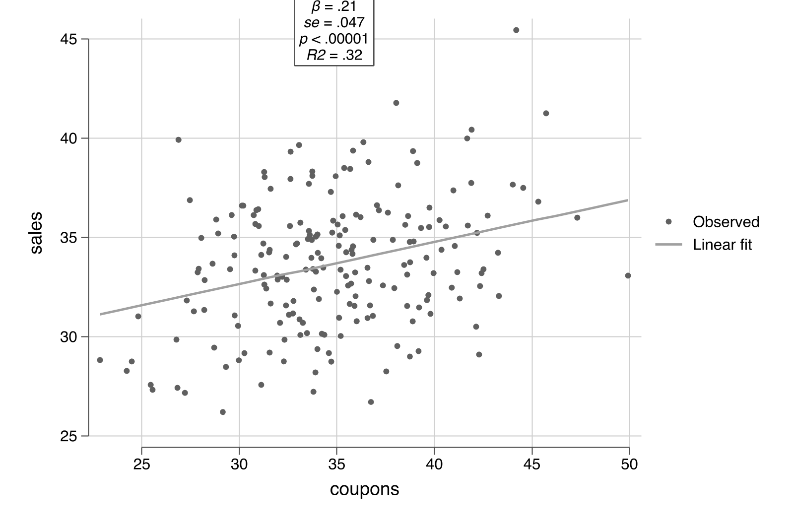
### 4.2 Controlling for income: one option
Now add income as a control. In `scatterfit`, the `controls()` option specifies continuous variables to partial out using the FWL procedure. Behind the scenes, `scatterfit` calls `reghdfe` to residualize both sales and coupons on income, then plots the residuals:
```stata
scatterfit sales coupons, controls(income) regparameters(coef pval r2) ///
opts(name(controlled, replace) title("B. FWL: Controlling for Income"))
```
The slope reverses to **+0.212** ($p < 0.001$, $R^2 = 0.32$) --- close to the true value of +0.2. The R-squared jumps from 0.03 to 0.32, showing that controlling for income explains a large share of the variation. Combining both panels:
```stata
graph combine naive controlled, ///
title("What Does 'Controlling for Income' Look Like?") rows(1)
graph export "stata_fwl_fig1_naive_vs_controlled.png", replace
```
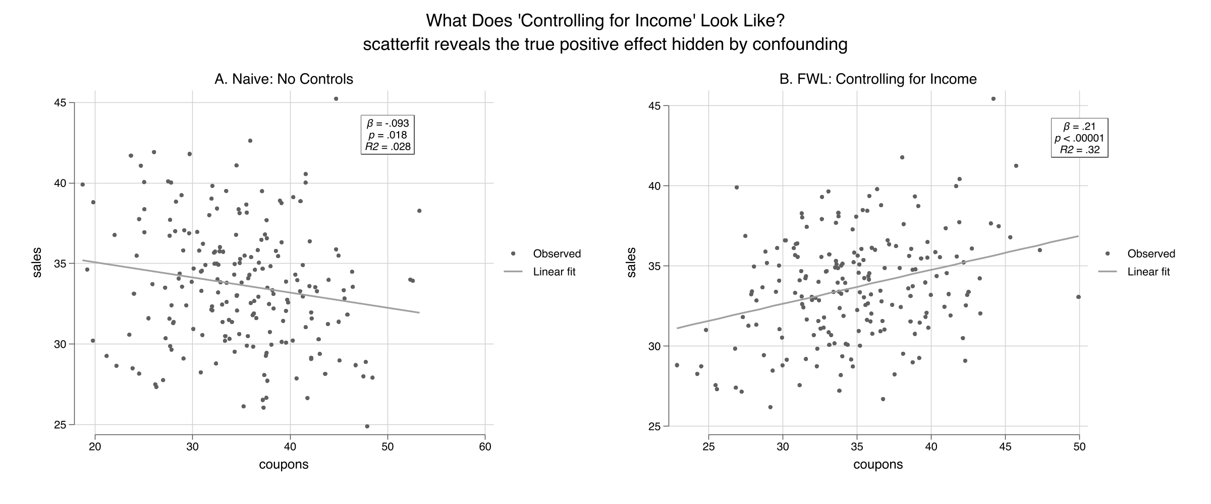
The left panel shows the raw relationship: more coupons, lower sales ($R^2 = 0.028$). The right panel shows the *same* data after removing the influence of income from both axes via `controls(income)`. The true positive effect of coupons emerges clearly, and the $R^2$ rises to 0.32.
### 4.3 The regression table confirms
We can compare the naive and controlled regressions side by side using Stata's `estimates store` and `estimates table` workflow. The `estimates store` command saves regression results under a name, and `estimates table` displays multiple stored results in columns --- similar to R's `etable()` or Python's `stargazer`:
```stata
regress sales coupons
estimates store naive_ols
regress sales coupons income
estimates store full_ols
estimates table naive_ols full_ols, stats(r2 N) b(%9.4f) se(%9.4f)
```
```text
--------------------------------------
Variable | naive_ols full_ols
-------------+------------------------
coupons | -0.0934 0.2123
| 0.0393 0.0467
income | 0.3004
| 0.0325
_cons | 36.9301 11.3352
| 1.3969 3.0080
-------------+------------------------
r2 | 0.0277 0.3215
N | 200 200
--------------------------------------
```
Adding income as a control flips the coupon coefficient from -0.093 to +0.212 and increases the R-squared from 0.028 to 0.321. The income coefficient (0.300) is close to the true value of 0.3.
### 4.4 Omitted variable bias: predicting the error
The confounding is not mysterious --- the **omitted variable bias (OVB) formula** predicts it exactly:
$$\text{bias} = \hat{\gamma} \times \hat{\delta}$$
In words, the bias equals the effect of the omitted variable on the outcome ($\hat{\gamma}$) multiplied by the relationship between the omitted variable and the treatment ($\hat{\delta}$).
```stata
* gamma = effect of income on sales (in full model)
regress sales coupons income
local gamma = _b[income] // 0.3004
* delta = regression of coupons on income
regress coupons income
local delta = _b[income] // -0.4937
* OVB = gamma * delta
display "OVB = " %9.4f `gamma' * `delta'
```
```text
OVB = -0.1483
```
The OVB formula predicts a bias of -0.148: income's positive effect on sales ($\hat{\gamma} = 0.300$) times its negative relationship with coupons ($\hat{\delta} = -0.494$) produces a large negative bias. The predicted naive coefficient (true + bias = 0.212 + (-0.148) = 0.064) is close to the actual naive coefficient (-0.093) --- the discrepancy comes from sampling variation with $n = 200$.
## 5. Under the Hood: Manual FWL Verification
### 5.1 The three-step recipe
The FWL theorem can be implemented manually in Stata using `regress` and `predict`:
```stata
* Step 1: Residualize sales on income
regress sales income
predict resid_sales, residuals
* Step 2: Residualize coupons on income
regress coupons income
predict resid_coupons, residuals
* Step 3: Regress residuals on residuals
regress resid_sales resid_coupons
```
```text
------------------------------------------------------------------------------
resid_sales | Coefficient Std. err. t P>|t| [95% conf. interval]
-------------+----------------------------------------------------------------
resid_coup~s | .2122882 .046581 4.56 0.000 .1204297 .3041466
_cons | -2.87e-09 .222537 -0.00 1.000 -.4388468 .4388468
------------------------------------------------------------------------------
```
The FWL coefficient on `resid_coupons` is **0.212288** --- exactly the same as the full regression coefficient on `coupons` (0.212288). This is not an approximation; it is an algebraic identity. Formally, the FWL theorem says:
$$\hat{\beta}\_1 = \frac{\text{Cov}(\tilde{Y}, \tilde{X}\_1)}{\text{Var}(\tilde{X}\_1)}$$
where $\tilde{Y}$ and $\tilde{X}\_1$ are the residuals from regressing $Y$ and $X\_1$ on the controls $Z$. In our example, $\tilde{Y}$ is `resid_sales` (the part of sales that income cannot explain) and $\tilde{X}\_1$ is `resid_coupons` (the part of coupons that income cannot explain). The ratio of their covariance to the variance of $\tilde{X}\_1$ gives the slope we see in the regression above.
Think of it like measuring height *for your age*: instead of comparing raw heights, you compare how much taller or shorter each person is than the average for their age group.
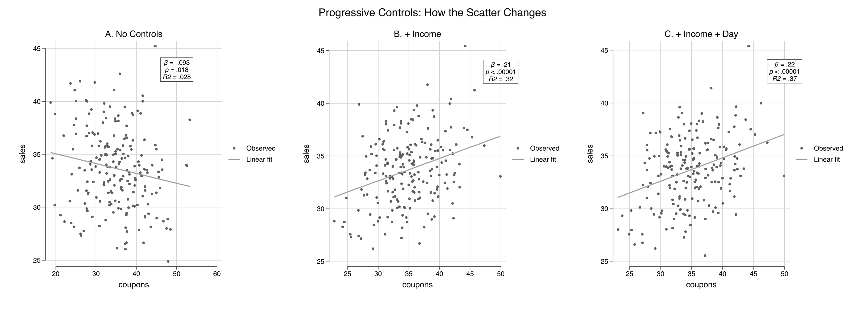
### 5.2 Adding more controls
The `scatterfit` command handles any number of controls automatically:
```stata
scatterfit sales coupons, ///
regparameters(coef pval r2) opts(name(panel_a, replace) title("A. No Controls"))
scatterfit sales coupons, controls(income) ///
regparameters(coef pval r2) opts(name(panel_b, replace) title("B. + Income"))
scatterfit sales coupons, controls(income dayofweek) ///
regparameters(coef pval r2) opts(name(panel_c, replace) title("C. + Income + Day"))
graph combine panel_a panel_b panel_c, ///
title("Progressive Controls: How the Scatter Changes") rows(1)
graph export "stata_fwl_fig2_three_panels.png", replace
```
```stata
estimates table m1_naive m2_income m3_full, stats(r2 r2_a N)
```
```text
--------------------------------------------------
Variable | m1_naive m2_income m3_full
-------------+------------------------------------
coupons | -0.0934 0.2123 0.2219
| 0.0393 0.0467 0.0454
income | 0.3004 0.2961
| 0.0325 0.0316
dayofweek | 0.4029
| 0.1095
_cons | 36.9301 11.3352 9.6398
| 1.3969 3.0080 2.9527
-------------+------------------------------------
r2 | 0.0277 0.3215 0.3654
r2_a | 0.0228 0.3146 0.3556
N | 200 200 200
--------------------------------------------------
```
The coupon coefficient progresses from -0.093 (naive, wrong sign), to +0.212 (controlling for income), to +0.222 (adding day of week). The R-squared --- now visible directly on each panel --- jumps from 0.028 to 0.32 to 0.37. Each scatterfit panel shows a tighter cloud as more variation is absorbed by the controls.
## 6. Binned Scatter Plots
### 6.1 Why binned scatters?
With large datasets (thousands or millions of observations), scatter plots become useless --- individual points merge into a solid blob. **Binned scatter plots** solve this by grouping observations into quantile bins along the x-axis and plotting the bin means. The regression line is still estimated on the full data, so the slope is unaffected. This is one of `scatterfit`'s key advantages over R's `fwl_plot()`.
### 6.2 Unbinned vs. binned
```stata
scatterfit sales coupons, controls(income) ///
regparameters(coef pval r2) opts(name(unbinned, replace) title("A. Unbinned (all points)"))
scatterfit sales coupons, controls(income) binned ///
regparameters(coef pval r2) opts(name(binned, replace) title("B. Binned (20 quantiles)"))
graph combine unbinned binned, ///
title("Binned Scatter: Summarizing Patterns in Large Data") rows(1)
graph export "stata_fwl_fig3_binned_scatter.png", replace
```
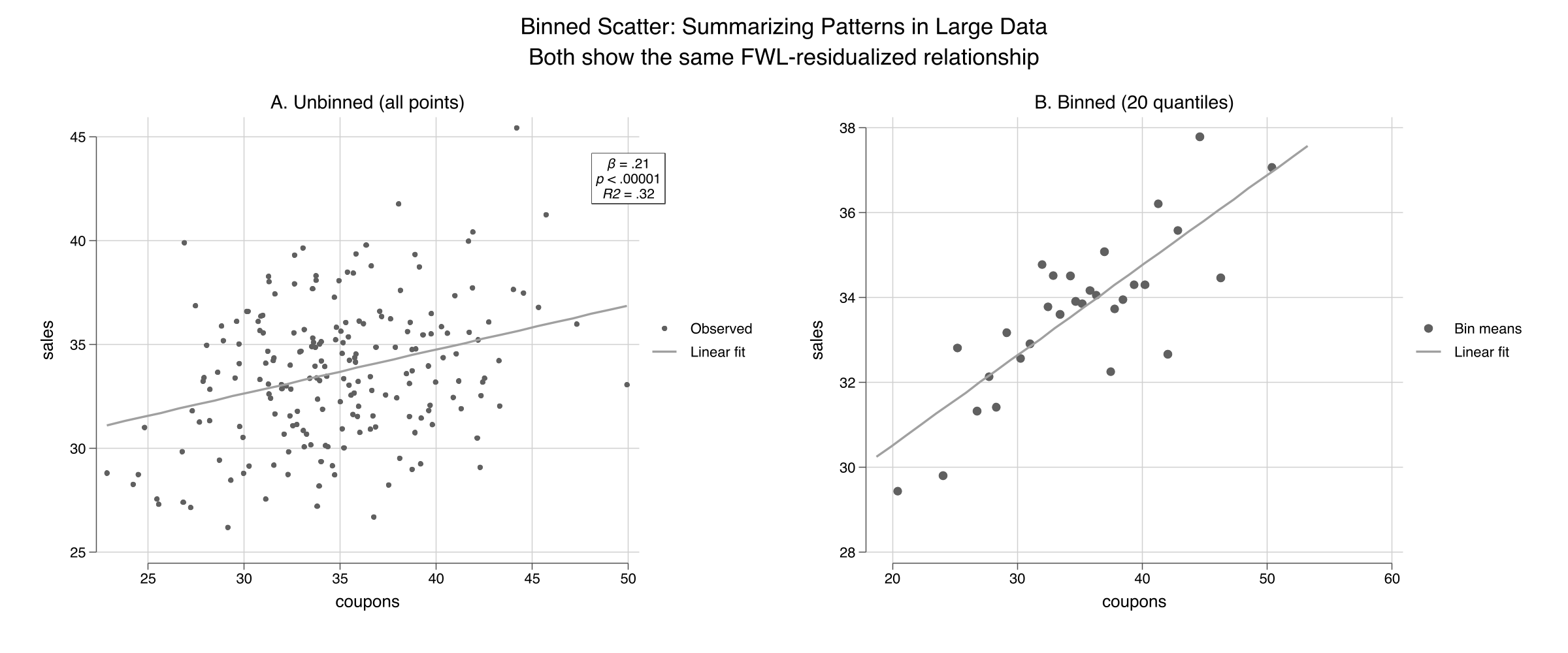
Both panels show the same FWL-residualized relationship ($\beta = 0.21$, $R^2 = 0.32$), but the binned version (right) replaces 200 individual points with 20 bin-mean markers. For our small dataset the difference is modest, but for the flights data (5,000+ observations) or production datasets (millions of rows), binning is essential. The `nquantiles()` option controls how many bins to use:
```stata
* Fewer bins = smoother but less detail
scatterfit sales coupons, controls(income) binned nquantiles(10)
* More bins = more detail but noisier
scatterfit sales coupons, controls(income) binned nquantiles(30)
```
## 7. Visualizing Fixed Effects
### 7.1 Load the flights data
We load the NYC flights sample --- 5,000 flights from New York's three airports (EWR, JFK, LGA) in 2013:
```stata
import delimited "https://raw.githubusercontent.com/cmg777/starter-academic-v501/master/content/post/r_fwlplot/flights_sample.csv", clear
summarize dep_delay air_time
tabulate origin
* Encode string variables for fixed effects (needed by scatterfit/reghdfe)
encode origin, gen(origin_fe)
encode dest, gen(dest_fe)
```
```text
Variable | Obs Mean Std. dev. Min Max
-------------+---------------------------------------------------------
dep_delay | 5,000 7.3172 22.83736 -20 119
air_time | 5,000 150.3636 93.47726 22 650
```
### 7.2 Progressive fixed effects
The `fcontrols()` option specifies categorical variables to absorb as fixed effects. This is analogous to `feols(...| FE)` in R's fixest:
```stata
* No fixed effects
scatterfit dep_delay air_time, regparameters(coef pval r2) ///
opts(name(fe_none, replace) title("A. No Fixed Effects"))
* Origin airport FE
scatterfit dep_delay air_time, fcontrols(origin_fe) ///
regparameters(coef pval r2) opts(name(fe_origin, replace) title("B. Origin FE"))
* Origin + destination FE
scatterfit dep_delay air_time, fcontrols(origin_fe dest_fe) ///
regparameters(coef pval r2) opts(name(fe_both, replace) title("C. Origin + Dest FE"))
graph combine fe_none fe_origin fe_both, ///
title("What Do Fixed Effects 'Do' to the Data?") rows(1)
graph export "stata_fwl_fig4_fixed_effects.png", replace
```
Panel A shows the raw cloud with a nearly flat slope ($R^2 \approx 0$). Panel B removes the three origin-airport means, tightening the horizontal spread. Panel C removes the destination means as well, collapsing the variation to *within-route* deviations and increasing $R^2$ substantially. The `fcontrols()` option handles all the demeaning internally using `reghdfe`.
### 7.3 Regression table
```stata
regress dep_delay air_time
estimates store fe0
reghdfe dep_delay air_time, absorb(origin_fe) vce(robust)
estimates store fe1
reghdfe dep_delay air_time, absorb(origin_fe dest_fe) vce(robust)
estimates store fe2
estimates table fe0 fe1 fe2, stats(r2 N) b(%9.4f) se(%9.4f)
```
```text
--------------------------------------------------
Variable | fe0 fe1 fe2
-------------+------------------------------------
air_time | -0.0050 -0.0079 -0.0324
| 0.0035 0.0034 0.0265
_cons | 8.0669 8.5072 12.1416
| 0.6117 0.6449 4.0186
-------------+------------------------------------
r2 | 0.0004 0.0055 0.0310
N | 5000 5000 4994
--------------------------------------------------
```
The air time coefficient changes as we add fixed effects: -0.005 (no FE), -0.008 (origin FE), -0.032 (origin + destination FE). Note that these are estimated on the 5,000-observation sample, so the coefficients differ somewhat from the full-data estimates in the R tutorial. The key pattern is the same: adding fixed effects absorbs between-group variation and changes both the magnitude and precision of the coefficient. With origin + destination FE, 6 singleton observations are dropped (N = 4,994) --- singletons are routes with only one flight in the sample, where within-group variation cannot be estimated.
## 8. Panel Data: Returns to Experience
### 8.1 Load the wage panel
The wage panel contains 545 individuals observed over 8 years (1980--1987). The classic question: what is the return to experience? The challenge is **unobserved ability** --- two people with the same experience may earn very different wages because one is more talented, motivated, or well-connected. These unmeasured personal traits are the "unobserved ability" that individual fixed effects absorb.
```stata
import delimited "https://raw.githubusercontent.com/cmg777/starter-academic-v501/master/content/post/r_fwlplot/wagepan.csv", clear
xtset nr year
summarize lwage exper expersq educ
```
```text
Variable | Obs Mean Std. dev. Min Max
-------------+---------------------------------------------------------
lwage | 4,360 1.649147 .5326094 -3.579079 4.05186
exper | 4,360 6.514679 2.825873 0 18
expersq | 4,360 50.42477 40.78199 0 324
educ | 4,360 11.76697 1.746181 3 16
```
### 8.2 Pooled OLS vs. individual fixed effects
```stata
regress lwage educ exper expersq
estimates store pool
reghdfe lwage exper expersq, absorb(nr)
estimates store fe_ind
reghdfe lwage exper expersq, absorb(nr year)
estimates store fe_twfe
estimates table pool fe_ind fe_twfe, stats(r2 N)
```
```text
--------------------------------------------------
Variable | pool fe_ind fe_twfe
-------------+------------------------------------
educ | 0.1021
| 0.0047
exper | 0.1050 0.1223 (omitted)
| 0.0102 0.0082
expersq | -0.0036 -0.0045 -0.0054
| 0.0007 0.0006 0.0007
_cons | -0.0564 1.0807 1.9223
| 0.0639 0.0263 0.0359
-------------+------------------------------------
r2 | 0.1477 0.6173 0.6185
N | 4360 4360 4360
--------------------------------------------------
```
Several things change as we add fixed effects. The `educ` coefficient disappears from the individual FE column --- education is time-invariant (it does not change over the 8 years for any individual), so it is perfectly collinear with person dummies. Stata marks `exper` as `(omitted)` in the two-way FE column --- because experience increments by one year for everyone, it is perfectly collinear with year dummies. Only `expersq` (which varies non-linearly) survives both sets of fixed effects. The R-squared jumps from 0.148 to 0.617, showing that individual fixed effects explain the majority of wage variation.
### 8.3 scatterfit with individual FE
```stata
* Sample 150 individuals for visual clarity
preserve
set seed 456
bysort nr: gen first = (_n == 1)
gen rand = runiform() if first
bysort nr (rand): replace rand = rand[1]
sort rand nr year
egen rank = group(rand) if first
bysort nr (rank): replace rank = rank[1]
keep if rank <= 150
scatterfit lwage exper, regparameters(coef pval r2) ///
opts(name(wage_raw, replace) title("A. Raw: Pooled Cross-Section"))
scatterfit lwage exper, fcontrols(nr) regparameters(coef pval r2) ///
opts(name(wage_fe, replace) title("B. FWL: Individual Fixed Effects"))
graph combine wage_raw wage_fe, ///
title("Controlling for Unobserved Ability") rows(1)
graph export "stata_fwl_fig5_panel_data.png", replace
restore
```
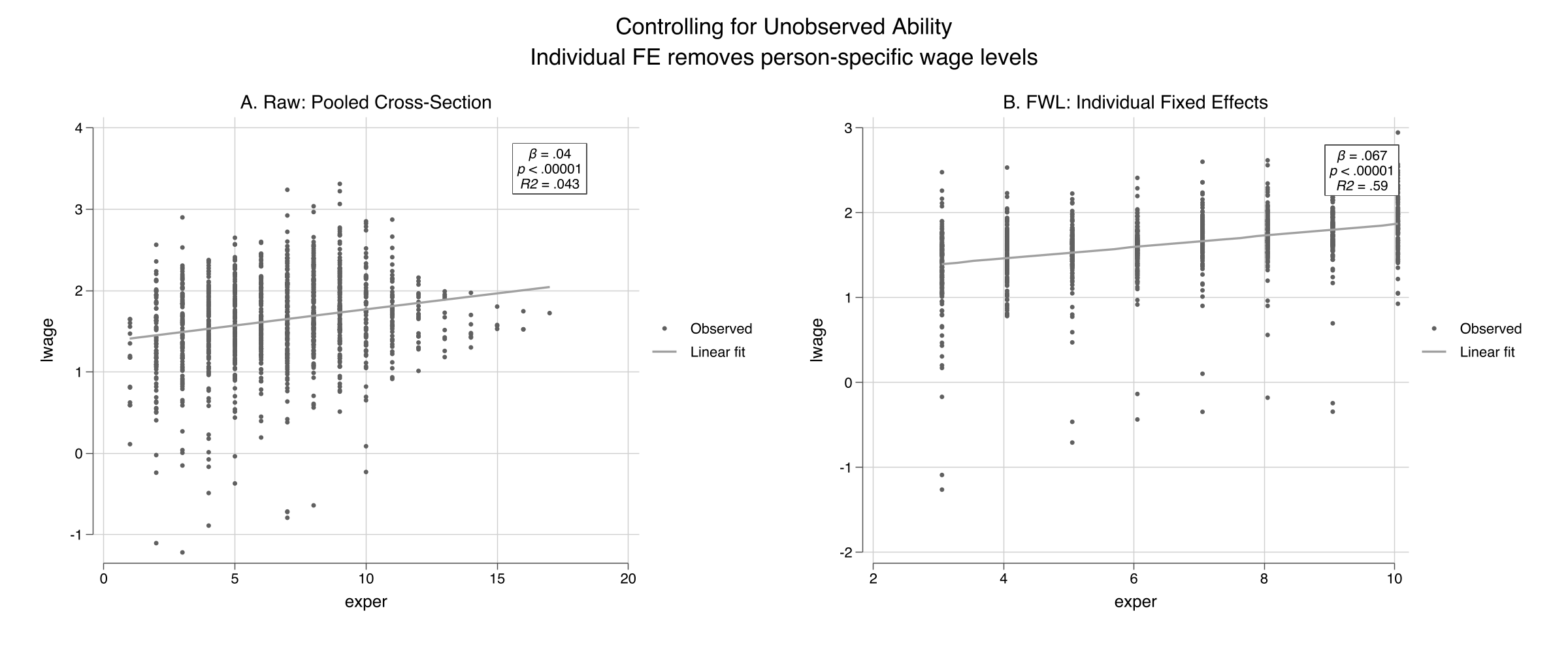
The visual difference is dramatic. Panel A shows a wide fan with a shallow slope ($R^2 = 0.043$) --- individuals at the same experience level have wildly different wages, reflecting unobserved ability. Panel B applies `fcontrols(nr)` to strip away each person's average wage and experience, leaving only *within-person* deviations. The $R^2$ jumps from 0.04 to 0.59, showing that individual fixed effects explain most of the wage variation. The slope steepens sharply: the within-person return to experience is about 0.07 log points per year (roughly 7%), and the relationship is much more precisely identified once we control for who each person is.
## 9. Advanced: Fit Types and Regression Parameters
### 9.1 Multiple fit types
The `regparameters()` option displays the coefficient, standard error, p-value, R-squared, and sample size directly on the plot. The `scatterfit` command also supports fit types beyond linear --- quadratic and lowess --- as diagnostics for nonlinearity:
```stata
* Linear fit with all regression parameters displayed on the plot
scatterfit sales coupons, controls(income) ///
regparameters(coef se pval r2 n)
graph export "stata_fwl_fig6_advanced.png", replace
```
```stata
* Lowess fit: nonparametric check (note: lowess does not support controls())
scatterfit sales coupons, fit(lowess)
```
The quadratic fit serves as a diagnostic. If the relationship looks curved in the residualized scatter, your linear specification may be misspecified. Note that `fit(lowess)` and `fit(lpoly)` do not support `controls()` in the current version of `scatterfit` --- use them on raw or manually residualized data. For our simulated data (which is truly linear), the quadratic fit closely follows the linear fit, confirming the specification is appropriate.
### 9.2 Regression parameters on the plot
The `regparameters()` option displays statistical information directly on the scatter plot. Available parameters:
| Parameter | Display |
|-----------|---------|
| `coef` | Slope coefficient |
| `se` | Standard error |
| `pval` | P-value |
| `r2` | R-squared |
| `n` | Sample size |
```stata
* Show everything
scatterfit sales coupons, controls(income) regparameters(coef se pval r2 n)
```
This is especially useful for presentations and papers where you want to communicate both the visual pattern and the statistical evidence in a single figure.
### 9.3 Quick reference: scatterfit recipes
```stata
* 1. Raw scatter (no controls)
scatterfit y x
* 2. Control for continuous variables (FWL)
scatterfit y x, controls(z1 z2)
* 3. Control for fixed effects (categorical)
scatterfit y x, fcontrols(group_fe)
* 4. Both continuous controls and fixed effects
scatterfit y x, controls(z1) fcontrols(group_fe)
* 5. Binned scatter (for large datasets)
scatterfit y x, controls(z1) binned nquantiles(20)
* 6. Show regression parameters on the plot
scatterfit y x, controls(z1) regparameters(coef pval r2)
* 7. Quadratic fit (works with controls)
scatterfit y x, controls(z1) fit(quadratic)
* 8. Lowess fit (does NOT support controls — use on raw data)
scatterfit y x, fit(lowess)
```
## 10. Discussion
The FWL theorem is not just a pedagogical tool --- it is the computational engine behind Stata's `reghdfe` command. When `reghdfe` estimates a model with fixed effects, it does not create a matrix with thousands of dummy variables. Instead, it uses an iterative demeaning algorithm (a generalization of FWL) to absorb the fixed effects, then runs OLS on the residuals. This is why `reghdfe` can handle millions of observations with tens of thousands of fixed effects.
The `scatterfit` package offers three advantages over the R and Python implementations of FWL visualization. First, **binned scatter plots** (Section 6) are essential for large datasets where individual points merge into an unreadable blob. Second, **regression parameters on the plot** (`regparameters()`) combine the visual and statistical evidence in a single figure, reducing the back-and-forth between plots and tables. Third, **multiple fit types** (`fit(quadratic)`, `fit(lowess)`) serve as built-in diagnostics for linearity.
Across the three tutorials (Python, R, Stata), the key numbers are the same because we use the same datasets: the naive coupon coefficient is -0.093, the true effect is +0.212 after controlling for income, and the OVB is -0.148. The FWL theorem is the same in every language --- only the syntax changes:
| Task | Python | R | Stata |
|------|--------|---|-------|
| Raw scatter | `plt.scatter(x, y)` | `fwl_plot(y ~ x)` | `scatterfit y x` |
| Control for Z | manual `resid()` | `fwl_plot(y ~ x + z)` | `scatterfit y x, controls(z)` |
| Fixed effects | not supported | `fwl_plot(y ~ x \| fe)` | `scatterfit y x, fcontrols(fe)` |
| Binned scatter | not supported | not supported | `scatterfit y x, binned` |
| Stats on plot | not supported | not supported | `regparameters(coef pval r2)` |
Students who learn FWL in one language can immediately apply it in another.
One limitation: the FWL theorem applies only to linear regression. For logistic, Poisson, or other nonlinear models, the partialling-out logic does not hold exactly. Stata's `scatterfit` does support `fitmodel(logit)` and `fitmodel(poisson)`, but these are direct fits, not FWL residualizations.
## 11. Summary and Next Steps
- **Confounding produces misleading regressions:** the naive coupon coefficient was -0.093 (wrong sign), while the true causal effect is +0.2. After FWL residualization with `controls(income)`, the estimate was +0.212.
- **The OVB formula predicts the bias exactly:** $0.300 \times (-0.494) = -0.148$, correctly predicting the negative direction and approximate magnitude of the confounding.
- **FWL is an exact identity:** the manual three-step procedure in Stata (`regress` + `predict resid` + `regress`) matches the full regression to six decimal places (0.212288).
- **Fixed effects are FWL applied to group dummies:** `fcontrols()` in `scatterfit` calls `reghdfe` internally to demean the data, equivalent to `feols(... | FE)` in R.
- **Binned scatter plots and on-plot statistics are Stata's advantage:** the `binned` and `regparameters()` options provide capabilities that the R and Python FWL tools lack.
For further study, see the companion [R FWL tutorial](/post/r_fwlplot/) using `fwl_plot()` and the [Python FWL tutorial](/post/python_fwl/) that extends FWL to Double Machine Learning.
## 12. Exercises
1. **OVB direction.** In our simulation, predict the direction of the OVB if you also omit `dayofweek`. Compute $\hat{\gamma}\_{day} \times \hat{\delta}\_{day}$ and add it to the income OVB. Does the total bias match the difference between the naive and the fully controlled coefficient?
2. **Binned scatter with different bins.** Re-run `scatterfit sales coupons, controls(income) binned nquantiles(k)` for $k = 5, 10, 20, 50$. How does the visual change? At what point do you lose meaningful information?
3. **slopefit: heterogeneous effects.** Use the `slopefit` command: `slopefit sales coupons income`. This shows how the coupon-sales slope varies across income levels. Do coupons work better in low-income or high-income neighborhoods?
## 13. References
1. [Ahrens, L. (2024). scatterfit: Scatter Plots with Fit Lines and Regression Results. GitHub.](https://github.com/leojahrens/scatterfit)
2. [Correia, S. (2016). reghdfe: Linear Models with Many Levels of Fixed Effects. Stata Journal.](http://scorreia.com/software/reghdfe/)
3. [Frisch, R. & Waugh, F. V. (1933). Partial Time Regressions as Compared with Individual Trends. *Econometrica*, 1(4), 387--401.](https://doi.org/10.2307/1907330)
4. [Lovell, M. C. (1963). Seasonal Adjustment of Economic Time Series and Multiple Regression Analysis. *JASA*, 58(304), 993--1010.](https://doi.org/10.1080/01621459.1963.10480682)
5. [Angrist, J. D. & Pischke, J.-S. (2009). *Mostly Harmless Econometrics.* Princeton University Press.](https://press.princeton.edu/books/paperback/9780691120355/mostly-harmless-econometrics)
6. Datasets: simulated store data, NYC flights sample, and Wooldridge wage panel from the companion [R FWL tutorial](/post/r_fwlplot/) on this site.
#### Acknowledgements
AI tools (Claude Code, Gemini, NotebookLM) were used to make the contents of this post more accessible to students. Nevertheless, the content in this post may still have errors. Caution is needed when applying the contents of this post to true research projects.