## Terminal's High-level and Advanced Methods
This section is about high-level methods of `Terminal` instances.
**NOTE:** In the following code sample, `term` is always a `Terminal` instance.
This is where Terminal-Kit becomes really shiny: you can really build a feature-rich terminal application using this.
You can handle keyboard inputs, change the terminal color palette, create menu, get text input (similar to *readline*),
create nice progress bars, or display some special effects.
## Table of Contents
* [.fullscreen()](#ref.fullscreen)
* [.processExit()](#ref.processExit)
* [.grabInput()](#ref.grabInput)
* [.getCursorLocation()](#ref.getCursorLocation)
* [.getColor()](#ref.getColor)
* [.setColor()](#ref.setColor)
* [.getPalette()](#ref.getPalette)
* [.setPalette()](#ref.setPalette)
* [.wrapColumn()](#ref.wrapColumn)
* [.table()](#ref.table)
* [.yesOrNo()](#ref.yesOrNo)
* [.inputField()](#ref.inputField)
* [.fileInput()](#ref.fileInput)
* [.singleLineMenu()](#ref.singleLineMenu)
* [.singleRowMenu()](#ref.singleRowMenu)
* [.singleColumnMenu()](#ref.singleColumnMenu)
* [.gridMenu()](#ref.gridMenu)
* [.spinner()](#ref.spinner)
* [.progressBar()](#ref.progressBar)
* [.bar()](#ref.bar)
* [.slowTyping()](#ref.slowTyping)
* [.drawImage()](#ref.drawImage)
## Advanced methods of a **Terminal** instance
Advanced methods are high-level library functions.
### .fullscreen( options )
* options: true/false/object: if truthy it activates the fullscreen mode, if falsy it returns to normal mode,
if it is an object it supports those properties:
* noAlternate `boolean` true if the alternate screen buffer should not be used
Basically, this method try to achieve the same goal than the native terminal capability *alternate screen buffer*.
If *alternate screen buffer* is disabled on your terminal, it will provide a clean fallback, clearing the screen and positionning
the cursor at the upper-left corner.
### .processExit( code )
* code `number` the exit code
This method should be used instead of calling `process.exit()` directly. The *code* argument will be transmitted to
`process.exit()` as it is.
It helps quitting cleanly your application without leaving the terminal in a bad state, so the user get a working shell back.
### .grabInput( options , [safeCallback] )
* options: false/true/Object, *false* disable input grabbing, *true* or an Object turn it on,
if it is an Object then those properties are supported:
* mouse: if defined, it activate mouse event, those values are supported for 'mouse':
* 'button': report only button-event
* 'drag': report button-event and report motion-event only when a button is pressed (i.e. a mouse drag)
* 'motion': report button-event and all motion-event, use it only when needed, many escape sequences are sent from
the terminal (e.g. you may consider it for script running over SSH)
* focus: true/false: if defined and true, focus event will be reported (if your terminal support it - *xterm* does)
* safe `boolean` (optional), when set and when *options* is set to `false`,
it returns a promise that resolve when input grabbing is safely turned off, avoiding extra junks to
be echoed when the terminal left the raw mode. It is mostly useful after grabbing mouse motion.
This function turns input grabbing on, key will not be echoed anymore, and every input will generate an event
on the `term` object.
Each key pressed will generate a [*key event*](events.md#ref.event.key) and mouse motion and button (if enabled)
will generate a [*mouse event*](events.md#ref.event.mouse).
Quick example:
```js
var term = require( 'terminal-kit' ).terminal ;
function terminate() {
term.grabInput( false ) ;
setTimeout( function() { process.exit() } , 100 ) ;
}
term.bold.cyan( 'Type anything on the keyboard...\n' ) ;
term.green( 'Hit CTRL-C to quit.\n\n' ) ;
term.grabInput( { mouse: 'button' } ) ;
term.on( 'key' , function( name , matches , data ) {
console.log( "'key' event:" , name ) ;
if ( name === 'CTRL_C' ) { terminate() ; }
} ) ;
term.on( 'terminal' , function( name , data ) {
console.log( "'terminal' event:" , name , data ) ;
} ) ;
term.on( 'mouse' , function( name , data ) {
console.log( "'mouse' event:" , name , data ) ;
} ) ;
```
### .getCursorLocation( [callback] )
* callback( error , x , y ) (optional)
* error `mixed` truthy if an underlying error occurs
* x `integer` the x coordinate of the cursor
* y `integer` the y coordinate of the cursor
Get the cursor location.
Without a callback argument, it returns a Promise that resolve to an object with a *x* and *y* properties.
### .getColor( register , [callback] )
* register `number` the register number in the 0..255 range
* callback( error , rgb ) (optional)
* error `mixed` truthy if an underlying error occurs
* rgb `Object` where:
* r `number` in the 0..255 range, the red value
* g `number` in the 0..255 range, the green value
* b `number` in the 0..255 range, the blue value
Get the RGB values of a color register.
Without a callback argument, it returns a Promise that resolve to that same *rgb* object.
### .setColor( register , r , g , b , [names] ) *or* .setColor( register , rgb , [names] )
* register `number` the register number in the 0..255 range
* r `number` in the 0..255 range, the red value
* g `number` in the 0..255 range, the green value
* b `number` in the 0..255 range, the blue value
* rgb `Object` where:
* r `number` in the 0..255 range, the red value
* g `number` in the 0..255 range, the green value
* b `number` in the 0..255 range, the blue value
* names `Array` of `string`: names for that color, it default to an empty array
Set the RGB values for a color indexed by the integer *register*.
### .getPalette( register , [callback] )
* callback( error , palette ) (optional)
* error `mixed` truthy if an underlying error occurs
* palette `Array` of 16 `Object` where:
* r `number` in the 0..255 range, the red value
* g `number` in the 0..255 range, the green value
* b `number` in the 0..255 range, the blue value
* names `Array` of `string`, names for this color
Request from the terminal the 16-colors palette in use.
If the terminal does not support the feature, then the default palette for this terminal is provided,
and each color that was modified by the lib replace it.
Without a callback argument, it returns a Promise that resolve to that same *palette* array.
### .setPalette( palette )
* palette, is either:
* `Array` of 16 `Object` where:
* r `number` in the 0..255 range, the red value
* g `number` in the 0..255 range, the green value
* b `number` in the 0..255 range, the blue value
* names `Array` of `string`, names for this color
* *OR* `string` one of the built-in palette (default, gnome, konsole, linux, solarized, vga, xterm)
If the terminal supports it, it will reset the 16-colors palette to the provided one.
### .wrapColumn() / .wrapColumn( [options] ) / .wrapColumn( [x] , width )
* options `Object` where:
* width `integer` or `null` the width of the column, or `null` for the terminal's width
* x `integer` the x-coordinate of the left side of the column
* continue `boolean` true if it would continue a previous output (mostly for insternal lib usage)
* offset `integer` the offset of the next/first line (used for continuing text, mostly for insternal lib usage)
This method change the behavior of the [.wrap modifier](low-level.md#ref.modifiers).
It defines the column setup used for word-wrapping.
Calling `.wrapColumn()` without argument simply reset the `continue` and `offset` value.
It is useful since issuing multiple `term.wrap( "some text" )` would continue the text one after the other.
That would stop that *continuation* behavior.
Any call to `.wrapColumn()`, with or without arguments, reset the offset, except if the user defines its own value.
The offset is also reset everytime some text is written without the *wrap* mode turned *on*.
Examples:
```js
var term = require( 'terminal-kit' ).terminal ;
// Word-wrap this along the full terminal width
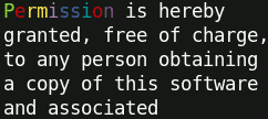
term.wrap.yellow( 'Permission is hereby granted, free of charge, to any person obtaining a copy of this software and associated documentation files (the "Software"), to deal in the Software without restriction, including without limitation the rights to use, copy, modify, merge, publish' ) ;
// Word-wrap this inside a column starting at x=10 with a width of 25 terminal cells
term.wrapColumn( { x: 10 , width: 25 } ) ;
term.wrap.green( 'Permission is hereby granted, free of charge, to any person obtaining a copy of this software and associated documentation files (the "Software"), to deal in the Software without restriction, including without limitation the rights to use, copy, modify, merge, publish' ) ;
// This reset the offset
term( '\n' ) ;
//term.wrapColumn() could be used as well, but the next text would overwrite the last line
// Text continuation: the second text start at the end of line of the first text
term.wrap.blue( '^GP^re^Yr^um^Mi^bs^bs^ci^ro^mn^ is ' )
term.wrap.red( 'hereby granted' ) ;
```
It produces:
### .table( tableCells , [options] )
* tableCells `array` of `array` of `string` describing the text content of each cells
* options `object`, see [TextTable](TextTable.md#ref.TextTable.new)
This creates a table of text.
Behind the scene, this method uses the *inlinized* variant of the [TextTable widget](TextTable.md#ref.TextTable.new)
of the document-model, so for more details, you will have to read the [TextTable doc](TextTable.md#top).
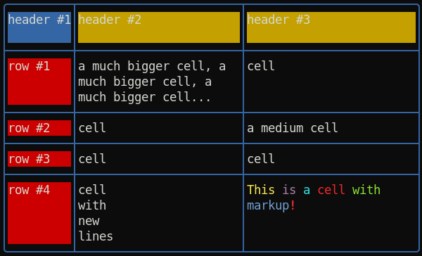
Example of a table with border:
```js
var term = require( 'terminal-kit' ).terminal ;
term.table( [
[ 'header #1' , 'header #2' , 'header #3' ] ,
[ 'row #1' , 'a much bigger cell, a much bigger cell, a much bigger cell... ' , 'cell' ] ,
[ 'row #2' , 'cell' , 'a medium cell' ] ,
[ 'row #3' , 'cell' , 'cell' ] ,
[ 'row #4' , 'cell\nwith\nnew\nlines' , '^YThis ^Mis ^Ca ^Rcell ^Gwith ^Bmarkup^R^+!' ]
] , {
hasBorder: true ,
contentHasMarkup: true ,
borderChars: 'lightRounded' ,
borderAttr: { color: 'blue' } ,
textAttr: { bgColor: 'default' } ,
firstCellTextAttr: { bgColor: 'blue' } ,
firstRowTextAttr: { bgColor: 'yellow' } ,
firstColumnTextAttr: { bgColor: 'red' } ,
width: 60 ,
fit: true // Activate all expand/shrink + wordWrap
}
) ;
```
It produces:
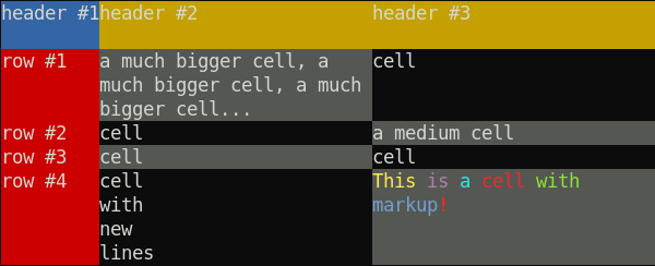
Example of a table without a border, with checkered cells:
```js
var term = require( 'terminal-kit' ).terminal ;
term.table( [
[ 'header #1' , 'header #2' , 'header #3' ] ,
[ 'row #1' , 'a much bigger cell, a much bigger cell, a much bigger cell... ' , 'cell' ] ,
[ 'row #2' , 'cell' , 'a medium cell' ] ,
[ 'row #3' , 'cell' , 'cell' ] ,
[ 'row #4' , 'cell\nwith\nnew\nlines' , '^YThis ^Mis ^Ca ^Rcell ^Gwith ^Bmarkup^R^+!' ]
] , {
hasBorder: false ,
contentHasMarkup: true ,
textAttr: { bgColor: 'default' } ,
firstCellTextAttr: { bgColor: 'blue' } ,
firstRowTextAttr: { bgColor: 'yellow' } ,
firstColumnTextAttr: { bgColor: 'red' } ,
checkerEvenCellTextAttr: { bgColor: 'gray' } ,
width: 60 ,
fit: true // Activate all expand/shrink + wordWrap
}
) ;
```
It produces:
### .yesOrNo( [options] , [callback] )
* options `Object` where:
* yes `string` or `Array` contains a key code or an array of key code that will trigger the yes
* no `string` or `Array` contains a key code or an array of key code that will trigger the
* echoYes `String` contains what to write on yes, default 'yes'
* echoNo `String` contains what to write on no, default 'no'
* callback( error , result ) (optional)
* error `mixed` truthy if an underlying error occurs
* result `boolean` true for 'yes' or false for 'no'
Wait for user input, call the completion callback when the user hit the 'y' key or the 'n' key,
*result* will be true if the user hit any *yes* keys or false if the user hit any *no* keys.
Other keys do not do anything.
Turn input grabbing on if necessary.
We can specify the keys for *yes* and *no* by providing a string or an array of string.
It returns an object featuring some functions to control things during the input process:
* abort(): abort the input process and do not even call the yesOrNo()'s callback
* **promise**: without a callback argument, this will be a promise that resolve with the result value
Quick example:
```js
var term = require( 'terminal-kit' ).terminal ;
function question() {
term( 'Do you like javascript? [Y|n]\n' ) ;
// Exit on y and ENTER key
// Ask again on n
term.yesOrNo( { yes: [ 'y' , 'ENTER' ] , no: [ 'n' ] } , function( error , result ) {
if ( result ) {
term.green( "'Yes' detected! Good bye!\n" ) ;
process.exit() ;
}
else {
term.red( "'No' detected, are you sure?\n" ) ;
question() ;
}
} ) ;
}
question() ;
```
It produces:

### .inputField( [options] , [callback] )
* options `Object` where:
* y `number` (optional) if set, this is the y coordinate (the row) of the beginning of the inputField
* x `number` (optional) if set, this is the x coordinate (the column) of the beginning of the inputField
* echo `boolean` if true (the default), input are displayed on the terminal
* echoChar `string` or `true` if set, all characters are replaced by this one (useful for password fields),
if true, it is replaced by a dot: •
* default `string` default input/placeholder
* cursorPosition `integer` (default: -1, end of input) set the cursor position/offset in the input,
negative value starts from the end
* cancelable `boolean` if true (default: false), it is cancelable by user using the cancel key (default: ESC),
thus will return `undefined`.
* style `Function` style used, default to the terminal instance (no style)
* hintStyle `Function` style used for hint (auto-completion preview), default to `terminal.brightBlack` (gray)
* maxLength `number` maximum length of the input
* minLength `number` minimum length of the input
* history `Array` (optional) an history array, so UP and DOWN keys move up and down in the history
* maxLength `number` (optional) the maximum length (in characters) of the user input
* autoComplete `Array` or `Function( inputString , [callback] )` (optional) an array of possible completion,
so the TAB key will auto-complete the input field. If it is a function, it should accept an input `string`
and return the completed `string` (if no completion can be done, it should return the input string,
if multiple candidate are possible, it should return an array of string), if **the function accepts 2 arguments**
(checked using *function*.length), then **the auto-completer will be asynchronous**!
If it does not accept a callback but returns a *thenable* (Promise-like), it will be **asynchronous** too.
Also note that if it is an array or the result of the function is an array, and if that array has a
special property `prefix` (a string), then this prefix will be prepended to the output of the auto complete menu,
and if it has the special property `postfix` (still a string), this will be appended to the output of the
auto complete menu.
* autoCompleteMenu `boolean` or `Object` of options, used in conjunction with the 'autoComplete' option, if *truthy*
any auto-complete attempt having many completion candidates will display a menu to let the user choose between each
possibilities. If an object is given, it should contain options for the [.singleLineMenu()](#ref.singleLineMenu)
that is used for the completion (notice: some options are overwritten: 'y' and 'exitOnUnexpectedKey')
* autoCompleteHint `boolean` if true (default: false) use the hintStyle to write the auto-completion preview
at the right of the input
* keyBindings `Object` overide default key bindings, object's keys are Terminal-kit key names, the value is the action (string). See below for the list of available actions.
* tokenHook `Function( token , isEndOfInput , previousTokens , term , config )` this is a hook called for each token
of the input, where:
* token `String` is the current token
* isEndOfInput `boolean` true if this is the **last token and if it ends the input string**
(e.g. it is possible for the last token to be followed by some blank char, in that case *isEndOfInput*
would be false)
* previousTokens `Array` of `String` is a array containing all tokens before the current one
* term is a Terminal instance
* config `Object` is an object containing dynamic settings that can be altered by the hook, where:
* style `Function` style in use (see the *style* option)
* hintStyle `Function` style in use for hint (see the *hintStyle* option)
* tokenRegExp `RegExp` the regexp in use for tokenization (see the *tokenRegExp* option)
* autoComplete `Array` or `Function( inputString , [callback] )` (see the *autoComplete* option)
* autoCompleteMenu `boolean` or `Object` (see the *autoCompleteMenu* option)
* autoCompleteHint `boolean` enable/disable the auto-completion preview (see the *autoCompleteHint* option)
The config settings are always reset on new input, on new tokenization pass.
The hook can return a *style* (`Function`, like the *style* option) that will be used to print that token.
Used together, this can achieve syntax hilighting, as well as dynamic behavior suitable for a shell.
Finally, it can return a string, styled or not, that will be displayed in place of that token,
useful if the token should have multiple styles (but that string **MUST** contains the same number of
printable character, or it would lead hazardous behavior).
* tokenResetHook `Function( term , config )` this is a hook called before the first token
* tokenRegExp `RegExp` this is the regex used to tokenize the input, by default a token is space-delimited,
so "one two three" would be tokenized as [ "one" , "two" , "three" ].
**NOTE**: this `RegExp` **MUST** have the `g` flag, or it will throw an error.
* callback( error , input ): an optional completion callback, for promise, use the *returnValue's* `.promise` preperty.
Arguments:
* error `mixed` truthy if an underlying error occurs
* input `string` the user input
Wait for user input, call the completion callback when the user hit the *ENTER* key and pass the user input
to the callback.
It turns input grabbing on if necessary.
Special keys are supported by the input field:
* ENTER, KP_ENTER: end the input process and return the current user input
* DELETE: delete
* BACKSPACE: backward delete
* LEFT/RIGHT: move the cursor one character left/right
* CTRL_LEFT/CTRL_RIGHT: move the cursor to the previous/next word
* HOME: move the cursor at the beginning of the input field
* END: move the cursor at the end of the input field
* DOWN, UP: use the history feature (if `options.history` is set)
* TAB: use the auto-completion feature (if `options.autoComplete` is set)
* CTRL_R: use the auto-completion feature, using the provided history array (`options.history`)
* CTRL_U/CTRL_K: delete all characters before/after the cursor
Additional keys are used when the auto-completion displays its menu (see [.singleLineMenu()](#ref.singleLineMenu) for details).
All those keys are customizable through the *keyBindings* options.
Available actions are:
* submit: submit the input field (default: ENTER and KP_ENTER)
* cancel: cancel the input field (default: ESC, the input field should be cancelable)
* backDelete: delete one character backward (default: BACKSPACE)
* delete: delete one character (default: DELETE)
* deleteAllBefore: delete all characters before the cursor (default: CTRL_U)
* deleteAllAfter: delete all characters from the cursor to the end of input (default: DELETE)
* backward: move the cursor one character backward (default: LEFT)
* forward: move the cursor one character forward (default: RIGHT)
* previousWord: move the cursor to the begining of the previous word (default: CTRL_LEFT)
* nextWord: move the cursor to the end of the next word (default: CTRL_RIGHT)
* historyPrevious: use the previous history entry (default: UP)
* historyNext: use the next history entry (default: DOWN)
* startOfInput: move the cursor at the begining of input (default: HOME)
* endOfInput: move the cursor at the end of input (default: END)
* autoComplete: auto-complete the input (default: TAB)
* autoCompleteUsingHistory: auto-complete the input, using the provided history (`options.history` array instead of `options.autoComplete`)
* meta: if bound to ESCAPE, allows for two-key combos like ESC-D to generate an ALT_D
(useful for terminals that do not have a modifier key assigned to alt/meta)
It returns an EventEmitter object featuring some functions to control things during the input process:
* abort(): abort the input process and do not even call the inputField()'s callback
* stop(): stop the input process now, call the inputField()'s callback (same behavior than a regular 'ENTER' key pressed)
* getInput(): get the current input string
* getPosition(): return an object containing 'x' and 'y' properties, the coordinates where the input field starts
* getCursorPosition(): return the cursor position/offset in the input
* setCursorPosition( offset ): set the cursor position/offset in the input
* redraw(): redraw the input field, useful if you had echo'ed something that can mess it
* hide(): hide the input field, it still records keystrokes
* show(): show the input field again
* rebase( [x] , [y] ): rebase the input field to the current cursor position. Please note: it does NOT erase the previously entered
text, you have to use hide() before. It works this way because you may want to modify the screen in between, and
it needs some I/O with the terminal to works accordingly.
If *x* and *y* are given, it use those coordinates instead of an internal asynchronous call to .getCursorLocation(),
so it makes *.rebase()* synchronous.
* **promise**: without a callback argument, this will be a promise that resolve with the *input* string
It emits:
* *ready*: when the input field is ready (rarely useful)
* *rebased*: when the input field has been rebased (rarely useful)
* *highlight*: when an underlying auto-complete single-line-menu emit an 'hightlight' event, it is re-emitted by the input-field
Quick example, featuring *history* and *auto-completion*:
```js
var term = require( 'terminal-kit' ).terminal ;
var history = [ 'John' , 'Jack' , 'Joey' , 'Billy' , 'Bob' ] ;
var autoComplete = [
'Barack Obama' , 'George W. Bush' , 'Bill Clinton' , 'George Bush' ,
'Ronald W. Reagan' , 'Jimmy Carter' , 'Gerald Ford' , 'Richard Nixon' ,
'Lyndon Johnson' , 'John F. Kennedy' , 'Dwight Eisenhower' ,
'Harry Truman' , 'Franklin Roosevelt'
] ;
term( 'Please enter your name: ' ) ;
term.inputField(
{ history: history , autoComplete: autoComplete , autoCompleteMenu: true } ,
function( error , input ) {
term.green( "\nYour name is '%s'\n" , input ) ;
process.exit() ;
}
) ;
```
It produces:

The same, with **Promise**:
```js
async function func() {
var term = require( 'terminal-kit' ).terminal ;
var history = [ 'John' , 'Jack' , 'Joey' , 'Billy' , 'Bob' ] ;
var autoComplete = [
'Barack Obama' , 'George W. Bush' , 'Bill Clinton' , 'George Bush' ,
'Ronald W. Reagan' , 'Jimmy Carter' , 'Gerald Ford' , 'Richard Nixon' ,
'Lyndon Johnson' , 'John F. Kennedy' , 'Dwight Eisenhower' ,
'Harry Truman' , 'Franklin Roosevelt'
] ;
term( 'Please enter your name: ' ) ;
var input = await term.inputField(
{ history: history , autoComplete: autoComplete , autoCompleteMenu: true }
).promise ;
term.green( "\nYour name is '%s'\n" , input ) ;
process.exit() ;
}
```
If we need our own auto-completer, we might take advantage of the built-in static method
[termkit.autoComplete()](global-api.md#ref.autoComplete).
Custom auto-completer can be asynchronous, if the function's *length* is **exactly 2**.
This is an example of a file selector that exposes the async behavior of auto-completer and the usage of
the static `termkit.autoComplete()` method:
```js
var fs = require( 'fs' ) ;
var termkit = require( 'terminal-kit' ) ;
var term = termkit.terminal ;
var autoCompleter = function autoCompleter( inputString , callback )
{
fs.readdir( __dirname , function( error , files ) {
callback( undefined , termkit.autoComplete( files , inputString , true ) ) ;
} ) ;
} ;
term( 'Choose a file: ' ) ;
term.inputField(
{ autoComplete: autoCompleter , autoCompleteMenu: true } ,
function( error , input ) {
if ( error )
{
term.red.bold( "\nAn error occurs: " + error + "\n" ) ;
}
else
{
term.green( "\nYour file is '%s'\n" , input ) ;
}
process.exit() ;
}
) ;
```
It produces:

**Note:** In this example, we created a simple file selector to demonstrate custom auto-completion in action.
However, such simple file selectors already exists in the lib: see [*.fileInput()*](#ref.fileInput).
Also note that if the `autoComplete` options is an array or if it is a function whose output is an array,
a special property `prefix` (a string) can be set on it: this prefix will be prepended to the output of the auto complete menu.
Here an example featuring *tokenHook* to achive a very basic syntax hilighting:
```js
var term = require( 'terminal-kit' ).terminal ;
term( 'shell> ' ) ;
var autoComplete = [
'dnf install' ,
'dnf install nodejs' ,
'dnf search' ,
'sudo' ,
'sudo dnf install' ,
'sudo dnf install nodejs' ,
'sudo dnf search' ,
] ;
term.inputField(
{
autoComplete: autoComplete ,
autoCompleteHint: true ,
autoCompleteMenu: true ,
tokenHook: function( token , isEndOfInput , previousTokens , term , config ) {
var previousText = previousTokens.join( ' ' ) ;
switch ( token )
{
case 'sudo' :
config.style = term.red ;
return previousTokens.length ? null : term.bold.red ;
case 'dnf' :
return previousText === '' || previousText === 'sudo' ?
term.brightMagenta : null ;
case 'install' :
config.style = term.brightBlue ;
config.hintStyle = term.brightBlack.italic ;
return previousText === 'dnf' || previousText === 'sudo dnf' ?
term.brightYellow : null ;
case 'search' :
config.style = term.brightBlue ;
return previousText === 'dnf' || previousText === 'sudo dnf' ?
term.brightCyan : null ;
}
}
} ,
function( error , input ) {
term.green( "\nYour command is: '%s'\n" , input ) ;
process.exit() ;
}
) ;
```
It produces:

If you want to see an advanced usage of *inputField* in action, have a look to [ngsh](https://www.npmjs.com/package/ngsh),
a node.js shell in early alpha stage, featuring auto-completion and syntax hilighting.
### .fileInput( [options] , [callback] )
* options `Object` where:
* baseDir `string` (optional, default: process.cwd()) the base directory path
* ... [*as well as all .inputField() options*](#ref.inputField)
* callback( error , input ) (optional)
* error `mixed` truthy if an underlying error occurs
* input `string` the user input
This is a variant of [*.inputField()*](#ref.inputField) that auto-complete file paths relative to the *baseDir* path.
Without a callback argument, it returns a promise that resolve to the *input*.
Example featuring the fileInput:
```js
var term = require( 'terminal-kit' ).terminal ;
term( 'Choose a file: ' ) ;
term.fileInput(
{ baseDir: '../' } ,
function( error , input ) {
if ( error )
{
term.red.bold( "\nAn error occurs: " + error + "\n" ) ;
}
else
{
term.green( "\nYour file is '%s'\n" , input ) ;
}
process.exit() ;
}
) ;
```

### .singleLineMenu( menuItems , [options] , [callback] )
* menuItems `array` of menu item text
* options `object` (optional) of options, where:
* y `number` the line where the menu will be displayed, default to the next line
* separator `string` (default: ' ') the string separating each menu item
* nextPageHint `string` (default: ' » ') string indicator for a next page
* previousPageHint `string` (default: ' « ') string indicator for a previous page
* style `function` the style of unselected items, default to the current `term`
* selectedStyle `function` the style of the selected item, default to `term.dim.blue.bgGreen`
* selectedIndex `number` selected index at initialization (default: 0)
* align `string` one of 'left' (default), 'right' or 'center', align the menu accordingly
* fillIn `boolean` if true (default: false), the menu will fill in the whole line with white chars
* keyBindings `Object` overide default key bindings, object's keys are Terminal-kit key names, the value is the action (string)
* cancelable `boolean` if ESCAPE is pressed, it exits, calling the callback with undefined values
* exitOnUnexpectedKey `boolean` if an unexpected key is pressed, it exits, calling the callback with undefined values
* callback( error , response ) (optional), where:
* error `mixed` truthy if an underlying error occurs
* response `Object` where
* selectedIndex `number` the user-selected menu item index
* selectedText `string` the user-selected menu item text
* x `number` the x coordinate of the selected menu item (the first character)
* y `number` the y coordinate of the selected menu item (same coordinate for all items since it's a single line menu)
* canceled `true` when 'cancelable' option is set and the ESCAPE key is pressed
* unexpectedKey `string` when 'exitOnUnexpectedKey' option is set and an unexpected key is pressed, this contains
the key that produced the exit
It creates an interactive menu that uses only a single line.
**It supports the mouse if the mouse has been activated by [.grabInput()](#ref.grabInput)'s mouse option.**
It features **paging** if items oversize the line length, and supports the following keys:
* ENTER, KP_ENTER: end the process and return the currently selected menu item
* LEFT, RIGHT: move and select the previous or the next item in the menu
* SHIFT_TAB, TAB: cycle backward or forward and select the item
* UP, DOWN: go to the previous or the next page of items (if paging is used)
* HOME, END: move and select the first or the last item of the menu
* ESCAPE: exit from the menu, if the 'cancelable' option is set
All those keys are customizable through the *keyBindings* options.
Available actions are:
* submit: submit the menu (default: ENTER and KP_ENTER)
* previous: move and select the previous item in the menu (default: LEFT)
* next: move and select the next item in the menu (default: RIGHT)
* cyclePrevious: cycle backward and select the item (default: SHIFT_TAB)
* cycleNext: cycle forward and select the item (default: TAB)
* previousPage: go to the previous page of items, if paging is used (default: UP)
* nextPage: go to the next page of items, if paging is used (default: DOWN)
* first: move and select the first item in the menu (default: HOME)
* last: move and select the last item in the menu (default: END)
* escape: exit from the menu, if the 'cancelable' option is set (default: ESCAPE)
If the 'exitOnUnexpectedKey' option is set, any other keys will exit the menu, the callback's *response* argument
does not contain any property except 'unexpectedKey', that will contain the key having triggered the exit.
It returns an EventEmitter object with those properties:
* **promise**: without a callback argument, this will be a promise that resolve with the *response* object.
It emits:
* *highlight*: every-time the hightlighted menu item changes, this event is emitted, with an object as its unique argument:
* highlightedIndex: the index of the highlighted item
* highlightedText: the text of the highlighted item
Example:
```js
var term = require( 'terminal-kit' ).terminal ;
var items = [ 'File' , 'Edit' , 'View' , 'History' , 'Bookmarks' , 'Tools' , 'Help' ] ;
var options = {
y: 1 , // the menu will be on the top of the terminal
style: term.inverse ,
selectedStyle: term.dim.blue.bgGreen
} ;
term.clear() ;
term.singleLineMenu( items , options , function( error , response ) {
term( '\n' ).eraseLineAfter.green(
"#%s selected: %s (%s,%s)\n" ,
response.selectedIndex ,
response.selectedText ,
response.x ,
response.y
) ;
process.exit() ;
} ) ;
```
It produces:

It creates a menu on the top of the terminal, with unselected items using inverted foreground/background colors,
and the selected item using blue on green.
When the user press RETURN/ENTER, it displays the index, text and coordinates of the selected menu item.
### .singleRowMenu( menuItems , [options] , [callback] )
This is an alias of [.singleLineMenu()](#ref.singleLineMenu).
### .singleColumnMenu( menuItems , [options] , [callback] )
* menuItems `array` of menu item text
* options `object` (optional) of options, where:
* y `number` the line where the menu will be displayed, default to the next line
* style `function` the style of unselected items, default to the current `term`
* selectedStyle `function` the style of the selected item, default to `term.inverse`
* submittedStyle `function` the style of the submitted item, default to `term.bgGray.bold`
* leftPadding `string` the text to put before a menu item, default to ' '
* selectedLeftPadding `string` the text to put before a selected menu item, default to ' '
* submittedLeftPadding `string` the text to put before a submitted menu item, default to ' '
* extraLines `number` (default: 1) the number of lines to create (if needed) between the end of the menu
and the bottom of the terminal
* oneLineItem `boolean` if true (default: false), big items do not span multiple lines, instead they are truncated
and ended with an ellipsis char
* itemMaxWidth `number` the max width for an item, default to the terminal width
* continueOnSubmit `boolean` if true, the submit action does not end the menu, the callback argument is ignored.
The 'submit' event should be listened instead.
* selectedIndex `number` selected index at initialization (default: 0)
* keyBindings `Object` overide default key bindings, object's keys are Terminal-kit key names, the value is the action (string)
* cancelable `boolean` if ESCAPE is pressed, it exits, calling the callback with undefined values
* exitOnUnexpectedKey `boolean` if an unexpected key is pressed, it exits, calling the callback with undefined values
* callback( error , response ) (optional), where:
* error `mixed` truthy if an underlying error occurs
* response `Object` where:
* selectedIndex `number` the user-selected menu item index
* selectedText `string` the user-selected menu item text
* submitted `boolean` if true, the `selectedIndex` was submitted (rarely false, except when stopped)
* x `number` the x coordinate of the selected menu item (the first character)
* y `number` the y coordinate of the selected menu item
* canceled `true` when 'cancelable' option is set and the ESCAPE key is pressed
* unexpectedKey `string` when 'exitOnUnexpectedKey' option is set and an unexpected key is pressed, this contains
the key that produced the exit
It creates an interactive menu over multiple lines.
**It supports the mouse if the mouse has been activated by [.grabInput()](#ref.grabInput)'s mouse option.**
* ENTER, KP_ENTER: end the process and return the currently selected menu item
* UP, DOWN: move and select the previous or the next item in the menu
* SHIFT_TAB, TAB: cycle backward or forward and select the item
* HOME, END: move and select the first or the last item of the menu
* ESCAPE: exit from the menu, if the 'cancelable' option is set
All those keys are customizable through the *keyBindings* options.
Available actions are:
* submit: submit the menu (default: ENTER and KP_ENTER)
* previous: move and select the previous item in the menu (default: UP)
* next: move and select the next item in the menu (default: DOWN)
* cyclePrevious: cycle backward and select the item (default: SHIFT_TAB)
* cycleNext: cycle forward and select the item (default: TAB)
* first: move and select the first item in the menu (default: HOME)
* last: move and select the last item in the menu (default: END)
* escape: exit from the menu, if the 'cancelable' option is set (default: ESCAPE)
If the 'exitOnUnexpectedKey' option is set, any other keys will exit the menu, the callback's *response* argument
does not contain any property except 'unexpectedKey', that will contain the key having triggered the exit.
It returns an EventEmitter object with those properties:
* **promise**: without a callback argument, this will be a promise that resolve with the *response* object.
It emits:
* *highlight*: every-time the hightlighted menu item changes, this event is emitted, with an object as its unique argument:
* highlightedIndex: the index of the highlighted item
* highlightedText: the text of the highlighted item
Example:
```js
var term = require( 'terminal-kit' ).terminal ;
term.cyan( 'The hall is spacious. Someone lighted few chandeliers.\n' ) ;
term.cyan( 'There are doorways south and west.\n' ) ;
var items = [
'a. Go south' ,
'b. Go west' ,
'c. Go back to the street'
] ;
term.singleColumnMenu( items , function( error , response ) {
term( '\n' ).eraseLineAfter.green(
"#%s selected: %s (%s,%s)\n" ,
response.selectedIndex ,
response.selectedText ,
response.x ,
response.y
) ;
process.exit() ;
} ) ;
```
It produces:

It creates a menu, when the user press RETURN/ENTER, it displays the index, text and coordinates of the selected menu item.
### .gridMenu( menuItems , [options] , [callback] )
* menuItems `array` of menu item text
* options `object` (optional) of options, where:
* y `number` the line where the menu will be displayed, default to the next line
* x `number` the column where the menu will be displayed (default: 1)
* width `number` the maximum width of the grid menu (default: terminal's width)
* style `function` the style of unselected items, default to the current `term`
* selectedStyle `function` the style of the selected item, default to `term.inverse`
* leftPadding `string` the text to put before a menu item, default to ' '
* selectedLeftPadding `string` the text to put before a selected menu item, default to ' '
* rightPadding `string` the text to put after a menu item, default to ' '
* selectedRightPadding `string` the text to put after a selected menu item, default to ' '
* itemMaxWidth `number` the max width for an item, default to the 1/3 of the terminal width or of the specified width option
* keyBindings `Object` overide default key bindings, object's keys are Terminal-kit key names, the value is the action (string)
* exitOnUnexpectedKey `boolean` if an unexpected key is pressed, it exits, calling the callback with undefined values
* callback( error , response ) (optional), where:
* error `mixed` truthy if an underlying error occurs
* response `Object` where
* selectedIndex `number` the user-selected menu item index
* selectedText `string` the user-selected menu item text
* x `number` the x coordinate of the selected menu item (the first character)
* y `number` the y coordinate of the selected menu item
* unexpectedKey `string` when 'exitOnUnexpectedKey' option is set and an unexpected key is pressed, this contains
the key that produced the exit
It creates an interactive menu, items are organized in multiple rows and columns, as a grid/table.
**It supports the mouse if the mouse has been activated by [.grabInput()](#ref.grabInput)'s mouse option.**
* ENTER, KP_ENTER: end the process and return the currently selected menu item
* UP, DOWN: move and select the previous or the next item in the menu
* LEFT, RIGHT: move and select the item on the left or on the right (previous or next column)
* SHIFT_TAB, TAB: cycle backward or forward and select the item
* HOME, END: move and select the first or the last item of the menu
All those keys are customizable through the *keyBindings* options.
Available actions are:
* submit: submit the menu (default: ENTER and KP_ENTER)
* previous: move and select the previous item in the menu (default: UP)
* next: move and select the next item in the menu (default: DOWN)
* previousColumn: move and select the item on the previous column/on the left (default: LEFT)
* nextColumn: move and select the item on the next column/on the right (default: RIGHT)
* cyclePrevious: cycle backward and select the item (default: SHIFT_TAB)
* cycleNext: cycle forward and select the item (default: TAB)
* first: move and select the first item in the menu (default: HOME)
* last: move and select the last item in the menu (default: END)
If the 'exitOnUnexpectedKey' option is set, any other keys will exit the menu, the callback's *response* argument
does not contain any property except 'unexpectedKey', that will contain the key having triggered the exit.
It returns an object with those properties:
* **promise**: without a callback argument, this will be a promise that resolve with the *response* object.
Example:
```js
var term = require( 'terminal-kit' ).terminal ;
var fs = require( 'fs' ) ;
term.cyan( 'Choose a file:\n' ) ;
var items = fs.readdirSync( process.cwd() ) ;
term.gridMenu( items , function( error , response ) {
term( '\n' ).eraseLineAfter.green(
"#%s selected: %s (%s,%s)\n" ,
response.selectedIndex ,
response.selectedText ,
response.x ,
response.y
) ;
process.exit() ;
} ) ;
```
It produces:

It reads the current directory and creates a menu with all files and folder, displayed using a table layout.
When the user press RETURN/ENTER, it displays the index, text and coordinates of the selected menu item.
### .spinner( [options] ) or .spinner( animation )
* animation `string` or `array` when using this shorthand ariant, the argument is turned into an object having an *animation* property
set to this value, if it is a string, it should be one of [those built-in animations](spChars.md#ref.spChars.animation),
if it is an array, it should comply with this format [those built-in animations](spChars.md#ref.spChars.animation.custom).
* options `object`, see [AnimatedText](#AnimatedText.md#ref.AnimatedText.new)
This creates a spinner.
Behind the scene, this method uses the *inlinized* variant of the [AnimatedText widget](AnimatedText.md#ref.AnimatedText.new)
of the document-model, so for more details, you will have to read the [AnimatedText doc](AnimatedText.md#top).
Example of the classic line spinner:
```js
var term = require( 'terminal-kit' ).terminal ;
term.spinner() ;
```
It produces:

Example of a colorful *unboxing* spinner with a text appended after it:
```js
var term = require( 'terminal-kit' ).terminal ;
async function test() {
var spinner = await term.spinner( 'unboxing-color' ) ;
term( ' Loading... ' ) ;
}
test() ;
```
It produces:

Internally, since the spinner is animated, the lib needs to get the cursor location from the terminal before starting spinning,
that's why we *await* it before writing after.
Without *await*, it would write *' Loading...'* first, then overwrite it with the spinner.
[Here is the list of all built-in animations](spChars.md#ref.spChars.animation) and for custom animation,
[follow this format](spChars.md#ref.spChars.animation.custom).
### .progressBar( [options] )
* options `object` of options, all of them are **OPTIONAL**, where:
* width: `number` the total width of the progress bar, default to the max available width
* percent: `boolean` if true, it shows the progress in percent alongside with the progress bar
* eta: `boolean` if true, it shows the Estimated Time of Arrival alongside with the progress bar
* items `number` the number of items that should be completed, turns the *item mode* on
* title `string` the title of the current progress bar, turns the *title mode* on
* barStyle `function` the style of the progress bar items, default to `term.cyan`
* barBracketStyle `function` the style of the progress bar bracket character, default to options.barStyle if given
or `term.blue`
* percentStyle `function` the style of percent value string, default to `term.yellow`
* etaStyle `function` the style of the ETA display, default to `term.bold`
* itemStyle `function` the style of the item display, default to `term.dim`
* titleStyle `function` the style of the title display, default to `term.bold`
* itemSize `number` the size of the item status, default to 33% of width
* titleSize `number` the size of the title, default to 33% of width or title.length depending on context
* barChar `string` the char used for the bar, default to '='
* barHeadChar `string` the char used for the bar, default to '>'
* maxRefreshTime `number` the maximum time between two refresh in ms, default to 500ms
* minRefreshTime `number` the minimum time between two refresh in ms, default to 100ms
* inline `boolean`
* when false (the default), the progressBar is locked in-place, it always redraws itself on the same place
* when true, the progressBar is redrawn on the beginning of the current line
* syncMode `boolean`
* when false (the default), the progressBar works asynchronously, every few milliseconds
it is redrawn. Note that it will fail for CPU bound tasks, if the tasks do not let the event loop breathes
* when true, the *progressBar* works in synchronous mode: it only redraws itself synchronously in those cases:
* at startup when `progressBar()` is called
* each time `progressBar.startItem()` is called
* each time `progressBar.itemDone()` is called
* each time `progressBar.update()` is called
* each time `progressBar.resume()` is called
* y `integer` if set (and non-zero), the progressBar will be on the *yth* line
* x `integer` if set (and non-zero) and the 'y' option is set (and non-zero), the progressBar will start on the *xth* row
It creates a nice progress bar and returns a controller object to interact with it.
The controller provides those functions:
* update( updateObject ): update the progress bar, having the arguments:
* updateObject `object` or `number` or `null`. If *updateObject* is not an object, it's a shorthand for `{ progress: value }`.
It supports those properties:
* progress `number` or `null` the progress value:
* if it's a float between 0 and 1, it's the actual progress value to be displayed
* if `null` then it will display a spinning wheel: something is in progress, but cannot be quantified
* items `number` change the number of items that should be completed, turns the *item mode* on
* title `string` change the title of the current progress bar, turns the *title mode* on
* startItem( name ): in *item mode*, it informs the progress bar that a new item is processing, having arguments:
* name `string` the name of the item that will be displayed in the item status part of the progress bar
* itemDone( name ): in *item mode*, it informs the progress bar that an item is now done, if that item was started using
`.startItem()`, it will be removed from the running item list. When the number of finished item reaches the `items` parameter
(see the `.progressBar()`'s 'items' option or `.update()` method's 'items' option), the progressBar reaches 100% and stop.
It has the arguments:
* name `string` the name of the item that just finished.
* stop(): stop the progress bar, no redraw will occurs
* resume(): resume a previously stopped progress bar, it will be redrawn again
* reset(): reset the progress bar, removing progress value, items done, time elapsed and so on...
Example of a progress bar using fake progress values:
```js
var term = require( 'terminal-kit' ).terminal ;
var progressBar , progress = 0 ;
function doProgress()
{
// Add random progress
progress += Math.random() / 10 ;
progressBar.update( progress ) ;
if ( progress >= 1 )
{
// Cleanup and exit
setTimeout( function() { term( '\n' ) ; process.exit() ; } , 200 ) ;
}
else
{
setTimeout( doProgress , 100 + Math.random() * 400 ) ;
}
}
progressBar = term.progressBar( {
width: 80 ,
title: 'Serious stuff in progress:' ,
eta: true ,
percent: true
} ) ;
doProgress() ;
```
It produces:

It creates a progress bar and feeds it with a random progress value, then quit when it reaches 100%.
Example of a progress bar in *item mode*:
```js
var term = require( 'terminal-kit' ).terminal ;
var progressBar ;
var thingsToDo = [
'update my lib' ,
'data analyzing' ,
'serious business' ,
'decrunching data' ,
'do my laundry' ,
'optimizing'
] ;
var countDown = thingsToDo.length ;
function start()
{
if ( ! thingsToDo.length ) { return ; }
var task = thingsToDo.shift() ;
progressBar.startItem( task ) ;
// Finish the task in...
setTimeout( done.bind( null , task ) , 500 + Math.random() * 1200 ) ;
// Start another parallel task in...
setTimeout( start , 400 + Math.random() * 400 ) ;
}
function done( task )
{
progressBar.itemDone( task ) ;
countDown -- ;
// Cleanup and exit
if ( ! countDown )
{
setTimeout( function() { term( '\n' ) ; process.exit() ; } , 200 ) ;
}
}
progressBar = term.progressBar( {
width: 80 ,
title: 'Daily tasks:' ,
eta: true ,
percent: true ,
items: thingsToDo.length
} ) ;
start() ;
```
It produces:

It creates a progress bar and start and finish task with a random time, then quit when everything is done.
### .bar( value , [options] )
* value `number` a number between 0 and 1
* options `object` of options, all of them are **OPTIONAL**, where:
* innerSize: `integer` inner width of the bar in characters (default: 10)
* barStyle `function` the style of the bar, default to term.blue
It displays a bar representing the value.
It uses unicode characters to improve the precision.
### .slowTyping( str , [options] , [callback] )
* str `string` the text to display
* options `object` of options, where:
* style `function` the style of text, default to `term.green`
* flashStyle `function` or `falsy` if a `function` is given, then this is the style of the text for the flash effect,
if `falsy` then the flash effect is turn off, default to `term.bold.brightGreen`
* delay `number` average delay before printing the next char, default to 150 ms
* flashDelay `number` fixed delay before the `flashStyle` of the last printed char is replaced by the regular `style`,
default to 100 ms
* callback `function` (optional) that will be called on completion
It outputs some text with an old-fashioned slow-typing effect.
Without a callback argument, it returns a promise that resolve on completion.
Example:
```js
var term = require( 'terminal-kit' ).terminal ;
term.slowTyping(
'What a wonderful world!\n' ,
{ flashStyle: term.brightWhite } ,
function() { process.exit() ; }
) ;
```
It produces:

### .drawImage( url , [options] , [callback] )
* url `string` filepath, or URL if the original `get-pixels` module is installed
* options `object` of options, where:
* shrink `object` (optional, but **recommanded**) if set, the image may be shrinked to conform to the max width and height.
When shrinking, aspect ratio is always preserved. It has those properties:
* width `integer` the max width of the image
* height `integer` the max height of the image
* callback `Function( error )` (optional) that will be called on completion, where:
* error: truthy if an error occured
Without a callback argument, it returns a promise that resolve on completion.
This get an image (using a filepath or an URL) and draw it directly into the terminal.
Support all format supported by [get-pixels](#https://www.npmjs.com/package/get-pixels), namely *PNG*, *JPEG* and *GIF*.
Only the first frame of *GIF* are used ATM.
**NOTE:** Terminal Kit does not support loading over HTTP **out of the box**.
Terminal Kit aims to have a good balance between features and lightweight, and loading images over HTTP adds tons of dependencies,
which of course are only useful in very rare use-cases.
If you need such feature, **just add the original get-pixels module** (`npm install get-pixels`), it has precedence
over the *get-pixels* fork which has HTTP support striped.
It uses the *upper half block* UTF-8 character (▀) to double the height resolution and produces the correct aspect ratio:
the upper half having a foreground color and the lower half having the background color.
The *shrink* object option can be used to reduce the size of the image.
It is suggested to set it to `{ width: term.width, height: term.height * 2 }` to avoid creating a 2000 lines image.
Example of rendering: