# 1 Introduction
The ActDev project was created to address a gap in the evidence-base
needed for a sustainable future. Transport and planning policy areas
have tended to be dealt with in isolation, despite the clear linkages
between them. New housing development sites that are within walking and
cycling distance to work, public transport links and other key trip
attractors can help meet a range of policy objectives, not least the
government’s target of doubling cycling by 2025 and commitment to
becoming zero carbon by 2050.
The project sits at the interface between two major challenges: the
pressing need for sustainable transport (which can tackle a range of
issues from physical inactivity and obesity to air pollution)[1] and
affordable housing[2]. It builds on the previous ACTON project which
outlined available datasets with reference to four case study sites in
West Yorkshire (see
[cyipt.github.io/acton](https://cyipt.github.io/acton/articles/the-acton-project.html)
for details).
## 1.1 Aims and objectives
The aim of the 4 month ActDev project, which was funded by the [UK
Research and Innovation](https://www.ukri.org/) in December 2020, was to
demonstrate what is possible with new datasets and methods to help
people working in the planning system to support walking and cycling
uptake. The wider aim was to make case for evidence-based tools for
assessing and improving provision for active travel associated with new
developments nationwide, at every stage in the planning process. This
report outlines the context and methods underlying the report. For
information on how to use the tool, see the [ActDev
Manual](https://actdev.cyipt.bike/manual/).
The specific objectives were to create an actionable evidence base:
1. Provides a rating for the level of active travel provision (cycling
and walking) between development sites and key services, to
determine whether a location would be or is acceptable from health
perspectives.
2. For known planned/existing development sites, provide additional
analysis to inform specific improvements that could be made in
active travel provision and proximity of key services within walking
and cycling distance.
3. Makes the case for further work to create an interactive web
application (including the underlying evolving evidence base) to do
the above but on a national scale.
As outlined below, we believe we have achieved each of these objectives
with the publication of the prototype ActDev tool.
# 2 Project Components
To act as case studies for the project, we chose 35 large residential
development sites, representing a range of types of development
including urban extensions, urban regeneration schemes and new
settlements such as proposed Garden Villages. These included
developments that were completed, alongside others that were in progress
or had not yet reached construction. Further information about the
majority of the selected sites can be found in two Transport for New
Homes reports; the [Project Summary and Recommendations July
2018](https://www.transportfornewhomes.org.uk/wp-content/uploads/2018/07/transport-for-new-homes-summary-web.pdf)
and [Garden Villages and Garden Towns: Visions and
Reality](https://www.transportfornewhomes.org.uk/wp-content/uploads/2020/06/garden-village-visions.pdf).
## 2.1 Planning data
[UK Planit](https://www.planit.org.uk) is a national database of
planning applications based on scraping and aggregating data from the
websites of more than 400 planning authorities. It is an important data
source for the ActDev project and as part of the project the ability to
search across the full national dataset has been upgraded.
As part of previous work on the national planning dataset it was found
that there was no standardised indication of the type or size of a
development which is being planned.
Consequently an ‘app\_size’ classification was added to the the PlanIt
database with the aim of flagging large scale strategic residential
developments as ‘Large’ and other residential developments with >10
dwellings as ‘Medium’.
The classification rules for ‘app\_size’ used three sources of indirect
proxy indicators for larger scale developments:
1. The number of documents associated with the application (more than
100 indicating a larger development),
2. The number of days before a decision is taken (more than 8 weeks
indicating wide community interest),
3. And the type of an application (environmental impact assessments
often being associated with large developments).
Using these three indicators a crude classification was made, although
it was known that many applications of interest were being missed.
As part of the ActDev project, we used our 35 case study sites to
further improve the derivation of the ‘app\_size’ field within PlanIt.
All planning applications (approx. 6400) within the 35 areas were
reviewed and compared against existing classifications and known missing
cases. From this it was noted that many such applications included key
words (such as ‘garden village’) and often a number of prospective
residences in the ‘description’ field (eg ‘2,300 new mixed-tenure
dwellings’). Subsequently a new set of rules was developed within PlanIt
to extract the key words and a new ‘n\_dwellings’ field. These were then
used as additional proxy indicators of development scale within the
process for deriving the ‘app\_size’ classification (specifically
‘n\_dwellings’ more than 40 indicating ‘Large’ and more than 10
indicating ‘Medium’).
The resulting changes raised the proportion of ‘Large’ applications
within our case study sites from 3% to 11% and reduced ‘Medium’
applications from 10% to 8%. Note the percentage of Large applications
in this sample of 6400 across the 35 sites can be contrasted with the
percentage across the UK as a whole (15.7 million applications), of
which 1.3% are Large.
## 2.2 Access to local services
When choosing a development site, a key consideration is proximity to
local services such as shops, schools, parks, and other community
facilities. Nationally, access to a range of services has been
quantified through the Department for Transport’s [Journey Time
Statistics](https://www.gov.uk/government/collections/journey-time-statistics).
These record the average journey times to the closest food store,
primary school, secondary school, further education college, pharmacy,
GP surgery, hospital, and town centre, at the Lower Super Output Area
(LSOA) level. These LSOA level averages are derived from the mean of the
journey times from each Output Area within the LSOA.
Journey times are computed by three modes. The first mode uses a
combination of walking and public transport, depending on which of these
is fastest. The second mode is cycling, and the third is driving. Using
these statistics, we can get a picture of which locations allow easy
access to local services by walking and cycling. We can also compare
these journey times to journey times by car.
The JTS data does have some limitations. There is no information on the
quality of the route. For example, a fast cycling route may be possible
along a busy road, but in practice this might not be a feasible route
for most people. Similarly, we cannot differentiate between a well-used
high frequency bus service and an expensive, occasional service.
A further limitation is that the JTS data comprises LSOA-level averages,
so will not necessarily be representative of a given locality within
that LSOA. To get data that better matches a particular development
site, we have also written code to abstract chosen points of interest
from OpenStreetMap (OSM). For example, we can identify all of the
supermarkets on OSM that are close to a given site, and calculate
journey times from the site to these known destinations.
Town centres are a key destination, visited for a wide range of purposes
such as shopping, leisure, entertainment, employment, personal business
and to access onward travel. Using the same 2004 town centre dataset as
is used in the JTS statistics, we can identify the closest town centre
to a given site.
Travel to work is one of the most frequent journey purposes. We have
high degree of knowledge of employment locations through the use of
census data, as described in the following section.
## 2.3 Demographic and travel data
Travel to work accounted for [around
20%](https://assets.publishing.service.gov.uk/government/uploads/system/uploads/attachment_data/file/877039/commuting-in-england-1988-2015.pdf)
of total UK travel by distance before the coronavirus pandemic led
working from home levels to increase from around 5% to 40% of the
workforce.[3]
The best available travel information available at high levels of
geographic resolution in the UK is the 2011 travel to work
origin-destination data, which formed a foundation of the analysis. Some
of our case study sites were already partially complete by that date,
meaning the MSOA data reflects, in part, the actual journeys of site
residents themselves. However, in most cases the census data is best
seen as an indication of travel patterns in the local area surrounding a
site, rather than a reflection of the site itself.
We used MSOA data to demonstrate the methods although higher resolution
data could be used.
We developed new methods to ‘disaggregate’ origin-destination data,
enabling a greater diversity of destinations within a single MSOA zone,
as illustrated in Figure 2.1 below.

Figure 2.1: Desire lines for commuter journeys from Leeds Climate
Innovation District, following disaggregation of origin-destination data
to represent multiple origin and destination points within each MSOA
zone
## 2.4 Journey routing and road characteristics
Having obtained data on commute destinations and modes of travel, the
next step was to identify the routes on the transport network. For all
desire lines lying within the large study area around each site, we
generated cycling and walking routes for the journeys to work. We also
combined the individual routes into a series of route networks.
For cycle journeys to work, we used a set of algorithms created by
[CycleStreets.net](https://www.cyclestreets.net/). Three routing options
are available, representing fast, balanced and quiet routes. For the
fast routes, journey times are minimised. For the quiet routes, a
‘quietness’ parameter is maximised, to avoid routes that follow busy
roads. The balanced routes represent an intermediate between the fast
and quiet approaches.
Factors assessed during the routing include road type, cycle path width
and surface quality, barriers and obstructions, signage and route
legibility, among others
(). The gradient of route
segments is also taken into account.
It is useful to have these three different versions of the cycle routes,
because this can reveal places where for example a direct road may link
to a destination, but may be too busy for most people to consider
cycling along it. If the ‘quiet route’ to a given destination is
considerably longer than the ‘fast route’, it suggests that the
introduction of dedicated cycle infrastructure along the line of the
fast route would likely help to improve cycle accessibility.
For journeys to work on foot, we used the [Open Source Routing
Machine](http://project-osrm.org/) (OSRM) routing engine.
In addition to the commuter journeys, we also generated routes for
journeys from each site to the nearest town centre. This included both
walking and cycling routes, as long as the town centre was within 6 km
of the site. There is no data available on the number of journeys
residents make to their nearest town centre, however we know from the
[National Travel
Survey](https://www.gov.uk/government/statistical-data-sets/nts04-purpose-of-trips)
that across England in 2018/19, 15% of journeys were for commuting, 19%
were for shopping, 8% were for sport/entertainment, 9% were for personal
business, and 5% were for visiting friends (but not at a private home).
Many of these journeys are likely to involve going to the town centre,
either as a destination or as a means of accessing further travel. We
therefore made a simple assumption that the number of journeys to the
nearest town centre are equal to the total number of commuter journeys
from a site.
The generation of the routes allows estimation of parameters such as
route length, duration, mean busyness, maximum busyness, mean gradient
and maximum gradient. The next step was to combine the routes into a
route network. We produced separate route networks for walking routes,
fast cycle routes, balanced cycle routes, and quiet cycle routes. With
these we can see the total number of journeys on each road segment,
which can be analysed alongside segment level data on road busyness and
gradient.
## 2.5 Mode shift scenarios
For each site, we generated two scenarios, Baseline and Go Active, as
illustrated in Figure 2.2. The 2011
Census journey to work data represents baseline conditions. For the
Baseline scenario, we simply adjusted this data to represent the
population, at completion, of the chosen residential development site,
rather than the population of the MSOA(s) that the site lies within. For
any given OD pair and mode: Baseline trips = 2011 Census trips from
local MSOA(s) / 2011 MSOA population(s) \* Number of dwellings at
completion \* Mean household size The data for MSOA population(s) and
mean household size both represent total population, rather than
population of working age.
The Go Active scenario represents the potential for increased uptake of
walking and cycling, in the presence of high quality infrastructure and
sustained investment. We calculated this increased uptake purely in
terms of a switch from car/van driving to walking or cycling. Other
modes of travel such as bus and rail were kept constant, and no change
was made to journeys that already took place by foot or bicycle in the
Baseline scenario. We also assumed that the journey destinations and the
total volume of travel remains the same as in the Baseline scenario.
To generate the increased cycle uptake in Go Active, we used the ‘Go
Dutch’ cycling uptake function from the [Propensity to Cycle
Tool](https://www.pct.bike/). This represents the proportion of journeys
that would be undertaken by bicycle if cycle mode share corresponded
with average cycling levels in the Netherlands. This function controls
for route length and hilliness.
To generate the increased walking uptake in Go Active, we used a set of
simple estimations. For journeys <= 2.0 km in length we assumed a
walking mode share 30% above baseline levels; for journeys of 2.0 - 2.5
km length, walking mode share was increased by 20%; for 2.5 - 3.0 km by
10%; and for 3.0 - 6.0 km by 5%. In future work we plan to refine the
uptake model, which is illustrated in Figure
2.2.
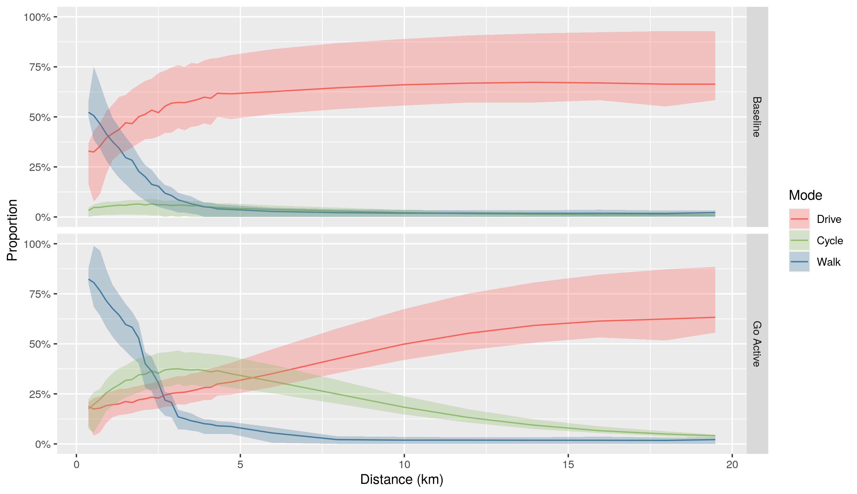
Figure 2.2: Overview of the uptake model underlying the Go Active
scenario compared with the Baseline scenario which is based on data from
the 2011 Census. The bands represent the range within which the majority
of origin-destination pairs fall, from the 20th to the 80th percentile.
## 2.6 Within-site metrics
The measures discussed so far relate to journeys to work or to other
destinations. The majority of the length of these journeys will take
place outside the boundaries of any particular new residential
development. However we also wanted to investigate the internal layout
of the sites themselves. In particular, the circuity of routes within a
site can reveal features relating to the design of the site. The
comparative circuity of routes by foot, by bicycle and by car can be
assessed.
To do this, we generated cycling, walking and driving routes for a set
of journeys between 20 random points within each site. We routed these
journeys using OSRM. Having obtained the sets of random points, we first
generated the driving journeys, then reset the exact origin and
destination points based on the results of this routing. This
constrained the points to be on the road network itself, preventing
cycle and walking route origins and destinations from spawning on
footpaths.
## 2.7 Traffic simulation
[A/B Street](https://github.com/a-b-street/abstreet#ab-street) is an
open source traffic simulator, designed to explore how gradual changes
to existing infrastructure can be modified to reduce dependency on motor
vehicles. It uses OpenStreetMap and many heuristics to build a detailed
model of roads, intersections, parking lots, and buildings, including
traffic signal timing, turn restrictions, and individual lanes. It
simulates the movement of individual people as pedestrians, cyclists,
car drivers, and public transit riders, using schedules input from
travel demand models such as the one developed as part of this project.
The user of A/B Street can modify the map by reconfiguring lanes (like
transforing street parking into a bike lane), modifying traffic signal
timing (like introducing a protected right turn stage), and setting
access restrictions (to model low traffic neighborhoods). The same
simulated people repeat their schedules, subject to the changed map, and
the user can explore the effects on individual people, or compare
aggregate results.
A/B Street aims to engage citizens with local transportation planning by
making it as easy as possible to imagine how changes might affect a
person’s commute. It could be used by city authorities to interactively
communicate proposed and ongoing projects; by the general public to
explore and submit ideas for improving their community; and by advocacy
groups to educate people about options for reducing automobile
dependency.
For ActDev, we imported each of the sites, synthesized a population
living in the site, and used 2011 census flow data to generate a
background population living in the larger study area and commuting
through it. A/B Street visualizes the existing road configuration and
locations of homes, shops, schools, and workplaces, according to
OpenStreetMap. The user can watch the simulation of individual people
living in the site follow through their workday route. When some traffic
bottleneck or issue with vehicles and cyclists mixing occurs, the user
can attempt to remedy the situation by modifying the road confguration,
and repeat the simulation to see how it may help.
# 3 Findings
The 35 case study sites encompass a wide range of development types,
from urban redevelopment schemes to suburban infill, urban fringe
expansion and entirely new settlements. The scale of these developments
also varies considerably. Most of the chosen sites will have over 1000
homes on completion, with up to 6900 at Hampton near Peterborough, but
some are smaller, the smallest being Tyersal Lane with only 270 new
homes. At least three of the sites are now entirely complete and another
24 are mostly or partly complete. In eight sites construction has not
yet begun, and for these sites we have not generated any in-site
metrics.
Table of site completion, number of dwellings and LA.
## 3.1 Existing travel patterns in the vicinity of the 35 case study sites
Unsurprisingly, existing travel patterns in the vicinity of these sites
vary greatly. The variation in commuter journeys is captured by the 2011
Census data as used in our Baseline scenario. It must be recognised that
these data represent travel patterns in the areas surrounding the sites,
rather than specifically for the sites themselves. The data are
aggregated at the MSOA level (these are zones with a mean population of
around 7800), so even for sites which were partially complete in 2011
the Baseline data is derived from a wide zone which stretches beyond the
site boundaries. With this caveat in mind, the differences in existing
travel patterns show some revealing patterns.
Walking mode share for these journeys varies from 3% at Upton and
Dickens Heath to 39% at Bath Western Riverside, with a mean of 11.4%.
Cycling mode share is as low as 1% at nine, mainly rural, sites. The
mean value is 4.3% and the maximum is 31%, at Great Kneighton in
Cambridge.
Driving mode share has a mean value of 65.5%. At five sites driving mode
share is > 80%, and four of these (Dickens Heath, Chapelford, Wynyard
and Upton) are sites in which some of the homes are known to have been
occupied prior to 2011. Only at five sites is driving mode share <
50%. These are all urban sites, with Kidbrooke Village (our only London
site) having the lowest driving mode share at 30%.
In terms of other modes of travel, Kidbrooke Village also has the
highest mode share for rail, and is one of only three sites - all in or
near London - having rail mode share > 10%. Bus mode share ranges
from 1% at Tresham to 17% at Leeds Climate Innovation District, with a
mean of 5.5%. Four of the seven sites with highest bus mode share are in
Leeds. The average mode share for other modes of travel, including
car/van passengers, motorbike and taxi, is 7%.
We expect to see a strong relationship between the distance travelled to
work and the mode of travel. For the vicinity of each site, we used the
2011 Census data to calculate the median commute distance. This ranges
from 1.7 km at Taunton Firepool to 16.0 km at Culm Garden Village, with
a mean of 7.9 km.
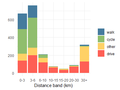
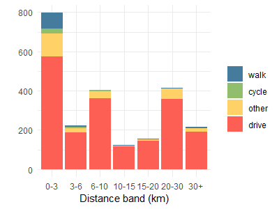
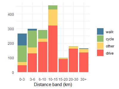
Combining the commute modes and distances, and using a standardised set
of distance bands, we can further interrogate the travel to work data,
as seen in the figure below. In this figure we compare commutes at Great
Kneighton (above) with those at Chapelford (below). We can see that
walking and cycling mostly occurs in the shorter distance bands. At
Chapelford the median commute distance is higher than at Great
Kneighton, and active modes also comprise a smaller proportion of the
short journeys.
## 3.2 Travel to town centres
Measured on the fast cycle route network, the median distance from our
case study sites to the nearest town centre is 3.2 km. Just three sites
lie within 2.0 km of the nearest town centre. At ten sites the nearest
town centre is >5.0 km away, the longest being Tresham Garden Village
with a distance of 23.9 km. This is an example of a site where there
appears to be no real cycle route to the nearest town. Using the
Euclidean distance, the town centre of Corby is 7.8 km from Tresham
Garden Village, linked by a direct road. This is a long way but could be
cycleable for some people. However, the local roads appear so
inhospitable to cycling that the fast cycling route follows a circuitous
path of almost 24 km in length.
## 3.3 Potential improvements for active travel - The Go Active scenario
Assuming existing travel patterns remain the same, in terms of the
locations of workplaces or other destinations, a key question is what
proportion of these journeys could theoretically switch from car/van
driving to walking or cycling? The answer will vary from site to site,
depending mainly on the distances from people’s homes to the
destinations of interest. Estimating this allows us to understand the
potential usership of new walking or cycling infrastructure, if
sustained investment was made in high quality active travel provision.
It lets us see how much walking and cycling uptake there could be under
the right circumstances. We can also see which sites are already close
to reaching these high levels of active travel, and which remain far
away from them. If existing walking and cycling levels are far below
their potential, this suggests there may be particular barriers that
need further investigation.
The proportion of commutes by foot under our Go Active scenario ranges
from 0% to 48%, with a mean of 12%. It is zero in four sites because in
these places we identify no journeys less than 6km in length, which is
our maximum threshold distance for walking. These are typically remote
rural locations where new settlements have been proposed or constructed.
There are three urban sites - Bath Western Riverside, Taunton Firepool
and Leeds Climate Innovation District - which see > 40% of commutes
by foot in this scenario.
Commutes by bicycle in the Go Active scenario range from 5% at Ashton
Park and Tresham Garden Village to 63% at Great Kneighton in Cambridge.
The site with the second highest value, also in Cambridge, sees 36% of
commutes by bicycle. The mean proportion of cycle commuting in this
scenario is 18%. The proportion of commutes by car/van drivers is
typically lower in Go Active than in the Baseline scenario. It has a
mean of 52%, ranging from 18% at Kidbrooke Village to 83% at Tresham
Garden Village. We do not model changes in other modes of travel.
Studying the differences between the Baseline and Go Active scenarios,
we can see where there is potential for substantially increased
increased uptake of walking and cycling, given the right circumstances.
Of the 35 sites, the one with the greatest proportional increase in
walking from Baseline to Go Active scenario, is at Chapelford, where
walking mode share increases 250%, from 4% to 10%. This suggests that in
2011, the proportion of people walking at Chapelford was well below
potential.
Proportional increases in cycling between the two scenarios are much
greater than for walking. The greatest proportional increase in cycling,
from the Baseline to the Go Active scenario, is at Dickens Heath, where
cycling mode share increases 2000%, from 1% to 20%. The mean
proportional increase in cycling across all sites is 700%.
The following figure shows the Baseline (above) and Go Active (below)
scenarios for Dickens Heath. We can see that in 2011, 82% of commutes
here were by car/van drivers, but many of these could potentially switch
to cycling, if sufficient investment was made into safe, convenient
cycle routes.
# 4 Additional links and reading
For details on how to use the tool see the [ActDev
Manual](https://actdev.cyipt.bike/manual/).
For slides on the tool see [slides presented at the ActDev
Workshop](https://www.robinlovelace.net/presentations/actdev-slides.html).
To see the source code underlying the tool, see
.
[1]
[2]
[3] See the 3rd report from the Department for Transport
funded SaferActive report for details:
\`