---
title: 'Chapter 1: Why Bar Graphs are Misleading'
description:
'This chapter will teach you about why bar graphs are misleading.'
prev: null
next: /chapter2
type: chapter
id: 1
---
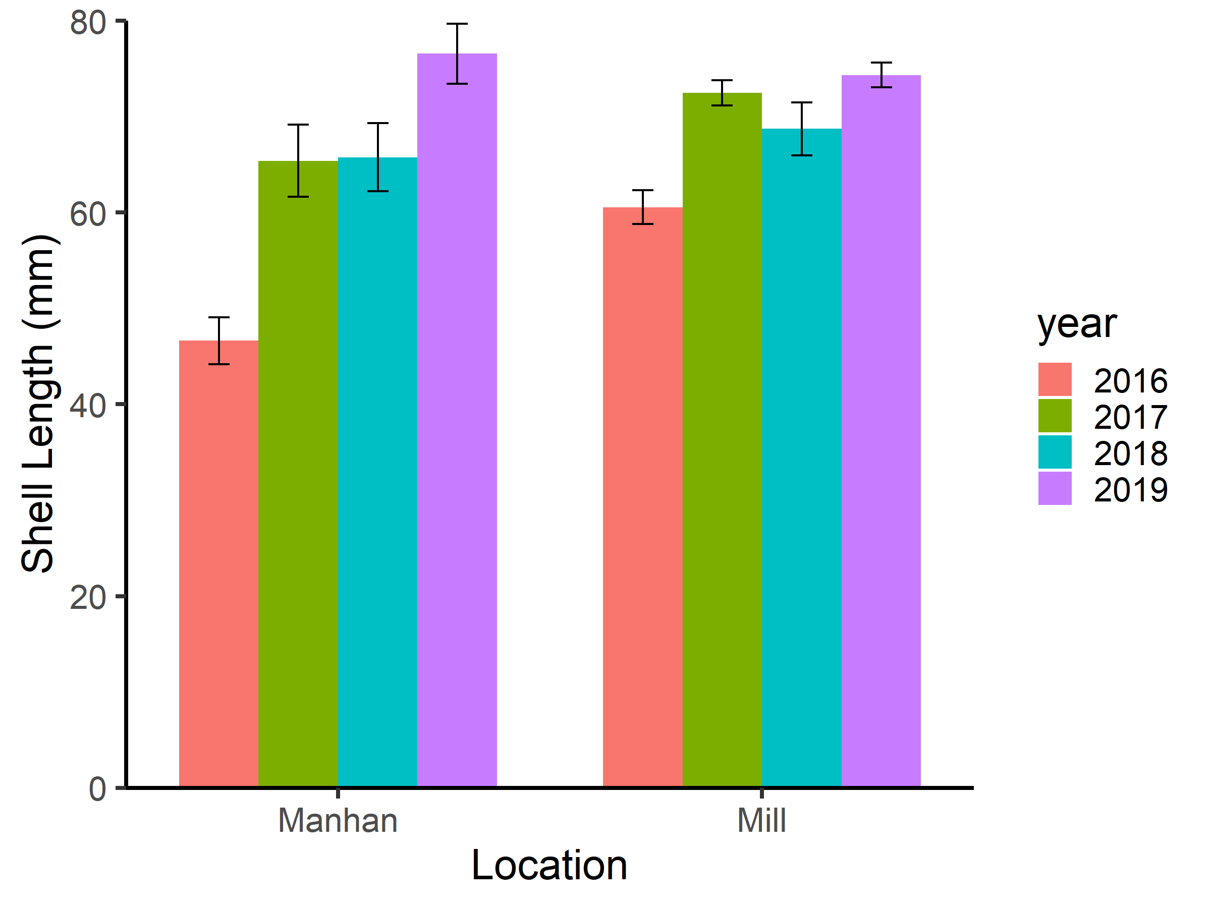 ### What is the sample size for each group?
How can you tell what the sample size is from this graph?
How can you tell what the sample size is from this graph?
How can you tell that the sample sizes are equal from this graph?
There is no way to tell from the graph given here what the sample size is for each group.
### Mussels lengths in both locations in all four years display a normal distribution.
How can you tell what the distribution of mussels lengths is from this graph?
How can you tell what the distribution of mussels lengths is from this graph?
There is no way to tell from the graph given here what the distribution is for each group.
### What is the length of the largest mussel?
How can you tell what the maximum mussel length is from this graph?
How can you tell what the maximum mussel length is from this graph?
How can you tell what the maximum mussel length is from this graph?
How can you tell what the maximum mussel length is from this graph?
There is no way to tell from the graph given here what the maximum mussel length is.
### What is the sample size for each group?
How can you tell what the sample size is from this graph?
How can you tell what the sample size is from this graph?
How can you tell that the sample sizes are equal from this graph?
There is no way to tell from the graph given here what the sample size is for each group.
### Mussels lengths in both locations in all four years display a normal distribution.
How can you tell what the distribution of mussels lengths is from this graph?
How can you tell what the distribution of mussels lengths is from this graph?
There is no way to tell from the graph given here what the distribution is for each group.
### What is the length of the largest mussel?
How can you tell what the maximum mussel length is from this graph?
How can you tell what the maximum mussel length is from this graph?
How can you tell what the maximum mussel length is from this graph?
How can you tell what the maximum mussel length is from this graph?
There is no way to tell from the graph given here what the maximum mussel length is.
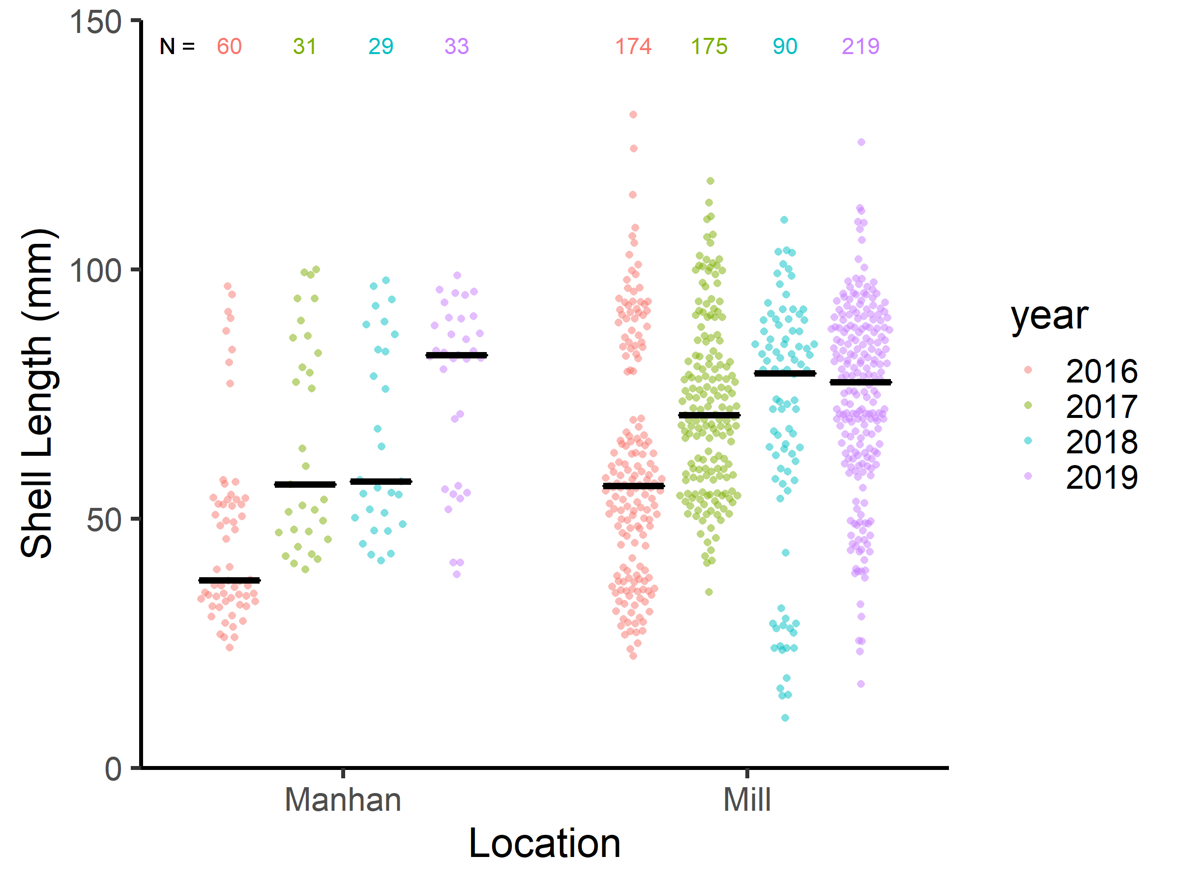 ### What is the sample size for each group?
One group (mussels in the Manhan River in 2018) has only 29 samples
None of the groups are less than 10
Sample sizes are shown and are not equal
The sample size for each group (N) is given at the top of the graph. The sample size varies among rivers and years.
### Mussels lengths in both locations in all four years display a normal distribution.
The jittered points do not show a normal distribution. Some are multimodal.
Some of the data is multimodal and the data are not all normally distributed.
Look at the distribution of the jittered points in each group - do they all look like a normal distribution?
### What is the length of the largest mussel?
Can you see that many of the mussels clearly go above 80mm? Compare this to the bar graph where this is not so clear.
While it is hard to tell the precise values, you can see that the maximum mussel length reaches close to at least 100 mm for all the years in the Manahan River and the maximum value is well over 100 mm for all the mussles measured in the Mill Rivevr.
The maximum mussel length for each location in each year varies, but none reach to 150 mm
The maximum mussel length for each location in each year varies
Unlike the bar graph where you could not tell what the maximum mussel length is for each group, this graph clearly shows the maximum because you can see all the points.
### What is the sample size for each group?
One group (mussels in the Manhan River in 2018) has only 29 samples
None of the groups are less than 10
Sample sizes are shown and are not equal
The sample size for each group (N) is given at the top of the graph. The sample size varies among rivers and years.
### Mussels lengths in both locations in all four years display a normal distribution.
The jittered points do not show a normal distribution. Some are multimodal.
Some of the data is multimodal and the data are not all normally distributed.
Look at the distribution of the jittered points in each group - do they all look like a normal distribution?
### What is the length of the largest mussel?
Can you see that many of the mussels clearly go above 80mm? Compare this to the bar graph where this is not so clear.
While it is hard to tell the precise values, you can see that the maximum mussel length reaches close to at least 100 mm for all the years in the Manahan River and the maximum value is well over 100 mm for all the mussles measured in the Mill Rivevr.
The maximum mussel length for each location in each year varies, but none reach to 150 mm
The maximum mussel length for each location in each year varies
Unlike the bar graph where you could not tell what the maximum mussel length is for each group, this graph clearly shows the maximum because you can see all the points.