# @2security/lunar-date-picker
[](https://www.npmjs.com/package/@2security/lunar-date-picker)
[](https://www.npmjs.com/package/@2security/lunar-date-picker)
[](LICENSE)
A powerful and feature-rich React Native lunar date picker component built with Nitro Modules, providing native performance for both iOS and Android platforms.
## 📱 Preview
| iOS Preview | Android Preview |
| :---: | :---: |
| 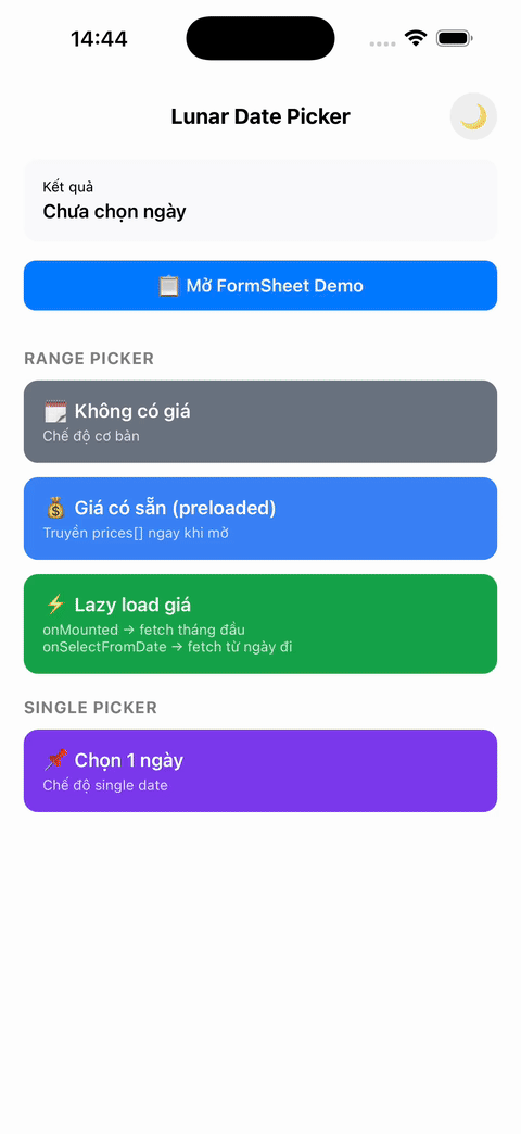 |
| 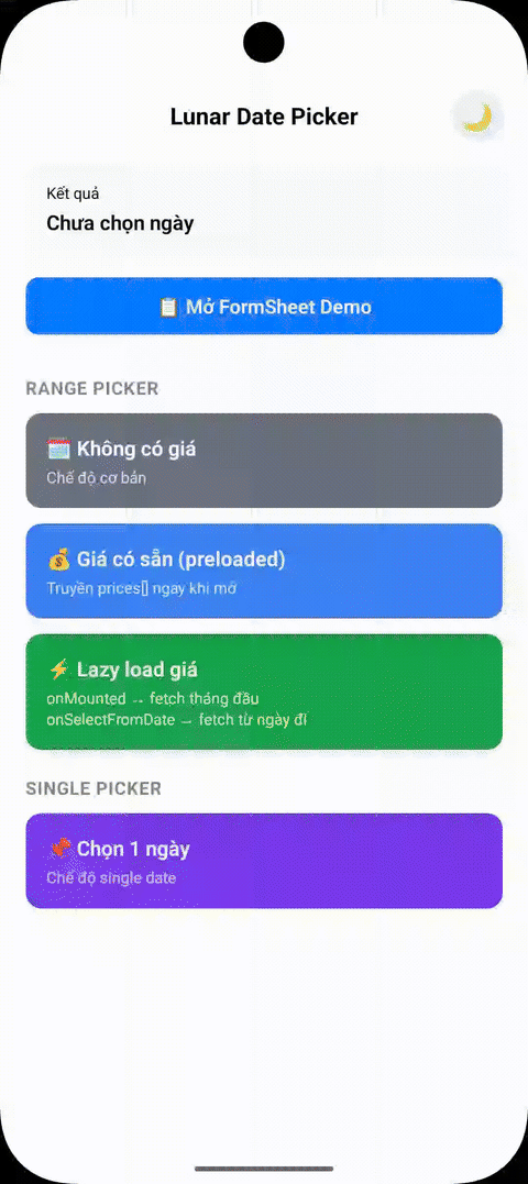 |
## ✨ Features
- 🌙 **Lunar calendar support** - Display both solar and lunar dates with proper timezone handling
- 📱 **Cross-platform** - Works seamlessly on iOS and Android with identical behavior
- ⚡ **High performance** - Built with Nitro Modules for native performance
- 🚀 **Optimized Android rendering** - Uses high-performance [kizitonwose Calendar](https://github.com/kizitonwose/Calendar) library for 60% faster scrolling
- 📏 **Fluid layout scaling** - Automatically scales typography and UI elements for a consistent look across all phone sizes (390px to 430px)
- 🖥️ **Native tablet support** - Beautiful centered Form Sheet presentation on iPads and Android tablets
- 🎨 **Customizable themes** - Light/dark themes with full customization
- 🌍 **Multi-language support** - Vietnamese, English, and extensible for other languages
- 📅 **Flexible date selection** - Single date or date range selection
- ⏰ **Timezone aware** - Proper timezone support for accurate date handling across regions
- 🚀 **Optimized rendering** - Hash-based change detection and partial updates for better performance
> **Note:** This calendar is designed specifically for flight booking and scheduling use cases. As such, it is intentionally not an "infinite" calendar. It only renders a limited number of years (configurable via `yearRangeOffset`) to optimize performance and memory usage for booking scenarios.
## 📦 Installation
```sh
npm install @2security/lunar-date-picker react-native-nitro-modules
# or
yarn add @2security/lunar-date-picker react-native-nitro-modules
```
> **Note:** `react-native-nitro-modules` is required as this library relies on [Nitro Modules](https://nitro.margelo.com/) for native performance.
## 📱 Expo Usage
This library uses native code and **cannot** be used with Expo Go. You must use [Development Builds](https://docs.expo.dev/develop/development-builds/introduction/).
### 1. Installation
```sh
npx expo install @2security/lunar-date-picker react-native-nitro-modules
```
### 2. Run with Development Build
```sh
npx expo run:ios
# or
npx expo run:android
```
## 🚀 Quick Start
### 1. Configure the picker (Required)
```javascript
import { configure } from '@2security/lunar-date-picker';
const pickerConfig = {
languages: {
vi: {
weekdayNames: ['T2', 'T3', 'T4', 'T5', 'T6', 'T7', 'CN'],
locale: 'vi-VN',
},
en: {
weekdayNames: ['Mon', 'Tue', 'Wed', 'Thu', 'Fri', 'Sat', 'Sun'],
locale: 'en-US',
},
},
themes: {
light: {
backgroundColor: '#ffffff',
titleColor: '#000000',
dateLabelColor: '#030712',
todayLabelColor: '#3B82F6',
lunarDateLabelColor: '#6B7280',
selectedTextColor: '#FFFFFF',
weekendLabelColor: '#E27B00',
specialDayLabelColor: '#ff3300',
monthLabelColor: '#030712',
secondColor: '#3B82F6',
weekViewBackgroundColor: '#F3F4F6',
selectedBackgroundColor: '#3B82F6',
rangeBackgroundColor: '#EFF6FF',
submitButtonColor: '#3B82F6',
noticeLabelColor: '#004085',
noticeBackgroundColor: '#cce5ff',
},
},
yearRangeOffset: 2,
timeZoneOffset: 7, // GMT+7 for Vietnam
showSubmitButton: true,
};
// Configure once in your app initialization
configure(pickerConfig);
```
### 2. Basic usage
```javascript
import { pickDate } from '@2security/lunar-date-picker';
const openDatePicker = () => {
pickDate({
theme: 'light',
language: 'vi',
title: 'Chọn ngày',
mode: 'range', // or 'single'
minimumDate: '01/01/2024', // Optional: minimum selectable date (DD/MM/YYYY)
maximumDate: '31/12/2024', // Optional: maximum selectable date (DD/MM/YYYY)
notice: 'Lưu ý: Giá vé có thể thay đổi tùy thời điểm.', // Optional banner text
onMounted: (start, end) => {
console.log('Calendar visible range:', start, 'to', end);
},
onSelectFromDate: (start, end) => {
console.log('Selected from-date. New range:', start, 'to', end);
},
onDone: (result) => {
console.log('Selected range:', result);
// result: LDP_Range = { from: "15/01/2024", to?: "20/01/2024" }
},
});
};
```
## 📚 API Reference
### Functions
#### `configure(config: LDP_ConfigParams): void`
Configure the picker with themes, languages, and global settings. **Must be called before using the picker.**
#### `pickDate(params: LDP_PresentParams): void`
Display the date picker with specified configuration.
#### `updatePrices(params: LDP_PriceUpdateParams): void`
Update the prices displayed on the calendar. This can be called while the picker is open to update the UI immediately (e.g., when lazy-loading prices for new months).
### Types
#### `LDP_PriceUpdateParams`
```typescript
interface LDP_PriceUpdateParams {
prices: LDP_PriceData[]; // Array of price data objects
}
```
#### `LDP_PriceData`
```typescript
interface LDP_PriceData {
date: string; // Date in DD/MM/YYYY format
price: number; // Price value (in thousands, e.g., 1500 for 1.5M)
isCheapest?: boolean; // Highlight as cheapest price
}
```
#### `LDP_PresentParams`
```typescript
interface LDP_PresentParams {
theme: string; // Theme key from configuration
language: string; // Language key from configuration
title: string; // Picker title
mode: LDP_Mode; // Selection mode ('range' | 'single')
onDone: (result: LDP_Range) => void; // Selection callback
minimumDate?: string; // Minimum selectable date (DD/MM/YYYY)
maximumDate?: string; // Maximum selectable date (DD/MM/YYYY)
initialValue?: LDP_Range; // Initial selected range
notice?: string; // Optional notice text to display below navigation bar
onMounted?: (startDate: string, endDate: string) => void; // Calendar mounted callback
onSelectFromDate?: (startDate: string, endDate: string) => void; // User selected from-date callback
}
```
#### `LDP_Range`
```typescript
interface LDP_Range {
from: string; // Start date in DD/MM/YYYY format
to?: string; // End date in DD/MM/YYYY format (optional for single mode)
}
```
#### `LDP_ConfigParams`
```typescript
interface LDP_ConfigParams {
themes: Record; // Theme configurations
languages: Record; // Language configurations
yearRangeOffset: number; // Year range offset for calendar
timeZoneOffset: number; // Timezone offset (e.g., 7 for GMT+7)
showSubmitButton: boolean; // Show/hide submit button on header
}
```
#### `LDP_CustomStyle`
```typescript
interface LDP_CustomStyle {
titleColor: string; // Title text color (hex)
dateLabelColor: string; // Date label color (hex)
todayLabelColor: string; // Today label color (hex)
lunarDateLabelColor: string; // Lunar date label color (hex)
selectedTextColor: string; // Selected text color (hex)
weekendLabelColor: string; // Weekend label color (hex)
specialDayLabelColor: string; // Special day label color (hex)
monthLabelColor: string; // Month label color (hex)
secondColor: string; // Secondary color (hex)
backgroundColor: string; // Background color (hex)
weekViewBackgroundColor: string; // Week view background color (hex)
selectedBackgroundColor: string; // Selected background color (hex)
rangeBackgroundColor: string; // Range background color (hex)
submitButtonColor: string; // Submit button color (hex)
noticeLabelColor: string; // Notice banner text color (hex)
noticeBackgroundColor: string; // Notice banner background color (hex)
}
```
#### `LDP_CustomLanguage`
```typescript
interface LDP_CustomLanguage {
weekdayNames: string[]; // Array of weekday names (7 items)
locale: string; // Locale identifier (e.g., 'vi-VN')
}
```
#### `LDP_Mode`
```typescript
type LDP_Mode = 'range' | 'single';
```
## 🎯 Advanced Usage
### Timezone Configuration
The picker properly handles timezones for accurate date operations and lunar calendar calculations:
```javascript
configure({
timeZoneOffset: 7, // GMT+7 for Vietnam
// All date formatting, lunar calculations will use this timezone
});
// Dates will be formatted according to the configured timezone
pickDate({
minimumDate: '01/01/2024', // DD/MM/YYYY interpreted in GMT+7
maximumDate: '31/12/2024', // DD/MM/YYYY interpreted in GMT+7
onDone: (result) => {
// result.from and result.to are in DD/MM/YYYY format using GMT+7
console.log('Selected:', result);
},
});
```
### Lazy Loading Prices
You can use `onMounted` and `onSelectFromDate` to implement efficient lazy loading for pricing data. Since the calendar only displays a specific range of years, these callbacks provide the full visible range once the picker is opened or when the user starts selecting a range.
```javascript
import { pickDate, updatePrices } from '@2security/lunar-date-picker';
const openLazyLoadingPicker = () => {
pickDate({
theme: 'light',
language: 'vi',
title: 'Chọn ngày',
mode: 'range',
onMounted: (startDate, endDate) => {
// Called when calendar is first opened
// Fetch prices for the entire visible range: startDate to endDate
fetchPrices(startDate, endDate).then(prices => {
updatePrices({ prices });
});
},
onSelectFromDate: (startDate, endDate) => {
// Called when user selects a 'from' date
// You can use this to refresh prices for the remaining range if needed
fetchPrices(startDate, endDate).then(prices => {
updatePrices({ prices });
});
},
onDone: (result) => {
console.log('Final selection:', result);
},
});
};
```
### Performance Optimizations
The picker includes several performance improvements:
**Android Optimizations:**
- **High-performance calendar library**: Uses [kizitonwose Calendar](https://github.com/kizitonwose/Calendar) for 60% faster scrolling
- **Optimized RecyclerView**: Hardware-accelerated rendering with better memory management
- **Smooth range selection**: Streamlined selection logic inspired by Example4Fragment
**Cross-platform Optimizations:**
- **Timezone-aware caching**: Consistent date formatting and lunar calculations
- **Fluid scaling & Tablet bounds**: Responsive typography on mobile and centered Dialogs/Form Sheets on tablets
- **Memory leak prevention**: Proper cleanup of handlers, work items, and references
- **LRU cache management**: Smart cache eviction prevents memory growth (iOS)
- **Object reuse**: Calendar instances and formatters are reused to reduce allocations
### Theme Customization
```javascript
const customTheme = {
backgroundColor: '#ffffff',
titleColor: '#000000',
dateLabelColor: '#030712',
todayLabelColor: '#3B82F6',
lunarDateLabelColor: '#6B7280',
selectedTextColor: '#FFFFFF',
weekendLabelColor: '#E27B00',
specialDayLabelColor: '#ff3300',
rangeBackgroundColor: '#EFF6FF',
monthLabelColor: '#030712',
secondColor: '#3B82F6',
weekViewBackgroundColor: '#F3F4F6',
selectedBackgroundColor: '#3B82F6',
submitButtonColor: '#3B82F6',
};
configure({
themes: {
custom: customTheme,
},
// ... other config
});
```
## 🏃♂️ Running the Example
The example app demonstrates all features including lazy loading, timezone handling, and performance optimizations:
```sh
cd example
npm install
# iOS
npx react-native run-ios
# Android
npx react-native run-android
```
### Example App Features
- **Basic Usage**: Single and range date selection
- **Timezone Demo**: See how timezone affects date formatting and lunar calculations
## 🛠️ Development
```sh
# Install dependencies
yarn install
# Generate native code
yarn nitrogen
# Build the library
yarn prepare
# Run tests
yarn test
# Lint code
yarn lint
# Run example app
yarn example ios
yarn example android
```
## 🤝 Contributing
We welcome contributions! Please see our [Contributing Guide](CONTRIBUTING.md) to learn how to contribute to the repository and development workflow.
## 📋 Documentation
- **[API Reference](README.md#-api-reference)** - Complete API documentation with examples
- **[Contributing Guide](CONTRIBUTING.md)** - How to contribute to the project
- **[Publishing Guide](PUBLISHING.md)** - Steps to publish new versions
- **[Changelog](CHANGELOG.md)** - Version history and changes
## 📄 License
MIT © [2Security](https://github.com/duongnguyen17/react-native-lunar-date-picker)
---
Built with ❤️ by [2Security](https://github.com/duongnguyen17/react-native-lunar-date-picker) using [Nitro Modules](https://nitro.margelo.com/)
|
## ✨ Features
- 🌙 **Lunar calendar support** - Display both solar and lunar dates with proper timezone handling
- 📱 **Cross-platform** - Works seamlessly on iOS and Android with identical behavior
- ⚡ **High performance** - Built with Nitro Modules for native performance
- 🚀 **Optimized Android rendering** - Uses high-performance [kizitonwose Calendar](https://github.com/kizitonwose/Calendar) library for 60% faster scrolling
- 📏 **Fluid layout scaling** - Automatically scales typography and UI elements for a consistent look across all phone sizes (390px to 430px)
- 🖥️ **Native tablet support** - Beautiful centered Form Sheet presentation on iPads and Android tablets
- 🎨 **Customizable themes** - Light/dark themes with full customization
- 🌍 **Multi-language support** - Vietnamese, English, and extensible for other languages
- 📅 **Flexible date selection** - Single date or date range selection
- ⏰ **Timezone aware** - Proper timezone support for accurate date handling across regions
- 🚀 **Optimized rendering** - Hash-based change detection and partial updates for better performance
> **Note:** This calendar is designed specifically for flight booking and scheduling use cases. As such, it is intentionally not an "infinite" calendar. It only renders a limited number of years (configurable via `yearRangeOffset`) to optimize performance and memory usage for booking scenarios.
## 📦 Installation
```sh
npm install @2security/lunar-date-picker react-native-nitro-modules
# or
yarn add @2security/lunar-date-picker react-native-nitro-modules
```
> **Note:** `react-native-nitro-modules` is required as this library relies on [Nitro Modules](https://nitro.margelo.com/) for native performance.
## 📱 Expo Usage
This library uses native code and **cannot** be used with Expo Go. You must use [Development Builds](https://docs.expo.dev/develop/development-builds/introduction/).
### 1. Installation
```sh
npx expo install @2security/lunar-date-picker react-native-nitro-modules
```
### 2. Run with Development Build
```sh
npx expo run:ios
# or
npx expo run:android
```
## 🚀 Quick Start
### 1. Configure the picker (Required)
```javascript
import { configure } from '@2security/lunar-date-picker';
const pickerConfig = {
languages: {
vi: {
weekdayNames: ['T2', 'T3', 'T4', 'T5', 'T6', 'T7', 'CN'],
locale: 'vi-VN',
},
en: {
weekdayNames: ['Mon', 'Tue', 'Wed', 'Thu', 'Fri', 'Sat', 'Sun'],
locale: 'en-US',
},
},
themes: {
light: {
backgroundColor: '#ffffff',
titleColor: '#000000',
dateLabelColor: '#030712',
todayLabelColor: '#3B82F6',
lunarDateLabelColor: '#6B7280',
selectedTextColor: '#FFFFFF',
weekendLabelColor: '#E27B00',
specialDayLabelColor: '#ff3300',
monthLabelColor: '#030712',
secondColor: '#3B82F6',
weekViewBackgroundColor: '#F3F4F6',
selectedBackgroundColor: '#3B82F6',
rangeBackgroundColor: '#EFF6FF',
submitButtonColor: '#3B82F6',
noticeLabelColor: '#004085',
noticeBackgroundColor: '#cce5ff',
},
},
yearRangeOffset: 2,
timeZoneOffset: 7, // GMT+7 for Vietnam
showSubmitButton: true,
};
// Configure once in your app initialization
configure(pickerConfig);
```
### 2. Basic usage
```javascript
import { pickDate } from '@2security/lunar-date-picker';
const openDatePicker = () => {
pickDate({
theme: 'light',
language: 'vi',
title: 'Chọn ngày',
mode: 'range', // or 'single'
minimumDate: '01/01/2024', // Optional: minimum selectable date (DD/MM/YYYY)
maximumDate: '31/12/2024', // Optional: maximum selectable date (DD/MM/YYYY)
notice: 'Lưu ý: Giá vé có thể thay đổi tùy thời điểm.', // Optional banner text
onMounted: (start, end) => {
console.log('Calendar visible range:', start, 'to', end);
},
onSelectFromDate: (start, end) => {
console.log('Selected from-date. New range:', start, 'to', end);
},
onDone: (result) => {
console.log('Selected range:', result);
// result: LDP_Range = { from: "15/01/2024", to?: "20/01/2024" }
},
});
};
```
## 📚 API Reference
### Functions
#### `configure(config: LDP_ConfigParams): void`
Configure the picker with themes, languages, and global settings. **Must be called before using the picker.**
#### `pickDate(params: LDP_PresentParams): void`
Display the date picker with specified configuration.
#### `updatePrices(params: LDP_PriceUpdateParams): void`
Update the prices displayed on the calendar. This can be called while the picker is open to update the UI immediately (e.g., when lazy-loading prices for new months).
### Types
#### `LDP_PriceUpdateParams`
```typescript
interface LDP_PriceUpdateParams {
prices: LDP_PriceData[]; // Array of price data objects
}
```
#### `LDP_PriceData`
```typescript
interface LDP_PriceData {
date: string; // Date in DD/MM/YYYY format
price: number; // Price value (in thousands, e.g., 1500 for 1.5M)
isCheapest?: boolean; // Highlight as cheapest price
}
```
#### `LDP_PresentParams`
```typescript
interface LDP_PresentParams {
theme: string; // Theme key from configuration
language: string; // Language key from configuration
title: string; // Picker title
mode: LDP_Mode; // Selection mode ('range' | 'single')
onDone: (result: LDP_Range) => void; // Selection callback
minimumDate?: string; // Minimum selectable date (DD/MM/YYYY)
maximumDate?: string; // Maximum selectable date (DD/MM/YYYY)
initialValue?: LDP_Range; // Initial selected range
notice?: string; // Optional notice text to display below navigation bar
onMounted?: (startDate: string, endDate: string) => void; // Calendar mounted callback
onSelectFromDate?: (startDate: string, endDate: string) => void; // User selected from-date callback
}
```
#### `LDP_Range`
```typescript
interface LDP_Range {
from: string; // Start date in DD/MM/YYYY format
to?: string; // End date in DD/MM/YYYY format (optional for single mode)
}
```
#### `LDP_ConfigParams`
```typescript
interface LDP_ConfigParams {
themes: Record; // Theme configurations
languages: Record; // Language configurations
yearRangeOffset: number; // Year range offset for calendar
timeZoneOffset: number; // Timezone offset (e.g., 7 for GMT+7)
showSubmitButton: boolean; // Show/hide submit button on header
}
```
#### `LDP_CustomStyle`
```typescript
interface LDP_CustomStyle {
titleColor: string; // Title text color (hex)
dateLabelColor: string; // Date label color (hex)
todayLabelColor: string; // Today label color (hex)
lunarDateLabelColor: string; // Lunar date label color (hex)
selectedTextColor: string; // Selected text color (hex)
weekendLabelColor: string; // Weekend label color (hex)
specialDayLabelColor: string; // Special day label color (hex)
monthLabelColor: string; // Month label color (hex)
secondColor: string; // Secondary color (hex)
backgroundColor: string; // Background color (hex)
weekViewBackgroundColor: string; // Week view background color (hex)
selectedBackgroundColor: string; // Selected background color (hex)
rangeBackgroundColor: string; // Range background color (hex)
submitButtonColor: string; // Submit button color (hex)
noticeLabelColor: string; // Notice banner text color (hex)
noticeBackgroundColor: string; // Notice banner background color (hex)
}
```
#### `LDP_CustomLanguage`
```typescript
interface LDP_CustomLanguage {
weekdayNames: string[]; // Array of weekday names (7 items)
locale: string; // Locale identifier (e.g., 'vi-VN')
}
```
#### `LDP_Mode`
```typescript
type LDP_Mode = 'range' | 'single';
```
## 🎯 Advanced Usage
### Timezone Configuration
The picker properly handles timezones for accurate date operations and lunar calendar calculations:
```javascript
configure({
timeZoneOffset: 7, // GMT+7 for Vietnam
// All date formatting, lunar calculations will use this timezone
});
// Dates will be formatted according to the configured timezone
pickDate({
minimumDate: '01/01/2024', // DD/MM/YYYY interpreted in GMT+7
maximumDate: '31/12/2024', // DD/MM/YYYY interpreted in GMT+7
onDone: (result) => {
// result.from and result.to are in DD/MM/YYYY format using GMT+7
console.log('Selected:', result);
},
});
```
### Lazy Loading Prices
You can use `onMounted` and `onSelectFromDate` to implement efficient lazy loading for pricing data. Since the calendar only displays a specific range of years, these callbacks provide the full visible range once the picker is opened or when the user starts selecting a range.
```javascript
import { pickDate, updatePrices } from '@2security/lunar-date-picker';
const openLazyLoadingPicker = () => {
pickDate({
theme: 'light',
language: 'vi',
title: 'Chọn ngày',
mode: 'range',
onMounted: (startDate, endDate) => {
// Called when calendar is first opened
// Fetch prices for the entire visible range: startDate to endDate
fetchPrices(startDate, endDate).then(prices => {
updatePrices({ prices });
});
},
onSelectFromDate: (startDate, endDate) => {
// Called when user selects a 'from' date
// You can use this to refresh prices for the remaining range if needed
fetchPrices(startDate, endDate).then(prices => {
updatePrices({ prices });
});
},
onDone: (result) => {
console.log('Final selection:', result);
},
});
};
```
### Performance Optimizations
The picker includes several performance improvements:
**Android Optimizations:**
- **High-performance calendar library**: Uses [kizitonwose Calendar](https://github.com/kizitonwose/Calendar) for 60% faster scrolling
- **Optimized RecyclerView**: Hardware-accelerated rendering with better memory management
- **Smooth range selection**: Streamlined selection logic inspired by Example4Fragment
**Cross-platform Optimizations:**
- **Timezone-aware caching**: Consistent date formatting and lunar calculations
- **Fluid scaling & Tablet bounds**: Responsive typography on mobile and centered Dialogs/Form Sheets on tablets
- **Memory leak prevention**: Proper cleanup of handlers, work items, and references
- **LRU cache management**: Smart cache eviction prevents memory growth (iOS)
- **Object reuse**: Calendar instances and formatters are reused to reduce allocations
### Theme Customization
```javascript
const customTheme = {
backgroundColor: '#ffffff',
titleColor: '#000000',
dateLabelColor: '#030712',
todayLabelColor: '#3B82F6',
lunarDateLabelColor: '#6B7280',
selectedTextColor: '#FFFFFF',
weekendLabelColor: '#E27B00',
specialDayLabelColor: '#ff3300',
rangeBackgroundColor: '#EFF6FF',
monthLabelColor: '#030712',
secondColor: '#3B82F6',
weekViewBackgroundColor: '#F3F4F6',
selectedBackgroundColor: '#3B82F6',
submitButtonColor: '#3B82F6',
};
configure({
themes: {
custom: customTheme,
},
// ... other config
});
```
## 🏃♂️ Running the Example
The example app demonstrates all features including lazy loading, timezone handling, and performance optimizations:
```sh
cd example
npm install
# iOS
npx react-native run-ios
# Android
npx react-native run-android
```
### Example App Features
- **Basic Usage**: Single and range date selection
- **Timezone Demo**: See how timezone affects date formatting and lunar calculations
## 🛠️ Development
```sh
# Install dependencies
yarn install
# Generate native code
yarn nitrogen
# Build the library
yarn prepare
# Run tests
yarn test
# Lint code
yarn lint
# Run example app
yarn example ios
yarn example android
```
## 🤝 Contributing
We welcome contributions! Please see our [Contributing Guide](CONTRIBUTING.md) to learn how to contribute to the repository and development workflow.
## 📋 Documentation
- **[API Reference](README.md#-api-reference)** - Complete API documentation with examples
- **[Contributing Guide](CONTRIBUTING.md)** - How to contribute to the project
- **[Publishing Guide](PUBLISHING.md)** - Steps to publish new versions
- **[Changelog](CHANGELOG.md)** - Version history and changes
## 📄 License
MIT © [2Security](https://github.com/duongnguyen17/react-native-lunar-date-picker)
---
Built with ❤️ by [2Security](https://github.com/duongnguyen17/react-native-lunar-date-picker) using [Nitro Modules](https://nitro.margelo.com/)