# Shine Border CTA Component
Prototype: https://ai-website-cybersecurity-company.vercel.app/
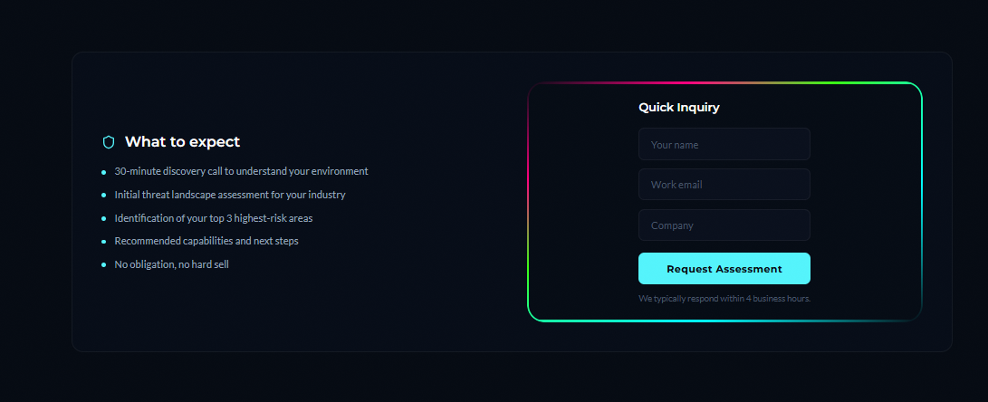
## The Problem
Security company landing pages all look the same — dark background, white text, flat forms. Prospects don't convert because nothing draws the eye to the CTA.
## The Solution
- Animated rainbow gradient border wrapping the Quick Inquiry / assessment form
- Uses 21st.dev Shine Border component (shadcn-based)
- Zero custom CSS — prompt-driven implementation via Bolt.new
- Works on any dark-theme cybersecurity site
## Use Cases
- "Get Assessment" form on MDR/GRC landing pages
- "Book a Call" CTA sections
- Pricing cards for security service tiers
## Target Audience
Security founders building their own websites without a design team
## Impact
Higher visual hierarchy on conversion CTAs — no designer required
Contact: kunsh@etxhuman.com