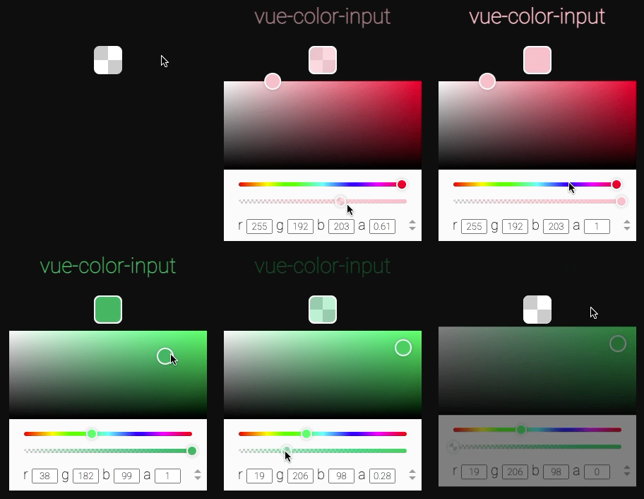
## Why
### Multi-format
Forget about color conversions: vue-color-input does it for you. Unlike `` (which only understands hex) vue-color-input supports all commonly used color models, and by default __will output color in the same format that was passed as input__. It also has support for alpha channel, unless you specifically disable it.
### Customizable
HTML's native color input is annoying to style. Most likely you'll have to get tricky hiding the original input & binding click event to a presentable-looking div. But it only gets you halfway there cause the color picker popup window is still out of reach and it might look way different in different browsers.
With vue-color-input this poblem is solved. It looks pretty out of the box with the default styles, but it's also intuitive & straight-forward to customize from css.
### Uniform
Not only that native color input looks different in different browsers, it also operates differently, and in some cases it's just not what you expect it to be. Yes, I'm looking at you, Safari. vue-color-input delivers a color picker that looks and performs the same regardless of browser.
### It just works
vue-color-input combines minimalist approach with comprehensive functionality. You *can* customize and extend it to your liking, set it up with additional properties, but you _don't have to_. It works as expected out of the box just as well, with only `v-model` provided.
## Usage
### Install
```
npm i vue-color-input
```
### Import
```javascript
import ColorInput from 'vue-color-input'
```
### Use
```xml
```
# Table of contents
| [Props](#props) | [Styling](#styling) | [Events](#events) | [Exposed](#exposed-methods-and-properties) |
|------------------------------------------------------|-------------------------------------------------|-----------------------------|----------------------------------------------------|
| [v-model](#v-model) | [Class names](#class-names) | [Event names](#event-names) | [Methods](#exposed-methods) |
| [format](#format-optional) | [Customization](#customizing-factory-styles) | | [Properties](#exposed-properties) |
| [position](#position-optional) | [Transitions](#transitions) | | |
| [disabled](#disabled-optional) | [Box active transition](#box-active-transition) | | |
| [disable-alpha](#disable-alpha-optional) | [Example CSS](#example-css) | | |
| [disable-text-inputs](#disable-text-inputs-optional) | [Styling guidelines](#styling-guidelines) | | |
| [transition](#transition-optional) | | | |
| [class](#class-optional) | | | |
# Props
## v-model
This is where you supply the variable holding the color to be adjusted by end user.
Model value is allowed to be changed externally too, vue-color-input will adjust accordingly.
When first initialized and every time v-model value updates _from outside the component_, incoming color format is stored to be matched by output.
### Input (initial value)
Under the hood vue-color-input uses [`tinycolor2`](https://www.npmjs.com/package/tinycolor2) for color conversion. So everything tinycolor [accepts as input](https://github.com/bgrins/TinyColor#accepted-string-input), is valid here as well (both string and object).
### Output (return value)
By default output will be a string or an object in the same color model as the initial value.
For example:
```javascript
// in parent component
const color = ref('rgb(50, 150, 150)')
```
```xml
```
User adjusts hue to `0`, now `color` becomes
```javascript
"rgb(150, 50, 50)"
```
Then user adjusts alpha to `0.5`, `color` becomes
```javascript
"rgba(150, 50, 50, 0.5)"
```
Let's say `color` property was initialy set to be an object:
```javascript
// in parent component
const color = ref({ "h": 350, "s": 1, "l": 0.8 })
```
In the same scenario the resulting output would be
```javascript
{ "h": 0, "s": 1, "l": 0.8, "a": 0.5 }
```
vue-color-input will always try to output color in the same color model as the initial value (unless target format is specified explicitly by `format` property.
However in some cases that would not be possible. For those colors it will fall back to different formats.
### name || hex -> rgba fallback
If initial color format was `name` (e.g. `"purple"`) or `hex` (e.g. `"#800080"`), and then alpha is changed to be less than `1`, output will be formatted as `rgba`:
```javascript
"#cd5c5c" // hex input
/* user changes alpha to 0.9 */
"rgba(205, 92, 92, 0.9)" // rgba output
```
_Note: this behavior does not apply if `format` property is explicitly set to be `hex` or `name`._
_Note 2: if initial color format is `hex8` (e.g. `#800080ff`), output will be `hex8` also, unless specified differently by `format` property._
### name -> hex fallback
If initial color format was `name`, but the resulting output color does not have a name equivalent, `hex` value will be output instead:
```javascript
"indianred" // name input
/* user changes hue to 180 */
"#5ccdcc" // hex output
```
### invalid -> rgb fallback
Invalid color initialy diasplays as black. Default output format will be set to `rgb`:
```javascript
"ironmanred" // invalid string input
/* user changes alpha to 0.1 */
"rgba(0, 0, 0, 0.1)" // rgb(a) output
```
## format _`optional`_
Here you can supply the color format you want the output to be in.
The value consists of two arguments: format & type. The order of two is inconsequential, e.g. both `"hsl object"` & `"object hsl"` are valid values.
__Format__ is the target color model that the return value is converted to. `[ "rgb", "hsv", "hsl", "hex", "hex8", "name" ]`
__Type__ is data type of the return value. `[ "string", "object" ]`
If you want to use v-model value for styling, `"string"` type should do the job. On the other hand, if you want to continue processing the data, `"object"` is probably more useful.
Hsv & hsl color component values are presented differently in different output types:
```javascript
"hsl(0, 53%, 58%)" // "hsl string"
{ "h": 0, "s": 0.531, "l": 0.582, "a": 1 } // "hsl object"
```
Notice how strings contain percent-based values, and object 0-1 floats.
>Note that name & hex formats don't support alpha channel. Specifying either of them as target format will prevent vue-color-input from falling back to rgba. Instead, it will disable alpha slider and always return full opacity color.
>If this is not the behavior that you want, and you'd rather it fall back to rgba to support alpha, you should not specify the format.
### Type
String
### Allowed values
```javascript
[ "rgb", "rgb object", "rgb string",
"hsv", "hsv object", "hsv string",
"hsl", "hsl object", "hsl string",
"name", "name string",
"hex", "hex string",
"hex8", "hex8 string" ]
```
_Note: `"name object"`, `"hex object"` & `"hex8 object"`, make no sense and therefore are illegal._
_Note 2: format without type is allowed, type without format is not._
### Default value
Calculated to match the input.
### Example
```xml
```
## position _`optional`_
This is where you specify the position of the popup color picker window relative to the clickable box.
### Type
String
### Allowed values
```javascript
[ "top", "top right", "top left", "top center",
"right top", "right", "right bottom", "right center",
"bottom right", "bottom", "bottom left", "bottom center",
"left top", "left bottom", "left", "left center" ]
```
Pretty intuitive: the first value is the direction from the box in which the popup will appear, the second is how it will align.
_Note: Omitting the second parameter results in center alignment, making `"top"` a shortcut for `"top center"`_
### Default value
`"bottom"`
### Example
```xml
```
## disabled _`optional`_
Setting this to `true` will make the initial box nonresponsive to user clicks. The popup will not appear.
However the box will still react to v-model changes, should they come from elsewhere.
### Type
Boolean
### Allowed values
```javascript
[ true, false ]
```
### Default value
`false`
### Example
```xml
```
## disable-alpha _`optional`_
If you set this to `true`, alpha slider will be removed from the color picker, and the returned color will always have full opacity.
>Specifying name or hex as the target `format` will make this property default to `true` and ignore any passed value.
### Type
Boolean
### Allowed values
```javascript
[ true, false ]
```
### Default value
`false`,
`true` if target format is hex or name
### Example
```xml
```
## disable-text-inputs _`optional`_
With this property you can hide the section of the color picker containing the text inputs.
### Type
Boolean
### Allowed values
```javascript
[ true, false ]
```
### Default value
`false`
### Example
```xml
```
## transition _`optional`_
Set this to a custom transition name to override factory enter and leave-to transitions of the popup.
This is _not_ the only way to customize color picker transition.
You can also override default transition classes from css. More details [below](#transitions).
>More information about Vue enter/leave transitions [here](https://v3.vuejs.org/guide/transitions-enterleave.html).
### Type
String
### Default value
`"color-input__popup-"`
### Example
```xml
```
```css
.my-cool-transition-enter-from,
.my-cool-transition-leave-to {
transform: rotate(240) scale(.5);
opacity: 0;
}
.my-cool-transition-enter-active,
.my-cool-transition-leave-active {
transition: transform .3s, opacity .3s;
}
```
## class _`optional`_
With this you can provide a custom class that will get applied both to the root element and the popup elemnt. You can use this class later for styling.
### Type
String
### Example
```xml
```
# Styling
As previously mentioned, applying styles to vue-color-input is a breeze.
Default CSS is written with custumizability in mind, so anything you want to style will likely work as expected, and the whole component's layout will not get screwed up by that.
Starting with v2, vue-color-input now uses bem class-naming approach instead of nested selectors and scoped styles to simplify customization while providing a namespaced classname isolation across the DOM.
## Class names
| class | description |
|--------------------------------------|---------------------------------------------------------|
| `.color-input__box [class]` | Root clickable box |
| `.color-input__popup [class]` | Popup color picker window (teleported to body) |
| `.color-input__saturation-area` | Picking area where you select saturation and brightness |
| `.color-input__slider` | Hue and opacity sliders (track) |
| `.color-input__saturation-pointer` | Pointer in the saturation-brightness area |
| `.color-input__slider-pointer` | Pointer on a slider |
Feel free to scout the HTML for more class names.
## Customizing factory styles
You don't have to use `!important` rules for everything you want to customize. Instead, here are several approaches you can take to override factory styles.
### Specificity
The easiest way is to add a level of [specificity](https://developer.mozilla.org/en-US/docs/Web/CSS/Specificity) to your selectors as in `div.class`, and that will outweight the factory styles which are defined simply as `.class`.
Example:
```css
div.color-input__box {
border-radius: 50%;
}
div.color-input__popup {
background: pink;
}
```
### Custom class
You can also use a `class` prop to set a custom class name on _both_ the root element and the popup, to later use it in your selectors.
Bear in mind though that the class is applied _only_ to the root elemnent and the popup root element, not to all nested elements. So it will be `.custom.color-input__box` and `.custom.color-input__popup` _but_ for all their nested elements it will be `.custom .color-input__box-inner` (note the space).
Example:
```xml
```
```css
.custom.color-input__box {
border-radius: 50%;
}
.custom.color-input__popup {
background: pink;
}
```
## Transitions
Instead of using `transition` property with a custom transition name, you can simply override default transition styles.
This can be done in the same manner as with the other classes, e.g:
```css
.color-input__popup--enter-from {
transform: translateY(-100%) scale(.1);
}
.color-input__popup--leave-to {
transform: scale(3);
}
/* and if you want to change the durations as well */
.color-input__popup--enter-active,
.color-input__popup--leave-active {
transition: all .5s;
}
```
>More information about Vue enter/leave transitions [here](https://v3.vuejs.org/guide/transitions-enterleave.html).
## Box active transition
When clicked on, the box gets what looks like an outline, but in reality its content is scaled down and background is revealed.
Here's what the box element html looks like:
```xml
```
To customize this transition, you can use `.color-input__box--active` in combination with `.color-input__box-inner--active`.
For example:
```css
div.color-input__box--active {
/* "outline" color */
background: #0f0f0f;
}
div.color-input__box-inner--active {
/* different transition effect */
transform: scale(.9) rotate(90deg);
}
```
## Popup offset
The popup gets a default offset from the box which is equal to `10px`. If you would like to use a different offset, you should set it with a `--popup-offset` css property defined on the popup.
Example:
```css
div.color-input__popup {
--popup-offset: 20px;
}
```
## Example CSS
```css
div.color-input__box {
/* make clickable box a 100x100 circle */
width: 100px;
height: 100px;
border-radius: 50px;
}
div.color-input__popup {
/* dark mode for popup window */
background: #000;
color: #fbfbfb;
/* and make it wide */
width: 400px;
}
div.color-input__slider {
/* thin out the sliders and make them wider */
height: 2px;
width: 92%;
}
div.color-input__saturation-area {
/* bigger picking area */
height: 150px;
}
div.color-input__slider-pointer {
/* make slider pointers square-ish and 10x10 */
border-radius: 4px;
width: 10px;
height: 10px;
}
div.color-input__saturation-pointer {
/* increase saturation pointer size */
width: 40px;
height: 40px;
}
```
## Styling guidelines
### Use stylesheets, no need to set inline styles
Inline styles will only let you style the root element, when typically you will want to style more than that.
### Use specificity or custom class to override default styles
Read more about the both approaches [here](#customizing-factory-styles).
### Don't expect the popup to be nested within the root
As the popup is teleported to the body, the following nested css selectors won't work:
```xml
```
```css
/* ❌ example of selector that won't work */
.my-custom-class .color-input__popup {}
```
Instead, think of box and popup as two _separate roots_ that both get your custom class. And then both of those have some children that you can access with nested selectors:
```css
.my-custom-class.color-input__popup {}
.my-custom-class.color-input__box {}
.my-custom-class .color-input__slider {}
.my-custom-class .color-input__box-inner {}
```
And likewise...
### Don't expect your custom class to point only to the box
As described above, _both the box and the popup_ will get your custom class, so don't try to use your custom class without the specifying selector, that will apply the styles to both the box and the popup:
```css
/* ❌ example of what not to do */
.my-custom-class {
width: 50px;
height: 50px;
}
```
Instead, use a specifying classname:
```css
.my-custom-class.color-input__box {}
.my-custom-class.color-input__popup {}
```
### Use preprocesser nesting to reduce typing
If you use a style preprocessor (like sass), you can use it's nesting to reduce the amount of typing and produce a cleaner and more readable code:
```scss
div.color-input {
&__box {
&--disabled {}
&--active {}
}
&__popup {}
&__slider {}
}
```
### Don't use scoped styles
With scoped styles you won't be able to reach component's inner elements, so you should use global styles.
If, for some reason, you need to use several vue-color-input instances that should be styled differently, you can set different class names on them to provide instance-based scope.
# Events
The instance provides hooks for custom event handling.
Most events carry payload with current state of the corresponding color component.
Note that event data is always passed in __hsv__ format.
## Event names
Generally you don't need to rely on events to retrieve color data from this component. Instead, you should use [v-model](#v-model) two-way binding.
But if you want to setup some additional hooks, the component emits following events:
| event | description | payload |
|---|---|---|
| __pickStart__ | color picking process is initiated, popup is opening | |
| __pickEnd__ | color picking process is finished, popup will close now | |
| __mounted__ | lifecycle hook, emitted from root component's mounted() | |
| __beforeUnmount__ | lifecycle hook, emitted from root component's beforeUnmount() | |
| __saturationInputStart__ | saturation-brightness adjustment has begun. This is only emitted when pointerdown inside saturation-brightness area is registered. This will _not_ emit when text inputs are edited | current state of saturation & value (hsv) `{ s: 0.5, v: 0.5 }` |
| __saturationInputEnd__ | saturation-brightness adjustment has ended. This is only emitted when pointerup of the saturation-brightness area is registered. This will _not_ emit when text inputs are edited | current state of saturation & value (hsv) `{ s: 0.5, v: 0.5 }` |
| __saturationInput__ | saturation-brightness is being adjusted. This will emit every time saturation-brightness is changed, including text inputs | current state of saturation & value (hsv) `{ s: 0.5, v: 0.5 }` |
| __hueInputStart__ | hue adjustment has begun. This is only emitted when pointerdown over the hue slider is registered. This will _not_ emit when hue is changed from text inputs | current state of hue `{ h: 180 }` |
| __hueInputEnd__ | hue adjustment has ended. This is only emitted when pointerup of the hue slider is registered. This will _not_ emit when hue is changed from text inputs | current state of hue `{ h: 180 }` |
| __hueInput__ | hue is being adjusted. This will emit every time hue is changed, including text inputs | current state of hue `{ h: 180 }` |
| __alphaInputStart__ | alpha adjustment has begun. This is only emitted when pointerdown over the alpha slider is registered. This will _not_ emit when alpha is changed from text inputs | current state of alpha `{ a: 0.5 }` |
| __alphaInputEnd__ | alpha adjustment has ended. This is only emitted when pointerup of the alpha slider is registered. This will _not_ emit when alpha is changed from text inputs | current state of alpha `{ a: 0.5 }` |
| __alphaInput__ | alpha is being adjusted. This will emit every time alpha is changed, including text inputs | current state of alpha `{ a: 0.5 }` |
| __change__ | the color has changed by user interaction. This will emit every time _any_ parameter is changed. This _will_ emit when color is changed from text inputs as well, on blur | current state of all color components `{ h: 180, s: 0.5, v: 0.5, a: 0.5 }` |
## Example
```xml
```
# Exposed methods and properties
You shouldn't _need_ to manually access instance methods and properties, but if you feel like it, you can.
This can be done by specifying a `ref` property on the instance.
The following section implies you have a vue-color-input instance with a `ref` variable named `colorInput` in a script setup context:
```xml
```
```javascript
const colorInput = ref()
```
## Exposed methods
```javascript
colorInput.value.pickStart() // begin color selection (show popup)
colorInput.value.pickEnd() // end color selection (hide popup)
```
## Exposed properties
```javascript
colorInput.value.color // tinycolor instance
colorInput.value.active // boolean - is the picker currently active
```
# License
MIT