# Material Preset
> This preset is inspired by [timomeh](https://github.com/timomeh) works on [react-native-material-bottom-navigation](https://github.com/timomeh/react-native-material-bottom-navigation).
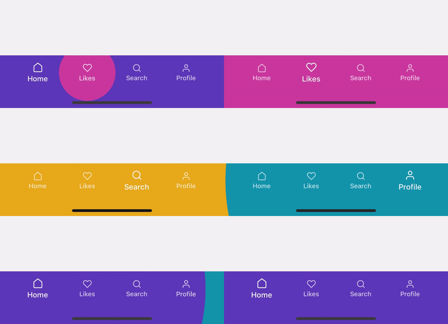
### Icon with label
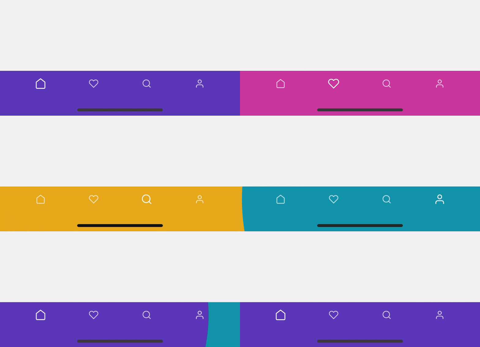
 ### Icon only
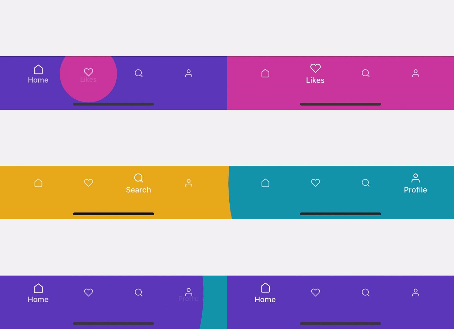
 ### Icon with label on focus
 ## Interfaces
### MaterialTabBarConfig
| name | description | required | type | default |
| ----------------- | -------------------------------------- | -------- | ------------------------------------------------------- | --------------- |
| `animation` | Material animation preset. | NO | `iconWithLabel` \| `iconOnly` \| `iconWithLabelOnFocus` | `iconWithLabel` |
| `inactiveOpacity` | Tab bar item inactive opacity. | NO | number | 0.75 |
| `inactiveScale` | Tab bar item indicator configurations. | NO | number | 0.85 |
## Interfaces
### MaterialTabBarConfig
| name | description | required | type | default |
| ----------------- | -------------------------------------- | -------- | ------------------------------------------------------- | --------------- |
| `animation` | Material animation preset. | NO | `iconWithLabel` \| `iconOnly` \| `iconWithLabelOnFocus` | `iconWithLabel` |
| `inactiveOpacity` | Tab bar item inactive opacity. | NO | number | 0.75 |
| `inactiveScale` | Tab bar item indicator configurations. | NO | number | 0.85 |
TypeScript Interface
```ts
export interface MaterialTabBarConfig {
/**
* Material animation preset.
* @type {'iconWithLabel' | 'iconOnly' | 'iconWithLabelOnFocus'}
* @default 'iconWithLabel'
*/
animation?: 'iconWithLabel' | 'iconOnly' | 'iconWithLabelOnFocus';
/**
* Tab bar item inactive opacity.
* @type {number}
* @default 0.75
*/
inactiveOpacity?: number;
/**
* Tab bar item inactive scale.
* @type {number}
* @default 0.85
*/
inactiveScale?: number;
}
```
### MaterialTabBarItemConfig
| name | description | required | type | default |
| ------------ | ------------------------------------------------------------ | -------- | ------------------- | ------------- |
| `labelStyle` | This will apply to the tab bar item label. | NO | TextStyle | |
| `icon` | Icon configurations. | YES | object | |
| `├component` | Icon component, this could be a function or class component. | YES | [`ReactNode`](#L45) | |
| `└color` | Icon color. | YES | string | |
| `ripple` | Tab bar item ripple configurations. | YES | object | |
| `└color` | Ripple color. | NO | string | `label color` |
TypeScript Interface
```ts
export interface MaterialTabBarItemConfig {
/**
* Tab bar item label style.
*/
labelStyle?: StyleProp;
/**
* Tab bar item icon config.
*/
icon: {
/**
* Tab bar item icon component, this could be a function or
* a react node.
* @type {(props: MaterialTabBarIconProps) => React.ReactNode | React.ReactNode}
*/
component:
| React.FC
| React.ComponentClass
| React.ReactNode;
/**
* Icon color.
* @type {string}
*/
color: string;
};
/**
* Tab bar item ripple config.
*/
ripple: {
/**
* Tab bar item ripple color.
* @type {string}
*/
color: string;
};
}
```
### MaterialTabBarIconProps
| name | description | required | type | default |
| --------------- | ---------------------------------- | -------- | ----------------------- | ------- |
| `animatedFocus` | Tab bar item animated focus value. | YES | `Animated.Node` |
| `color` | Tab bar item icon color. | YES | number | |
| `size` | Tab bar item icon size. | YES | number | |
TypeScript Interface
```ts
export interface MaterialTabBarIconProps {
/**
* Tab bar item animated focus value.
* @type {Animated.Node}
*/
animatedFocus: Animated.Node;
/**
* Tab bar item icon color.
* @type {string}
*/
color: string;
/**
* Tab bar item icon size.
* @type {number}
*/
size: number;
}
```