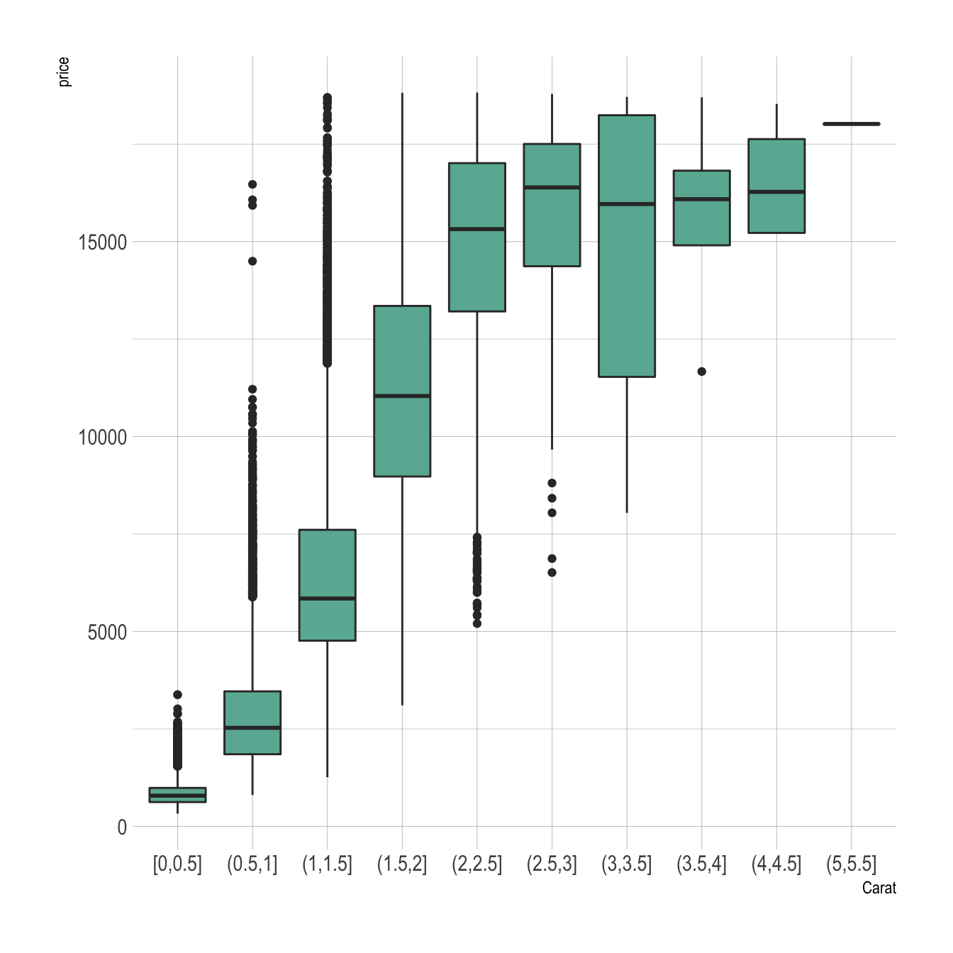
Let’s say we want to study the relationship between 2 numeric variables. It is possible to cut on of them in different bins, and to use the created groups to build a boxplot.
Here, the numeric variable called carat from the
diamonds dataset in cut in 0.5 length bins thanks to
the cut_width function. Then, we just need to provide
the newly created variable to the X axis of ggplot2.
# library
library(ggplot2)
library(dplyr)
library(hrbrthemes)

# Start with the diamonds dataset, natively available in R:
p <- diamonds %>%

  # Add a new column called 'bin': cut the initial 'carat' in bins
  mutate( bin=cut_width(carat, width=0.5, boundary=0) ) %>%

  # plot
  ggplot( aes(x=bin, y=price) ) +
    geom_boxplot(fill="#69b3a2") +
    theme_ipsum() +
    xlab("Carat")