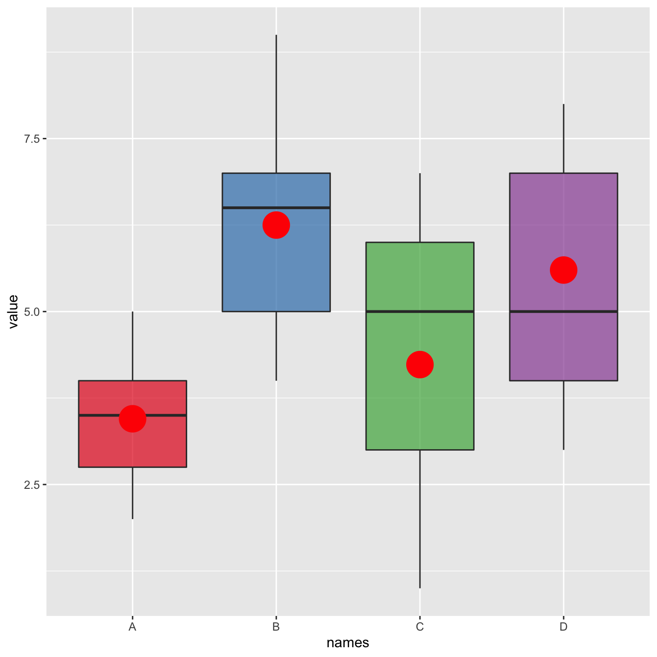
Ggplot2 allows to show the
average value of each group using the
stat_summary() function. No more need to calculate your
mean values before plotting.
# Library
library(ggplot2)

# create data
names=c(rep("A", 20) , rep("B", 8) , rep("C", 30), rep("D", 80))
value=c( sample(2:5, 20 , replace=T) , sample(4:10, 8 , replace=T), sample(1:7, 30 , replace=T), sample(3:8, 80 , replace=T) )
data=data.frame(names,value)

# plot
p <- ggplot(data, aes(x=names, y=value, fill=names)) +
    geom_boxplot(alpha=0.7) +
    stat_summary(fun.y=mean, geom="point", shape=20, size=14, color="red", fill="red") +
    theme(legend.position="none") +
    scale_fill_brewer(palette="Set1")