Packages
In order to create this chart, we need to load the following packages, as well as some fonts:
Dataset
The data consists of a CSV file containing baby names, which is loaded
into a data frame called babynames. The data is then
filtered to find the 50 most popular female and male names of all
time, and the results are stored in the top_female and
top_male vectors, respectively.
The babynames data frame is then filtered again to
include only the top 50 female and male names for
each year, and the results are stored in the
female_names and male_names data frames. The
name column in both data frames is converted to a factor
with levels based on the order of popularity.
The female_names and male_names data frames
are grouped by year and name, and the total number of
occurrences for each name is summarized in the n column.
# Loading data
babynames <- readr::read_csv("https://raw.githubusercontent.com/rfordatascience/tidytuesday/master/data/2022/2022-03-22/babynames.csv")

# 50 most popular female names over all time
top_female <- babynames |>
  filter(sex == "F") |>
  group_by(name) |>
  summarise(total = sum(n)) |>
  slice_max(total, n = 50) |>
  mutate(
    rank = 1:50,
    name = forcats::fct_reorder(name, -total)
  ) |>
  pull(name)

# 50 most popular male names over all time
top_male <- babynames |>
  filter(sex == "M") |>
  group_by(name) |>
  summarise(total = sum(n)) |>
  slice_max(total, n = 50) |>
  mutate(
    rank = 1:50,
    name = forcats::fct_reorder(name, -total)
  ) |>
  pull(name)

# filter female names data
female_names <- babynames |>
  filter(
    sex == "F",
    name %in% top_female
  ) |>
  mutate(name = factor(name, levels = levels(top_female))) |>
  group_by(year, name) |>
  summarise(n = sum(n))

# filter top males
male_names <- babynames |>
  filter(
    sex == "M",
    name %in% top_male
  ) |>
  mutate(name = factor(name, levels = levels(top_male))) |>
  group_by(year, name) |>
  summarise(n = sum(n))
Ridgeline with female names
We start by creating a single ridgeline plot using only female names.
The ridgeline plot is made via the
geom_ridgeline() function from the
ggridges package.
plot1 <- ggplot(female_names, aes(year,
  y = fct_reorder(name, n), height = n / 50000,
  group = name, scale = 2
)) +
  geom_ridgeline(
    alpha = 0.5, scale = 4.5, linewidth = 0,
    fill = "#05595B", color = "white"
  ) +
  xlim(1900, NA) +
  labs(title = "Female", y = "", x = "") +
  theme(
    plot.title = element_text(hjust = 0, family = "Bahnschrift", size = 20),
    axis.ticks.y = element_blank(),
    axis.text = element_text(family = "Bahnschrift", size = 15),
    panel.grid.major.x = element_blank(),
    panel.grid.minor.x = element_blank(),
    panel.grid.major.y = element_line(size = 0.5),
    panel.border = element_blank()
  ) +
  geom_segment(aes(x = 1967, xend = 1967, y = 56.7, yend = 52), color = "#404040") +
  geom_segment(aes(x = 1967, xend = 1964, y = 56.7, yend = 56.7), color = "#404040") +
  annotate(
    geom = "text", x = 1970, y = 57, label = "73,982 babies called\n'Mary' in 1921", hjust = "left",
    size = 7, color = "#404040", family = "Bahnschrift"
  )

plot1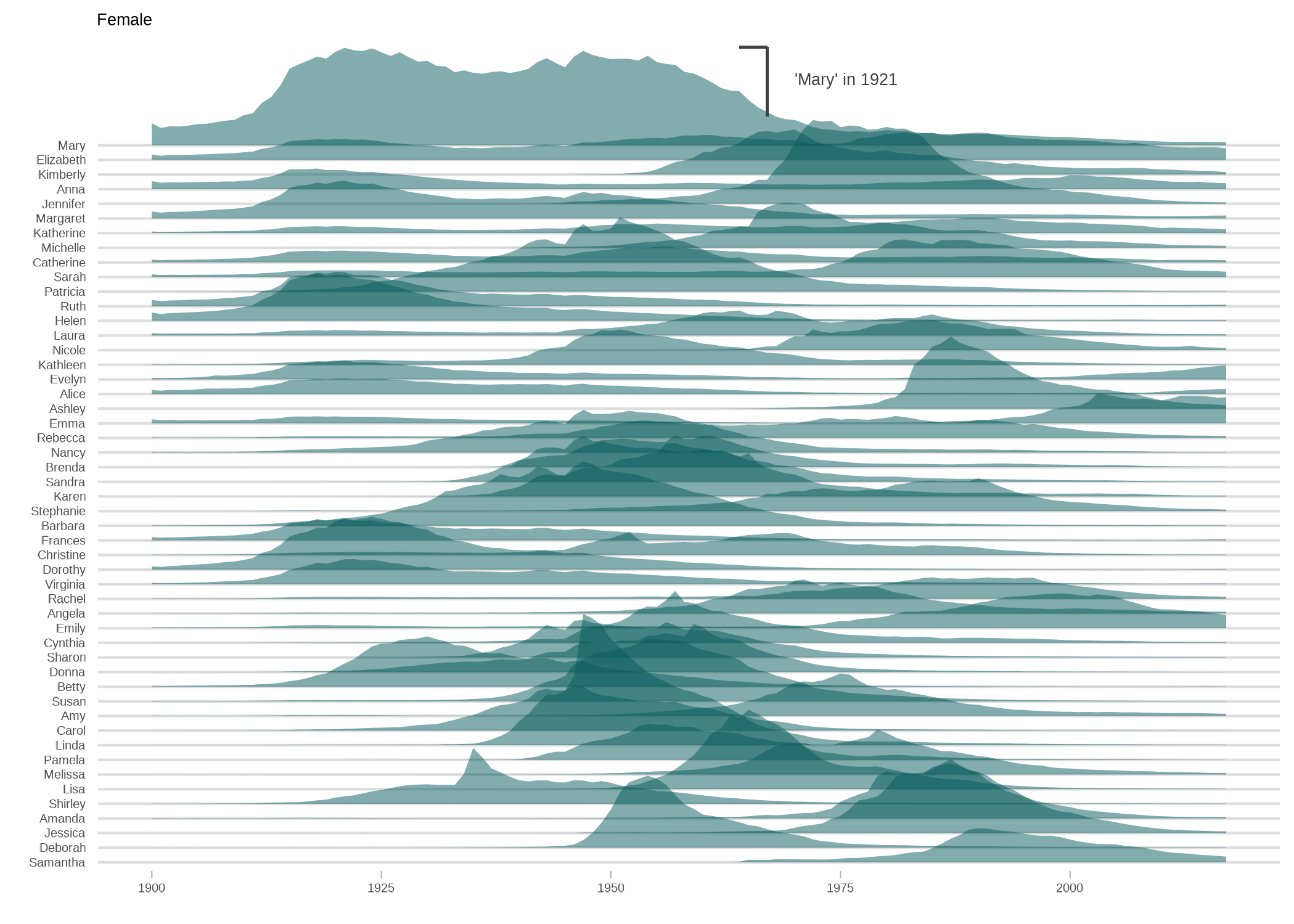
Ridgeline with male names
Now we create the same chart but using the male names only. The code is pretty much the same as above:
plot2 <- ggplot(male_names, aes(year,
  y = fct_reorder(name, n), height = n / 50000,
  group = name, scale = 2
)) +
  geom_ridgeline(
    alpha = 0.5, scale = 4.5, linewidth = 0,
    fill = "#603601", color = "white"
  ) +
  xlim(1900, NA) +
  labs(title = "Male", y = "", x = "") +
  theme(
    plot.title = element_text(hjust = 0, family = "Bahnschrift", size = 20),
    axis.ticks.y = element_blank(),
    axis.text = element_text(family = "Bahnschrift", size = 15),
    panel.grid.major.x = element_blank(),
    panel.grid.minor.x = element_blank(),
    panel.grid.major.y = element_line(size = 0.5),
    panel.border = element_blank(),
    panel.background = element_rect(fill = "white"),
    plot.background = element_rect(fill = "white")
  ) +
  geom_segment(aes(x = 1975, xend = 1975, y = 58, yend = 53.1), color = "#404040") +
  geom_segment(aes(x = 1975, xend = 1972, y = 58, yend = 58), color = "#404040") +
  annotate(
    geom = "text", x = 1977, y = 57.6, label = "94,756 babies called\n'James' in 1947", hjust = "left",
    size = 7, color = "#404040", family = "Bahnschrift"
  )

plot2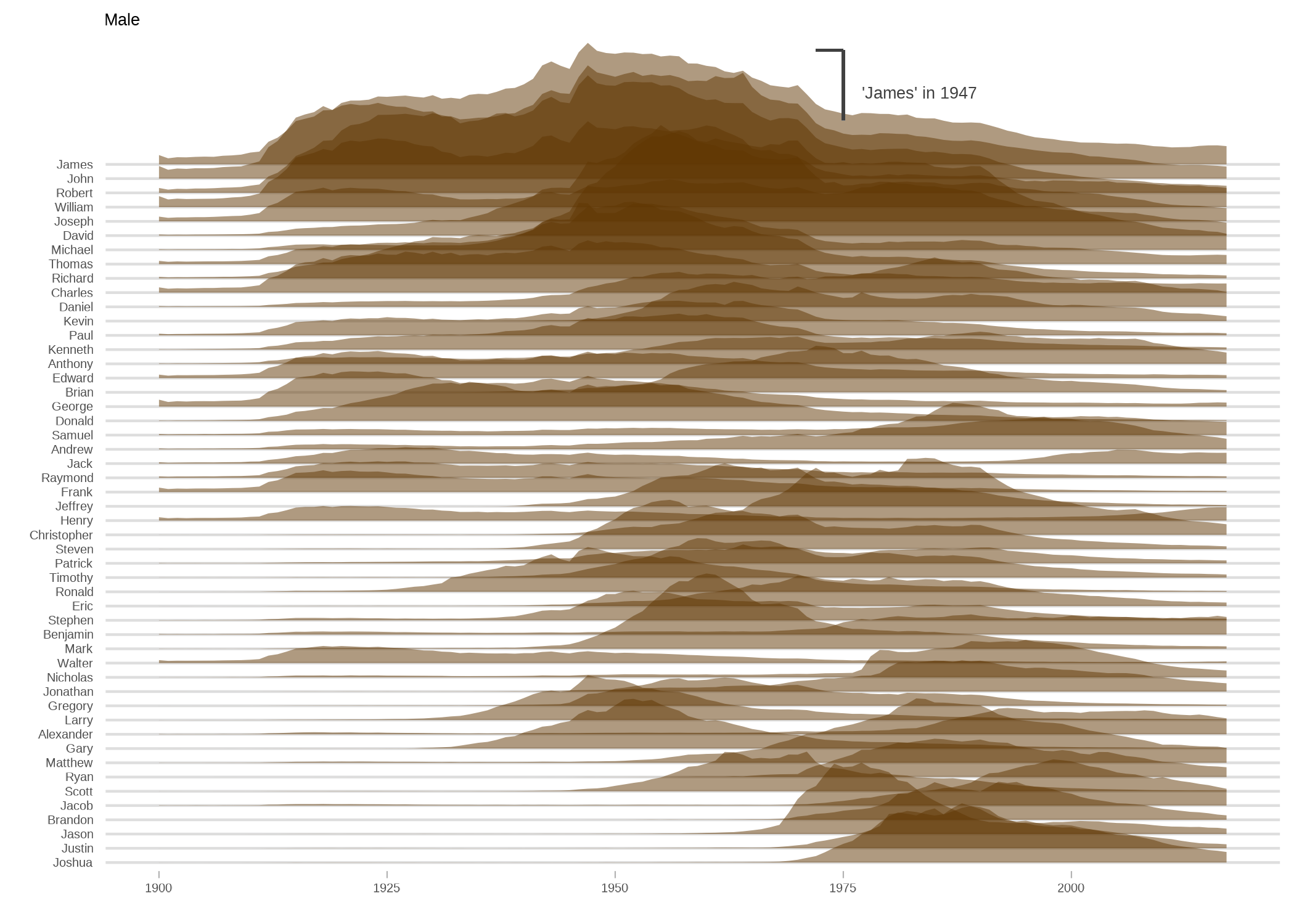
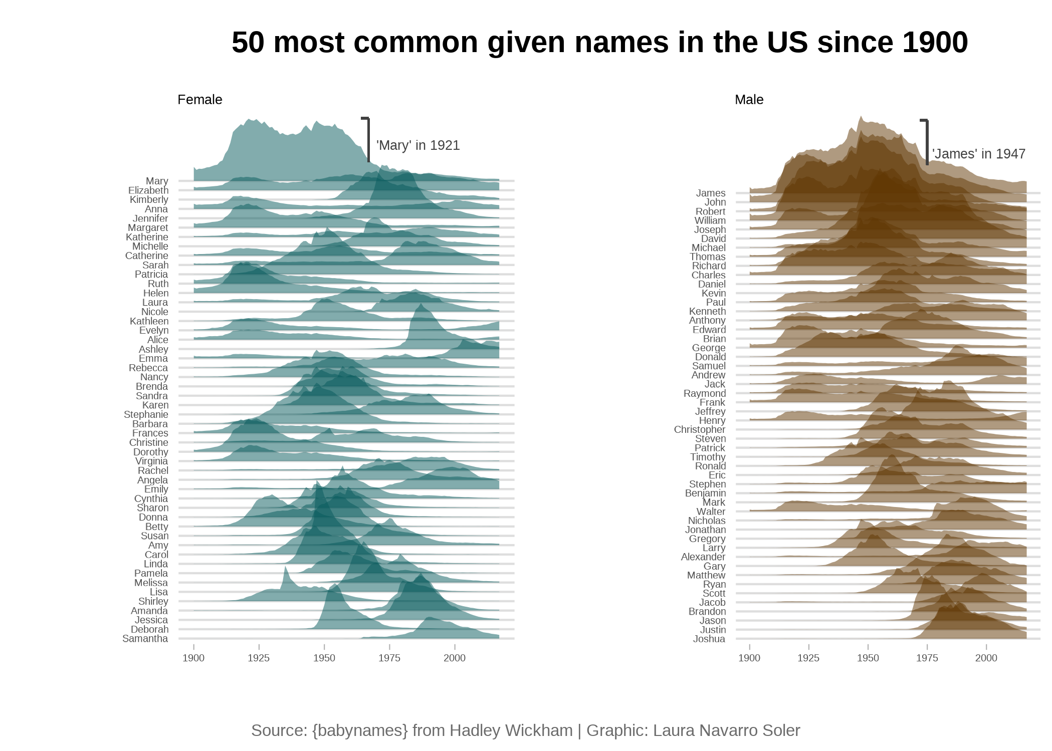
Combine plots
Now that we have the charts that we needed, we can
concatenate them into a single one thanks to the
plot_grid() function:
title_theme <- ggdraw() +
  draw_label("50 most common given names in the US since 1900",
    fontfamily = "Gadugi",
    fontface = "bold",
    size = 45,
    hjust = 0.4
  )

# caption
caption <- ggdraw() +
  draw_label("Source: {babynames} from Hadley Wickham | Graphic: Laura Navarro Soler",
    fontfamily = "Bahnschrift",
    size = 25,
    hjust = 0.5,
    color = "#6B6B6B"
  )

gridofplots <- plot_grid(plot1, plot2, nrow = 1)
plot_grid(title_theme,
  gridofplots,
  caption,
  ncol = 1, rel_heights = c(0.2, 1.5, 0.1)
)
Going further
You might be interested in:
- this beautiful ridgeline plot about rental prices
- how to create a small multiple line chart
- how to mix time series and facetting