{
"cells": [
{
"cell_type": "markdown",
"metadata": {},
"source": [
"# Plotting\n",
"\n",
"Use matplotlib, pandas, and plotly to leverage Python's power of data visualization. \n",
"\n",
"## Tools (Packages) for Plotting with Python\n",
"\n",
"Several packages enable plotting in Python. The last page already introduced [NumPy](https://hydro-informatics.com/python-basics/pynum.html#numpy) and [pandas](https://hydro-informatics.com/python-basics/pynum.html#pandas) for plotting histograms. *pandas* plotting capacities go way beyond just plotting histograms and it relies on the powerful [matplotlib](https://matplotlib.org/) library. *SciPy*'s *matplotlib* is the most popular plotting library in *Python* (since its introduction in 2003) and not only *pandas*, but also other libraries (for example the abstraction layer [Seaborn](https://seaborn.pydata.org/)) use *matplotlib* with facilitated commands. This page introduces the following packages for data visualization:\n",
"\n",
"* [matplotlib](https://hydro-informatics.com/python-basics/pynum.html#matplotlib) - the baseline for data visualization in Python\n",
"* [pandas](https://hydro-informatics.com/python-basics/pynum.html#pandas) - as wrapper API of *matplotlib*, with many simplified options for meaningful plots\n",
"* [plotly](https://hydro-informatics.com/jupyter/pyplot.html#interactive-plots-with-plotly) - for interactive plots, in which users can change and move plot scales "
]
},
{
"cell_type": "markdown",
"metadata": {},
"source": [
"## Matplotlib \n",
"\n",
"Because of its complexity and the fact that all important functions can be used with *pandas* in a much more manageable way, we will discuss *matplotlib* only briefly here. Yet it is important to know how *matplotlib* works to better understand the baseline of plotting with *Python* and to use more complex graphics or more plotting options when needed.\n",
"\n",
"In 2003, the development of *matplotlib* was initiated in the field of neurobiology by [*John D. Hunter (†)*](https://en.wikipedia.org/wiki/John_D._Hunter) to emulate *The MathWork*'s *MATLAB®* software. This early development constituted the `pylab` package, which is deprecated today for its bad practice of overwriting Python (in particular NumPy) `plot()` and `array()` methods/objects. Today, it is recommended to use:
\n",
"`import matplotlib.pyplot as plt`.\n",
"\n",
"### Some Terms and Definitions\n",
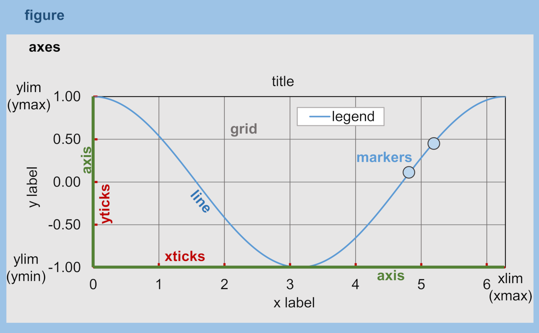
"A `plt.figure` can be thought of as a box containing one or more axes, which represent the actual plots. Within the axes, there are smaller objects in the hierarchy such as markers, lines, legends, and text fields. Almost every element of a plot is a manipulable attribute and the most important attributes are shown in the following figure. More attributes can be found in the showcases of [matplotlib.org](https://matplotlib.org/examples/showcase/anatomy.html).\n",
"\n",
""
]
},
{
"cell_type": "markdown",
"metadata": {},
"source": [
"### Step-by-step Recipe for 1d/2d (line) Plots \n",
"\n",
"1. Import *matplolib*'s `pyplot` package with `import matplotlib.pyplot as plt`\n",
"1. Create a figure with `plt.figure(figsize=(width_inch, height_inch), dpi=int, facecolor=str, edgecolor=str)`\n",
"1. Add axes to the figure with `axes=fig.add_subplot(row=int, column=int, index=int, label=str)\n",
"1. Generate a [color map](http://matplotlib.org/users/colormaps.html); `plt.cm.getcmap()` generates an array of colors as explained in the [NumPy section](https://hydro-informatics.com/python-basics/pynum.html#colors). For example `colormap=([255, 0, 0])` creates a color map with just one color (red).\n",
"1. To plot the data with\n",
" * lines use `axes.plot(x, y, linestyle=str, marker=str, color=Colormap(int), label=str)` and many more `**kwargs` can be defined ([go the *matplotlib* docs](https://matplotlib.org/3.1.1/api/_as_gen/matplotlib.lines.Line2D.html#matplotlib.lines.Line2D)).\n",
" * points (markers) use `axes.scatter(x, y, MarkerStyle=str, cmap=Colormap, label=str)` and many more `**kwargs` can be defined ([go the *matplotlib* docs](https://matplotlib.org/3.2.1/api/_as_gen/matplotlib.pyplot.scatter.html))\n",
"1. Manipulate axis ticks\n",
" * `plt.xticks(list)` define x-axis ticks\n",
" * `plt.yticks(list)` define y-axis ticks\n",
" * `axes.set_xlim(tuple(min, max))` sets the x-axis minimum and maximum\n",
" * `axes.set_ylim(tuple(min, max))` sets the y-axis minimum and maximum\n",
" * `axes.set_xlabel(str)` sets the x-axis label\n",
" * `axes.set_ylabel(str)` sets the y-axis label\n",
"1. Add a legend (optionally) with `axes.legend(loc=str, facecolor=str, edgecolor=str, framealpha=float_between_0_and_1)` and many more `**kwargs` can be defined ([confer to the *matplotlib* docs](https://matplotlib.org/3.1.1/api/legend_api.html#matplotlib.legend.Legend)).\n",
"1. Optional: Save the figure with `plt.savefig(fname=str, dpi=int)` with many more `**kwargs` available ([confer to the *matplotlib* docs](https://matplotlib.org/3.1.1/api/_as_gen/matplotlib.pyplot.savefig.html)).\n",
"\n",
"> **Tip:** Most of the below illustrated `matplotlib` features are embedded in a plotter script, which is available at a [supplemental repository of the hydro-informatics.com eBook](https://raw.githubusercontent.com/hydro-informatics/material-py-codes/main/plotting/plotter.py).\n",
"\n",
"The following code block illustrates a plot recipe using [randomly drawn samples from a *Weibull* distribution](https://numpy.org/doc/stable/reference/random/generated/numpy.random.RandomState.weibull.html#numpy.random.RandomState.weibull) with the distribution shape factor *a* (for `a=1`, the *Weibull* distribution reduces to an exponential distribution). The `seed` argument describes the source of randomness and `seed=None` makes Python use randomness from operating system variables.\n",
"\n",
"The code block defines a function called `plot_xy` that requires `x` and `y` arguments and accepts the following optional keyword arguments:\n",
"* `plot_type=str` defines if a line or scatter plot should be produced,\n",
"* `label=str` sets the legend,\n",
"* `save=str` defines a path where the figure should be saved (the figure is not saved if nothing is provided). To activate saving a figure, use the optional keyword argument `save`, for example, `save='C:/temp/weibull.png'` saves the figure to a local `temp` folder on a Windows `C:` drive."
]
},
{
"cell_type": "code",
"execution_count": null,
"metadata": {},
"outputs": [],
"source": [
"import matplotlib.pyplot as plt\n",
"import matplotlib.cm as cm\n",
"import numpy as np\n",
"x = np.arange(1, 100)\n",
"y = np.random.RandomState(seed=None).weibull(3., x.__len__())\n",
"\n",
"def plot_xy(x, y, plot_type=\"1D-line\", label=\"Rnd. Weibull\", save=None):\n",
" fig = plt.figure(figsize=(6.18, 3.82), dpi=100, facecolor='w', edgecolor='gray') # figsize in inches\n",
" axes = fig.add_subplot(1, 1, 1, label=label) # row, column, index, label\n",
" colormap = cm.plasma(np.linspace(0, 1, len(y))) # more colormaps: http://matplotlib.org/users/colormaps.html\n",
" if plot_type == \"1D-line\":\n",
" ax = axes.plot(x, y, linestyle=\"-\", marker=\"o\", color=colormap[0], label=label) # play with the colormap index\n",
" if plot_type == \"scatter\":\n",
" ax = axes.scatter(x, y, marker=\"x\", color=colormap, label=label)\n",
" if not \"ax\" in locals():\n",
" print(\"ERROR: No valid input data provided.\")\n",
" return -1\n",
" plt.xticks(list(np.arange(0, x.__len__() + 10, (x.__len__() + 1) / 5.)))\n",
" plt.yticks(list(np.arange(0, np.ceil(y.max()), 0.5)))\n",
" axes.set_xlim((0,100))\n",
" axes.set_ylim((0,2))\n",
" axes.set_xlabel(\"Linear x data\")\n",
" axes.set_ylabel(\"Scale of \" + str(label))\n",
" axes.legend(loc='upper right', facecolor='y', edgecolor='k', framealpha=0.5)\n",
" if save:\n",
" plt.savefig(save)\n",
"\n",
"print(\"Plot lines\") \n",
"plot_xy(x, y)\n",
"print(\"Scatter plot\")\n",
"plot_xy(x, y, plot_type=\"scatter\", label=\"Rand. Weibull scattered\")"
]
},
{
"cell_type": "markdown",
"metadata": {},
"source": [
"> **Challenge:** The `plot_xy` function has some weaknesses. For instance, if more arguments are provided, or `y` data is a multidimensional array (not *nx1* or *1xm*) that should produce multiple plot lines, the function will not work. So, how can you optimize the `plot_xy` function, to make it more robust and enable multi-line plotting?"
]
},
{
"cell_type": "markdown",
"metadata": {},
"source": [
"### Surface and Contour Plots\n",
"\n",
"*matplotlib* provides multiple options to plot X-Y-Z (2d/3d) data such as:\n",
"\n",
"* Surface plots with color shades: [`axes.plot_surface(X, Y, Z)`](https://matplotlib.org/mpl_toolkits/mplot3d/tutorial.html#surface-plots) \n",
"* Contour plots: [`axes.contour(X, Y, Z)`](https://matplotlib.org/mpl_toolkits/mplot3d/tutorial.html#contour-plots) \n",
"* Contour plots with filled surfaces: [`axes.contourf(X, Y, Z)`](https://matplotlib.org/mpl_toolkits/mplot3d/tutorial.html#filled-contour-plots) \n",
"* Surface plots with triangulated mesh: [`axes.plot_trisurf(X, Y, Z)`](https://matplotlib.org/mpl_toolkits/mplot3d/tutorial.html#tri-surface-plots) \n",
"* Three-dimensional scatter plots: [`axes.scatter3D(X, Y, Z)`](https://matplotlib.org/3.1.1/gallery/mplot3d/scatter3d.html) \n",
"* Streamplots (e.g., of velocity vectors): [`axes.streamplot(X, Y, U, V)`](https://matplotlib.org/3.1.1/api/_as_gen/matplotlib.pyplot.streamplot.html) \n",
"* Color-coded representation of gridded values with (annotated) heatmaps (e.g., for habitat suitability index maps): [`axes.imshow(data, **kwargs)`](https://matplotlib.org/3.1.1/gallery/images_contours_and_fields/image_annotated_heatmap.html)\n",
"\n",
"This section features the usage of streamplots, which are a useful tool for the visualization of velocity vectors (flow fields) in rivers (e.g., produced with a numerical model). To generate a streamplot:\n",
"\n",
"1. Create an `X` - `Y` grid, for example with the [NumPy's `mgrid` method](https://numpy.org/doc/stable/reference/generated/numpy.mgrid.html): `Y, X = np.mgrid[range, range]`\n",
"1. Assign stream field data (can be artificially generated, for example, in the form of `U` and `V` variables in the below code block) to the grid nodes. Note that every grid node can only get assigned one scalar value, which is `velocity` (as a function of the 2-directional field data) in the below code block.\n",
"1. Generate figures, as before in the `plot_xy` function example (see the above 1d/2d plot instructions).\n",
"\n",
"The below code block illustrates the generation of a streamplot (adapted from the [matplotlib docs](https://matplotlib.org/3.1.1/gallery/images_contours_and_fields/plot_streamplot.html#sphx-glr-gallery-images-contours-and-fields-plot-streamplot-py)) and uses `import matplotlib.gridspec` to place the subplots in the figure."
]
},
{
"cell_type": "code",
"execution_count": null,
"metadata": {},
"outputs": [],
"source": [
"import matplotlib.pyplot as plt\n",
"import matplotlib.gridspec as gridspec\n",
"\n",
"# generate grid\n",
"w = 100\n",
"Y, X = np.mgrid[-w:w:10j, -w:w:10j] # j creates complex numbers\n",
"\n",
"# calculate U and V vector matrices on the grid\n",
"U = -2 - X**2 + Y\n",
"V = 0 + X - Y**2\n",
"\n",
"fig = plt.figure(figsize=(6., 2.5), dpi=200)\n",
"fig_grid = gridspec.GridSpec(nrows=1, ncols=2)\n",
"velocity = np.sqrt(U**2 + V**2) # calculate velocity vector \n",
"\n",
"# Varying line width along a streamline\n",
"axes1 = fig.add_subplot(fig_grid[0, 0])\n",
"axes1.streamplot(X, Y, U, V, density=0.6, color='b', linewidth=3*velocity/velocity.max())\n",
"axes1.set_title('Line width variation', fontfamily='Tahoma', fontsize=8, fontweight='bold')\n",
"\n",
"# Varying color along a streamline\n",
"axes2 = fig.add_subplot(fig_grid[0, 1])\n",
"uv_stream = axes2.streamplot(X, Y, U, V, color=velocity, linewidth=2, cmap='Blues')\n",
"fig.colorbar(uv_stream.lines)\n",
"axes2.set_title('Color maps', fontfamily='Tahoma', fontsize=8, fontweight='bold')\n",
"\n",
"plt.tight_layout()\n",
"plt.show()"
]
},
{
"cell_type": "markdown",
"metadata": {},
"source": [
"### Fonts and Styles\n",
"\n",
"The previous example featured a font type adjustment for the plot titles (`axes.set_title('title', font ...)`). The font and its characteristics (e.g., size, weight, style, or family) can be defined more coherently with `matplotlib.font_manager.FontProperties` ([cf. the matplotlib docs](https://matplotlib.org/3.1.1/api/font_manager_api.html)), where plot font settings can be globally modified within a script."
]
},
{
"cell_type": "code",
"execution_count": null,
"metadata": {},
"outputs": [],
"source": [
"import matplotlib.pyplot as plt\n",
"from matplotlib.font_manager import FontProperties\n",
"from matplotlib import rc\n",
"\n",
"# create FontProperties object and set font characteristics\n",
"font = FontProperties()\n",
"font.set_family(\"sans-serif\")\n",
"font.set_name(\"Times New Roman\")\n",
"font.set_style(\"italic\")\n",
"font.set_weight(\"semibold\")\n",
"font.set_size(10)\n",
"print(\"Needs to be converted to a dictionary: \" + str(font))\n",
"\n",
"# translate FontProperties to a dictionary\n",
"font_dict = {\"family\": \"normal\"}\n",
"for e in str(font).strip(\":\").split(\":\"):\n",
" if \"=\" in e:\n",
" font_dict.update({e.split(\"=\")[0]: e.split(\"=\")[1]})\n",
"\n",
"# apply font properties to script\n",
"rc(\"font\", **font_dict)\n",
"\n",
"# make some plot data\n",
"x_lin = np.linspace(0.0, 10.0, 1000) # evenly spaced numbers over a specific interval (start, stop, number-of-elements)\n",
"y_osc = np.cos(5 * np.pi * x_lin) * np.exp(-x_lin)\n",
"\n",
"# plot\n",
"fig, axes = plt.subplots(figsize=(6.18, 1.8), dpi=150)\n",
"axes.plot(x_lin, y_osc, label=\"Oscillations\")\n",
"axes.legend()\n",
"axes.set_xlabel(\"Time (s)\")\n",
"axes.set_ylabel(\"Oscillation (V)\")\n",
"plt.tight_layout()\n",
"plt.show()"
]
},
{
"cell_type": "markdown",
"metadata": {},
"source": [
"Instead of using `rc`, font characteristics can also be updated with matplotlib's `rcParams` *dictionary*. In general, all font parameters can be accessed with `rcParams` along with many more parameters of plot layout options. The parametric options are stored in the [`matplotlibrc`](https://matplotlib.org/tutorials/introductory/customizing.html#customizing-with-matplotlibrc-files) file and can be accessed with `rcParams[\"matplotlibrc-parameter\"]`. Read more about modification options (`\"matplotlibrc-parameter\"`) in the [*matplotlib* docs](https://matplotlib.org/tutorials/introductory/customizing.html#customizing-with-matplotlibrc-files). In order to modify a (font) style parameter use `rcParams.update({parameter-name: parameter-value})` (which does not always work, for example, in [jupyter](https://github.com/jupyter/notebook/issues/3385)). \n",
"\n",
"In addition, many default plot styles are available through [`matplotlib.style`](https://matplotlib.org/api/style_api.html#matplotlib-style) with many [style templates](https://matplotlib.org/gallery/style_sheets/style_sheets_reference.html). The following example illustrates the application of `rcParams` and `style` variables to the previously generated x-y oscillation dataset."
]
},
{
"cell_type": "code",
"execution_count": null,
"metadata": {},
"outputs": [],
"source": [
"from matplotlib import rcParams\n",
"from matplotlib import rcParamsDefault\n",
"from matplotlib import style\n",
"rcParams.update(rcParamsDefault) # reset parameters in case you run this block multiple times\n",
"print(\"Some available serif fonts: \" + \", \".join(rcParams['font.serif'][0:5]))\n",
"print(\"Some available sans-serif fonts: \" + \", \".join(rcParams['font.sans-serif'][0:5]))\n",
"print(\"Some available monospace fonts: \" + \", \".join(rcParams['font.monospace'][0:5]))\n",
"print(\"Some available fantasy fonts: \" + \", \".join(rcParams['font.fantasy'][0:5]))\n",
"\n",
"# change rcParams\n",
"rcParams.update({'font.fantasy': 'Impact'}) # has no effect here!\n",
"\n",
"print(\"Some available styles: \" + \", \".join(style.available[0:5]))\n",
"style.use('seaborn-darkgrid')\n",
"\n",
"# plot\n",
"fig, axes = plt.subplots(figsize=(6.18, 1.8), dpi=150)\n",
"axes.plot(x_lin, y_osc, label=\"Oscillations\")\n",
"axes.legend()\n",
"axes.set_xlabel(\"Time (s)\")\n",
"axes.set_ylabel(\"Oscillation (V)\")\n",
"plt.tight_layout()\n",
"plt.show()"
]
},
{
"cell_type": "markdown",
"metadata": {},
"source": [
"### Colors\n",
"\n",
"The use of color maps is a sensitive topic: often default-set rainbow palettes map distinct hues that many viewers with color-vision deficiencies (approx. 1 in 12 men) cannot reliably differentiate. Consider the following aspects to accommodate perceptually uniform, colorblind-friendly colormaps:\n",
"\n",
"* **Sequential (low > high):** use Matplotlib's `viridis`, `magma`, `plasma`, `inferno`; or domain-aware sequences from cmocean (see also below) to use, for instance, `cmo.thermal` for temperature, `cmo.haline` for salinity).\n",
"* **Diverging (midpoint emphasis):** use when values deviate around a meaningful center (0, climatology, etc.). Examples: Matplotlib's `seismic`-style but *perceptually tuned* options like `coolwarm` (still imperfect) or cmocean's `balance`, `delta`, `curl`, which are engineered for symmetry and lightness control.\n",
"* **Cyclic (wrap-around variables):** for phase/aspect (0°≡360°). Use cyclic maps such as cmocean's `phase`.\n",
"* **Categorical (discrete classes):** use distinct, desaturated palettes with good lightness separation; avoid \"rainbow\" categories for quantitative data.\n",
"* **Dynamic range:** ensure the lightness ramp spans the range where your audience needs discrimination (you can trim/clip the colormap range if needed).\n",
"* **Background:** pick a map whose lightness contrasts with the figure background (dark maps on dark backgrounds obscure low values).\n",
"\n",
"To ease working with such colormaps, consider installing `cmocean`:"
]
},
{
"cell_type": "raw",
"metadata": {},
"source": [
"pip install cmocean"
]
},
{
"cell_type": "markdown",
"metadata": {},
"source": [
"Below is an example of code for using perceptually uniform, colorblind-friendly colormaps. You can find this example also on [https://hydro-informatics.com/scilife/color-hacks.html](https://hydro-informatics.com/scilife/color-hacks.html)."
]
},
{
"cell_type": "code",
"execution_count": null,
"metadata": {},
"outputs": [],
"source": [
"import matplotlib.pyplot as plt\n",
"import numpy as np\n",
"import cmocean\n",
"\n",
"# Set a perceptually-uniform default\n",
"plt.rcParams[\"image.cmap\"] = \"viridis\"\n",
"\n",
"# Generate data\n",
"x = np.linspace(-3, 3, 400)\n",
"y = np.linspace(-3, 3, 400)\n",
"X, Y = np.meshgrid(x, y)\n",
"Z = np.hypot(X, Y)\n",
"\n",
"# Create sequential perceptually-uniform plot\n",
"plt.imshow(Z, origin=\"lower\", cmap=cmocean.cm.thermal)\n",
"plt.colorbar(label=\"Temperature-like quantity\")\n",
"plt.title(\"Sequential, perceptually-uniform\")\n",
"plt.show()"
]
},
{
"cell_type": "markdown",
"metadata": {},
"source": [
"### Annotations\n",
"\n",
"Pointing out particularities in graphs is sometimes helpful to explain or name observations on graphs. The following code block shows some options with self-explaining *strings*."
]
},
{
"cell_type": "code",
"execution_count": null,
"metadata": {},
"outputs": [],
"source": [
"from matplotlib import rcParams\n",
"from matplotlib import rcParamsDefault\n",
"from matplotlib import style\n",
"rcParams.update(rcParamsDefault) # reset parameters in case you run this block multiple times\n",
"\n",
"fig, axes = plt.subplots(figsize=(10, 2.5), dpi=150)\n",
"style.use('fivethirtyeight') # let s just use still another style\n",
"\n",
"fig.suptitle('This is the figure (super) title', fontsize=8, fontweight='bold')\n",
"\n",
"axes.set_title('This is the axes (sub) title', fontsize=8)\n",
"\n",
"axes.text(1, 0.8, 'B-boxed italic text with axis coords 1, 0.8', style='italic', fontsize=8, bbox={'facecolor': 'green', 'alpha': 0.5, 'pad': 5})\n",
"axes.text(5, 0.6, r'Annotation text with equation: $u=U^2 + V^2$', fontsize=8)\n",
"axes.text(7, 0.2, 'Color text with axis coords (7, 0.2)', verticalalignment='bottom', horizontalalignment='left', color='red', fontsize=8)\n",
"\n",
"axes.plot([0.5], [0.2], 'x', markersize=7, color='blue') #plot an arbitrary point\n",
"axes.annotate('Annotated point', xy=(0.5, 0.2), xytext=(2, 0.4), fontsize=8, arrowprops=dict(facecolor='blue', shrink=0.05))\n",
"\n",
"axes.axis([0, 10, 0, 1]) # x_min, x_max, y_min, y_max\n",
"\n",
"plt.show()"
]
},
{
"cell_type": "markdown",
"metadata": {},
"source": [
"> **Challenge:** The above code blocks involve many repetitive statements such as `import ...` - `rcParams.update(rcParamsDefault)`, and `plot.show()` at the end. Can you write a [wrapper function](https://hydro-informatics.com/jupyter/pyfun.html#wrappers) to decorate a *matplotlib* plot function?"
]
},
{
"cell_type": "markdown",
"metadata": {},
"source": [
"> **Exercise:** Familiarize with built-in plot functions using *matplotlib* with the template scripts provided with the [reservoir design](https://hydro-informatics.com/exercises/ex-sp) and [flood return period calculation](https://hydro-informatics.com/exercises/ex-floods) exercises."
]
},
{
"cell_type": "markdown",
"metadata": {},
"source": [
"## Plotting with *pandas*\n",
"\n",
"Plotting with *matplotlib* can be daunting, not because the library is poorly documented (the complete opposite is the case), but because *matplotlib* is very extensive. *pandas* brings remedy with simplified commands for high-quality plots. The simplest way to plot a *pandas* data frame is [`pd.DataFrame.plot(x=\"col1\", y=\"col2\")`](https://pandas.pydata.org/pandas-docs/stable/reference/api/pandas.DataFrame.plot.html). The following example illustrates this fundamentally simple usage with a river discharge series stored in a workbook ([download example_flow_gauge.xlsx](https://raw.githubusercontent.com/hydro-informatics/jupyter-python-course/main/data/example_flow_gauge.xlsx))."
]
},
{
"cell_type": "code",
"execution_count": null,
"metadata": {},
"outputs": [],
"source": [
"import pandas as pd\n",
"flow_df = pd.read_excel('data/example_flow_gauge.xlsx', sheet_name='Mean Monthly CMS')\n",
"print(flow_df.head(3))\n",
"flow_df.plot(x=\"Date (mmm-jj)\", y=\"Flow (CMS)\", kind='line')"
]
},
{
"cell_type": "markdown",
"metadata": {},
"source": [
"### *pandas* and *matplotlib*\n",
"\n",
"Because *pandas* plot functionality roots in the *matplotlib* library, those can be easily combined, for example, to create subplots:"
]
},
{
"cell_type": "code",
"execution_count": null,
"metadata": {},
"outputs": [],
"source": [
"import matplotlib.pyplot as plt\n",
"from matplotlib import cm\n",
"\n",
"flow_ex_df = pd.read_excel('data/example_flow_gauge.xlsx', sheet_name='FlowDuration')\n",
"\n",
"fig, axes = plt.subplots(nrows=1, ncols=2, figsize=(10, 2.5), dpi=150)\n",
"flow_ex_df.plot(x=\"Relative exceedance\", y=\"Flow (CMS)\", kind='area', color='DarkBlue', grid=True, title=\"Blue area plot\", ax=axes[0])\n",
"flow_ex_df.plot(x=\"Relative exceedance\", y=\"Flow (CMS)\", kind='scatter', color=\"DarkGreen\", title=\"Green scatter\", marker=\"x\", ax=axes[1])"
]
},
{
"cell_type": "markdown",
"metadata": {},
"source": [
"### Boxplots and Error Bars\n",
"\n",
"A [box-plot](https://en.wikipedia.org/wiki/Box_plot) graphically represents the distribution of (statistical) scatter and parameters of a data series.\n",
"\n",
"Why use a box-plot with a *pandas* data frame? The reason is that with *pandas* data frames, we typically load data series with per-column statistical properties. For instance, if we run a steady-flow experiment in a hydraulic lab flume with ultrasonic probes for deriving water depths, we will observe signal fluctuation, even though the flow was steady. By loading the signal data into a *pandas* data frame, we can use a box plot to observe the average water depth and the noise in the measurement among different probes. Thus, probes with unexpected noise can be identified and repaired. This small example can be applied on a broader scale to many other sensors and for many other purposes (noise does not always mean that a sensor is broken). A box-plot has the following attributes:\n",
"\n",
"* *boxes* represent the main body of the data with quartiles and confidence intervals around the median (if activated).\n",
"* *medians* are horizontal lines at the median (visually in the middle) of every box.\n",
"* *whiskers* are vertical lines that extend to the most extreme, non-outlier data points.\n",
"* *caps* are small horizontal line endings of whiskers.\n",
"* *fliers* are outlier points beyond whiskers.\n",
"* *means* are either points or lines of dataset means.\n",
"\n",
"*pandas* data frames make use of [`matplotlib.pyplot.boxplot`](https://matplotlib.org/api/_as_gen/matplotlib.pyplot.boxplot.html#matplotlib.pyplot.boxplot) to generate box-plots with [`df.boxplot()`](https://pandas.pydata.org/pandas-docs/stable/reference/api/pandas.DataFrame.boxplot.html) or `df.plot.box()`. The following example features box-plots of water depth measurements with ultrasonic probes (sensors 1, 2, 3, and 5) stored in `FlowDepth009.csv` ([download](https://raw.githubusercontent.com/hydro-informatics/jupyter-python-course/main/data/FlowDepth009.csv))."
]
},
{
"cell_type": "code",
"execution_count": null,
"metadata": {},
"outputs": [],
"source": [
"us_sensor_df = pd.read_csv(\"data/FlowDepth009.csv\", index_col=0, usecols=[0, 1, 2, 3, 5])\n",
"print(us_sensor_df.head(2))\n",
"fig, axes = plt.subplots(nrows=1, ncols=2, figsize=(10, 2.5), dpi=150)\n",
"fontsize = 8.0\n",
"labels = [\"S1\", \"S2\", \"S3\", \"S5\"]\n",
"\n",
"# make plot props dicts\n",
"diamond_fliers = dict(markerfacecolor='thistle', marker='D', markersize=2, linestyle=None)\n",
"square_fliers = dict(markerfacecolor='aquamarine', marker='+', markersize=3)\n",
"capprops = dict(color='deepskyblue', linestyle='-')\n",
"medianprops = {'color': 'purple', 'linewidth': 2}\n",
"boxprops = {'color': 'palevioletred', 'linestyle': '-'}\n",
"whiskerprops = {'color': 'darkcyan', 'linestyle': ':'}\n",
"\n",
"us_sensor_df = us_sensor_df.rename(columns=dict(zip(list(us_sensor_df.columns), labels))) # rename for plot conciseness\n",
"us_sensor_df.boxplot(fontsize=fontsize, ax=axes[0], labels=labels, widths=0.25, flierprops=diamond_fliers,\n",
" capprops=capprops, medianprops=medianprops, boxprops=boxprops, whiskerprops=whiskerprops)\n",
"us_sensor_df.plot.box(color=\"tomato\", vert=False, title=\"Hz. box-plot\", flierprops=square_fliers, \n",
" whis=0.75, fontsize=fontsize, meanline=True, showmeans=True, ax=axes[1], labels=labels)"
]
},
{
"cell_type": "markdown",
"metadata": {},
"source": [
"Box-plots represent the statistical assets of datasets, but box-plots can quickly become confusing (messy) when they are presented in technical reports for multiple measurement series. Yet, it is state-of-the-art and good practice to present uncertainties in datasets in scientific and non-scientific publications, but somewhat more easily than, for example, with box-plots. To this end, so-called [error bars](https://en.wikipedia.org/wiki/Error_bar) can be added to data bars. Error bars graphically express the uncertainty of a data set simply, by displaying only whiskers. Regardless of whether scatter or bar plot, error bars can easily be added to graphics through *matplotlib* ([more in the developer's docs](https://matplotlib.org/3.1.1/api/_as_gen/matplotlib.pyplot.errorbar.html)). The following example shows the application of error bars to bar plots of the above ultrasonic sensor data."
]
},
{
"cell_type": "code",
"execution_count": null,
"metadata": {},
"outputs": [],
"source": [
"fig, axes = plt.subplots(nrows=1, ncols=2, figsize=(10, 2.5), dpi=150)\n",
"# calculate stats\n",
"means = us_sensor_df.mean()\n",
"errors = us_sensor_df.std()\n",
"# make error bar bar plots\n",
"means.plot.bar(yerr=errors, capsize=4, color='palegreen', title=\"Error bars\", width=0.3, fontsize=fontsize, ax=axes[0])\n",
"means.plot.barh(xerr=errors, capsize=5, color=\"lightsteelblue\", title=\"Horizontal error bars\", fontsize=fontsize, ax=axes[1])"
]
},
{
"cell_type": "markdown",
"metadata": {},
"source": [
"> In scatter plots, errors are present in both *x* and *y* directions. For instance, the *x*-uncertainty may result from the measurement device precision, and *y*-uncertainty can be a result of signal processing. The above error measure in terms of the standard deviation is just an example of error amplitude. To measure and represent uncertainty correctly, always refer to device descriptions and assess precision effects of multiple devices or signal processing by calculating the [propagation of errors](https://en.wikipedia.org/wiki/Propagation_of_uncertainty).\n",
"\n",
"More options for visualizing a *pandas* data frame is provided in the [developer's visualization docs](https://pandas.pydata.org/pandas-docs/stable/user_guide/visualization.html). Keep in mind that *matplotlib* can always be applied on top of a *pandas* plot."
]
},
{
"cell_type": "markdown",
"metadata": {},
"source": [
"## Interactive Plots with *plotly* \n",
"\n",
"The above shown *matplotlib* and *pandas* packages are great for creating static graphs in a desktop, report, or paper environment. Although interactive plots for web presentations can be created with *matplotlib* ([read more in the *matplotlib* docs](https://matplotlib.org/3.1.1/users/interactive.html)), the *plotly* library leverages many more interactive web plotting options within an easy-to-use API. *plotly* can also handle JSON-like data (hosted somewhere on the internet) to create web applications with *Dash*. Just one issue: the company behind (*Plotly*) is business-oriented..."
]
},
{
"cell_type": "markdown",
"metadata": {},
"source": [
"### Installation\n",
"*plotly* is not a default package neither in the `flusstools` environment file (*environment.yml*), nor in the *conda base* environment. Therefore, it must be installed manually with *conda prompt* (or *Conda Navigator* if you prefer the Desktop version). Therefore, **for usage with Juypter**, open *conda prompt* to install *plotly* for:\n",
"\n",
"* *jupyter* usage and a **conda environment**:
`conda install plotly` (confirm installation when asked for it)
`jupyter labextension install jupyterlab-plotly@4.11.0` (change version `4.11.0` to latest version listed [here](https://github.com/plotly/plotly.py/releases))
optional: `conda install -c plotly chart-studio` (good for other plots than featured on this page)\n",
"* *jupyter* usage in a **virtual environment**: `pip install plotly`\n",
"\n",
"[For troubleshooting, visit the developer's website and fix problems with jupyter or Python](https://plotly.com/python/troubleshooting/) (there may be some...).\n",
"\n",
"To **install *plotly* in *flussenv* (e.g., for usage with Juypter, PyCharm, or Atom) use** either :\n",
"\n",
"* a **conda environment** ([recall installation instructions](https://hydro-informatics.com/python-basics/pyinstall.html#conda-env)): \n",
" * `conda activate flussenv`\n",
" * `conda install plotly` (confirm installation when asked for it)\n",
" * `conda install \"notebook>=5.3\" \"ipywidgets>=7.2\"`\n",
"* a **pip environment** ([recall installation instructions](https://hydro-informatics.com/python-basics/pyinstall.html#pip-env)): \n",
" * `source vflussenv/bin/activate`\n",
" * `pip install plotly`\n",
" \n",
"Read more about installing packages in a [conda environment](https://hydro-informatics.com/python-basics/pyinstall.html#install-pckg) or [pip environment](https://hydro-informatics.com/python-basics/pyinstall.html#pip-install-pckg)."
]
},
{
"cell_type": "markdown",
"metadata": {},
"source": [
"### Usage (Simple Plots)\n",
"\n",
"*plotly* comes with datasets that can be queried online for showcases. The following example uses one of these datasets (find more at [plotly.com](https://plotly.com/python-api-reference/generated/plotly.express.data.html)).\n",
"\n",
"> **Recall:** If the graph is not showing up, open *Anaconda Prompt* and make sure to install support for *Jupyter Notebook* in the active environment: `conda install \"notebook>=5.3\" \"ipywidgets>=7.2\"`"
]
},
{
"cell_type": "code",
"execution_count": null,
"metadata": {},
"outputs": [],
"source": [
"import plotly.express as px\n",
"import plotly.graph_objects as go\n",
"import plotly.offline as pyo\n",
"pyo.init_notebook_mode() \n",
"df = px.data.gapminder().query(\"continent=='Europe'\")\n",
"fig = px.line(df, x=\"year\", y=\"pop\", color='country')\n",
"fig.show()\n",
"pyo.iplot(fig, filename='population')"
]
},
{
"cell_type": "markdown",
"metadata": {},
"source": [
"In hydraulics, we often prefer to visualize data in locally stored text files, for example, after processing output from 2d-numerical modeling with NumPy or pandas. *plotly* works hand-in-hand with *pandas* and the following example features plotting *pandas* data frames, build from a *csv* file, with *ploty* (better solutions for *pandas* data frame sorting are shown in the [pandas reshaping section](https://hydro-informatics.com/jupyter/pynum.html#pd-reshape)). The following example uses `plotly.offline` to plot data in notebook mode (`pyo.init_notebook_mode()`) and `pyo.iplot()` can be used to write plot functions to a locally-living script for interactive plotting. The *csv* file comes from the *Food and Agriculture Organization of the United Nations* (FAO) data center [FAOSTAT](http://www.fao.org/faostat/en/#data/ET) ([download temperature_change.csv](https://raw.githubusercontent.com/hydro-informatics/jupyter-python-course/main/data/temperature_change.csv))."
]
},
{
"cell_type": "code",
"execution_count": null,
"metadata": {},
"outputs": [],
"source": [
"import plotly.graph_objects as go\n",
"import plotly.offline as pyo\n",
"import pandas as pd\n",
"pyo.init_notebook_mode() # activate to create local function script\n",
"\n",
"df = pd.read_csv(\"data/temperature_change.csv\")\n",
"\n",
"# filter dataframe by country and month\n",
"country_filter = \"France\" # available in the csv: Austria, Belgium, Finland, France, Germany\n",
"month_filter1 = \"January\"\n",
"month_filter2 = \"July\"\n",
"\n",
"df_country = df[df.Area == country_filter]\n",
"df_country_month1 = df[df.Months == month_filter1]\n",
"df_country_month2 = df[df.Months == month_filter2]\n",
"\n",
"# define plot type = go.Bar\n",
"bar_plots = [go.Bar(x=df_country_month1[\"Year\"], y=df_country_month1[\"Value\"], name=str(month_filter1), marker=go.bar.Marker(color='#86DCEB')),\n",
" go.Bar(x=df_country_month2[\"Year\"], y=df_country_month2[\"Value\"], name=str(month_filter2), marker=go.bar.Marker(color='#EA9285'))]\n",
"\n",
"# set layout\n",
"layout = go.Layout(title=go.layout.Title(text=\"Monthly average surface temperature deviation (ref. 1951-1980) in \" + str(country_filter), x=0.5),\n",
" yaxis_title=\"Temperature (°C)\")\n",
"\n",
"fig = go.Figure(data=bar_plots, layout=layout)\n",
"\n",
"# In local IDE use fig.show() - use iplot(fig) to procude local script for running figure functions\n",
"#fig.show(filename='basic-line2', include_plotlyjs=False, output_type='div')\n",
"pyo.iplot(fig, filename='temperature-evolution')"
]
},
{
"cell_type": "markdown",
"metadata": {},
"source": [
"### Interactive map applications\n",
"*plotly* uses the [GeoJSON](https://en.wikipedia.org/wiki/GeoJSON) data format (an open standard for simple geospatial objects) in interactive maps. The developers provide many examples in their documentation and the below code block replicates a map representing unemployment rates in the United States. More examples are available at the [developer's website](https://plotly.com/python/maps/)."
]
},
{
"cell_type": "code",
"execution_count": null,
"metadata": {},
"outputs": [],
"source": [
"import plotly.offline as pyo\n",
"from urllib.request import urlopen\n",
"import json\n",
"import pandas as pd\n",
"\n",
"pyo.init_notebook_mode() # only necessary in jupyter\n",
"with urlopen('https://raw.githubusercontent.com/plotly/datasets/master/geojson-counties-fips.json') as response:\n",
" counties = json.load(response)\n",
"\n",
"\n",
"df = pd.read_csv(\"https://raw.githubusercontent.com/plotly/datasets/master/fips-unemp-16.csv\", dtype={\"fips\": str})\n",
"\n",
"import plotly.express as px\n",
"\n",
"fig = px.choropleth_mapbox(df, geojson=counties, locations='fips', color='unemp',\n",
" color_continuous_scale=\"Viridis\",\n",
" range_color=(0, 12),\n",
" mapbox_style=\"carto-positron\",\n",
" zoom=2, center = {\"lat\": 35.0, \"lon\": -90.0},\n",
" opacity=0.5,\n",
" labels={'unemp':'Unemployment rate (%)'}\n",
" )\n",
"fig.update_layout(margin={\"r\":0,\"t\":0,\"l\":0,\"b\":0})\n",
"fig.show()"
]
},
{
"cell_type": "markdown",
"metadata": {},
"source": [
"Many more maps are available - some of them require a *Mapbox* account and the creation of a public token (read more at [plotly.com](https://plotly.com/python/mapbox-layers/))."
]
}
],
"metadata": {
"kernelspec": {
"display_name": "Python 3 (ipykernel)",
"language": "python",
"name": "python3"
},
"language_info": {
"codemirror_mode": {
"name": "ipython",
"version": 3
},
"file_extension": ".py",
"mimetype": "text/x-python",
"name": "python",
"nbconvert_exporter": "python",
"pygments_lexer": "ipython3",
"version": "3.12.3"
}
},
"nbformat": 4,
"nbformat_minor": 4
}