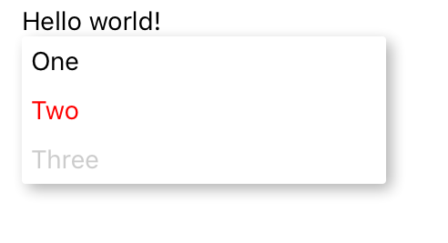
# Examples ## Basic menu [BasicExample](../examples/BasicExample.js): Most basic example showing menu in its uncontrolled form where menu automatically opens once user click the trigger or as a result of imperative API. ![basic](img/basic.png) ```js alert(`Selected number: ${value}`)}> Two ``` Both `MenuTrigger` and `MenuOption` can have arbitrary children so you have full power over its styling. Attribute `text` is just simple shorthand for `Text` child as it is the most common case. ## Per option action Actions (`onSelect`) can be attached also directly to specific `MenuOption` if you don't share logic between different options. In fact you can combine both approaches and have some actions attached to a menu option and rest will be handled by "global" [`Menu`](./api.md#menu) `onSelect` prop. ```js this.toggleHighlight(l.id)} text={l.highlighted ? 'Unhighlight' : 'Highlight'} /> this.deleteLogItem(l.id)} text='Delete' /> ``` Not all children of `MenuOptions` must be a menu options (e.g. use it as a menu separator/divider) ## Declarative menu [ControlledExample](../examples/ControlledExample.js): Menu can be controlled also declaratively via properties. ```js this.onBackdropPress()} onSelect={value => this.onOptionSelect(value)}> this.onTriggerPress()} text='Select option'/> ``` ## Slide in menu [Example](../examples/Example.js): In addition to default popup menu, menu (options) can slide in from bottom of the screen. ```js import { renderers } from 'react-native-popup-menu'; const { SlideInMenu } = renderers; ... this.selectNumber(value)}> Slide-in menu... ``` You can select one of our provided `renderers` or you can write your own renderer. This allow you to define animations, position of menu and much more. Renderer can be set on menu level or globally via `Menu.setDefaultRenderer`. For more details see [extensions](extensions.md) documentation. ## Custom menu options [ExtensionExample](../examples/ExtensionExample.js): You can also define your own `MenuOption`s if you want to use more complex options often. Another nice use case is to have menu options with icons. ![checked](img/checked.png) ```js ... const CheckedOption = (props) => ( ) ``` ## Menu within scroll view If you want to display menu options in scroll view, simply wrap all menu options with `` component. For example: ```js ... ``` You can also check our [FlatListExample](../examples/FlatListExample.js). ## Styled menu [StylingExample](../examples/StylingExample.js): Although you can style options and triggers directly via its children, you can achieve almost any styling `customStyles` property on various levels. ![styled](img/styled.png) ```js this.setState({renderer: ContextMenu})}/> this.setState({renderer: SlideInMenu})}/> alert('Selected custom styled option')} /> Four (disabled) ... const triggerStyles = { triggerText: { color: 'white', }, triggerWrapper: { padding: 5, backgroundColor: 'blue', }, triggerTouchable: { underlayColor: 'darkblue', activeOpacity: 70, }, TriggerTouchableComponent: TouchableHighlight, }; ``` For exact definitions of `customStyles` please refer to [API](api.md). Also note that `MenuOption` can have either `value` or directly attached `onSelect` handler as in this case. More examples can be found in [examples](../examples/) directory.