Visualize Density Distribution by Heatmap
densityHeatmap.RdVisualize Density Distribution by Heatmap
densityHeatmap(data,
    density_param = list(na.rm = TRUE),

    col = rev(brewer.pal(11, "Spectral")),
    color_space = "LAB",
    ylab = deparse(substitute(data)),
    column_title = paste0("Density heatmap of ", deparse(substitute(data))),
    title = column_title,
    ylim = NULL,
    range = ylim,

    title_gp = gpar(fontsize = 14),
    ylab_gp = gpar(fontsize = 12),
    tick_label_gp = gpar(fontsize = 10),
    quantile_gp = gpar(fontsize = 10),
    show_quantiles = TRUE,

    column_order = NULL,
    column_names_side = "bottom",
    show_column_names = TRUE,
    column_names_max_height = unit(6, "cm"),
    column_names_gp = gpar(fontsize = 12),
    column_names_rot = 90,

    cluster_columns = FALSE,
    clustering_distance_columns = "ks",
    clustering_method_columns = "complete",
    mc.cores = 1,

    ...)
Arguments
| data | A matrix or a list. If it is a matrix, density is calculated by columns. |
|---|---|
| density_param | Parameters send to |
| col | A vector of colors that density values are mapped to. |
| color_space | The color space in which colors are interpolated. Pass to |
| ylab | Label on y-axis. |
| column_title | Title of the heatmap. |
| title | Same as |
| ylim | Ranges on the y-axis. |
| range | Same as |
| title_gp | Graphic parameters for title. |
| ylab_gp | Graphic parameters for y-labels. |
| tick_label_gp | Graphic parameters for y-ticks. |
| quantile_gp | Graphic parameters for the quantiles. |
| show_quantiles | Whether show quantile lines. |
| column_order | Order of columns. |
| column_names_side | Pass to |
| show_column_names | Pass to |
| column_names_max_height | Pass to |
| column_names_gp | Pass to |
| column_names_rot | Pass to |
| cluster_columns | Whether cluster columns? |
| clustering_distance_columns | There is a specific distance method |
| clustering_method_columns | Pass to |
| mc.cores | Multiple cores for calculating ks distance. |
| ... | Pass to |
Details
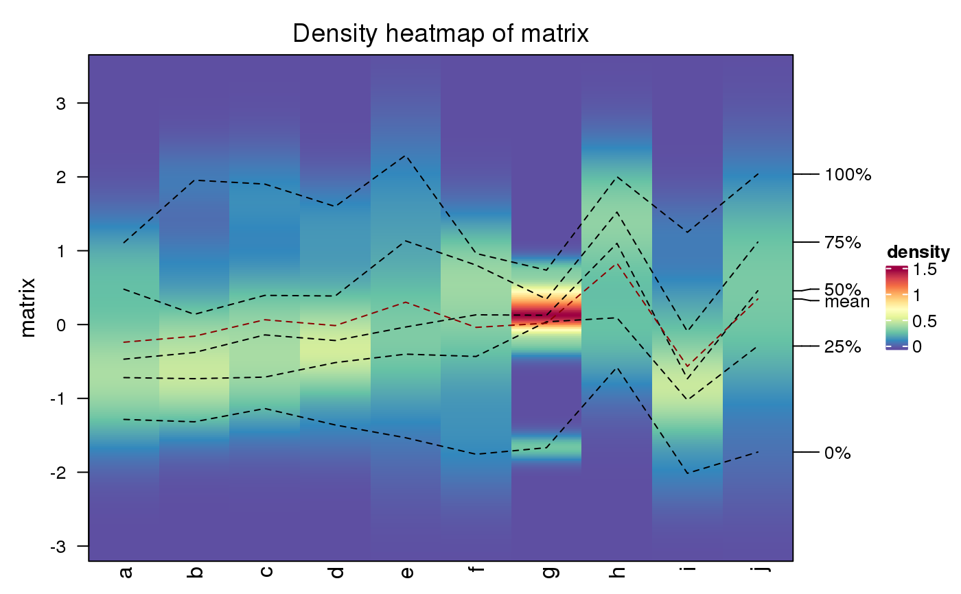
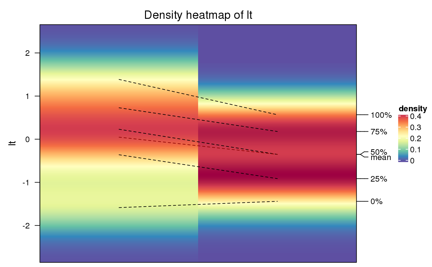
To visualize data distribution in a matrix or in a list, we normally use
boxplot or violinplot. We can also use colors to map the density values and
visualize distribution of values through a heatmap. It is useful if you have
huge number of columns in data to visualize.
The density matrix is generated with 500 rows ranging between the maximun and minimal values in all densities.
Value
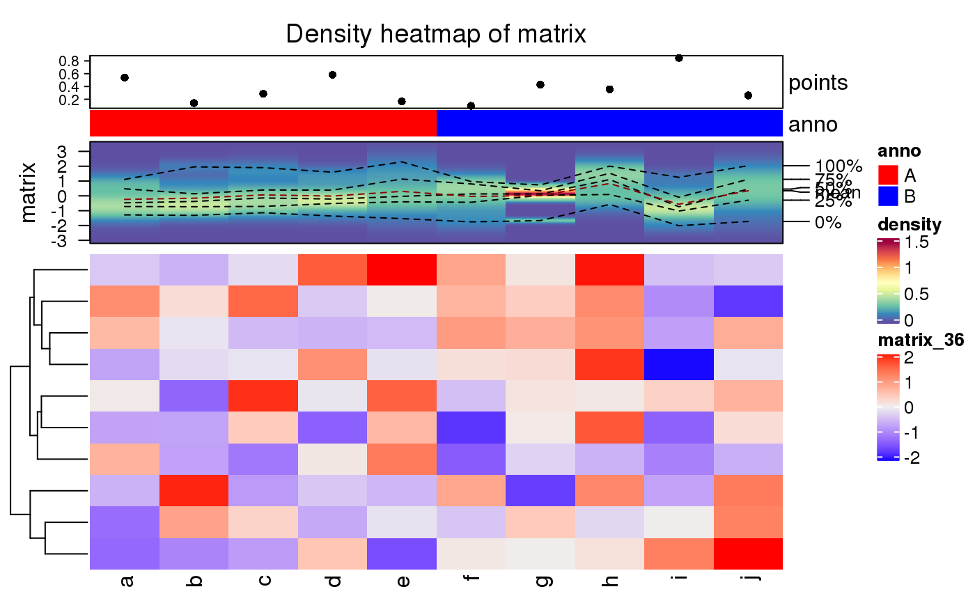
A Heatmap-class object. It can oly add other heatmaps/annotations vertically.
See also
https://jokergoo.github.io/ComplexHeatmap-reference/book/other-high-level-plots.html#density-heatmap
Examples
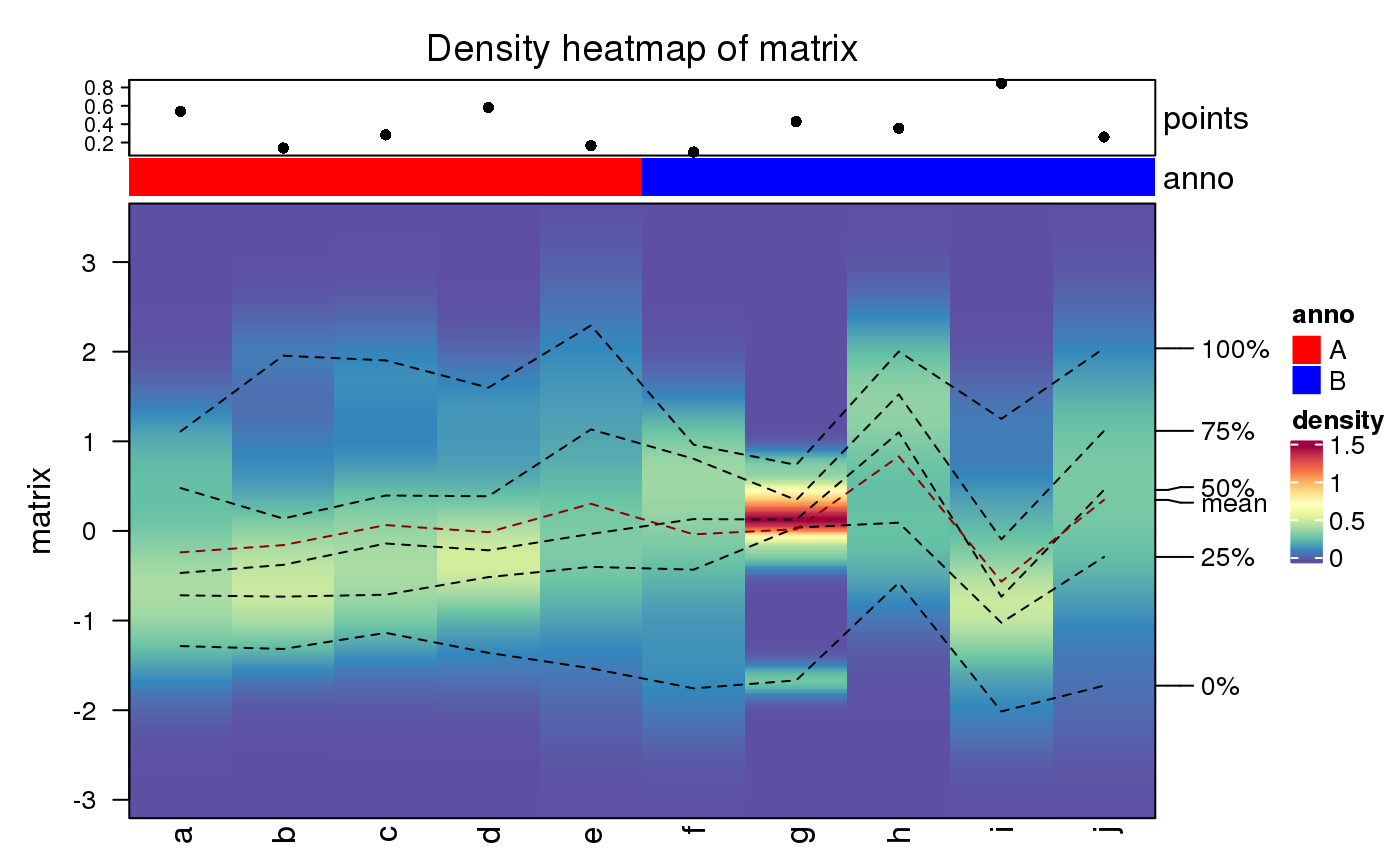
ha = HeatmapAnnotation(points = anno_points(runif(10)), anno = rep(c("A", "B"), each = 5), col = list(anno = c("A" = "red", "B" = "blue"))) densityHeatmap(matrix, top_annotation = ha)


