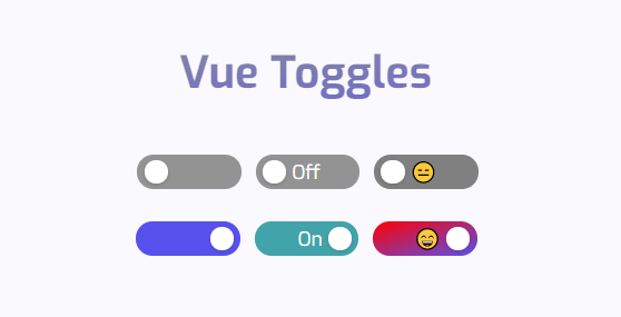
A highly customizable and accessible toggle component for Vue 3.
## Introduction
Vue Toggles comes out of the box with accessibility support for:
- `aria-checked` depending on state
- `aria-readonly` if the toggle is disabled
- `prefers-reduced-motion` if the user has requested any type of motion reduction [[prefers-reduced-motion](https://developer.mozilla.org/en-US/docs/Web/CSS/@media/prefers-reduced-motion)]
### Accessibility
What's left for you, when it comes to accessibility, is labeling the toggle correctly. This is either done by:
- A `` followed by the toggle component ``
- Or an `aria-label`, for example ``. Remember, you still need a visual text description of what the toggle does
The focus-style is also left up to you - which you shouldn't remove. If you think the default is ugly, style it yourself!
## Installation
```
npm i vue-toggles
```
### Import component
```javascript
import { VueToggles } from "vue-toggles";
```
### Import types
```javascript
import type { VueTogglesProps } from "vue-toggles";
```
```javascript
import VueToggles, { type VueTogglesProps } from "vue-toggles";
```
## Usage
The toggle is very easy to use out of the box. The bare minimum for it to work is a `@click`-function and a `:value`-prop.
```html
```
Or if you prefer the `v-model`-syntax:
```html
```
## Options
You can also add more props to customize things like color and width/height.
```html
```
## Properties
| Name | Type | Default | Description |
| ------------------ | ------- | --------- | ------------------------------------------------- |
| value | Boolean | `false` | Initial state of the toggle button |
| disabled | Boolean | `false` | Toggle does not react on mouse or keyboard events |
| reverse | Boolean | `false` | Reverse toggle to Right to Left |
| width | Number | `75` | Width of the toggle in `px` |
| height | Number | `25` | Height of the toggle in `px` |
| dotColor | String | `#ffffff` | Color of the toggle dot |
| dotSize | Number | `0` | Dot size in `px` |
| checkedBg | String | `#5850ec` | Background color when the toggle is checked |
| uncheckedBg | String | `#939393` | Background color when the toggle is unchecked |
| checkedTextColor | String | `#ffffff` | Text color when the toggle is checked |
| uncheckedTextColor | String | `#ffffff` | Text color when the toggle is unchecked |
| uncheckedText | String | `""` | Optional text when the toggle is unchecked |
| checkedText | String | `""` | Optional text when the toggle is checked |
| fontSize | Number | `12` | Font size in `px` |
| fontWeight | String | `normal` | Font weight |
## Vue 2 support
If you're looking for Vue 2 support, the `1.1.4`version is available [here](https://www.npmjs.com/package/vue-toggles/v/1.1.4).
## License
[MIT](http://opensource.org/licenses/MIT)