## Components - sample walkthrough, part 2
Let's take a look at another similar example of using Aurora commands.
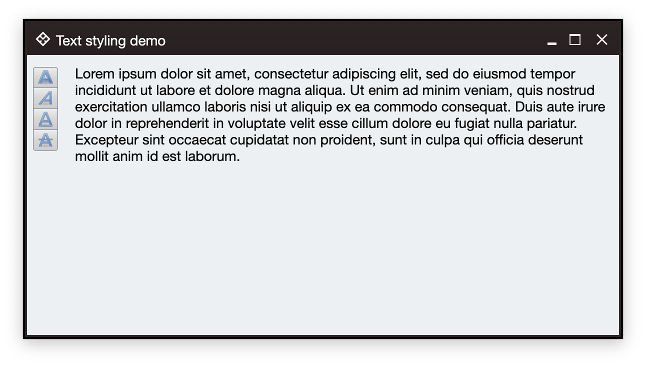 The setup has the same multiline text area and a vertical button strip with four buttons. Each button corresponds to bold, italic, underline and strikethrough content style. When clicked, the presence of the matching style is toggled. For code brevity, each style is applied on the whole text, and not on individual spans.
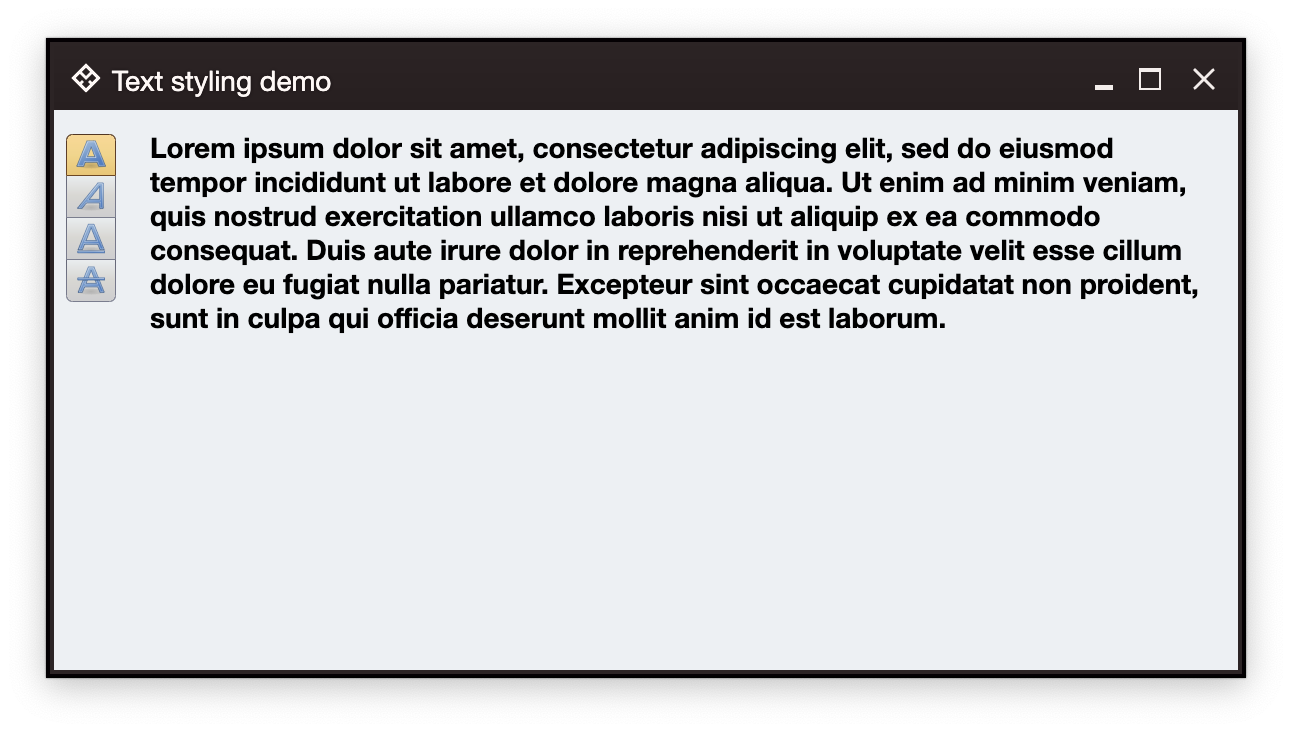
For example, clicking the bold button shows this:
The setup has the same multiline text area and a vertical button strip with four buttons. Each button corresponds to bold, italic, underline and strikethrough content style. When clicked, the presence of the matching style is toggled. For code brevity, each style is applied on the whole text, and not on individual spans.
For example, clicking the bold button shows this:
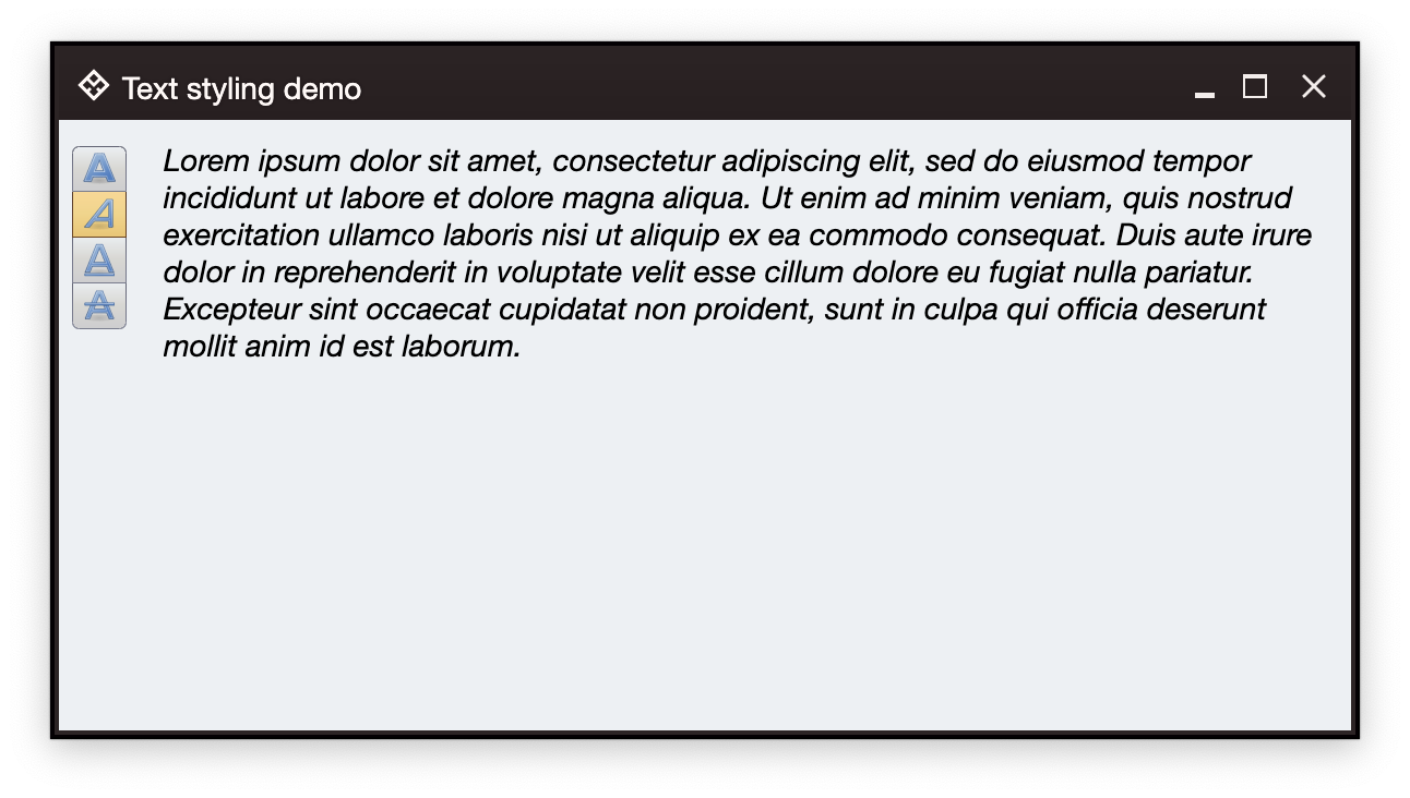
 And then clicking the italic button shows this:
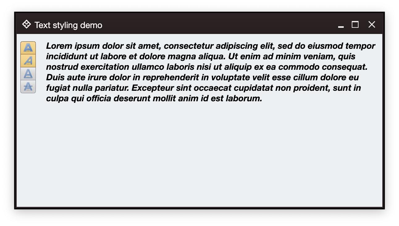 Note how both bold and italic buttons show up as selected.
### Content setup
As before, we start with the overall definition of our application and window content:
```kotlin
fun main() = auroraApplication {
val state = rememberWindowState(
placement = WindowPlacement.Floating,
position = WindowPosition.Aligned(Alignment.Center),
size = DpSize(600.dp, 320.dp)
)
AuroraWindow(
skin = marinerSkin(),
title = "Text styling demo",
icon = radiance_menu(),
iconFilterStrategy = IconFilterStrategy.ThemedFollowText,
state = state,
windowTitlePaneConfiguration = AuroraWindowTitlePaneConfigurations.AuroraPlain(),
onCloseRequest = ::exitApplication,
) {
// Here we'll have our data models
Row(
modifier = Modifier.fillMaxSize().padding(6.dp),
horizontalArrangement = Arrangement.spacedBy(12.dp)
) {
// Here we'll have the box for the buttons
// And here we'll have the TextFieldValueProjection
}
}
}
```
For the data models, we start with setting up our `TextFieldValue`:
```kotlin
val text = "Lorem ipsum dolor sit amet, consectetur adipiscing elit, sed do eiusmod " +
"tempor incididunt ut labore et dolore magna aliqua. Ut enim ad minim" +
" veniam, quis nostrud exercitation ullamco laboris nisi ut aliquip " +
"ex ea commodo consequat. Duis aute irure dolor in reprehenderit in " +
"voluptate velit esse cillum dolore eu fugiat nulla pariatur. " +
"Excepteur sint occaecat cupidatat non proident, sunt in culpa qui " +
"officia deserunt mollit anim id est laborum."
var bold by remember { mutableStateOf(false) }
var italic by remember { mutableStateOf(false) }
var underline by remember { mutableStateOf(false) }
var strikethrough by remember { mutableStateOf(false) }
val spanStyle by derivedStateOf {
SpanStyle(
fontWeight = if (bold) FontWeight.Bold else FontWeight.Normal,
fontStyle = if (italic) FontStyle.Italic else FontStyle.Normal,
textDecoration = when {
underline && strikethrough -> TextDecoration.combine(
listOf(TextDecoration.Underline, TextDecoration.LineThrough)
)
underline -> TextDecoration.Underline
strikethrough -> TextDecoration.LineThrough
else -> null
}
)
}
val textFieldValue by derivedStateOf {
TextFieldValue(
annotatedString = AnnotatedString(
text = text,
spanStyle = spanStyle
)
)
}
```
Here, we have a block of text (note that in this example the text area is again not going to be editable, so we do not use `mutableStateOf` for the text itself). In this demo we are going to be changing the individual style bits (bold, italic, underline, strikethrough), so we set up a mutable variable for each one, then use `derivedStateOf` to wrap a correspondingly configured `SpanStyle`, and finish with a `derivedStateOf` to wrap our `TextFieldValue`. Whenever the any of the basic styling boolean bits changes, that change will cause recomposition and update of `spanStyle` and `textFieldValue`.
In order to add our read-only text area, we use Aurora's text field projection:
```kotlin
TextFieldValueProjection(
contentModel = TextFieldValueContentModel(
value = textFieldValue,
readOnly = true,
onValueChange = {}
),
presentationModel = TextFieldPresentationModel(showBorder = false)
).project(modifier = Modifier.weight(1.0f, true))
```
And now let's take a look at configuring and displaying the command buttons that will change the style bits.
### Commands
We start with our commands
```kotlin
// Bold style command
val commandBold = Command(
text = "Bold",
icon = format_text_bold(),
isActionToggle = true,
isActionToggleSelected = bold,
onTriggerActionToggleSelectedChange = { bold = it }
)
// Italic style command
val commandItalic = Command(
text = "Italic",
icon = format_text_italic(),
isActionToggle = true,
isActionToggleSelected = italic,
onTriggerActionToggleSelectedChange = { italic = it }
)
// Underline style command
val commandUnderline = Command(
text = "Underline",
icon = format_text_underline(),
isActionToggle = true,
isActionToggleSelected = underline,
onTriggerActionToggleSelectedChange = { underline = it }
)
// Strikethrough style command
val commandStrikethrough = Command(
text = "Strikethrough",
icon = format_text_strikethrough(),
isActionToggle = true,
isActionToggleSelected = strikethrough,
onTriggerActionToggleSelectedChange = { strikethrough = it }
)
```
Each one is mapped to configure its current `isActionToggleSelected` state based on the presense of the matching style bit, as well as updating that bit in the `onTriggerActionToggleSelectedChange` lambda.
Whenever one of these buttons is clicked, its lambda updates the underlying boolean variable, which causes the recomposition and update of the button itself, as well as the text area itself with the newly updated span style:
Note how both bold and italic buttons show up as selected.
### Content setup
As before, we start with the overall definition of our application and window content:
```kotlin
fun main() = auroraApplication {
val state = rememberWindowState(
placement = WindowPlacement.Floating,
position = WindowPosition.Aligned(Alignment.Center),
size = DpSize(600.dp, 320.dp)
)
AuroraWindow(
skin = marinerSkin(),
title = "Text styling demo",
icon = radiance_menu(),
iconFilterStrategy = IconFilterStrategy.ThemedFollowText,
state = state,
windowTitlePaneConfiguration = AuroraWindowTitlePaneConfigurations.AuroraPlain(),
onCloseRequest = ::exitApplication,
) {
// Here we'll have our data models
Row(
modifier = Modifier.fillMaxSize().padding(6.dp),
horizontalArrangement = Arrangement.spacedBy(12.dp)
) {
// Here we'll have the box for the buttons
// And here we'll have the TextFieldValueProjection
}
}
}
```
For the data models, we start with setting up our `TextFieldValue`:
```kotlin
val text = "Lorem ipsum dolor sit amet, consectetur adipiscing elit, sed do eiusmod " +
"tempor incididunt ut labore et dolore magna aliqua. Ut enim ad minim" +
" veniam, quis nostrud exercitation ullamco laboris nisi ut aliquip " +
"ex ea commodo consequat. Duis aute irure dolor in reprehenderit in " +
"voluptate velit esse cillum dolore eu fugiat nulla pariatur. " +
"Excepteur sint occaecat cupidatat non proident, sunt in culpa qui " +
"officia deserunt mollit anim id est laborum."
var bold by remember { mutableStateOf(false) }
var italic by remember { mutableStateOf(false) }
var underline by remember { mutableStateOf(false) }
var strikethrough by remember { mutableStateOf(false) }
val spanStyle by derivedStateOf {
SpanStyle(
fontWeight = if (bold) FontWeight.Bold else FontWeight.Normal,
fontStyle = if (italic) FontStyle.Italic else FontStyle.Normal,
textDecoration = when {
underline && strikethrough -> TextDecoration.combine(
listOf(TextDecoration.Underline, TextDecoration.LineThrough)
)
underline -> TextDecoration.Underline
strikethrough -> TextDecoration.LineThrough
else -> null
}
)
}
val textFieldValue by derivedStateOf {
TextFieldValue(
annotatedString = AnnotatedString(
text = text,
spanStyle = spanStyle
)
)
}
```
Here, we have a block of text (note that in this example the text area is again not going to be editable, so we do not use `mutableStateOf` for the text itself). In this demo we are going to be changing the individual style bits (bold, italic, underline, strikethrough), so we set up a mutable variable for each one, then use `derivedStateOf` to wrap a correspondingly configured `SpanStyle`, and finish with a `derivedStateOf` to wrap our `TextFieldValue`. Whenever the any of the basic styling boolean bits changes, that change will cause recomposition and update of `spanStyle` and `textFieldValue`.
In order to add our read-only text area, we use Aurora's text field projection:
```kotlin
TextFieldValueProjection(
contentModel = TextFieldValueContentModel(
value = textFieldValue,
readOnly = true,
onValueChange = {}
),
presentationModel = TextFieldPresentationModel(showBorder = false)
).project(modifier = Modifier.weight(1.0f, true))
```
And now let's take a look at configuring and displaying the command buttons that will change the style bits.
### Commands
We start with our commands
```kotlin
// Bold style command
val commandBold = Command(
text = "Bold",
icon = format_text_bold(),
isActionToggle = true,
isActionToggleSelected = bold,
onTriggerActionToggleSelectedChange = { bold = it }
)
// Italic style command
val commandItalic = Command(
text = "Italic",
icon = format_text_italic(),
isActionToggle = true,
isActionToggleSelected = italic,
onTriggerActionToggleSelectedChange = { italic = it }
)
// Underline style command
val commandUnderline = Command(
text = "Underline",
icon = format_text_underline(),
isActionToggle = true,
isActionToggleSelected = underline,
onTriggerActionToggleSelectedChange = { underline = it }
)
// Strikethrough style command
val commandStrikethrough = Command(
text = "Strikethrough",
icon = format_text_strikethrough(),
isActionToggle = true,
isActionToggleSelected = strikethrough,
onTriggerActionToggleSelectedChange = { strikethrough = it }
)
```
Each one is mapped to configure its current `isActionToggleSelected` state based on the presense of the matching style bit, as well as updating that bit in the `onTriggerActionToggleSelectedChange` lambda.
Whenever one of these buttons is clicked, its lambda updates the underlying boolean variable, which causes the recomposition and update of the button itself, as well as the text area itself with the newly updated span style:
 ### Command strip
The same way as in our first example, we are now ready to create the content model and the presentation model for our command button strip:
```kotlin
CommandButtonStripProjection(
contentModel = CommandGroup(
commands = listOf(
commandBold,
commandItalic,
commandUnderline,
commandStrikethrough
)
),
presentationModel = CommandStripPresentationModel(
orientation = StripOrientation.Vertical,
commandPresentationState = CommandButtonPresentationState.Small,
horizontalGapScaleFactor = 0.75f
)
).project()
```
### Next
Continue to the [command overview](Command.md).
### Command strip
The same way as in our first example, we are now ready to create the content model and the presentation model for our command button strip:
```kotlin
CommandButtonStripProjection(
contentModel = CommandGroup(
commands = listOf(
commandBold,
commandItalic,
commandUnderline,
commandStrikethrough
)
),
presentationModel = CommandStripPresentationModel(
orientation = StripOrientation.Vertical,
commandPresentationState = CommandButtonPresentationState.Small,
horizontalGapScaleFactor = 0.75f
)
).project()
```
### Next
Continue to the [command overview](Command.md).