## Components - box with highlights
`AuroraBoxWithHighlights` is a special container provided by Aurora that does not use projections. The primary purpose of this container is to provide a way to apply selection and rollover highlights on complex content that behaves as a single unit.
### Example
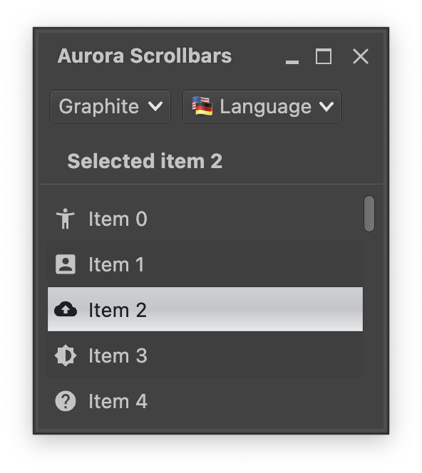 Every row in this vertical list is an `AuroraBoxWithHighlights`. Selection and rollover state facets are applied on the label - compare the light-on-dark visuals of unselected rows vs the dark-on-light visuals of the selected one.
Let's take a look at the moving parts. First we start with managing state, one for the lazy list and one for the selected index:
```kotlin
val lazyListState = rememberLazyListState()
val stateSelection = mutableStateOf(-1)
```
Next we get the `MessageFormat` object for fetching the locale-aware texts of each row:
```kotlin
val commandMf = MessageFormat(resourceBundle.getString("Group.entrySimple"))
```
And now the scrollable content itself that uses `AuroraBoxWithHighlights` to wrap the content of each row:
```kotlin
Box(modifier = Modifier.fillMaxSize().padding(6.dp)) {
val itemsList = (0 until itemCount).toList()
val backgroundColorTokens = AuroraSkin.colors.getNeutralContainerTokens(
decorationAreaType = AuroraSkin.decorationAreaType)
val backgroundEvenRows = backgroundColorTokens.containerSurface
val backgroundOddRows = if (backgroundColorTokens.isDark) {
backgroundColorTokens.containerSurfaceHigh
} else {
backgroundColorTokens.containerSurfaceLow
}
LazyColumn(
modifier = Modifier.fillMaxSize()
.padding(end = ScrollBarSizingConstants.DefaultScrollBarThickness),
state = lazyListState
) {
itemsIndexed(itemsList) { index, item ->
AuroraBoxWithHighlights(
modifier = Modifier.fillMaxWidth().height(32.dp)
.background(if (index % 2 == 0) backgroundEvenRows else backgroundOddRows),
selected = (stateSelection.value == item),
onClick = { stateSelection.value = item },
sides = Sides.ClosedRectangle,
content = {
LabelProjection(
contentModel = LabelContentModel(
text = commandMf.format(arrayOf(index)),
icon = icons[item % icons.size]
),
presentationModel = LabelPresentationModel(
inheritStateFromParent = true,
iconEnabledFilterStrategy = IconFilterStrategy.ThemedFollowText,
horizontalGapScaleFactor = 2.0f
)
).project()
}
)
}
}
AuroraVerticalScrollbar(
modifier = Modifier.align(Alignment.CenterEnd).fillMaxHeight(),
adapter = rememberScrollbarAdapter(scrollState = lazyListState)
)
}
```
Let's take a closer look at all the parts:
- The top-level container is a `Box` that has two child composables, `LazyColumn` for the scrollable content and `AuroraVerticalScrollbar` for the scrollbar. Note the `Modifier.padding(end)` on the `LazyColumn` that "reserves" the space for the vertical scroll bar, and the usage of our `lazyListState` to keep the vertical scroll bar in sync with the current scroll state.
- Each item in the list is a wrapped `LabelProjection`. Note the `inheritStateFromParent=true` attribute on the presentation model that instructs Aurora to propagate the state (selected and rollover facets) from the wrapper down to the label projection, and the usage of `IconFilterStrategy.ThemedFollowText` to keep the icon painted in the same color as the label text.
- The wrapper around each label projection is our `AuroraBoxWithHighlights`. Note how it syncs its `selected` attribute with the `stateSelection` state variable, and then updates that state variable in `onClick` lambda.
### Next
Continue to [context menu](ContextMenu.md).
Every row in this vertical list is an `AuroraBoxWithHighlights`. Selection and rollover state facets are applied on the label - compare the light-on-dark visuals of unselected rows vs the dark-on-light visuals of the selected one.
Let's take a look at the moving parts. First we start with managing state, one for the lazy list and one for the selected index:
```kotlin
val lazyListState = rememberLazyListState()
val stateSelection = mutableStateOf(-1)
```
Next we get the `MessageFormat` object for fetching the locale-aware texts of each row:
```kotlin
val commandMf = MessageFormat(resourceBundle.getString("Group.entrySimple"))
```
And now the scrollable content itself that uses `AuroraBoxWithHighlights` to wrap the content of each row:
```kotlin
Box(modifier = Modifier.fillMaxSize().padding(6.dp)) {
val itemsList = (0 until itemCount).toList()
val backgroundColorTokens = AuroraSkin.colors.getNeutralContainerTokens(
decorationAreaType = AuroraSkin.decorationAreaType)
val backgroundEvenRows = backgroundColorTokens.containerSurface
val backgroundOddRows = if (backgroundColorTokens.isDark) {
backgroundColorTokens.containerSurfaceHigh
} else {
backgroundColorTokens.containerSurfaceLow
}
LazyColumn(
modifier = Modifier.fillMaxSize()
.padding(end = ScrollBarSizingConstants.DefaultScrollBarThickness),
state = lazyListState
) {
itemsIndexed(itemsList) { index, item ->
AuroraBoxWithHighlights(
modifier = Modifier.fillMaxWidth().height(32.dp)
.background(if (index % 2 == 0) backgroundEvenRows else backgroundOddRows),
selected = (stateSelection.value == item),
onClick = { stateSelection.value = item },
sides = Sides.ClosedRectangle,
content = {
LabelProjection(
contentModel = LabelContentModel(
text = commandMf.format(arrayOf(index)),
icon = icons[item % icons.size]
),
presentationModel = LabelPresentationModel(
inheritStateFromParent = true,
iconEnabledFilterStrategy = IconFilterStrategy.ThemedFollowText,
horizontalGapScaleFactor = 2.0f
)
).project()
}
)
}
}
AuroraVerticalScrollbar(
modifier = Modifier.align(Alignment.CenterEnd).fillMaxHeight(),
adapter = rememberScrollbarAdapter(scrollState = lazyListState)
)
}
```
Let's take a closer look at all the parts:
- The top-level container is a `Box` that has two child composables, `LazyColumn` for the scrollable content and `AuroraVerticalScrollbar` for the scrollbar. Note the `Modifier.padding(end)` on the `LazyColumn` that "reserves" the space for the vertical scroll bar, and the usage of our `lazyListState` to keep the vertical scroll bar in sync with the current scroll state.
- Each item in the list is a wrapped `LabelProjection`. Note the `inheritStateFromParent=true` attribute on the presentation model that instructs Aurora to propagate the state (selected and rollover facets) from the wrapper down to the label projection, and the usage of `IconFilterStrategy.ThemedFollowText` to keep the icon painted in the same color as the label text.
- The wrapper around each label projection is our `AuroraBoxWithHighlights`. Note how it syncs its `selected` attribute with the `stateSelection` state variable, and then updates that state variable in `onClick` lambda.
### Next
Continue to [context menu](ContextMenu.md).