## Components - command popup menus
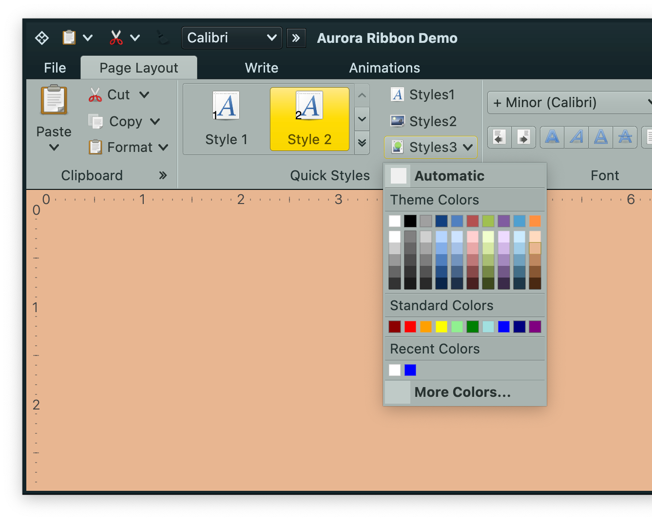 A projection of a color selector command is a popup button ("Styles3" button in the screenshot above) that displays a popup menu with regular commands and additional, optional three color selector panels:
- color section with derived colors
- regular color section
- color section with recently selected colors
### Content model
`ColorSelectorCommand` is the content model for color selector commands. It extends the [core `BaseCommand`](Command.md) content model. Thus anything that can be configured on a regular command (text, icon factory, etc) can be configured on a color selector command.
Its secondary (popup) content model is of type `ColorSelectorMenuContentModel`. Let's take a look at the content model for the color selector popup menu.
### Color selector popup menu content model
The constructor of `ColorSelectorMenuContentModel` accepts a list of `ColorSelectorPopupMenuEntry` objects. It's a sealed interface with four data classes that implement it:
- `ColorSelectorPopupMenuCommand` - wraps a regular command. In the screenshot above, the leading "Automatic" and the trailing "More colors" are regular commands. - `ColorSelectorPopupMenuSection` - a single row of color selector cells. In the screenshot above it can be seen in the "Standard Colors" section.
- `ColorSelectorPopupMenuSectionWithDerived` - a grid of color selector cells. In the screenshot above it can be seen in the "Theme Colors" section.
- `ColorSelectorPopupMenuRecentsSection` - a single row of selector cells based on recently selected colors.
### Color activation and preview listeners
Same as with [command action](Command.md#action) and [command action preview](Command.md#action-preview), the `ColorSelectorMenuContentModel` has APIs for the application code to be notified on user previewing and activating colors in the color selector popup menu.
For preview color events, the following interface is used:
```kotlin
interface ColorPreviewListener {
/**
* Invoked when the preview of a color in any of the color sections of this model is
* activated.
*
* @param color Color for which the preview has been activated.
*/
fun onColorPreviewActivated(color: Color)
/**
* Invoked when the color preview has been canceled.
*/
fun onColorPreviewCanceled(color: Color)
}
```
For activation color events, the `(Color) -> Unit` interface is used
### Sample code
A projection of a color selector command is a popup button ("Styles3" button in the screenshot above) that displays a popup menu with regular commands and additional, optional three color selector panels:
- color section with derived colors
- regular color section
- color section with recently selected colors
### Content model
`ColorSelectorCommand` is the content model for color selector commands. It extends the [core `BaseCommand`](Command.md) content model. Thus anything that can be configured on a regular command (text, icon factory, etc) can be configured on a color selector command.
Its secondary (popup) content model is of type `ColorSelectorMenuContentModel`. Let's take a look at the content model for the color selector popup menu.
### Color selector popup menu content model
The constructor of `ColorSelectorMenuContentModel` accepts a list of `ColorSelectorPopupMenuEntry` objects. It's a sealed interface with four data classes that implement it:
- `ColorSelectorPopupMenuCommand` - wraps a regular command. In the screenshot above, the leading "Automatic" and the trailing "More colors" are regular commands. - `ColorSelectorPopupMenuSection` - a single row of color selector cells. In the screenshot above it can be seen in the "Standard Colors" section.
- `ColorSelectorPopupMenuSectionWithDerived` - a grid of color selector cells. In the screenshot above it can be seen in the "Theme Colors" section.
- `ColorSelectorPopupMenuRecentsSection` - a single row of selector cells based on recently selected colors.
### Color activation and preview listeners
Same as with [command action](Command.md#action) and [command action preview](Command.md#action-preview), the `ColorSelectorMenuContentModel` has APIs for the application code to be notified on user previewing and activating colors in the color selector popup menu.
For preview color events, the following interface is used:
```kotlin
interface ColorPreviewListener {
/**
* Invoked when the preview of a color in any of the color sections of this model is
* activated.
*
* @param color Color for which the preview has been activated.
*/
fun onColorPreviewActivated(color: Color)
/**
* Invoked when the color preview has been canceled.
*/
fun onColorPreviewCanceled(color: Color)
}
```
For activation color events, the `(Color) -> Unit` interface is used
### Sample code
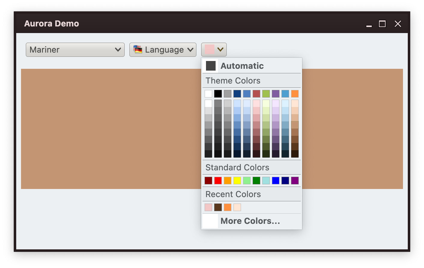 First let's take a look at the functionality that we see in this screenshot, and then get to the code behind it.
- We have a small popup button that displays a color selector popup menu with five sections - "automatic" with hard-coded color, a grid of color selector cells based on "theme" colors, a single row of "standard" colors, another row of "recent" colors and a command that brings up a `JColorChooser`.
- Any color selected in the popup is automatically added to the "recent" color section.
- Any color selected in the popup also updates the background of the main panel.
- Any color selected in the popup also updates the icon of our popup button.
- Moving the mouse over any color cell in the popup menu shows the preview of that color - temporarily changing the background fill of the main panel for as long as that cell is under the mouse cursor. When the mouse moves out, the main panel reverts its background to the previous value.
#### Button icon
First we have a custom implementation of the `Painter` interface that paints a square fill with the color passed to the constructor:
```kotlin
class ColorSolidIcon(val color: Color) : Painter() {
override val intrinsicSize: Size
get() = Size.Unspecified
override fun DrawScope.onDraw() {
drawRect(
color = color,
topLeft = Offset.Zero,
size = size,
style = Fill
)
}
}
```
#### Color preview and activation synchronization
Now, let's set up our panel and wire color preview and activation events to update the backround fill of the panel, as well as the button icon:
```kotlin
@Stable
data class ColorData(
val isInPreview: Boolean,
val permanentColor: Color,
val previewColor: Color,
)
var colorData by remember {
mutableStateOf(
ColorData(
isInPreview = false,
permanentColor = Color.White,
previewColor = Color.White
)
)
}
val colorActivationListener: (Color) -> Unit = {
colorData = colorData.copy(
isInPreview = false,
permanentColor = it
)
}
val colorPreviewListener = object : ColorPreviewListener {
override fun onColorPreviewActivated(color: Color) {
colorData = colorData.copy(
isInPreview = true,
previewColor = color
)
}
override fun onColorPreviewCanceled(color: Color) {
// Handle the case where the user moves the mouse between color cells,
// and we get color preview cancel on the old cell after color preview
// activation on the new cell. Detect this by looking at the color we are
// getting in this cancellation and comparing it with the current preview
// color in our data model. If they don't match, don't do anything.
if (colorData.isInPreview && (colorData.previewColor == color)) {
colorData = colorData.copy(isInPreview = false)
}
}
}
ColorSelectorButton(
permanentColor = colorData.permanentColor,
colorActivationListener = colorActivationListener,
colorPreviewListener = colorPreviewListener,
resourceBundle = resourceBundle
)
// Animate color to preview / permanent based on the preview state
val color = animateColorAsState(
targetValue = if (colorData.isInPreview) colorData.previewColor else colorData.permanentColor
)
Canvas(modifier = Modifier.height(200.dp).fillMaxWidth()) {
drawRect(
color = color.value,
topLeft = Offset.Zero,
size = size,
style = Fill
)
}
```
What do we have here?
- Our `colorActivationListener` updates the remembered `colorData` with the new value for its `permanentColor` field. That, in turn, triggers the color animation with the new permanent color, and then recomposition of our `Canvas` to be drawn with the new color selection. It also triggers the recomposition of the `ColorSelectorButton` with the newly updated permanent color.
- Our `colorPreviewListener` updates the remembered `colorData` with the new value for its `previewColor` field. That, in turn, triggers the color animation with the new preview color, and then recomposition of our `Canvas` to be drawn with the new color selection.
Now we are ready to configure the color selector popup menu.
#### Adding the "automatic" color command
```kotlin
private val DefaultColor = Color.DarkGray
val defaultColorCommand = Command(
text = resourceBundle.getString("ColorSelector.textAutomatic"),
icon = ColorSolidIcon(DefaultColor),
action = {
colorActivationListener.invoke(DefaultColor)
RecentlyUsedColors.addToRecentlyUsed(DefaultColor)
},
actionPreview = object : CommandActionPreview {
override fun onCommandPreviewActivated(command: BaseCommand) {
colorPreviewListener.onColorPreviewActivated(DefaultColor)
}
override fun onCommandPreviewCanceled(command: BaseCommand) {
colorPreviewListener.onColorPreviewCanceled(DefaultColor)
}
}
)
val selectorModel = ColorSelectorMenuContentModel(
entries = listOf(
ColorSelectorPopupMenuCommand(defaultColorCommand),
...
),
onColorActivated = colorActivationListener,
onColorPreviewActivated = colorPreviewListener
)
```
Here we have a `Command` that is configured with:
- `icon` to use the `ColorSolidIcon` with the default panel color
- `action` to explicitly activate our color activation listener with the default panel color, and add that color to recently used
- `actionPreview` to explicitly activate our color preview listener
And then wrap this command in a `ColorSelectorPopupMenuCommand` and pass it to the `ColorSelectorMenuContentModel` constructor.
#### Adding a color section with a grid of derived colors
```kotlin
val selectorModel = ColorSelectorMenuContentModel(
entries = listOf(
...
ColorSelectorPopupMenuSectionWithDerived(
title = resourceBundle.getString("ColorSelector.textThemeCaption"),
colors = listOf(
Color(255, 255, 255), Color(0, 0, 0),
Color(160, 160, 160), Color(16, 64, 128),
Color(80, 128, 192), Color(180, 80, 80),
Color(160, 192, 80), Color(128, 92, 160),
Color(80, 160, 208), Color(255, 144, 64)
),
derivedCount = 8
),
...
),
onColorActivated = colorActivationListener,
onColorPreviewActivated = colorPreviewListener
)
```
We're using `ColorSelectorPopupMenuSectionWithDerived`, passing a list of ten `Color` objects. Internally, each color will be used to generate additional eight colors (`derivedCount`) of varying brightness but the same hue and saturation:
#### Adding a color section with a row of colors
```kotlin
val selectorModel = ColorSelectorMenuContentModel(
entries = listOf(
...
ColorSelectorPopupMenuSection(
title = resourceBundle.getString("ColorSelector.textStandardCaption"),
colors = listOf(
Color(140, 0, 0), Color(253, 0, 0),
Color(255, 160, 0), Color(255, 255, 0),
Color(144, 240, 144), Color(0, 128, 0),
Color(160, 224, 224), Color(0, 0, 255),
Color(0, 0, 128), Color(128, 0, 128)
)
),
...
),
onColorActivated = colorActivationListener,
onColorPreviewActivated = colorPreviewListener
)
```
Here we're using `ColorSelectorPopupMenuSection`, passing a list of ten `Color` objects.
#### Adding a recents color section
```kotlin
val selectorModel = ColorSelectorMenuContentModel(
entries = listOf(
...
ColorSelectorPopupMenuRecentsSection(
title = resourceBundle.getString("ColorSelector.textRecentCaption")
),
...
),
onColorActivated = colorActivationListener,
onColorPreviewActivated = colorPreviewListener
)
```
We're using `ColorSelectorPopupMenuRecentsSection`. Internally, any color selection made in any color selector popup menu will add the matching color to the recently selected list and display it the next time a color selector popup menu with a recents section is shown.
#### Adding a command to bring up the full color selector dialog
```kotlin
val selectorModel = ColorSelectorMenuContentModel(
entries = listOf(
...
ColorSelectorPopupMenuCommand(
command = Command(
text = resourceBundle.getString("ColorSelector.textMoreColor"),
action = {
val awtColor = JColorChooser.showDialog(
null,
"Color chooser", java.awt.Color(DefaultColor.red, DefaultColor.green, DefaultColor.blue)
)
if (awtColor != null) {
val composeColor = Color(awtColor.red, awtColor.green, awtColor.blue, awtColor.alpha)
colorActivationListener.invoke(composeColor)
RecentlyUsedColors.addToRecentlyUsed(composeColor)
}
}
)
)
),
onColorActivated = colorActivationListener,
onColorPreviewActivated = colorPreviewListener
)
```
Here we have a `Command` configured to bring up a `JColorChooser` from Swing configured to display the current background color of our panel as the initial color. When a selection is made in that color chooser dialog, we explicitly activate our color activation listener, and add that color to recently used.
#### Bringing it all together to project a color selector button
Now that we have our `selectorModel` of the type `ColorSelectorMenuContentModel` fully configured, we configure the top level `ColorSelectorCommand` and project it:
```kotlin
val colorSelectorCommand = ColorSelectorCommand(
text = "",
icon = ColorSolidIcon(permanentColor),
secondaryContentModel = selectorModel
)
ColorSelectorCommandButtonProjection(
contentModel = colorSelectorCommand,
presentationModel = ColorSelectorCommandButtonPresentationModel(
presentationState = CommandButtonPresentationState.Medium
)
).project()
```
- The initial icon is set to be based on the permanent color from our data model. All color selections are wired to our main color activation listener that updates the command's icon factory with the newly selected color - automatically updating the projected color selector command.
- The `secondaryContentModel` is set to our popup menu content model.
- We use `ColorSelectorCommandButtonProjection` to combine our `ColorSelectorCommand` content model with a `ColorSelectorCommandButtonPresentationModel` presentation model configured with `Medium` presentation state. Its default background appearance strategy is set to `Always` (meaning that the button always shows its full background).
- Finally, we call `ColorSelectorCommandButtonProjection.project()` to add the color selector command button to the component hierarchy.
### Next
Continue to the [custom command button projections](CustomCommandProjections.md).
First let's take a look at the functionality that we see in this screenshot, and then get to the code behind it.
- We have a small popup button that displays a color selector popup menu with five sections - "automatic" with hard-coded color, a grid of color selector cells based on "theme" colors, a single row of "standard" colors, another row of "recent" colors and a command that brings up a `JColorChooser`.
- Any color selected in the popup is automatically added to the "recent" color section.
- Any color selected in the popup also updates the background of the main panel.
- Any color selected in the popup also updates the icon of our popup button.
- Moving the mouse over any color cell in the popup menu shows the preview of that color - temporarily changing the background fill of the main panel for as long as that cell is under the mouse cursor. When the mouse moves out, the main panel reverts its background to the previous value.
#### Button icon
First we have a custom implementation of the `Painter` interface that paints a square fill with the color passed to the constructor:
```kotlin
class ColorSolidIcon(val color: Color) : Painter() {
override val intrinsicSize: Size
get() = Size.Unspecified
override fun DrawScope.onDraw() {
drawRect(
color = color,
topLeft = Offset.Zero,
size = size,
style = Fill
)
}
}
```
#### Color preview and activation synchronization
Now, let's set up our panel and wire color preview and activation events to update the backround fill of the panel, as well as the button icon:
```kotlin
@Stable
data class ColorData(
val isInPreview: Boolean,
val permanentColor: Color,
val previewColor: Color,
)
var colorData by remember {
mutableStateOf(
ColorData(
isInPreview = false,
permanentColor = Color.White,
previewColor = Color.White
)
)
}
val colorActivationListener: (Color) -> Unit = {
colorData = colorData.copy(
isInPreview = false,
permanentColor = it
)
}
val colorPreviewListener = object : ColorPreviewListener {
override fun onColorPreviewActivated(color: Color) {
colorData = colorData.copy(
isInPreview = true,
previewColor = color
)
}
override fun onColorPreviewCanceled(color: Color) {
// Handle the case where the user moves the mouse between color cells,
// and we get color preview cancel on the old cell after color preview
// activation on the new cell. Detect this by looking at the color we are
// getting in this cancellation and comparing it with the current preview
// color in our data model. If they don't match, don't do anything.
if (colorData.isInPreview && (colorData.previewColor == color)) {
colorData = colorData.copy(isInPreview = false)
}
}
}
ColorSelectorButton(
permanentColor = colorData.permanentColor,
colorActivationListener = colorActivationListener,
colorPreviewListener = colorPreviewListener,
resourceBundle = resourceBundle
)
// Animate color to preview / permanent based on the preview state
val color = animateColorAsState(
targetValue = if (colorData.isInPreview) colorData.previewColor else colorData.permanentColor
)
Canvas(modifier = Modifier.height(200.dp).fillMaxWidth()) {
drawRect(
color = color.value,
topLeft = Offset.Zero,
size = size,
style = Fill
)
}
```
What do we have here?
- Our `colorActivationListener` updates the remembered `colorData` with the new value for its `permanentColor` field. That, in turn, triggers the color animation with the new permanent color, and then recomposition of our `Canvas` to be drawn with the new color selection. It also triggers the recomposition of the `ColorSelectorButton` with the newly updated permanent color.
- Our `colorPreviewListener` updates the remembered `colorData` with the new value for its `previewColor` field. That, in turn, triggers the color animation with the new preview color, and then recomposition of our `Canvas` to be drawn with the new color selection.
Now we are ready to configure the color selector popup menu.
#### Adding the "automatic" color command
```kotlin
private val DefaultColor = Color.DarkGray
val defaultColorCommand = Command(
text = resourceBundle.getString("ColorSelector.textAutomatic"),
icon = ColorSolidIcon(DefaultColor),
action = {
colorActivationListener.invoke(DefaultColor)
RecentlyUsedColors.addToRecentlyUsed(DefaultColor)
},
actionPreview = object : CommandActionPreview {
override fun onCommandPreviewActivated(command: BaseCommand) {
colorPreviewListener.onColorPreviewActivated(DefaultColor)
}
override fun onCommandPreviewCanceled(command: BaseCommand) {
colorPreviewListener.onColorPreviewCanceled(DefaultColor)
}
}
)
val selectorModel = ColorSelectorMenuContentModel(
entries = listOf(
ColorSelectorPopupMenuCommand(defaultColorCommand),
...
),
onColorActivated = colorActivationListener,
onColorPreviewActivated = colorPreviewListener
)
```
Here we have a `Command` that is configured with:
- `icon` to use the `ColorSolidIcon` with the default panel color
- `action` to explicitly activate our color activation listener with the default panel color, and add that color to recently used
- `actionPreview` to explicitly activate our color preview listener
And then wrap this command in a `ColorSelectorPopupMenuCommand` and pass it to the `ColorSelectorMenuContentModel` constructor.
#### Adding a color section with a grid of derived colors
```kotlin
val selectorModel = ColorSelectorMenuContentModel(
entries = listOf(
...
ColorSelectorPopupMenuSectionWithDerived(
title = resourceBundle.getString("ColorSelector.textThemeCaption"),
colors = listOf(
Color(255, 255, 255), Color(0, 0, 0),
Color(160, 160, 160), Color(16, 64, 128),
Color(80, 128, 192), Color(180, 80, 80),
Color(160, 192, 80), Color(128, 92, 160),
Color(80, 160, 208), Color(255, 144, 64)
),
derivedCount = 8
),
...
),
onColorActivated = colorActivationListener,
onColorPreviewActivated = colorPreviewListener
)
```
We're using `ColorSelectorPopupMenuSectionWithDerived`, passing a list of ten `Color` objects. Internally, each color will be used to generate additional eight colors (`derivedCount`) of varying brightness but the same hue and saturation:
#### Adding a color section with a row of colors
```kotlin
val selectorModel = ColorSelectorMenuContentModel(
entries = listOf(
...
ColorSelectorPopupMenuSection(
title = resourceBundle.getString("ColorSelector.textStandardCaption"),
colors = listOf(
Color(140, 0, 0), Color(253, 0, 0),
Color(255, 160, 0), Color(255, 255, 0),
Color(144, 240, 144), Color(0, 128, 0),
Color(160, 224, 224), Color(0, 0, 255),
Color(0, 0, 128), Color(128, 0, 128)
)
),
...
),
onColorActivated = colorActivationListener,
onColorPreviewActivated = colorPreviewListener
)
```
Here we're using `ColorSelectorPopupMenuSection`, passing a list of ten `Color` objects.
#### Adding a recents color section
```kotlin
val selectorModel = ColorSelectorMenuContentModel(
entries = listOf(
...
ColorSelectorPopupMenuRecentsSection(
title = resourceBundle.getString("ColorSelector.textRecentCaption")
),
...
),
onColorActivated = colorActivationListener,
onColorPreviewActivated = colorPreviewListener
)
```
We're using `ColorSelectorPopupMenuRecentsSection`. Internally, any color selection made in any color selector popup menu will add the matching color to the recently selected list and display it the next time a color selector popup menu with a recents section is shown.
#### Adding a command to bring up the full color selector dialog
```kotlin
val selectorModel = ColorSelectorMenuContentModel(
entries = listOf(
...
ColorSelectorPopupMenuCommand(
command = Command(
text = resourceBundle.getString("ColorSelector.textMoreColor"),
action = {
val awtColor = JColorChooser.showDialog(
null,
"Color chooser", java.awt.Color(DefaultColor.red, DefaultColor.green, DefaultColor.blue)
)
if (awtColor != null) {
val composeColor = Color(awtColor.red, awtColor.green, awtColor.blue, awtColor.alpha)
colorActivationListener.invoke(composeColor)
RecentlyUsedColors.addToRecentlyUsed(composeColor)
}
}
)
)
),
onColorActivated = colorActivationListener,
onColorPreviewActivated = colorPreviewListener
)
```
Here we have a `Command` configured to bring up a `JColorChooser` from Swing configured to display the current background color of our panel as the initial color. When a selection is made in that color chooser dialog, we explicitly activate our color activation listener, and add that color to recently used.
#### Bringing it all together to project a color selector button
Now that we have our `selectorModel` of the type `ColorSelectorMenuContentModel` fully configured, we configure the top level `ColorSelectorCommand` and project it:
```kotlin
val colorSelectorCommand = ColorSelectorCommand(
text = "",
icon = ColorSolidIcon(permanentColor),
secondaryContentModel = selectorModel
)
ColorSelectorCommandButtonProjection(
contentModel = colorSelectorCommand,
presentationModel = ColorSelectorCommandButtonPresentationModel(
presentationState = CommandButtonPresentationState.Medium
)
).project()
```
- The initial icon is set to be based on the permanent color from our data model. All color selections are wired to our main color activation listener that updates the command's icon factory with the newly selected color - automatically updating the projected color selector command.
- The `secondaryContentModel` is set to our popup menu content model.
- We use `ColorSelectorCommandButtonProjection` to combine our `ColorSelectorCommand` content model with a `ColorSelectorCommandButtonPresentationModel` presentation model configured with `Medium` presentation state. Its default background appearance strategy is set to `Always` (meaning that the button always shows its full background).
- Finally, we call `ColorSelectorCommandButtonProjection.project()` to add the color selector command button to the component hierarchy.
### Next
Continue to the [custom command button projections](CustomCommandProjections.md).