## Components - command button presentation model
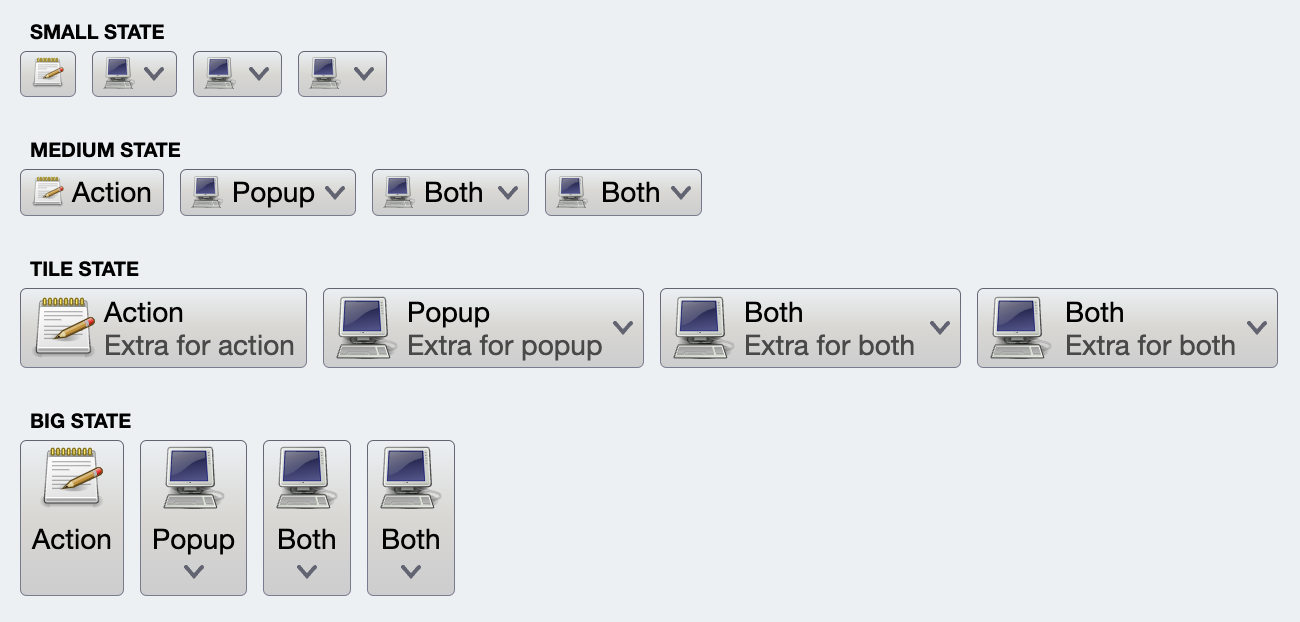 As [discussed earlier](CommandProjections.md#command-button-presentation-model), the code for the app in the screenshot above uses four commands that are projected with different layouts. Here is the code snippet that creates the first "Action" button (the first button in the first row):
```kotlin
val commandActionOnly =
Command(
text = resourceBundle.getString("Action.text"),
extraText = resourceBundle.getString("Action.textExtra"),
icon = accessories_text_editor(),
action = { println("Action activated!") },
...
)
CommandButtonProjection(
contentModel = commandActionOnly,
presentationModel = CommandButtonPresentationModel(
presentationState = CommandButtonPresentationState.Small)
).project()
```
The **content model** (`Command` data class) describes the basic elements of a command (such as text and icon), how the user interacts with it, and what happens when that interaction happens.
The **presentation model** describes how to "convert" (or project) that content model into a composable - a command button in our case - that can be added to the application UI hierarchy to present the data backed by that content model and react to the user interaction.
Let's take a look at the attributes of command button presentation model.
### Attributes overview
Command button presentation models are created by populating attributes on the `CommandButtonPresentationModel` data class. The following attributes are available:
| | Attribute | Type |
| --- | --- | --- |
| **Visuals** | backgroundAppearanceStrategy | BackgroundAppearanceStrategy |
| | presentationState | CommandButtonPresentationState |
| | iconDimension | DpSize
| | iconActiveFilterStrategy | IconFilterStrategy
| | iconEnabledFilterStrategy | IconFilterStrategy
| | iconDisabledFilterStrategy | IconFilterStrategy
| | textStyle | TextStyle
| | textOverflow | TextOverflow
| | showPopupIcon | Boolean
| | selectedStateHighlight | SelectedStateHighlight
| | sides | Sides
| **Layout metrics** | horizontalAlignment | HorizontalAlignment |
| | horizontalGapScaleFactor | Float |
| | verticalGapScaleFactor | Float |
| | contentPadding | PaddingValues |
| | minWidth | Dp |
| | forceAllocateSpaceForIcon | Boolean
| **Interaction** | focusable | Boolean |
| | menu | Boolean |
| | textClick | TextClick |
| | popupMenuPresentationModel | CommandPopupMenuPresentationModel |
| | popupPlacementStrategy | PopupPlacementStrategy |
| | popupAnchorBoundsProvider | () -> Rect |
| | toDismissPopupsOnActivation | Boolean |
| | actionRichTooltipPresentationModel | RichTooltipPresentationModel |
| | popupRichTooltipPresentationModel | RichTooltipPresentationModel |
| | autoRepeatAction | Boolean |
| | autoRepeatInitialInterval | Long |
| | autoRepeatSubsequentInterval | Long |
| | actionFireTrigger | ActionFireTrigger |
| | popupFireTrigger | PopupFireTrigger |
### Visual attributes
Going back to the same screenshot that shows how four commands are projected on the screen:
Here's the relevant code snippet that creates a command button presentation model used to project the first button in the first row:
```kotlin
CommandButtonProjection(
contentModel = commandActionOnly,
presentationModel = CommandButtonPresentationModel(
presentationState = CommandButtonPresentationState.Small)
).project()
```
In here, `CommandButtonPresentationState.Small` is used to instruct the projection to create the specific layout that is using a small icon and no text. There are additional presentation states available in that class for out-of-box configuration of buttons, as well as support for custom application-specific layouts.
The `backgroundAppearanceStrategy` attribute controls the appearance of the projected button in a non-active state (no rollover, selection, press, arm, etc). In the example above, all the buttons are projected as `BackgroundAppearanceStrategy.Always` - showing the background at all times. Using `BackgroundAppearanceStrategy.Flat` will only show the background in one of the active states.
### Layout metrics
The `horizontalAlignment` attribute controls what happens when the projected button gets more horizontal space than it needs to fully display the content under the specific presentation state:
As [discussed earlier](CommandProjections.md#command-button-presentation-model), the code for the app in the screenshot above uses four commands that are projected with different layouts. Here is the code snippet that creates the first "Action" button (the first button in the first row):
```kotlin
val commandActionOnly =
Command(
text = resourceBundle.getString("Action.text"),
extraText = resourceBundle.getString("Action.textExtra"),
icon = accessories_text_editor(),
action = { println("Action activated!") },
...
)
CommandButtonProjection(
contentModel = commandActionOnly,
presentationModel = CommandButtonPresentationModel(
presentationState = CommandButtonPresentationState.Small)
).project()
```
The **content model** (`Command` data class) describes the basic elements of a command (such as text and icon), how the user interacts with it, and what happens when that interaction happens.
The **presentation model** describes how to "convert" (or project) that content model into a composable - a command button in our case - that can be added to the application UI hierarchy to present the data backed by that content model and react to the user interaction.
Let's take a look at the attributes of command button presentation model.
### Attributes overview
Command button presentation models are created by populating attributes on the `CommandButtonPresentationModel` data class. The following attributes are available:
| | Attribute | Type |
| --- | --- | --- |
| **Visuals** | backgroundAppearanceStrategy | BackgroundAppearanceStrategy |
| | presentationState | CommandButtonPresentationState |
| | iconDimension | DpSize
| | iconActiveFilterStrategy | IconFilterStrategy
| | iconEnabledFilterStrategy | IconFilterStrategy
| | iconDisabledFilterStrategy | IconFilterStrategy
| | textStyle | TextStyle
| | textOverflow | TextOverflow
| | showPopupIcon | Boolean
| | selectedStateHighlight | SelectedStateHighlight
| | sides | Sides
| **Layout metrics** | horizontalAlignment | HorizontalAlignment |
| | horizontalGapScaleFactor | Float |
| | verticalGapScaleFactor | Float |
| | contentPadding | PaddingValues |
| | minWidth | Dp |
| | forceAllocateSpaceForIcon | Boolean
| **Interaction** | focusable | Boolean |
| | menu | Boolean |
| | textClick | TextClick |
| | popupMenuPresentationModel | CommandPopupMenuPresentationModel |
| | popupPlacementStrategy | PopupPlacementStrategy |
| | popupAnchorBoundsProvider | () -> Rect |
| | toDismissPopupsOnActivation | Boolean |
| | actionRichTooltipPresentationModel | RichTooltipPresentationModel |
| | popupRichTooltipPresentationModel | RichTooltipPresentationModel |
| | autoRepeatAction | Boolean |
| | autoRepeatInitialInterval | Long |
| | autoRepeatSubsequentInterval | Long |
| | actionFireTrigger | ActionFireTrigger |
| | popupFireTrigger | PopupFireTrigger |
### Visual attributes
Going back to the same screenshot that shows how four commands are projected on the screen:
Here's the relevant code snippet that creates a command button presentation model used to project the first button in the first row:
```kotlin
CommandButtonProjection(
contentModel = commandActionOnly,
presentationModel = CommandButtonPresentationModel(
presentationState = CommandButtonPresentationState.Small)
).project()
```
In here, `CommandButtonPresentationState.Small` is used to instruct the projection to create the specific layout that is using a small icon and no text. There are additional presentation states available in that class for out-of-box configuration of buttons, as well as support for custom application-specific layouts.
The `backgroundAppearanceStrategy` attribute controls the appearance of the projected button in a non-active state (no rollover, selection, press, arm, etc). In the example above, all the buttons are projected as `BackgroundAppearanceStrategy.Always` - showing the background at all times. Using `BackgroundAppearanceStrategy.Flat` will only show the background in one of the active states.
### Layout metrics
The `horizontalAlignment` attribute controls what happens when the projected button gets more horizontal space than it needs to fully display the content under the specific presentation state:
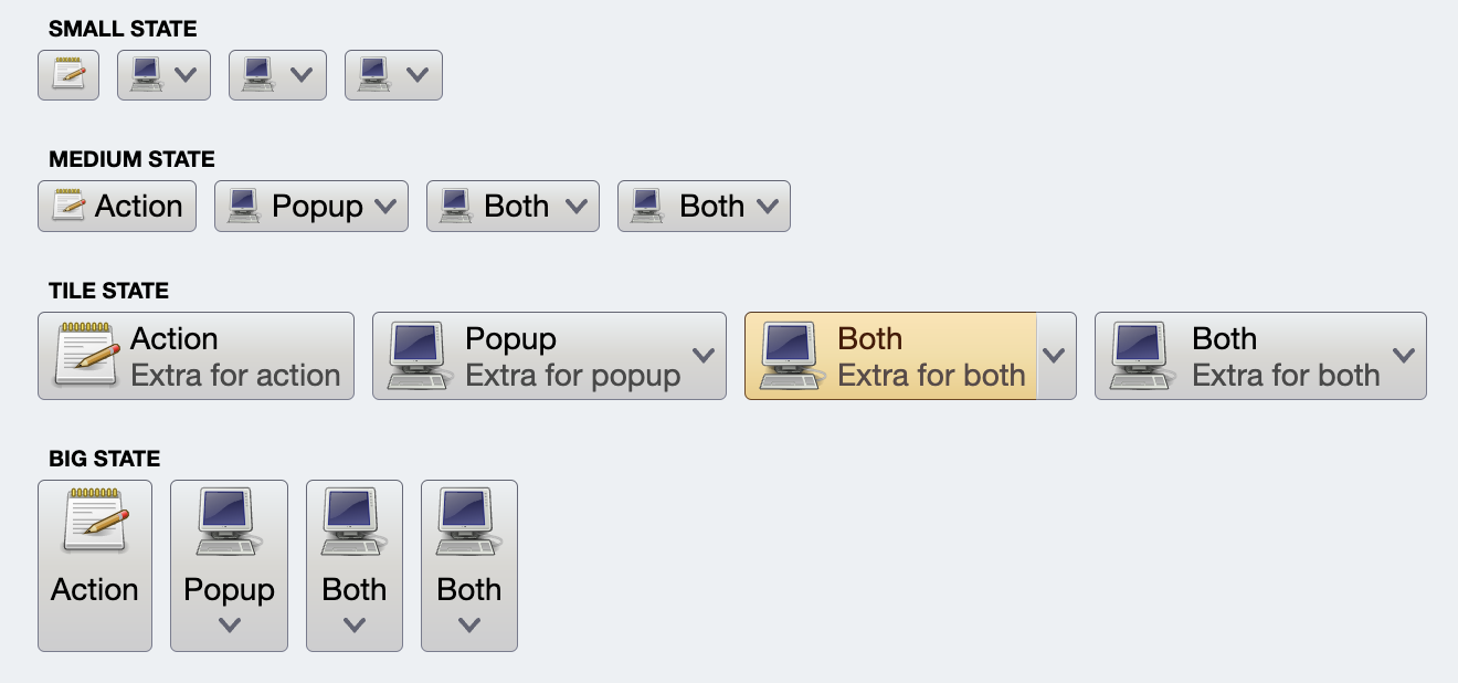
 The supported attribute values are `HorizontalAlignment.Leading`, `HorizontalAlignment.Center` and `HorizontalAlignment.Trailing`. As can be seen from the screenshot above, some combinations of the attribute values and presentation states may result in a layout that would look distracting for certain application scenarios.
The `horizontalGapScaleFactor` and `verticalGapScaleFactor` attributes can be used to decrease or increase the amount of space (gap) between the icon and the text(s) of the specific projected button:
The supported attribute values are `HorizontalAlignment.Leading`, `HorizontalAlignment.Center` and `HorizontalAlignment.Trailing`. As can be seen from the screenshot above, some combinations of the attribute values and presentation states may result in a layout that would look distracting for certain application scenarios.
The `horizontalGapScaleFactor` and `verticalGapScaleFactor` attributes can be used to decrease or increase the amount of space (gap) between the icon and the text(s) of the specific projected button:
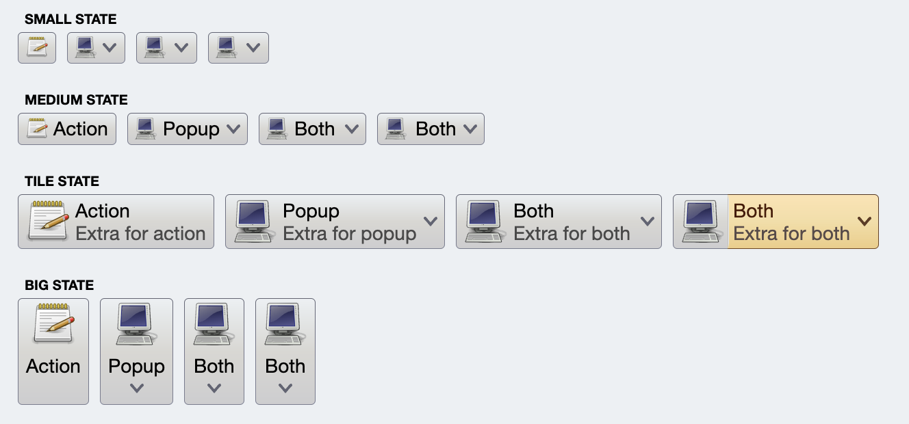
 In the first row the `horizontalGapScaleFactor` is combined with `CommandButtonPresentationState.Medium` presentation state to tweak the horizontal space between the icon and the text. In the second row the `verticalGapScaleFactor` is combined with `CommandButtonPresentationState.Big` presentation state to tweak the vertical space between the icon and the text.
### Interaction
#### Text click area
Let's take a look at two screenshots. In the first one, the mouse cursor is over the text area of the "Both" button in tile state. Note that the yellow highlight is only painted around the icon and the texts, and not around the down arrow. This projection is configured with `textClick=TextClick.Action` to indicate that clicking anywhere in the area that shows the command text (and extra text, if relevant) will activate the main command action:
In the first row the `horizontalGapScaleFactor` is combined with `CommandButtonPresentationState.Medium` presentation state to tweak the horizontal space between the icon and the text. In the second row the `verticalGapScaleFactor` is combined with `CommandButtonPresentationState.Big` presentation state to tweak the vertical space between the icon and the text.
### Interaction
#### Text click area
Let's take a look at two screenshots. In the first one, the mouse cursor is over the text area of the "Both" button in tile state. Note that the yellow highlight is only painted around the icon and the texts, and not around the down arrow. This projection is configured with `textClick=TextClick.Action` to indicate that clicking anywhere in the area that shows the command text (and extra text, if relevant) will activate the main command action:
 In the second one, the mouse cursor is over the same text area, this time of the other "Both" button in tile state. Here, the area of the button with the icon is not highlighted, while the area with the two texts and the down arrow is. This projection is configured with `textClick=TextClick.Popup` to indicate that clicking anywhere in the area that shows the command text (and extra text, if relevant) will activate the secondary command content - in this case, showing a popup menu:
 #### Repeated action
In some cases, the design calls for facilitating repeated activation of the command action. For example, it would be quite tedious to scroll down a large list of items by repeatedly clicking the down button (or area below the scrollbar thumb). The usability of such actions can be improved if, pressed once, the action is repeated continuously until the mouse button is released.
Command button presentation models come with four attributes that aim to address such scenarios.
* `autoRepeatAction=true` will result in a repeated, continuous activation of the command action as long as the projected button is activated.
* `fireActionTrigger = FireActionTrigger.OnRollover` will result in command action activation when the mouse is moved over the projected button - without the need to press the mouse button itself.
* Alternatively, `fireActionTrigger = FireActionTrigger.OnPressed` will result in command action activation when the mouse button is pressed - as opposed to the usual click which is a combination of pressing the button and then releasing it.
* Finally, `autoRepeatInitialInterval` and `autoRepeatSubsequentInterval` can be used to configure the projection-specific initial and subsequent intervals between action activation. The static `CommandButtonInteractionConstants` constants can be used to check for the default values of these two intervals.
#### Working with popups
A `CommandButtonProjection` uses `CommandButtonPresentationModel` to project a command as a command button composable. The [secondary content](Command.md#secondary-content-model) configured on the command is displayed in a popup window anchored to the projected button:
#### Repeated action
In some cases, the design calls for facilitating repeated activation of the command action. For example, it would be quite tedious to scroll down a large list of items by repeatedly clicking the down button (or area below the scrollbar thumb). The usability of such actions can be improved if, pressed once, the action is repeated continuously until the mouse button is released.
Command button presentation models come with four attributes that aim to address such scenarios.
* `autoRepeatAction=true` will result in a repeated, continuous activation of the command action as long as the projected button is activated.
* `fireActionTrigger = FireActionTrigger.OnRollover` will result in command action activation when the mouse is moved over the projected button - without the need to press the mouse button itself.
* Alternatively, `fireActionTrigger = FireActionTrigger.OnPressed` will result in command action activation when the mouse button is pressed - as opposed to the usual click which is a combination of pressing the button and then releasing it.
* Finally, `autoRepeatInitialInterval` and `autoRepeatSubsequentInterval` can be used to configure the projection-specific initial and subsequent intervals between action activation. The static `CommandButtonInteractionConstants` constants can be used to check for the default values of these two intervals.
#### Working with popups
A `CommandButtonProjection` uses `CommandButtonPresentationModel` to project a command as a command button composable. The [secondary content](Command.md#secondary-content-model) configured on the command is displayed in a popup window anchored to the projected button:
 The `popupMenuPresentationModel` attribute can be used to tune the presentation of that popup content. Use the `popupPlacementStrategy` attribute to control the anchoring of the popup content. The default
`PopupPlacementStrategy.Downward.HAlignStart` to display the popup content below the projected button. Use `PopupPlacementStrategy.Endward.VAlignTop` to display the popup content popup to the end side (right under left-to-right and left under right-to-left) of the projected button.
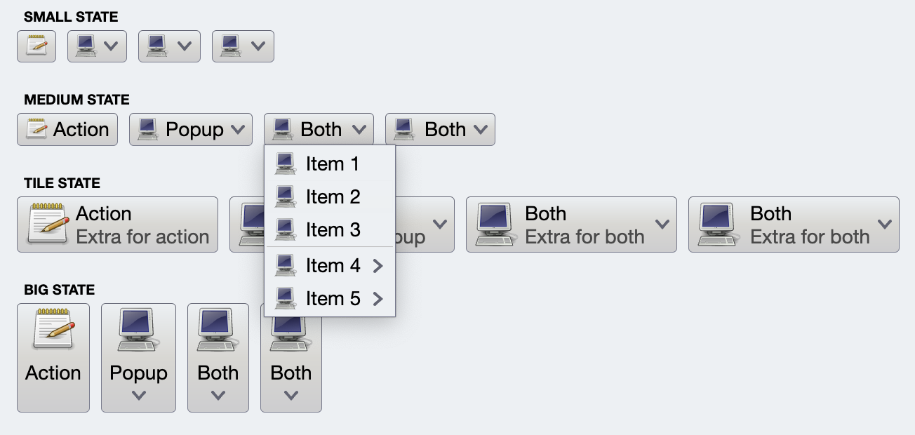
In some cases, you would want to allow the user to interact with multiple entries in the popup menu. Let's take a look at this screenshot:
The `popupMenuPresentationModel` attribute can be used to tune the presentation of that popup content. Use the `popupPlacementStrategy` attribute to control the anchoring of the popup content. The default
`PopupPlacementStrategy.Downward.HAlignStart` to display the popup content below the projected button. Use `PopupPlacementStrategy.Endward.VAlignTop` to display the popup content popup to the end side (right under left-to-right and left under right-to-left) of the projected button.
In some cases, you would want to allow the user to interact with multiple entries in the popup menu. Let's take a look at this screenshot:
 Here is the code behind the "multi" button and its popup content:
```kotlin
val commandBold =
Command(
text = resourceBundle.getString("FontStyle.bold.title"),
icon = format_bold_black_24dp(),
isActionToggle = true,
isActionToggleSelected = style.bold.value,
onTriggerActionToggleSelectedChange = {
style.bold.value = it
println("Selected bold? $it")
}
)
val commandItalic =
Command(
text = resourceBundle.getString("FontStyle.italic.title"),
icon = format_italic_black_24dp(),
isActionToggle = true,
isActionToggleSelected = style.italic.value,
onTriggerActionToggleSelectedChange = {
style.italic.value = it
println("Selected italic? $it")
}
)
val commandUnderline =
Command(
text = resourceBundle.getString("FontStyle.underline.title"),
icon = format_underlined_black_24dp(),
isActionToggle = true,
isActionToggleSelected = style.underline.value,
onTriggerActionToggleSelectedChange = {
style.underline.value = it
println("Selected underline? $it")
}
)
val commandStrikethrough =
Command(
text = resourceBundle.getString("FontStyle.strikethrough.title"),
icon = format_strikethrough_black_24dp(),
isActionToggle = true,
isActionToggleSelected = style.strikethrough.value,
onTriggerActionToggleSelectedChange = {
style.strikethrough.value = it
println("Selected strikethrough? $it")
}
)
CommandButtonProjection(
contentModel = Command(
text = "multi",
secondaryContentModel = CommandMenuContentModel(
CommandGroup(
commands = listOf(
commandBold,
commandItalic,
commandUnderline,
commandStrikethrough
)
)
)
),
presentationModel = CommandButtonPresentationModel(
presentationState = CommandButtonPresentationState.Medium,
toDismissPopupsOnActivation = false
)
).project()
```
First we create the four styling commands. Then we create a `CommandMenuContentModel` with those commands, and set it as `secondaryContentModel` for the top-level "multi" command.
The default behavior for Aurora popup content is to dismiss all popups immediately when the user activates an entry in a popup. In this particular case, however, we want to allow the user to make as many selections in this popup as necessary without dismissing the popup after every single selection. This is what `toDismissPopupsOnActivation=false` attribute on the `CommandButtonPresentationModel` is for.
### Next
Continue to [command popup menus](CommandPopupMenu.md).
Here is the code behind the "multi" button and its popup content:
```kotlin
val commandBold =
Command(
text = resourceBundle.getString("FontStyle.bold.title"),
icon = format_bold_black_24dp(),
isActionToggle = true,
isActionToggleSelected = style.bold.value,
onTriggerActionToggleSelectedChange = {
style.bold.value = it
println("Selected bold? $it")
}
)
val commandItalic =
Command(
text = resourceBundle.getString("FontStyle.italic.title"),
icon = format_italic_black_24dp(),
isActionToggle = true,
isActionToggleSelected = style.italic.value,
onTriggerActionToggleSelectedChange = {
style.italic.value = it
println("Selected italic? $it")
}
)
val commandUnderline =
Command(
text = resourceBundle.getString("FontStyle.underline.title"),
icon = format_underlined_black_24dp(),
isActionToggle = true,
isActionToggleSelected = style.underline.value,
onTriggerActionToggleSelectedChange = {
style.underline.value = it
println("Selected underline? $it")
}
)
val commandStrikethrough =
Command(
text = resourceBundle.getString("FontStyle.strikethrough.title"),
icon = format_strikethrough_black_24dp(),
isActionToggle = true,
isActionToggleSelected = style.strikethrough.value,
onTriggerActionToggleSelectedChange = {
style.strikethrough.value = it
println("Selected strikethrough? $it")
}
)
CommandButtonProjection(
contentModel = Command(
text = "multi",
secondaryContentModel = CommandMenuContentModel(
CommandGroup(
commands = listOf(
commandBold,
commandItalic,
commandUnderline,
commandStrikethrough
)
)
)
),
presentationModel = CommandButtonPresentationModel(
presentationState = CommandButtonPresentationState.Medium,
toDismissPopupsOnActivation = false
)
).project()
```
First we create the four styling commands. Then we create a `CommandMenuContentModel` with those commands, and set it as `secondaryContentModel` for the top-level "multi" command.
The default behavior for Aurora popup content is to dismiss all popups immediately when the user activates an entry in a popup. In this particular case, however, we want to allow the user to make as many selections in this popup as necessary without dismissing the popup after every single selection. This is what `toDismissPopupsOnActivation=false` attribute on the `CommandButtonPresentationModel` is for.
### Next
Continue to [command popup menus](CommandPopupMenu.md).