## Components - custom command projections
As detailed in the [overview documentation](MoreCommands.md), Aurora commands are meant to be flexible enough to:
* Restrict the command attributes to a smaller subset that is relevant for the particular usage
* Plug in a custom content secondary content model that is relevant for the particular usage
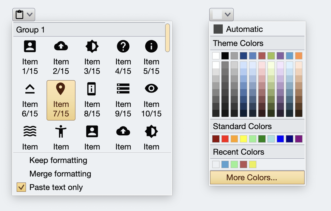 Let's take a look at all the pieces that participate in creating a custom application command button projection that looks like this:
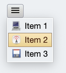 The requirements are:
* Only display the small icon
* Clicking anywhere displays the popup
* But we don't show the arrow indicator
* The popup arranges its content in a single column
* The popup content is a list of Aurora commands
To make a fully custom command button projection, we are going to make:
* Content models for the command and its menu
* Presentation models for the command button and its popup menu
* Layout manager for the button
* Menu handler for the popup
* Projection
### Content models
We start by defining our content models, one for the command, and one for the secondary content:
```kotlin
data class CustomCommand(
override val icon: Painter,
override val secondaryContentModel: CustomMenuContentModel,
) : BaseCommand {
override val text = ""
override val extraText = null
override val action = null
override val actionPreview = null
override val isSecondaryEnabled = true
override val secondaryRichTooltip = null
override val isActionEnabled = false
override val isActionToggle = false
override val isActionToggleSelected = false
override val actionRichTooltip = null
override val onTriggerActionToggleSelectedChange = null
}
data class CustomMenuContentModel(
val entries: List
) : BaseCommandMenuContentModel
```
### Presentation models
```
data class CustomCommandPopupMenuPresentationModel(
override val itemPresentationState: CommandButtonPresentationState = DefaultCommandPopupMenuPresentationState,
override val itemPopupFireTrigger: PopupFireTrigger = PopupFireTrigger.OnRollover,
override val itemSelectedStateHighlight: SelectedStateHighlight = SelectedStateHighlight.IconOnly,
) : BaseCommandPopupMenuPresentationModel
data class CustomCommandButtonPresentationModel(
override val backgroundAppearanceStrategy: BackgroundAppearanceStrategy = BackgroundAppearanceStrategy.Always,
override val horizontalAlignment: HorizontalAlignment = HorizontalAlignment.Center,
override val iconDimension: DpSize? = null,
override val iconDisabledFilterStrategy: IconFilterStrategy = IconFilterStrategy.ThemedFollowColorTokens,
override val iconEnabledFilterStrategy: IconFilterStrategy = IconFilterStrategy.Original,
override val iconActiveFilterStrategy: IconFilterStrategy = IconFilterStrategy.Original,
override val textStyle: TextStyle? = null,
override val textOverflow: TextOverflow = TextOverflow.Clip,
override val popupPlacementStrategy: PopupPlacementStrategy = PopupPlacementStrategy.Downward.HAlignStart,
override val toDismissPopupsOnActivation: Boolean = true,
override val popupKeyTip: String? = null,
override val popupMenuPresentationModel: CustomCommandPopupMenuPresentationModel = CustomCommandPopupMenuPresentationModel(),
override val contentPadding: PaddingValues = CommandButtonSizingConstants.CompactButtonContentPadding,
override val minWidth: Dp = 0.dp,
override val sides: Sides = Sides()
) : BaseCommandButtonPresentationModel {
override val presentationState = CustomPresentationState
override val forceAllocateSpaceForIcon = false
override val actionKeyTip = null
override val autoRepeatAction = false
override val autoRepeatInitialInterval =
CommandButtonInteractionConstants.DefaultAutoRepeatInitialIntervalMillis
override val autoRepeatSubsequentInterval =
CommandButtonInteractionConstants.DefaultAutoRepeatSubsequentIntervalMillis
override val actionFireTrigger = ActionFireTrigger.OnPressReleased
override val popupFireTrigger: PopupFireTrigger = PopupFireTrigger.OnPressed
override val textClick = TextClick.Action
override val actionRichTooltipPresentationModel = RichTooltipPresentationModel()
override val popupRichTooltipPresentationModel = RichTooltipPresentationModel()
override val horizontalGapScaleFactor = 1.0f
override val verticalGapScaleFactor = 1.0f
override val selectedStateHighlight: SelectedStateHighlight = SelectedStateHighlight.FullSize
}
```
Similar to content models, we implement the `BaseCommandButtonPresentationModel` and `BaseCommandPopupMenuPresentationModel`, "removing" the attributes that are not relevant out of the concrete presentation model data class.
### Layout manager
The layout manager is responsible for determining the overall size of the projected command button, the presence and positioning of the command icon and text(s), as well as other visual elements such as action / popup separator and the popup arrow icon.
The requirements are:
* Only display the small icon
* Clicking anywhere displays the popup
* But we don't show the arrow indicator
* The popup arranges its content in a single column
* The popup content is a list of Aurora commands
To make a fully custom command button projection, we are going to make:
* Content models for the command and its menu
* Presentation models for the command button and its popup menu
* Layout manager for the button
* Menu handler for the popup
* Projection
### Content models
We start by defining our content models, one for the command, and one for the secondary content:
```kotlin
data class CustomCommand(
override val icon: Painter,
override val secondaryContentModel: CustomMenuContentModel,
) : BaseCommand {
override val text = ""
override val extraText = null
override val action = null
override val actionPreview = null
override val isSecondaryEnabled = true
override val secondaryRichTooltip = null
override val isActionEnabled = false
override val isActionToggle = false
override val isActionToggleSelected = false
override val actionRichTooltip = null
override val onTriggerActionToggleSelectedChange = null
}
data class CustomMenuContentModel(
val entries: List
) : BaseCommandMenuContentModel
```
### Presentation models
```
data class CustomCommandPopupMenuPresentationModel(
override val itemPresentationState: CommandButtonPresentationState = DefaultCommandPopupMenuPresentationState,
override val itemPopupFireTrigger: PopupFireTrigger = PopupFireTrigger.OnRollover,
override val itemSelectedStateHighlight: SelectedStateHighlight = SelectedStateHighlight.IconOnly,
) : BaseCommandPopupMenuPresentationModel
data class CustomCommandButtonPresentationModel(
override val backgroundAppearanceStrategy: BackgroundAppearanceStrategy = BackgroundAppearanceStrategy.Always,
override val horizontalAlignment: HorizontalAlignment = HorizontalAlignment.Center,
override val iconDimension: DpSize? = null,
override val iconDisabledFilterStrategy: IconFilterStrategy = IconFilterStrategy.ThemedFollowColorTokens,
override val iconEnabledFilterStrategy: IconFilterStrategy = IconFilterStrategy.Original,
override val iconActiveFilterStrategy: IconFilterStrategy = IconFilterStrategy.Original,
override val textStyle: TextStyle? = null,
override val textOverflow: TextOverflow = TextOverflow.Clip,
override val popupPlacementStrategy: PopupPlacementStrategy = PopupPlacementStrategy.Downward.HAlignStart,
override val toDismissPopupsOnActivation: Boolean = true,
override val popupKeyTip: String? = null,
override val popupMenuPresentationModel: CustomCommandPopupMenuPresentationModel = CustomCommandPopupMenuPresentationModel(),
override val contentPadding: PaddingValues = CommandButtonSizingConstants.CompactButtonContentPadding,
override val minWidth: Dp = 0.dp,
override val sides: Sides = Sides()
) : BaseCommandButtonPresentationModel {
override val presentationState = CustomPresentationState
override val forceAllocateSpaceForIcon = false
override val actionKeyTip = null
override val autoRepeatAction = false
override val autoRepeatInitialInterval =
CommandButtonInteractionConstants.DefaultAutoRepeatInitialIntervalMillis
override val autoRepeatSubsequentInterval =
CommandButtonInteractionConstants.DefaultAutoRepeatSubsequentIntervalMillis
override val actionFireTrigger = ActionFireTrigger.OnPressReleased
override val popupFireTrigger: PopupFireTrigger = PopupFireTrigger.OnPressed
override val textClick = TextClick.Action
override val actionRichTooltipPresentationModel = RichTooltipPresentationModel()
override val popupRichTooltipPresentationModel = RichTooltipPresentationModel()
override val horizontalGapScaleFactor = 1.0f
override val verticalGapScaleFactor = 1.0f
override val selectedStateHighlight: SelectedStateHighlight = SelectedStateHighlight.FullSize
}
```
Similar to content models, we implement the `BaseCommandButtonPresentationModel` and `BaseCommandPopupMenuPresentationModel`, "removing" the attributes that are not relevant out of the concrete presentation model data class.
### Layout manager
The layout manager is responsible for determining the overall size of the projected command button, the presence and positioning of the command icon and text(s), as well as other visual elements such as action / popup separator and the popup arrow icon.
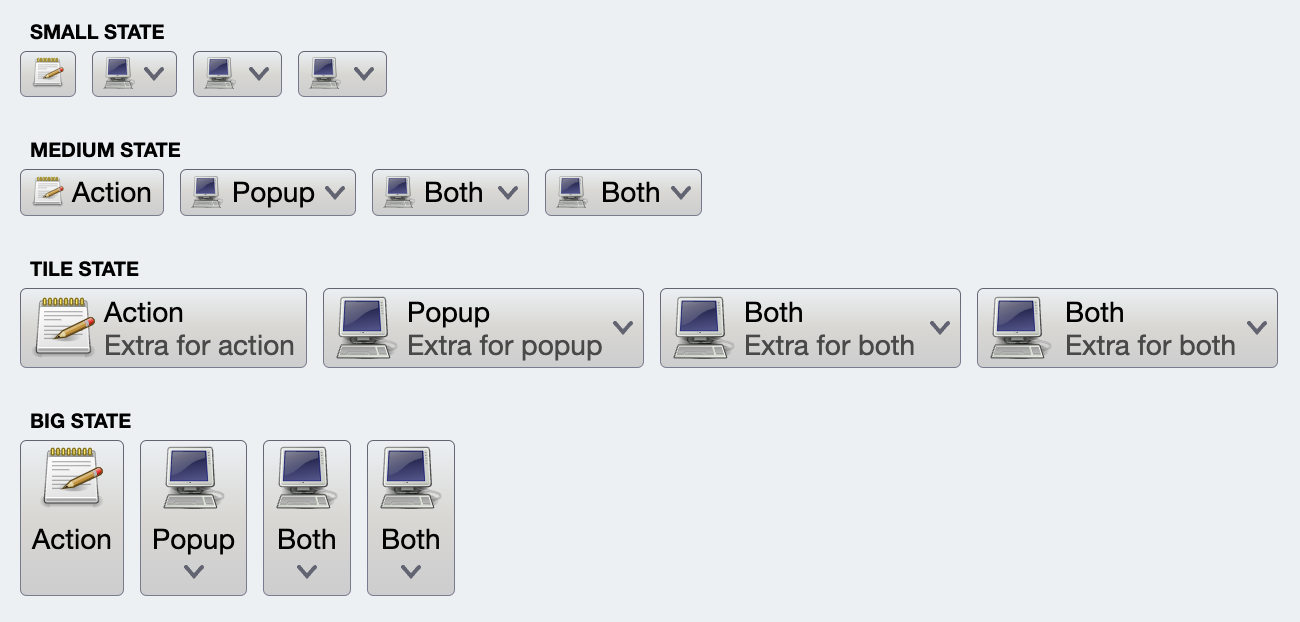 In this screenshot, each row has its own layout manager that determines the icon size and position, the text presence and position relative to the icons, etc.
In our case, our layout manager should:
* Reserve space for the small (16x16) variant of the command icon
* Mark the whole command button area to show the popup on click
* Not show any text, separator or popup arrow icon
We start by defining a custom presentation state to be hardcoded in our command button presentation model (to be shown in the next section):
```kotlin
val CustomPresentationState: CommandButtonPresentationState =
object : CommandButtonPresentationState("Custom") {
override fun createLayoutManager(
layoutDirection: LayoutDirection,
density: Density,
textStyle: TextStyle,
fontFamilyResolver: FontFamily.Resolver
): CommandButtonLayoutManager {
return CommandButtonLayoutManagerCustom(layoutDirection, density)
}
}
```
What is a `CommandButtonLayoutManager`? It is an interface with the following four functions:
* `getPreferredIconSize` - returns how big the icon should be
* `getPreLayoutInfo` - returns the pre-layout info. Pre-layout info is the information on what the command button is going to display - **but not where**.
* `getPreferredSize` - returns the preferred size of the command button
* `getLayoutInfo` - returns the layout information for the command button given layout constraints (that may or may not match what `getPreferredSize` returned)
The `getPreferredSize` function is useful to know how much space a command button needs to display its content in a specific configuration. When is this useful? A couple of scenarios:
1. To know how much space a command popup needs to fully display its content before the actual layout phase
2. To dynamically switch the command button (or rather, the [projection](CommandProjections.md)) to a different presentation state given the available space constraints
Let's take a look at the implementation of each one of these four functions:
```kotlin
override fun getPreferredIconSize(
command: BaseCommand,
presentationModel: BaseCommandButtonPresentationModel
): DpSize {
return DpSize(16.dp, 16.dp)
}
```
Here we are saying that our button will show the command icon at 16x16dp.
```kotlin
override fun getPreLayoutInfo(
command: BaseCommand,
presentationModel: BaseCommandButtonPresentationModel
): CommandButtonLayoutManager.CommandButtonPreLayoutInfo {
// Popup only button with no popup (arrow) icon
return CommandButtonLayoutManager.CommandButtonPreLayoutInfo(
commandButtonKind = CommandButtonLayoutManager.CommandButtonKind.PopupOnly,
showIcon = true,
texts = emptyList(),
extraTexts = emptyList(),
isTextInActionArea = false,
separatorOrientation = CommandButtonLayoutManager.CommandButtonSeparatorOrientation.Vertical,
showPopupIcon = false
)
}
```
Here we are saying that the button is popup only (`commandButtonKind`), always shows the icon (`showIcon`), does not show the popup arrow icon (`showPopupIcon`) or any other text / separator elements (the rest of the attributes).
```kotlin
override fun getPreferredSize(
command: BaseCommand,
presentationModel: BaseCommandButtonPresentationModel,
preLayoutInfo: CommandButtonLayoutManager.CommandButtonPreLayoutInfo
): Size {
val prefIconWidth = getPreferredIconSize(command, presentationModel).width.toPx()
val prefIconHeight = getPreferredIconSize(command, presentationModel).height.toPx()
val paddingValues = presentationModel.contentPadding
val by = presentationModel.verticalGapScaleFactor * paddingValues.verticalPaddings.toPx()
val bx = presentationModel.horizontalGapScaleFactor * paddingValues.horizontalPaddings.toPx()
return Size(bx + prefIconWidth, by + prefIconHeight)
}
```
The `getPreferredSize` accounts for the size of the icon (from the earlier `getPreferredIconSize`) and the relevant presentation attributes - `contentPadding`, `verticalGapScaleFactor` and `horizontalGapScaleFactor`.
```kotlin
override fun getLayoutInfo(
constraints: Constraints,
command: BaseCommand,
presentationModel: BaseCommandButtonPresentationModel,
preLayoutInfo: CommandButtonLayoutManager.CommandButtonPreLayoutInfo
): CommandButtonLayoutManager.CommandButtonLayoutInfo {
val preferredSize = getPreferredSize(command, presentationModel, preLayoutInfo)
val paddingValues = presentationModel.contentPadding
val paddingTop = presentationModel.verticalGapScaleFactor * paddingValues.topPadding.toPx()
val paddingBottom = presentationModel.verticalGapScaleFactor * paddingValues.bottomPadding.toPx()
val iconWidth = getPreferredIconSize(command, presentationModel).width.toPx()
val iconHeight = getPreferredIconSize(command, presentationModel).height.toPx()
val ltr = (layoutDirection == LayoutDirection.Ltr)
// Handle the case where we are given more horizontal or
// vertical space than we need by looking at incoming
// constraints. See the full sample for details.
// ...
var shiftX = ...
var finalWidth = ...
var finalHeight = ...
val iconTop = paddingTop + (finalHeight - iconHeight - paddingTop - paddingBottom) / 2
val iconRect = if (ltr) {
val x = paddingValues.startPadding.toPx() + shiftX
Rect(
left = x,
right = x + iconWidth,
top = iconTop,
bottom = iconTop + iconHeight
)
} else {
val x = finalWidth - paddingValues.startPadding.toPx() - shiftX
Rect(
left = x - iconWidth,
right = x,
top = iconTop,
bottom = iconTop + iconHeight
)
}
val popupClickArea = Rect(
left = 0.0f,
right = finalWidth,
top = 0.0f,
bottom = finalHeight
)
return CommandButtonLayoutManager.CommandButtonLayoutInfo(
fullSize = Size(finalWidth, finalHeight),
actionClickArea = Rect.Zero,
popupClickArea = popupClickArea,
separatorArea = Rect.Zero,
iconRect = iconRect,
textLayoutInfoList = emptyList(),
extraTextLayoutInfoList = emptyList(),
popupActionRect = Rect.Zero
)
}
```
There is a bit of overhead here around how we handle more horizontal / vertical space than we need, and centering the icon within the space while at the same time respecting the content padding **and** layout direction.
### Menu handler
The last piece is the command menu handler. The base `BaseCommandMenuHandler` has two methods:
* `getPopupContentLayoutInfo` - returns the information on how big the popup content is (width and height in pixels), as well as usage-specific layout metrics on the sizes of various elements inside the popup
* `generatePopupContent` - a `@Composable` function that generates the popup content
The first function in our particular case goes over all the secondary content model commands, queries the presentation state / associated layout manager on the preferred size of each command, and uses the max width and combined height to return the popup content size:
```kotlin
override fun getPopupContentLayoutInfo(
menuContentModel: CustomMenuContentModel,
menuPresentationModel: CustomCommandPopupMenuPresentationModel,
layoutDirection: LayoutDirection,
density: Density,
textStyle: TextStyle,
fontFamilyResolver: FontFamily.Resolver
): CustomPopupContentLayoutInfo {
// If at least one secondary command in this popup menu has icon factory
// we force all command buttons to allocate space for the icon (for overall
// alignment of content across the entire popup menu)
var atLeastOneButtonHasIcon = false
for (entry in menuContentModel.entries) {
if (entry.icon != null) {
atLeastOneButtonHasIcon = true
}
if (entry.isActionToggle) {
atLeastOneButtonHasIcon = true
}
}
// Command presentation for menu content, taking some values from
// the popup menu presentation model configured on the top-level presentation model
val itemButtonPresentationModel = CommandButtonPresentationModel(
presentationState = menuPresentationModel.menuPresentationState,
iconActiveFilterStrategy = IconFilterStrategy.Original,
iconEnabledFilterStrategy = IconFilterStrategy.Original,
iconDisabledFilterStrategy = IconFilterStrategy.ThemedFollowColorTokens,
forceAllocateSpaceForIcon = atLeastOneButtonHasIcon,
popupPlacementStrategy = PopupPlacementStrategy.Downward.HAlignStart,
popupFireTrigger = menuPresentationModel.itemPopupFireTrigger,
backgroundAppearanceStrategy = BackgroundAppearanceStrategy.Flat,
horizontalAlignment = HorizontalAlignment.Leading,
contentPadding = CommandButtonSizingConstants.CompactButtonContentPadding,
selectedStateHighlight = menuPresentationModel.itemSelectedStateHighlight,
sides = Sides.ClosedRectangle
)
val layoutManager: CommandButtonLayoutManager =
itemButtonPresentationModel.presentationState.createLayoutManager(
layoutDirection = layoutDirection,
density = density,
textStyle = textStyle,
fontFamilyResolver = fontFamilyResolver
)
var maxWidth = 0.0f
var combinedHeight = 0.0f
for (entry in menuContentModel.entries) {
val preferredSize = layoutManager.getPreferredSize(
command = entry,
presentationModel = menuButtonPresentationModel,
preLayoutInfo = layoutManager.getPreLayoutInfo(
command = entry,
presentationModel = menuButtonPresentationModel
)
)
maxWidth = max(maxWidth, preferredSize.width)
combinedHeight += preferredSize.height
}
return CustomPopupContentLayoutInfo(
popupSize = Size(
width = maxWidth,
height = combinedHeight
),
menuButtonPresentationModel = menuButtonPresentationModel
)
}
```
Note the usage of `getPreLayoutInfo` and `getPreferredSize` from the `CommandButtonLayoutManager` - which is our `CommandButtonLayoutManagerCustom` detailed in the previous section.
The second function composes the popup menu content, which is in this particular case a core `Column` wiht no custom layout logic needed (to simplify this walkthrough):
```kotlin
@Composable
override fun generatePopupContent(
menuContentModel: CustomMenuContentModel,
menuPresentationModel: CustomCommandPopupMenuPresentationModel,
overlays: Map,
popupContentLayoutInfo: CustomPopupContentLayoutInfo
) {
val itemButtonPresentationModel = popupContentLayoutInfo.menuButtonPresentationModel
val neutralColorTokens = AuroraSkin.colors.getNeutralContainerTokens(AuroraSkin.decorationAreaType)
Column(
modifier = Modifier.fillMaxSize().background(color = neutralColorTokens.containerSurface)
.padding(all = 1.0.dp)
) {
for (entry in menuContentModel.entries) {
// Check if we have a presentation overlay for this secondary command
val hasOverlay = overlays.containsKey(entry)
val currSecondaryPresentationModel = if (hasOverlay)
itemButtonPresentationModel.overlayWith(overlays[entry]!!)
else itemButtonPresentationModel
// Project a command button for each secondary command, passing the same
// overlays into it.
CommandButtonProjection(
contentModel = entry,
presentationModel = currSecondaryPresentationModel,
overlays = overlays
).project(
modifier = Modifier.fillMaxWidth(),
actionInteractionSource = remember { MutableInteractionSource() },
popupInteractionSource = remember { MutableInteractionSource() }
)
}
}
}
```
### Projection
And the last, much smaller piece to bring it all together is the projection:
```kotlin
class CustomCommandButtonProjection(
contentModel: CustomCommand,
presentationModel: CustomCommandButtonPresentationModel = CustomCommandButtonPresentationModel(),
overlays: Map? = null
) : BaseCommandButtonProjection(
contentModel, presentationModel, overlays
) {
@Composable
fun project(
modifier: Modifier = Modifier,
popupInteractionSource: MutableInteractionSource = remember { MutableInteractionSource() }
) {
super.project(
modifier = modifier,
actionInteractionSource = remember { MutableInteractionSource() },
popupInteractionSource = popupInteractionSource,
popupHandler = CustomCommandMenuPopupHandler,
)
}
}
```
### Next
Continue to [command strip](CommandStrip.md).
In this screenshot, each row has its own layout manager that determines the icon size and position, the text presence and position relative to the icons, etc.
In our case, our layout manager should:
* Reserve space for the small (16x16) variant of the command icon
* Mark the whole command button area to show the popup on click
* Not show any text, separator or popup arrow icon
We start by defining a custom presentation state to be hardcoded in our command button presentation model (to be shown in the next section):
```kotlin
val CustomPresentationState: CommandButtonPresentationState =
object : CommandButtonPresentationState("Custom") {
override fun createLayoutManager(
layoutDirection: LayoutDirection,
density: Density,
textStyle: TextStyle,
fontFamilyResolver: FontFamily.Resolver
): CommandButtonLayoutManager {
return CommandButtonLayoutManagerCustom(layoutDirection, density)
}
}
```
What is a `CommandButtonLayoutManager`? It is an interface with the following four functions:
* `getPreferredIconSize` - returns how big the icon should be
* `getPreLayoutInfo` - returns the pre-layout info. Pre-layout info is the information on what the command button is going to display - **but not where**.
* `getPreferredSize` - returns the preferred size of the command button
* `getLayoutInfo` - returns the layout information for the command button given layout constraints (that may or may not match what `getPreferredSize` returned)
The `getPreferredSize` function is useful to know how much space a command button needs to display its content in a specific configuration. When is this useful? A couple of scenarios:
1. To know how much space a command popup needs to fully display its content before the actual layout phase
2. To dynamically switch the command button (or rather, the [projection](CommandProjections.md)) to a different presentation state given the available space constraints
Let's take a look at the implementation of each one of these four functions:
```kotlin
override fun getPreferredIconSize(
command: BaseCommand,
presentationModel: BaseCommandButtonPresentationModel
): DpSize {
return DpSize(16.dp, 16.dp)
}
```
Here we are saying that our button will show the command icon at 16x16dp.
```kotlin
override fun getPreLayoutInfo(
command: BaseCommand,
presentationModel: BaseCommandButtonPresentationModel
): CommandButtonLayoutManager.CommandButtonPreLayoutInfo {
// Popup only button with no popup (arrow) icon
return CommandButtonLayoutManager.CommandButtonPreLayoutInfo(
commandButtonKind = CommandButtonLayoutManager.CommandButtonKind.PopupOnly,
showIcon = true,
texts = emptyList(),
extraTexts = emptyList(),
isTextInActionArea = false,
separatorOrientation = CommandButtonLayoutManager.CommandButtonSeparatorOrientation.Vertical,
showPopupIcon = false
)
}
```
Here we are saying that the button is popup only (`commandButtonKind`), always shows the icon (`showIcon`), does not show the popup arrow icon (`showPopupIcon`) or any other text / separator elements (the rest of the attributes).
```kotlin
override fun getPreferredSize(
command: BaseCommand,
presentationModel: BaseCommandButtonPresentationModel,
preLayoutInfo: CommandButtonLayoutManager.CommandButtonPreLayoutInfo
): Size {
val prefIconWidth = getPreferredIconSize(command, presentationModel).width.toPx()
val prefIconHeight = getPreferredIconSize(command, presentationModel).height.toPx()
val paddingValues = presentationModel.contentPadding
val by = presentationModel.verticalGapScaleFactor * paddingValues.verticalPaddings.toPx()
val bx = presentationModel.horizontalGapScaleFactor * paddingValues.horizontalPaddings.toPx()
return Size(bx + prefIconWidth, by + prefIconHeight)
}
```
The `getPreferredSize` accounts for the size of the icon (from the earlier `getPreferredIconSize`) and the relevant presentation attributes - `contentPadding`, `verticalGapScaleFactor` and `horizontalGapScaleFactor`.
```kotlin
override fun getLayoutInfo(
constraints: Constraints,
command: BaseCommand,
presentationModel: BaseCommandButtonPresentationModel,
preLayoutInfo: CommandButtonLayoutManager.CommandButtonPreLayoutInfo
): CommandButtonLayoutManager.CommandButtonLayoutInfo {
val preferredSize = getPreferredSize(command, presentationModel, preLayoutInfo)
val paddingValues = presentationModel.contentPadding
val paddingTop = presentationModel.verticalGapScaleFactor * paddingValues.topPadding.toPx()
val paddingBottom = presentationModel.verticalGapScaleFactor * paddingValues.bottomPadding.toPx()
val iconWidth = getPreferredIconSize(command, presentationModel).width.toPx()
val iconHeight = getPreferredIconSize(command, presentationModel).height.toPx()
val ltr = (layoutDirection == LayoutDirection.Ltr)
// Handle the case where we are given more horizontal or
// vertical space than we need by looking at incoming
// constraints. See the full sample for details.
// ...
var shiftX = ...
var finalWidth = ...
var finalHeight = ...
val iconTop = paddingTop + (finalHeight - iconHeight - paddingTop - paddingBottom) / 2
val iconRect = if (ltr) {
val x = paddingValues.startPadding.toPx() + shiftX
Rect(
left = x,
right = x + iconWidth,
top = iconTop,
bottom = iconTop + iconHeight
)
} else {
val x = finalWidth - paddingValues.startPadding.toPx() - shiftX
Rect(
left = x - iconWidth,
right = x,
top = iconTop,
bottom = iconTop + iconHeight
)
}
val popupClickArea = Rect(
left = 0.0f,
right = finalWidth,
top = 0.0f,
bottom = finalHeight
)
return CommandButtonLayoutManager.CommandButtonLayoutInfo(
fullSize = Size(finalWidth, finalHeight),
actionClickArea = Rect.Zero,
popupClickArea = popupClickArea,
separatorArea = Rect.Zero,
iconRect = iconRect,
textLayoutInfoList = emptyList(),
extraTextLayoutInfoList = emptyList(),
popupActionRect = Rect.Zero
)
}
```
There is a bit of overhead here around how we handle more horizontal / vertical space than we need, and centering the icon within the space while at the same time respecting the content padding **and** layout direction.
### Menu handler
The last piece is the command menu handler. The base `BaseCommandMenuHandler` has two methods:
* `getPopupContentLayoutInfo` - returns the information on how big the popup content is (width and height in pixels), as well as usage-specific layout metrics on the sizes of various elements inside the popup
* `generatePopupContent` - a `@Composable` function that generates the popup content
The first function in our particular case goes over all the secondary content model commands, queries the presentation state / associated layout manager on the preferred size of each command, and uses the max width and combined height to return the popup content size:
```kotlin
override fun getPopupContentLayoutInfo(
menuContentModel: CustomMenuContentModel,
menuPresentationModel: CustomCommandPopupMenuPresentationModel,
layoutDirection: LayoutDirection,
density: Density,
textStyle: TextStyle,
fontFamilyResolver: FontFamily.Resolver
): CustomPopupContentLayoutInfo {
// If at least one secondary command in this popup menu has icon factory
// we force all command buttons to allocate space for the icon (for overall
// alignment of content across the entire popup menu)
var atLeastOneButtonHasIcon = false
for (entry in menuContentModel.entries) {
if (entry.icon != null) {
atLeastOneButtonHasIcon = true
}
if (entry.isActionToggle) {
atLeastOneButtonHasIcon = true
}
}
// Command presentation for menu content, taking some values from
// the popup menu presentation model configured on the top-level presentation model
val itemButtonPresentationModel = CommandButtonPresentationModel(
presentationState = menuPresentationModel.menuPresentationState,
iconActiveFilterStrategy = IconFilterStrategy.Original,
iconEnabledFilterStrategy = IconFilterStrategy.Original,
iconDisabledFilterStrategy = IconFilterStrategy.ThemedFollowColorTokens,
forceAllocateSpaceForIcon = atLeastOneButtonHasIcon,
popupPlacementStrategy = PopupPlacementStrategy.Downward.HAlignStart,
popupFireTrigger = menuPresentationModel.itemPopupFireTrigger,
backgroundAppearanceStrategy = BackgroundAppearanceStrategy.Flat,
horizontalAlignment = HorizontalAlignment.Leading,
contentPadding = CommandButtonSizingConstants.CompactButtonContentPadding,
selectedStateHighlight = menuPresentationModel.itemSelectedStateHighlight,
sides = Sides.ClosedRectangle
)
val layoutManager: CommandButtonLayoutManager =
itemButtonPresentationModel.presentationState.createLayoutManager(
layoutDirection = layoutDirection,
density = density,
textStyle = textStyle,
fontFamilyResolver = fontFamilyResolver
)
var maxWidth = 0.0f
var combinedHeight = 0.0f
for (entry in menuContentModel.entries) {
val preferredSize = layoutManager.getPreferredSize(
command = entry,
presentationModel = menuButtonPresentationModel,
preLayoutInfo = layoutManager.getPreLayoutInfo(
command = entry,
presentationModel = menuButtonPresentationModel
)
)
maxWidth = max(maxWidth, preferredSize.width)
combinedHeight += preferredSize.height
}
return CustomPopupContentLayoutInfo(
popupSize = Size(
width = maxWidth,
height = combinedHeight
),
menuButtonPresentationModel = menuButtonPresentationModel
)
}
```
Note the usage of `getPreLayoutInfo` and `getPreferredSize` from the `CommandButtonLayoutManager` - which is our `CommandButtonLayoutManagerCustom` detailed in the previous section.
The second function composes the popup menu content, which is in this particular case a core `Column` wiht no custom layout logic needed (to simplify this walkthrough):
```kotlin
@Composable
override fun generatePopupContent(
menuContentModel: CustomMenuContentModel,
menuPresentationModel: CustomCommandPopupMenuPresentationModel,
overlays: Map,
popupContentLayoutInfo: CustomPopupContentLayoutInfo
) {
val itemButtonPresentationModel = popupContentLayoutInfo.menuButtonPresentationModel
val neutralColorTokens = AuroraSkin.colors.getNeutralContainerTokens(AuroraSkin.decorationAreaType)
Column(
modifier = Modifier.fillMaxSize().background(color = neutralColorTokens.containerSurface)
.padding(all = 1.0.dp)
) {
for (entry in menuContentModel.entries) {
// Check if we have a presentation overlay for this secondary command
val hasOverlay = overlays.containsKey(entry)
val currSecondaryPresentationModel = if (hasOverlay)
itemButtonPresentationModel.overlayWith(overlays[entry]!!)
else itemButtonPresentationModel
// Project a command button for each secondary command, passing the same
// overlays into it.
CommandButtonProjection(
contentModel = entry,
presentationModel = currSecondaryPresentationModel,
overlays = overlays
).project(
modifier = Modifier.fillMaxWidth(),
actionInteractionSource = remember { MutableInteractionSource() },
popupInteractionSource = remember { MutableInteractionSource() }
)
}
}
}
```
### Projection
And the last, much smaller piece to bring it all together is the projection:
```kotlin
class CustomCommandButtonProjection(
contentModel: CustomCommand,
presentationModel: CustomCommandButtonPresentationModel = CustomCommandButtonPresentationModel(),
overlays: Map? = null
) : BaseCommandButtonProjection(
contentModel, presentationModel, overlays
) {
@Composable
fun project(
modifier: Modifier = Modifier,
popupInteractionSource: MutableInteractionSource = remember { MutableInteractionSource() }
) {
super.project(
modifier = modifier,
actionInteractionSource = remember { MutableInteractionSource() },
popupInteractionSource = popupInteractionSource,
popupHandler = CustomCommandMenuPopupHandler,
)
}
}
```
### Next
Continue to [command strip](CommandStrip.md).