## Components - more commands
Revisiting the [command documentation](Command.md), there is more depth and variety to Aurora commands and, by extension, to command buttons.
Let's first look at the command attributes as documented earlier:
| | Attribute | Type | Required? |
| --- | --- | --- | --- |
| **Base** | text | String | yes |
| | extraText | String | no |
| | icon | Painter | no |
| **Action** | action | () -> Unit | no |
| | actionPreview | CommandActionPreview | no |
| | actionRichTooltip | RichTooltip | no |
| | isActionEnabled | Boolean | no |
| **Secondary** | secondaryContentModel | CommandMenuContentModel | no |
| | secondaryRichTooltip | RichTooltip | no |
| | isSecondaryEnabled | Boolean | no |
| **Toggle** | isActionToggle | Boolean | no |
| | isActionToggleSelected | Boolean | no |
| | onTriggerActionToggleSelectedChange | (Boolean) -> Unit | no |
While this table shows that only the `text` attribute is required, that only applies to this particular command variant.
### Base command
The `Command` data class implements the more generic `BaseCommand` interface. That interface has the same attributes, except for the `secondaryContentModel` which is of type `BaseCommandMenuContentModel?`
Aurora commands are meant to be flexible enough to:
* Restrict the command attributes to a smaller subset that is relevant for the particular usage
* Plug in a custom content secondary content model that is relevant for the particular usage
First, let's take a look at these two popup menus:
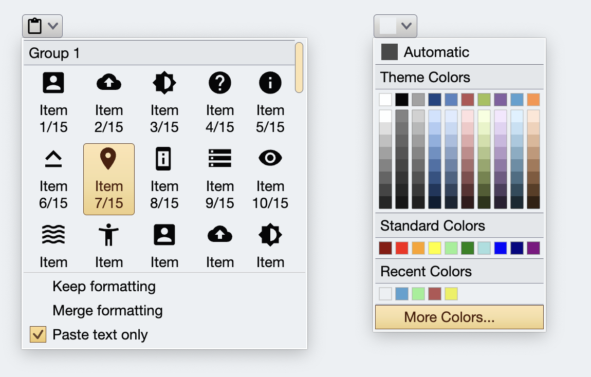 In both cases, the content and the presentation of the command button itself is driven by the same [command content model](Command.md) and by the same [command button presentation model](CommandButtonPresentation.md). However, it is clear that there can be an unbounded variety of **secondary / popup** content that suits individual application needs, and that Aurora should address such requirements.
On the left, the popup menu has an embedded vertically scrollable [command button panel](CommandPanel.md). On the right, the popup menu shows a variety of options to select colors, from a simple row of "standard" colors to a multi-row of "derived" colors, to a section that keeps track of recently selected colors.
### Revisiting the attributes
The presentation of the command itself is still controlled by the various attributes in the `BaseCommand` and `BaseCommandButtonPresentationModel`.
Let's take another look at an earlier screenshot that shows how four commands might be rendered on the screen (or projected, in Aurora terminology):
In both cases, the content and the presentation of the command button itself is driven by the same [command content model](Command.md) and by the same [command button presentation model](CommandButtonPresentation.md). However, it is clear that there can be an unbounded variety of **secondary / popup** content that suits individual application needs, and that Aurora should address such requirements.
On the left, the popup menu has an embedded vertically scrollable [command button panel](CommandPanel.md). On the right, the popup menu shows a variety of options to select colors, from a simple row of "standard" colors to a multi-row of "derived" colors, to a section that keeps track of recently selected colors.
### Revisiting the attributes
The presentation of the command itself is still controlled by the various attributes in the `BaseCommand` and `BaseCommandButtonPresentationModel`.
Let's take another look at an earlier screenshot that shows how four commands might be rendered on the screen (or projected, in Aurora terminology):
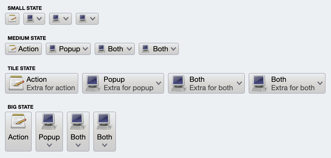 All buttons at the same index in their row are projected from the same command. The only difference is the presentation model associated with each one of the projection, varying the icon size, the presence of text, the overall layout flow of the icon and text(s), and what happens (action trigger or showing the popup) when the text is clicked.
### Defining the content model
In order to define the content model, you implement the `BaseCommand` and "remove" attributes that are not relevant to the context of your particular usage. For example, the color selector command in Aurora is defined as:
```kotlin
data class ColorSelectorCommand(
override val text: String,
override val extraText: String? = null,
override val icon: Painter? = null,
override val secondaryContentModel: ColorSelectorMenuContentModel,
override val isSecondaryEnabled: Boolean = true,
override val secondaryRichTooltip: RichTooltip? = null
) : BaseCommand {
override val action = null
override val actionPreview = null
override val isActionEnabled = false
override val isActionToggle = false
override val isActionToggleSelected = false
override val actionRichTooltip = null
override val onTriggerActionToggleSelectedChange = null
}
```
where the choice has been made that it can only be used to project a popup-only command button. In addition, the `secondaryContentModel` is of the type `ColorSelectorMenuContentModel` which implements the base `BaseCommandMenuContentModel` interface and exposes attributes that describe the content model for the color selector command button popup (single row sections, multi-row sections, recents sections, etc).
The same holds for the presentation model. `ColorSelectorCommandButtonPresentationModel` implements the base `BaseCommandButtonPresentationModel`, again "removing" the presentation attributes that are not relevant to the context of your particular usage. In your presentation model, you also specify which particular implementation of the `BaseCommandPopupMenuPresentationModel` interface should be used for the `popupMenuPresentationModel` attribute.
Let's expand on these concepts by showing all the moving pieces that participate in defining a completely custom command button projection.
### Next
Continue to the [color selector command](ColorSelectorCommand.md).
All buttons at the same index in their row are projected from the same command. The only difference is the presentation model associated with each one of the projection, varying the icon size, the presence of text, the overall layout flow of the icon and text(s), and what happens (action trigger or showing the popup) when the text is clicked.
### Defining the content model
In order to define the content model, you implement the `BaseCommand` and "remove" attributes that are not relevant to the context of your particular usage. For example, the color selector command in Aurora is defined as:
```kotlin
data class ColorSelectorCommand(
override val text: String,
override val extraText: String? = null,
override val icon: Painter? = null,
override val secondaryContentModel: ColorSelectorMenuContentModel,
override val isSecondaryEnabled: Boolean = true,
override val secondaryRichTooltip: RichTooltip? = null
) : BaseCommand {
override val action = null
override val actionPreview = null
override val isActionEnabled = false
override val isActionToggle = false
override val isActionToggleSelected = false
override val actionRichTooltip = null
override val onTriggerActionToggleSelectedChange = null
}
```
where the choice has been made that it can only be used to project a popup-only command button. In addition, the `secondaryContentModel` is of the type `ColorSelectorMenuContentModel` which implements the base `BaseCommandMenuContentModel` interface and exposes attributes that describe the content model for the color selector command button popup (single row sections, multi-row sections, recents sections, etc).
The same holds for the presentation model. `ColorSelectorCommandButtonPresentationModel` implements the base `BaseCommandButtonPresentationModel`, again "removing" the presentation attributes that are not relevant to the context of your particular usage. In your presentation model, you also specify which particular implementation of the `BaseCommandPopupMenuPresentationModel` interface should be used for the `popupMenuPresentationModel` attribute.
Let's expand on these concepts by showing all the moving pieces that participate in defining a completely custom command button projection.
### Next
Continue to the [color selector command](ColorSelectorCommand.md).